Juice bar branding
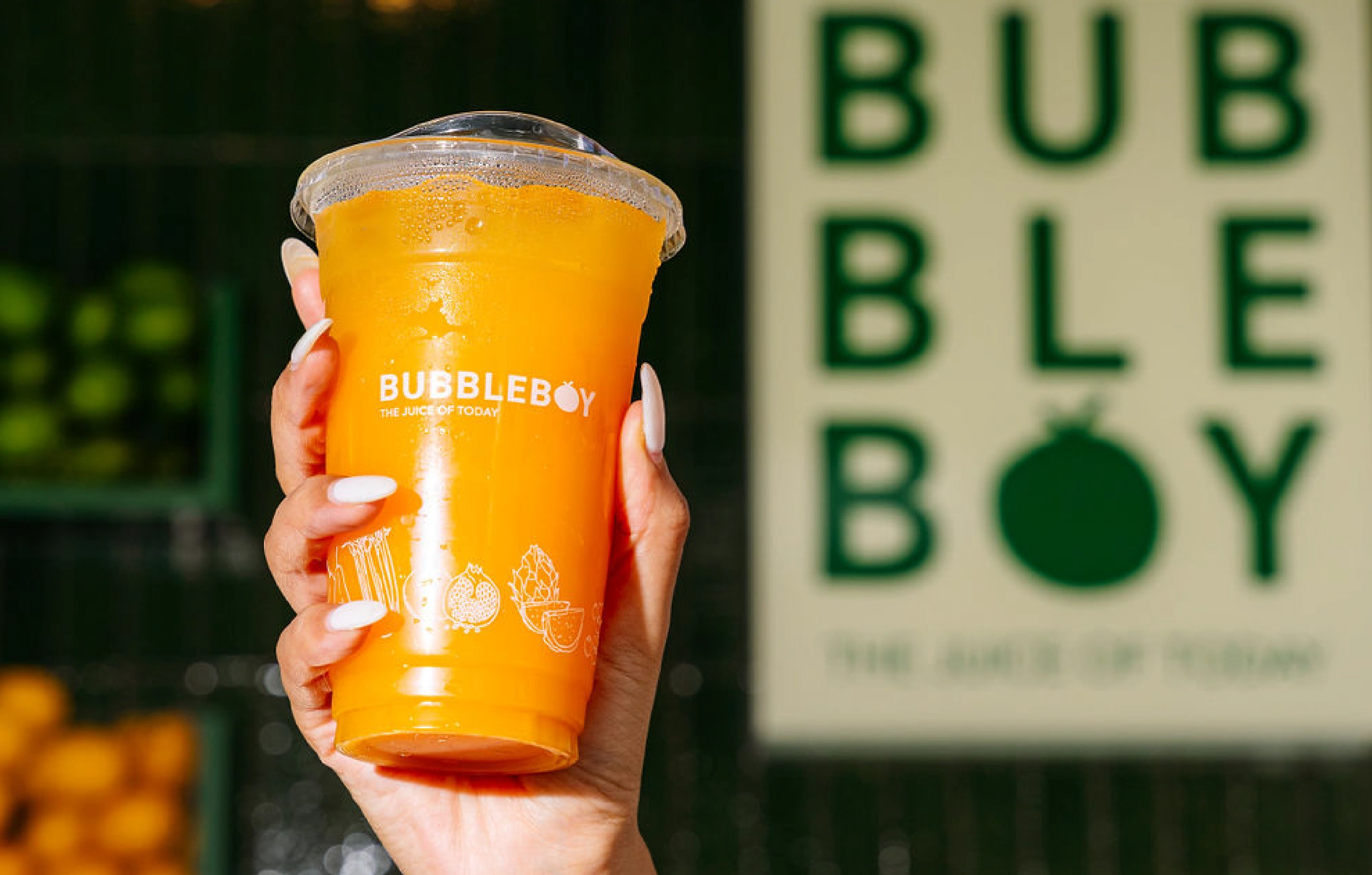

Bubbleboy
For this project, I worked closely together with my client to build the brand for Bubbleboy: a new juice bar situated in a busy part of Hamilton, New Zealand.
The juice bar is for all those that value health - so the majority of the customers are those that just finished a session at the gym and want to replenish their energy with a healthy drink.
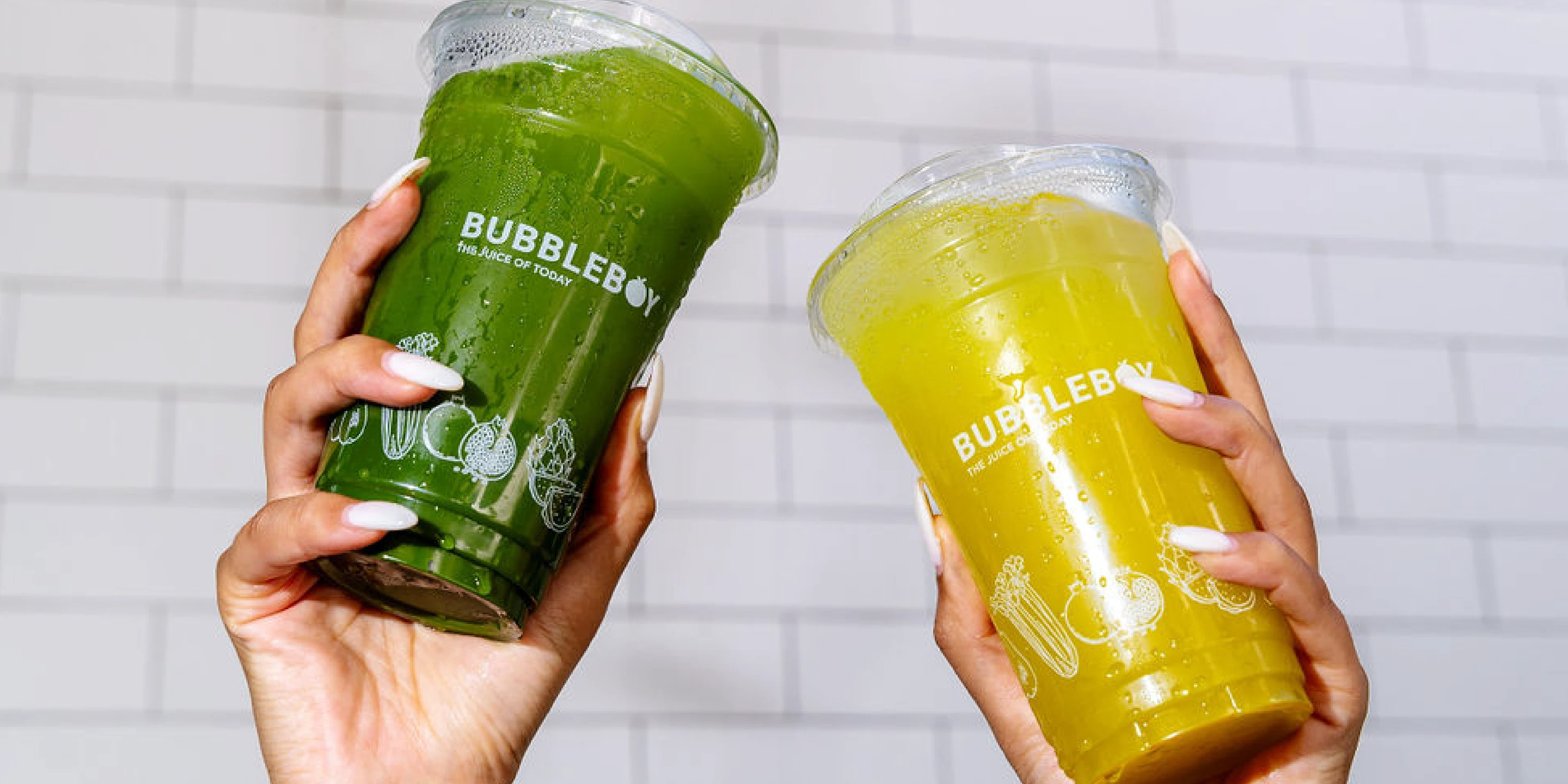
A big focus of the brand was that they use fresh ingredients and boost their drinks with extra healthy benefits like matcha.
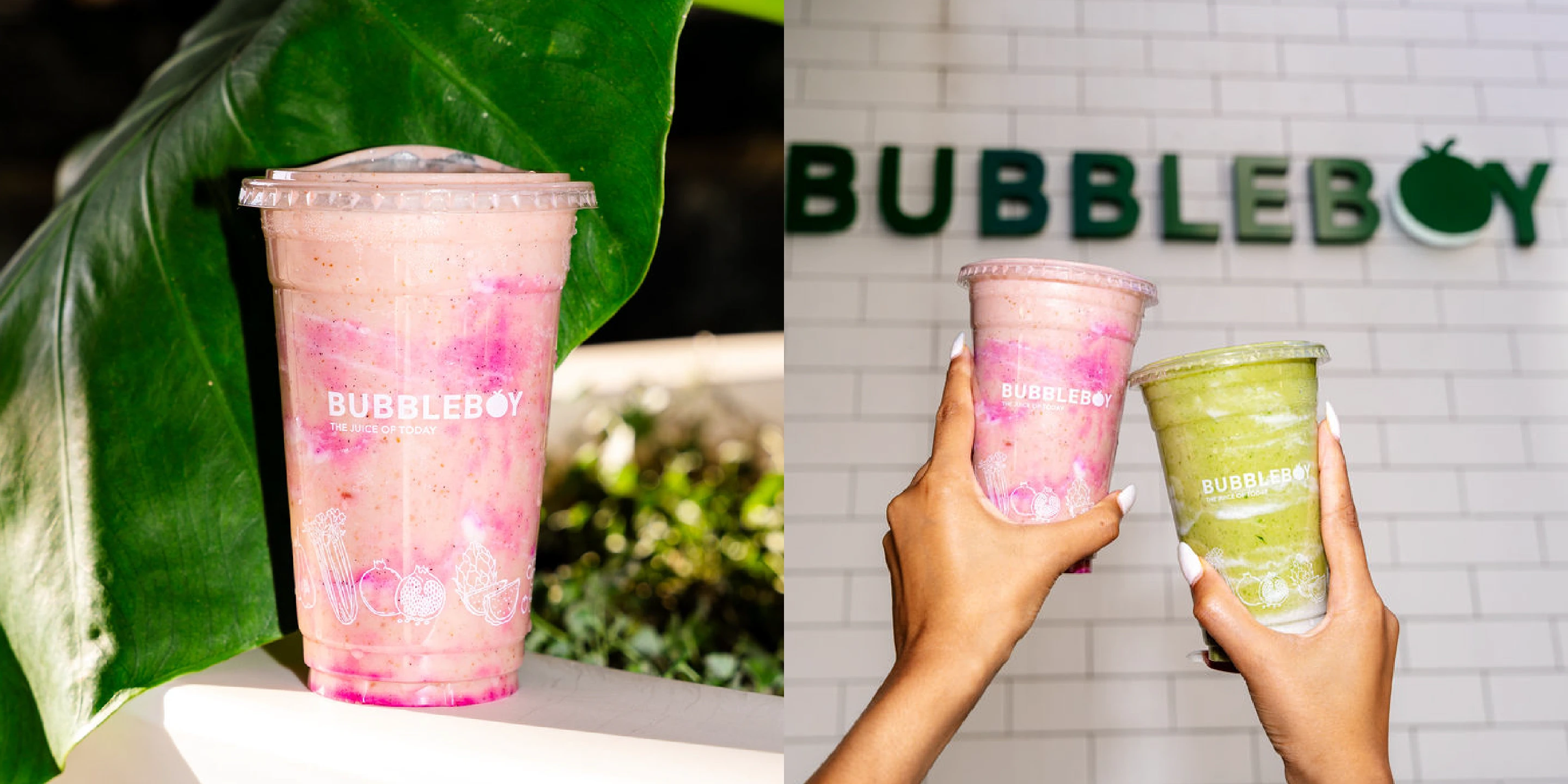
It became clear pretty early that there was quite some competition and so we identified the main things that the brand would stand out on amongst the competition. This would be the unique and artistic design of the drink and the overall branding that would draw them in. It itself, we would build a strong brand that advocates a healthy lifestyle through and through - this being because the audience finds this of great importance. In the end, the actual design of the juice bar, contributed to bringing this vision to life in collaboration with the branding.
As the designer and art director of this project, it was my job to align the client's ideas, overall business info, and target audience data, and create a brand that represents all of the above.
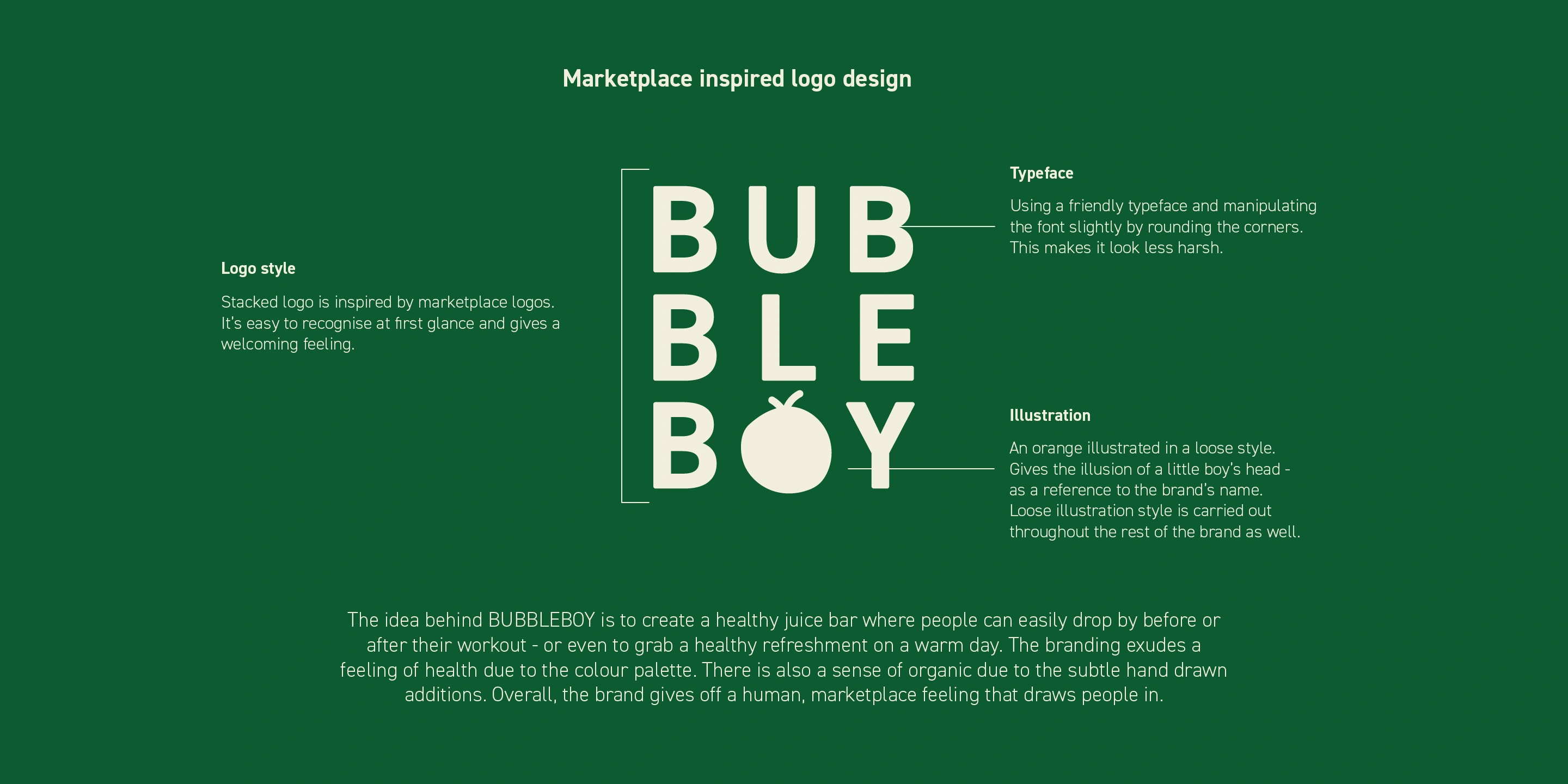
During our strategy session, we agreed that the brand should look more organic. It should give off a bit of a marketplace vibe. This in order to exude that healthy, farm, feeling. Since the drinks would look more artistic, we also wanted to add in a bit of a funky, artistic nod to the design.
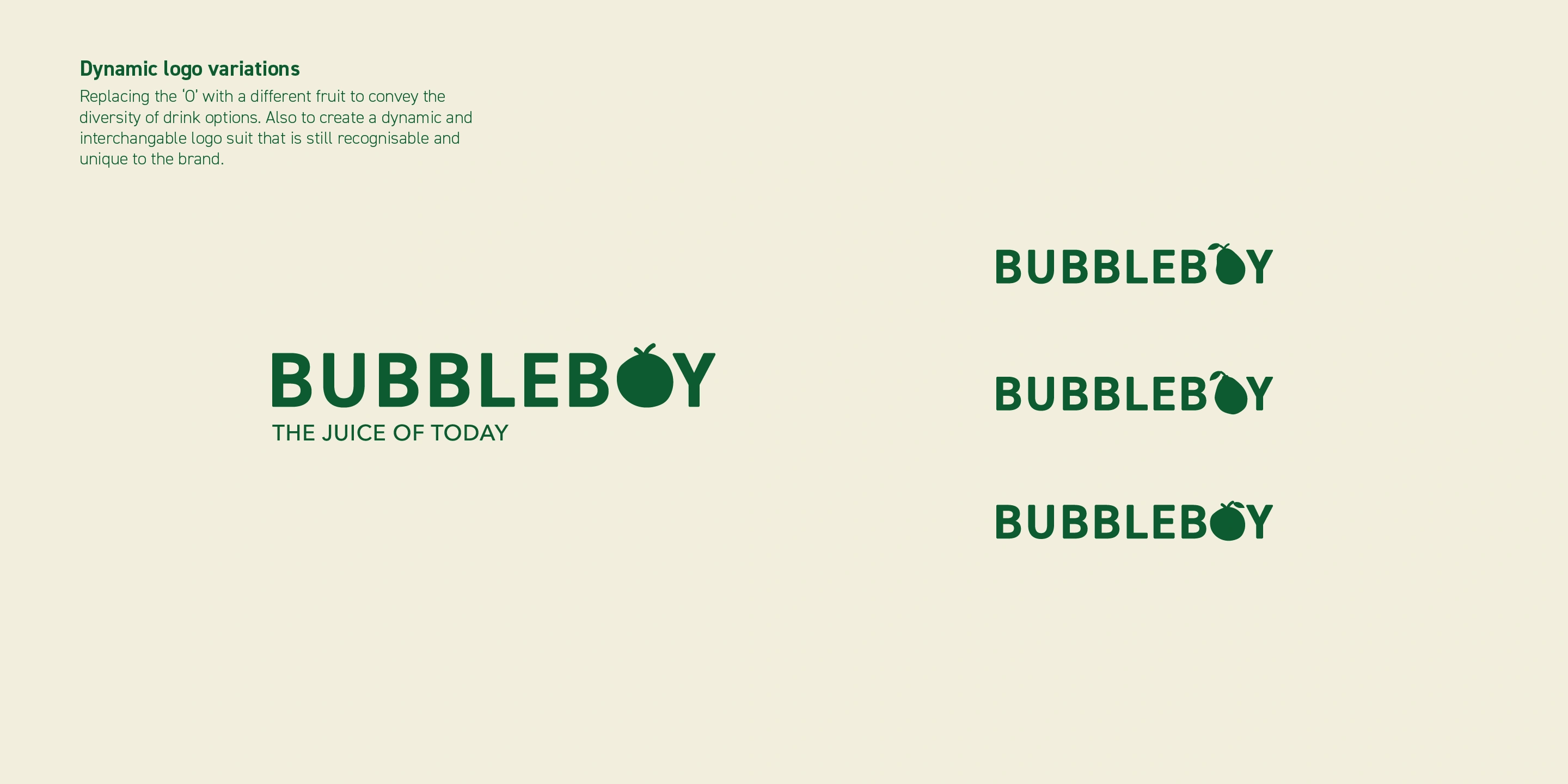
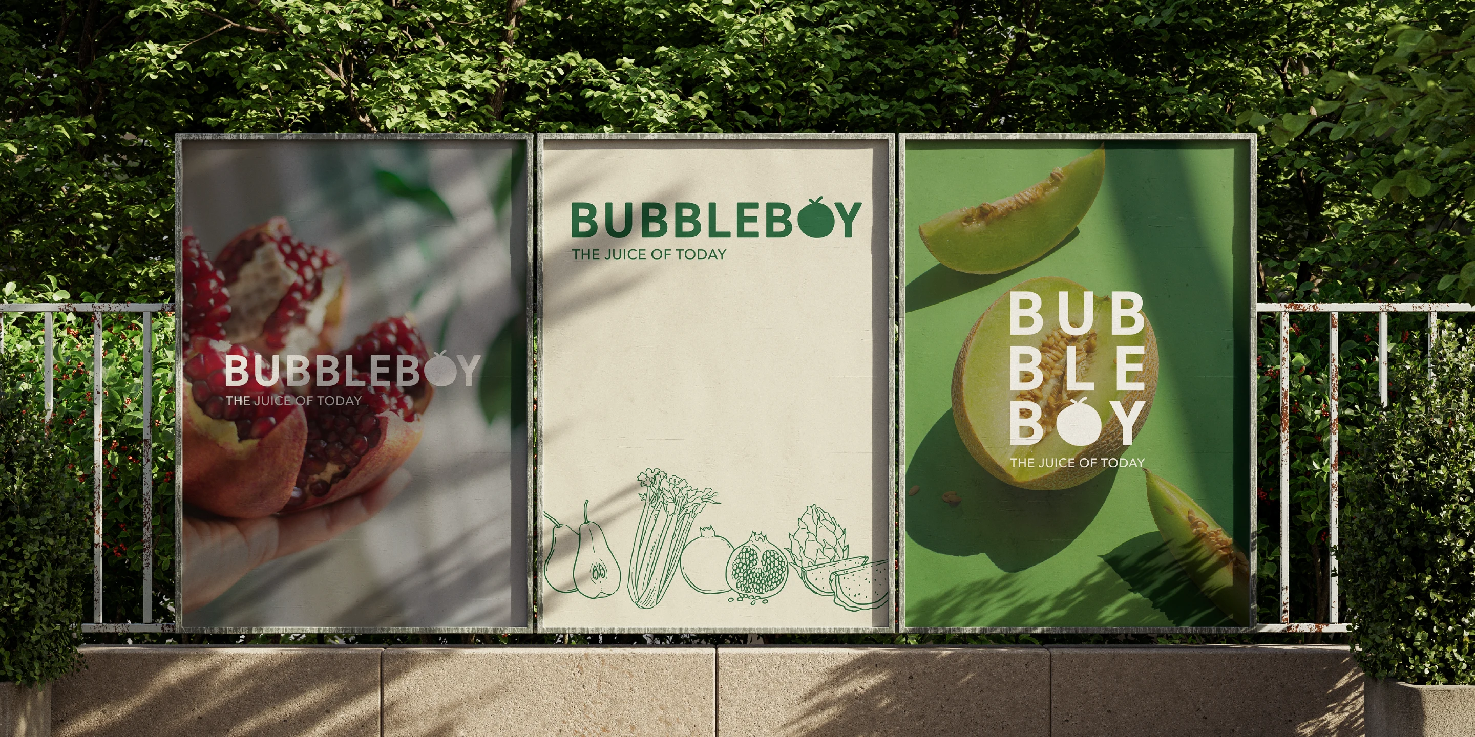
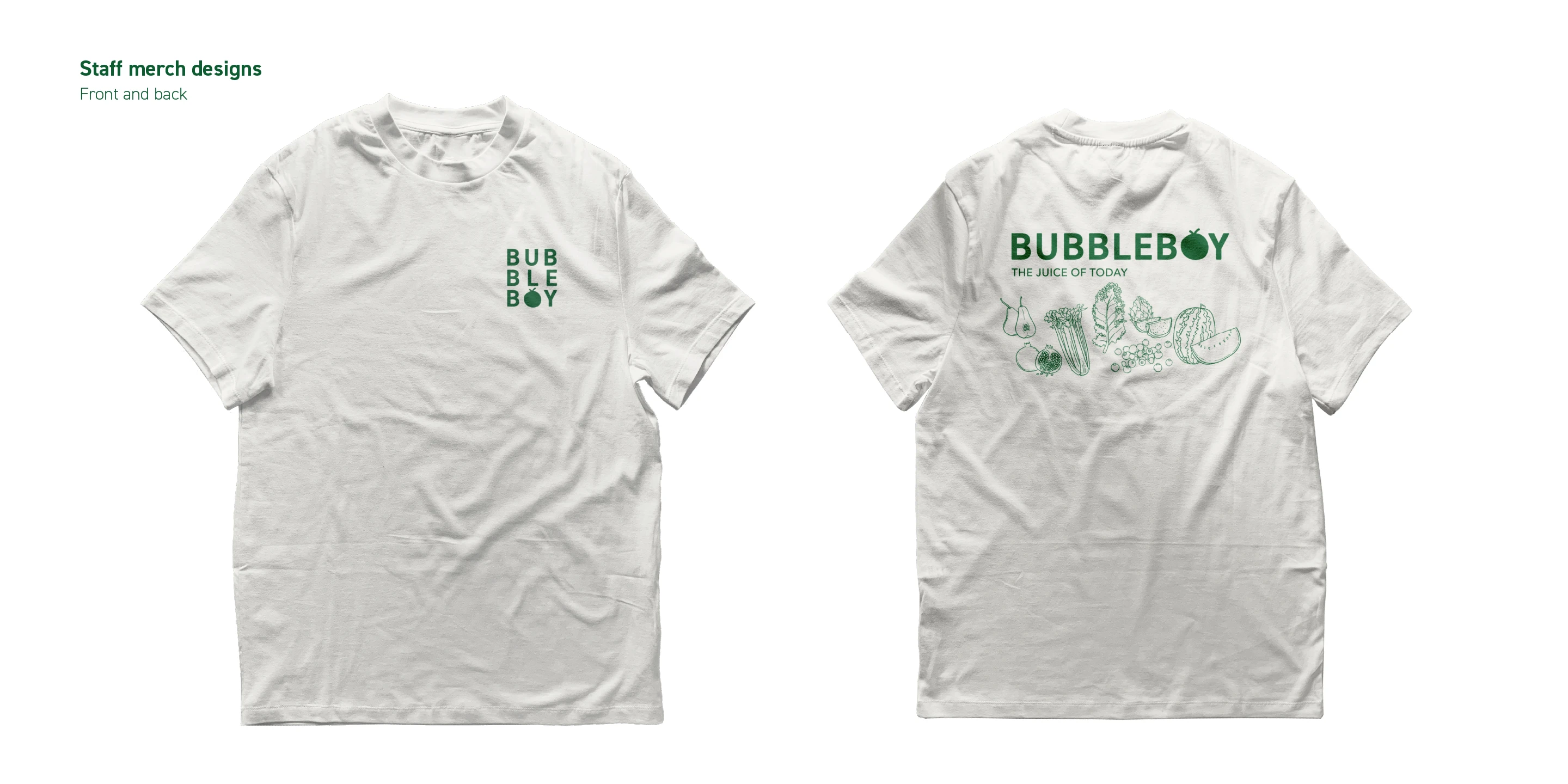
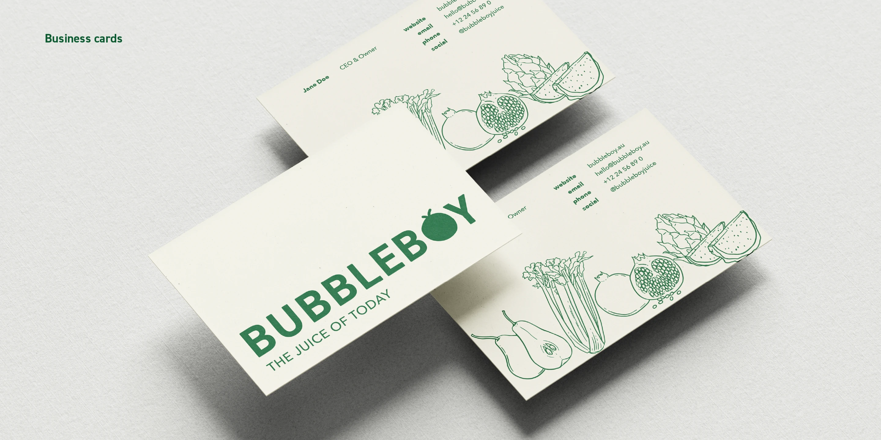
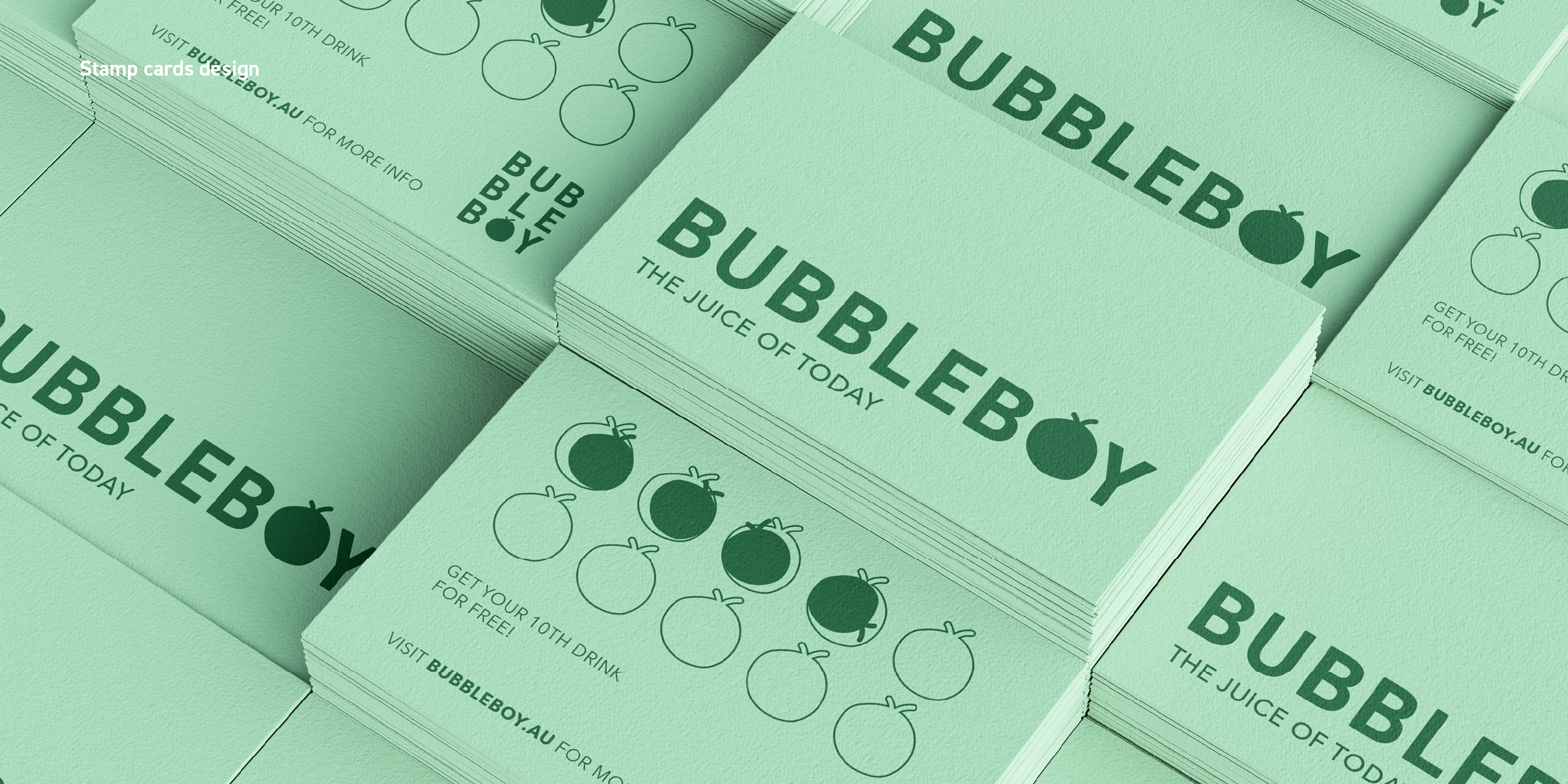
So, for the branding, I brainstormed many options, exploring all ideas we gathered together. In the end, we loved a simple word mark that incorporated an apple that simultaneously looks like a little boys head - this being a reference to the brand name. The different logo variations - i.e. the stacked version, really contribute to the marketplace feeling we wanted to convey originally. I also made sure that the text in the logo had slightly more rounded corners to give it a more friendly and approachable feeling + it made it look a bit more organic.
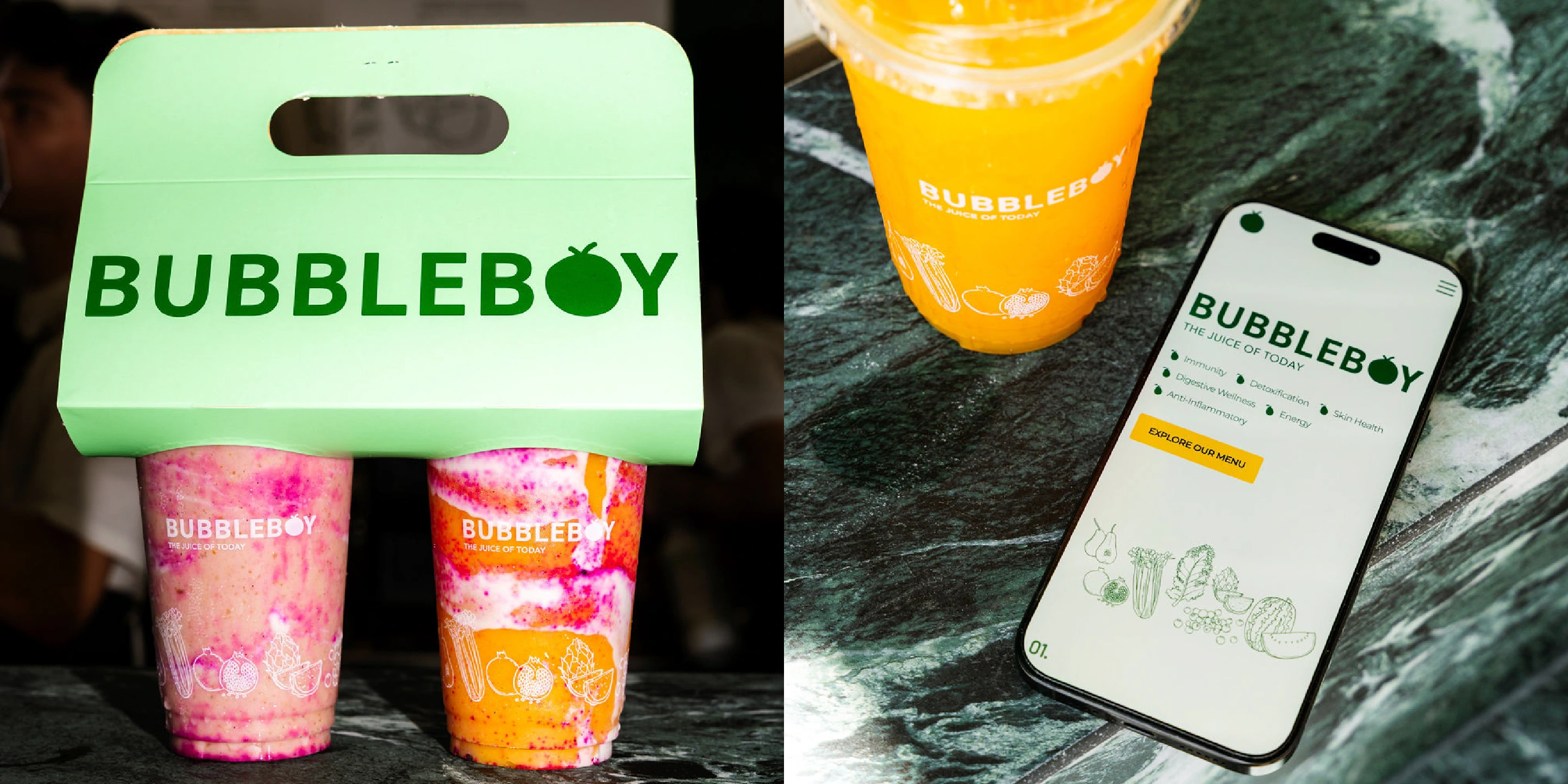
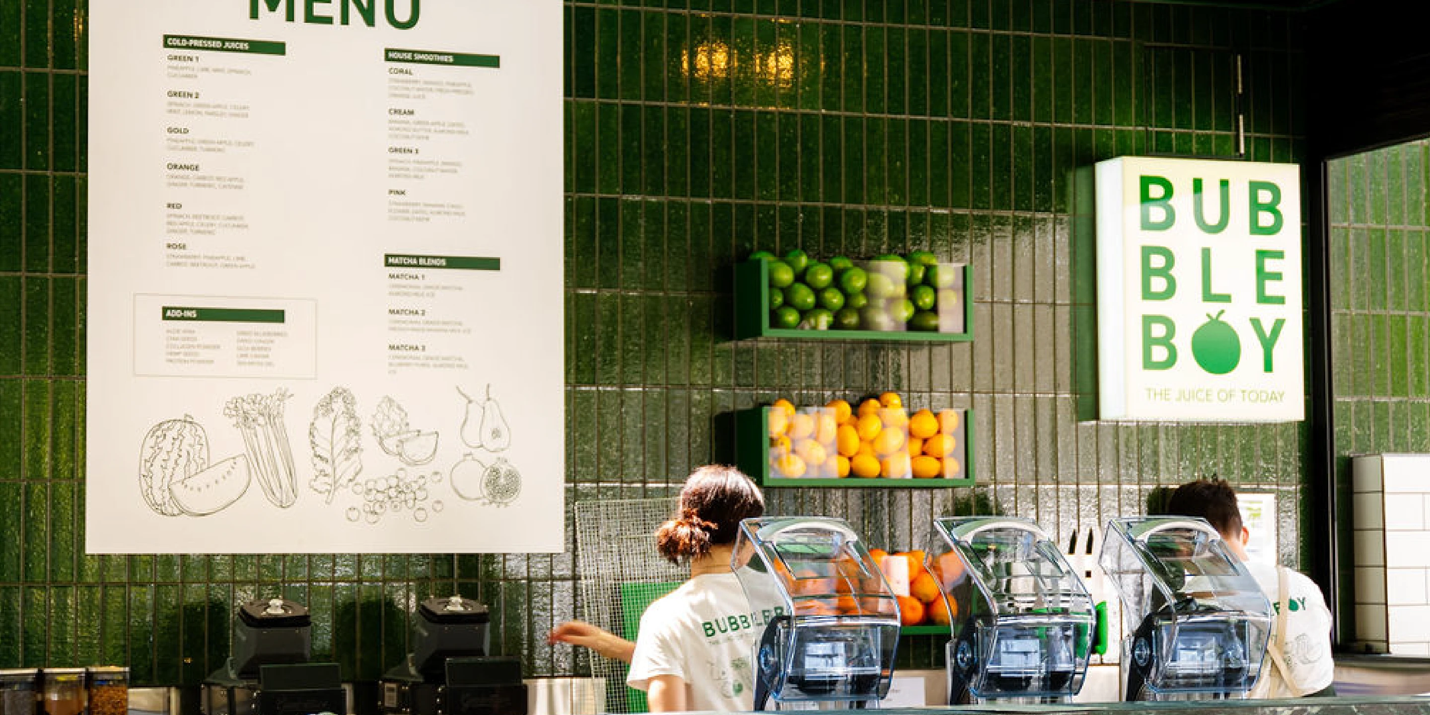
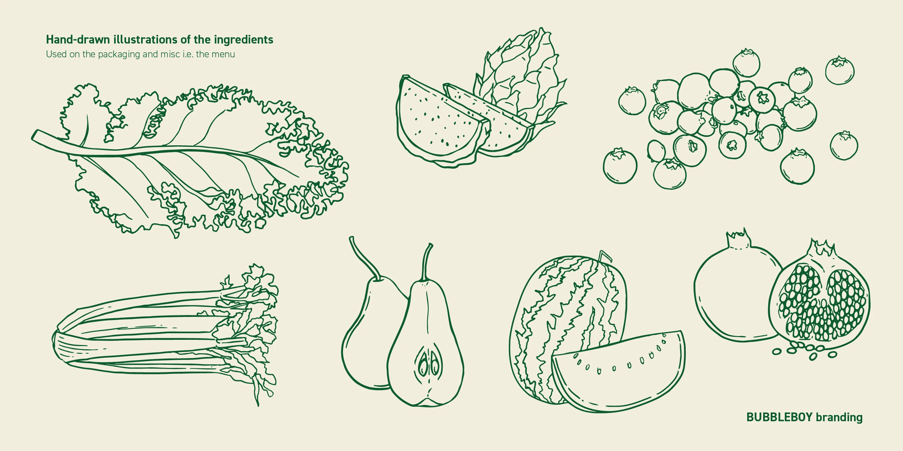
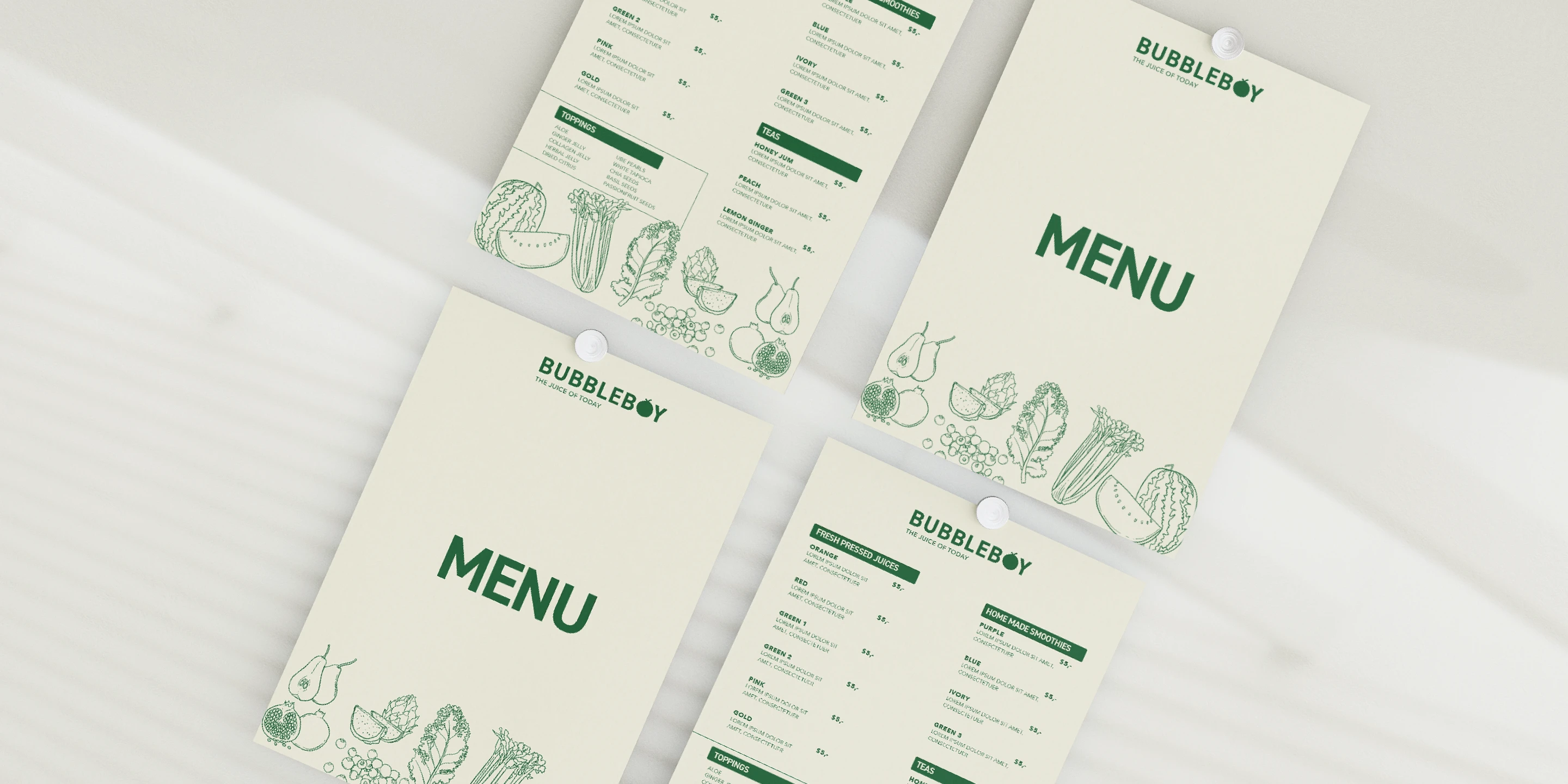
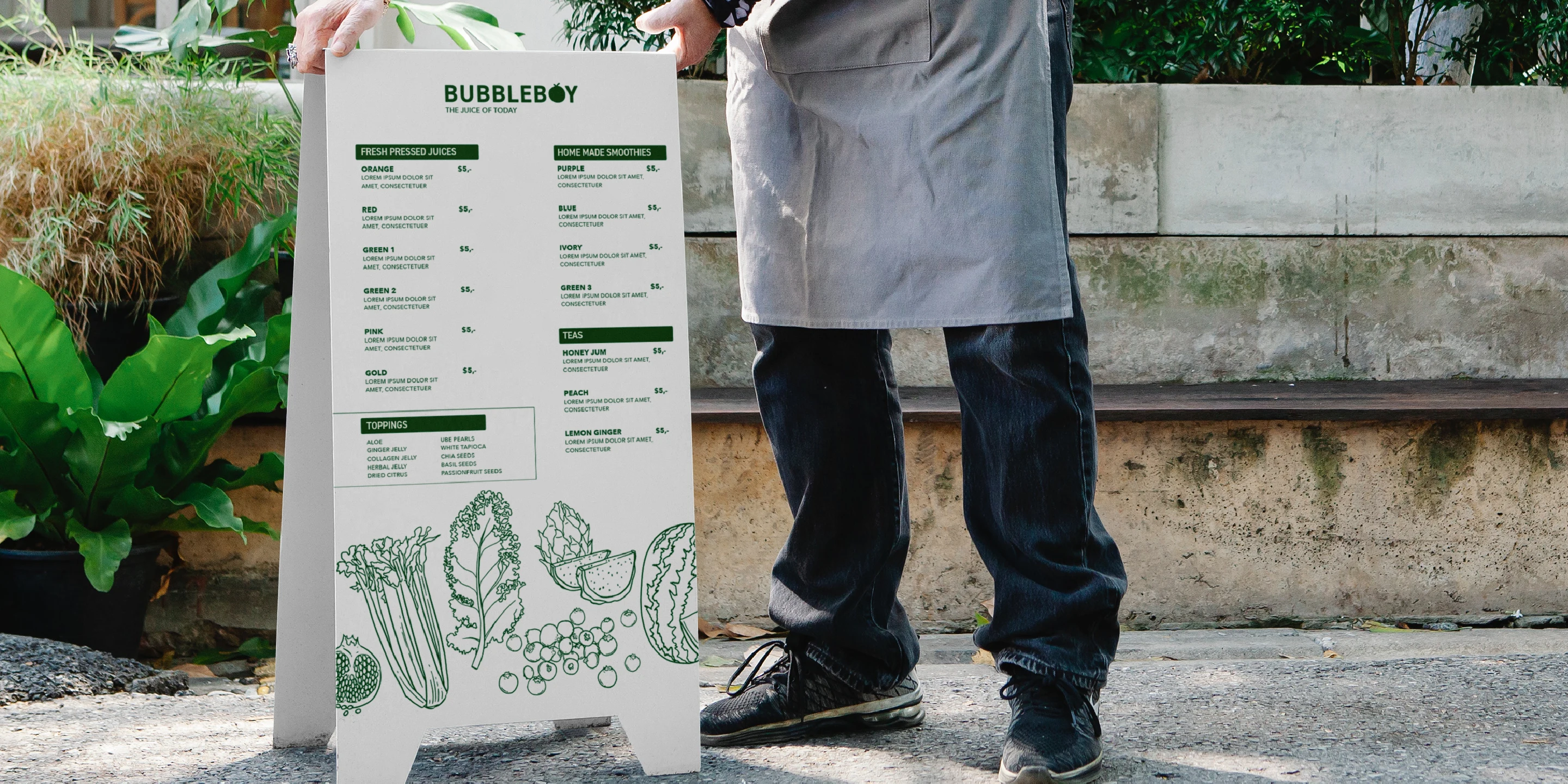
We complimented the branding with a set of brand assets which included illustrations of the most used ingredients in their juice options. These brand assets would be used on the cup but also on the menu, merchandise, and website. We agreed that the illustrations should look more organic as well and give off a hand drawn feeling.
For the colour palette, we explored quite a few options. On one hand we wanted to go for a bright blue to have an unexpected colour for a healthy brand - they're usually green. But we felt that it didn't work with the overall branding we had so far and that we should explore some green. We both felt that the branding called for green. I advised we try a variety of green - lighter / darker and really select an iconic Bubbleboy green. The colour I chose in the end was inspired by the spinach colour while still being very bright and therefore gives off a healthy feeling. I paired it with different shades of green, all of them being bright which feels energetic - exactly what we wanted the audience to feel when visiting the juice bar. I also added a highlight colour of orange, as a reference to the fruit, and because it complemented the green really well. Thus creating a colour palette that feels energetic, healthy, inviting, and makes an impact.
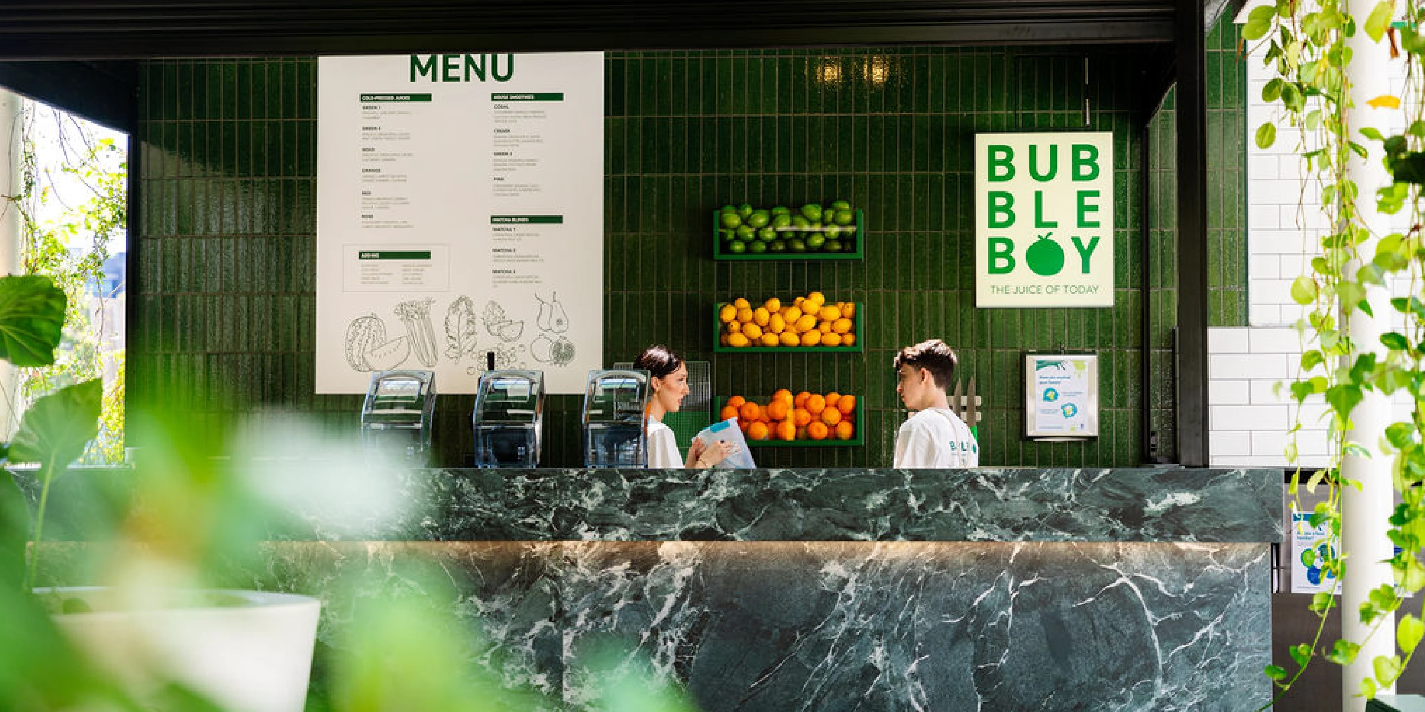
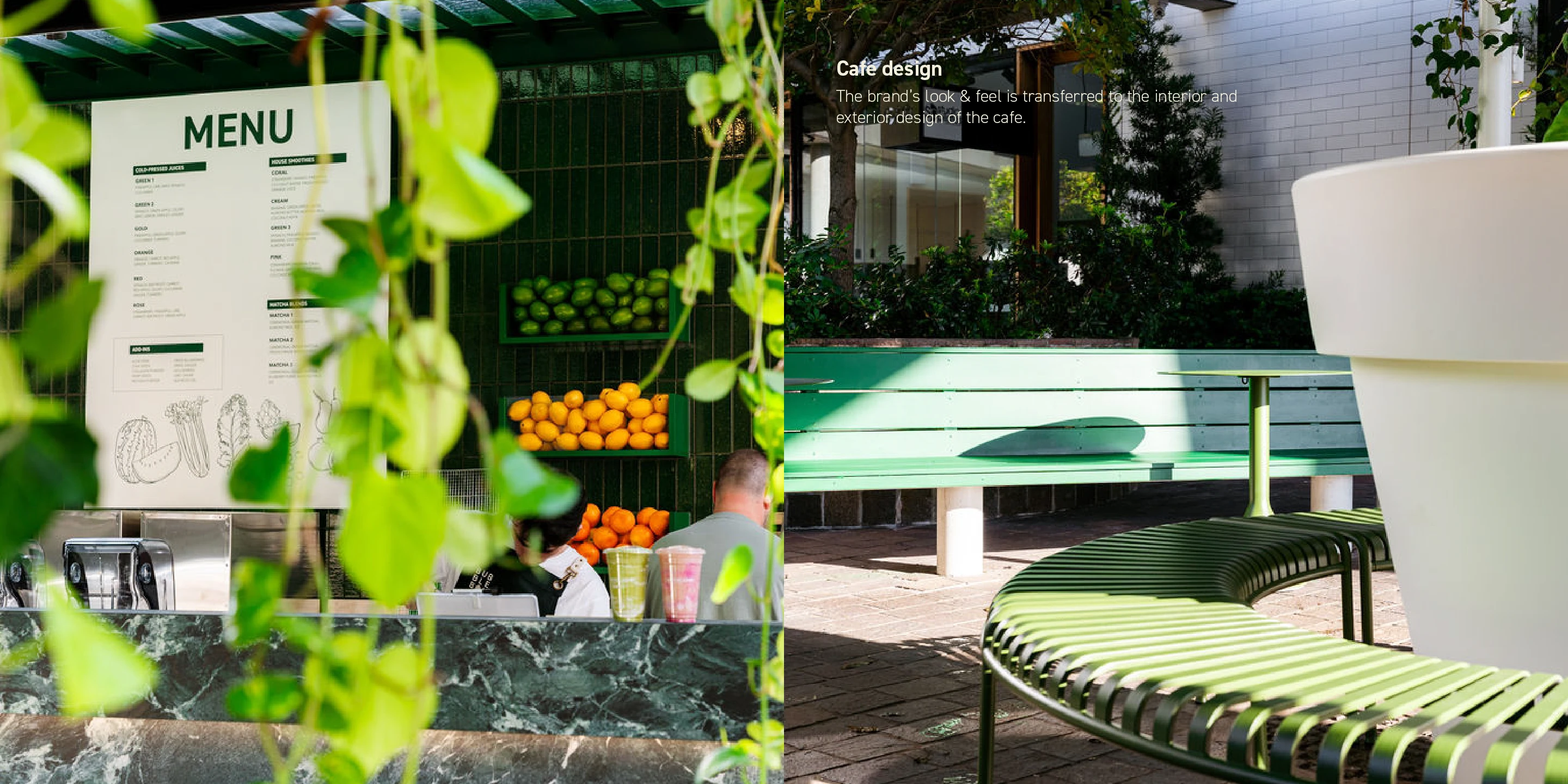
All the branding was incredibly well received by the client and everything was implemented in the construction of the interior of the juice bar. The bar has been very successful since their opening in 2025 and they are even expanding to open up a new 2nd location very soon!

Like this project
Posted Apr 15, 2025
Bubbleboy is a juice bar that offers a one of a kind experience for its customers with healthy, nutritious, but also beautiful looking juices.
Likes
1
Views
14
Timeline
Apr 3, 2024 - May 10, 2024
