Knead More Dough App

Cora Mullinix
Illustrator
Product Designer
Web Designer
Adobe Illustrator
Adobe Photoshop
Figma
Miro

Simple yet memorable
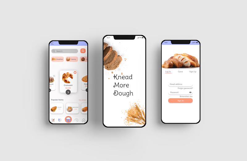
Knead More Dough is a bakery specializing in homestyle baked goods. It started with an idea with my business partner and me to spread more great-tasting baked confections to loved ones that had less sugar than most American bakeries. With a catchy/punny name and we are off to brainstorming and researching ideas. Food doesn't need a lot of sugar to taste great. We have researched through our competitors local and national to see where the trending themes were currently. What we could do differently, what isn't currently being done in the market, etc. We wanted to create something unique in the color palette. Simple and refreshing, stylish and young- no matter your age. Our target audience is men+women 18-60 years old. As we continue to develop this bakery our hopes and goal are to support local outreach programs in DFW for the homeless, small businesses, artists, and to continually support the underrepresented people in America.

Wireframes

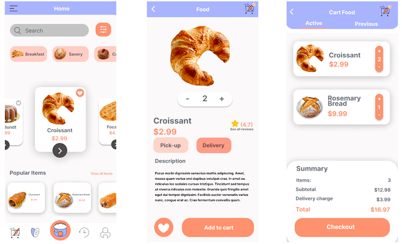
I get through ideas for the setup with making low-fidelity wireframes in Illustrator so I can get through ideas quickly before I begin high-fidelity prototyping.
Bread-Themed Icons

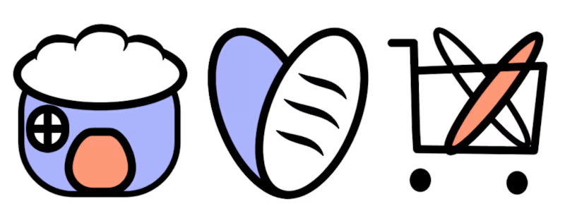
I wanted to add a stylistic element true to our brand image and theme. In this case, I made the icons to make the app both memorable and easy to use. I want the customer to enjoy the ordering process but also take away the visual elements.
In psychology, the color lilac is frequently associated with qualities such as friendliness, open-mindedness, immaturity, and extroversion. The color is said to help reduce antisocial behavior and aggression by encouraging emotional expression.
The color peach is known to be an excellent color for communication, it also has much influence on good manners and calm. This color brings a high degree of positivism.

Project Status: Ongoing
2021


