ShopSalonCity Redesign

Cora Mullinix
Photographer
Product Designer
UX Designer
Adobe Illustrator
Adobe XD
Google Analytics
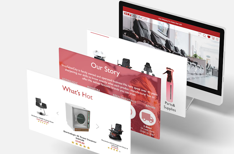
Improving the Web Design & Functionality
It all started with clutter & ended with zen simplicity a Buddist could appreciate
ShopSalonCity has a ton of products they can offer their customers however, their current website layout is cluttered and not effectively showing HOW their products can benefit the customer. I tackled this project as a personal endeavor as I currently work for the company and our current page gives me a headache with all the boggled information. This began my curiosity about how our users are feeling and how we could better fit the site to their needs and pain points. We are in the transitional phase of transferring from BigCommerce to Shopify. Sales on the site are either by the customer online or they give us a call to help them with their order.
The target audience is salon owners/workers from 18-65. Our products help our customers with their hair or nail salon, school, and store by having the furnishings and appliances they need to take care of their clients. ShopSalonCity has multiple marketplaces from Amazon to Walmart to Wayfair. The site does not get as much revenue as our Amazon storefront for example. I wanted to tackle this issue by implementing a design that was easy and catered to the user's needs but also, caters to our needs by being able to sell more on our site, show promotions, and gain new leads.
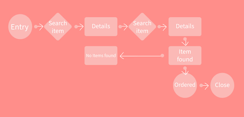
User Flow
Research
How is the current experience users are having with ShopSalonCity?
Interviews show that there are 2 major user pain points:
-Confusing navigation
-Lack of information hierarchy
The current layout of ShopSalonCity

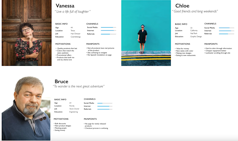
Personas
Based on the individuals we sell our retail products to. I set up three base personas.
From the beginning, I knew we needed personas, a variety of customers with different needs. I wanted to fine-tune their needs
•I researched within our database for user research and asked my team more about the individuals they sell to
•Personal motivations, problems, what language they speak are some areas I cover
•The personas affected the design as there is a large Vietnamese and Spanish speaking percentage of customers
•I reflected back to the personas when I designed the product category
"Will it make the boat go faster?"
Wireframes
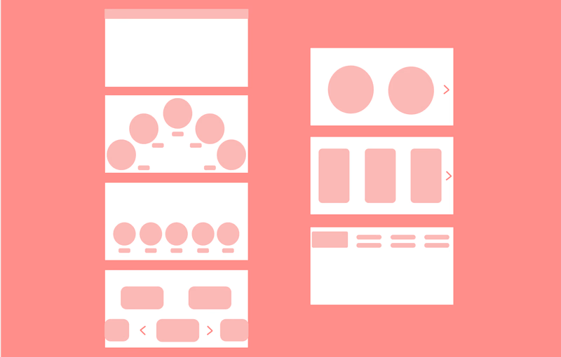
I usually start the design process with low-fidelity wireframes. By sketches then through computer applications. This is the way I iterate through many design options quickly.
•Brainstorm ideas
•Knowledge of our users influenced designs to "keep it simple stupid"
•4 different versions
•Different: landing images, and the category bar
•Chose the 2nd version for its simplicity and appeal
"How can we simplify the layout to be more intuitive and help user retention on entering?"
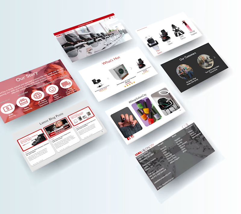
I wanted to highlight more of those featured products and make the homepage less of a war zone with its mass of information. There is already a product dropdown at top of the page yet there is another on the left side of the page. Too much repeating information can make the user feel overwhelmed and confused. I wanted to make the experience on-site, searching for the item, and looking at similar items more seamless. Adding the star reviews to the featured item category, a customer is more likely to click items that have good reviews/ratings. Amazon does this very well for example. Additionally, it serves as "trust".
"The following customers loved this item so you will too!"

Take-Out
This project made me realize how much data plays an important role in designing. To know the "whys" behind things and see the reasoning behind others' motivations, feelings, and actions.
What does the consumer feel?
What makes them feel pain/triggers?
What color combination do you like better?
How does it make you feel?
How can we use this design to better position our brand image and gain trust?
What changes can we make to increase the likelihood of sales?
With that said, there were struggles (hello challenge, we meet yet again!). My struggles with this project were; how can I best use data for designing? I overcame this by looking through our inventory system, and Google analytics, and BigCommerce account.
Another issue came into the design itself matching with quality images. The category section I conceptualized as a hot appliance holder at first, then later changed it to 4 rectangular category selection. Researching our competitors- their designs are kept simple, some still old UI styles. This leads me to believe this was an excellent area to experiment with easier navigation and shopping categories.
Just
keep
creating.
2021


