Echo Mobile: Precision in Network Oversight
Overview
The Echo Mobile project aimed to enhance the user experience for executives by redesinging the Network Health Page. The focus was on simplifying the data presentation, imrpving access to critical information, and streamlining navigation for quick decision-making. My role involved leading the UX design process to address these challenges.
The Challenge
Executives required immediate visibility into current network outages without navigating through cumbersome filters and multiple clicks. The exisiting interface required selecting a time period and interacting with mutliple selection, hampering the efficiency of accessing critical outage information.
The Process
1. Research
Methods: Conducted interviews and usability tests with executives to understand their pain points with the current interface. Additionaly also doing a hypothesis analysis to identify common interaction patterns and bottlenecks.
Key Finding: Users require actionable information to be prominently displayed, eliminating the need for extensive searching or navigation.
2. Define
We defined the problem by consolidation research insights, highlighting the need for
Immediate visibility of current outages
A simplified user interface with reduced interactions.
Highlighting and prioritizing critical issues based on severity and duration.
3. Ideate
We brainstromed several concepts to address the defined problem inculding:
Showing current outages by default.
Removing the time period selection step.
Focusing the inital view on actionable information.
4. Design
Information Architecture:
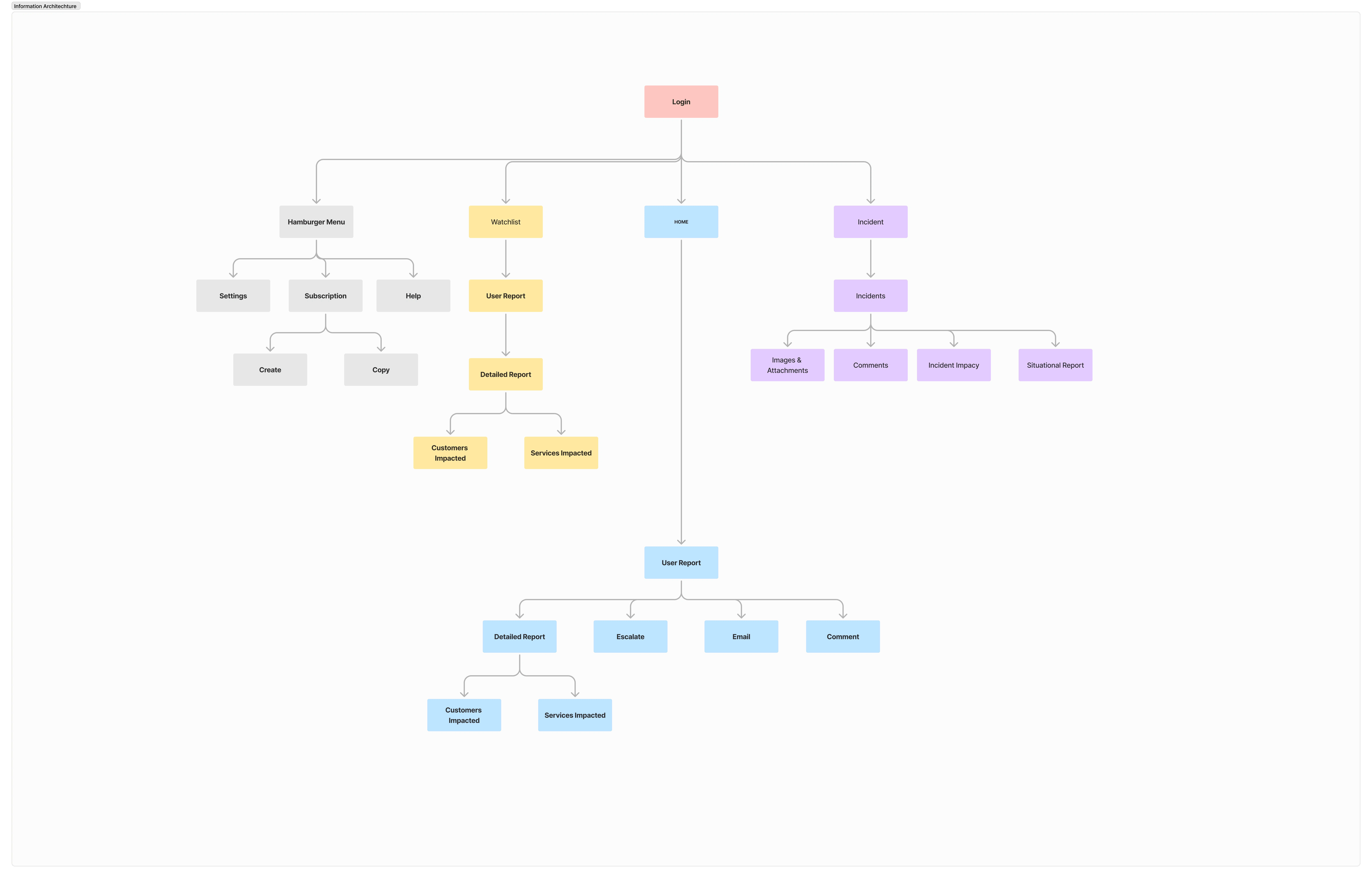
Userflow

Wireframes: Initial wireframes focused on a clean layout with immediate outage visibility.
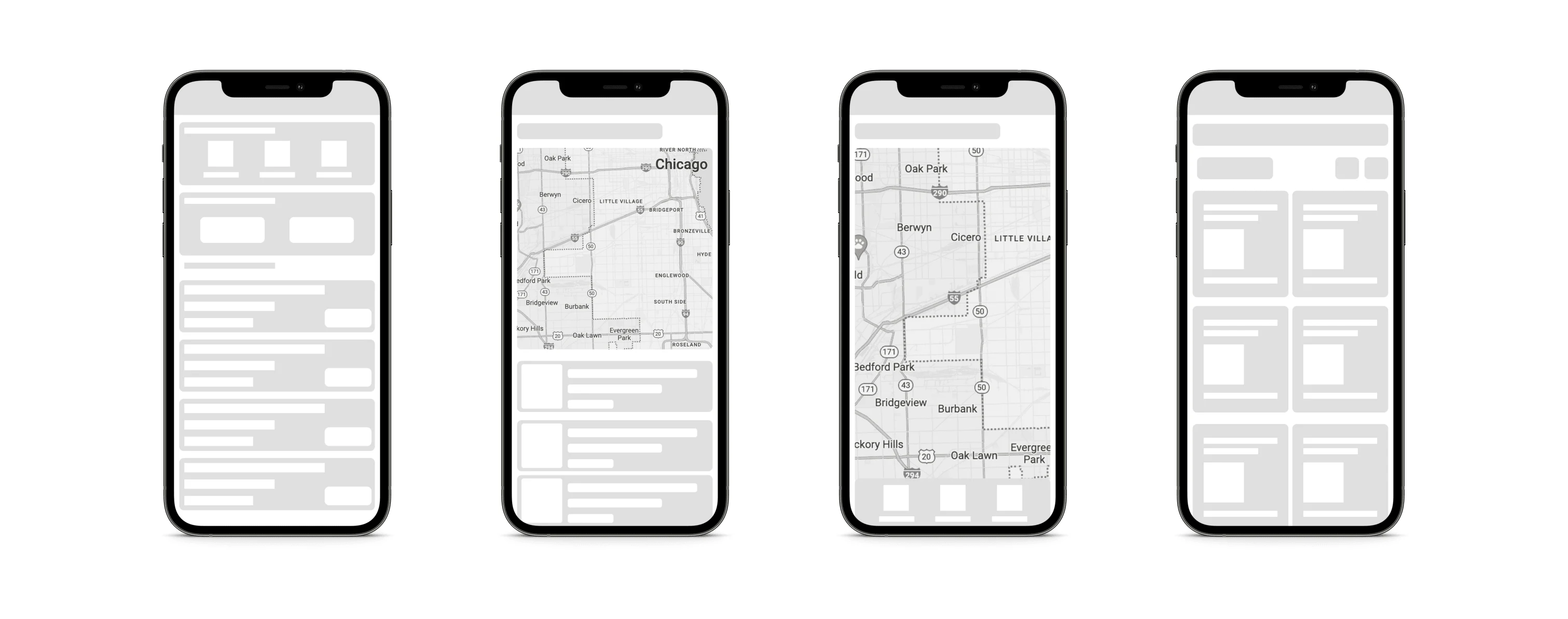
Initial Concepts
High Fidelity Mockups:
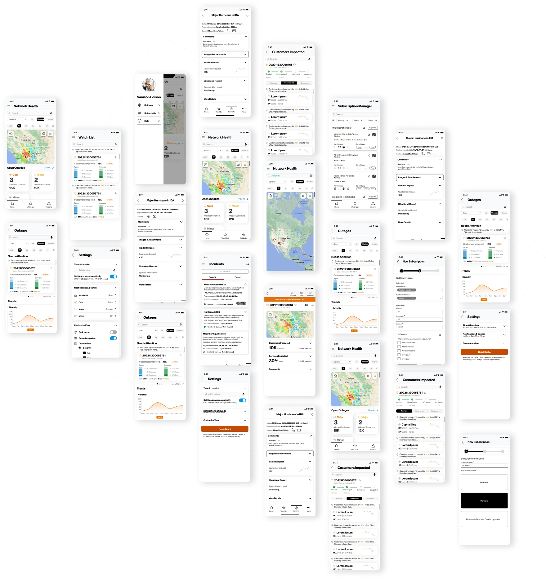
Iteration: Based on feedback, we iterated the design to inculde a persona - based home page, interactive maps and timeline view for better context.
5. Test
Methods: We conducted usability tests with prototypes versions of the redesigned interface.
Results: Feedback indicated a significant improvement in accessing critical information quickly. The new design was intuitive, and users appreciated the immediate visibility of outages.
Key Decisions
Replacing Tabular Format: The previous homepage design consisted of a tale with all outage inforamation, which was overwhelming for executives. We replaced with an interactive map providing visual feedback of the network status, offering a bird's eye view.
Redesigning the incidents page: We brought important information like updates and real time data to forefront, enabling users to take quick actions on high-priority tasks.
I was pretty impressed when they showed me the demo this week. I think it makes it a lot more easier in terms of consuming from a device as well as taking actions on it so clearly.
- Sankaran (Ram) Ramanathan | VP Network Systems
Like this project
Posted Jul 18, 2024
The Echo Mobile project addresses the need for an improved user experience for executives managing network health.

