
🏗️ PROJECT OVERVIEW
Led the creation of a comprehensive design system for Omnify's business management dashboard, addressing inconsistencies and improving user experience. Established foundations in typography, color, layout, and components, resulting in a cohesive and scalable design language.
🎯 CHALLENGE
Unify disjointed design elements across Omnify's dashboard, created by various designers over time, lacking cohesive style and clear guidelines.
💡 SOLUTION
Conducted thorough design audit
Researched top industry design systems
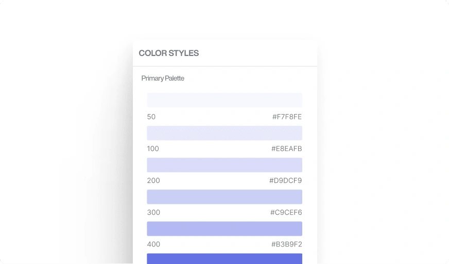
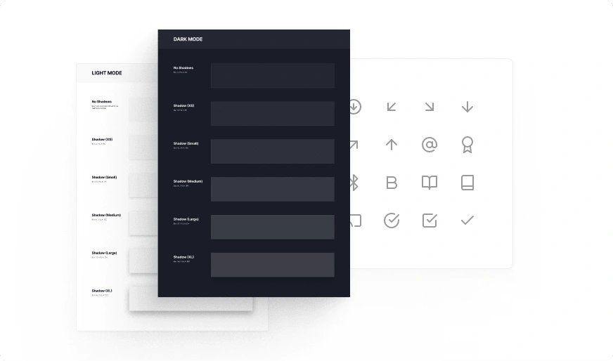
Established design foundations (typography, color, grid, icons)
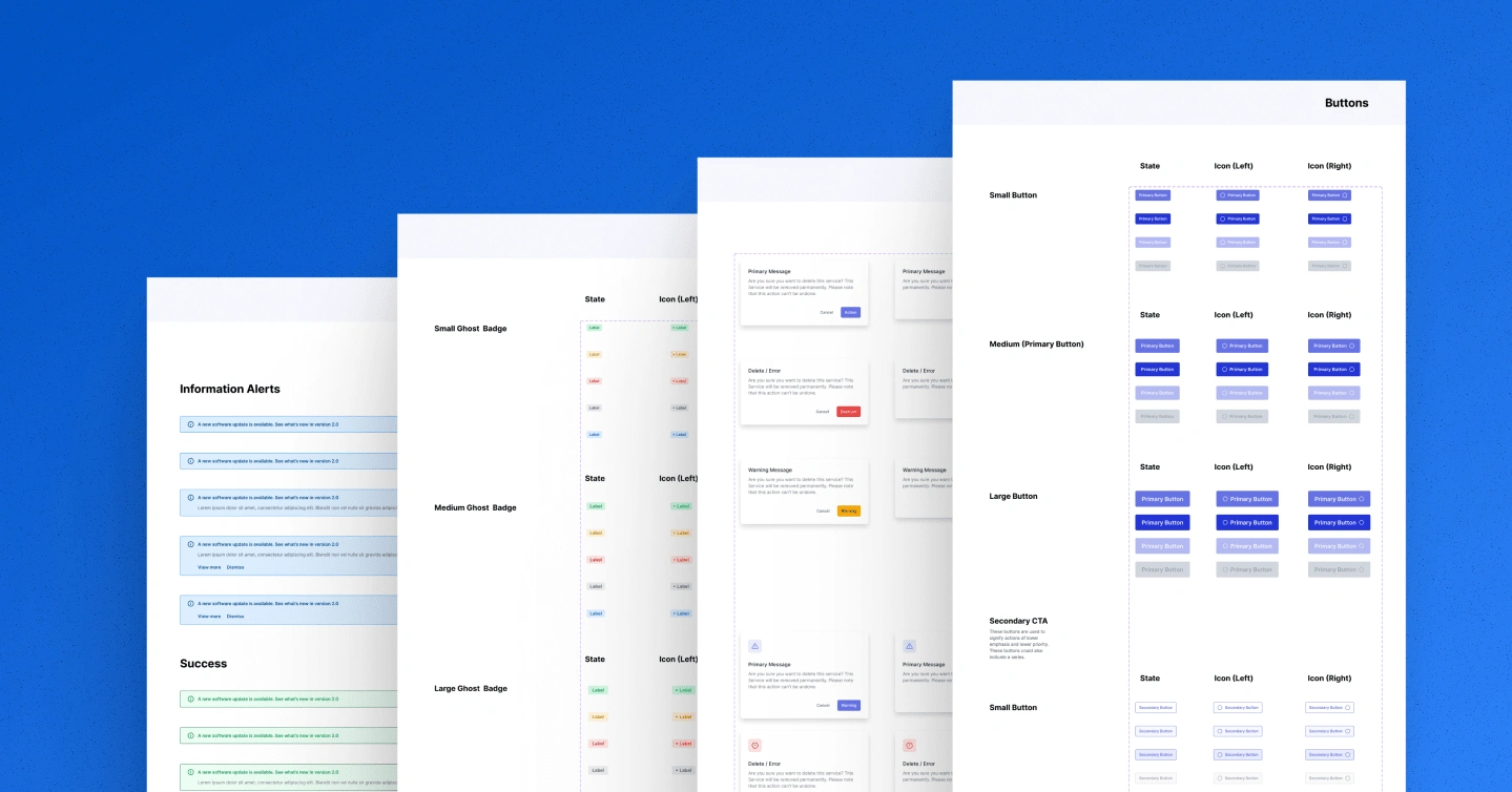
Created a standardized component library
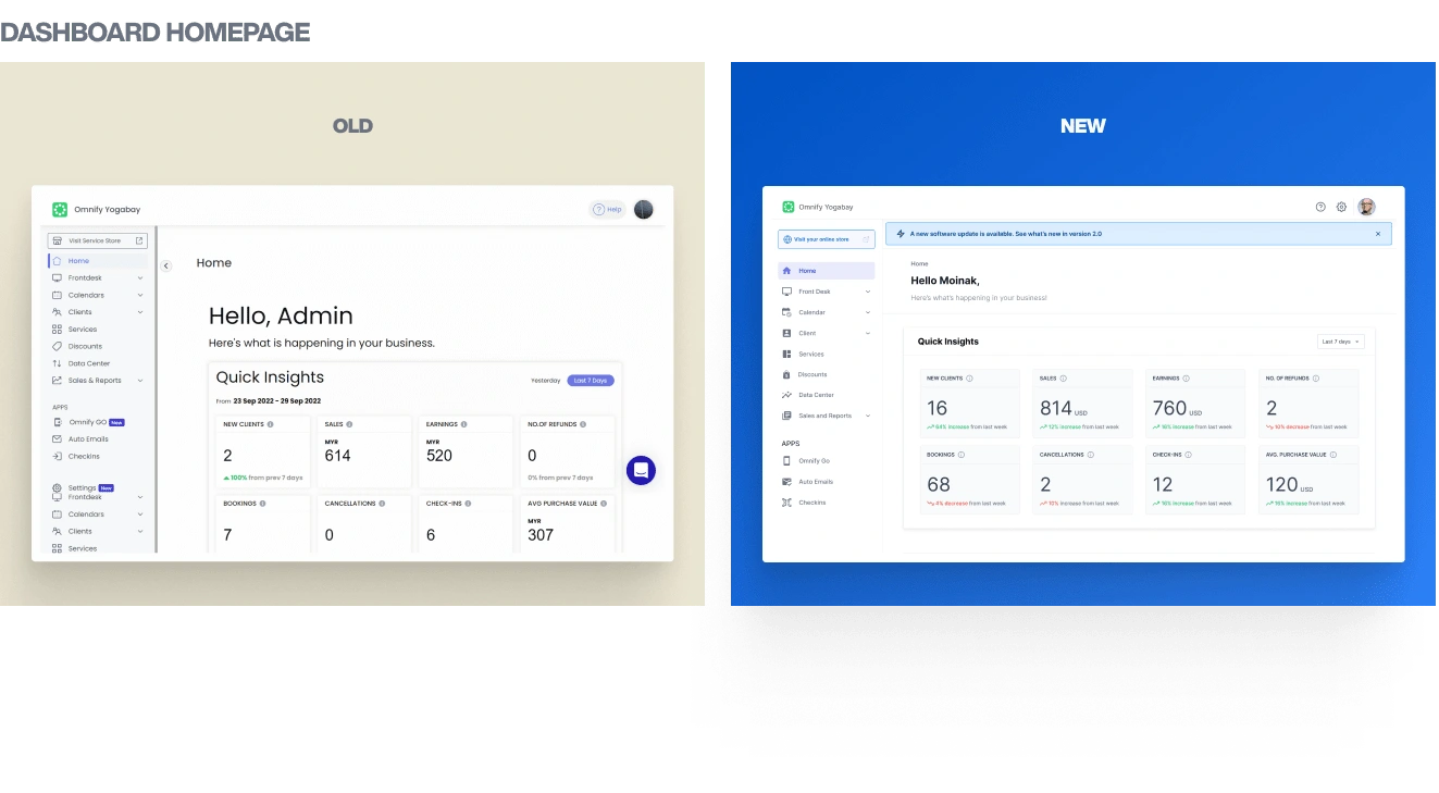
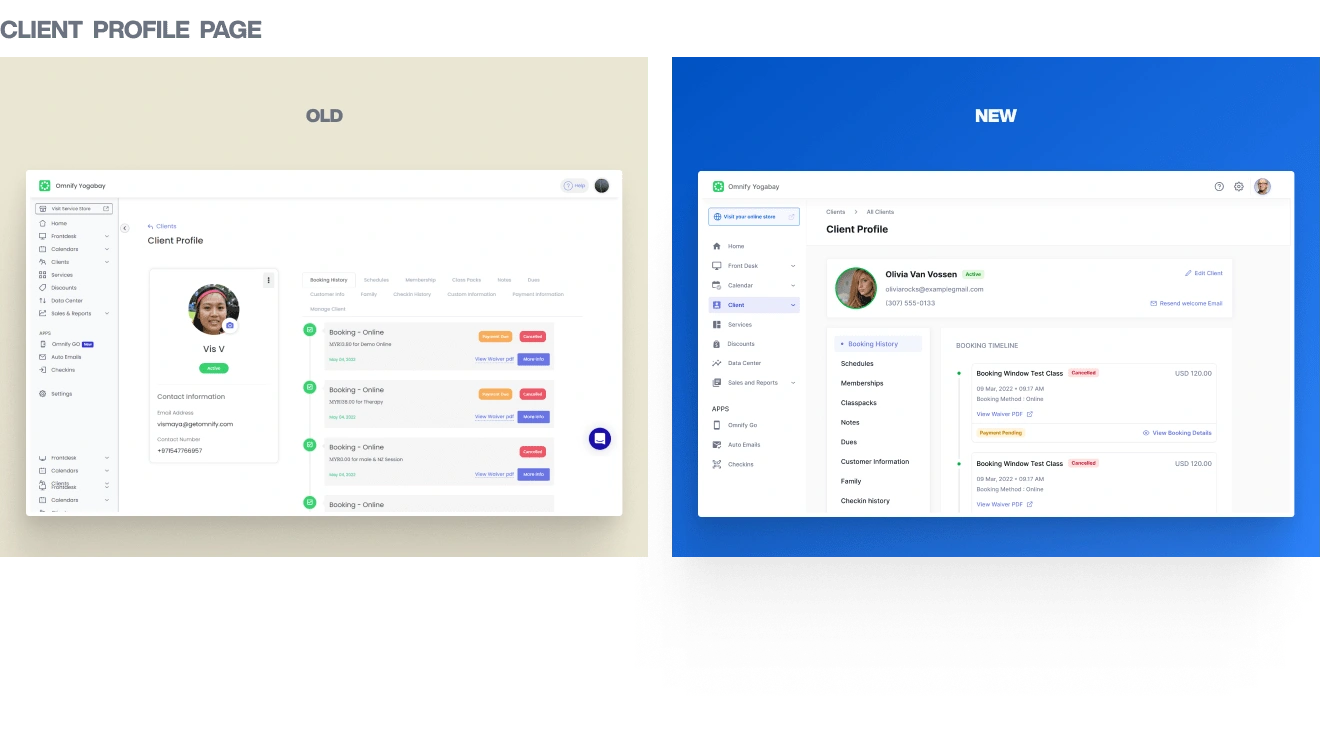
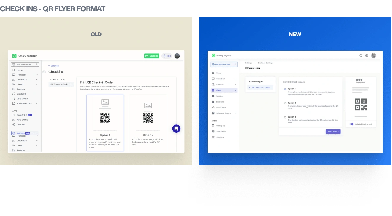
Redesigned key screens as proof of concept
🛠 PROCESS
Design audit revealing 38 inconsistent components
Adoption of Inter typeface for versatility
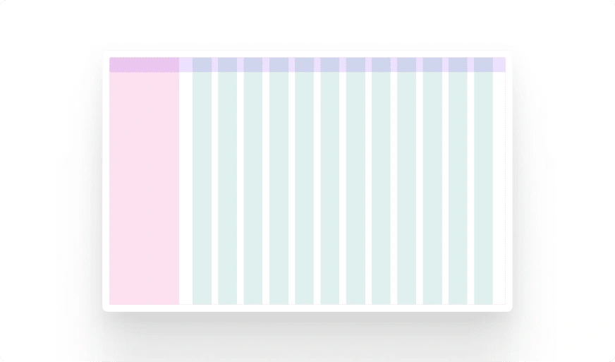
Implementation of 12-column grid system with 4px spacing
Customization of Feather Icon set for consistency
Component creation based on Material Design and custom designs
📊 RESULTS
Unified visual language across the dashboard
Improved design efficiency and consistency
Enhanced user experience through cohesive design
Scalable foundation for future design work
🎉 Here are some screens that were redesigned with the new design system:
0 likes · 65 views · Aug 14, 2024
- UX Audit - UI Design and Component Creation - Platform Design - User Testing
