Aestus Group
Matea Raić
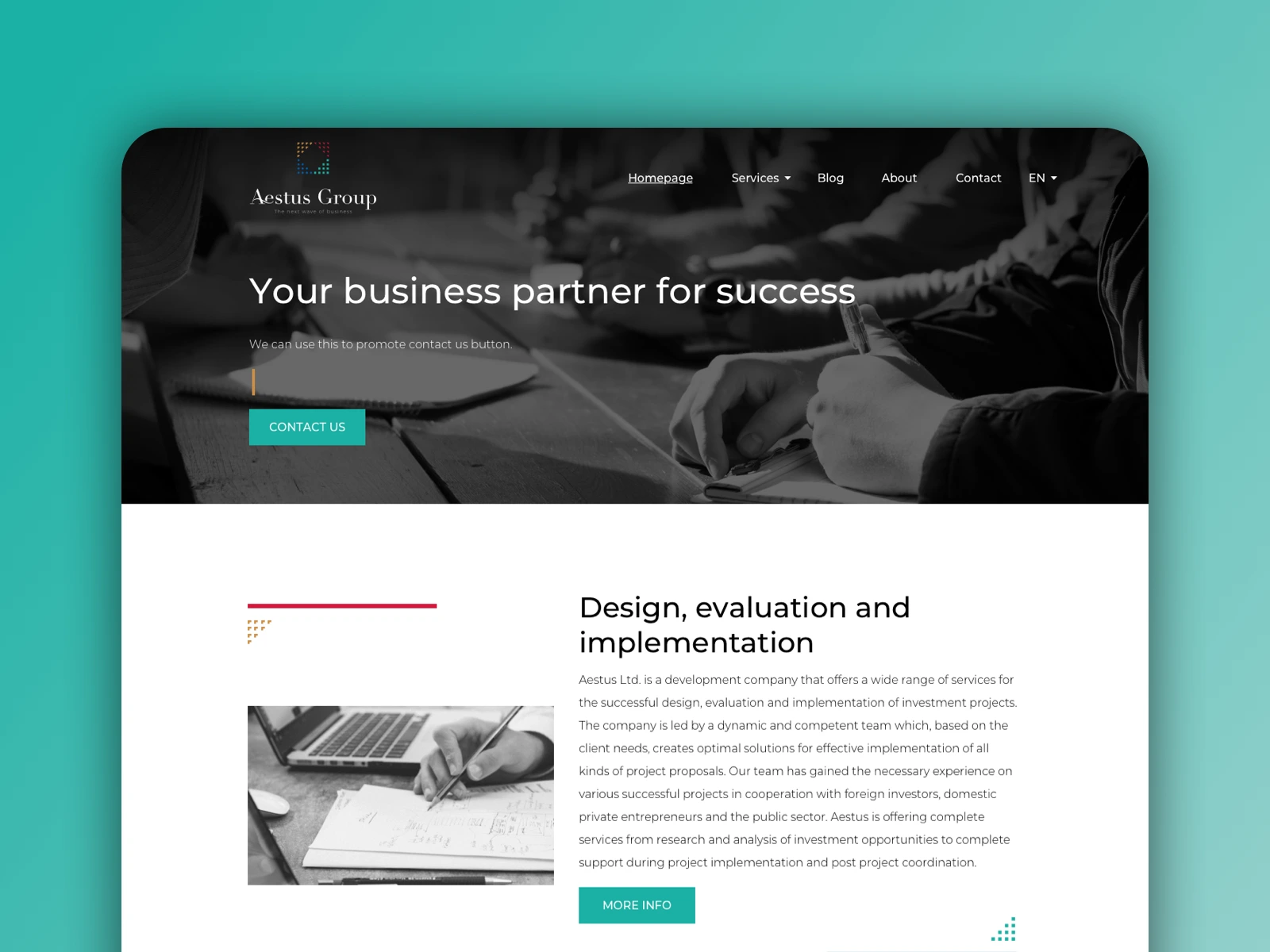
Aestus Group is an accounting and advisory firm that approached me to redesign their website following the launch of a new brand identity. The goal was to create a modern, professional digital presence that clearly communicates their services while remaining approachable and easy to navigate for business clients.
The Challenge
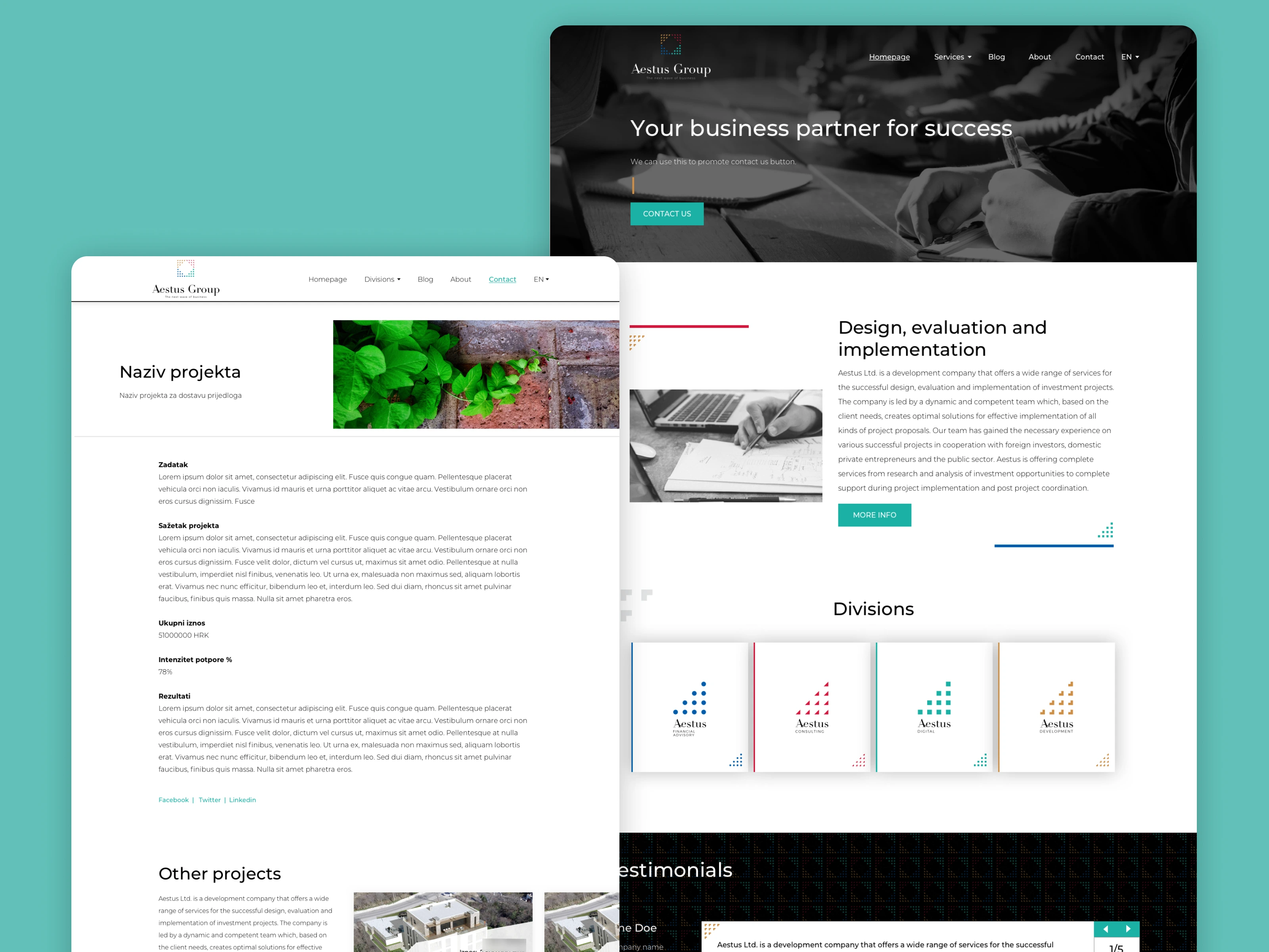
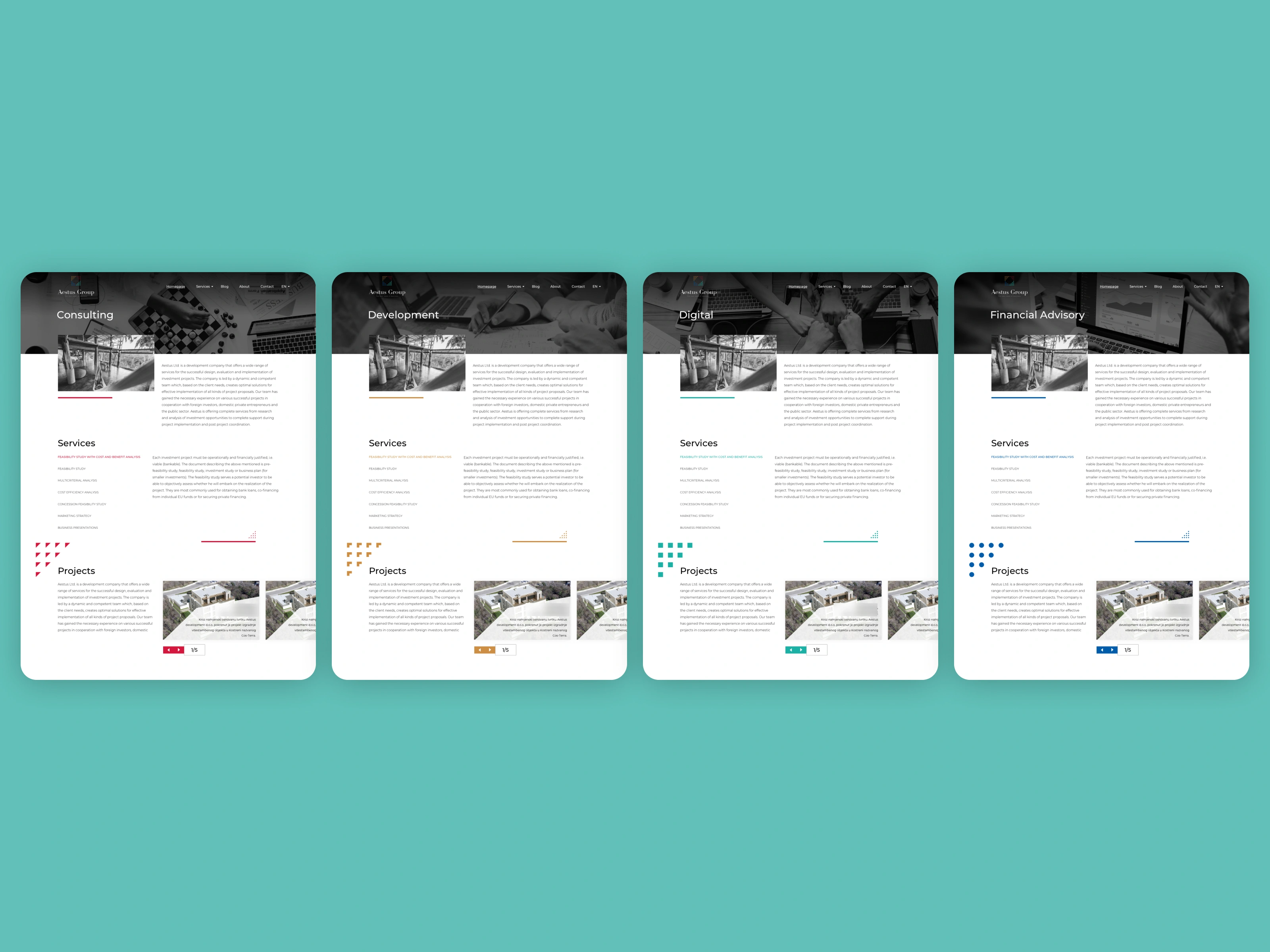
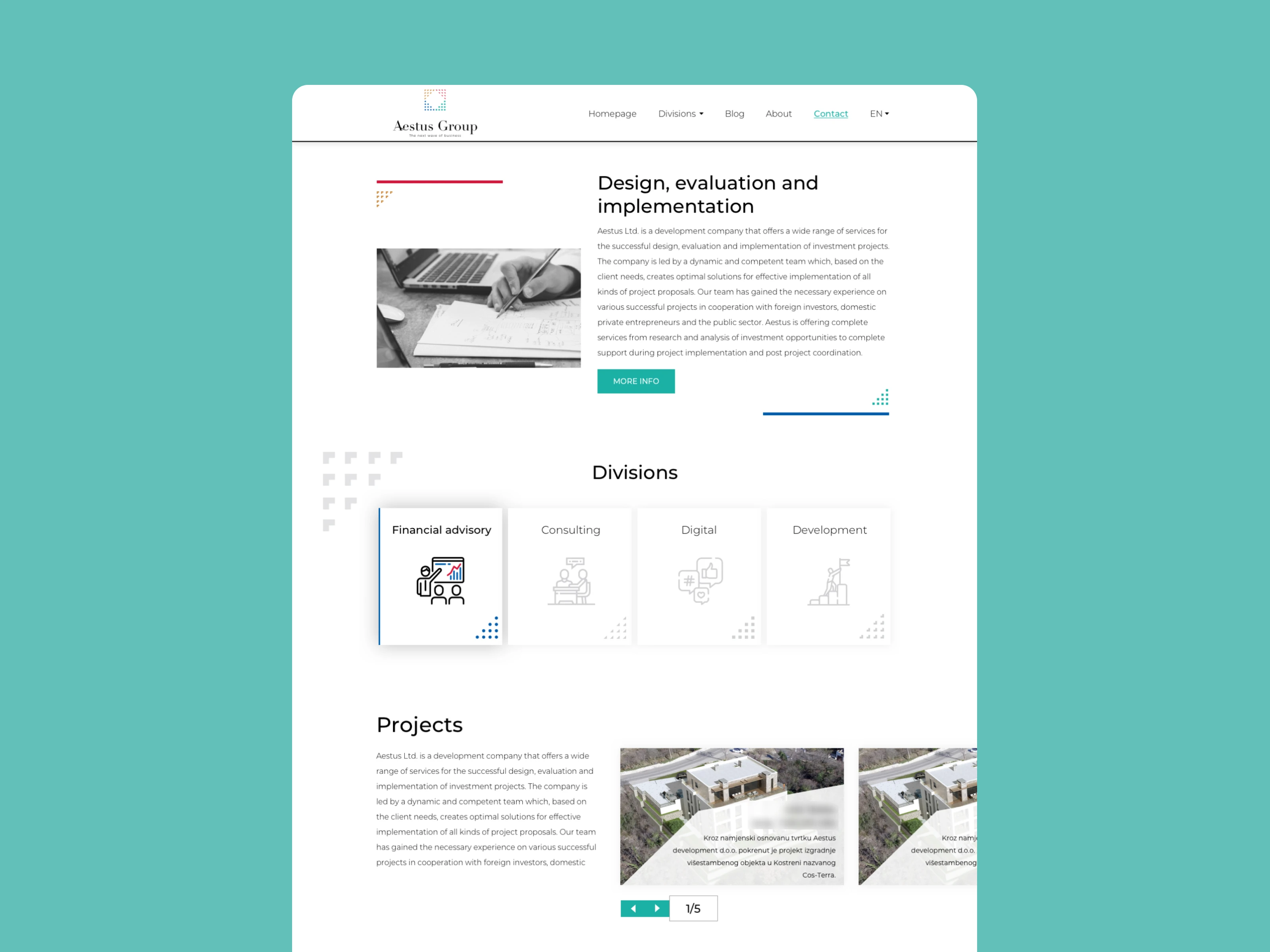
The main challenge was translating the new branding guidelines into a cohesive web experience. Aestus Group’s brand system relied heavily on color-coded services, where each service was represented by a distinct color from the logo. This required a careful balance—using color as a functional navigation and recognition tool without overwhelming the interface or compromising clarity.
Key challenges included:
Applying new branding consistently across the website
Designing a clear service structure for an advisory-heavy business
Visually connecting each service to its corresponding brand color
Maintaining a professional, trustworthy tone
The Solution
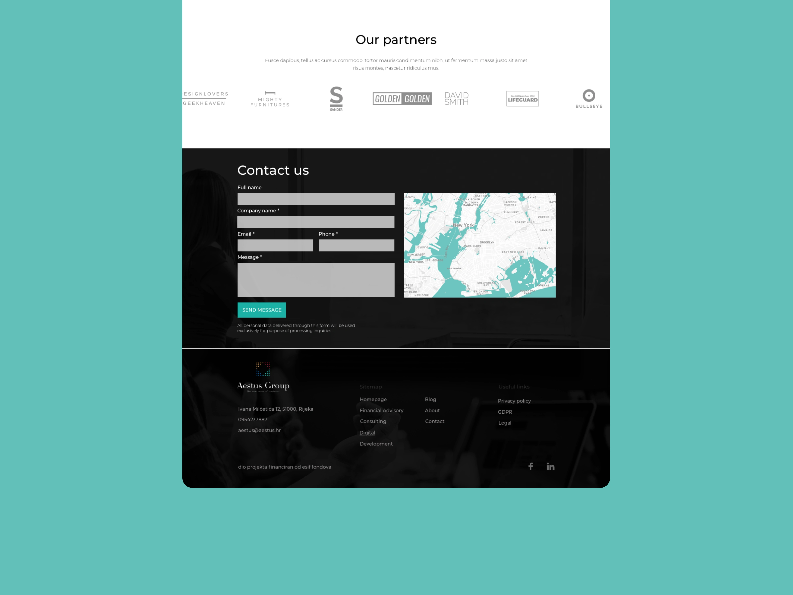
The redesign focused on clarity, structure, and brand expression. Each service was visually distinguished using its assigned brand color, helping users quickly recognize and differentiate offerings across the site. These colors were applied consistently across service pages, navigation elements, and call-to-action components.
The layout emphasizes hierarchy and readability, pairing strong typography with subtle imagery to reinforce credibility and expertise. Color was used intentionally—as a guide, not decoration—supporting both usability and brand recognition.
Process
Prototyping
I began by creating interactive prototypes to define layout, content hierarchy, and user flows. This allowed us to validate structure early and ensure that service discovery felt intuitive.
UI Design
Using the approved branding guidelines, I designed the full UI system for the website. Special attention was given to how service colors were applied across sections, buttons, and highlights, ensuring visual consistency and a cohesive experience.
Iteration & Refinement
Designs were refined to balance visual interest with professionalism, ensuring the website appeals to both corporate and private clients.
My Role
UI design aligned with new brand guidelines
Interactive prototyping
Service-based color system implementation
Desktop and responsive design
Design handoff for development
Outcome
The final result is a clean, modern, and brand-driven website that clearly communicates Aestus Group’s expertise and service offering. The color-coded service system adds a distinctive visual layer while improving usability, making it easier for users to understand what the firm offers and navigate to the right information.
This project showcases how thoughtful UI design can transform complex advisory services into a clear, confident, and visually structured digital experience.
🌏 https://aestus.hr/ (since then they changed their website, my work has been done in 2017)
Like this project
Posted Dec 9, 2025
Aestus Group is an accounting and advisory firm that approached me to redesign their website following the launch of a new brand identity.
Likes
1
Views
2
Timeline
Mar 1, 2017 - Jun 1, 2017