Frenchie Graphic Design | Social Media Content Design
Overview
Assisted Frenchie Graphic Design in creating content for her SM channels. Busy with her business she didnt have time to keep up her accounts.
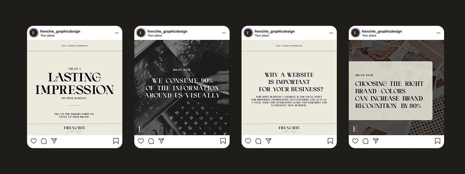
She requested a clean, minimalist design with neutral colors and typography-focused posts that would maintain a professional and stylish look, incorporating her brand fonts.
Scope of Work
Infographic Social Media Posts
Minimalist Typography Templates
Process
I developed a series of infographic posts that reflect a minimalist aesthetic, using neutral tones to keep the focus on the typography. The simple yet elegant design aligns with the brand identity, ensuring the content is eye-catching and easy to read while maintaining a professional tone.
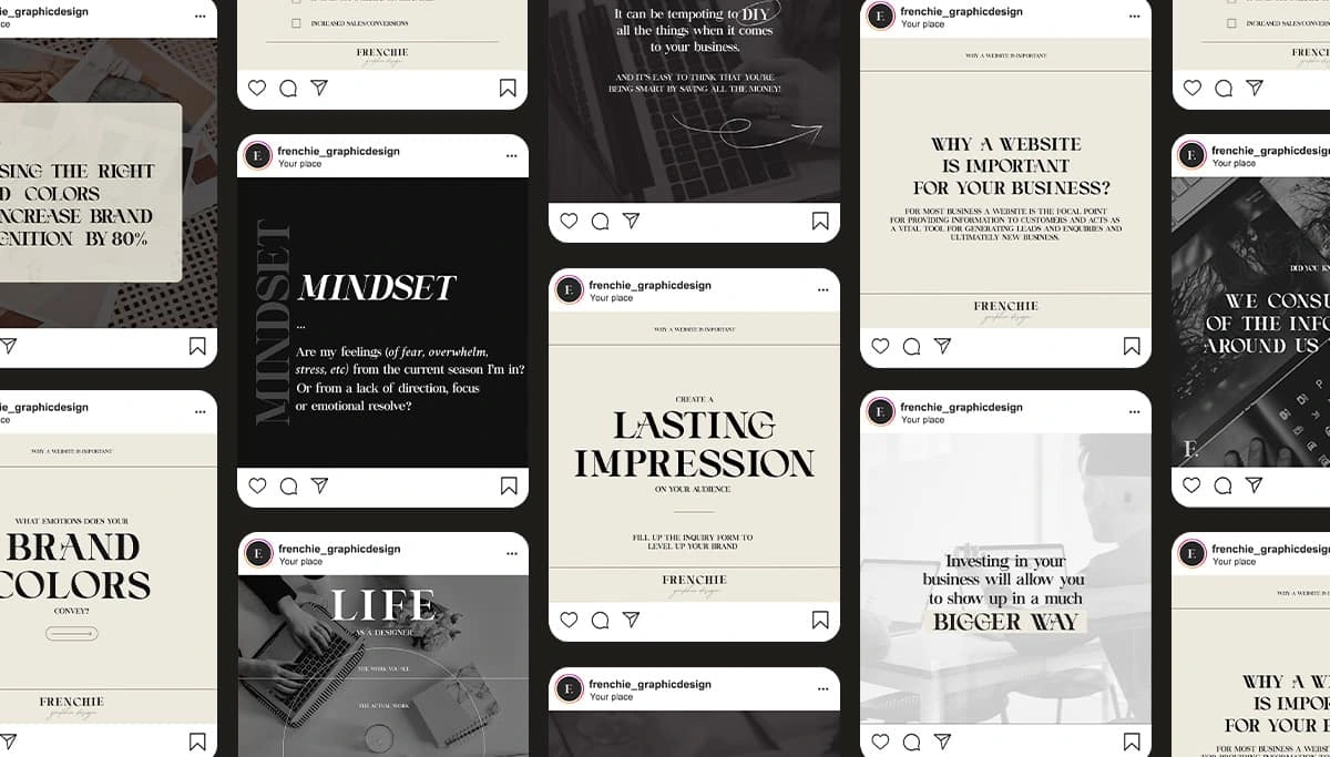
Instagram Templates

Client Feedback
Like this project
Posted Oct 15, 2024
Minimalist Social Media Infographics for a Graphic Design Business

