P&G - Olay.com
My role on this project was Lead UX Designer, working with a Creative Director, Sr Visual Designer, and offshore development team.
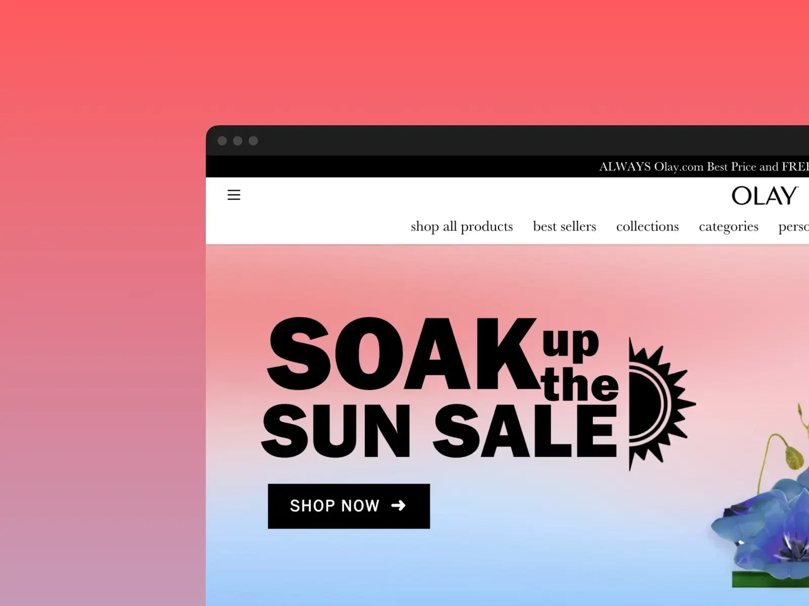
Screenshot of Olay.com homepage
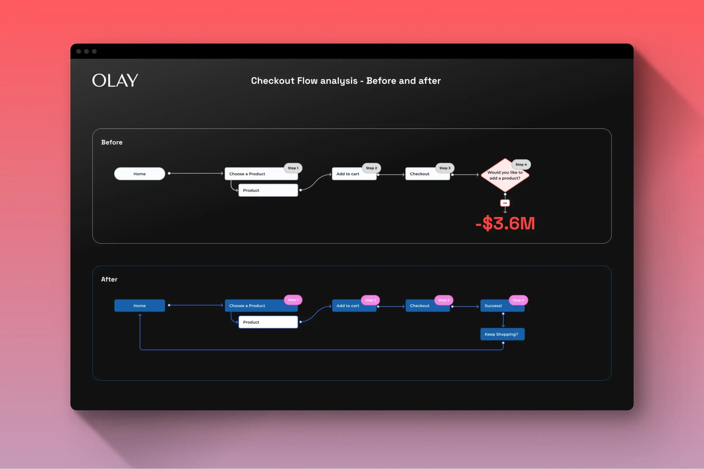
Before and after checkout flows
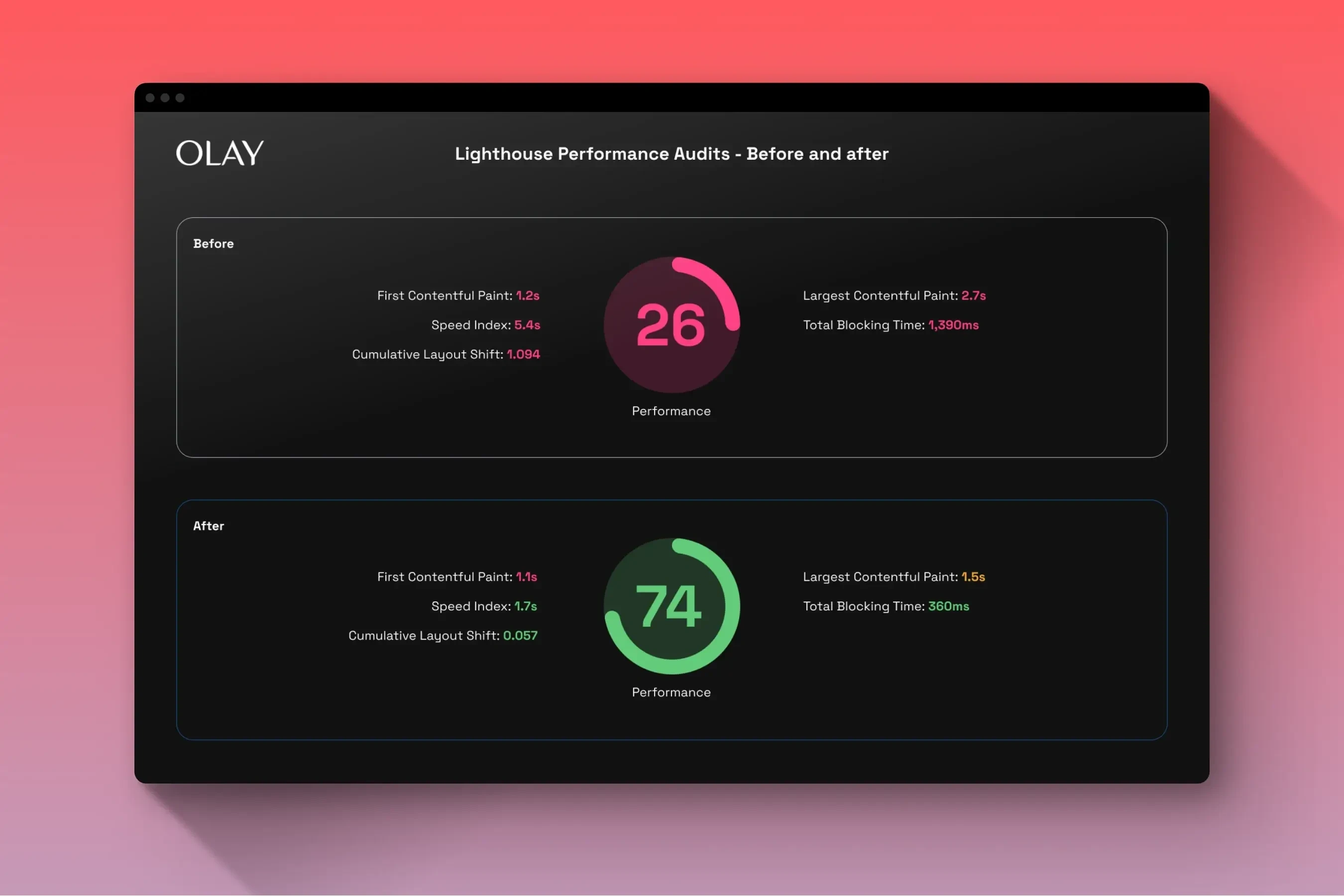
Before and after Lighthouse audit results
Challenge
When I arrived at P&G and started working on Olay.com, I ran a Lighthouse Audit in the browser and did a cognitive walkthrough/expert review using Occam's Razor to find the most significant opportunities. After digging through a lot of cruft I found that the performance of the site was lagging significantly and there was a problematic checkout flow that seemed to be blocking users from placing an order after they pressed the submit button.
My Responsibilities
My role on this project was Lead UI/UX Designer working directly with a Product Owner, Business Analyst, Offshore Development team, and several other stakeholders.
I also got to work with a wonderful visual designer with a background in fine arts who I was able to mentor on UX fundamentals while she taught me about some of the finer points of visual design.
Most of this project was spent presenting solutions to stakeholders and trying to get approval to execute them. The most successful tactic I used was sharing Lighthouse Audits directly with the Offshore Development team who did their best to increase the performance ratings on the site.
Some of the deliverables and tools I used:
Redesigning the home page, product page, and checkout flow - Figma
Analyzing metrics - Google Analytics
Presenting recommendations - Microsoft Teams
Outcomes
Although the outcomes could have been much better if we could have moved faster, P&G is over a hundred years old and has over 100,000 employees so things do tend to move a bit slower. Even so, I feel like we accomplished a lot.
260%
Increase in overall site performance
$3.6M
Saved revenue YoY by modifying a key checkout flow
Like this project
Posted Jul 6, 2023
My role on this project was Lead UX Designer, working with a Creative Director, Visual Designer, and offshore dev team. Performance increase 260%, saved $3.6M
Likes
0
Views
43
Clients

Kaleidoscope Innovation and Product Design
Procter & Gamble

