Pioneering - Rebranding | Visual Identity
Dhyogo Gouveia
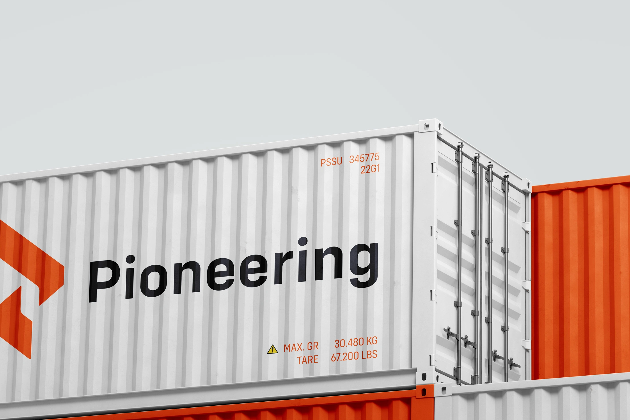
The Brand
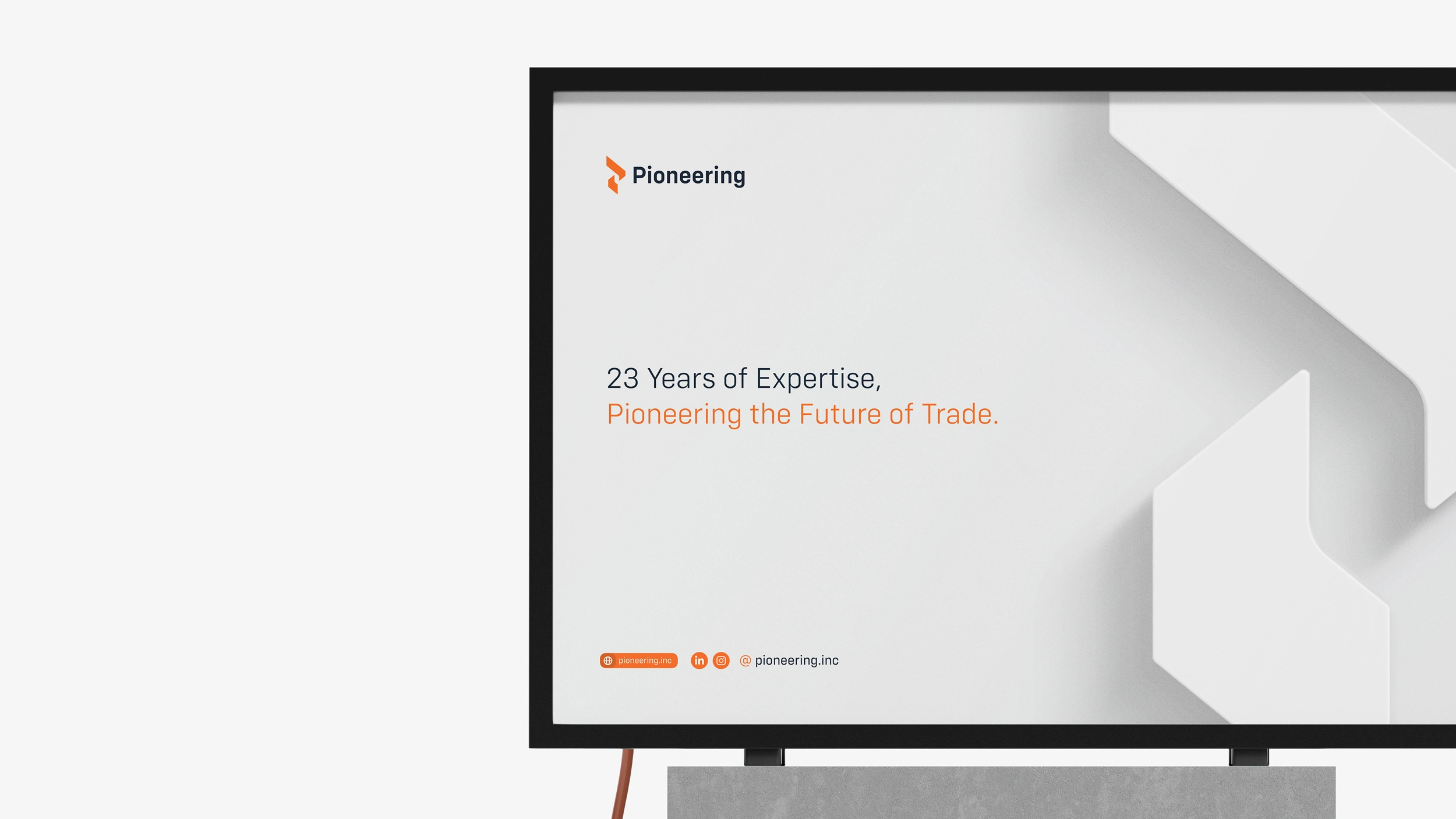
With over 23 years of experience in customs clearance, Pioneering for Clearance is dedicated to simplifying and expediting the movement of goods for merchants and businesses.
The rebranding of Pioneering was driven by the need to modernize its visual identity and better reflect its global expertise. The new brand system brings clarity, strength, and a renewed sense of trust, aligning visuals with the company’s evolution and strategic goals.
The Typeface
The project uses Config Variable, a contemporary and flexible sans-serif typeface. Its clean geometry and balanced proportions convey precision, confidence, and clarity, key attributes of Pioneering's brand.
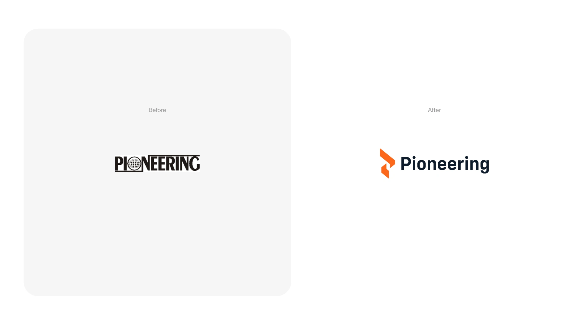
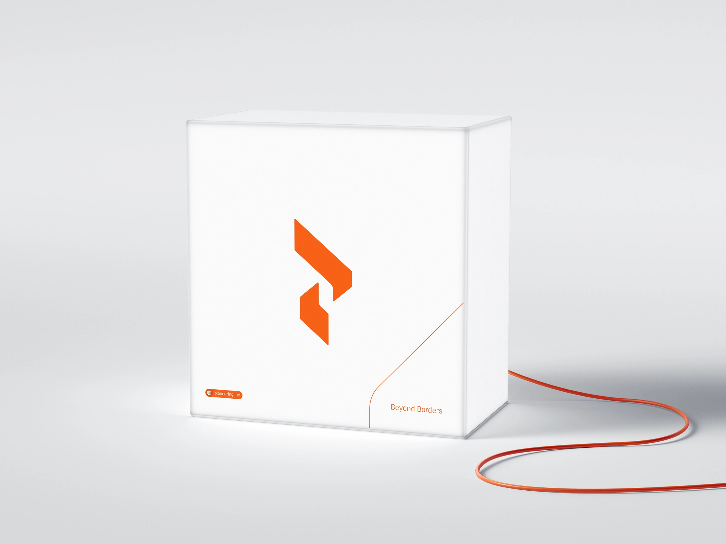
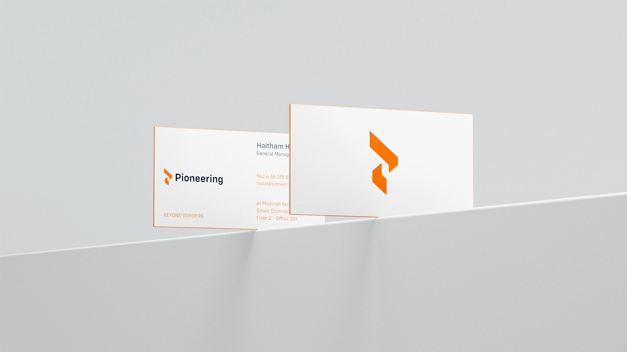
The Symbol
Combines the ideas of import and export, distinct yet interconnected paths, and the personalized care given to each client. It also incorporates the letter “P” to reflect the brand’s name, forming a unique and purposeful mark.


The Strategy
This project is a rebranding of Pioneering, aiming to modernize its visual identity while preserving its legacy. The strategy focused on clarity, trust, and international professionalism to align with the company’s role in global trade operations.
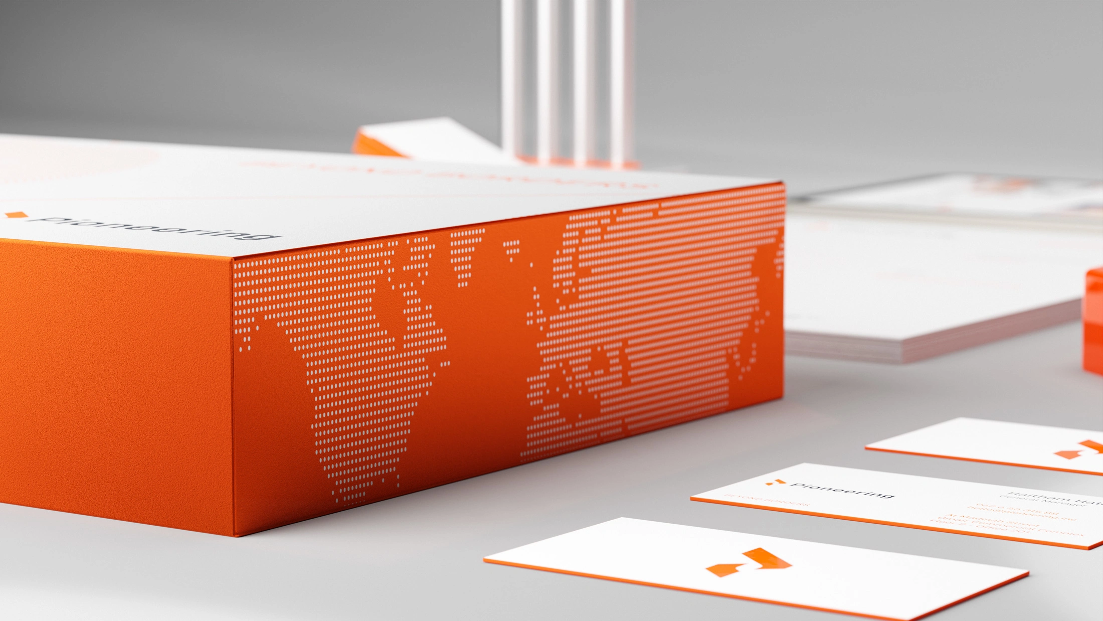
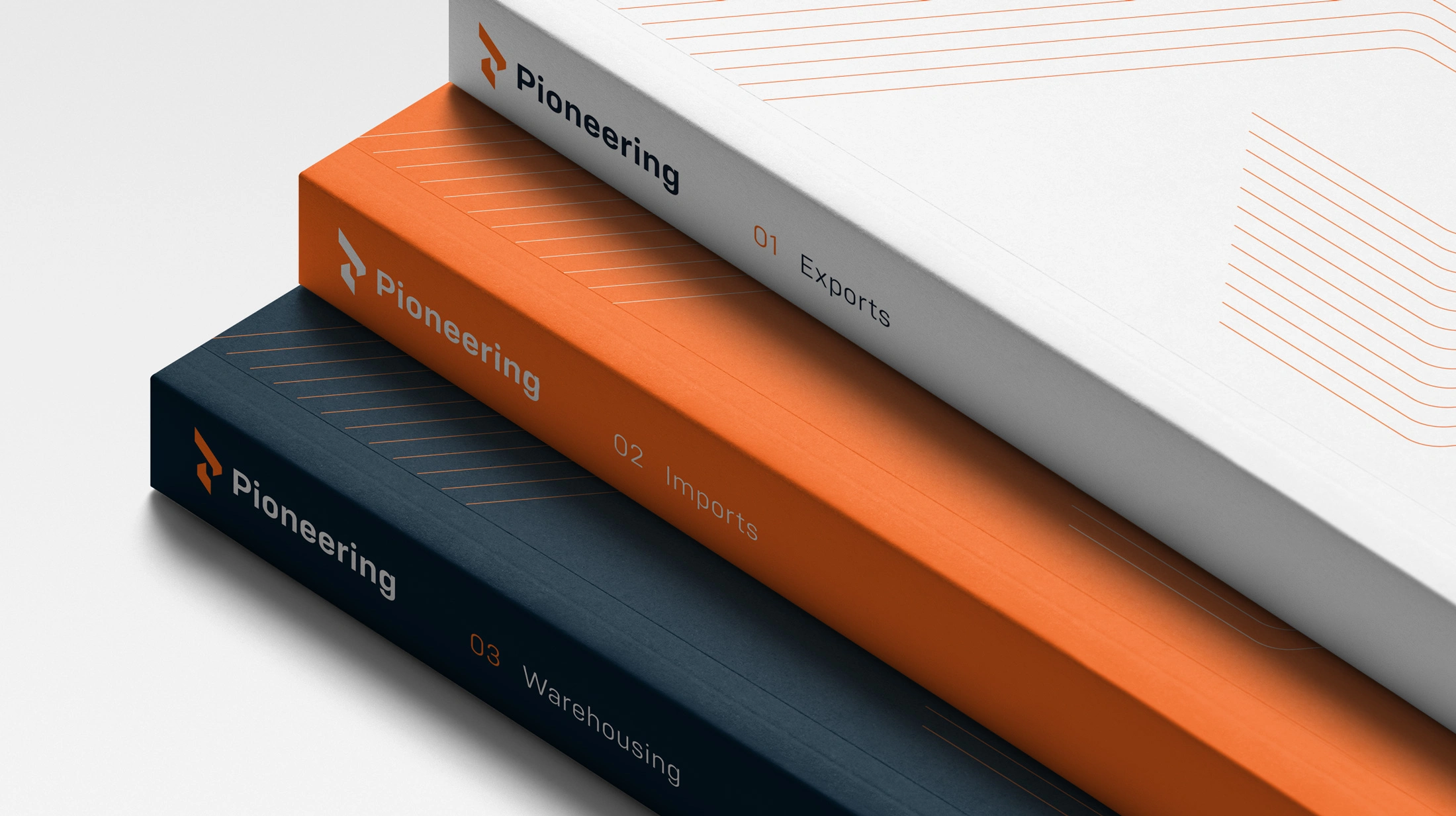
The Support Elements
Combine the concept of route and unlocking new destinations with agility, bringing a dynamic form to the project. The final shapes are graphic syntheses of the concepts, using lines as details and forms inspired by the nature of the logo and maps, adding personality and modernity to the project.

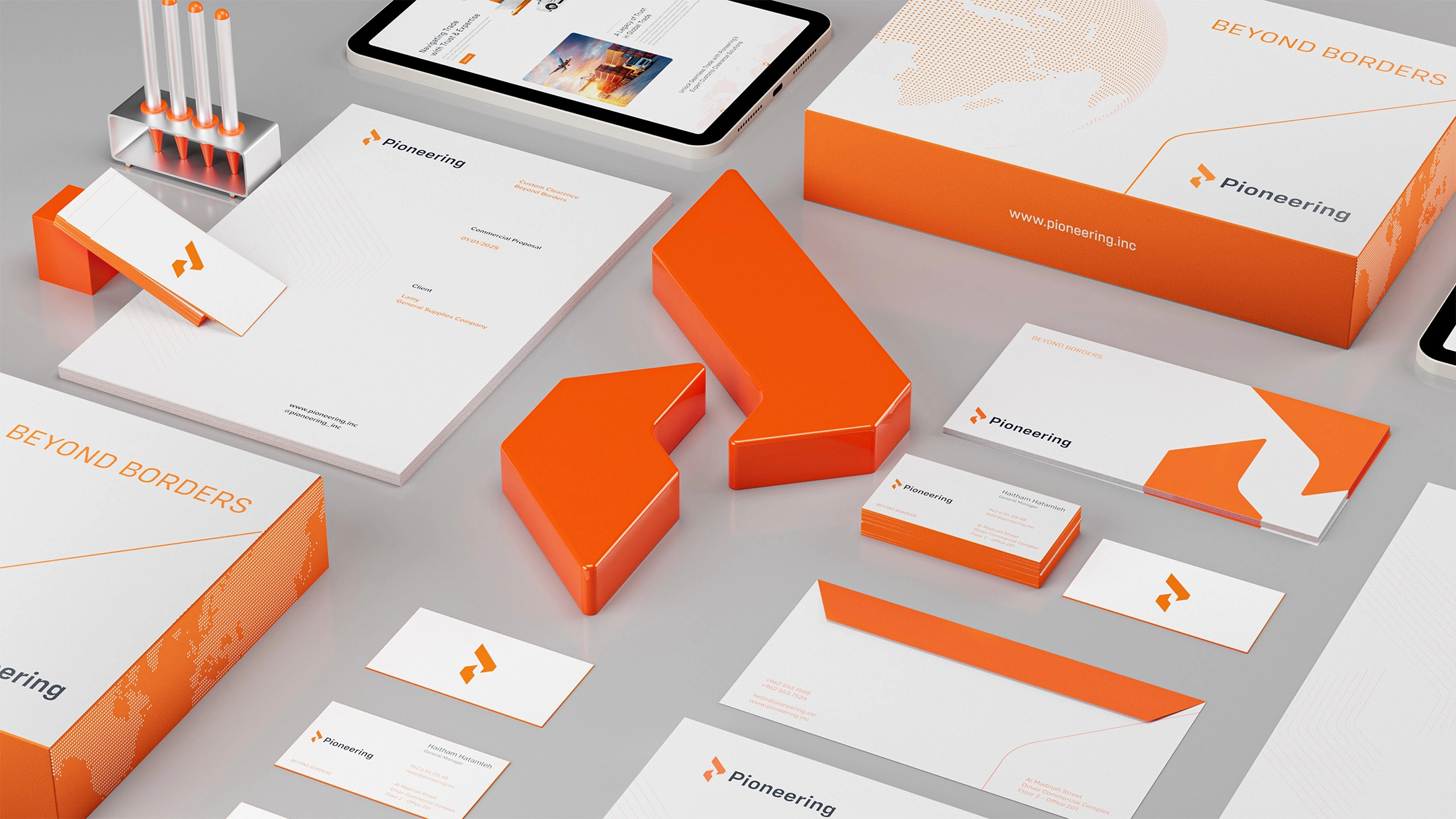
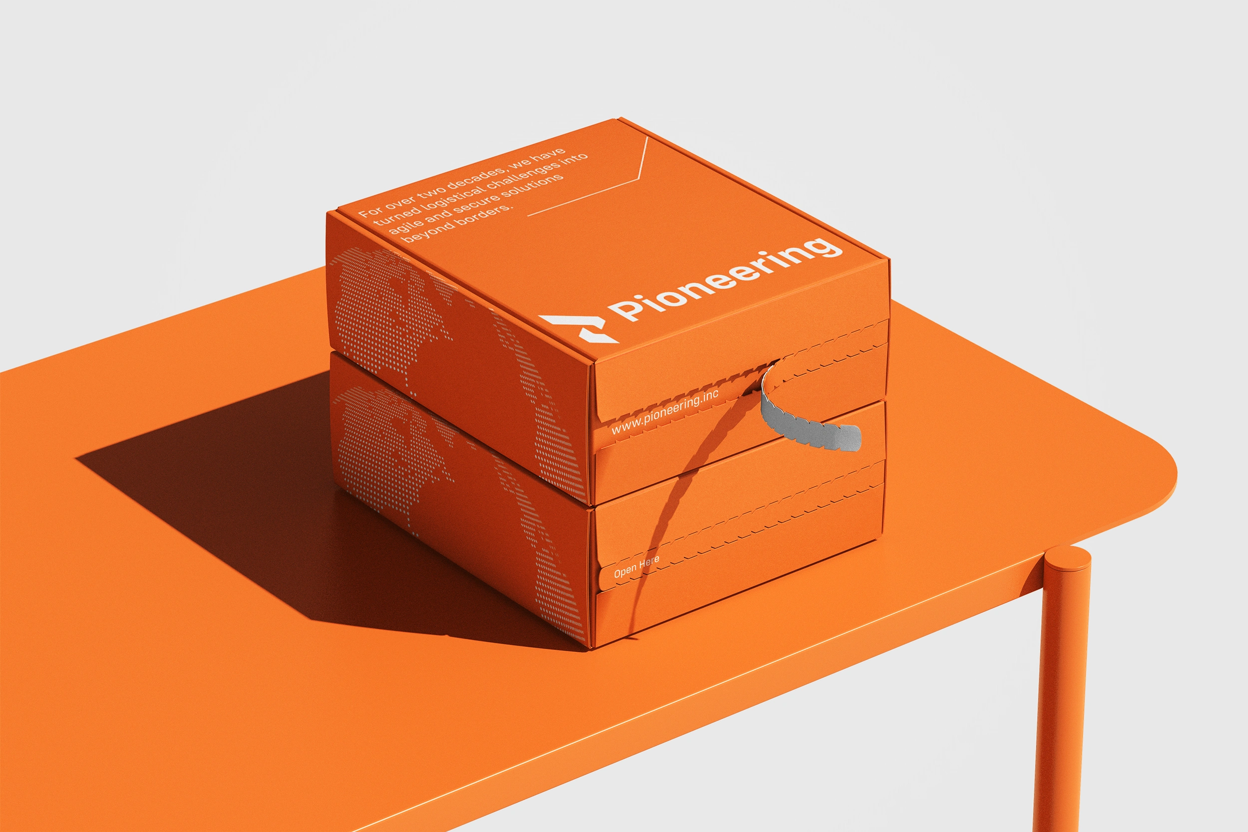
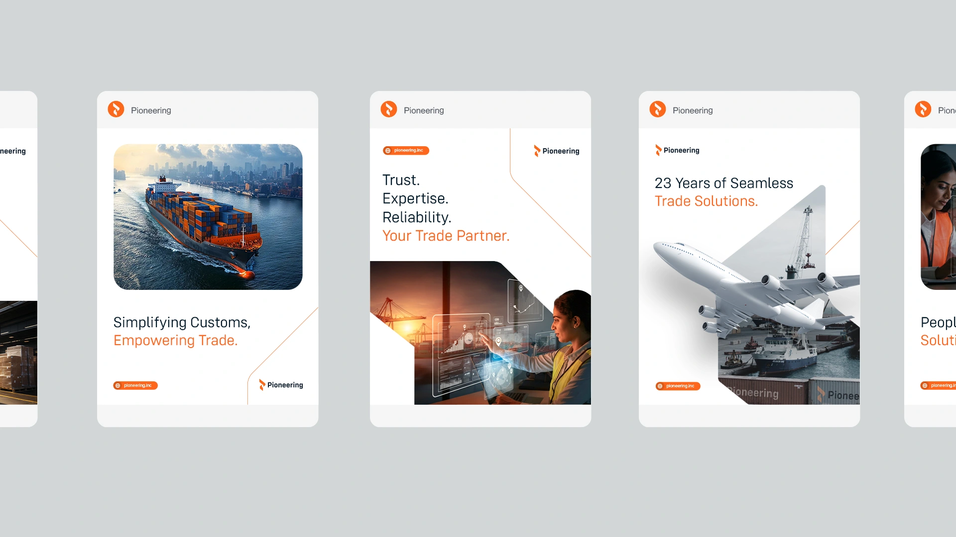
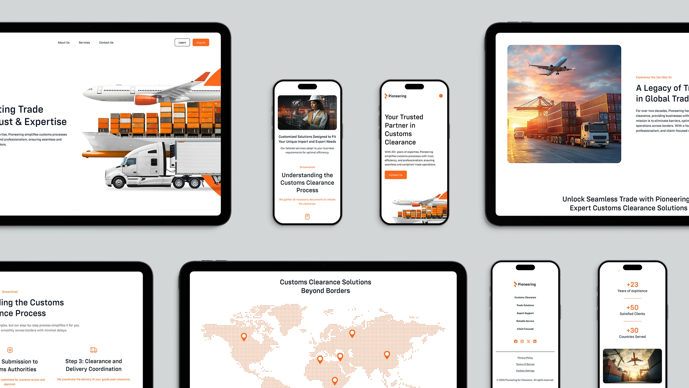
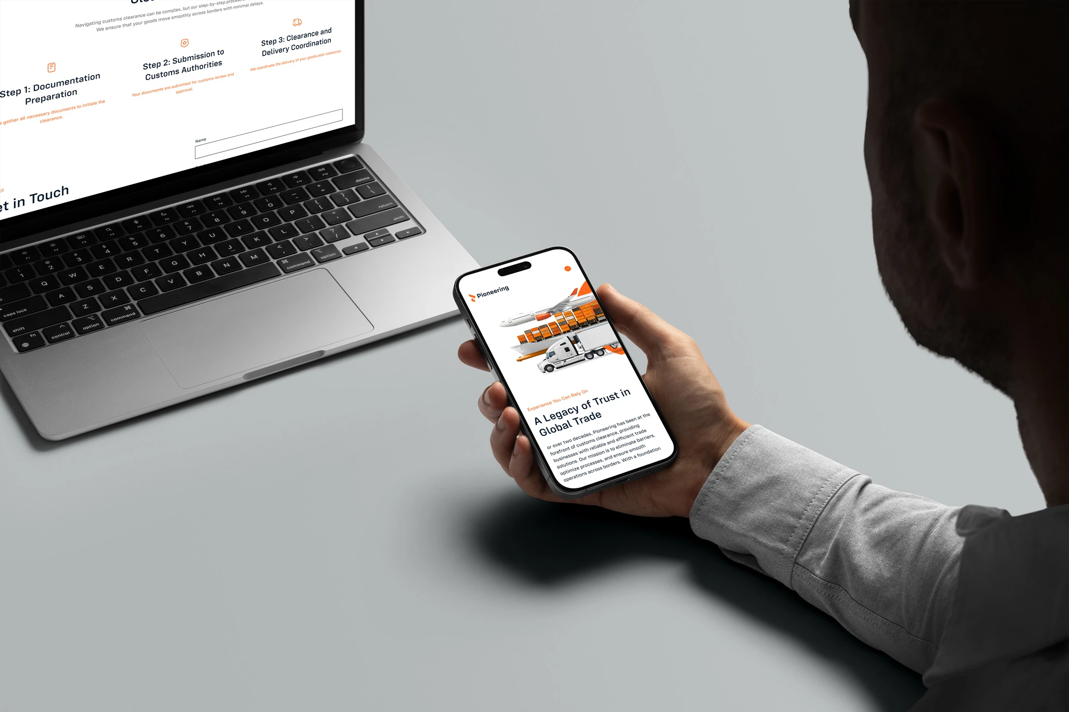
Applications
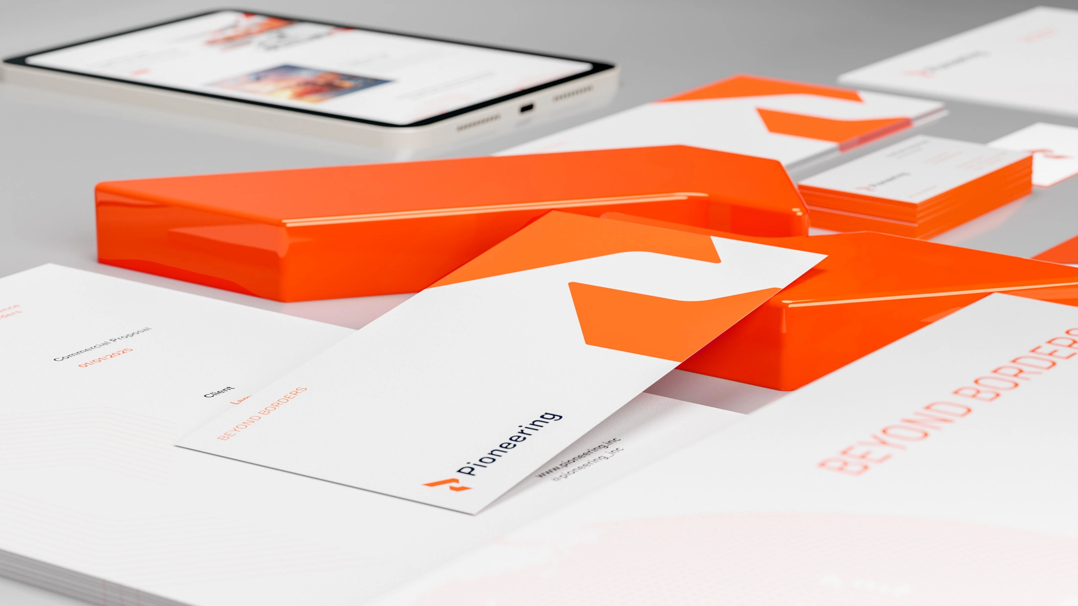

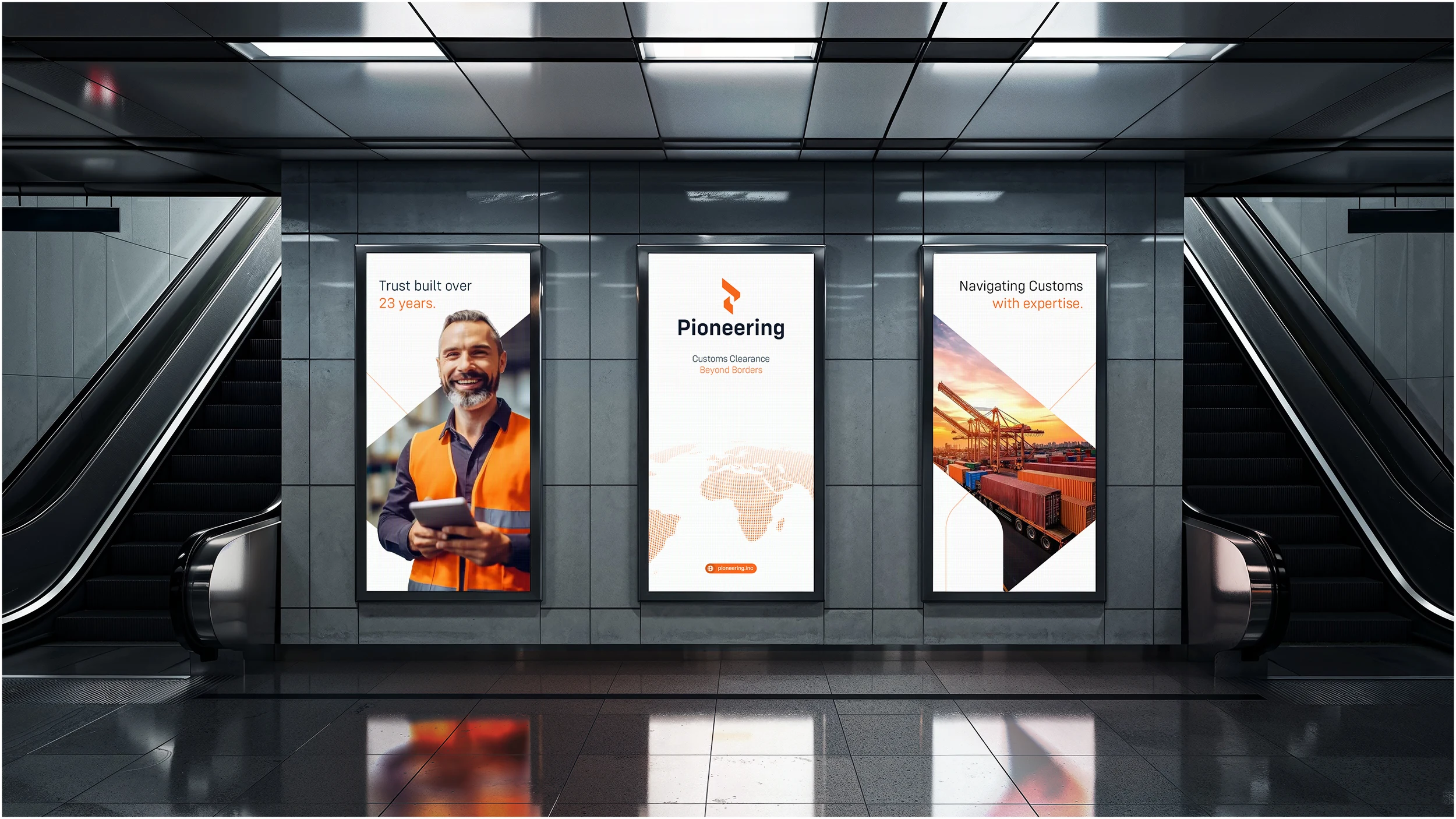
The Digital
Social media layouts follow a minimalist and functional aesthetic. The content highlights key services, global presence, and client-focused solutions, always reinforcing the brand’s expertise in international trade.
The Website
The website design mirrors the social media approach: simple, clean, and visually structured. It uses bold imagery and a clear hierarchy to communicate expertise and guide users through services, benefits, and contact points with ease.

The Brand Guidelines
The brand manual ensures consistency across all applications. It defines logo usage, typography, color palette, iconography, and visual language. Each element was carefully developed to reinforce Pioneering’s identity: professional, reliable, and globally oriented.

Let's Work: Contact Here
•
Industry: Custom Clearance
Country: Jordan
Deliveries: Strategic Rebranding, Logo Design, Brand Identity, Brand Strategy, Motion Design, Website
Credits: Samuel Motion
•
Like this project
Posted Jun 20, 2026
With over 23 years of experience in customs clearance, Pioneering for Clearance is dedicated to simplifying and expediting the movement of goods for merchants and businesses. The rebranding of Pioneering was driven by the need to modernize its visual identity and better reflect its global expertise. The new brand system brings clarity, strength, and a renewed sense of trust, aligning visuals with the company’s evolution and strategic goals.
Likes
1
Views
4
Timeline
Sep 1, 2025 - Oct 15, 2025