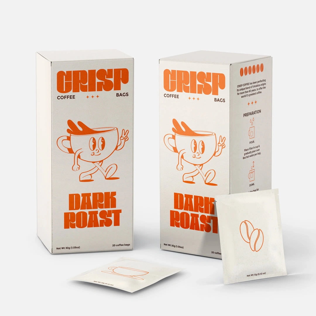
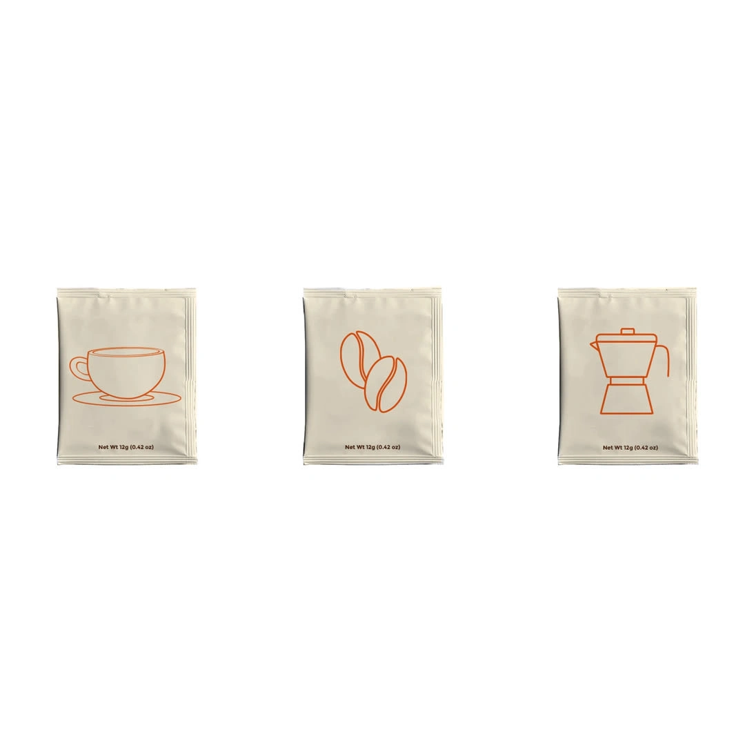
Crisp Coffee Bags
Andrea Monsalvo
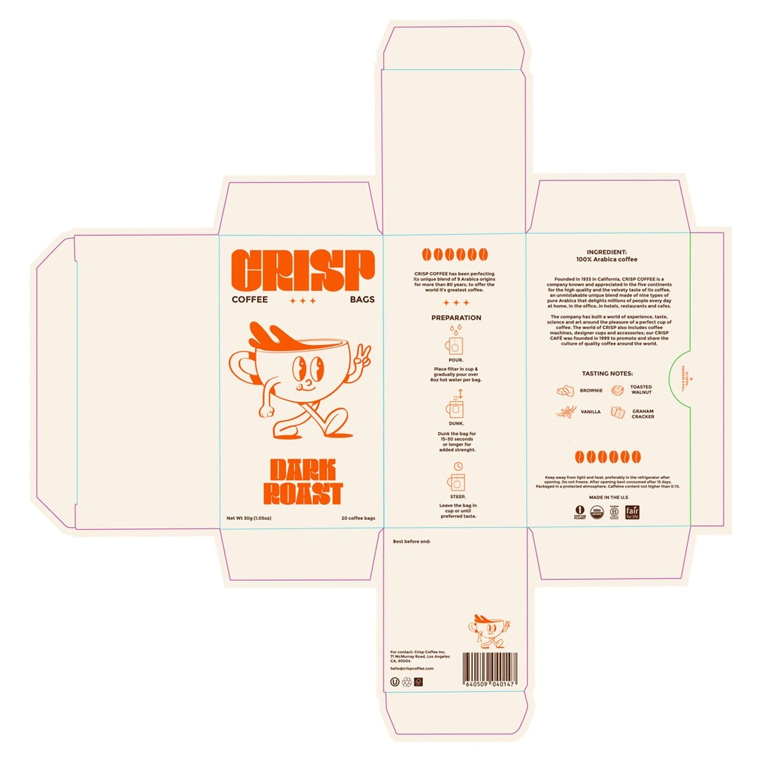
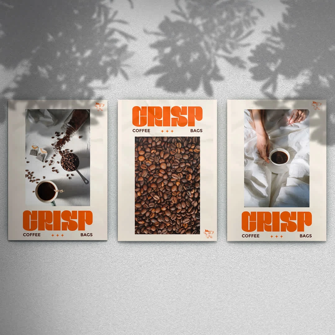
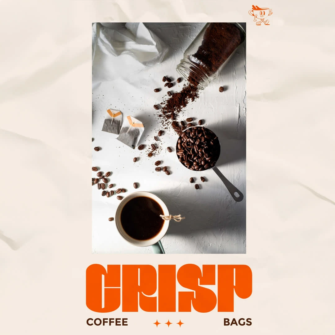
Package design for a coffee bag brand. Differentiated by an eye-catching retro illustration of a coffee cup that serves as its logo and mascot. This quirky touch gives the brand personality and nostalgia, evoking the warm and comfortable feelings associated with a nice cup of coffee.
The brand's intentional use of the color orange is significant since it represents energy and freshness. It stands out against the classic coffee tones, giving the packaging a sense of excitement and modernity. The fun yet polished look of this brand not only makes it stand out on the shelf, but it also conveys the essence of a rich coffee experience, allowing customers to acknowledge moments of warmth.

Like this project
Posted Jul 10, 2024
Package design for a coffee bag brand.