Toronto Frost Hockey Team
Toronto Frost Logo Design- Personal Project
Project Brief: As the PWHL (Professional Woman's Hockey League) was created this year and being a huge fan of hockey, I was super excited to see what their team names and logos would be. Unfortunately they decided to not do either of those and elected to go with PWHL Toronto as the name. This led me to want to create a logo and namesake for the team. I wanted to create something that would reflect their current colour choices and use iconography that would reflect being in Canada and being a hockey team. This led to the namesake of Frost. Frost being something we deal with a lot in Canada and generally a good indication of the cold weather but can also be very dangerous as it generally leads to icy conditions I decided to go with that moniker. The icon is reminiscent of a snowflake with pointed ends to try and emulate that dangerous almost sword like quality. This was the end result of trying to come up with something for the team keeping these qualities in mind.

Final logo for the PWHL Toronto Women's hockey team. Using their current colour palette I created a sports logo for the team.

Secondary Logos utilizing current colour palette.

Black and white versions of the logo.

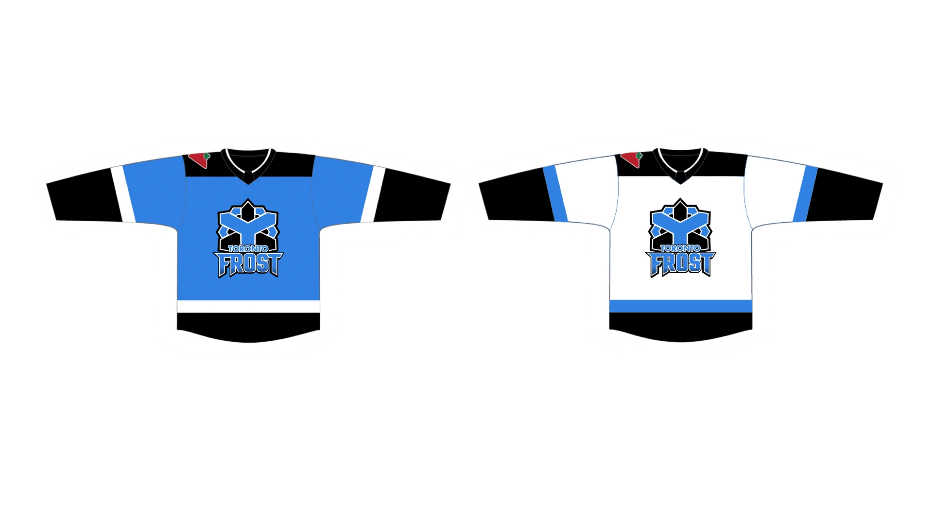
Jersey designs using their current jerseys.
Like this project
Posted Apr 15, 2024
Personal project where I created a logo for the PWHL Women's hockey team utilizing their current colour palette.


