Mentis: University Library Branding Concept
Aljaž Kočevar

Mentis - University Library Branding Concept
Mentis is a contemporary identity concept for a university library, created to reflect a modern intellectual environment focused on clarity, concentration, and academic exchange.
As library systems grow in scale and complexity, a strong visual identity becomes essential for both navigation and institutional presence.
This self-initiated project explores the strategic branding of an academic library, developing a cohesive system that extends from the core mark to wayfinding, editorial materials, and environmental applications.
The identity is built around the themes of knowledge, community, academic rigor, and quiet confidence.
Challenge
Mentis was conceived as more than a traditional library.
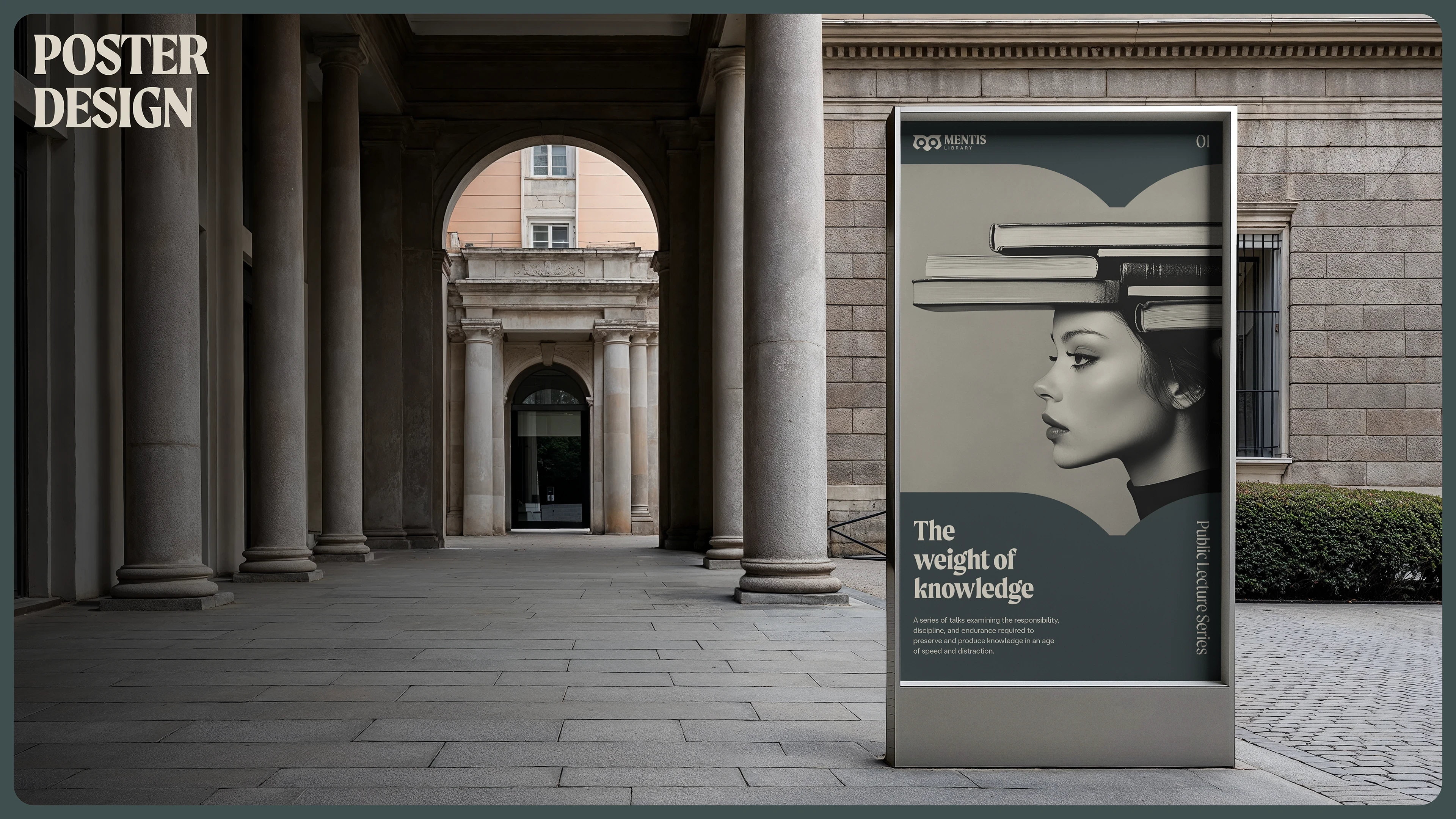
Alongside its academic collections, the space includes social areas, a café, and a conference room intended for talks and community events. The goal was to transform the library into a shared intellectual environment rather than a purely functional study space.
The challenge was to design an identity that communicates both academic credibility and contemporary openness—positioning the library as a place for knowledge, community, and focused thinking.
Concept & Symbolism
Mentis is derived from the Latin mens, meaning “of the mind,” a reference to intellectual and cognitive capacity.
The name positions the library as a space dedicated to thought, learning, and academic rigor.
The identity is built around the form of the owl—an enduring symbol of wisdom and knowledge.
As a nocturnal creature, the owl also reflects the library’s 24/7 accessibility and its role as a constant presence in the academic environment.
The symbol is constructed from simple geometric forms. Within its structure, the shapes evoke the pages of an open book while subtly referencing the form of a lowercase “m,” creating a mark that is both conceptually meaningful and structurally adaptable.
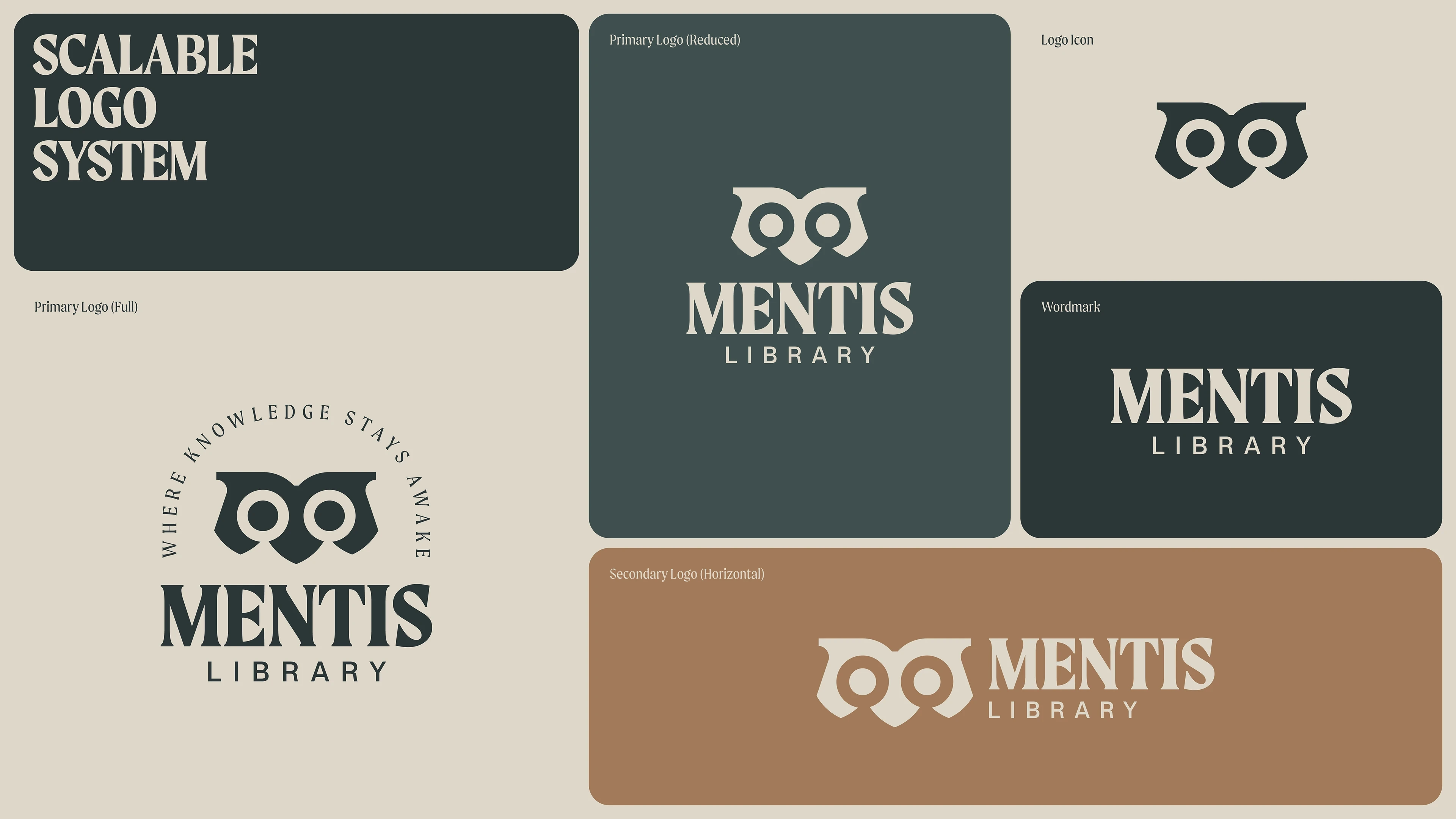
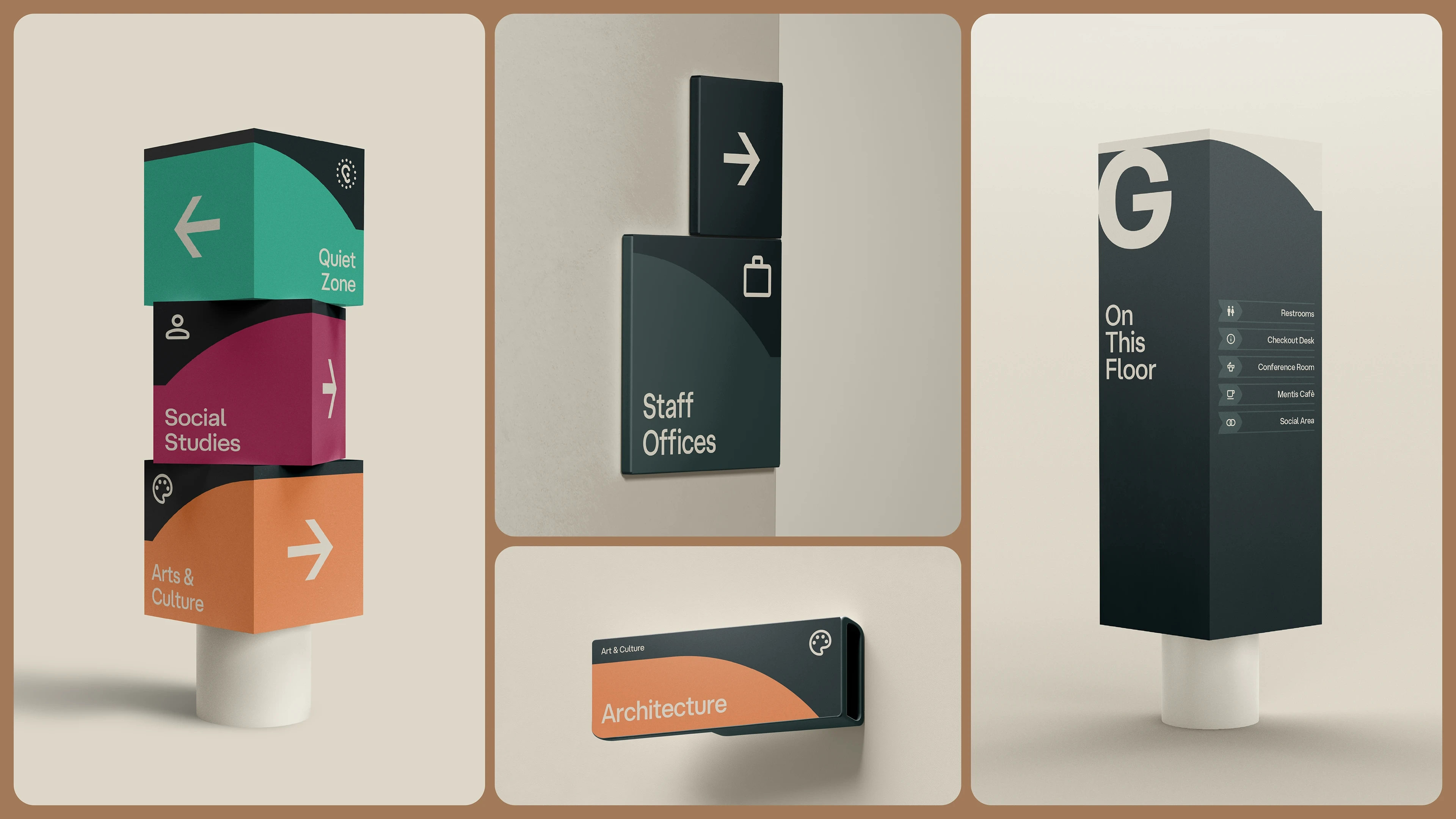
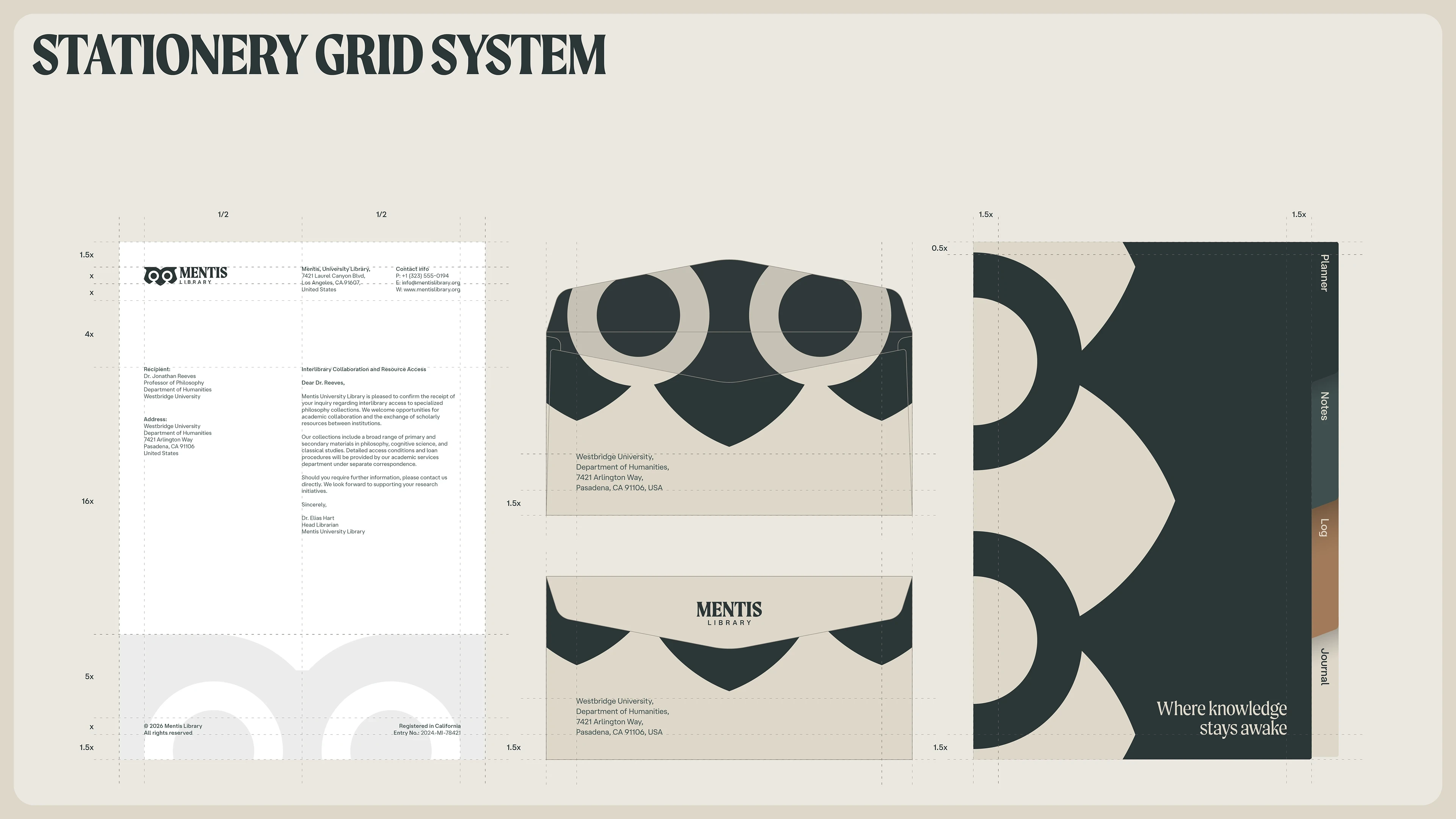
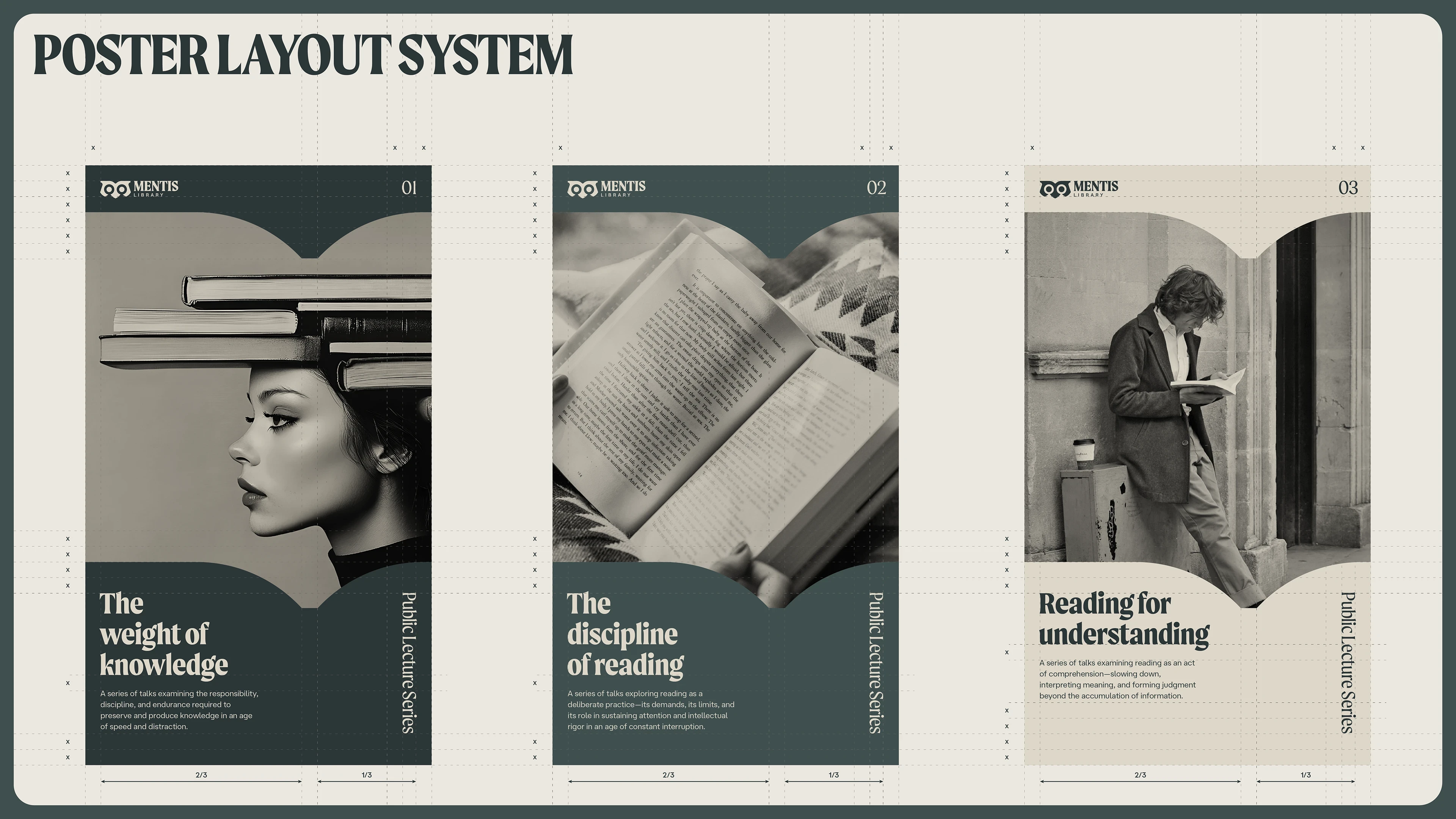
System Logic
The identity system is constructed entirely from the geometry of the core mark. When scaled, the upper portion of the symbol and its negative space form the shape of an open book—an intuitive reference to the function of the library.
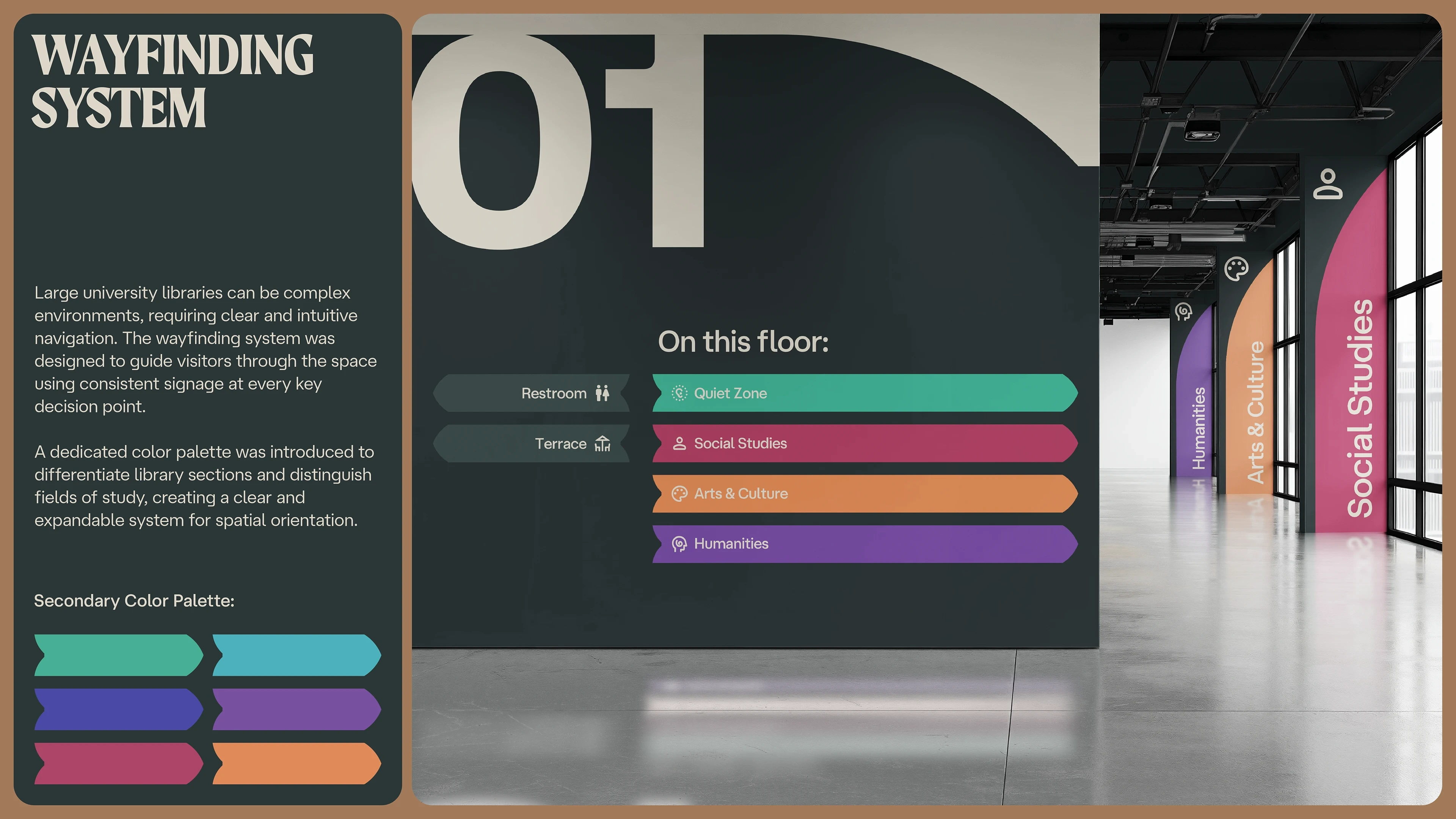
The owl’s brow becomes a structural device within the wayfinding system, framing directional information and reinforcing spatial organization.
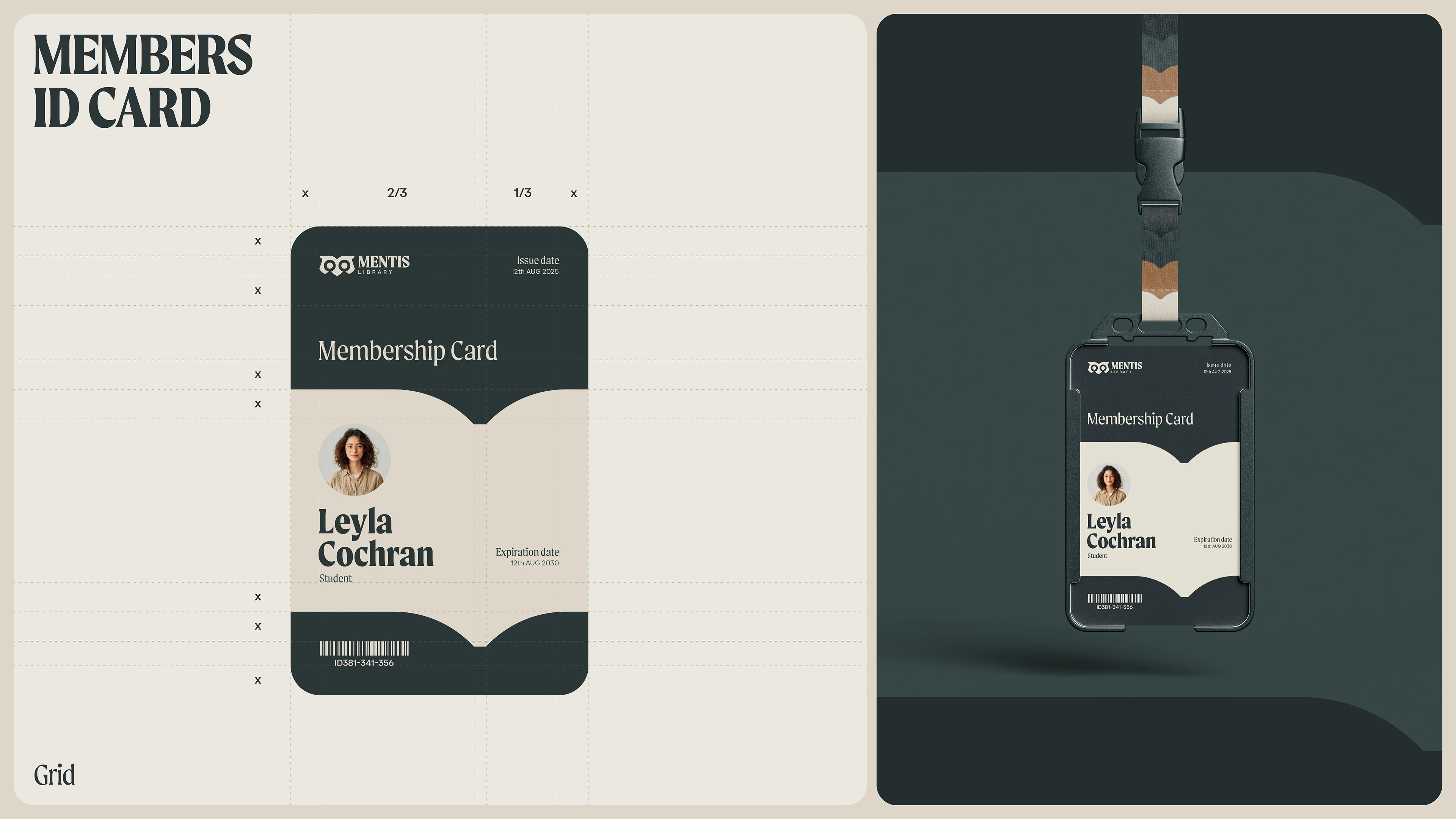
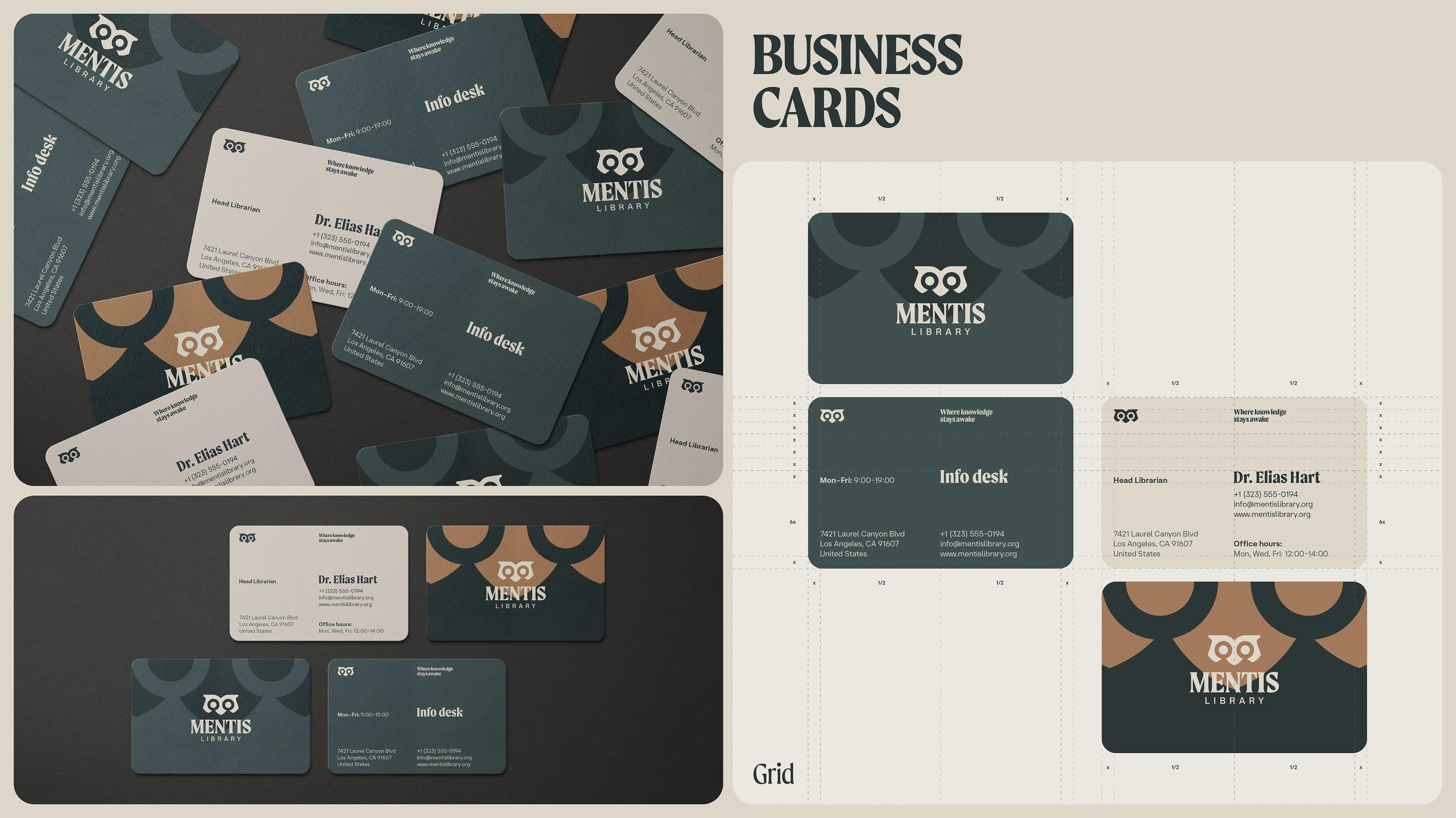
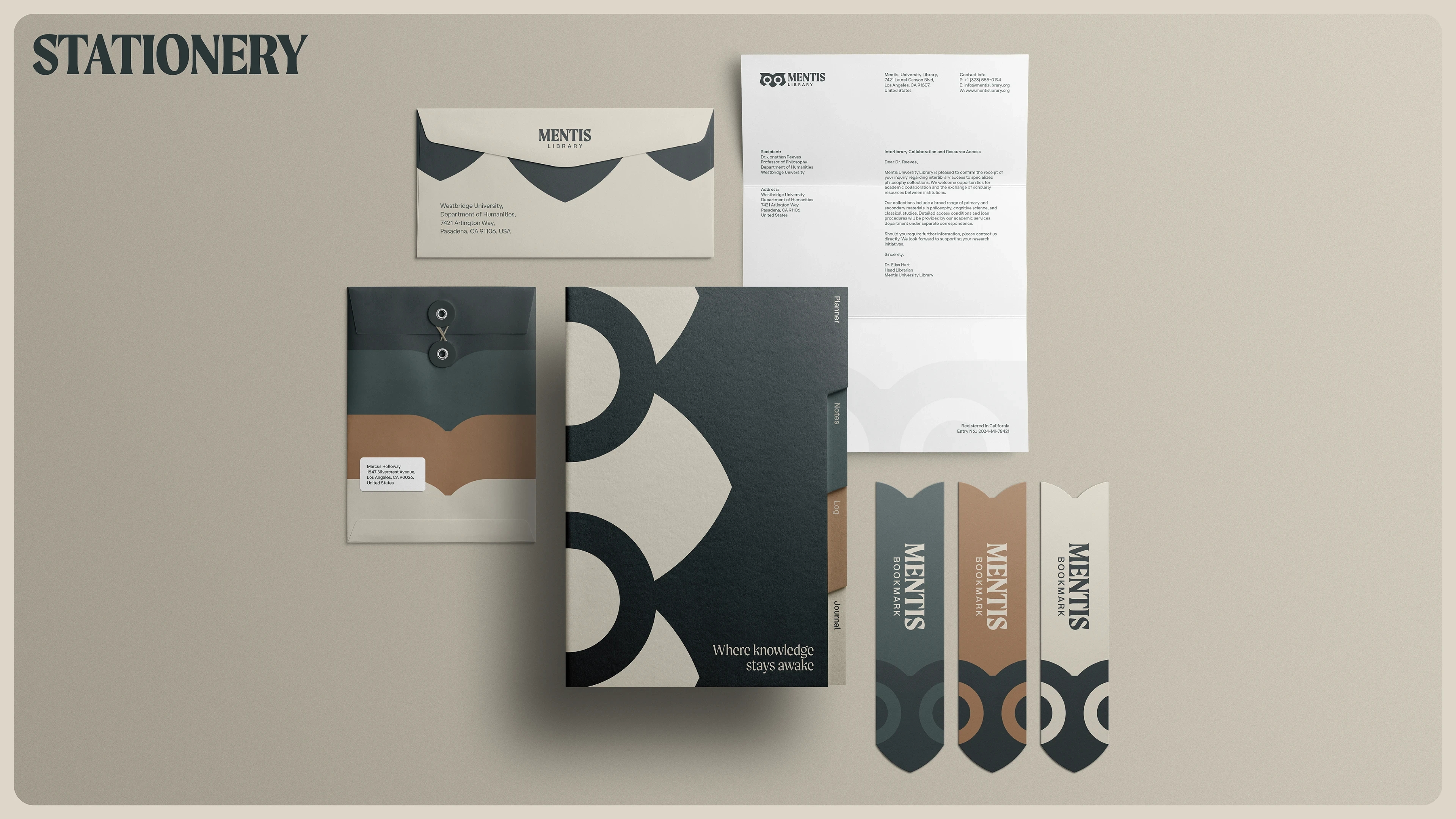
The eyes and beak generate a distinctive geometric pattern, applied across stationery and secondary applications. By deriving all graphic elements from the core symbol, the system remains cohesive, scalable, and immediately recognizable.


Like this project
Posted Feb 16, 2026
Created a cohesive branding concept for a modern university library.