Credora Rebrand for Institutional Clarity
Chidiebere Peter
Why Redesign?
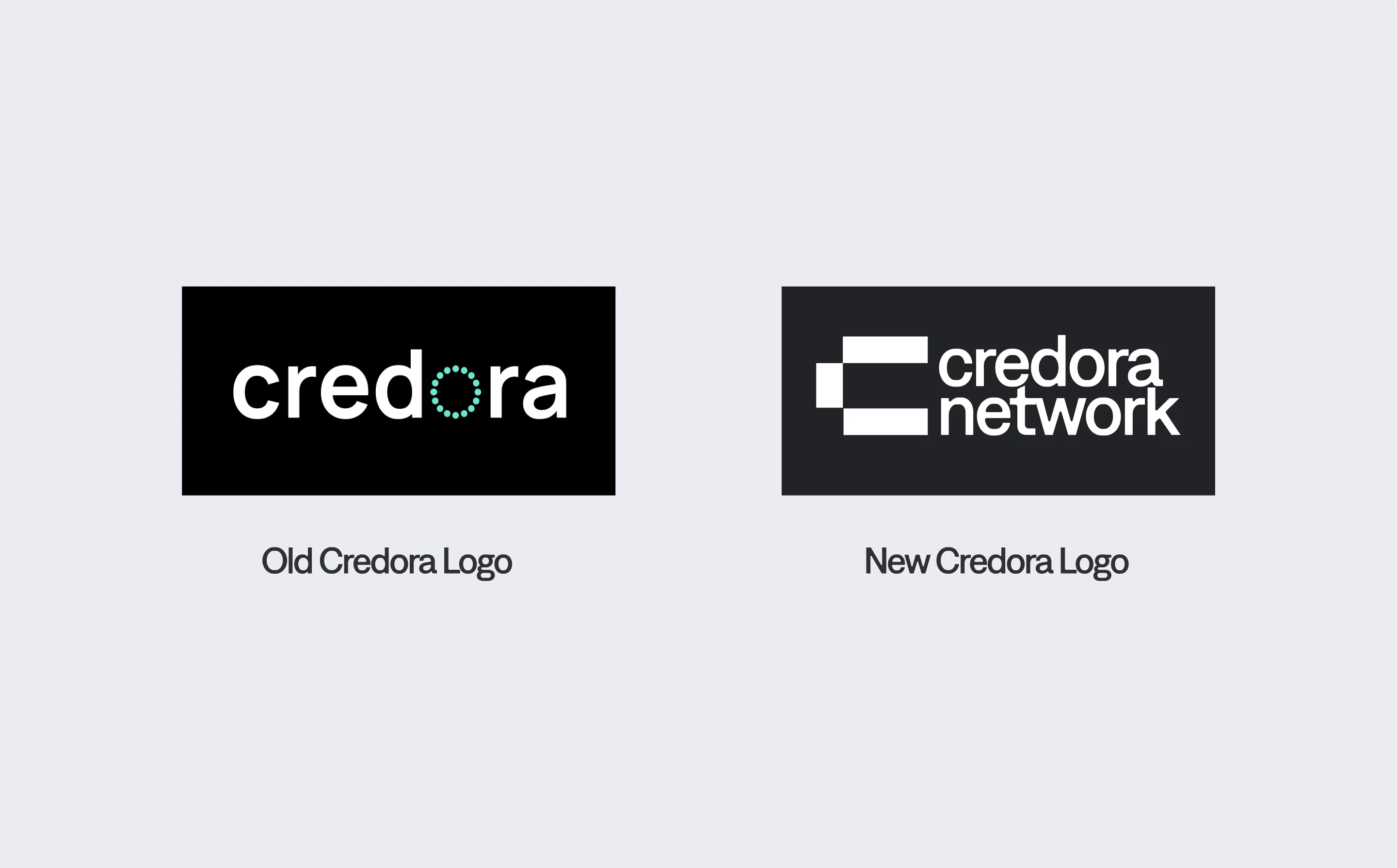
The Problem:
Credora’s original dot-based identity felt uncertain for a risk protocol—like "maybe" visualized. As DeFi’s institutional adoption grew, the brand needed to scream math, not mystery.
User Quote:
"Their old logo looked like a loading screen. I need to trust ratings before I stake seven figures."
— Hedge Fund Ops Lead, Pilot Interview
The Solution:
Meet Credora’s bold rebrand—where precision meets transparency in decentralised finance. Gone are the vague dots of the past; the new identity screams "institutional-grade clarity" with its sharp, block-geometric language. Think of it as Bloomberg Terminal meets Web3—trustworthy, data-driven, but built for the blockchain era.
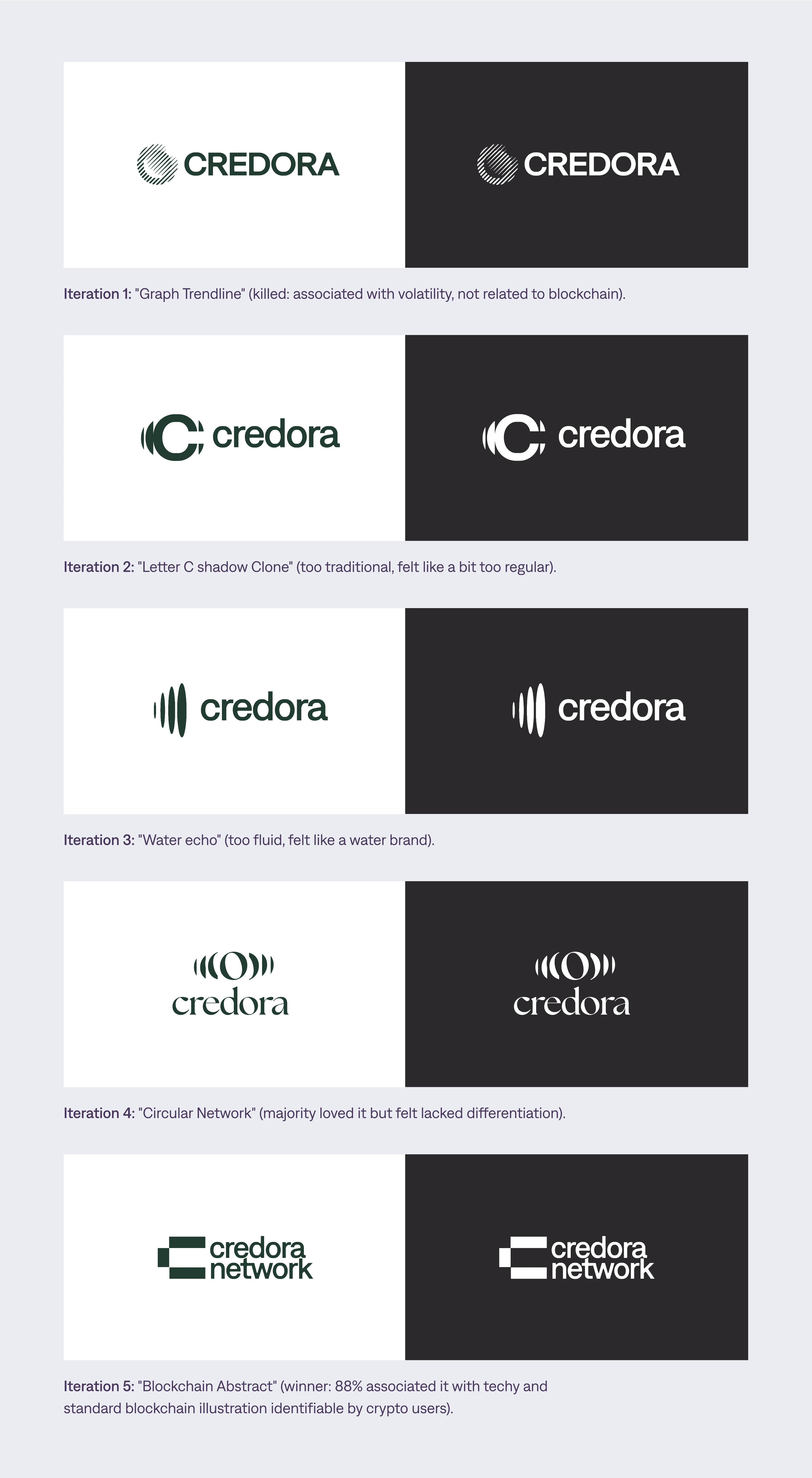
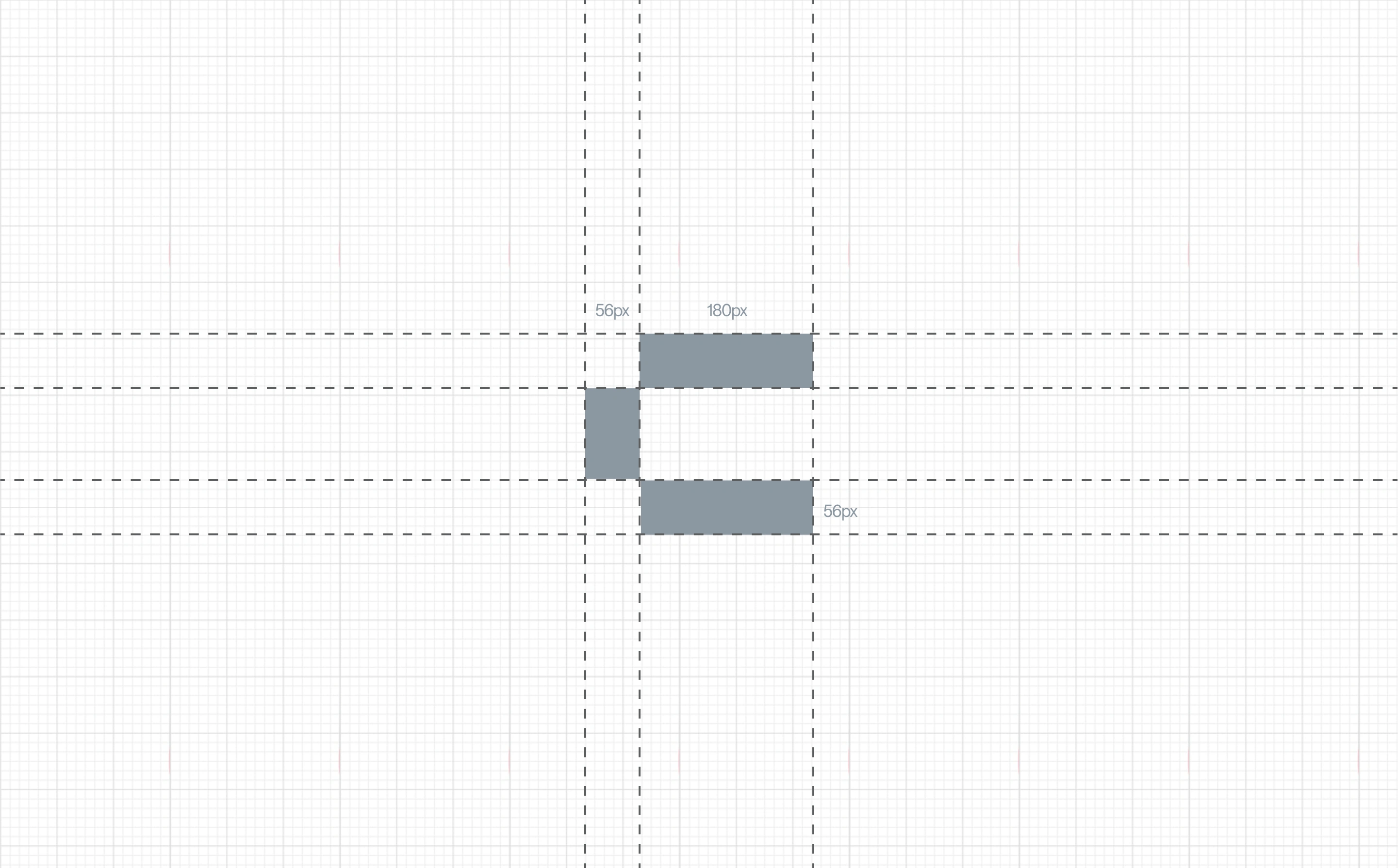
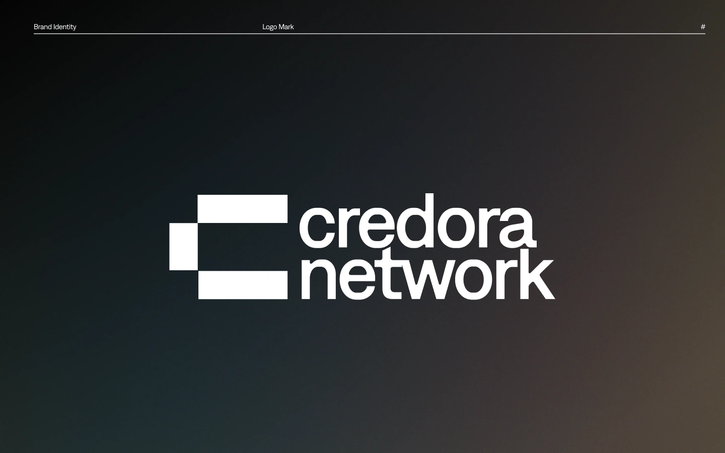
Logo Architecture
Grid-Based Construction:
Modular 8x8 grid system (mimics blockchain’s rigidity)
47° angles = tested optimal "structured but not sterile" perception
Negative space at the edges that forms letter "C" for instant recognition
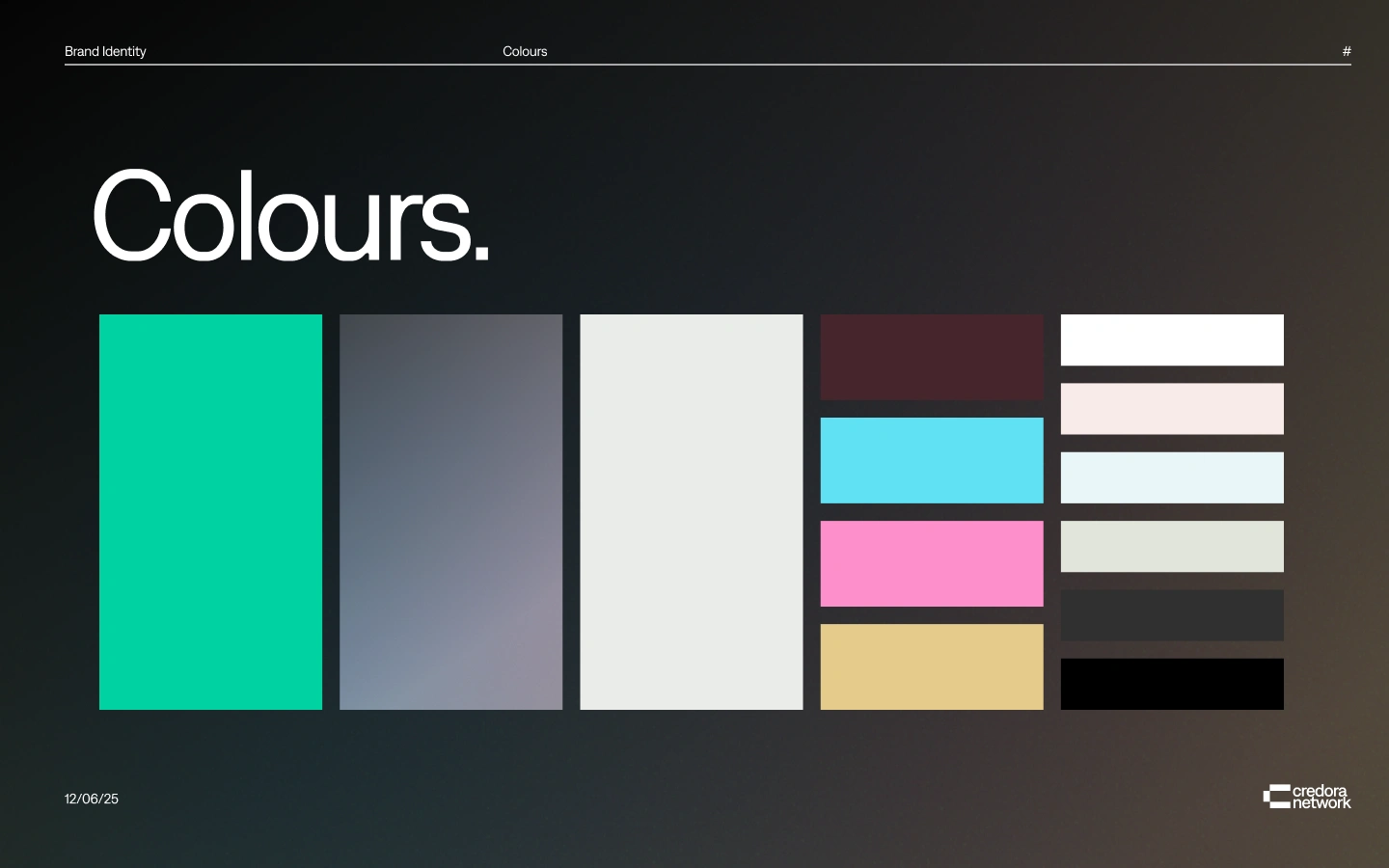
Colors:
Primary Palette:
- Credora Grey (#30302F): Institutional weight
- Mature Turquoise teal (#00D2A2): Data liquidity glow
Why It Works:
Teal grounds the brand in TradFi credibility, while teal pulses with on-chain energy—visualizing risk assessments in real-time.
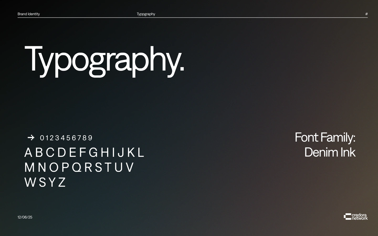
Typography:
Font Family: Denim Ink
Headlines (Denim Ink Bold): Chiseled, like blockchain immutability
Body (Denim Ink Regular): 8% wider letter spacing for data legibility
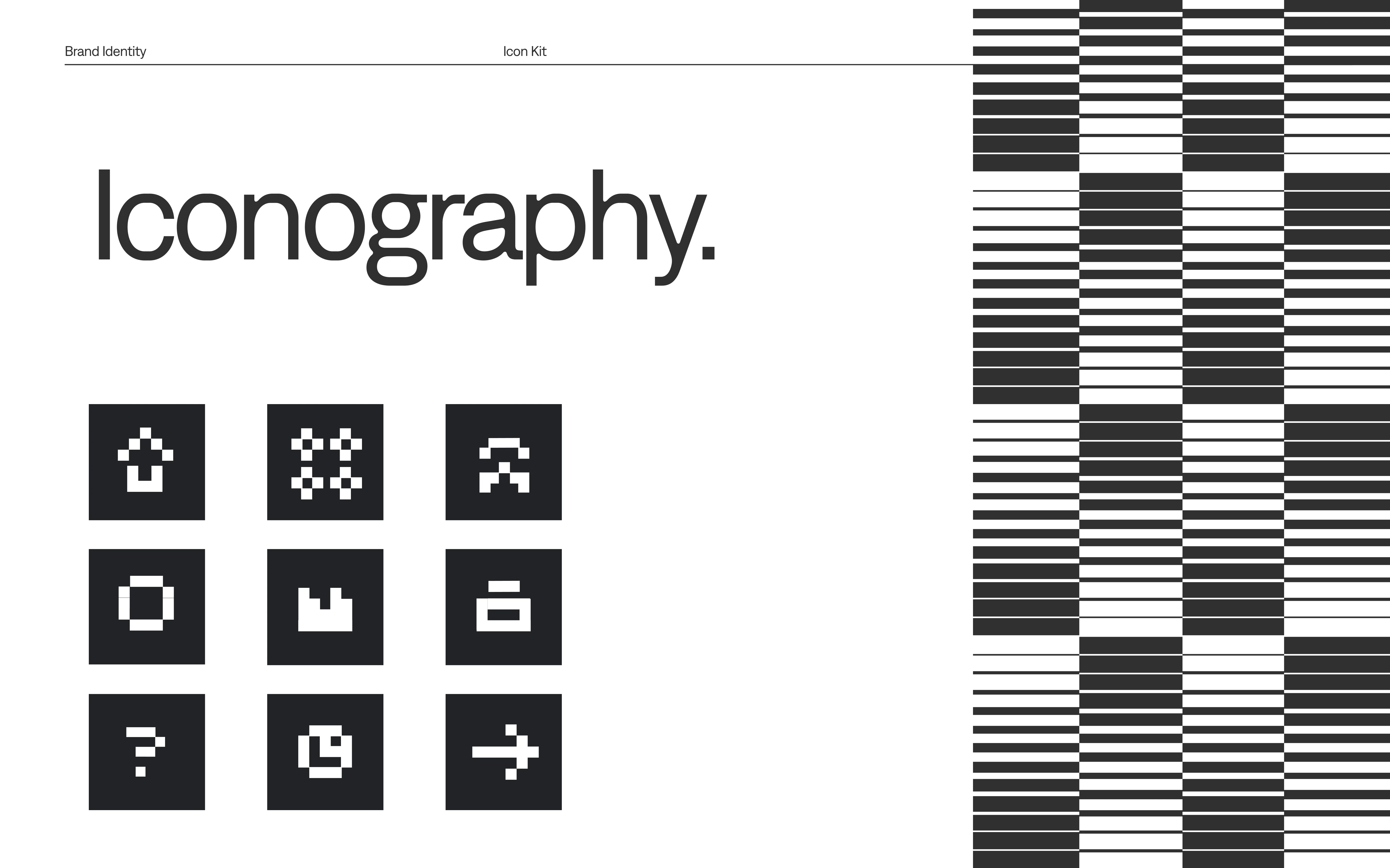
Iconography:
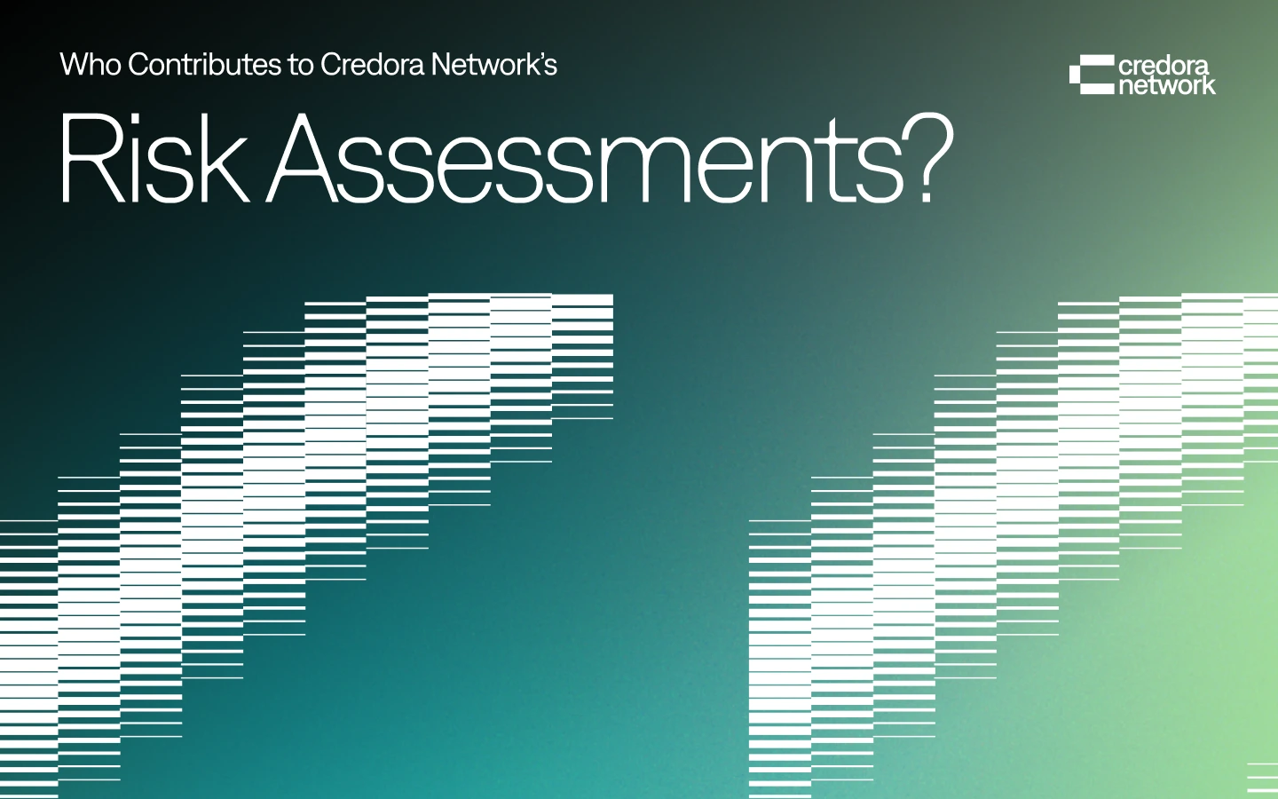
Risk Score Icons (Math as Visual Language):
Blocks = volatility tiers (rectangular structure = risk severity)
Symmetric halves = collateralization status
Data Viz Rules:
Always 4 - 5px row (matches logo layering height)
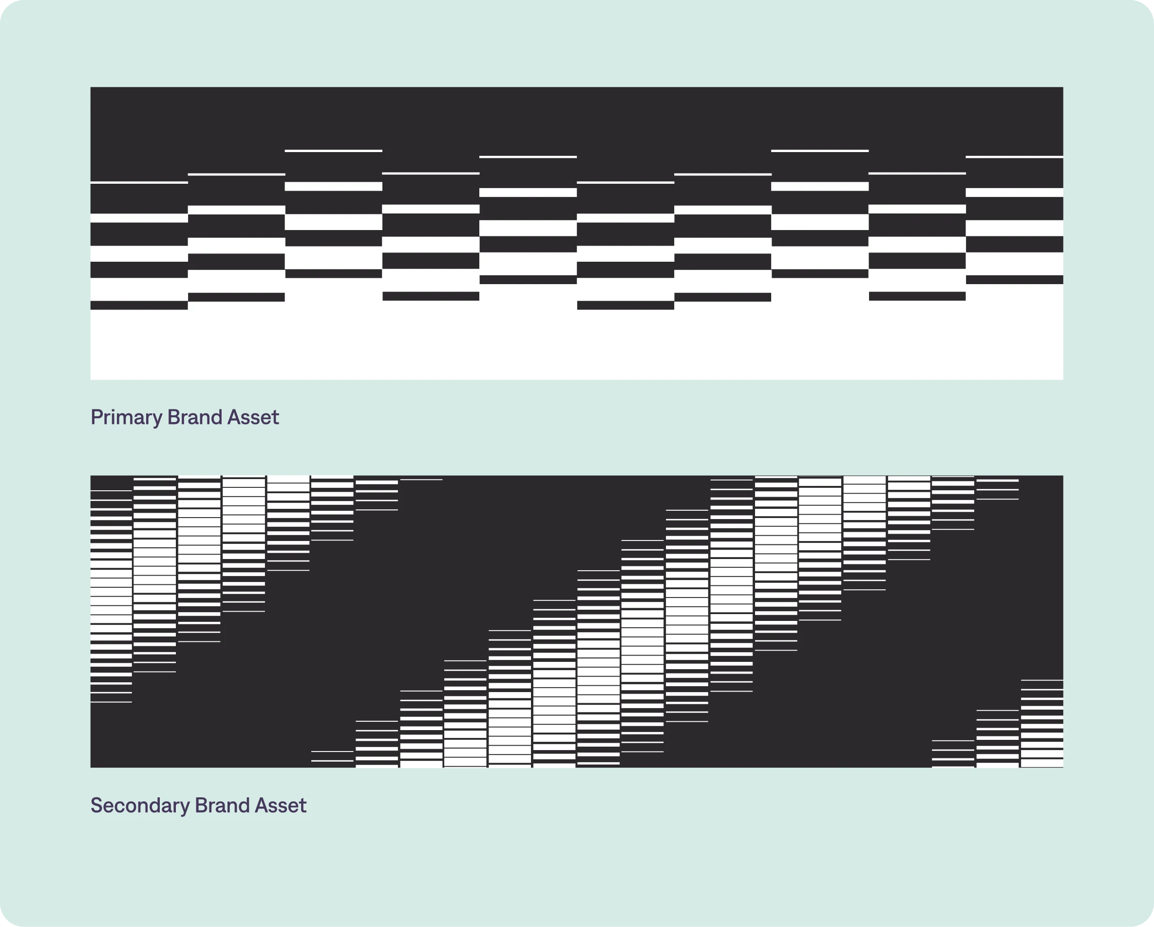
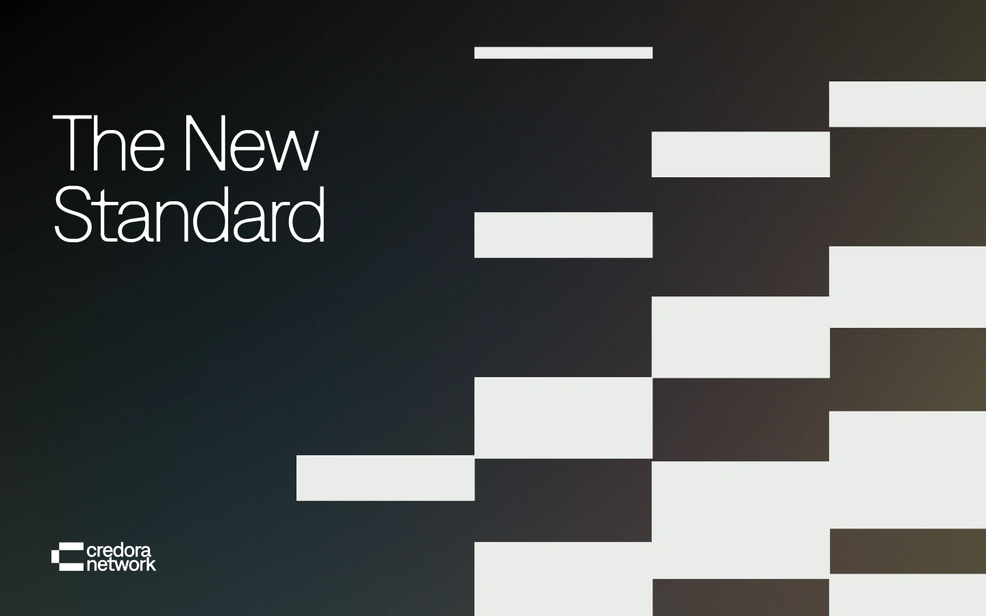
Brand Artifacts: Rectangular Rhythm
Pattern System:
Block Lines: 180° angled stripes (logo echo)
Usage: Report borders, social dividers
Motion Principle:
"Builds like a risk model"—blocks assemble/disassemble to show score changes
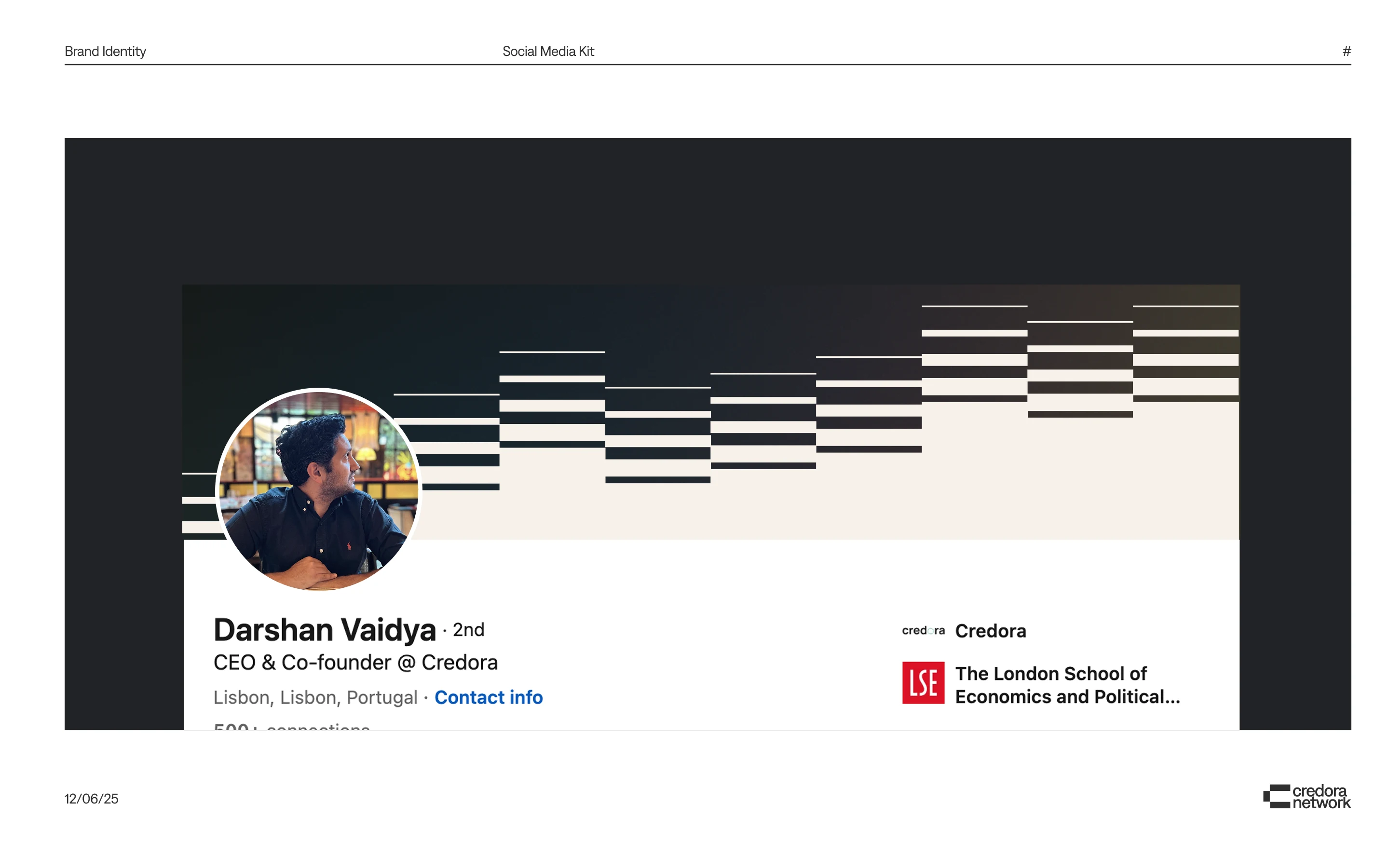
Credora's Signature Content Formats for Social Media
The Confidence Meter
What: Animated teal bars filling as risk scores calculate
Visual Hook:
- Starts with fragmented blocks (uncertainty)
- Assembles into Credora's angular logo (certainty)
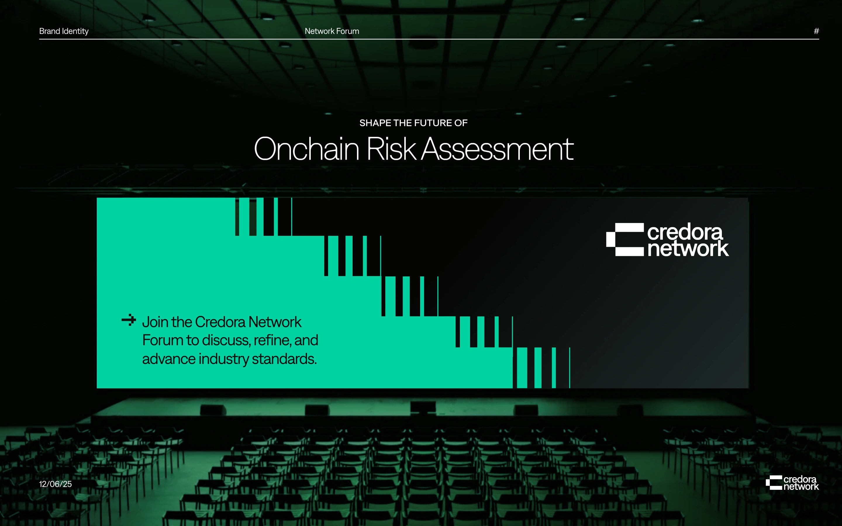

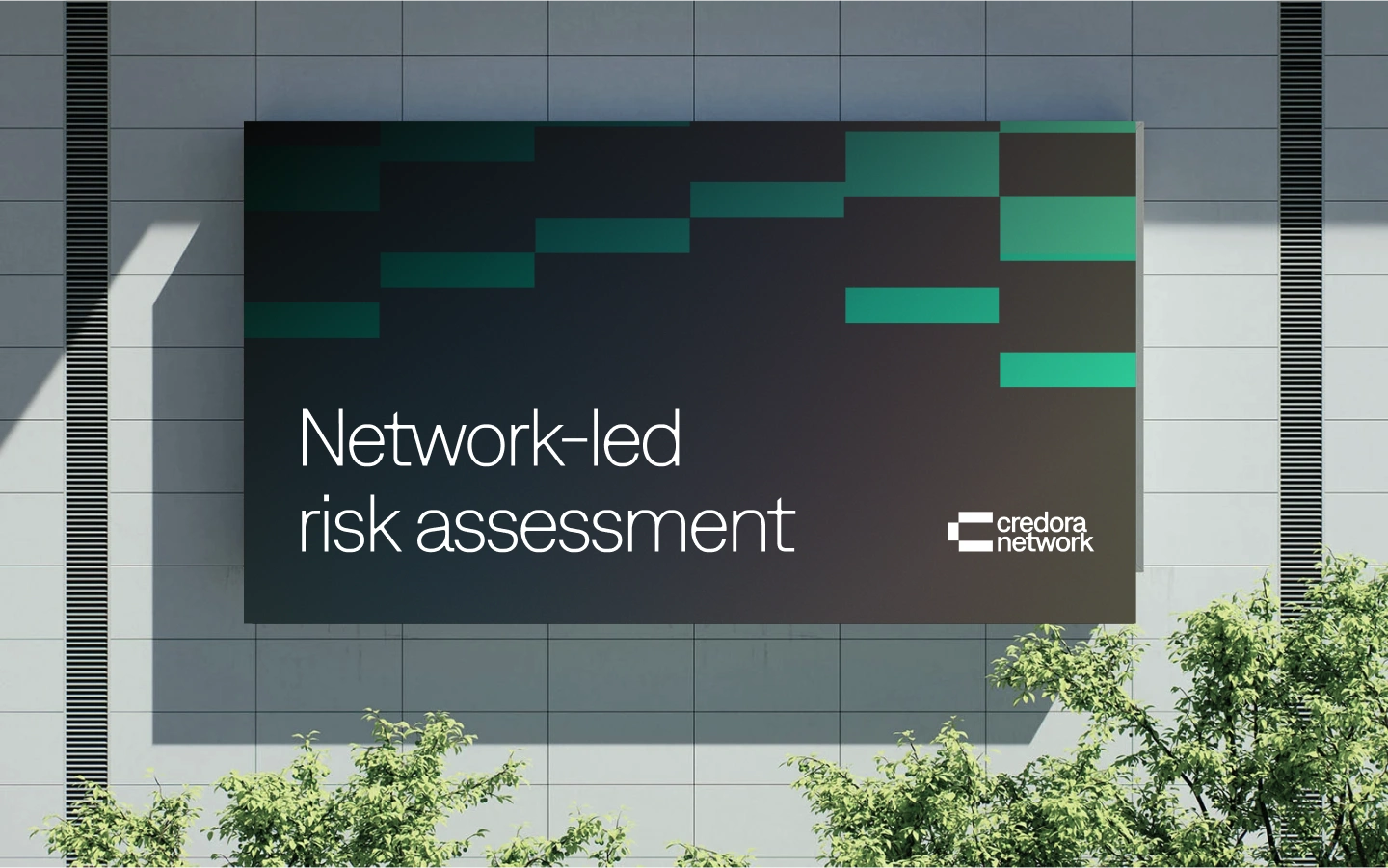
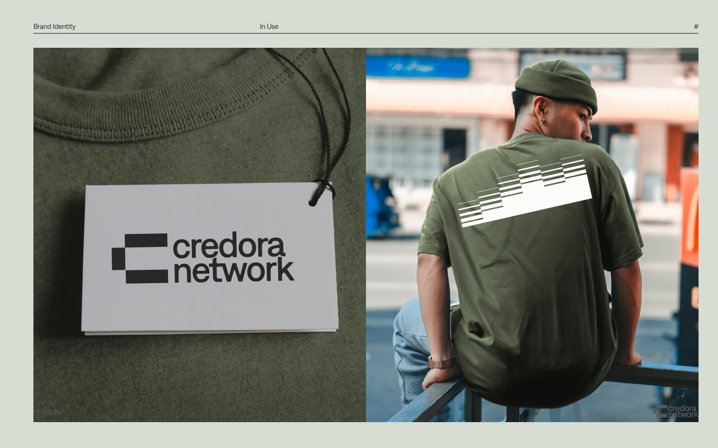
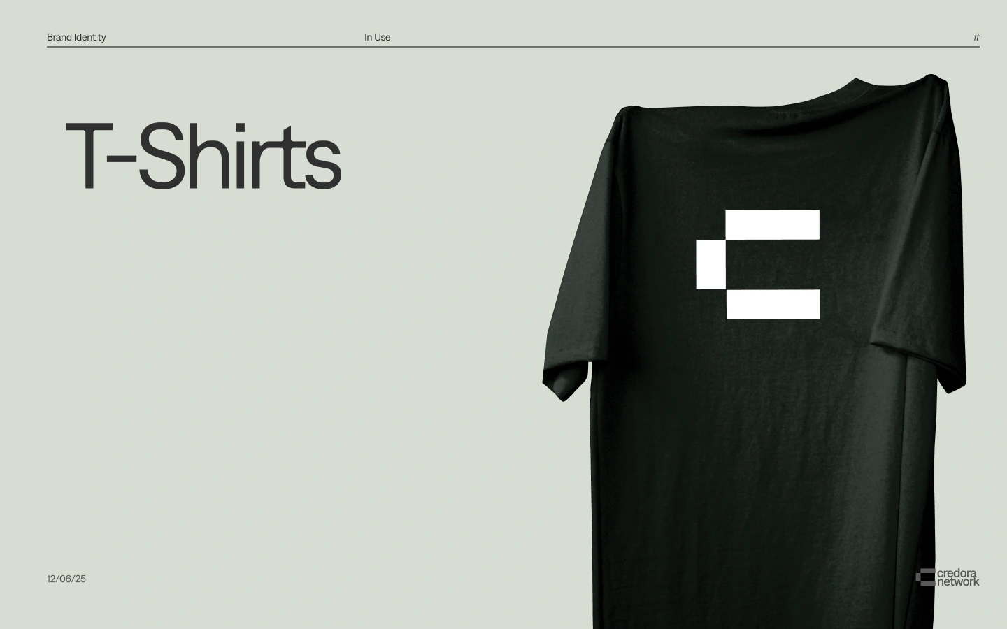
Brand Applications: From Billboards to Merch
What Makes this New Brand Special
Architecture as Brand: Angular lines mirror Credora’s consensus-rating protocol—no fluff, just structured accuracy.
Color = Confidence: A restrained palette (navy, electric teal) balances financial gravitas with DeFi’s forward energy.
Dynamic Symbolism: The logo’s interlocked blocks visualize risk layers converging into consensus—literally building trust.
Tools
Figma, Illustrator, On-chain data viz prototypes
Like this project
Posted Jun 9, 2025
Executed a comprehensive rebrand for Credora, enhancing institutional clarity and trust through a modern visual identity and cohesive messaging strategy.
Likes
6
Views
22
Timeline
Apr 7, 2025 - May 30, 2025
Clients
Credora