Survey - Online Survey App
PROJECT DETAILS
My Role
UX Researcher, UI Designer, UX Designer
Tools
Figma, Miro, Maze, and Clickup
Overview 🔎
Deliver a figma mock-up for a responsive web application that features user profile, and drop-down modal.
Process Overview
Chosen process: DOUBLE DIAMOND; design the right thing, design things right
When designing Double Diamond UX/UI processes, there are many different ways people tend to approach it: some may start with wireframes or prototypes before moving onto higher fidelity designs; others may start with higher fidelity designs like mockups so they can get more of an idea of what they're going for before jumping into coding; still others may jump straight into designing without any prototypes at all (which I don't recommend).
Due to the lack of time, this feature was created in just 8 days (Design & Development), We decided to start with Mid Fidelity designs this is the process We followed:
IMAGINE: User Persona
DEFINE: User Journey, HMW Statement, Problems & Hypothesis
PROTOTYPE: User flow, Wireframes, Design System, Mid-fi Prototype
TEST: Testing results, Iteration & Implementation, High-fi prototype, Next steps
Problem & Solution 🤝
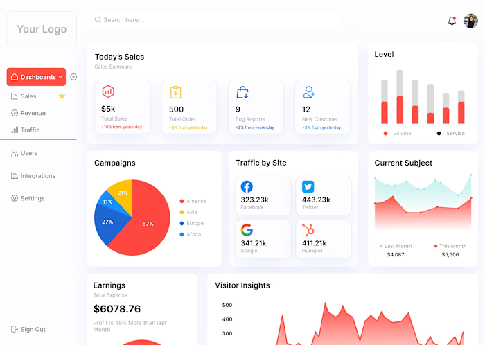
The challenge at hand involves crafting a UX/UI design solution to develop a Figma mock-up for an analytical dashboard. This dashboard is expected to offer customization features, thus necessitating a seamless integration of user-centric design principles to accommodate diverse data analysis needs while ensuring an intuitive and visually appealing interface.
Our proposed solution involves a comprehensive UX/UI design process to develop an analytical dashboard mock-up in Figma. By conducting thorough user research, we will identify key customization needs and user preferences. The design will prioritize a user-centric approach, allowing users to tailor their dashboard view according to their unique requirements. Visual elements such as informative charts, interactive graphs, and customizable widgets will be strategically placed to provide a clear and visually appealing representation of data. Through iterative design and usability testing, we will ensure the dashboard is intuitive, easy to navigate, and aligns seamlessly with users' analytical needs. The final result will be a Figma mock-up that not only showcases data insights effectively but also offers a highly customizable and engaging user experience.
Process 🛣
User Research and Analysis: Conduct thorough research to understand the target audience, their data analysis needs, and preferences. Gather insights through surveys, interviews, and user personas.
Requirements Gathering: Collaborate with stakeholders to define the specific customization features and functionalities required for the analytical dashboard.
Information Architecture: Create a clear structure for the dashboard by organizing data categories, hierarchy, and navigation pathways to ensure logical flow.
Wireframing: Develop low-fidelity wireframes outlining the layout and arrangement of key elements on the dashboard. Focus on achieving a balanced and intuitive design.
Prototype Development: Translate wireframes into interactive high-fidelity prototypes using Figma. Incorporate initial design concepts for visual elements, widgets, and customization options.
Visual Design: Apply a harmonious color scheme, typography, and visual elements that align with the brand and provide clarity in data representation.
Customization Features: Integrate user-friendly customization options, such as drag-and-drop widgets, filters, and data source selection, ensuring users can tailor the dashboard to their needs.
Graphs and Charts: Incorporate various types of graphs and charts for data visualization, keeping in mind the user's analytical requirements and the clarity of presentation.
Iterative Design: Engage in iterative design cycles, gathering feedback from stakeholders and potential users to refine the dashboard's appearance and functionality.
Usability Testing: Conduct usability testing sessions to validate the dashboard's user-friendliness, customization features, and overall navigation flow.
Feedback Incorporation: Analyze user feedback and make necessary adjustments to enhance the dashboard's usability and effectiveness.
Finalization: Implement the refined design elements and customization features into the Figma mock-up, ensuring a cohesive and seamless user experience.
Documentation: Create comprehensive documentation outlining design guidelines, customization instructions, and usability insights for developers and users.
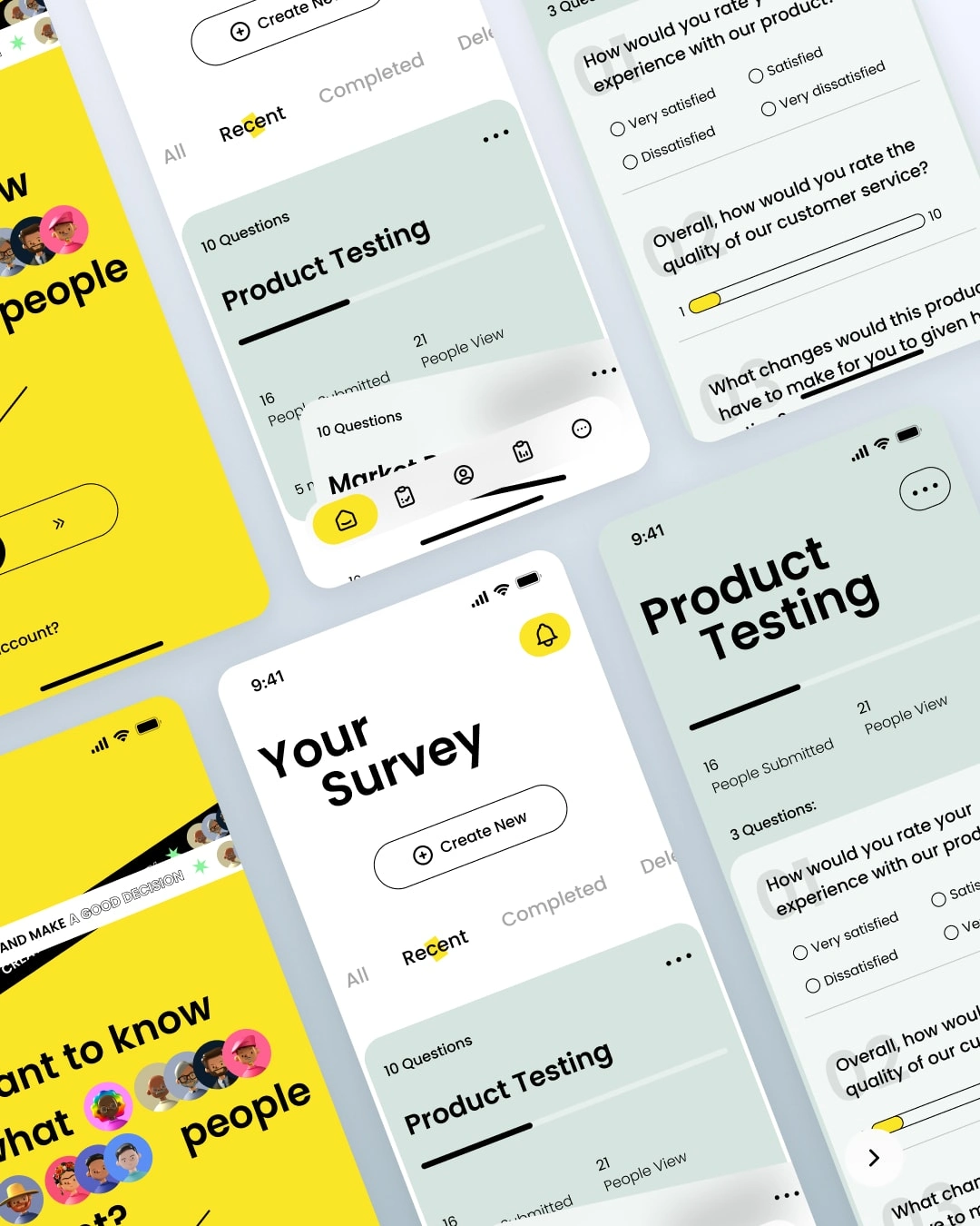
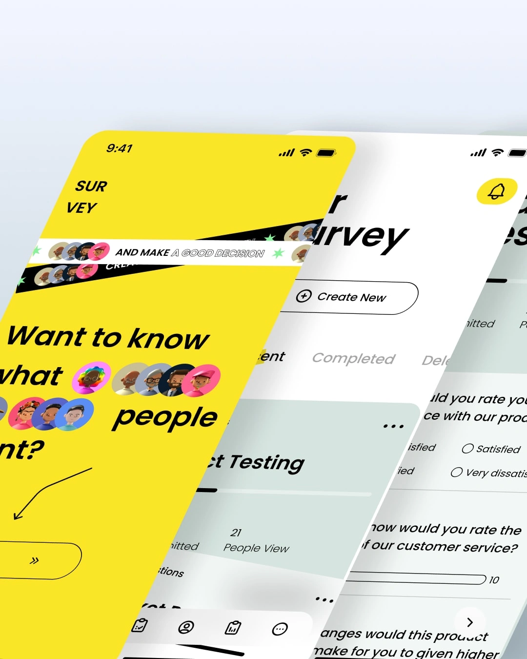
The implementation of the analytical dashboard design has had a profound impact on sales and revenue, driving substantial improvements across various aspects of the business:
Impact on Sales and Revenue
The analytical dashboard's implementation has significantly transformed sales and revenue outcomes. It empowers informed decision-making, leading to accurate sales forecasts, targeted marketing efforts, and optimized inventory management. Real-time analysis of customer behaviors and market trends ensures timely campaign optimization, personalized offerings, and identification of upselling opportunities. Insights into high-performing products and optimized pricing strategies contribute to increased sales and revenue growth.
Results 🎁
The rigorous implementation of the UX/UI design process has yielded a highly effective and user-centric analytical dashboard mock-up in Figma. This design solution has brought forth a range of significant outcomes:
The results were:
Enhanced Customization: Users can now tailor the dashboard according to their specific data analysis needs, enabling them to focus on the most relevant insights.
Intuitive Navigation: The organized information architecture and logical navigation pathways ensure users can effortlessly explore and interact with data.
Engaging Data Visualization: The integration of various types of graphs, charts, and widgets facilitates the clear representation of complex data, aiding in quick comprehension.
Improved User Experience: The user-centric design approach has led to a seamless and engaging experience, reducing the learning curve and enhancing user satisfaction.
Increased Efficiency: The customization features allow users to access the data they require swiftly, leading to improved efficiency in decision-making.
Positive Feedback: Usability testing and user feedback have indicated high levels of satisfaction with the design, confirming that the dashboard meets their analytical needs effectively.
Foundation for Development: The detailed Figma mock-up provides developers with clear design guidelines and specifications for seamless implementation.
Scalability: The adaptable design structure ensures that the dashboard can accommodate future enhancements and additional customization options.
In conclusion, the results reflect the successful amalgamation of user-focused design principles and analytical functionalities. The analytical dashboard mock-up stands as a testament to the effective collaboration between design and functionality, empowering users with an efficient, intuitive, and visually engaging tool for data analysis.
Takeaways 📣
As you can see, this project was a lot of fun. I learned a lot about how to make an web app, and I’m really happy with the final product.
If I had to do anything differently, it would be that I would have spent more time researching how to make my web app easier for users to use. But overall, I think the web app is pretty easy to navigate, so that’s no problem!
Like this project
Posted Aug 10, 2023
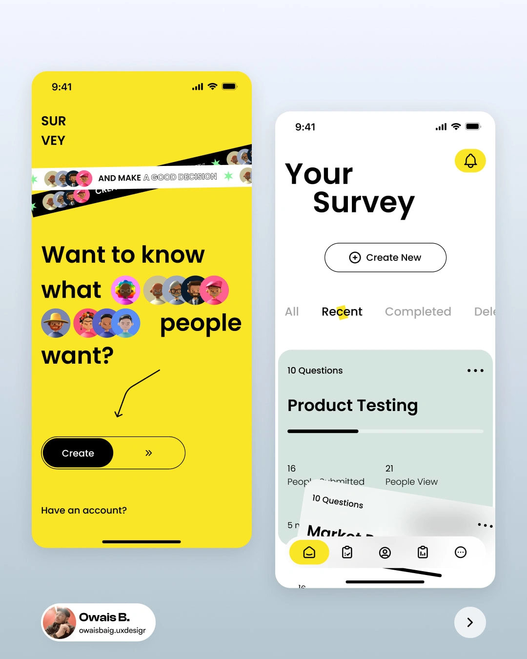
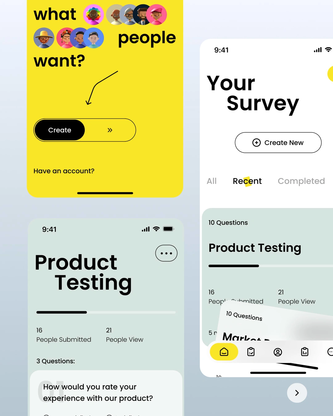
I designed a user-friendly survey app that allows users to build surveys, collect responses, and track results seamlessly, all in one platform.
Likes
0
Views
23

