Amplify
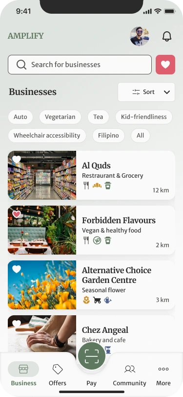
A B2C mobile app that supports local businesses by connecting them to customers.
Overview
Amplify is an eCommerce mobile app that connects local businesses to customers with a multi-vendor reward system that focuses mainly on people who are illiterate and digitally challenged.
Problem
Amplify is finding a solution for the lack of a multi-vendor rewards system accessible to small businesses, such as local restaurants and coffee shops. Unlike major companies like Starbucks and Tim Hortons, small businesses often lack the economic resources needed to implement and sustain a rewards program across multiple vendors.
Solution
Design a payment and rewards app in which customers can earn rewards such as gift certificates and exclusive offers from their preferred local stores. This will incentivize customer loyalty and retention, ultimately improving their growth and profitability.
Process
Discovery
Wireframing
UI Design
Prototype
Dev Handoff
Tools
Figma
Slack
Google Meet
Role
UX / UI Designer (Team of 6)
Duration
5 weeks
Discovery
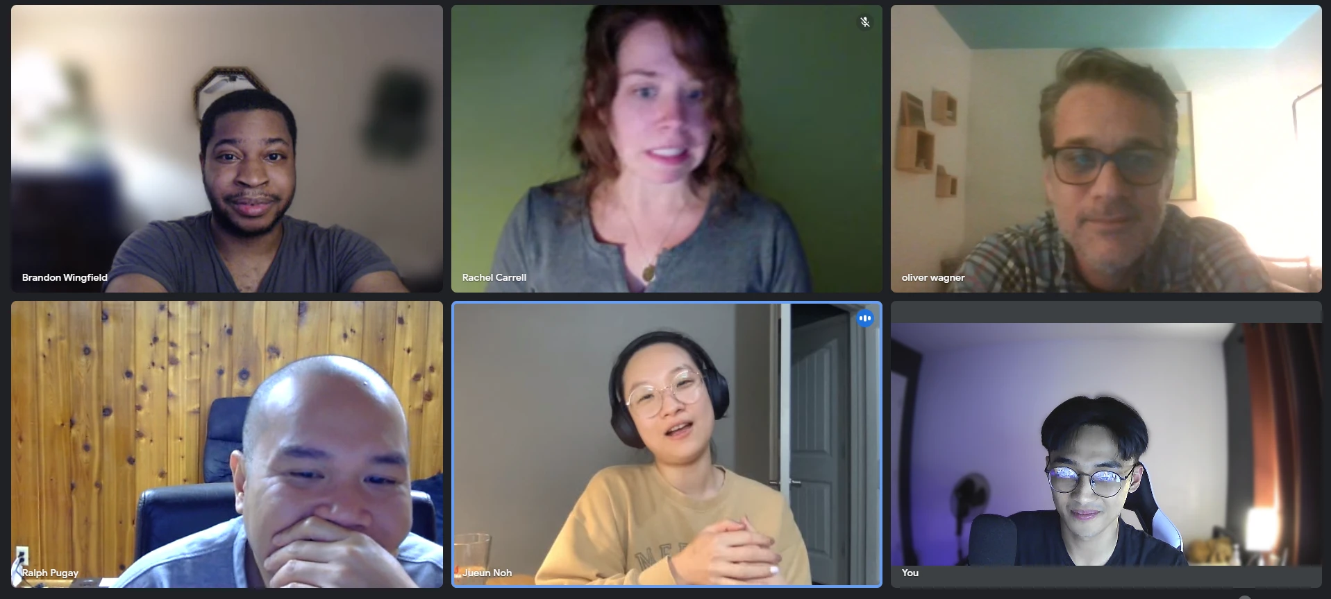
Kick-off Meeting
Our team met with the client to gain insight into Amplify and its branding, targeted audience, and company goals. During this meeting, the client elaborated on what they wanted us to design. Here are the features they wanted us to work on:
Make an onboarding screen with login/register screens that are seamless and effortless
A Home screen that includes a creative QR code that can be used as a payment method
Payment screens that let users load money into the app through their credit card or bank
Content share feature that lets users share rewards, locale stores, and reviews
User Stories
User stories were provided by the client. This gave us a better understanding of the features that the client wanted us to create.
As a user, I want to be able to make a purchase using the Amplify app with fewer clicks.
As a user, I want to be able to connect my bank account or credit card easily.
As a user, I want to be able to share content with other users.
User Flows
Using the user stories, we created user flows to determine the screens we need to create and visualize how someone would navigate through the app. Keeping our targeted users in mind, we made sure that the app is easy to use.
Design
Style Guide
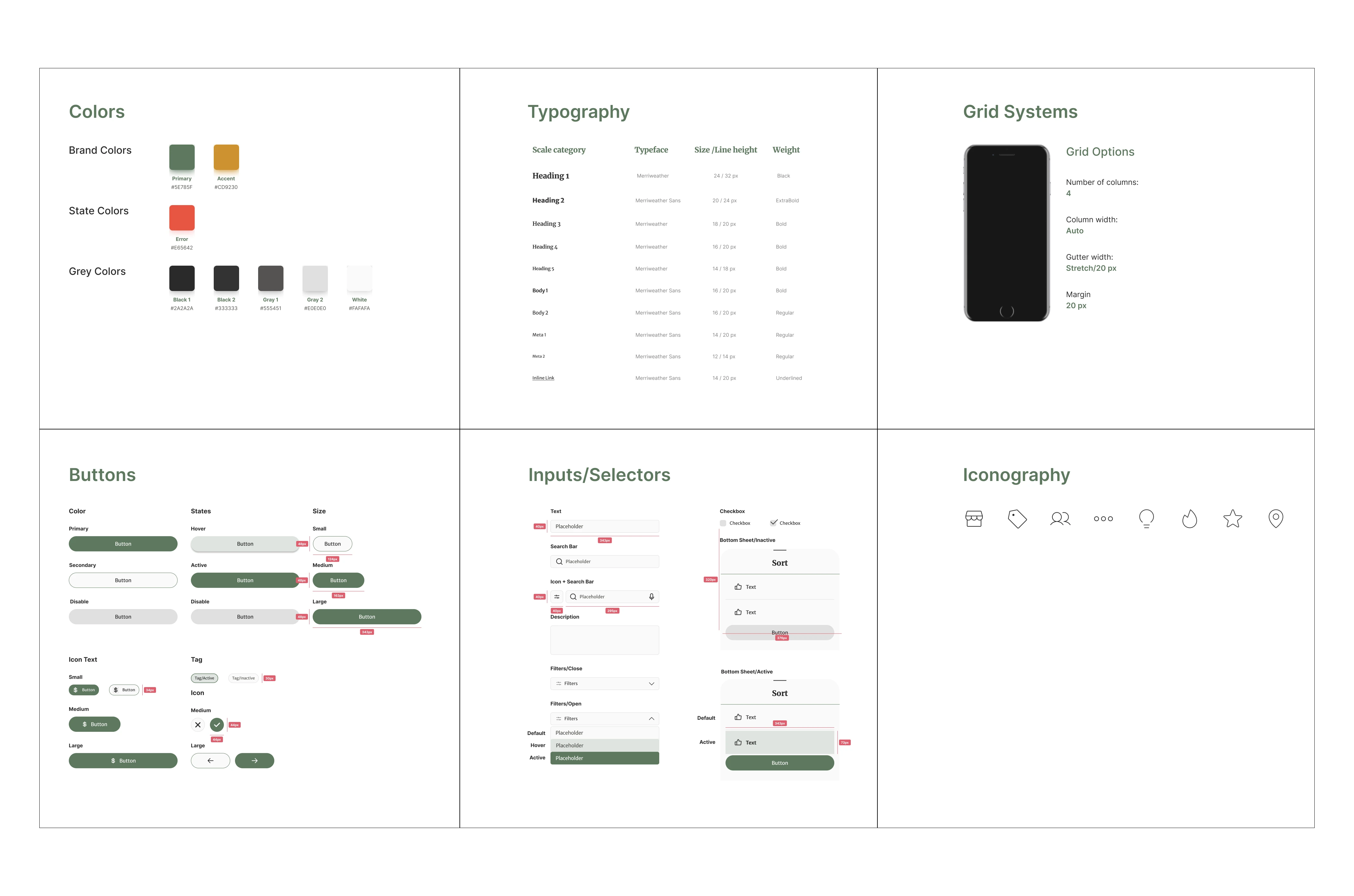
I was tasked with creating the style guide we will use for our screens. The client provided us with the brand guidelines they wanted us to use such as font styles and colors. For the font, Merriweather is their chosen font family. As for the colors, the client gave us the freedom to explore more colors because their current colors do not pass the Web Content Accessibility Test since their color combinations fail the contrast test.
Mid-fi Wireframes
Using the style guide created, we also created components to ensure consistency for all screens. We were then grouped and assigned to a user flow and created wireframes for them. Our team was not just focused on our own user flow, because we helped each other to come up with solutions. This is where our teamwork really shined.
Revisions
Our client had some comments regarding our first wireframes. Our team then revised some screens and created new screens to incorporate our client’s feedback.
Incorporate a select language from the onboarding screen
Make the QR code screen more visually appealing
Make the pay button more prominent
Create categories sections
Create screens for receiving gifts
Payment confirmation modal
UI Iterations
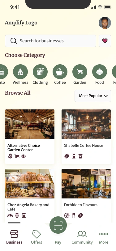
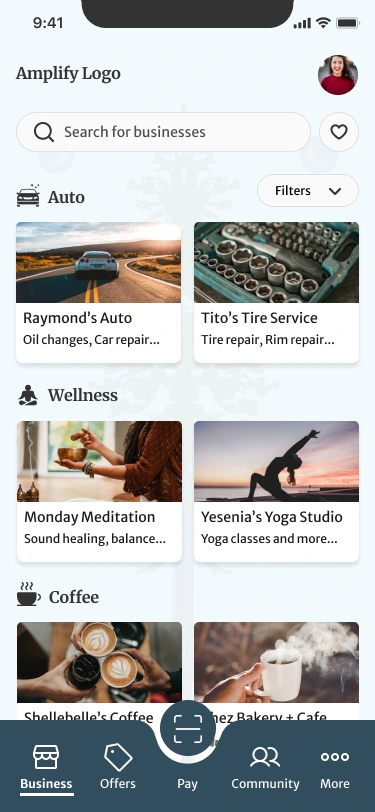
We created 3 different UI iterations for the client to choose from. The client liked the shapes used and browsability because it’s friendly and easy to navigate.
Hi-fi Screens
The team was split into 3 teams to work on incorporating all the styles and colors for each user flows. Even though it was split into 3, we still helped each other when incorporating the client’s final comments regarding our screens. This part of the process took the longest because the client had a lot that they wanted to add since they were able to see how the app would actually look with all the styles, fonts, and colors applied. With the help of everyone, we were able to deliver the best design for the client with the added features/screens that they wanted. Our team was able to create 90 screens for our project.
Prototype
This illustrates how a user would navigate through the app. It shows how someone can log in/register, pay using their QR code, add funds, and share gifts with people.
Dev Handoff
Annotated Screens and flows
Our team annotated all screens for each user flow and used arrows on how each screen flowed. We made sure that all the annotations are detailed so that Amplify's developers will understand the design specifications for each screen and how a user will use the app.
Reflection
Our client loved the product design and appreciated all the work we have done. They were really grateful, especially when they asked for additional features. We were able to deliver exactly what they were looking for and were impressed with how much we have done in such a short amount of time.
Client Reaction
Here is the video showing our client's reaction after presenting our final product.
Looking Back
This project was enjoyable and I had a great time working on this project. Our team had good communication and we always held weekly meetings. We did an amazing job at doing our tasks and helping out each other, which I believe is very important. Even though our work was divided between the user flows, we still helped each other out, especially when the client wanted to add more features/screens.
Learnings
I believe that this project helped me improve my design thinking skills and how to deeply understand our users.
Things I learned:
Keep users in mind when designing
Quickly iterate designs
Work well with a team
Research UI designs for inspiration
Like this project
Posted Jun 3, 2023
A Payment and Rewards Mobile App
Likes
0
Views
0
