Mira Therapy Platform- Framer Website
Hauwa Yusuf
Mira: Reimagining Therapy for Women
Mira is a therapy matching platform built exclusively for women, connecting them with licensed female therapists who specialise in the challenges women actually face. I designed the end-to-end UI/UX with one goal: make women feel genuinely welcome.
The design Challenge
Women seeking mental health support are often already carrying a lot before they even open a browser. They may have been dismissed by a doctor, talked themselves out of it a dozen times, or simply never felt like existing platforms were built with them in mind. Mira started from a different question: what would it take for a woman to feel genuinely welcome here, from the very first word on the page?
How I approached this design
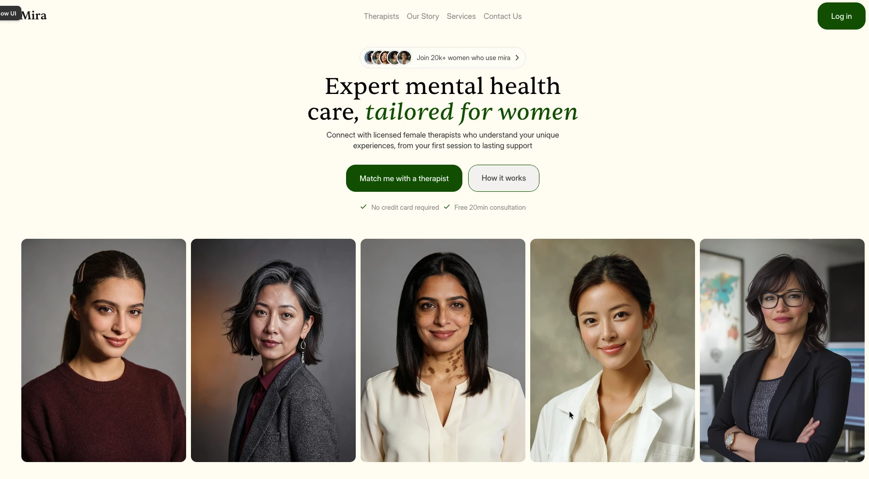
Visual language and tone: The colour palette centres on deep forest green and warm cream. Green was a considered choice: it carries associations of calm and growth, two things that feel genuinely relevant to a woman beginning a mental health journey. The cream ground keeps it warm and approachable rather than corporate. Together they create a visual environment that feels safe to spend time in, which matters when the content itself asks something emotionally significant of the user.
Typography: The type system pairs a soft italic serif for display and emotional emphasis with a clean, highly legible body font for everything informational. The serif was chosen for its softness: rounded, considered, a little warm. It gives headlines and key phrases like "tailored for women" a quality that feels personal rather than broadcast. The body font then does the practical work of making longer content easy to read without fatigue.
Trust-building design choices: Every section earns the next click rather than demanding it. The hero opens with a social proof pill showing real faces alongside "Join 20k+ women". The CTA is immediately followed by "No credit card required. Free 20min consultation" because nobody should have to wonder if there is a catch. Therapist profiles lead with faces and lived specialisations rather than a list of credentials, because the user needs to feel a connection before they feel reassured by a qualification.
The Outcome
The Mira website came together in 2 weeks. Every visual and interaction decision points back to the same goal: that women deserve mental health platforms designed with the same care and intention they are being asked to bring to their own healing. Mira is what that looks like.
mira website framer design
Like this project
Posted Feb 17, 2026
I worked on the end-to-end UI/UX for a women's mental health platform, designed to build trust from the very first screen
Likes
1
Views
3
Timeline
Feb 12, 2026 - Feb 26, 2026