Brand Identity and Design for SYSTARA
Ibrahim Hajoori

About SYSTARA:
SYSTARA is a silver jewelry brand inspired by quiet luxury and refined expression. The brand focuses on simplicity, balance, and timeless design, avoiding both overly traditional and overly trendy aesthetics.
Drawing from subtle ornamental influences, SYSTARA blends modern minimalism with a sense of heritage. Each piece highlights texture, form, and craftsmanship, creating a calm and understated visual identity.
SYSTARA approaches jewelry as an extension of presence — designed not to overpower, but to complement with quiet confidence.
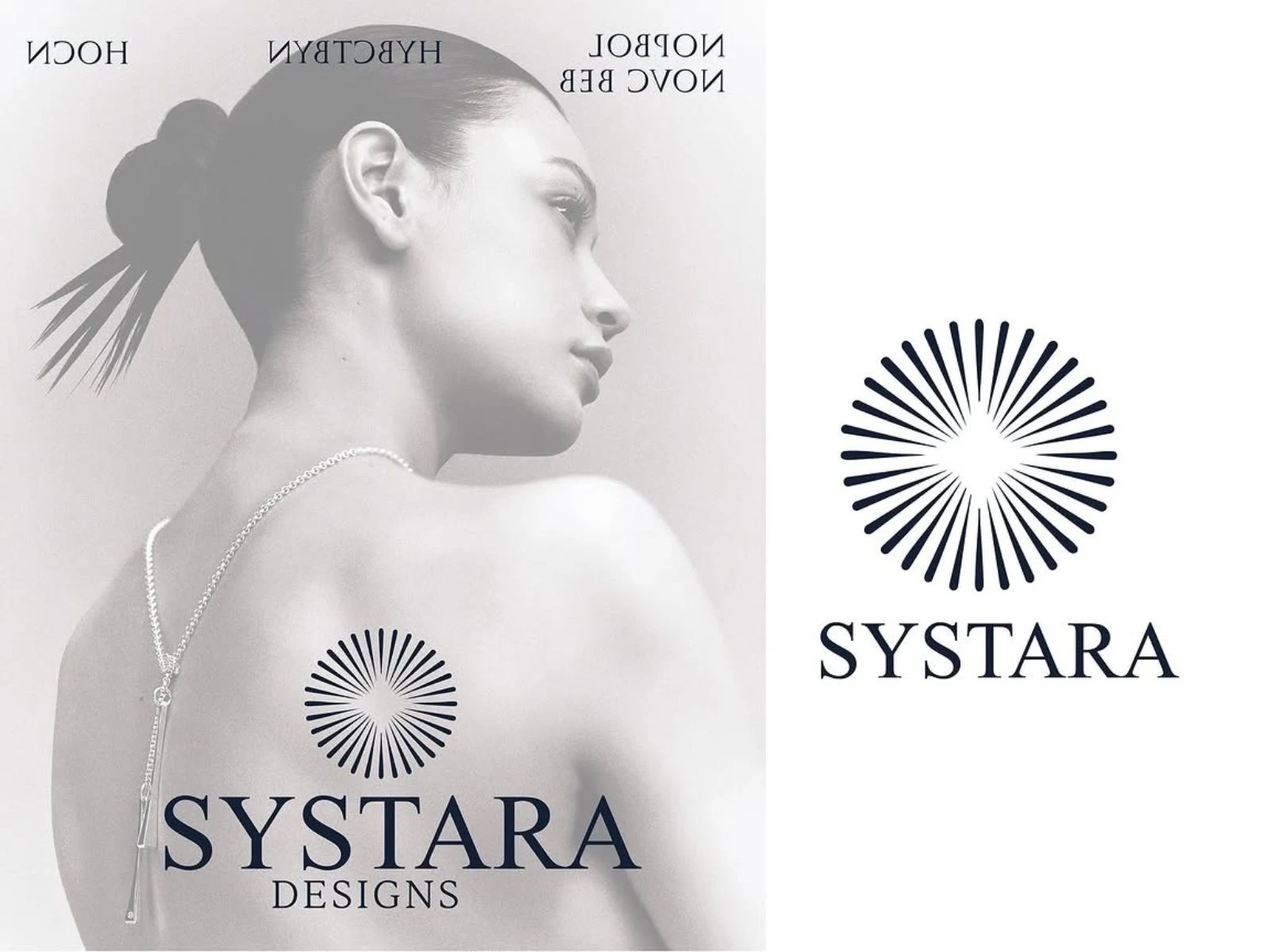
Brand Idea & Logo Direction:
SYSTARA is built around the idea of quiet luxury — where elegance is expressed through subtle details rather than bold statements. The brand focuses on balance, calmness, and refined simplicity, creating a timeless and composed visual language.
The logo reflects this approach through a minimal radial symbol inspired by traditional patterns, paired with a refined serif wordmark. This combination of modern structure and ornamental influence creates an identity that feels elegant, balanced, and quietly distinctive.
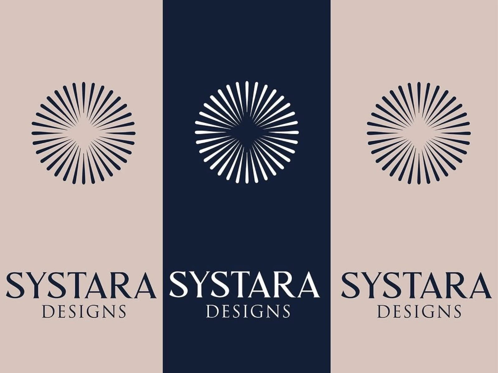
Colour Palette:
The SYSTARA color palette is built around deep navy, soft ivory, and muted beige tones, creating a refined and balanced visual identity. The dark base adds depth and sophistication, while the lighter shades bring softness and contrast, reflecting the subtle elegance of silver. Together, the palette maintains a calm, premium feel while allowing the brand to remain timeless and versatile across applications.
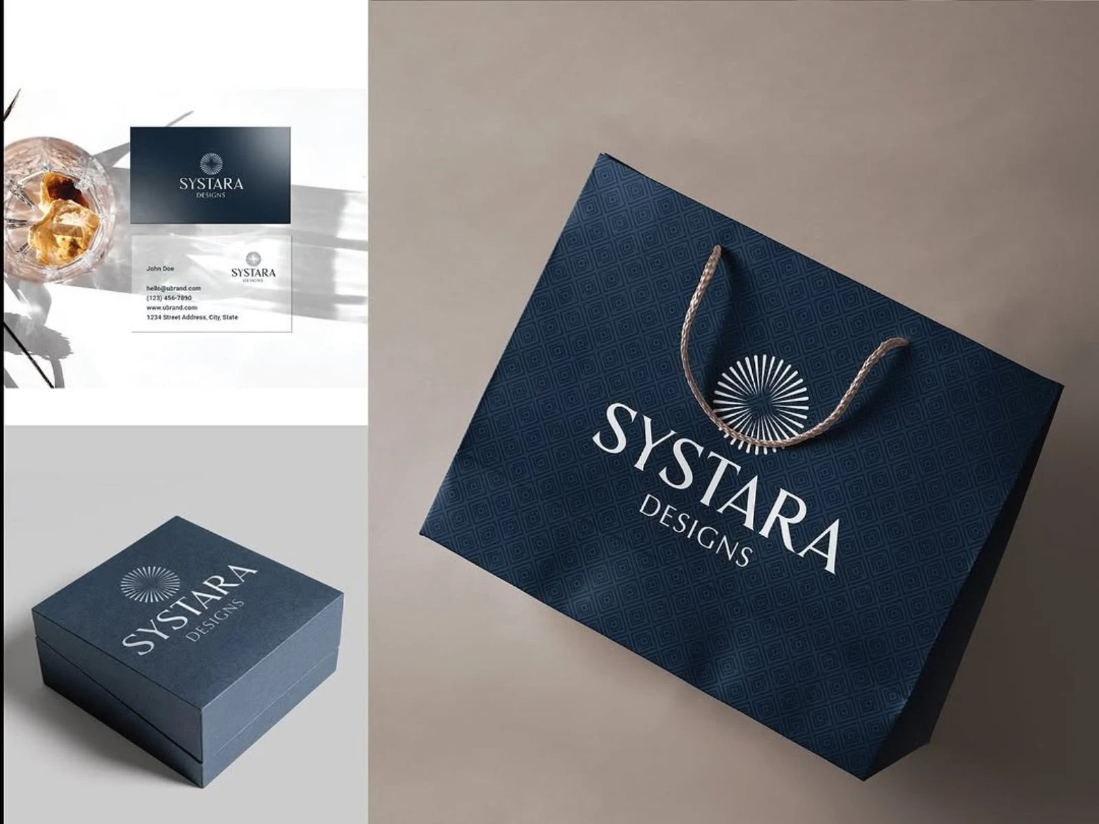
Packaging Design:
The SYSTARA packaging design reflects the brand’s refined and understated identity. Deep tones, subtle patterns, and minimal typography create a sense of quiet luxury, while structured forms add a premium feel. Every element is intentional and clean, resulting in packaging that feels elegant, timeless, and aligned with the craftsmanship of the jewelry inside.
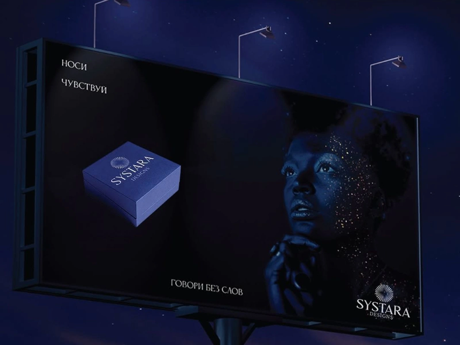
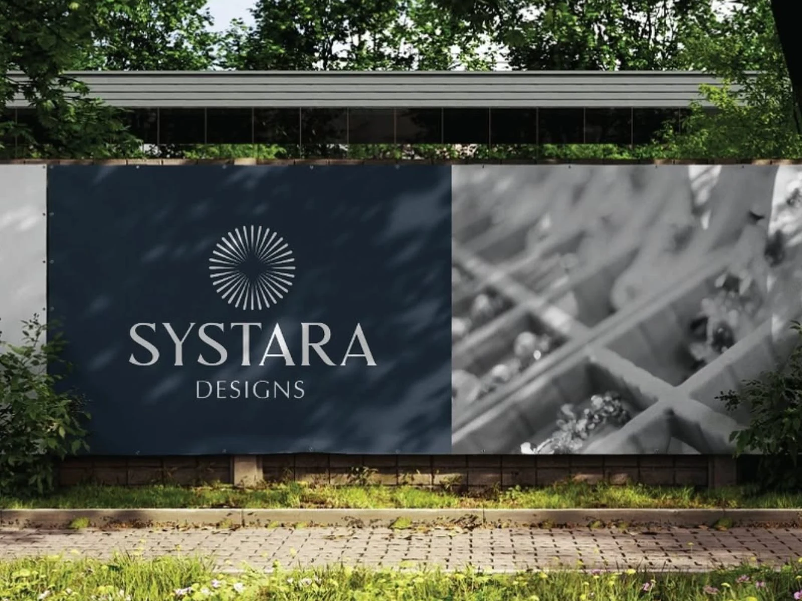
Hoarding Design:
The SYSTARA hoarding design translates the brand’s quiet luxury into a bold, atmospheric visual. Deep tones and minimal composition create a strong presence, while the contrast of light and texture draws attention without overwhelming. The use of subtle highlights and expressive imagery adds a sense of emotion and depth, allowing the brand to communicate elegance and confidence in a striking yet understated way.
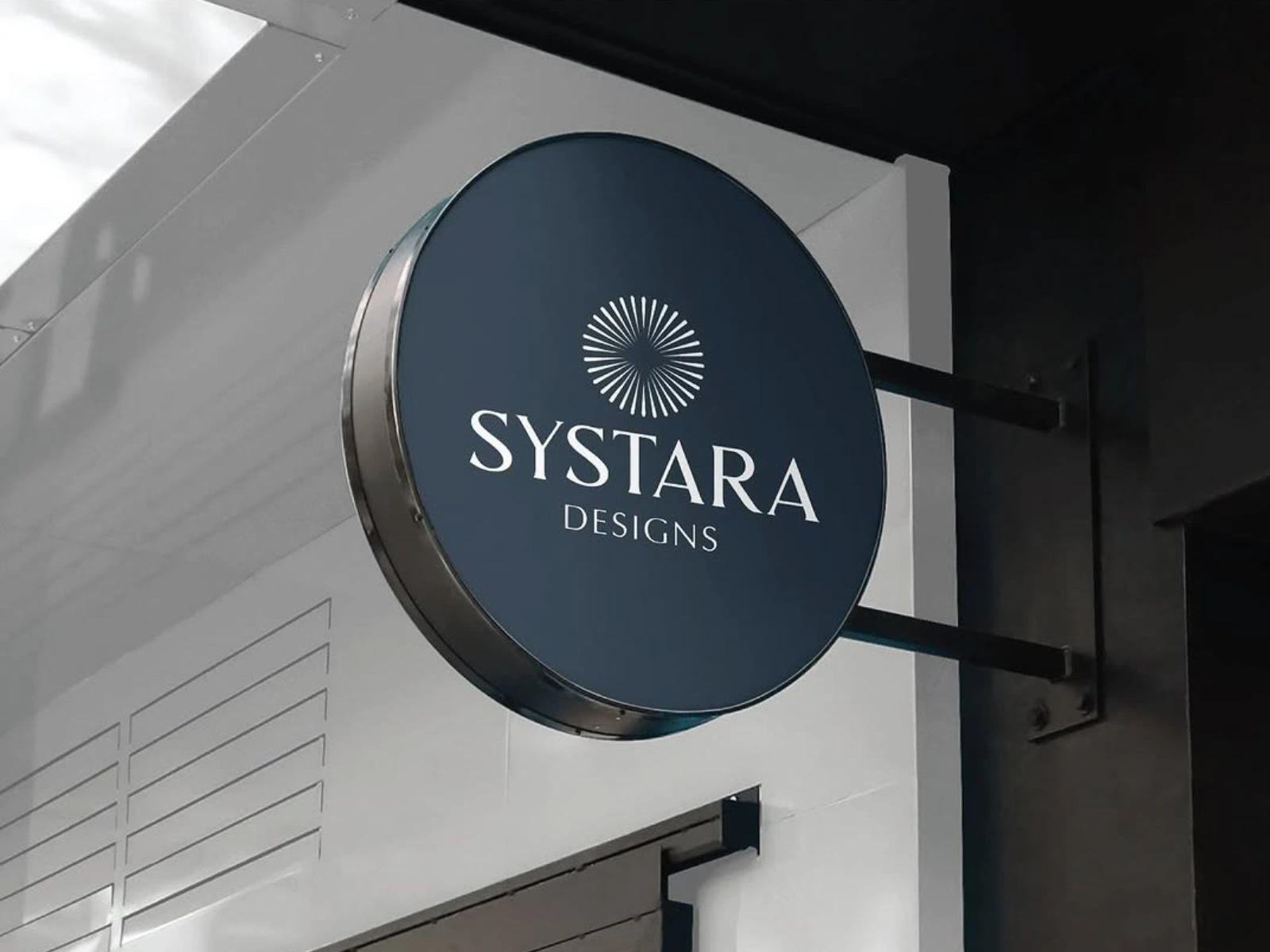

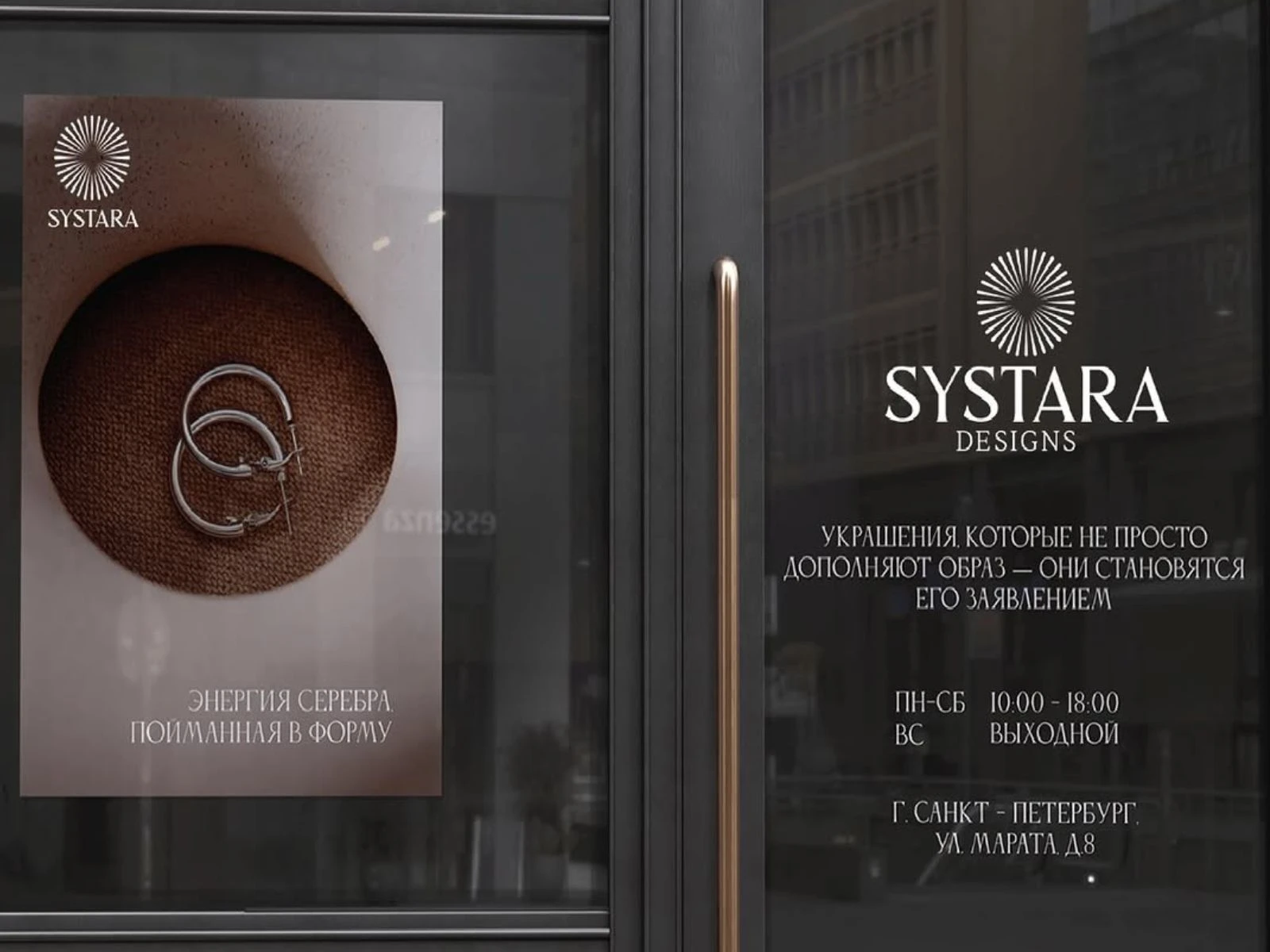
Store Signage & Brand Applications
The SYSTARA store signage extends the brand’s identity into physical space with a focus on clarity, balance, and presence. The use of deep tones paired with refined typography ensures strong visibility while maintaining a calm and premium aesthetic.
Minimal compositions and structured layouts allow the logo and symbol to stand confidently without visual noise. Subtle textures and imagery are introduced to add depth, creating a cohesive experience across storefronts, in-store graphics, and environmental branding.
Every application is designed to feel consistent and intentional, reinforcing SYSTARA’s identity as a brand rooted in quiet luxury and timeless elegance.
Like this project
Posted May 5, 2026
Developed visual identity elements for SYSTARA, focusing on elegance and simplicity.
Likes
0
Views
1
Timeline
Feb 19, 2026 - Mar 19, 2026