
RITS. One brand language. Many applications.
Client: RITS
My role: Brand & Digital Design
Technology takes many forms. A brand needs one recognisable language. Mark, light, colour and typography connect RITS materials into a coherent whole.
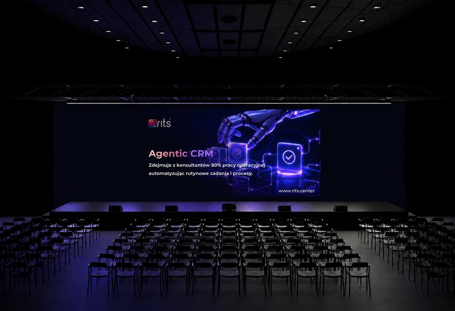
Brand application concept · mockup
THE STARTING POINT
Experts. Systems. Delivery.
RITS is a technology partner: it augments client teams, delivers custom software and operates systems. It also deploys AI into business processes with human oversight of significant decisions. This context shapes the visual direction: human expertise, collaboration and responsibility for technology in operation.
01
Primary logo
A generous, quiet surface brings out the colour mark and light wordmark. The original vector preserves the shape and proportions at every scale.

Light-background version

Original vector geometry

02
Typography
Montserrat and Urbanist. Four weights and a shared hierarchy of headlines, subheads and body text, following the brand specification.
TYPEFACE / MONTSERRAT
Montserrat
BoldAa
SemiboldAa
RegularAa
LightAa
IntelligenceAmplified.From concept to deployment.
TYPEFACE / URBANIST
Urbanist
BoldAa
SemiboldAa
RegularAa
LightAa
IntelligenceAmplified.From concept to deployment.
Headline 42–96 pxSubhead 18–42 pxBody 10–18 px
03
Brand palette
White, blue, purple and black form the primary palette. Gradients extend it with light and depth. The board follows the supplied colour specification.
RITS BlueRITS / PRIMARY
RITS PurpleRITS / PRIMARY
RITS Off BlackRITS / PRIMARY
RITS WhiteRITS / PRIMARY
Brand gradientRITS / SIGNATURE
04
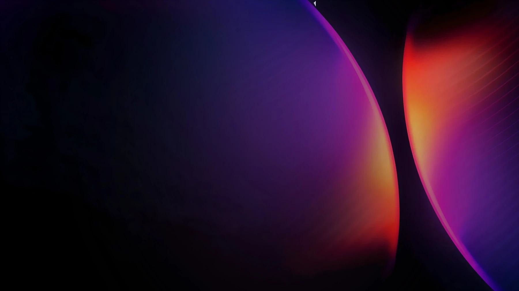
Light & motion
Arcs and bands of light form a shared motif. Different crops create varied compositions while preserving the character of the brand.


05
Website
Colour, typography and the signature arcs create a recognisable interface. The RITS website presented on a laptop screen.
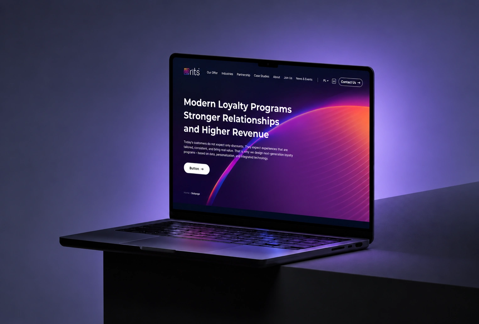
Brand application concept · mockup
06
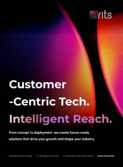
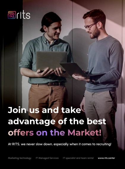
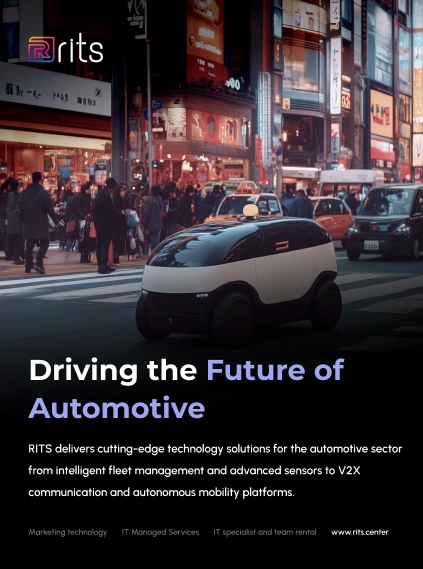
Three campaign directions
Services, recruitment and automotive technology. A shared message structure brings different stories into one poster family.
07 / THE BRAND AT EVENTS
From stage to event badge.
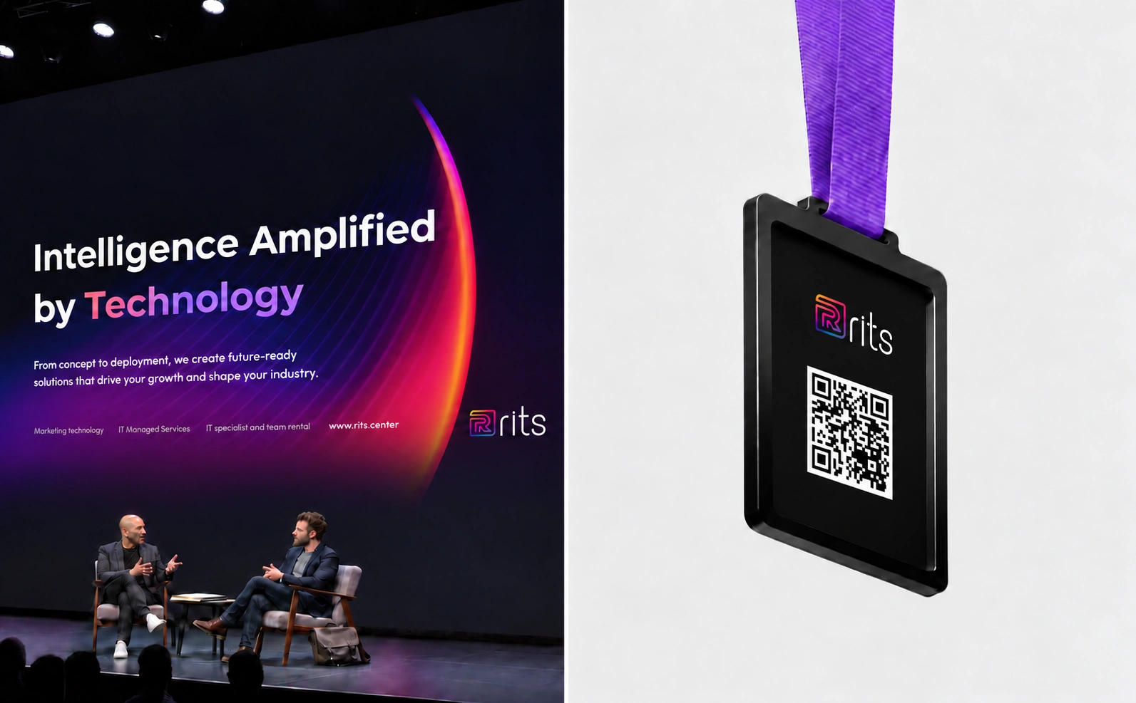
Brand application concept · mockup
08
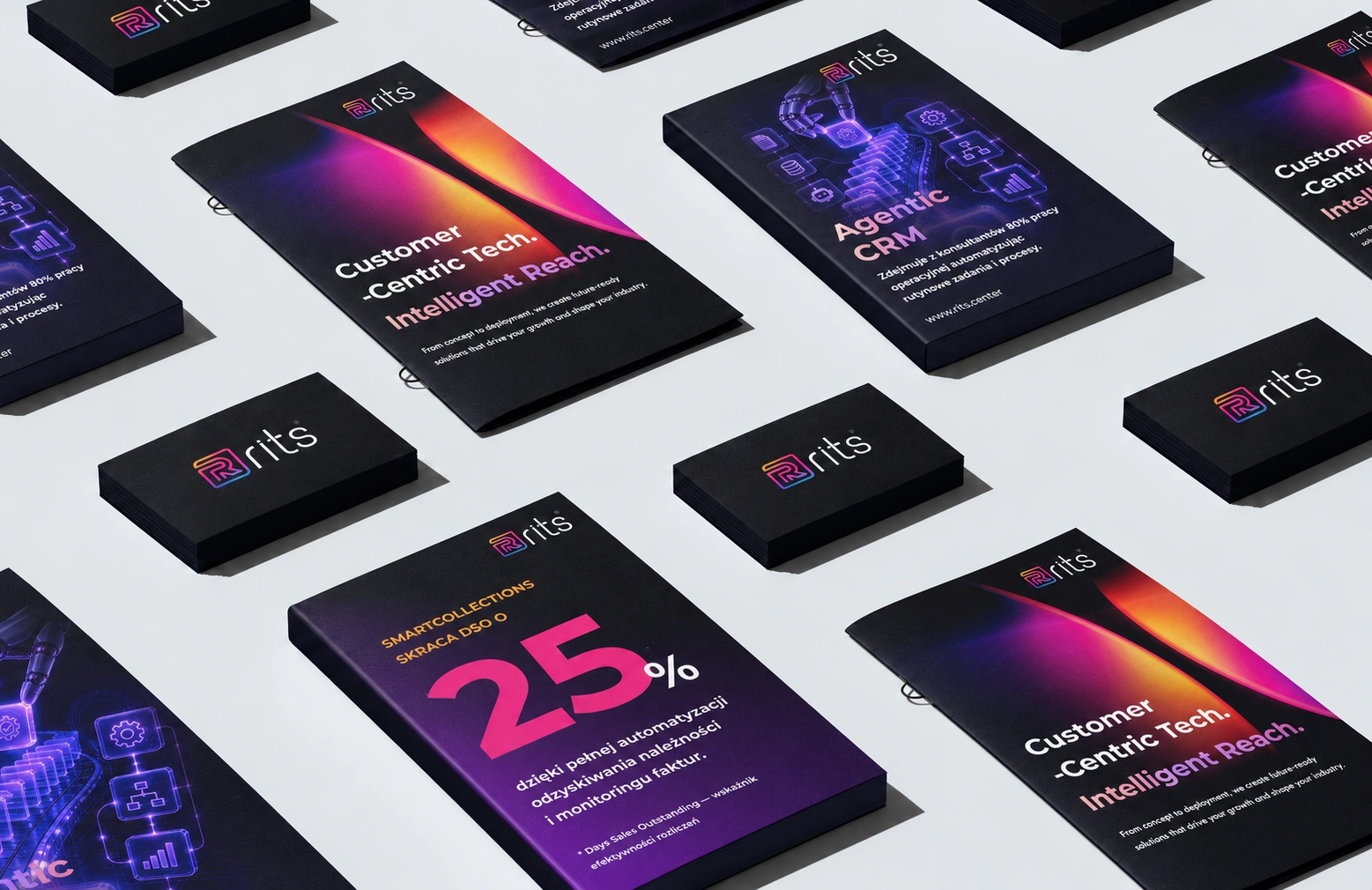
Printed materials
Campaign folders, brochures and business cards. A dark foundation, gradients and clear typography bring the offer materials into one collection.
Brand application concept · mockup
View the original artwork
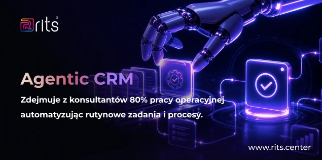
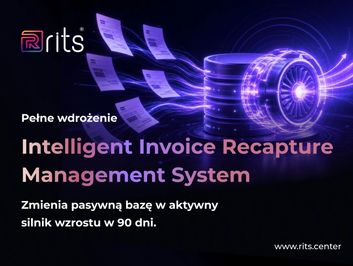
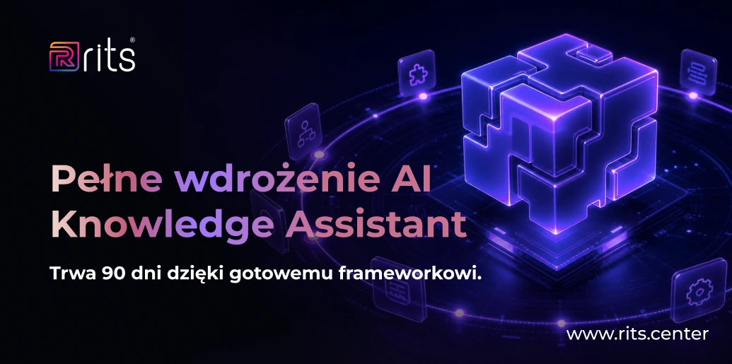
09
One message. At scale.
The original display artwork. A strong headline, contrast and the signature arc focus attention on the brand message.
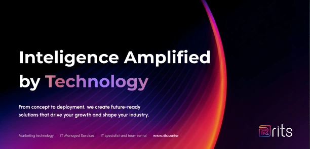
Selected RITS design materials. Photographic mockups present brand application concepts.
Written by: Kosma Lenar Brand & Digital Design
0 likes · 4 views · Oct 15, 2026
A consistent visual language for RITS across its website, campaigns, events and print: typography, colour, light and original brand assets.
