Redefining Minimalism
Baite Studio

Note: This is a mock case study based off a local firm.
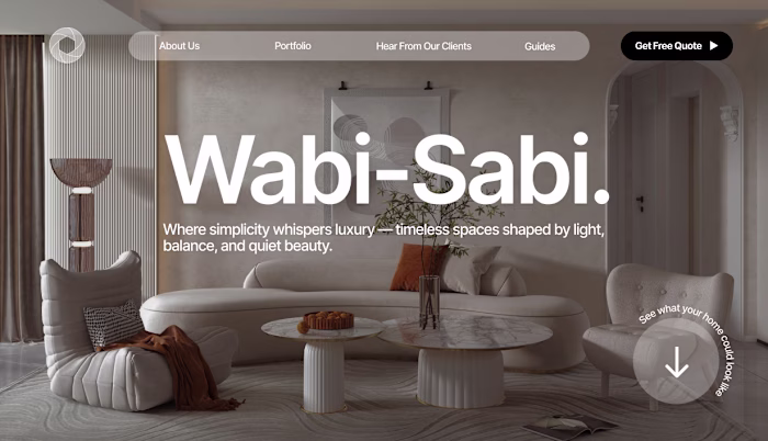
Redefining Minimalism Online
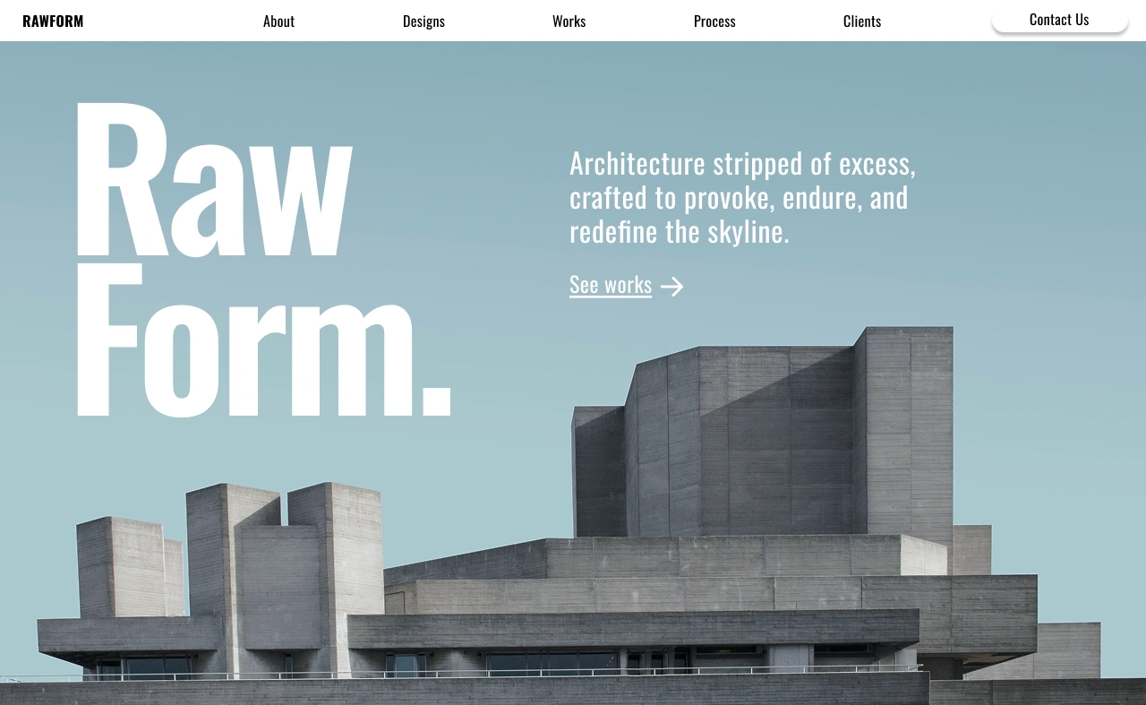
We rebuilt Rawform's digital identity from the ground up.
Despite designing some of the most striking minimalist structures in the city, their digital presence felt inconsistent — cursive graphics, poor typography hierarchy, and cluttered layouts diluted the power of their brand.
Inspired by the firm’s brutalist architecture, the new design embraces clean grids, stark contrasts, bold typography, and restrained color palettes.
Every page breathes structure and precision, reflecting Rawform’s philosophy: where minimalism isn’t about less, but about intention, clarity, and form.
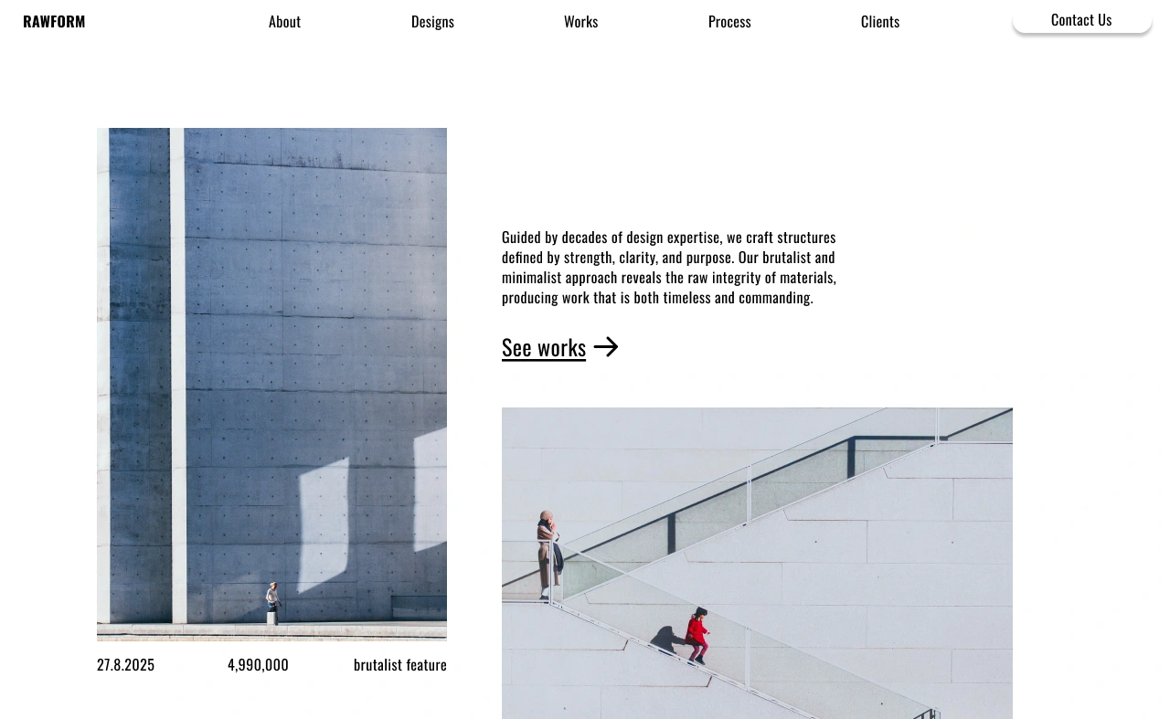
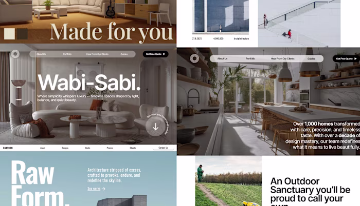
Gallery showcase, emphasizing storytelling with a unconventional minimalist grid
We incorporated unique layouts that disrupted traditional website styling and grids, which featured the minimalist architectural style Rawform adopted.
Like this project
Posted Nov 3, 2025
Rebuilt Rawform’s digital identity into a bold, brutalist-inspired experience. A statement with clean grids, sharp contrast, and modern minimalism redefined.
Likes
1
Views
10