Reciperie App Redesign
Jordan Sinclair
Every time I scroll down on my Dribbble profile I see my old Reciperie design and have to scroll right back up because it was terrible. It was my first post, and I'm happy I did post it because it is cool to see how much I've grown as a designer since then. But, I decided now would be a good time to redesign it because it's been over three years since I made the original.
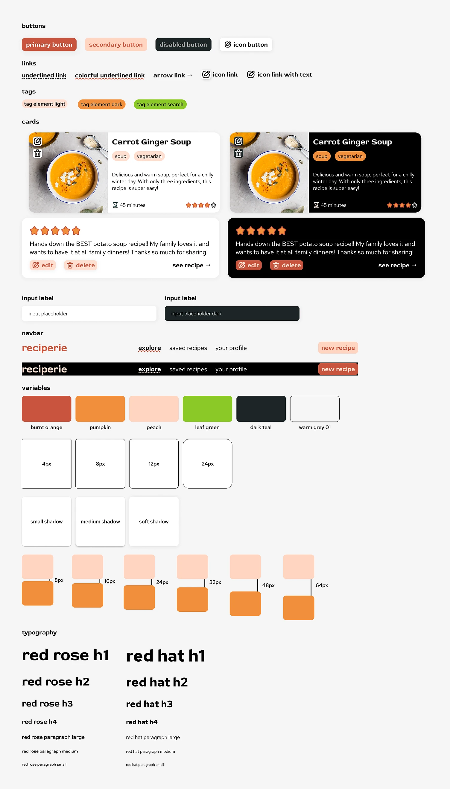
Design Kit
I started out by thinking about what the brand should represent. Looking back at the original design, it seemed like the (fictional) company's goal was to make healthy eating fun with advanced preference options and semantic searching (although I definitely didn't think it through that far back then). My original design used some, let's say interesting, color options to convey that sense of fun. But I think we can achieve that with some more sophisticated choices. The full brand kit is shown above, but I'll dive into a few of the choices I made below.
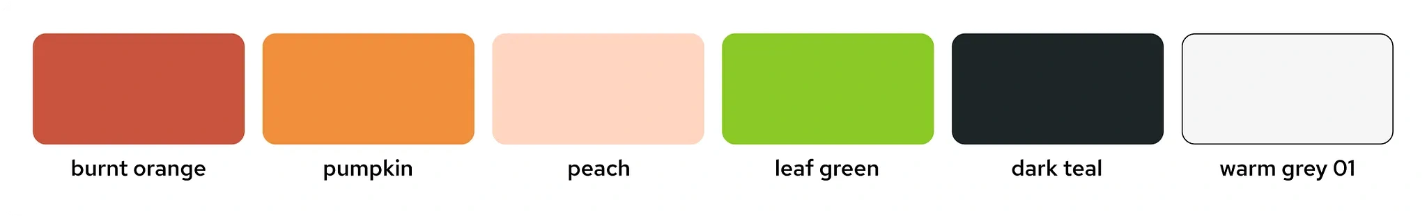
Colors
I wanted to convey a sense of vibrancy and fun, while keeping things easy to use and readable. I chose a color palette consisting of a few oranges and a green. This is a more natural and food related palette that I think matches better with the intended use of the website. Also having a variety of lighter and darker color tones will help provide better user experiences in both light and dark modes.
Fonts
I chose to use Red Rose and Red Hat together in the design. Red Rose is a little more unique, giving a hint at the fun energy the recipe app is meant to convey. Red Hat seemed to complement that well but be more of a traditional sans serif that might be more readable. In hindsight, I think I probably could have just gone with Red Rose for everything, but maybe I'll revisit that in another three years 😆.
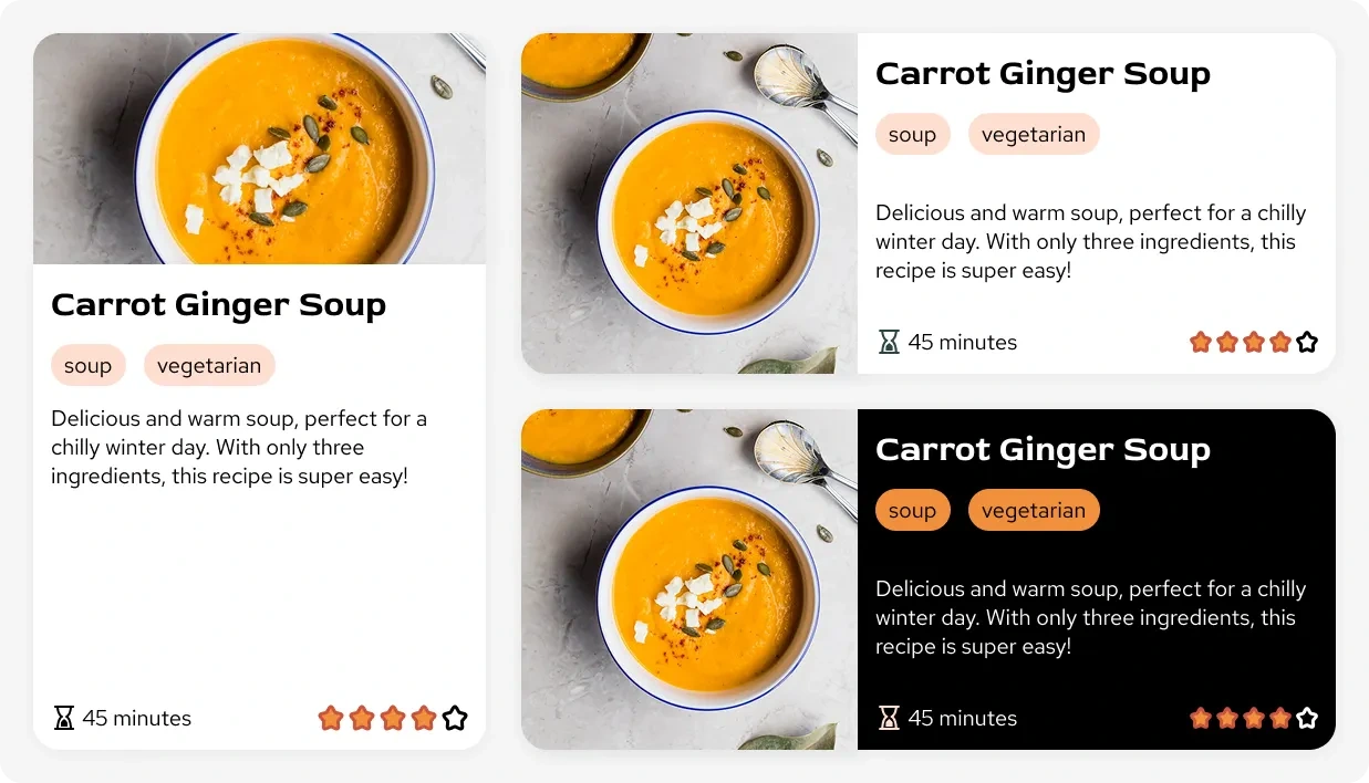
Cards
I made a few different card versions for recipes and reviews. The recipe card features the name of the recipe, tags, a description, time it takes to make, the overall rating, and an image. I tried both a horizontal and vertical layout for the image to content flex box. I think I like the horizontal better, but I left both in the design because I thought the vertical cards might be used as a featured recipe section or something like that.
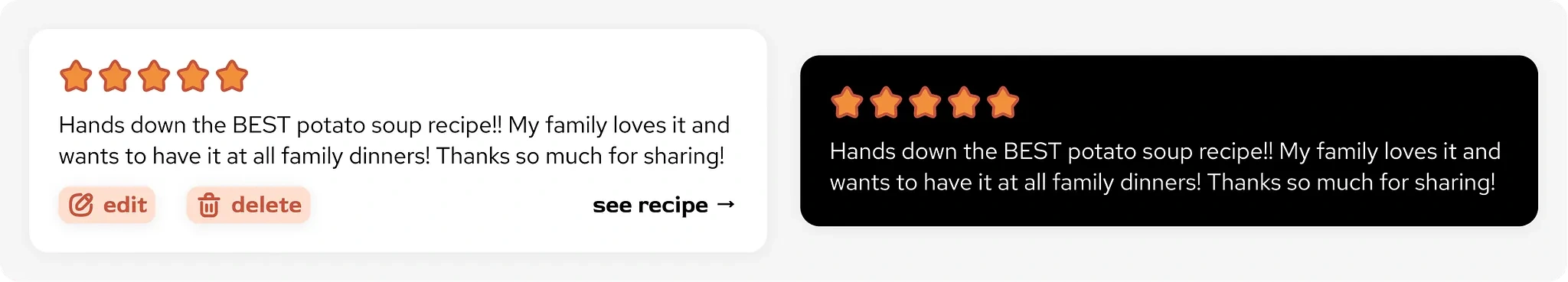
The review card component was pretty simple, just showing the number of stars given by the reviewer, and the text. I also added an optional bottom row for editing, deleting, and jumping to the recipe if the card was being used on the user profile page.
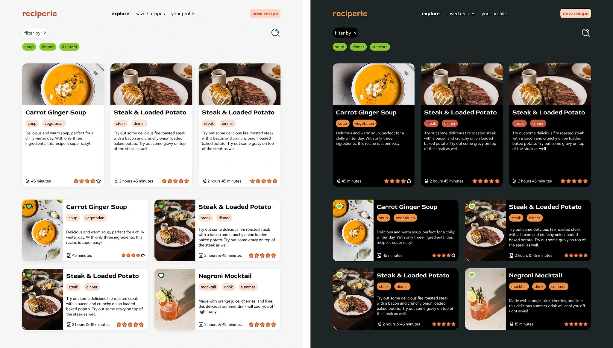
Recipes
This page would likely be the first place that users come to when looking for new recipes. They can search, and filter by recipe tags. To start, the tags are auto-populated with the users indicated favorites, aligning with the brand goals of making healthy eating easy. Like I mentioned above, I thought the vertical card format could be used here as indicating a featured recipe, or perhaps one that closely matches the tags.
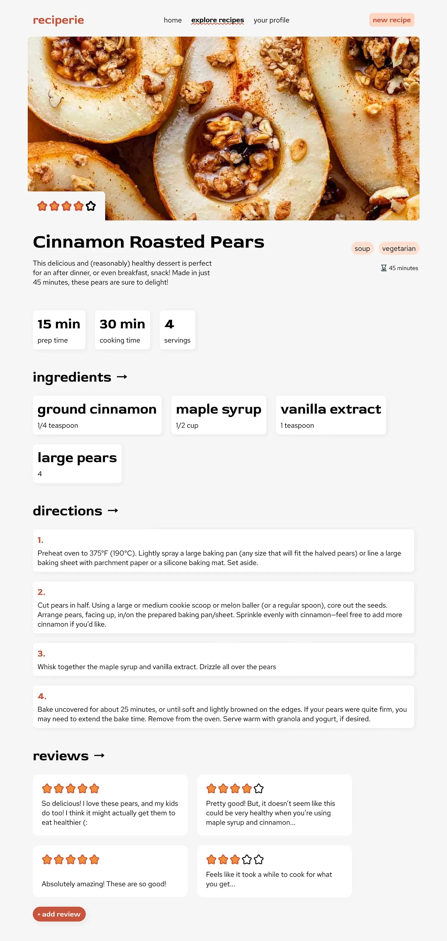
Recipe Page
If the user clicks on one of the cards on the explore page, they'll be taken to the recipe details page which shows instructions, reviews, etc. I tried to emphasize the feeling of fun and excitement through this design, while keeping it simple and readable. I thought a large hero image would bring users in, and I cut out a corner of the image to show the rating to give some visual interest. The prep time, cooking time, and servings were shown in containers, as well as the ingredients. I also used a larger font for this because I found it to balance the directions containers nicely, and give a sense of whimsy.
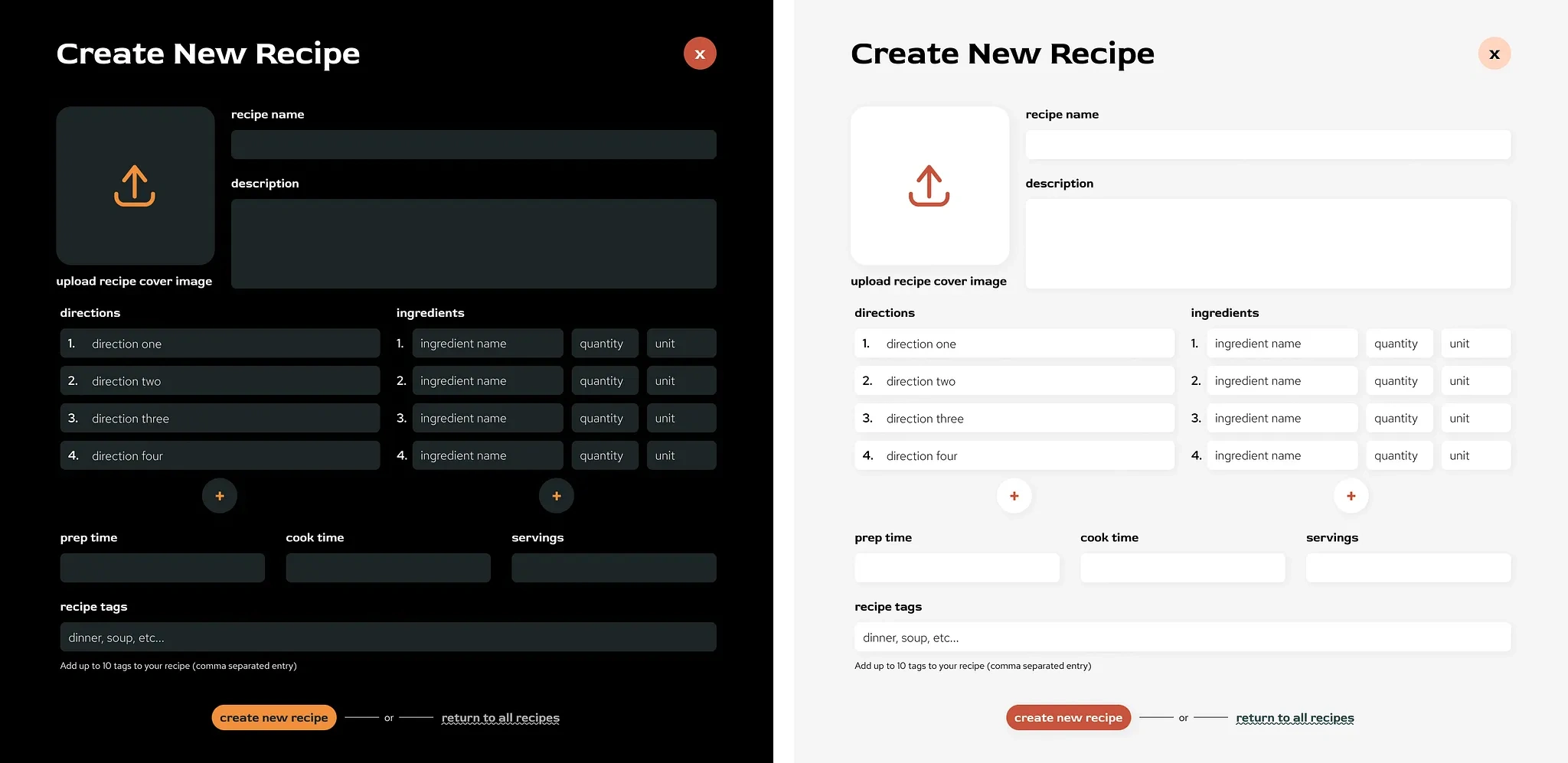
Create New Recipe
This form would be used to create or update a recipe. It would be brought up as a popup page, hence the close button. The directions and ingredients inputs would be expandable to allow as many entries as desired. The ingredients each have a name, amount, and unit input as well, forming a group. This was designed based on the backend I created for class. I decided to use a large image upload button to add visual interest to the form, and because the image that is uploaded would be used as a cover and for the hero image of the recipe page (i.e. it is pretty important for the recipe to be noticed by other users). I designed a dark and light mode version here as well, mainly changing the background and input colors, and the burnt orange was swapped to pumpkin in most areas.
Users
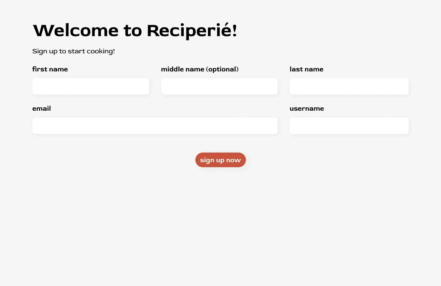
Sign Up
This form was used when users first sign up, or to update their account details. I might have designed this differently if it wasn't for a class project, but we had a backend schema set up already before working on the frontend and I wanted to make sure my design would work with that. The form follows the same styling as the recipe creation form. And if the user was updating their account, the fields would be auto-populated.
User Profile Page
I'm pretty happy about how this came out! The user profile is a place for the user to see all of their details, add preferences, see the recipes they've created and add more, and see their reviews. They can also update or delete their recipes and reviews here.
Thanks for Reading!
I think that's about it for my redesign! Let me know what you think, and if you have any feedback or suggestions they would be appreciated!
Like this project
Posted Feb 8, 2026
Redesigned the Reciperie app to improve aesthetics and functionality. Implemented backend with MongoDB and frontend with React.