Panda Bank — Visual Adaptation Series

Trista Sia


Description
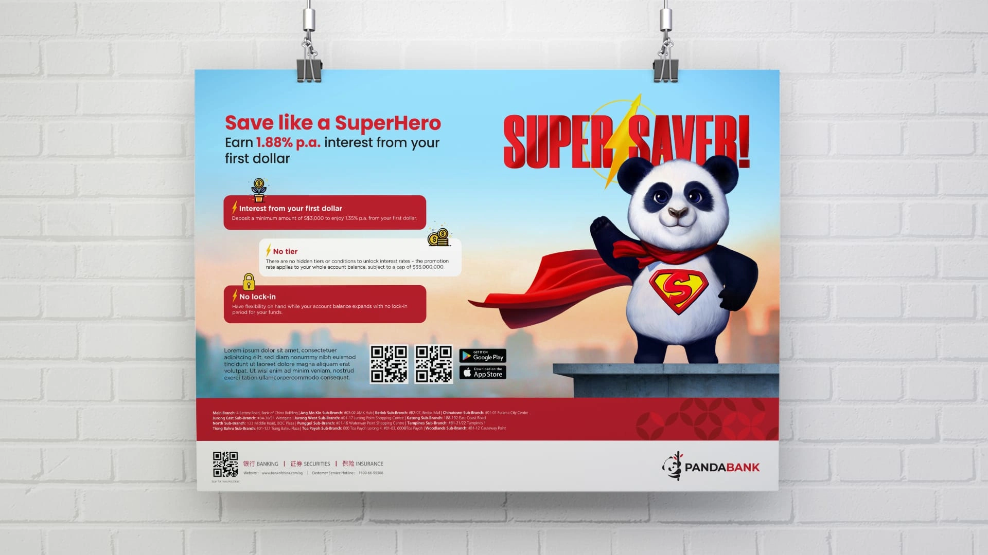
This fictional campaign demonstrates visual adaptation across both print and digital platforms. The concept “Super Saver!” features a superhero-style panda symbolizing savings power. The Key Visual (KV) was designed to be adaptable, ensuring a consistent brand message across various touchpoints. Design adjustments were made to suit different media, optimizing readability and visual impact while maintaining clarity and cohesion.
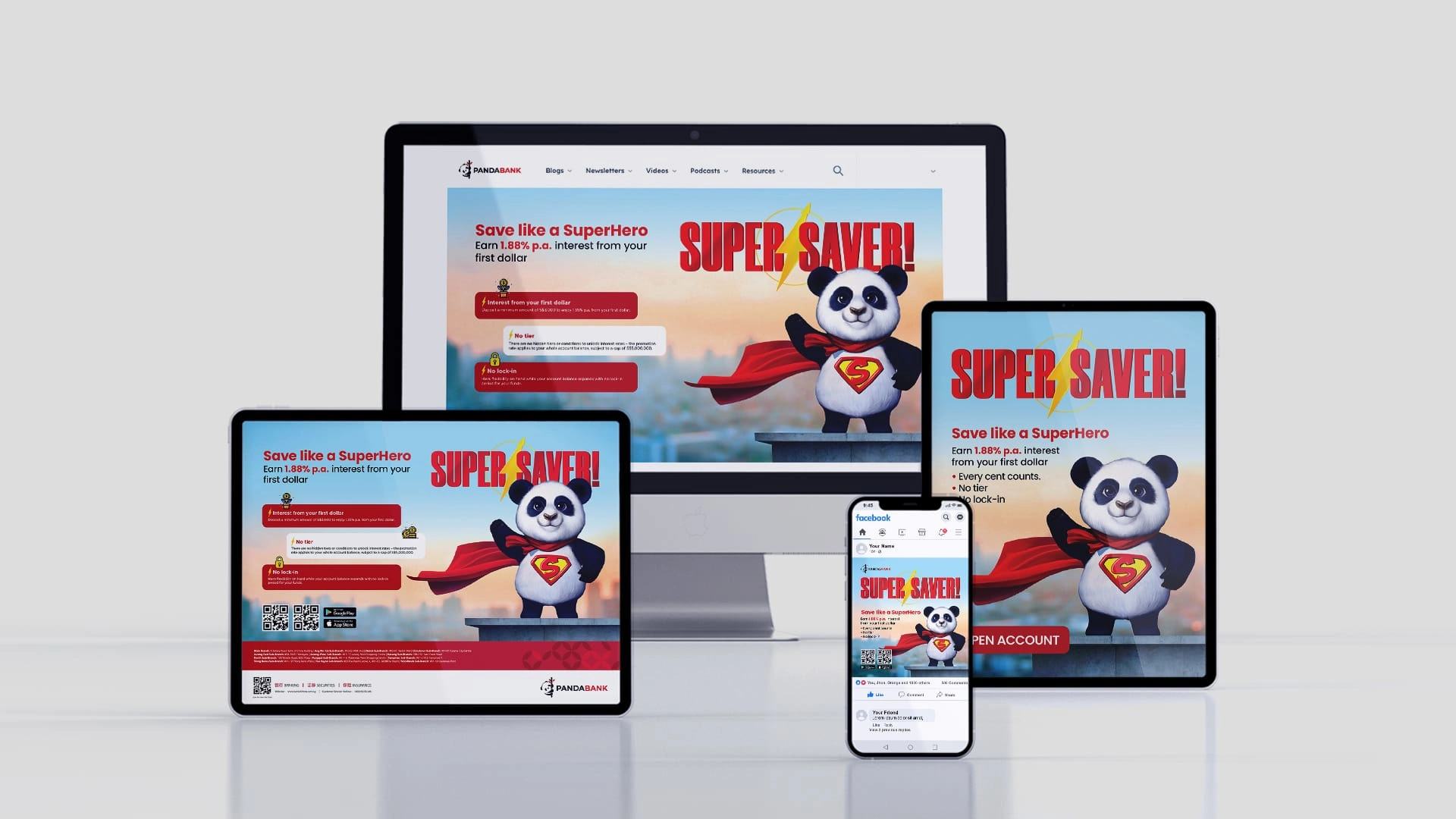
Website hero, tablet promo & mobile ad – adapted for digital platforms with responsive layouts.
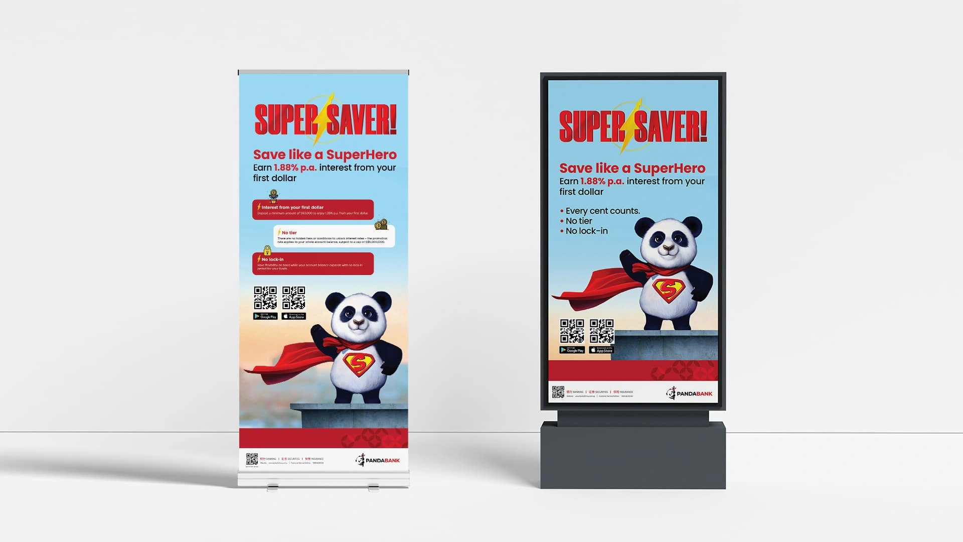
In-branch TV screen & roll-up banner – designed for high-visibility on-site promotion.
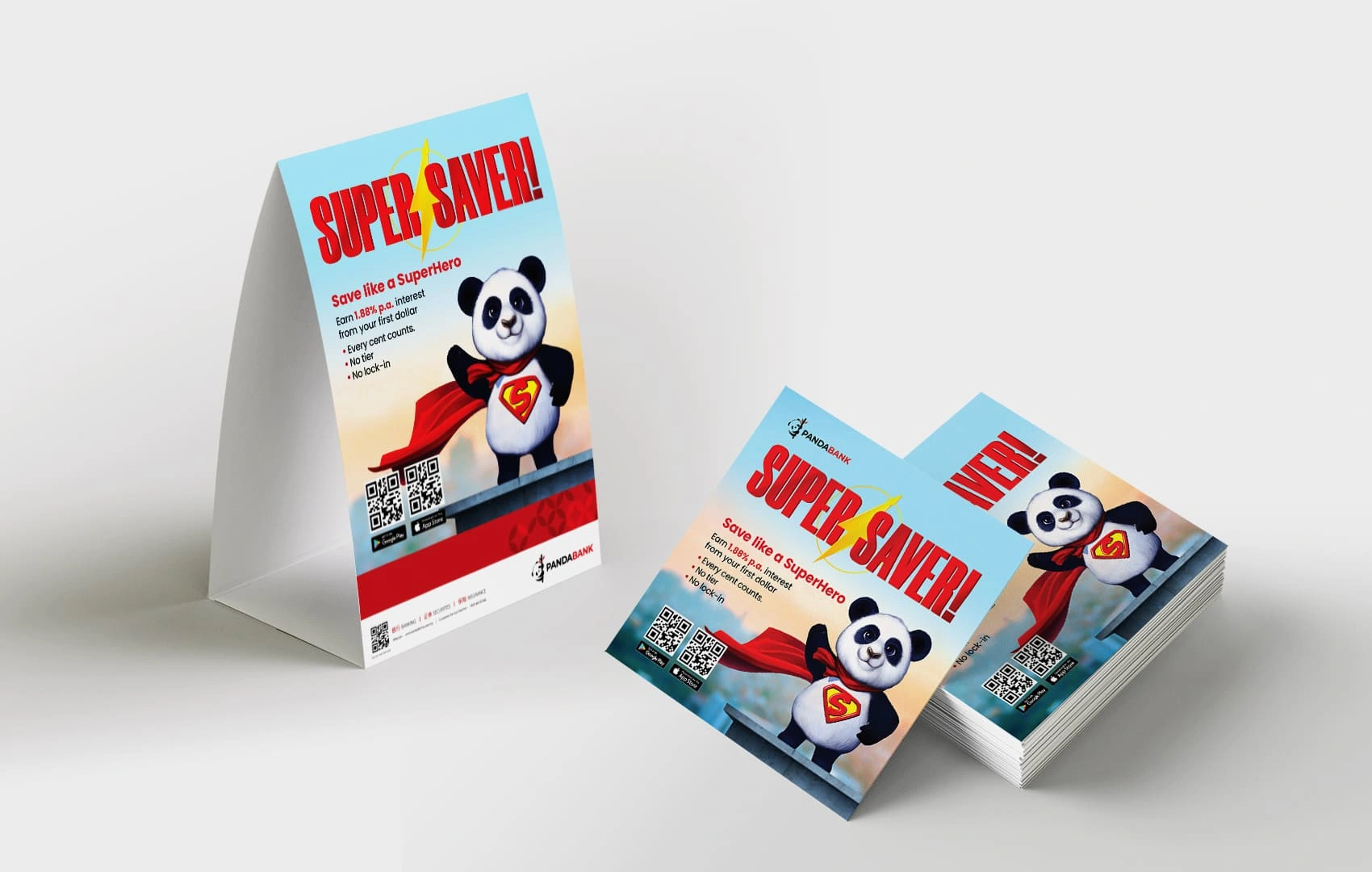
Table tent & takeaway flyer – compact formats for physical branch touchpoints.
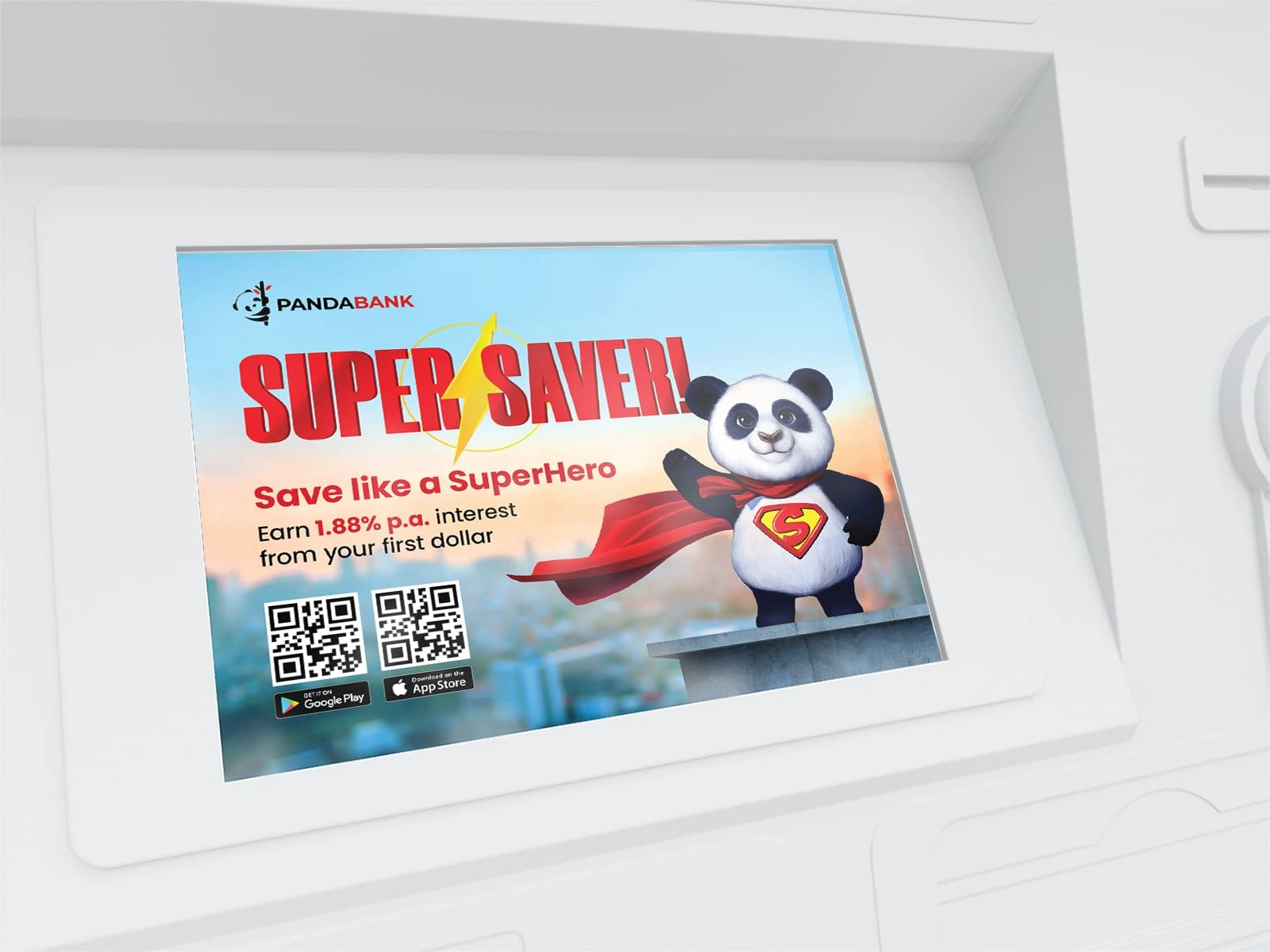
ATM interface promo – clean visual hierarchy for small screen impact.
Discover more of my branding, event, and print design projects in my full portfolio: https://trista.my.canva.site/intro
Like this project
Posted Apr 26, 2025
A social media and print adaptation series based on an existing campaign key visual. Designed to ensure brand consistency across formats.


Elora — Logo Guideline & Brand Identity
RedRum Logo & Label Design