Brand Strategy and Visual Identity for Seido Matcha

Sevd Atas


Brand Strategy & Visual Identity
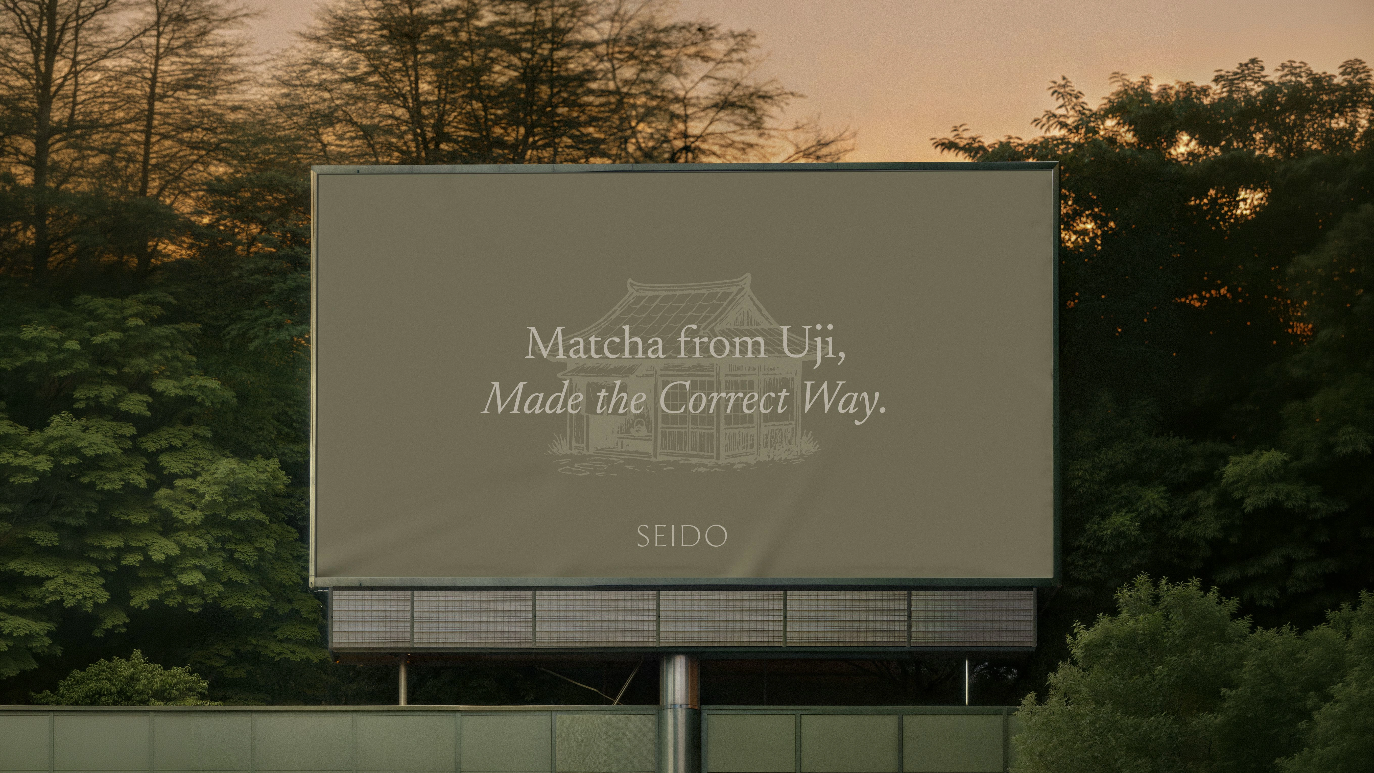
Seido is a heritage-led matcha brand rooted in Uji, Japan, the historic heart of Japanese tea. Meaning “the correct way,” the brand was built around a simple idea: honoring matcha as a centuries-old ritual rather than treating it as another wellness trend.

The Direction
The identity needed to feel calm, considered, and deeply connected to tradition while still working within a contemporary brand landscape.
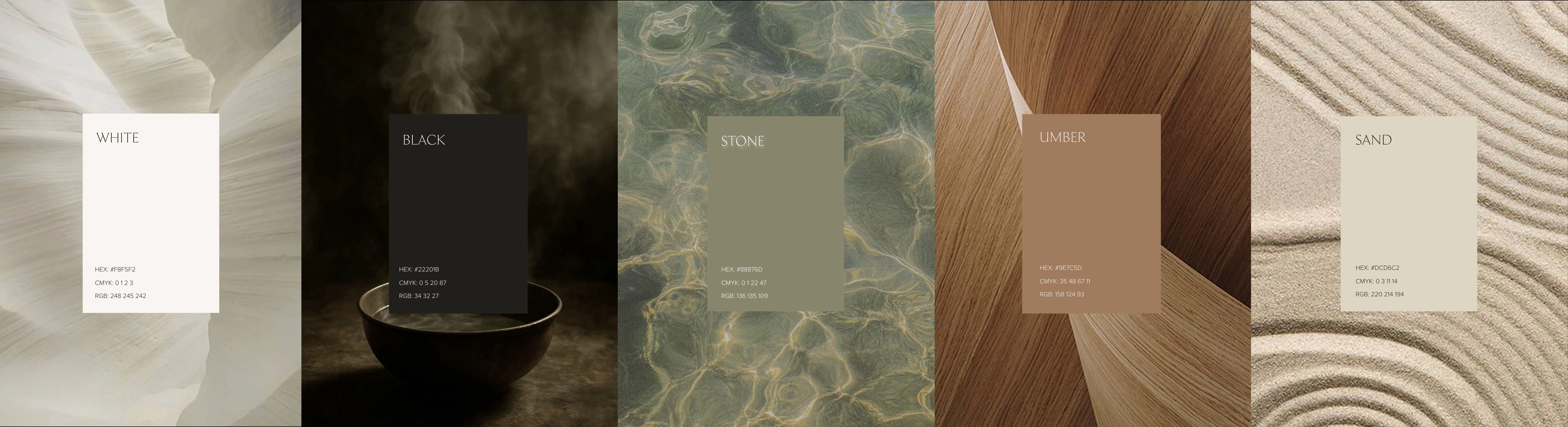
The visual direction was shaped around purity, natural materials, and the imperfect beauty of traditional Japanese craftsmanship.
The Identity
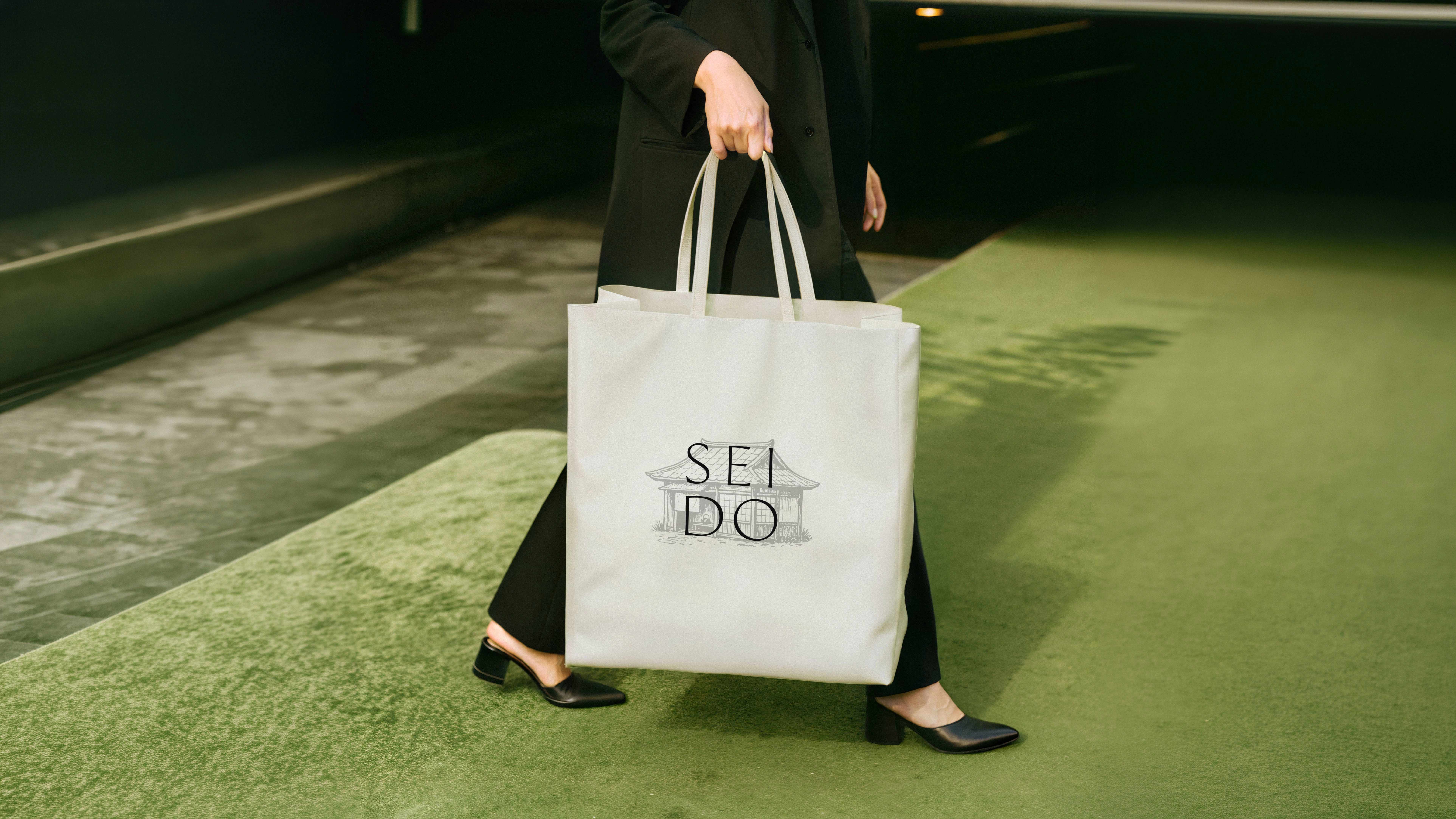
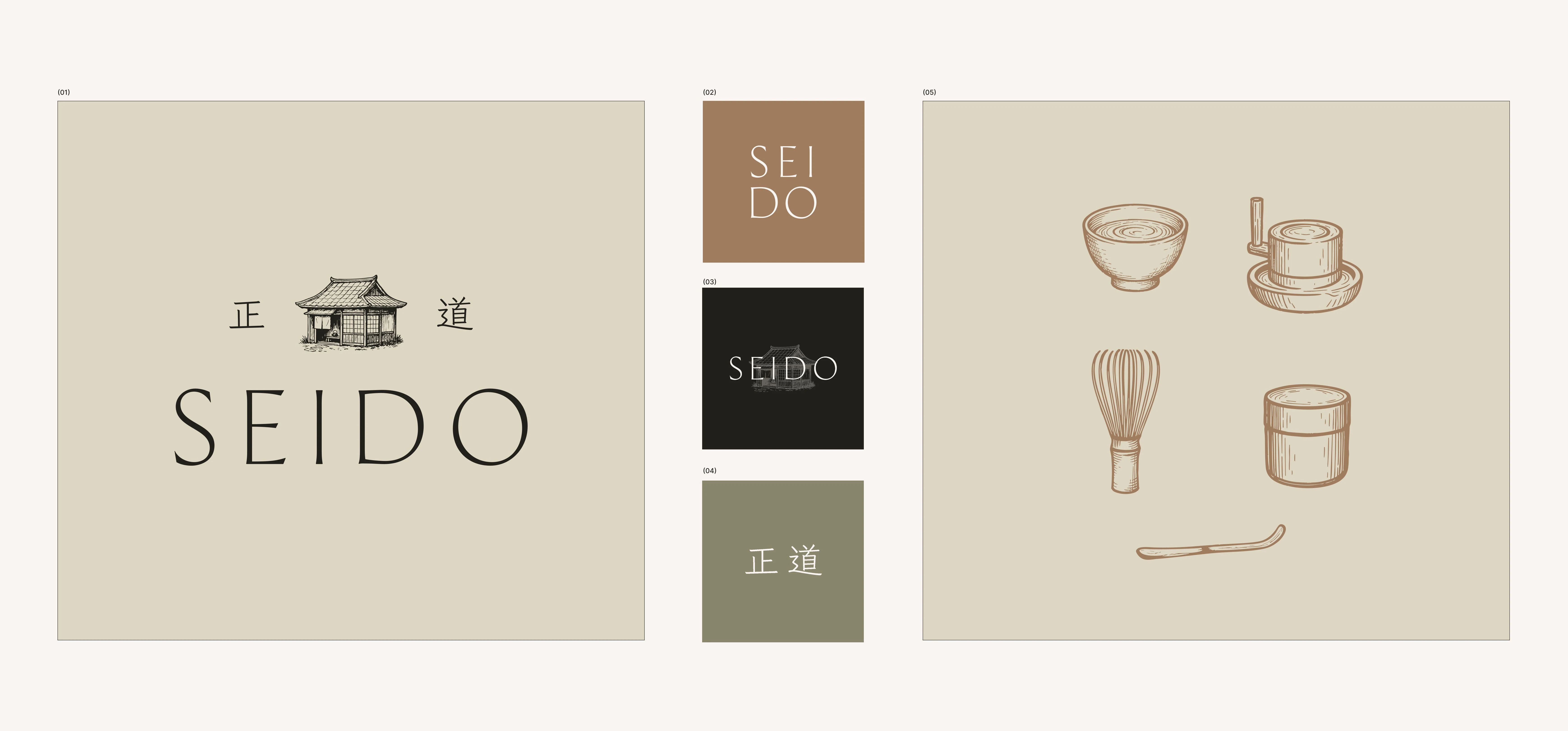
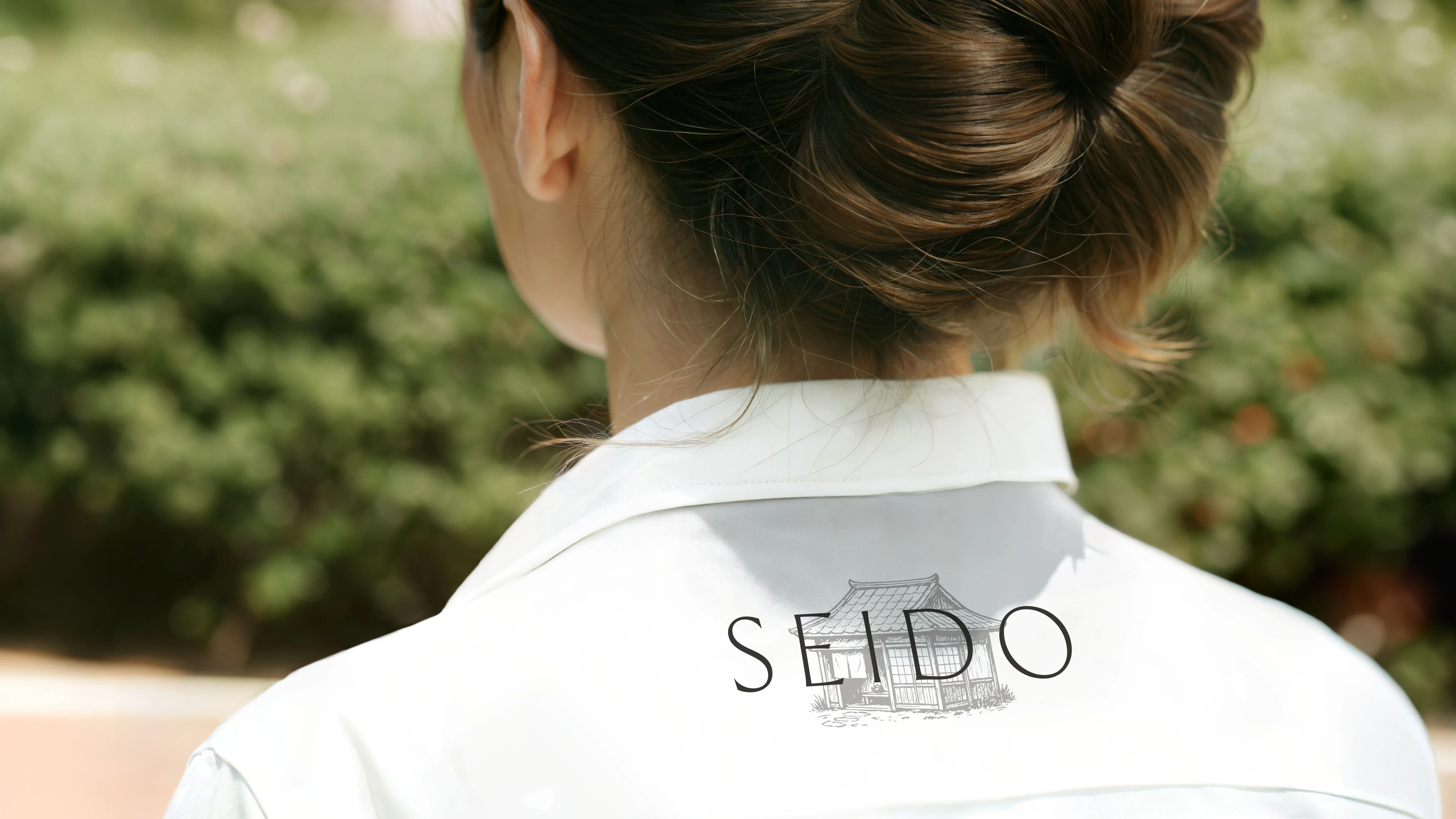
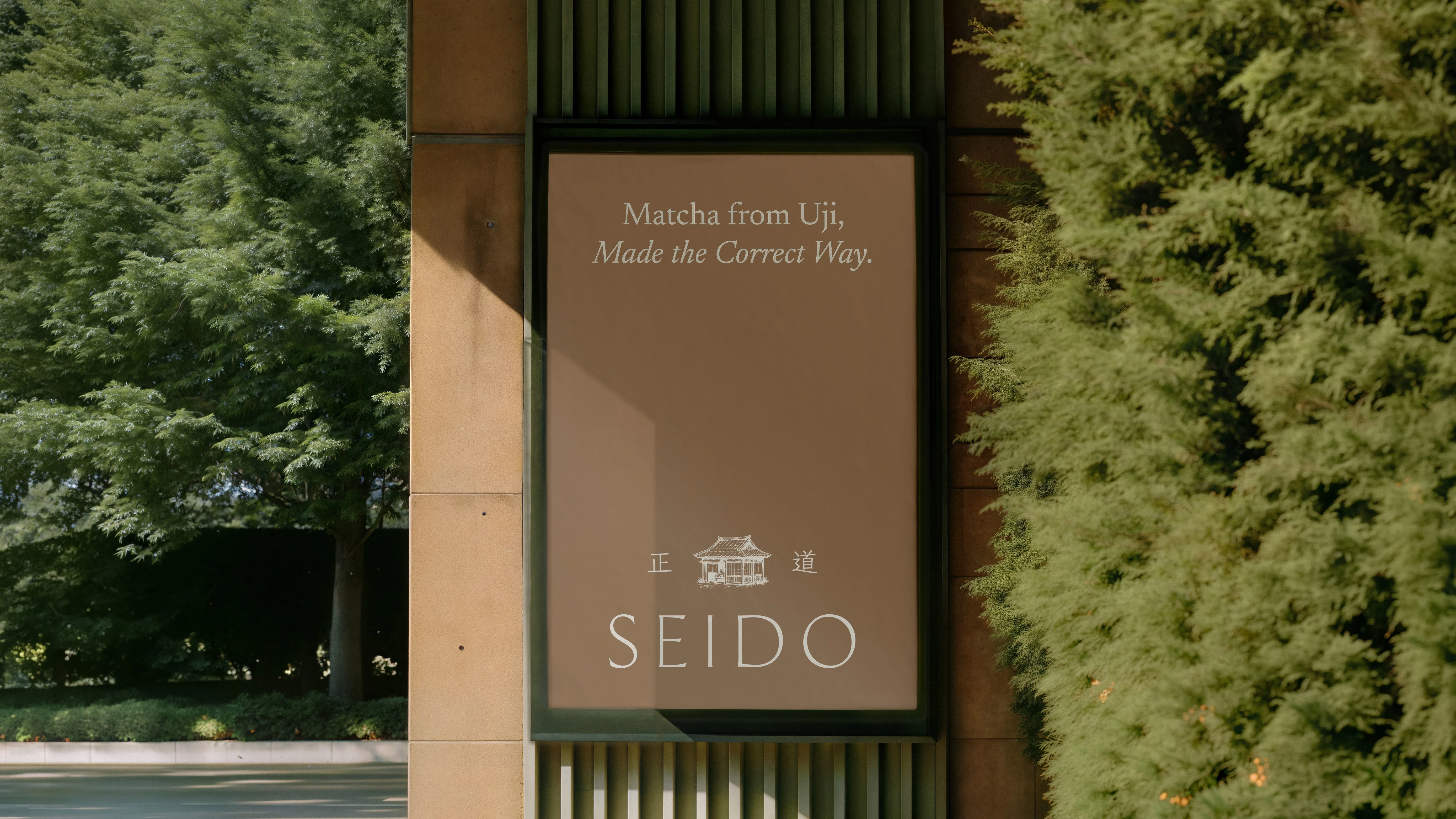
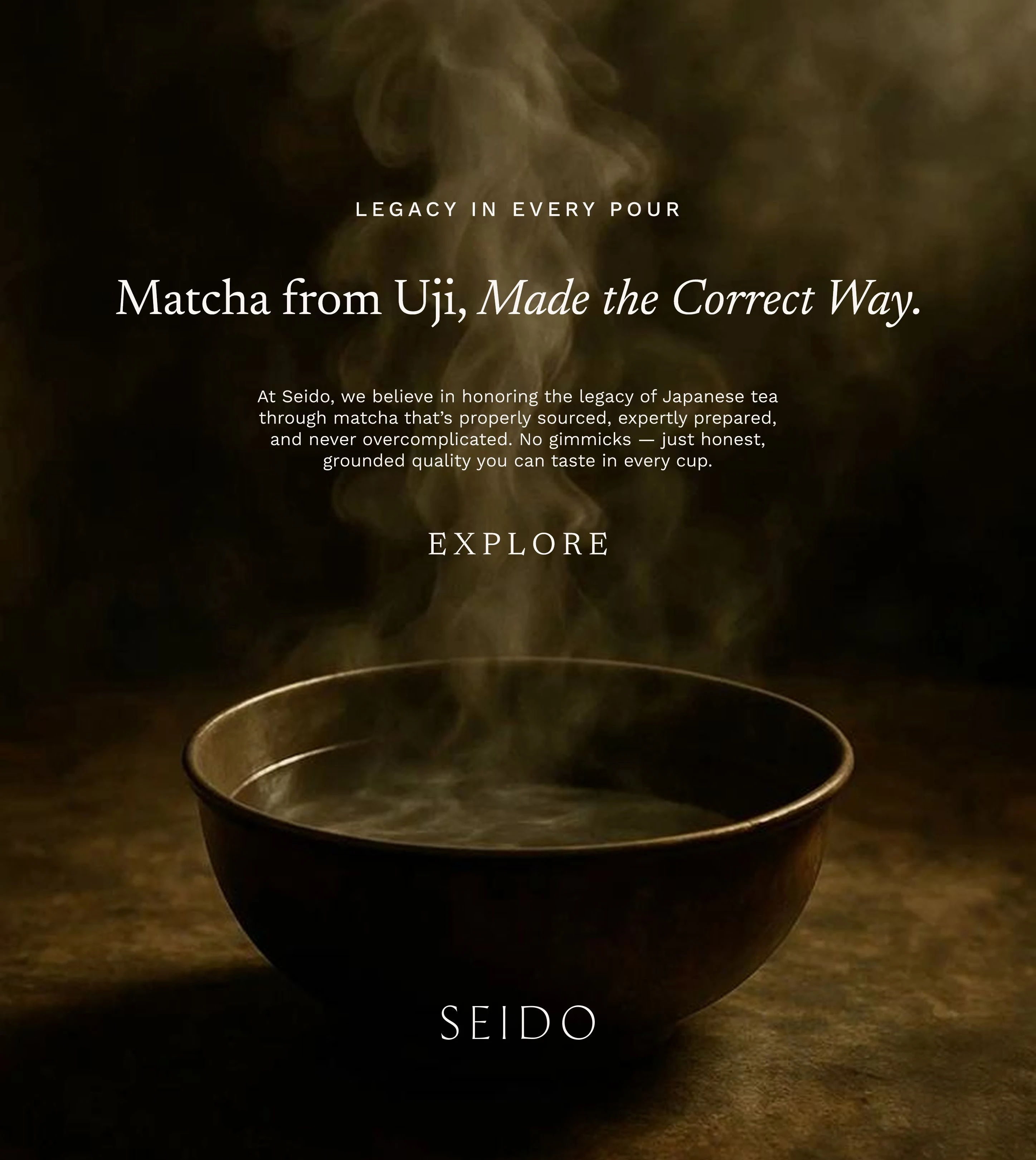
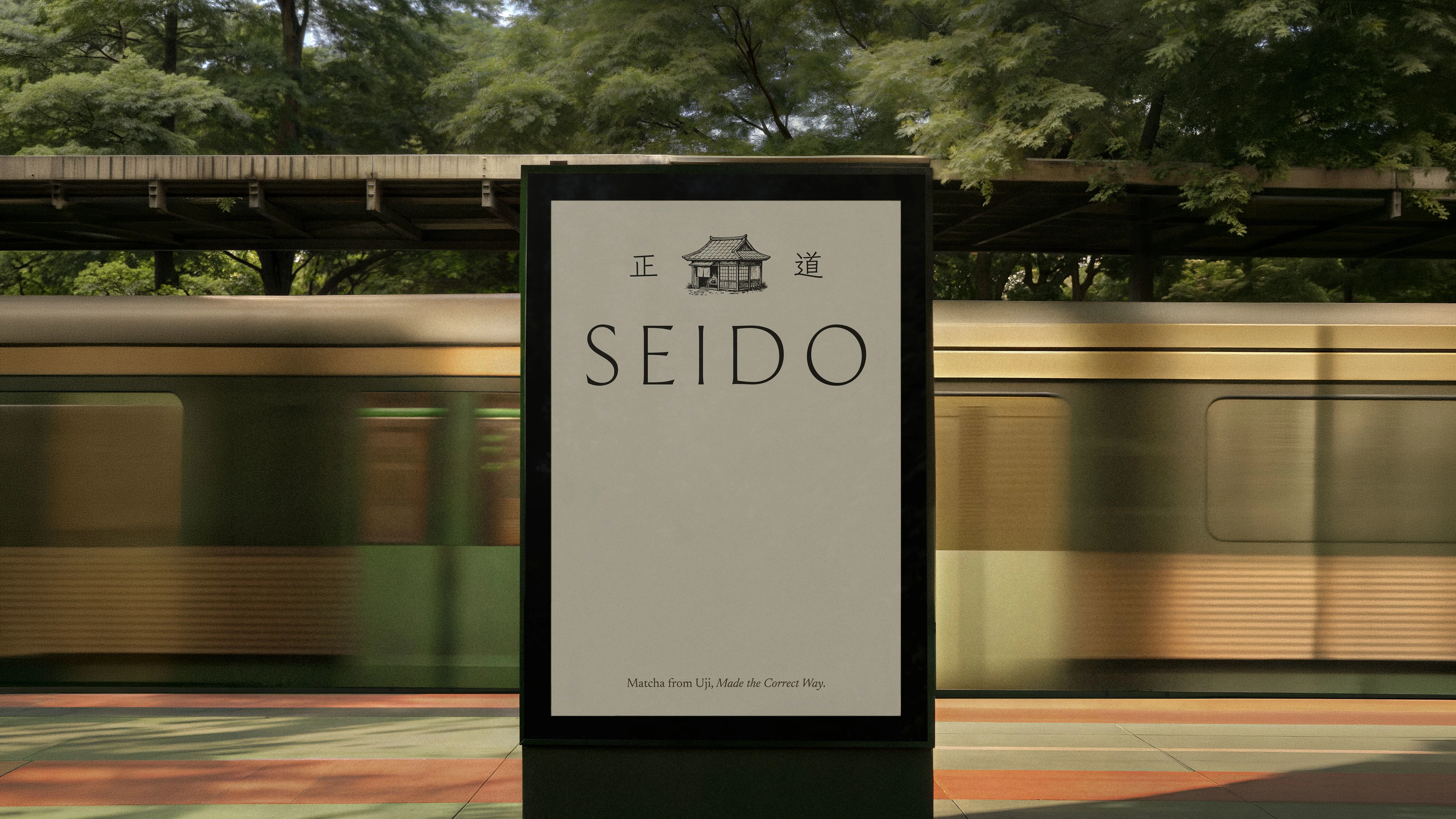
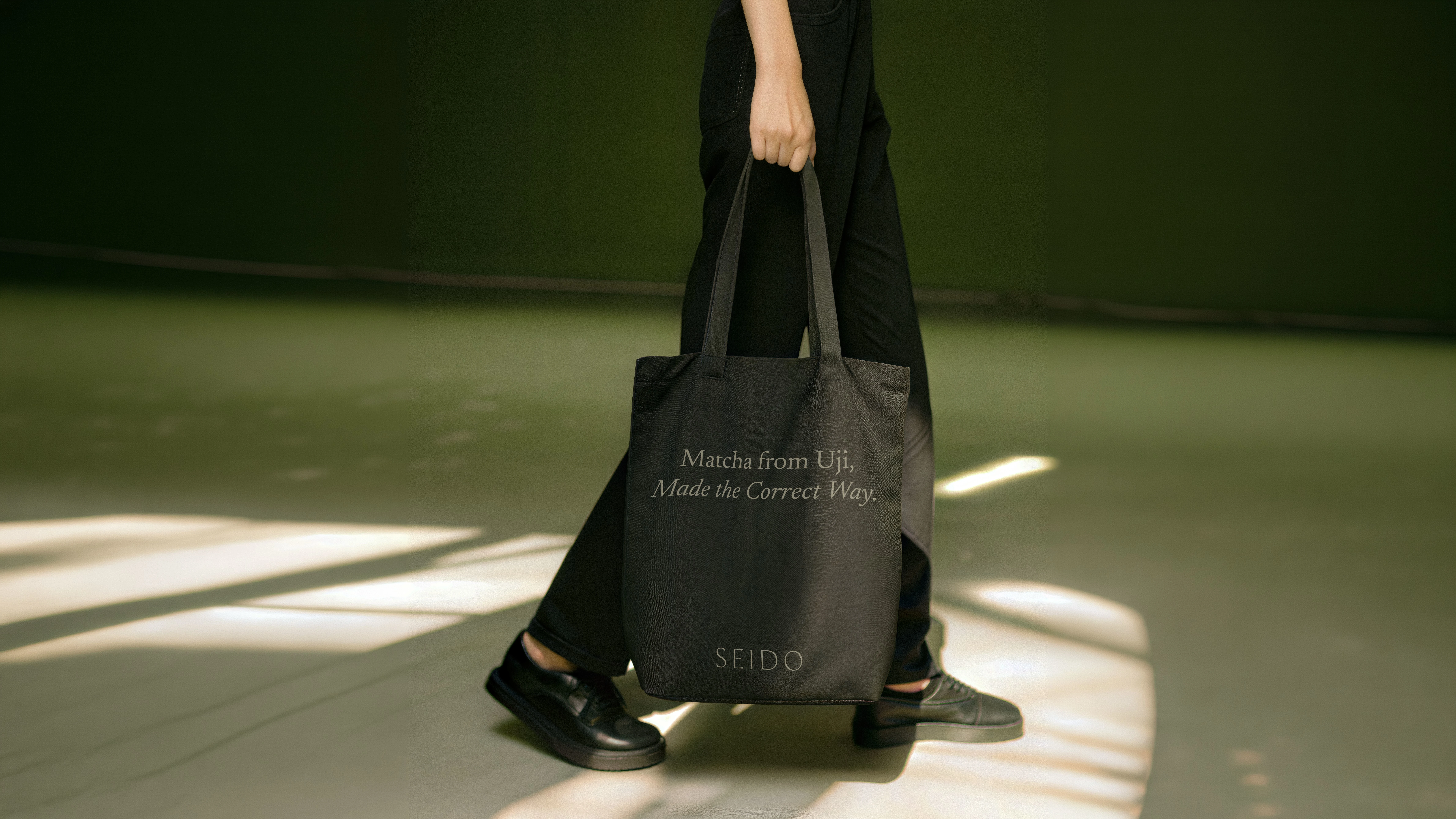
A refined, minimal wordmark forms the foundation of the identity, paired with a hand-drawn Japanese tea house illustration and kanji representing Seido’s meaning, “The Correct Way.”
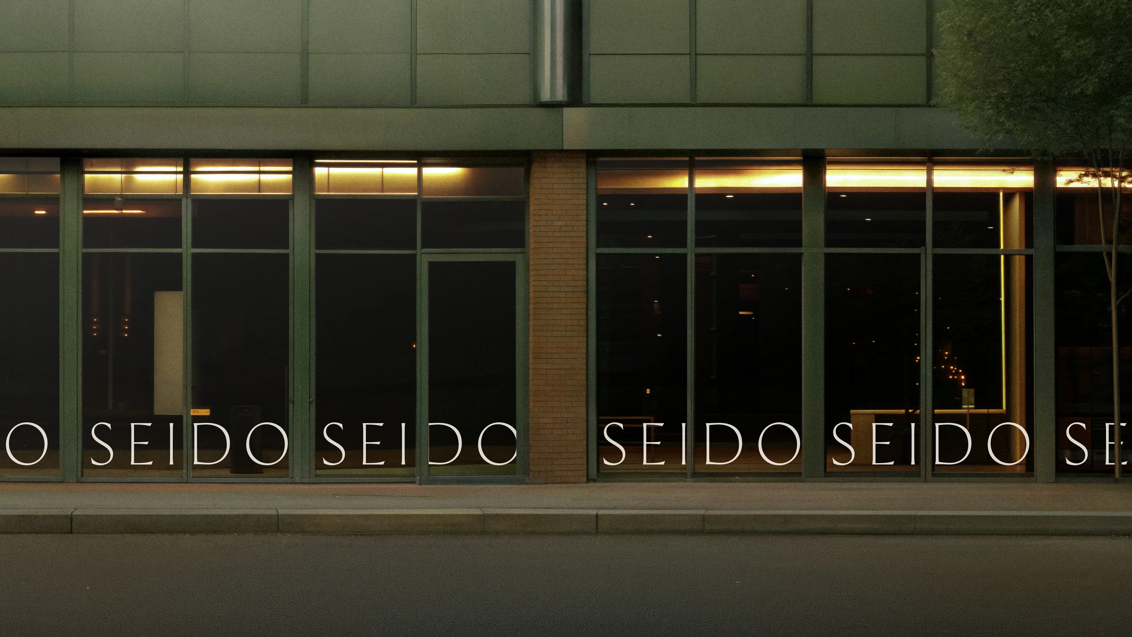
The wider visual system uses earthy greens, warm browns, soft neutrals, textured illustrations, and understated typography. Every element was designed to feel grounded and timeless, creating a brand that celebrates the ritual, craft, and history behind matcha.
Like this project
Posted Aug 27, 2026
Developed a brand strategy and visual identity for Seido, a heritage-led matcha brand.
Likes
14
Views
397