RANGE
Yordani Awono
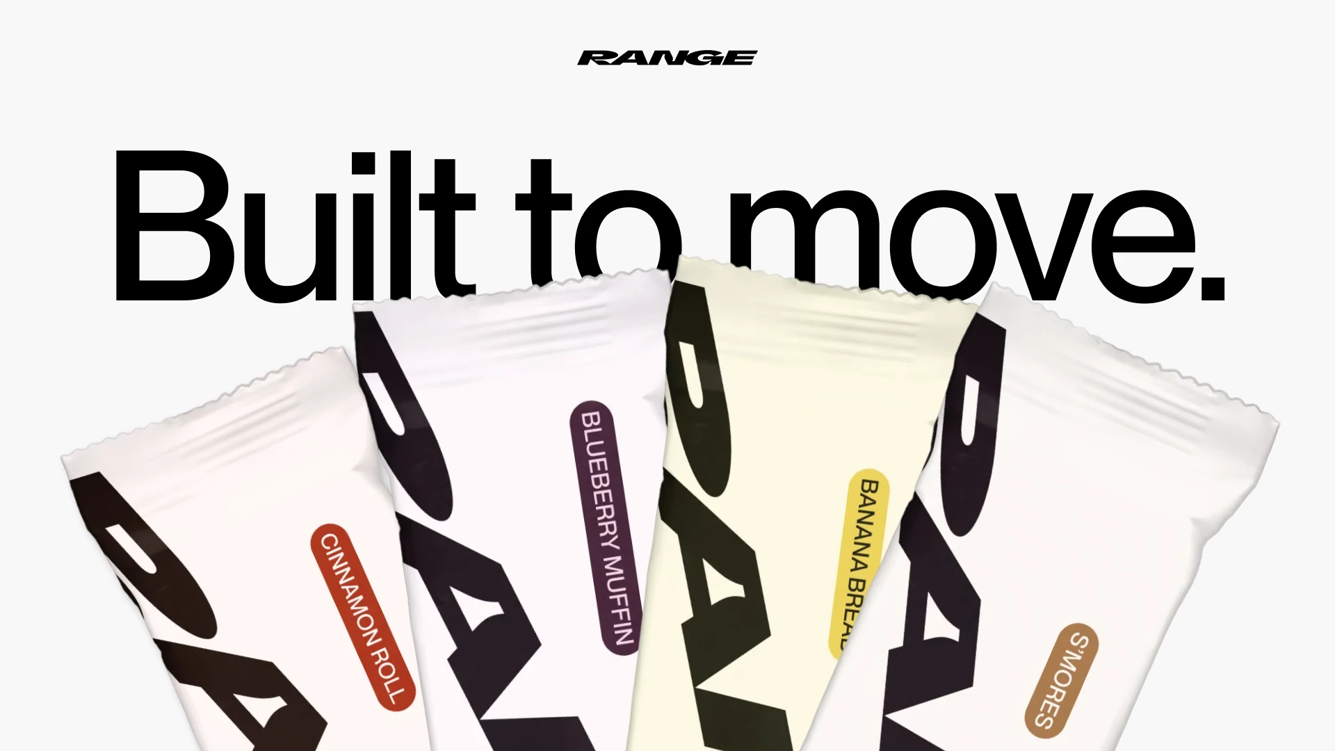
Range Protein
RANGE Protein is a protein bar brand built for people who stay in motion. Made with whole, recognizable ingredients and familiar flavors, RANGE challenges the category norm of bland diet food packaging with a more energized point of view.
I led brand strategy, logo design, and packaging design for RANGE as a speculative exploration focused on rethinking how protein bars show up in everyday life. Many existing brands rely on flat compositions and dated color and type that feel more clinical than motivating.
RANGE’s identity is built around movement, capability, and versatility. Designed for active working professionals balancing early mornings, long days, workouts, and real life.
To express motion, I used an italicized, slightly stretched wordmark and subtle rotation in the packaging composition. Flavor callouts use a classic sans serif and color to create clarity at shelf and connect flavor to taste. For advertising, I explored black and white imagery with motion blur to represent movement.
The result is a visual language designed to fuel both work and play.
Moodboard exploring how typographic angle, hierarchy, and color can communicate motion in packaging.
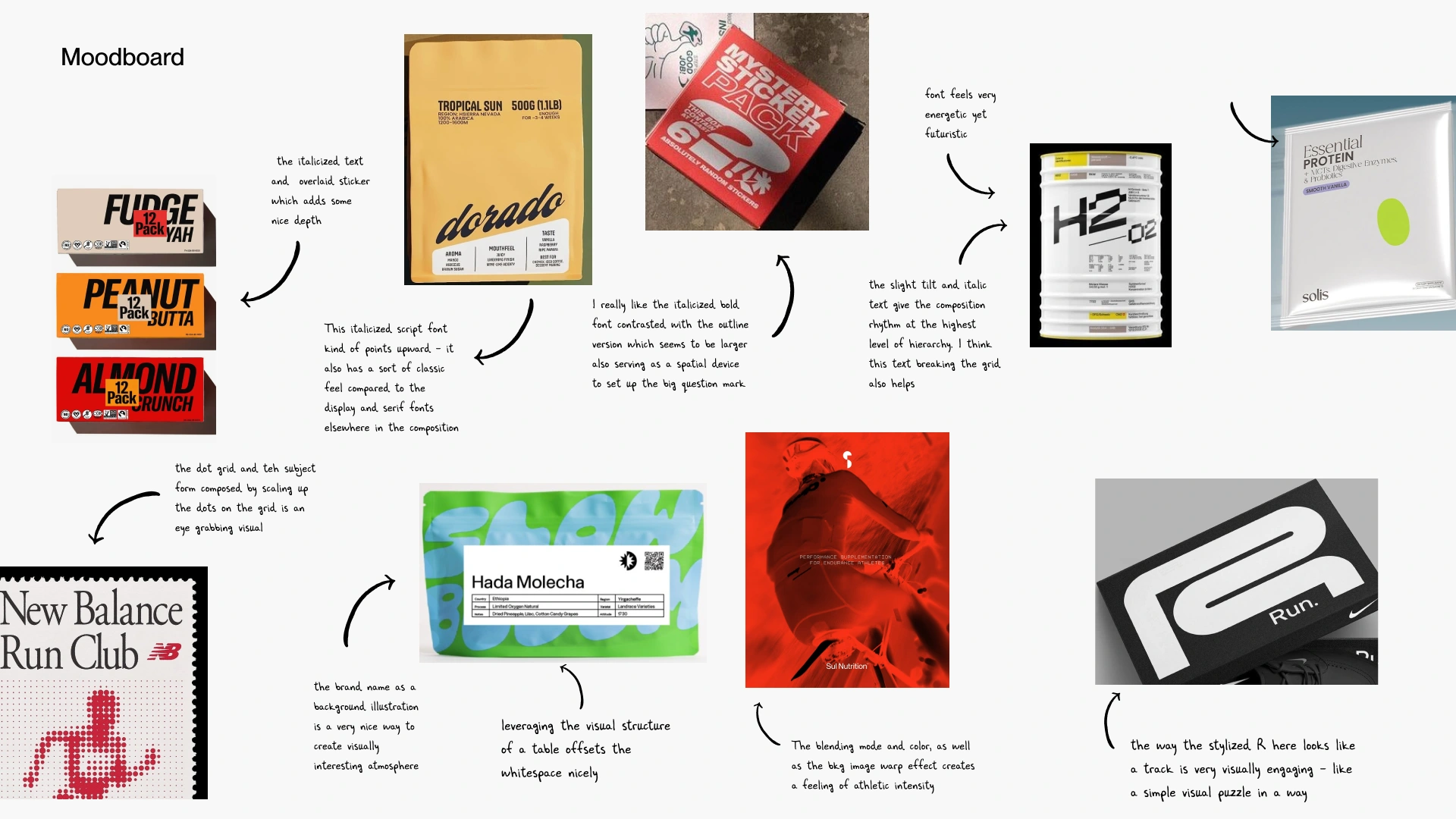
Moodboard
Early layout sketches exploring logo placement, hierarchy, and pacing across the wrapper.
Layout sketches
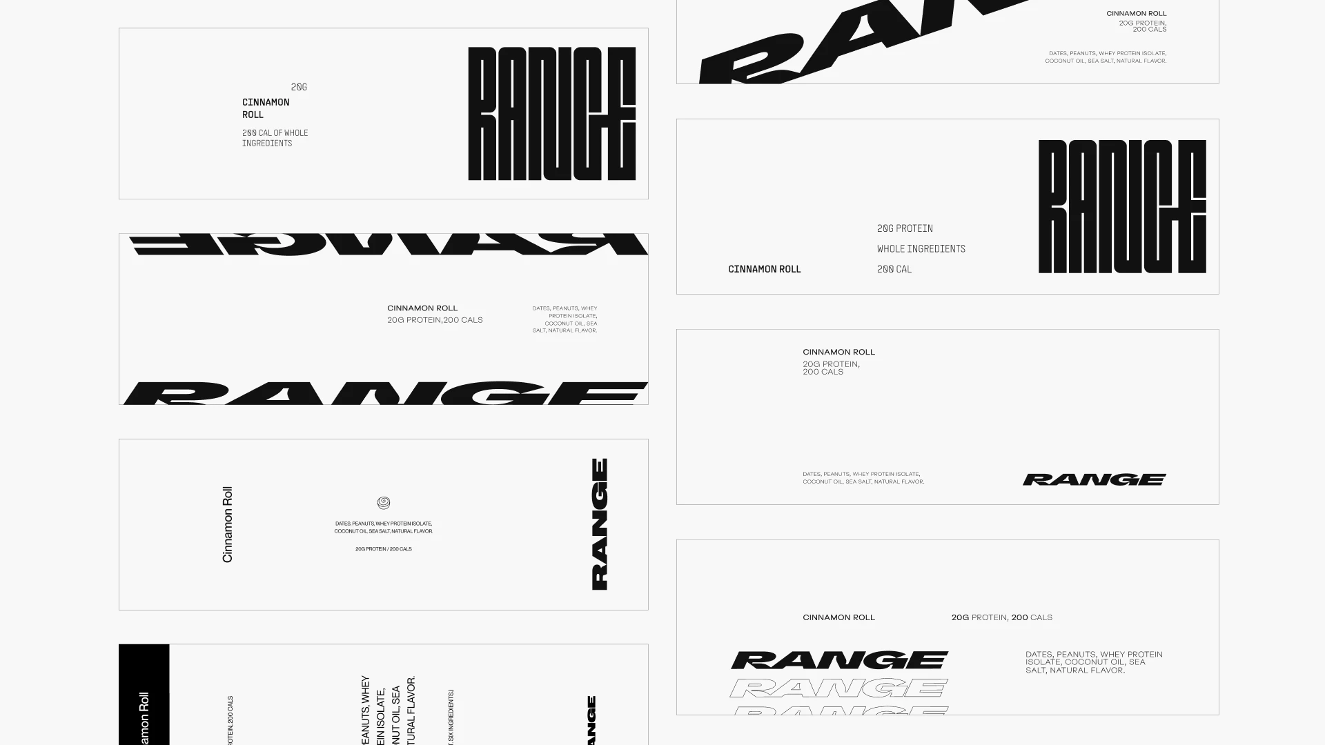
Theme explorations testing color, contrast, and typographic emphasis across the packaging system.

Theme explorations
These explorations informed a final system that balances clarity and motion. By introducing subtle typographic angles, intentional pacing, and color-led flavor cues, the final packaging avoids category clichés while still feeling immediately readable on shelf.
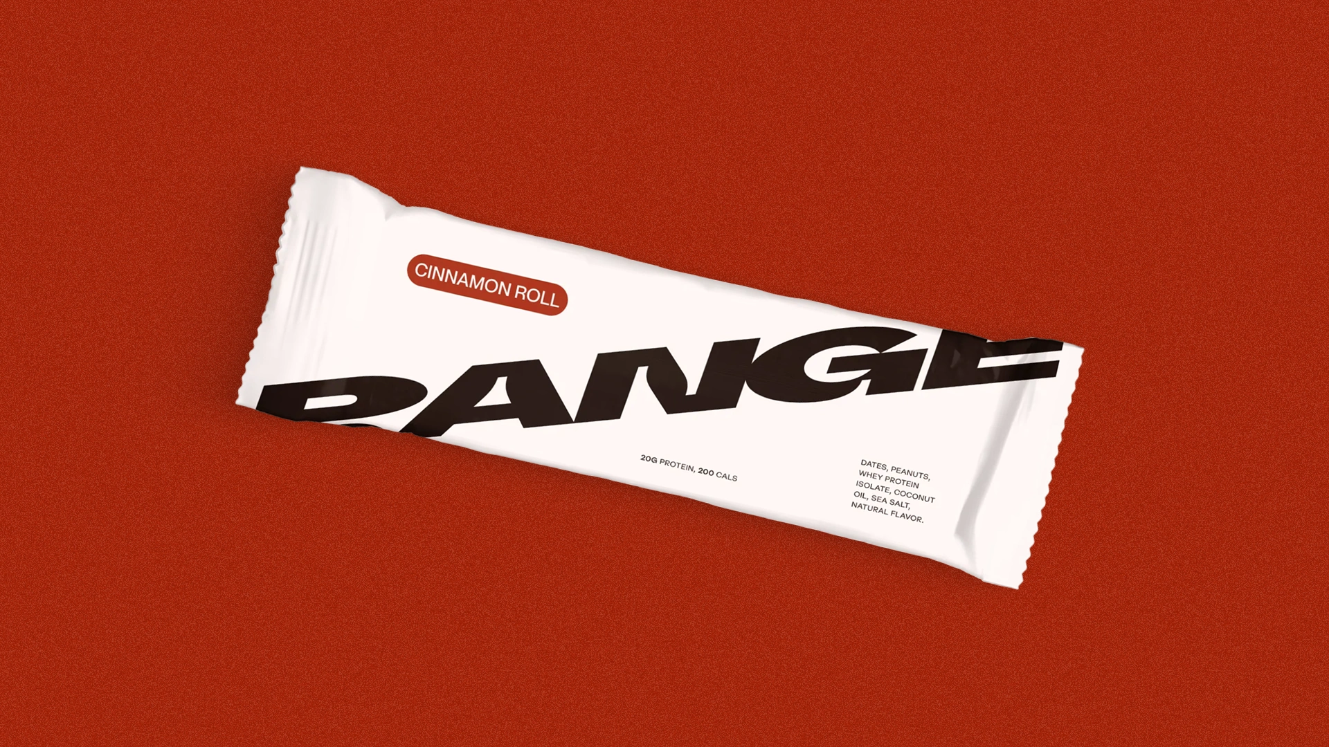
Cinnamon Roll Flavor
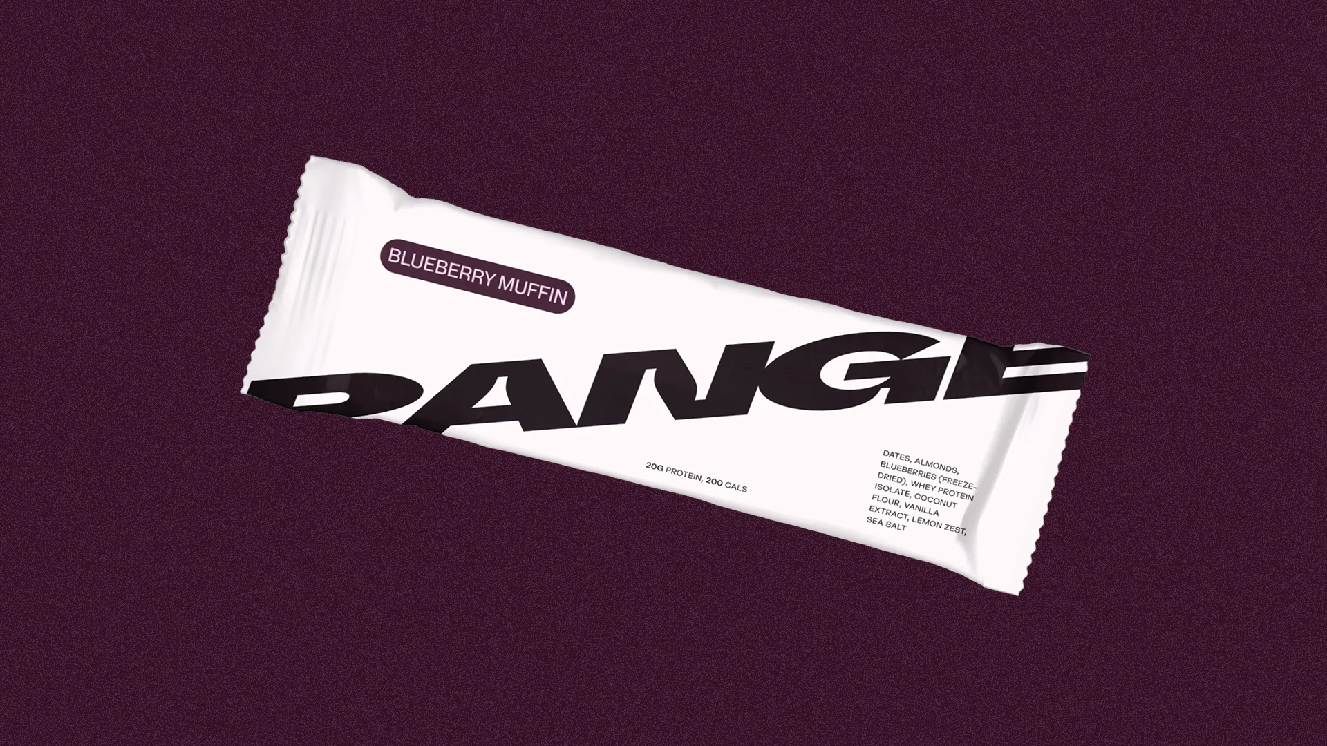
Blueberry Muffin Flavor
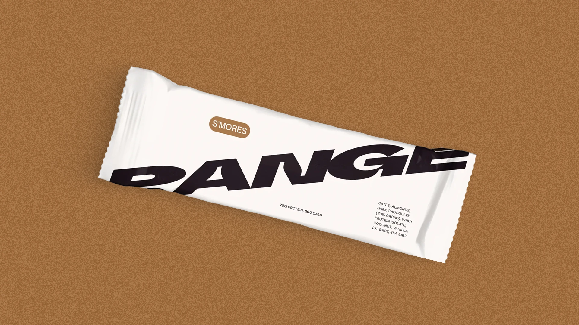
S'mores Flavor
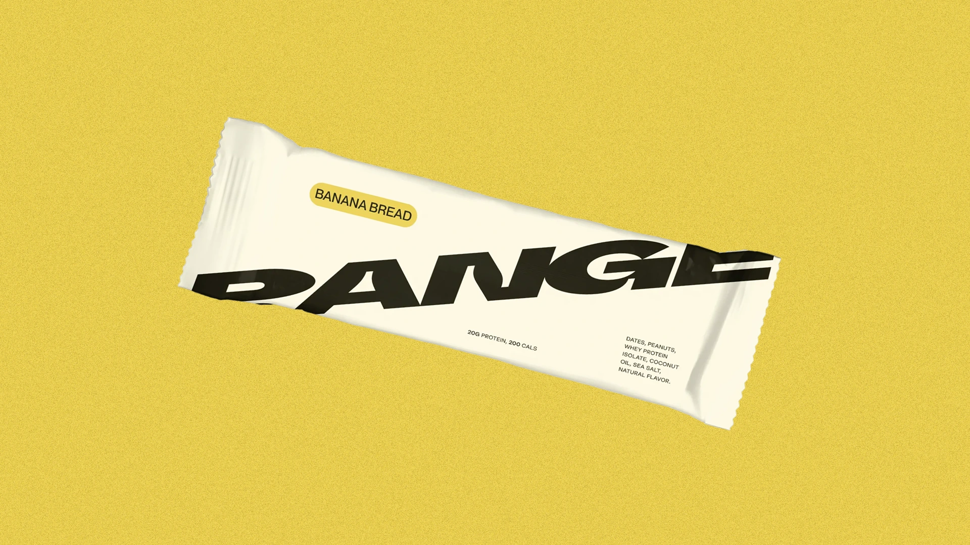
Banana Bread Flavor
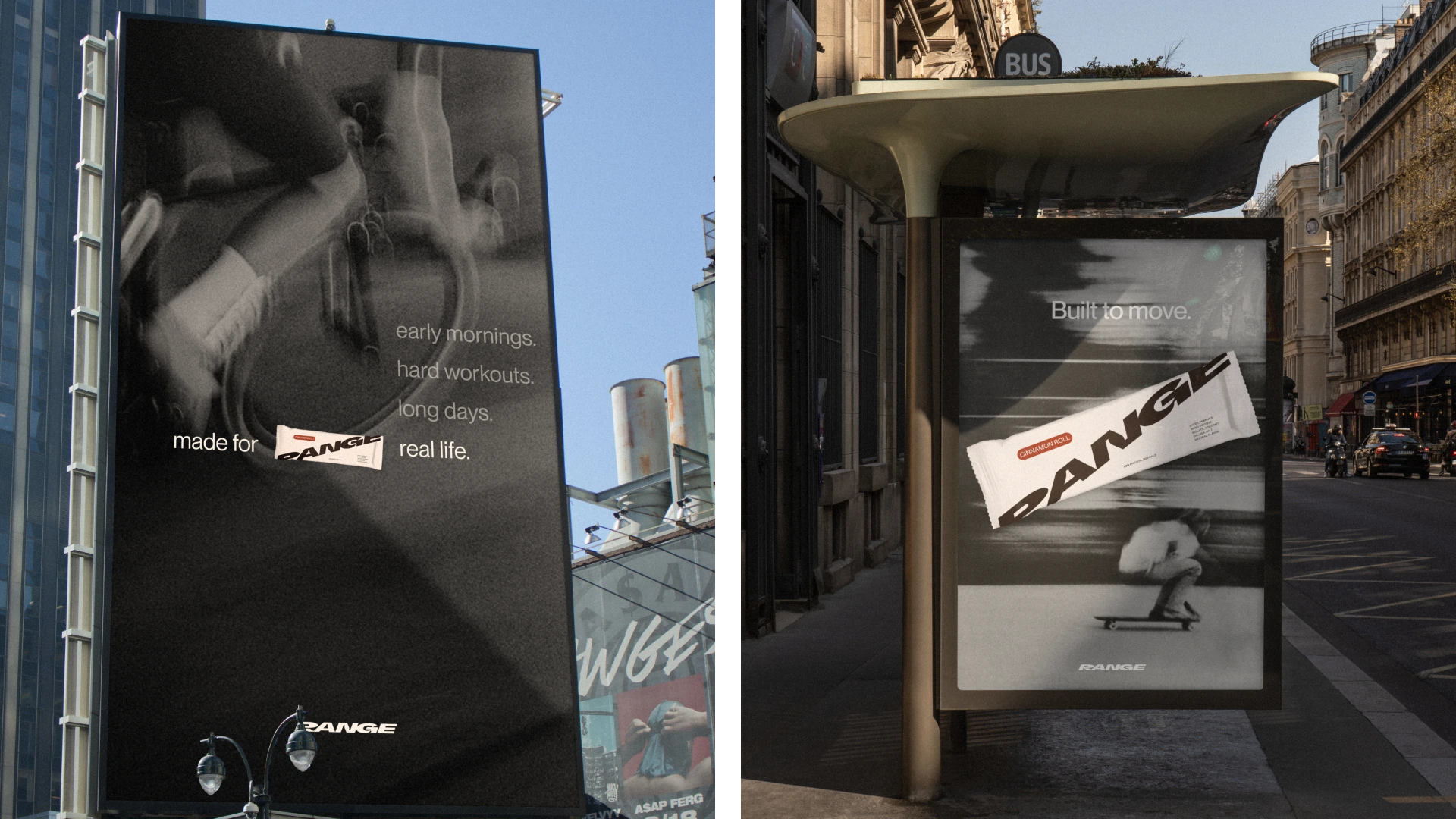
Billboard Ads
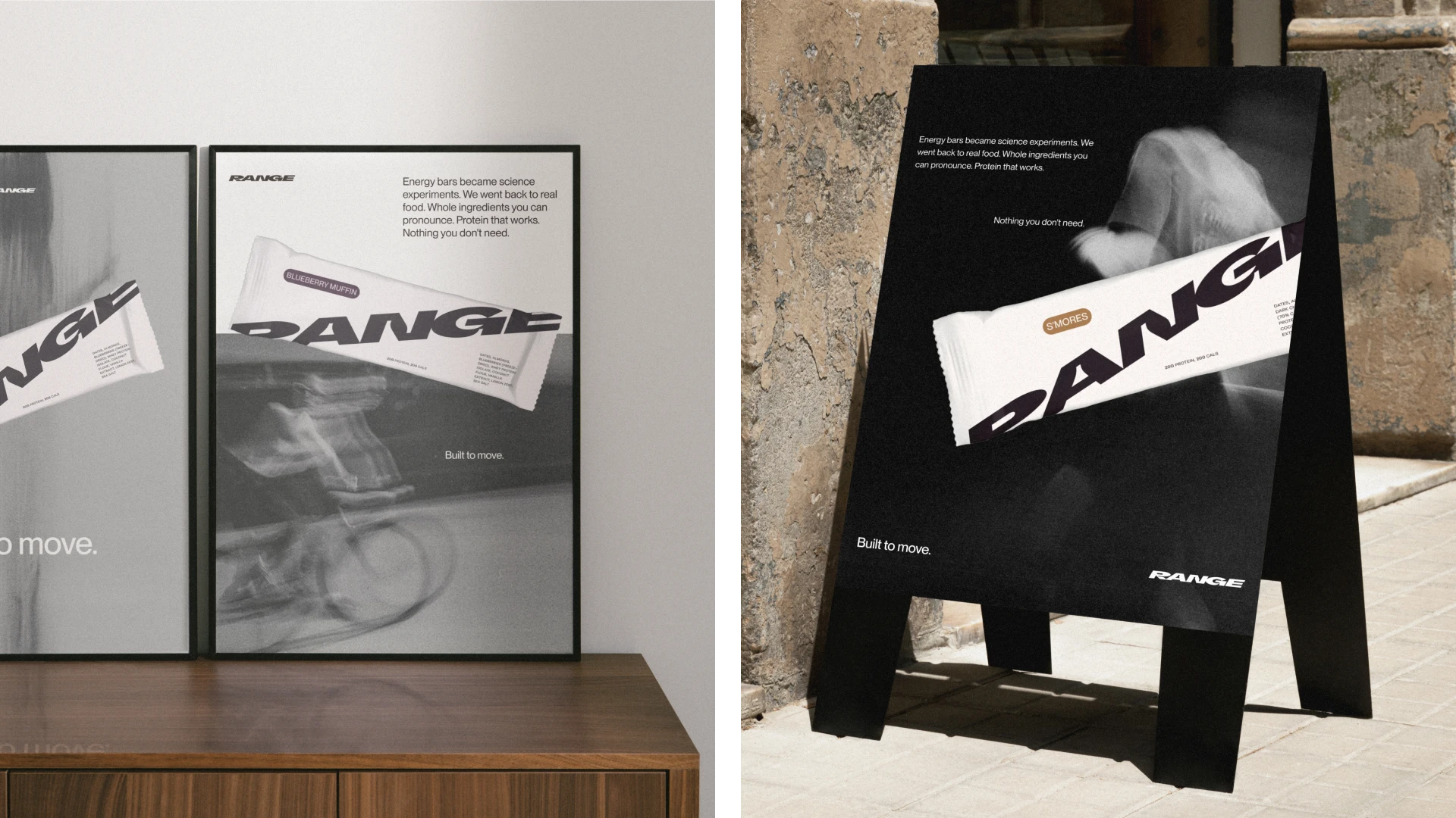
Poster and Signage Ads
Like this project
Posted Dec 31, 2025
Created brand strategy and packaging design for RANGE Protein bars.
Likes
0
Views
1