Responsive Web Redesign for an English Teacher
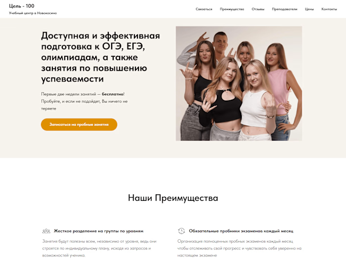
I designed a commercial landing page for an English teacher, focusing on a friendly atmosphere with vibrant, warm colors. The layout follows a bento style for clear, organized sections. All images were generated using Midjourney, adding a unique visual touch.
A significant amount of marketing work went into the project, including audience and competitor research, along with text editing to enhance messaging. The site is responsive and features custom animations, creating an engaging user experience. Built with Tilda, ensuring a seamless journey for potential students and their parents.
The result:

The result
The old version of the website:

The old version
Like this project
Posted Nov 17, 2024
Redesigned an English teacher's website with vibrant colors, bento style, Midjourney images, and marketing research for better engagement and responsiveness.
Likes
0
Views
12


