Dnevnik.bg - Redesign for Bulgaria's Leading News Portal
Ivo Ivanov
Dnevnik.bg - Redesign for Bulgaria's Leading News Portal
Dnevnik.bg is one of Bulgaria's most trusted and widely read independent online news outlets. Founded in 2001 by Economedia, it started as a daily broadsheet newspaper and evolved into a digital-first publication known for quality journalism, in-depth analysis, and a loyal audience of urban, educated readers. Today it ranks among the top news sites in the country with millions of monthly visits.
Industry: Media / News Publishing
Founded: 2001
Headquarters: Sofia, Bulgaria
Published by: Economedia
The Problem
Dnevnik's website had a fundamental issue - it wasn't responsive. The desktop and mobile versions were built and maintained as two completely separate codebases. This created a growing pile of technical debt, made updates slower and more error-prone, and delivered an inconsistent experience across devices. For a site that millions of people rely on daily for news, that's a real problem.
Beyond the technical side, the homepage needed to handle a massive amount of content - breaking news, long-form analysis, video, lifestyle sections, election coverage, culture, sports - all competing for attention on a single page. The challenge wasn't adding more; it was organizing what was already there in a way that actually made sense.
Scope of Work
Complete homepage redesign - fully responsive across desktop, tablet, and mobile
Worked closely with Economedia's editorial team, using heatmaps and scroll data to guide content hierarchy decisions
Shifted the primary typography from the brand's custom serif typeface to its sans-serif counterpart for improved on-screen readability
Balanced modernizing the design with preserving familiar layout patterns the editorial team wanted to keep
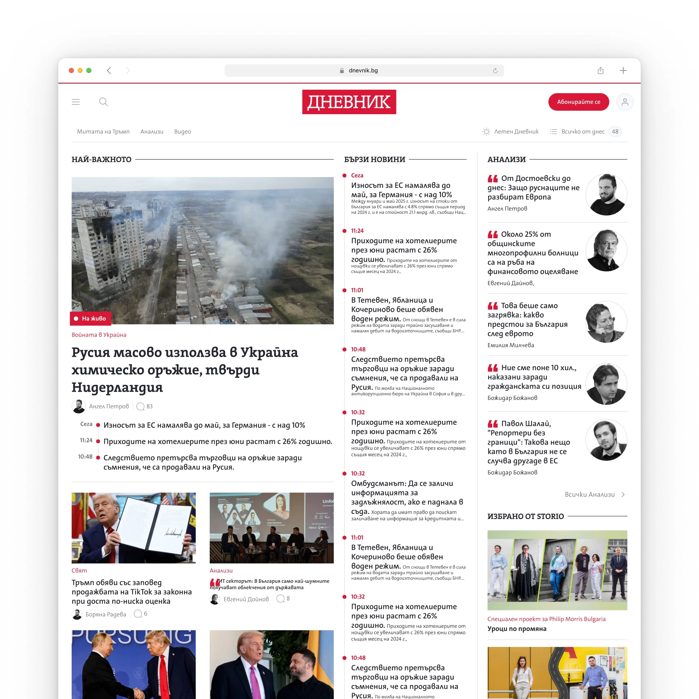
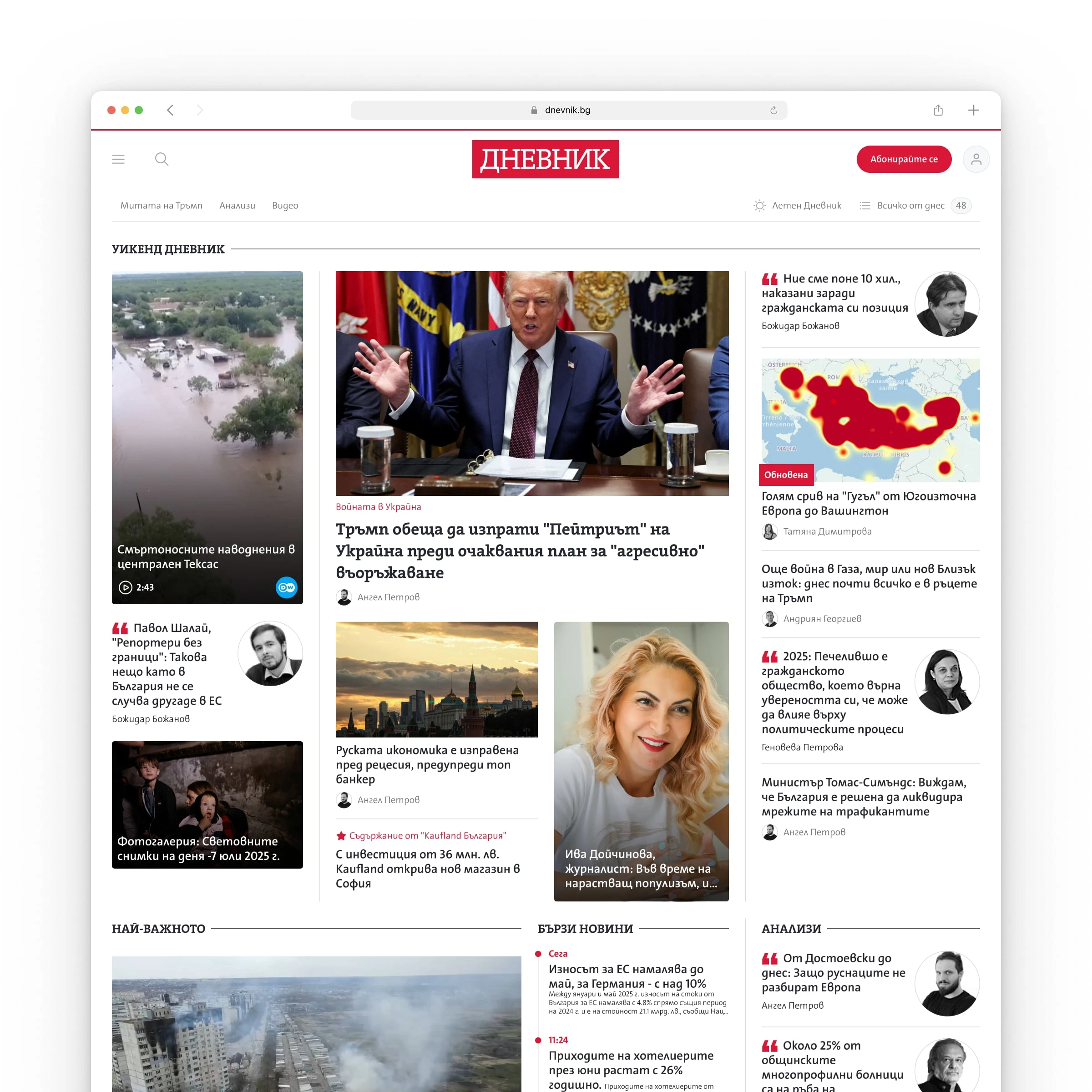
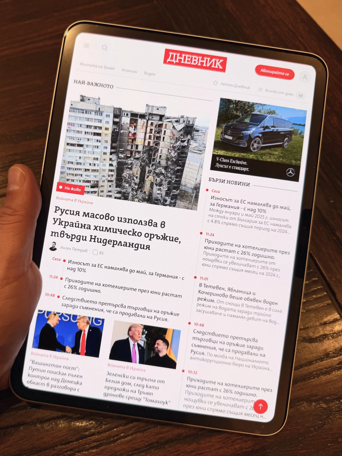
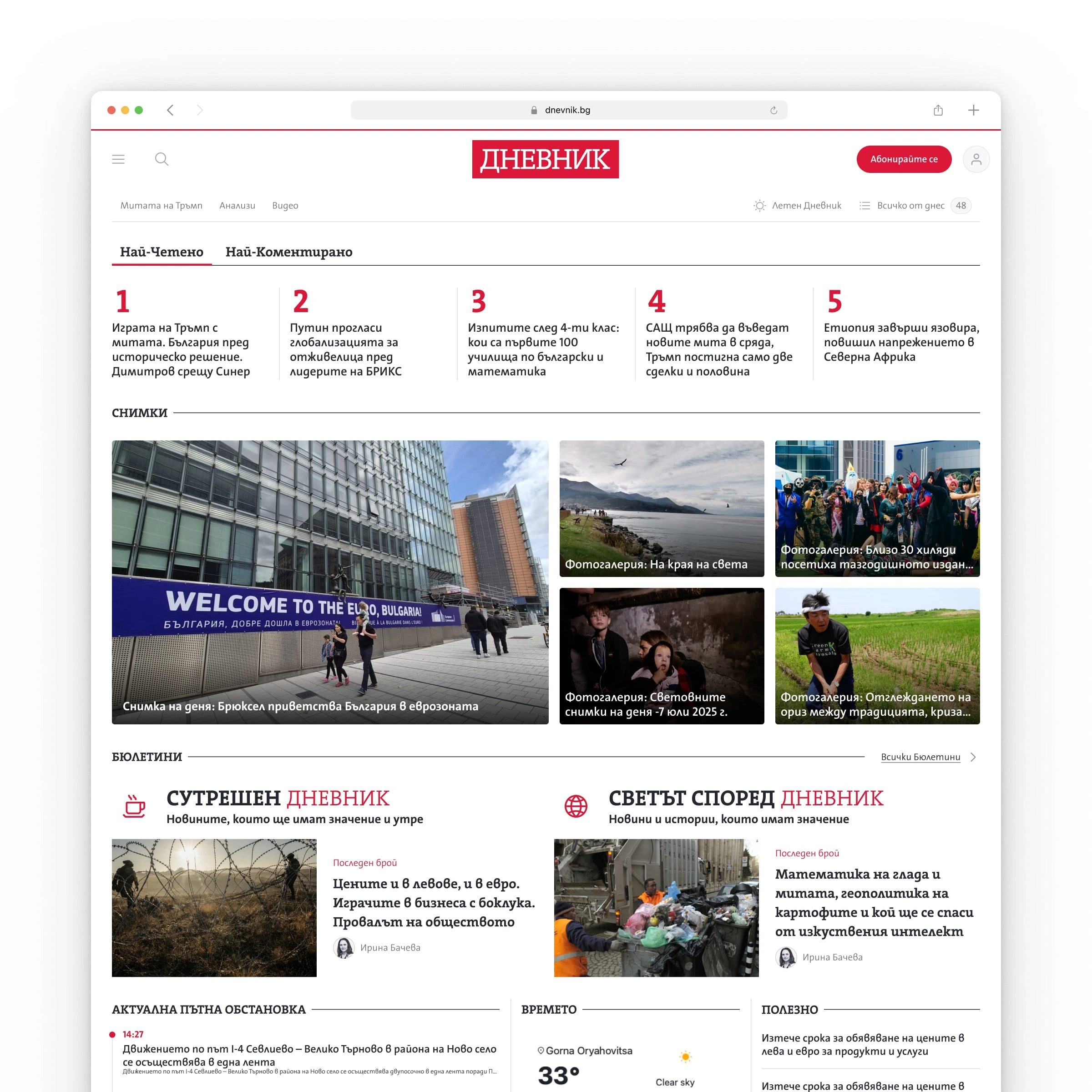
Dnevnik.bg Home Page Hero
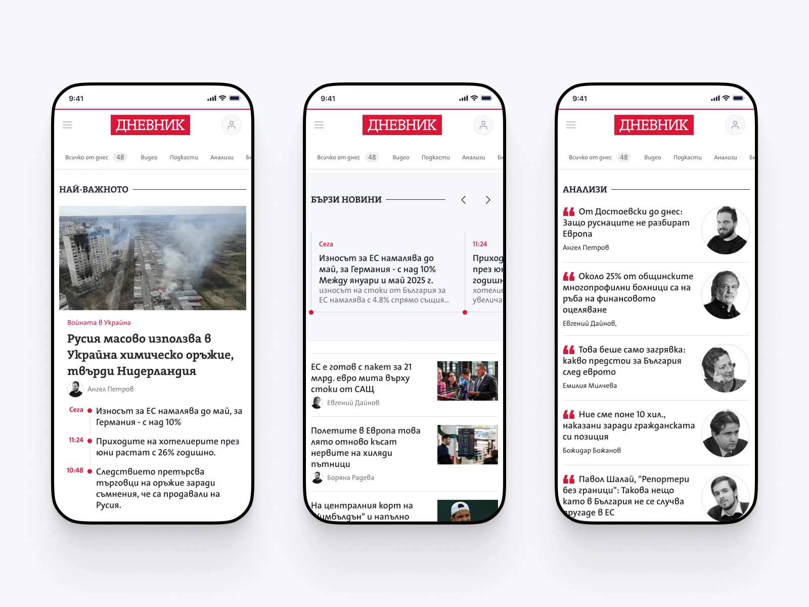
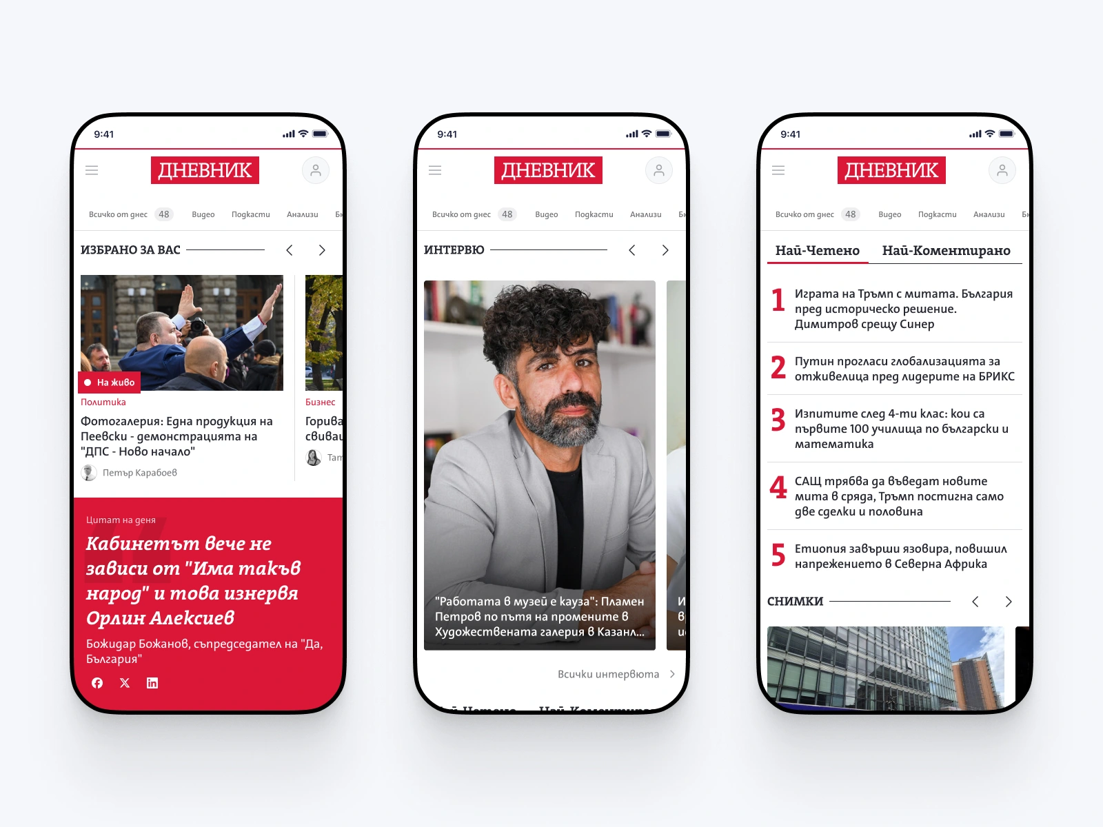
Dnevnik.bg mobile
Dnevnik.bg Tablet
Approach
Started desktop-first since that's where the layout complexity lives - news homepages have a lot of moving parts and content blocks that need careful spatial arrangement. Once the desktop was solid, the mobile version came together quickly. Tablet was the last piece, essentially a hybrid of the two.
The editorial team had strong opinions on structure and priorities - and honestly, that was a good thing. They knew their readers, they had the data, and they weren't shy about sharing it. Heat maps and scroll maps gave us clear signals about what content gets attention and where people drop off. That made the information architecture decisions much more grounded than guesswork.
Boyan Kolev - Product Manager at Economedia
The hardest part was keeping it simple. When you have this many content types and sections fighting for homepage real estate, the temptation is to cram everything in. The real work was in restraint - giving each section enough room to breathe while maintaining a clear visual hierarchy from top to bottom.
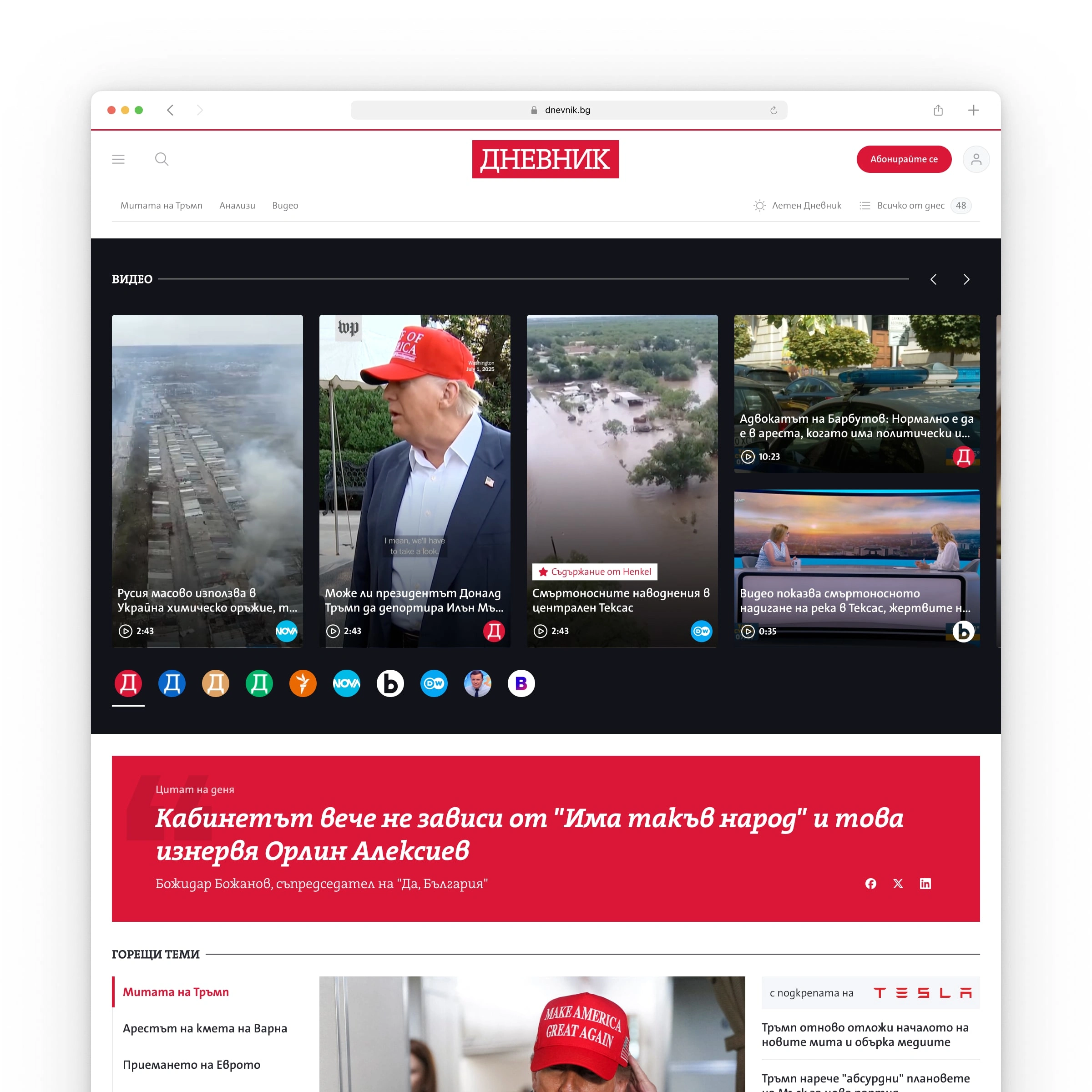
Dnevnik.bg videos
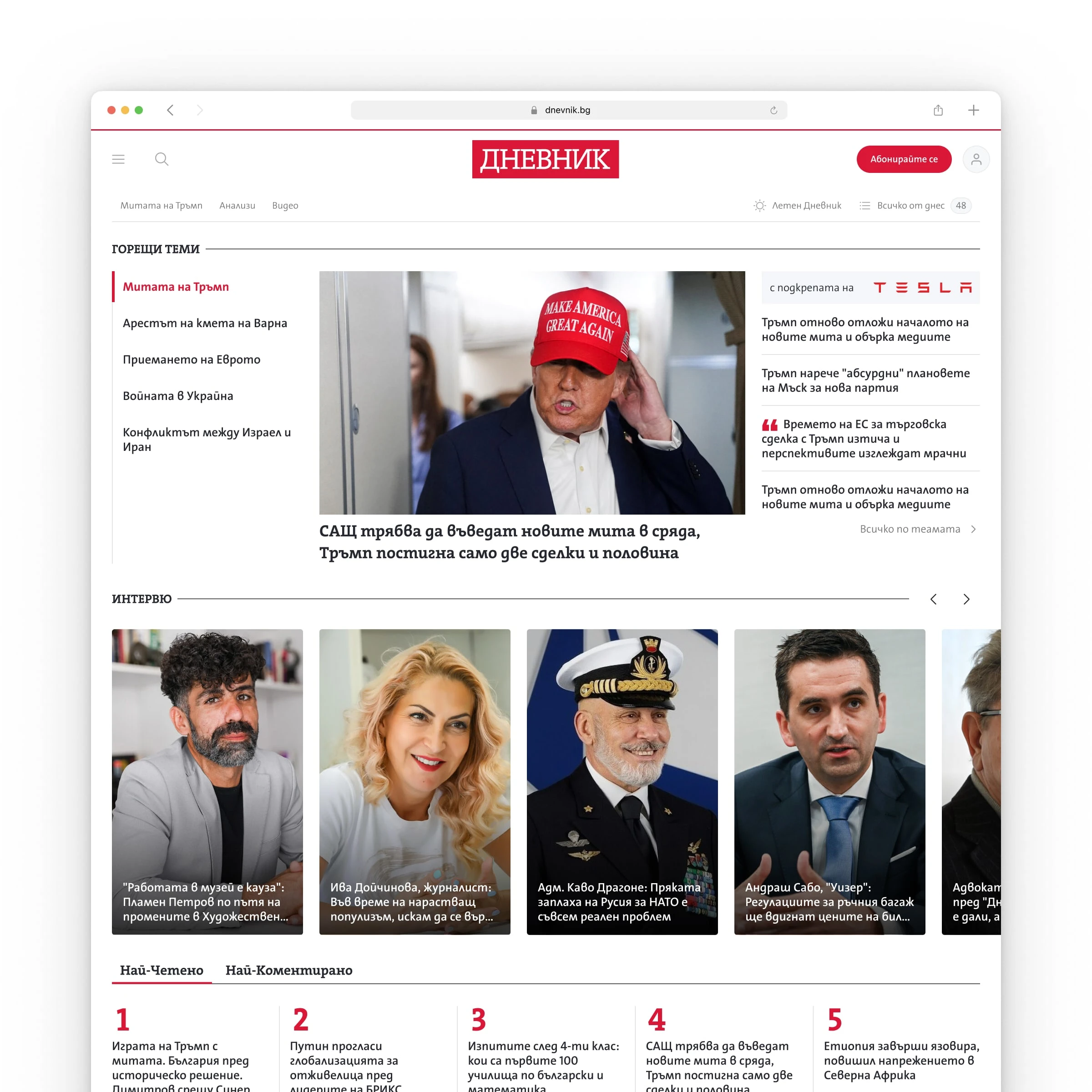
Dnevnik.bg Intervirews
Dnevnik.bg Galllery
Dnevnik.bg Mobile
Looking for web design help?
I help SaaS, AI & Fintech startups with strategic web design and Framer development — from full website redesigns to ongoing additions and upgrades.
Like this project
Posted Feb 10, 2026
Redesign for Bulgaria's leading independent news portal - from separate desktop/mobile builds to a single responsive experience and clean modern vision
Likes
3
Views
40
Timeline
Aug 10, 2025 - Oct 2, 2025
Clients
Economedia