User-Friendly Real Estate Website for Homeseeker
Gayan
Homeseeker is an online portal/website where people can find safe, cost-effective housing, to their liking.
A user can engage with a product or service by using a user interface (UI), which is essentially a collection of screens, pages, visual elements (such as buttons and icons). The phrase “User Experience” refers to how a person reacts to each component.
Finding the perfect place to live can be daunting for most people. Whether you’re looking to rent a newly built apartment downtown or buy a small cottage house in the suburbs, searching for your dream home is often very difficult.
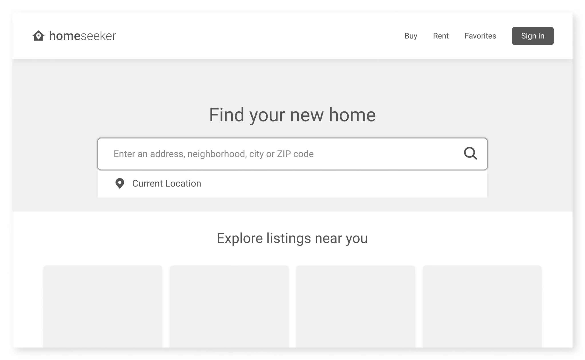
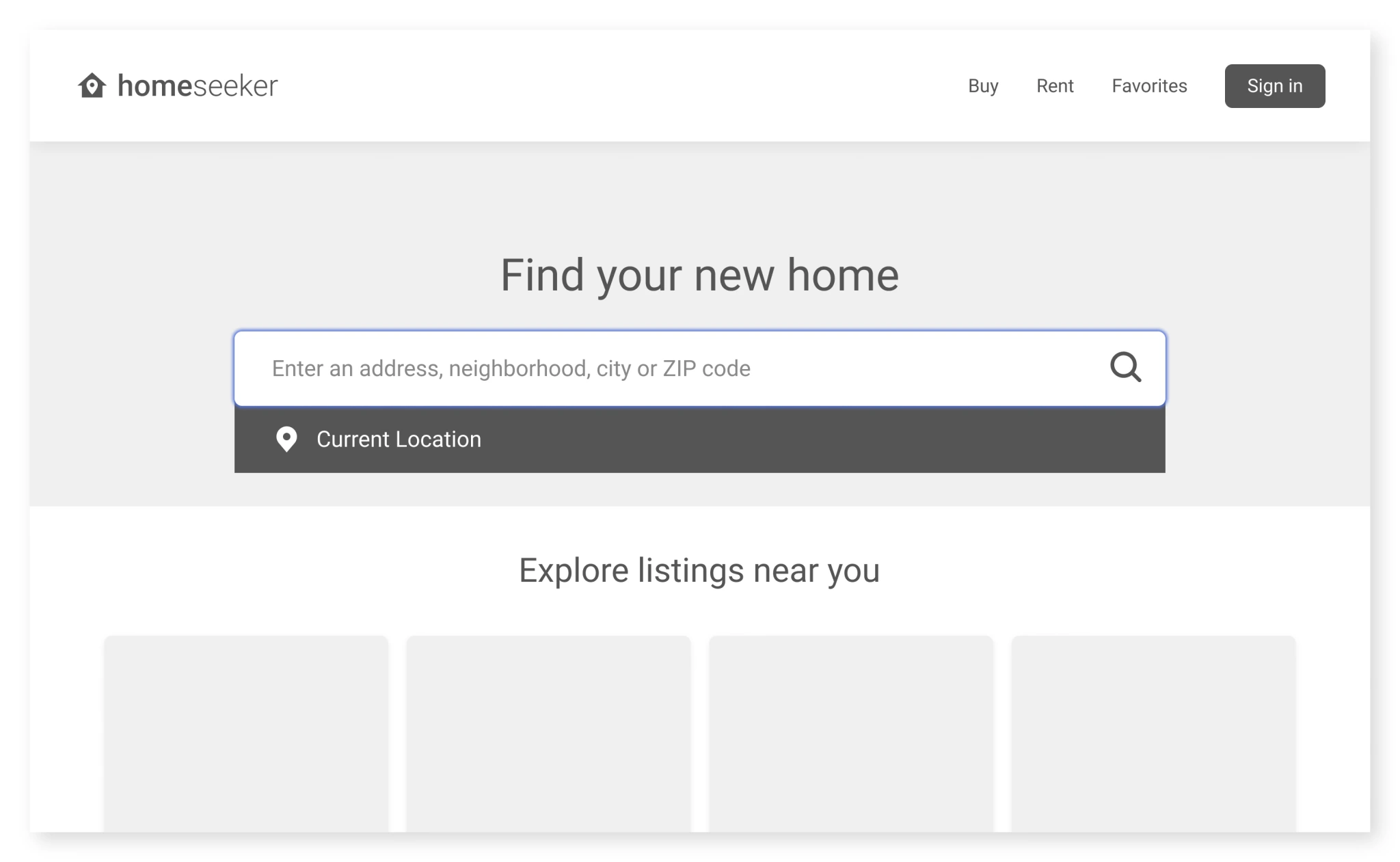
To alleviate some of this stress, the goal for this project was to create a website that allows individuals to search based on their needs, easily browse through listings, and ultimately seek their dream home.
Understanding the User
I started the research process by analyzing data taken from user surveys. This helped me learn what struggles people face when searching for their ideal home and what some of their most common pain points are.
Here are some of the insights I gathered from my research:
Users would like to know more about the atmosphere and environment they will be living in.
Users frequently cited hidden fees and overall availability as some of their biggest pain points during the home-seeking process.
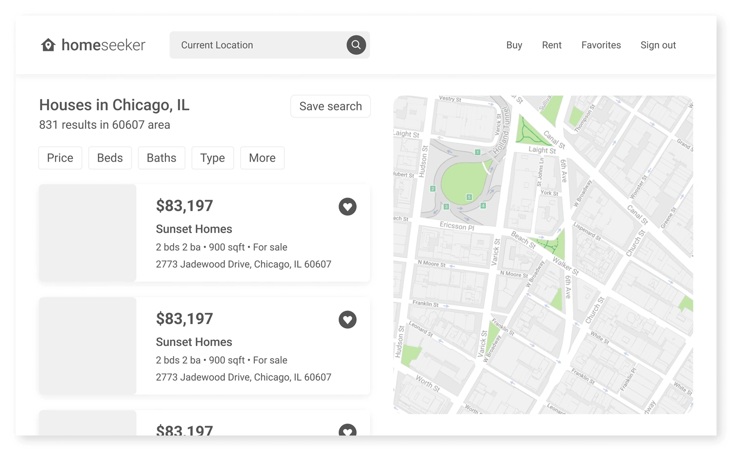
Users want an easier way to browse homes and filter through basic details such as cost, location, dimensions, and amenities.
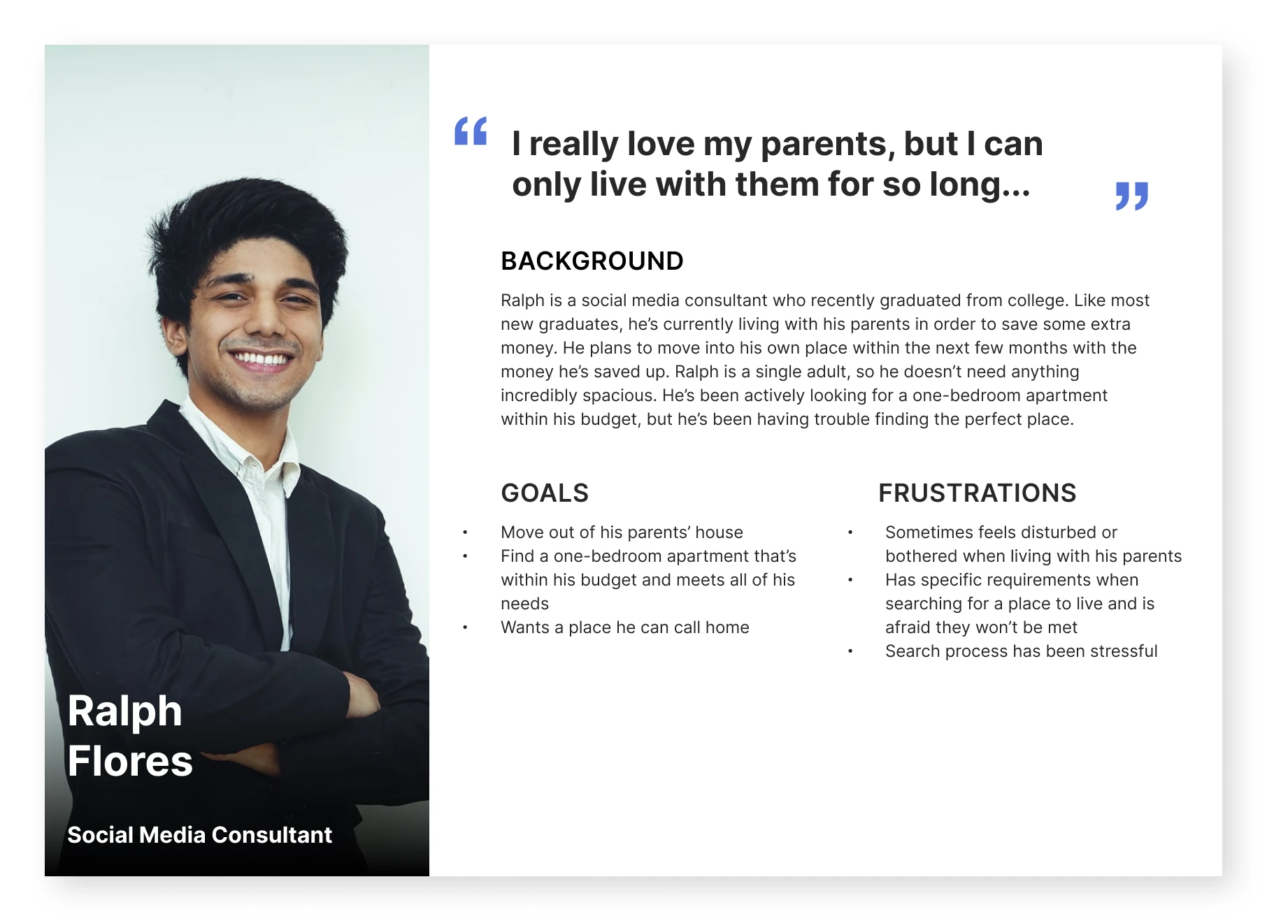
After coming up with a few insights based on user research, it was time to create personas. This helped in visualizing the target audience.
To guide me through the design process, I ensured this persona accurately portrayed an adult eager to find their dream home based on the parameters/needs they’ve established beforehand.
This persona was referred to throughout the entire product design life cycle to remain focused when making design decisions.
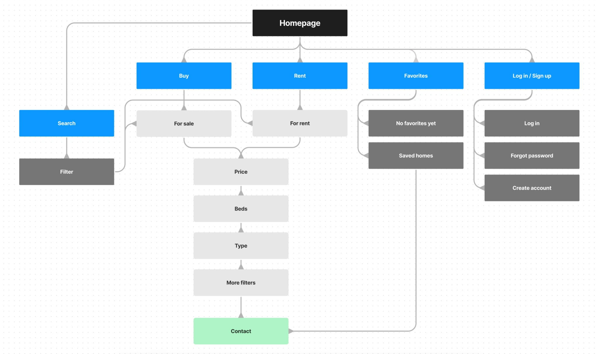
The next step in my design process was visualizing how the product would be structured. Because users tend to sit down and strategically plan where their next home will be, this led me to create a website rather than something like a mobile application, for example.
With this in mind, I shifted priority towards a desktop or laptop computer and created a sitemap that illustrates the main user flow of the product.
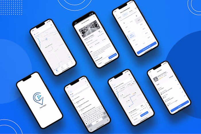
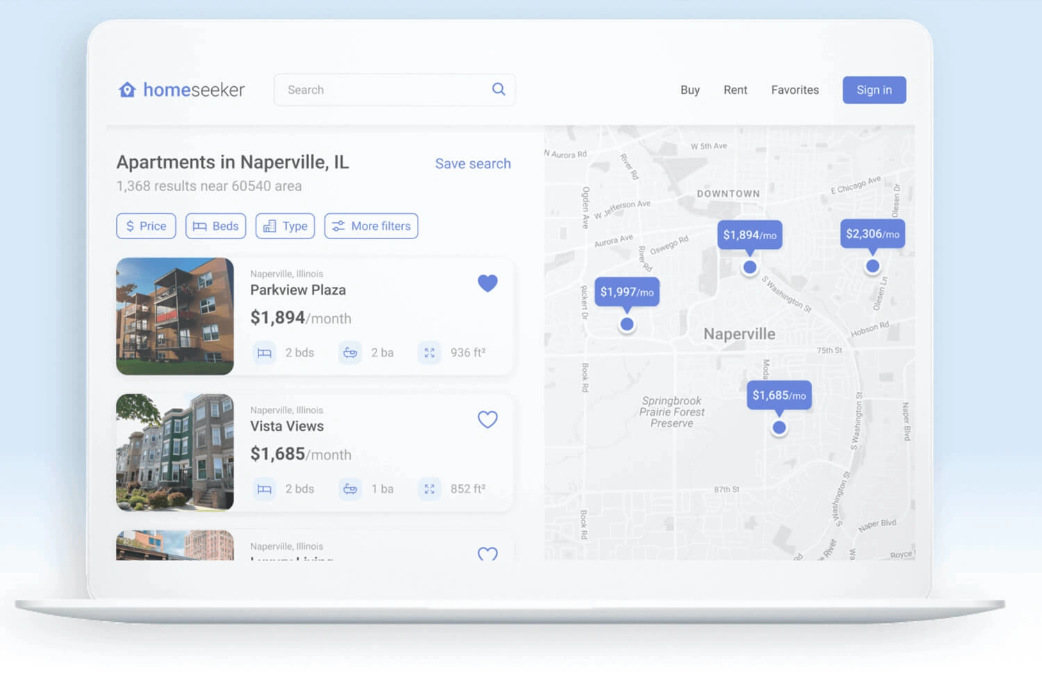
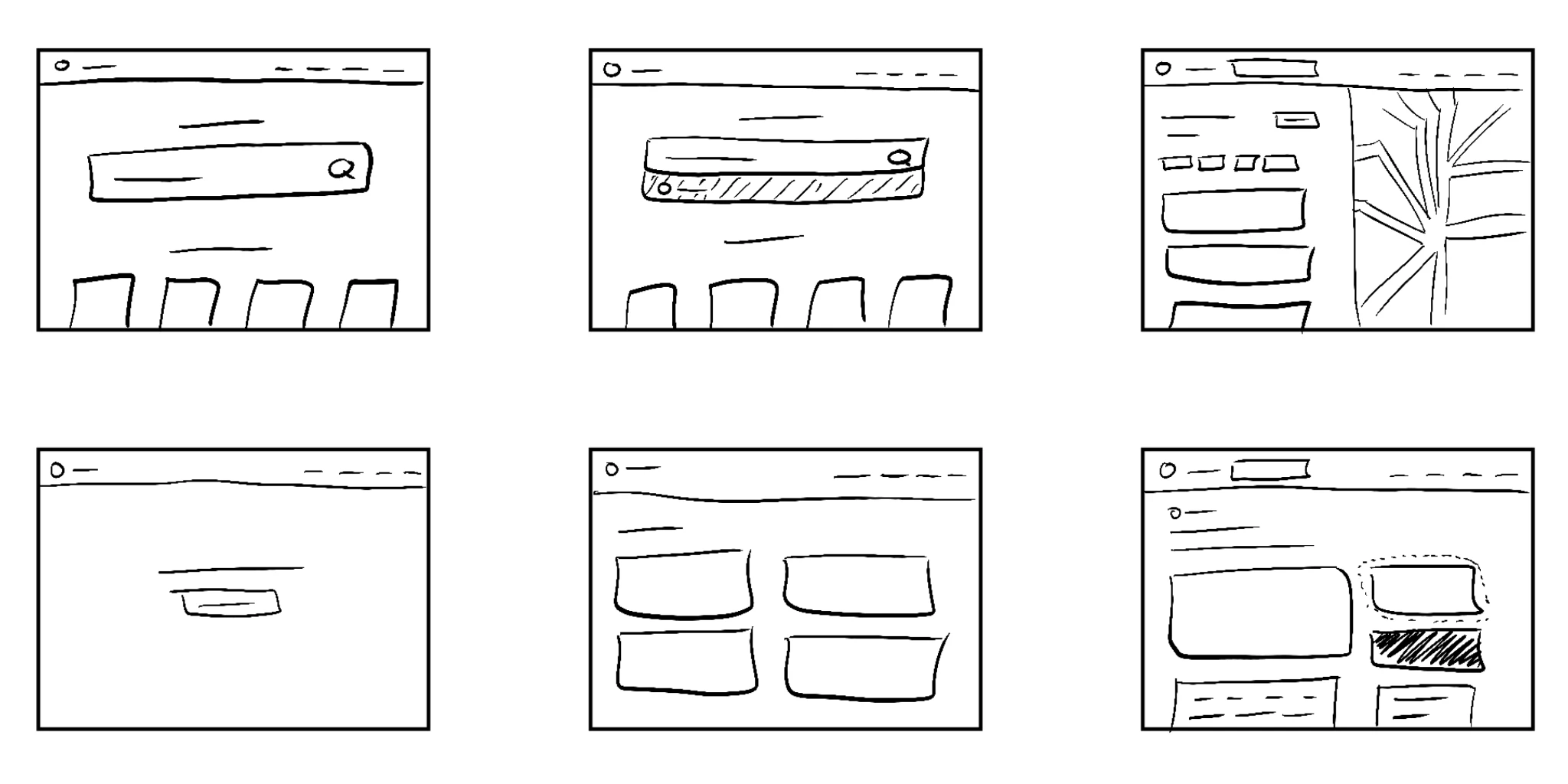
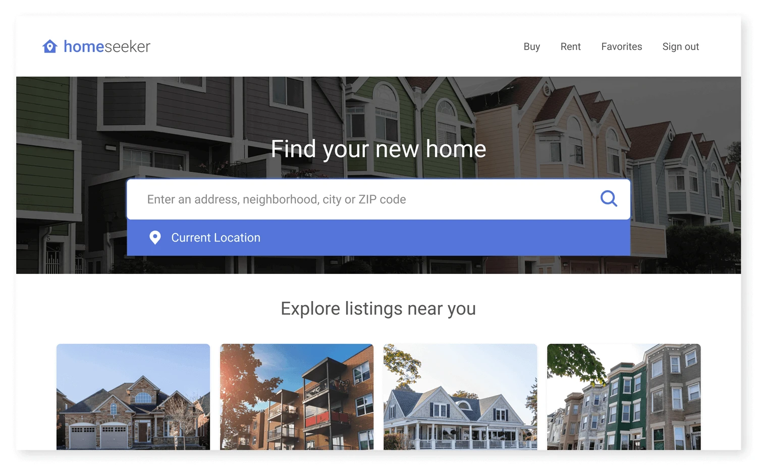
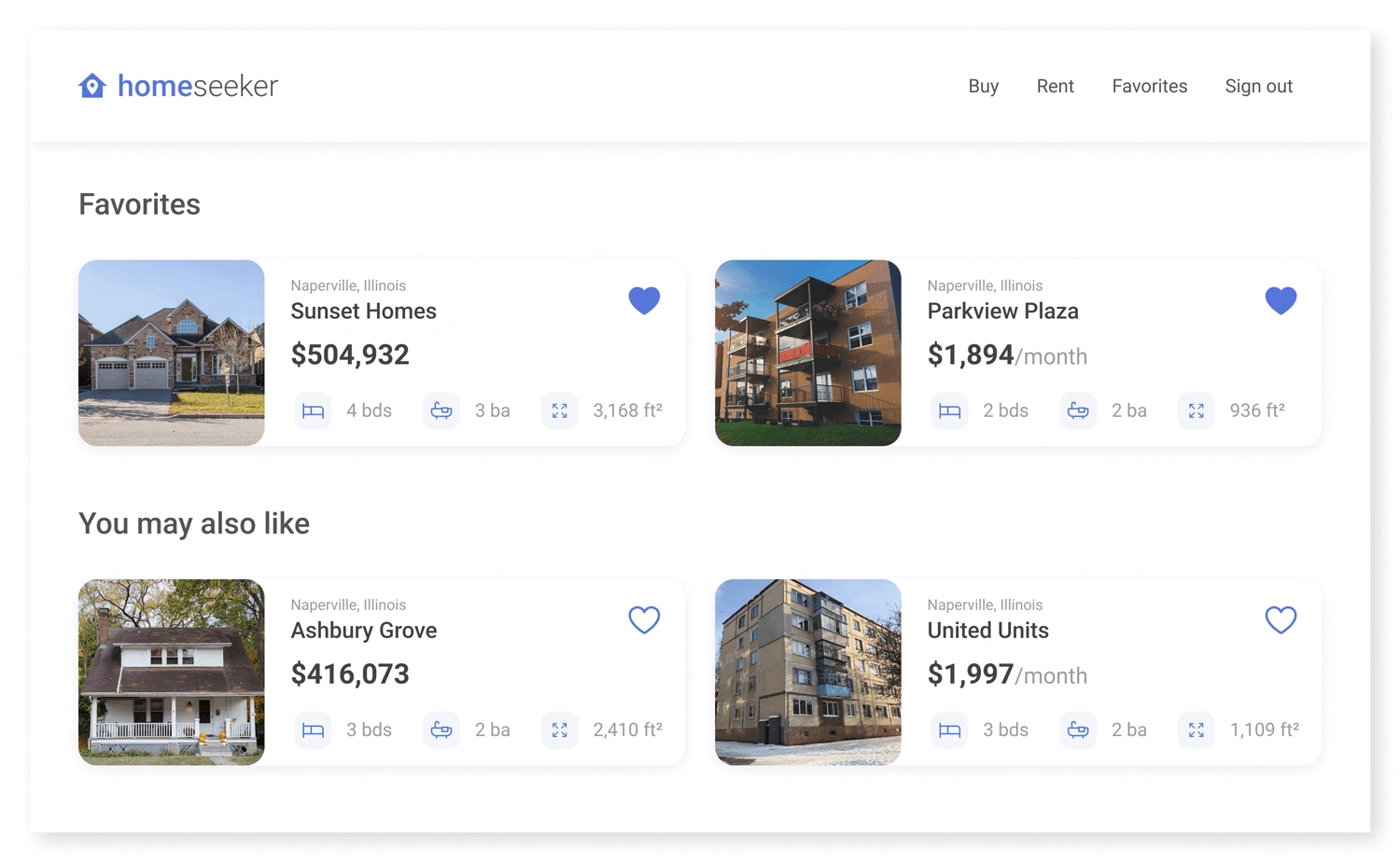
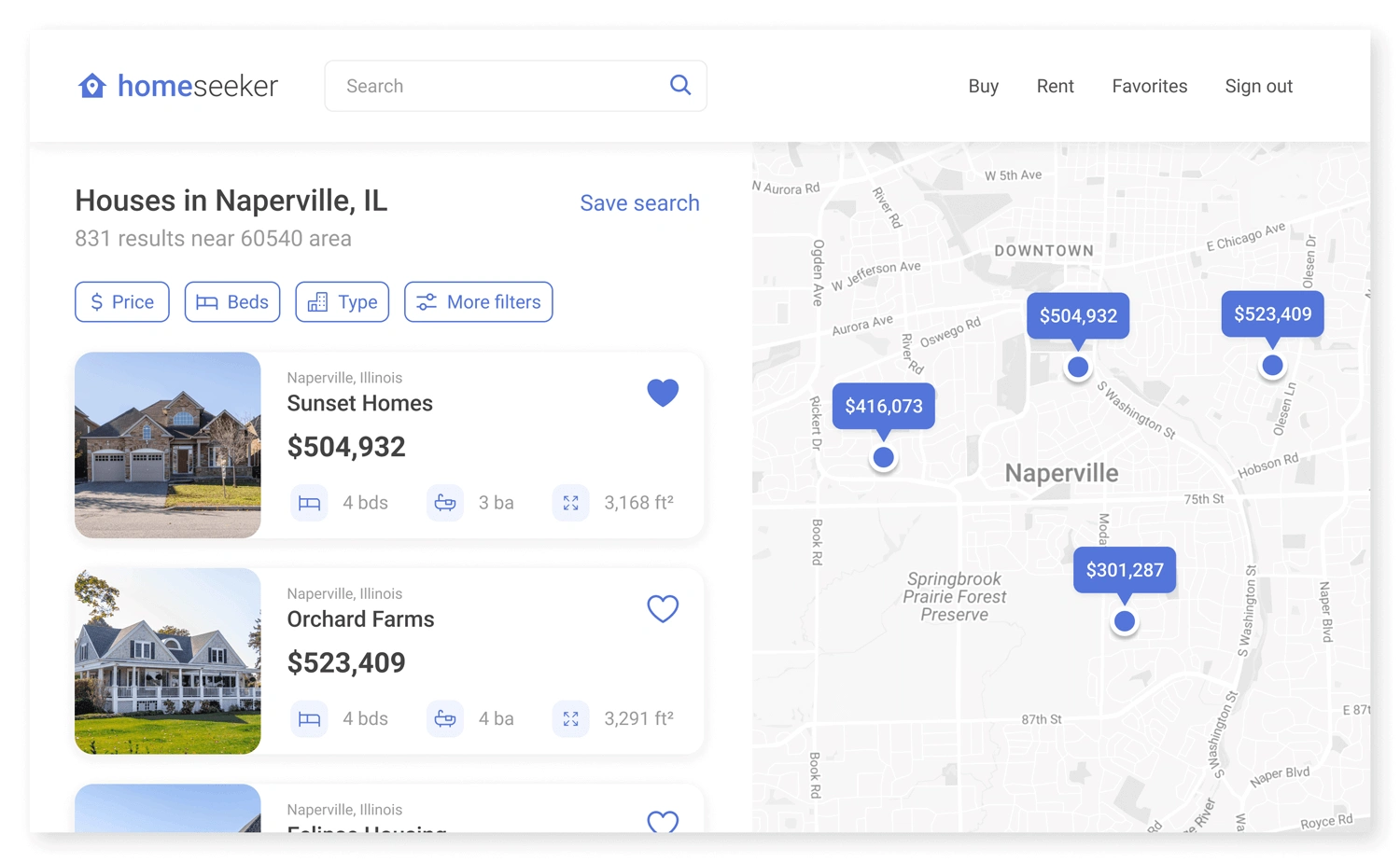
To begin the design stage, I started with a few rough sketches of the intended page layout. I wanted the user to search for listings based on their location, browse and filter between various parameters, and add listings to their favorites. These features are reflected in the sketches shown below.
Now that the structure was established, it was time to create low-fidelity wireframes for the website. These wireframes were later converted to lo-fi prototypes to quickly get a sense of how each screen should flow together
Before moving on to high-fidelity mockups, I tested the lo-fi prototype on five different participants in an unmoderated usability study. Here are some of the improvements made based on user feedback:
Users suggested adding more clarity to filter options
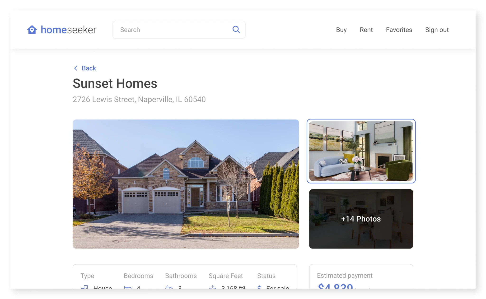
Users stated that listing info may be a little too “wordy”
Users wished to see where the listing was relative to the map
Users wanted a “recommended” or “suggested” section
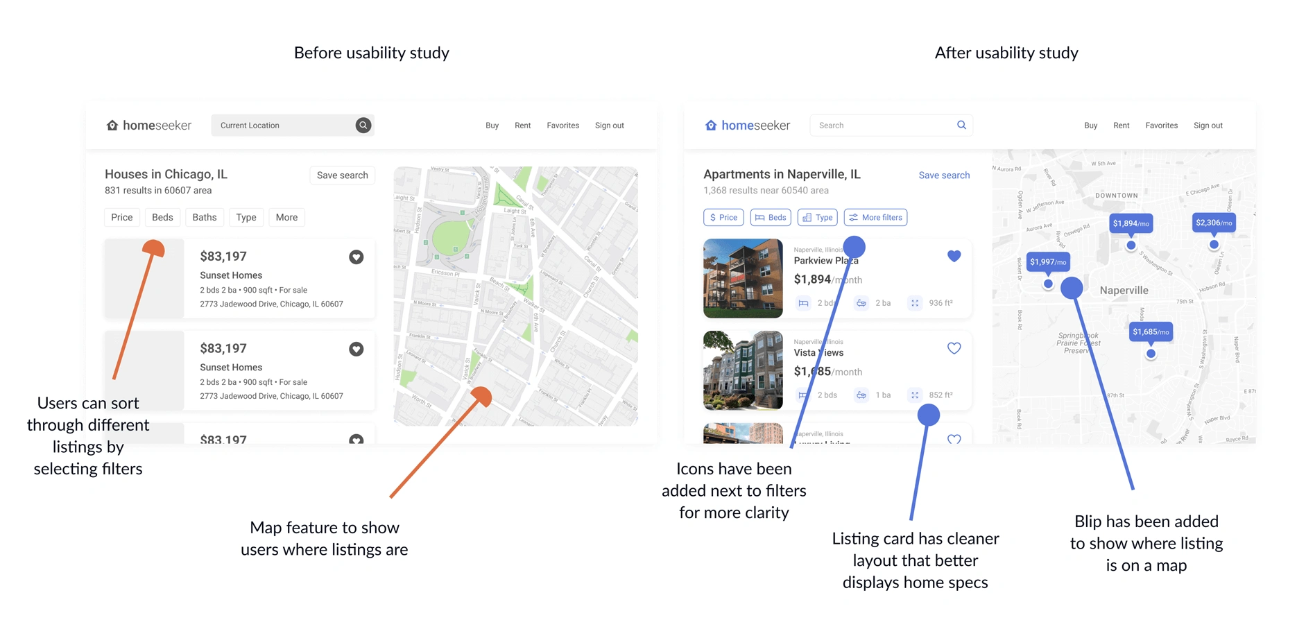
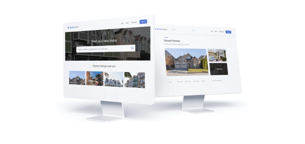
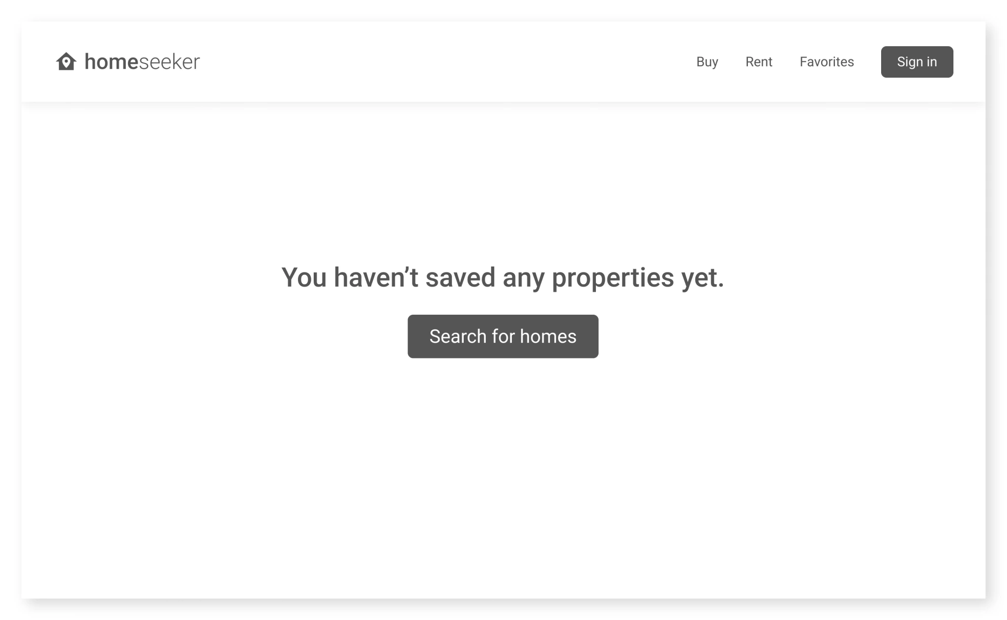
After receiving user feedback and iterating on the prototype, the final design was complete. Because the home-seeking process is often tedious for most people, the website was intended to be clean and streamlined to provide a stress-free experience for the user.
The final high-fidelity prototype can be tested below. Feel free to press F on your keyboard or click the maximize icon in the top right of the frame below to enter full-screen mode. You can also press R to reset the user flow.
With this project, I learned about some of the common struggles users face during the home-seeking process. Additionally, I also had the chance to design a digital product for a desktop device for the first time.
Although I’m fairly satisfied with the final outcome, here are a few things I wish I did differently throughout the design process:
Expand on the “more filters” button. When searching for listings on Homeseeker, users can filter between parameters like price and type, but they can also select “more filters” to view even more specifications. To give users even more control, I wish I expanded on this feature a little more.
Elaborate on saved searches. Similar to the more filters button, I initially planned for users to save specific searches to view at a later time. This could definitely be an interesting feature to explore in the future.
Make Homeseeker less generalized. Homeseeker is intended to be a great place for people to easily find their dream home. However, there are many sites that serve a similar function. It would be intriguing to see what other features (or audiences) I could target to make it stand out from the rest.
What would a mobile application look like? This product focuses on a desktop website experience. It would be interesting to see what a dedicated mobile application would look like with the same goals in mind.
What can be improved with the design? UX design is an ongoing process. The next steps include continuing usability testing and constant iteration.
There are many variations of passages of Lorem Ipsum available, but the majority have suf alteration in some form, by injected humour, or randomised words which don’t look even slightly believable.
Like this project
Posted Jan 6, 2026
Homeseeker is a comprehensive real estate platform designed to eliminate the friction of finding a home.
Likes
0
Views
0