Branding | Packaging Voskord
Yamila Liendo
Fun fact: We surveyed almost 100 people, and 97% said they would buy the bottle just for the packaging. That's when you realize: Yes, design sells.🔥
Voskord was one of the most challenging and stimulating projects I've ever developed. We didn't just design a visual identity; we created a brand from scratch: from the naming to the packaging, including the concept, characters, flavors, and consumer experience.
The goal was to break away from the traditional. To break away from the mold of traditional alcoholic beverages and build a playful, vibrant, creative, and provocative brand.
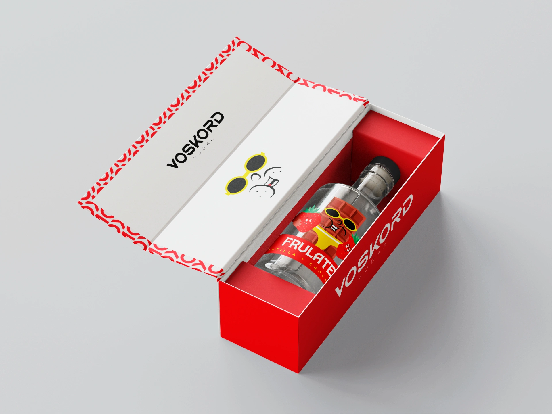
The branding was based on an explosive color palette, characters with their own unique personality, and graphics that scream fun and flavor. Each bottle represents a different character: a unique, coherent visual identity with a unique voice.
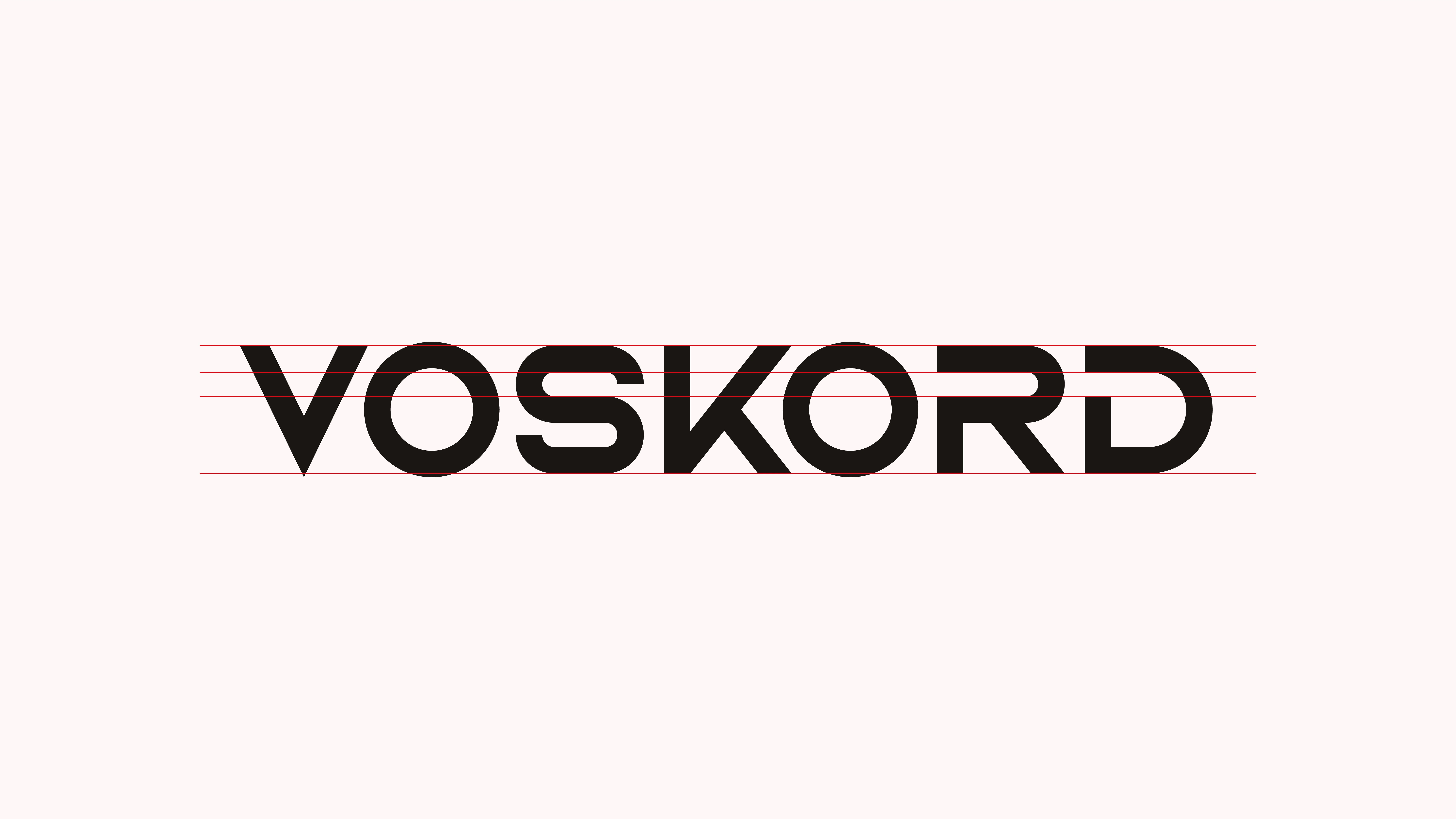
The name Voskord is a fusion of "Vostorg" (delicacy in Russian) and Córdoba, our city. We played with phonetics, rhythm, and visual aesthetics to create something authentic, memorable, and premium... but with a whole lot of attitude.
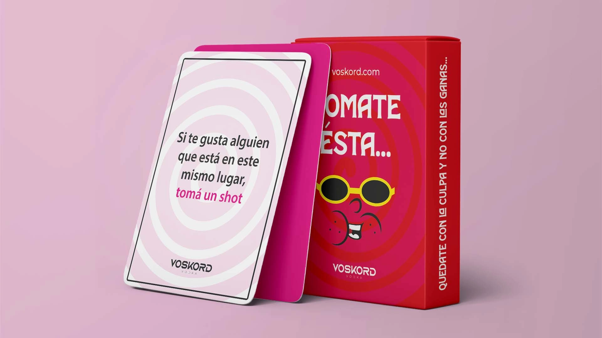
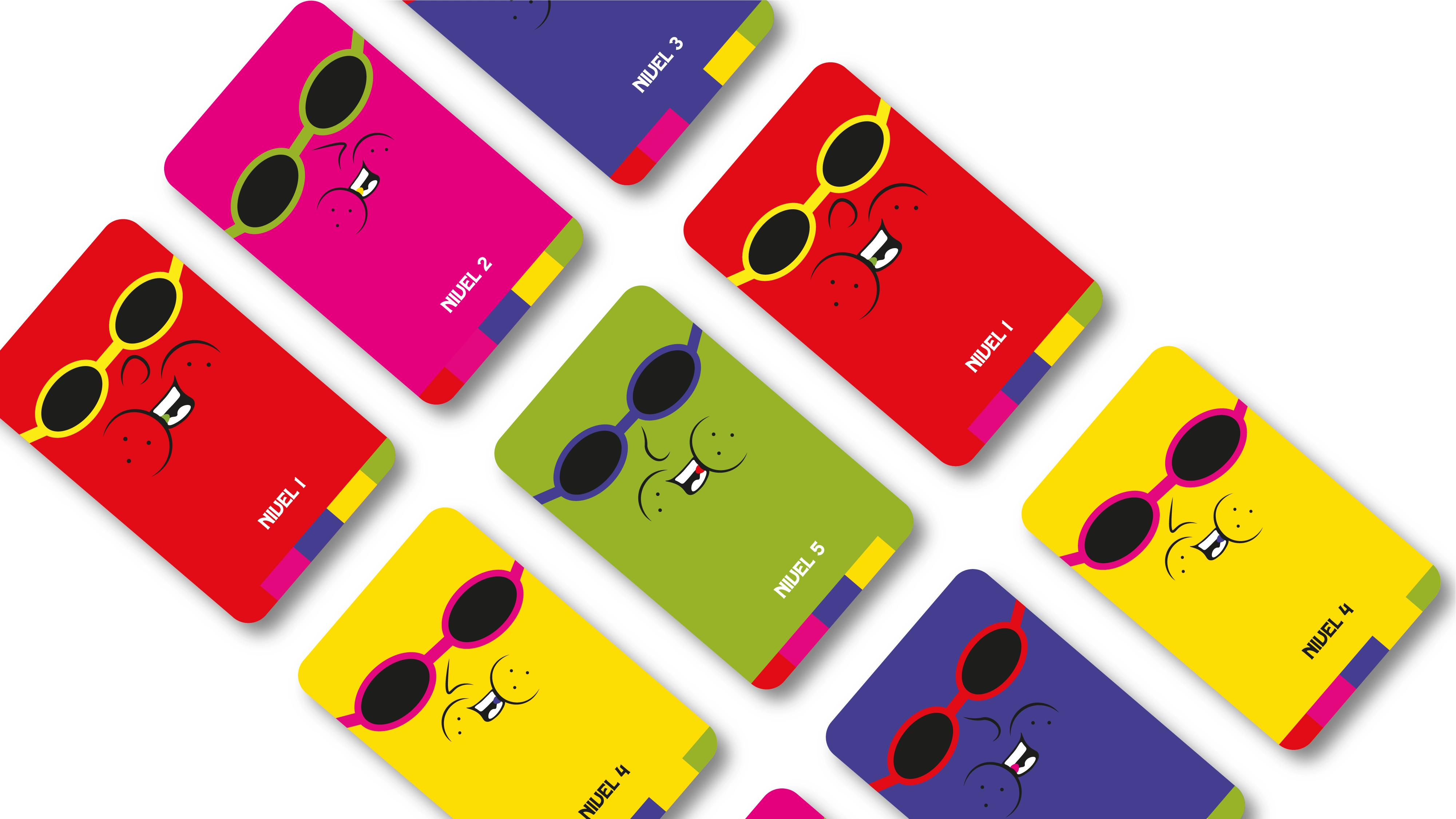
And as a bonus: We created a card game with a spicy twist to liven up any gathering, and only for those who dare 🔥. A different way to connect with the brand and with others.
Everything was strategically designed to connect with a young, daring audience in search of different experiences
Like this project
Posted Aug 1, 2025
Strategic branding that converts: 97% of respondents said the packaging alone convinced them to buy.