WalkOn's Visual Identity
Anand Sawrup
WalkOn is a Colombia-based travel platform built on a simple but compelling idea: that the best part of travel isn't the places, it's the people you meet along the way. As lead brand and visual designer, I built their entire visual identity from scratch - wordmark, colour system, typography, social templates, poster design, and a full merchandise range covering apparel, accessories, and packaging.
Launching into a saturated travel app market without an established identity, WalkOn needed a visual language that immediately communicated something its competitors don't: that this platform is about human connection, not destinations. The brand had to feel energetic, community-driven, and socially alive - while remaining versatile enough to work across a phone screen, a printed poster, and a piece of merchandise simultaneously.
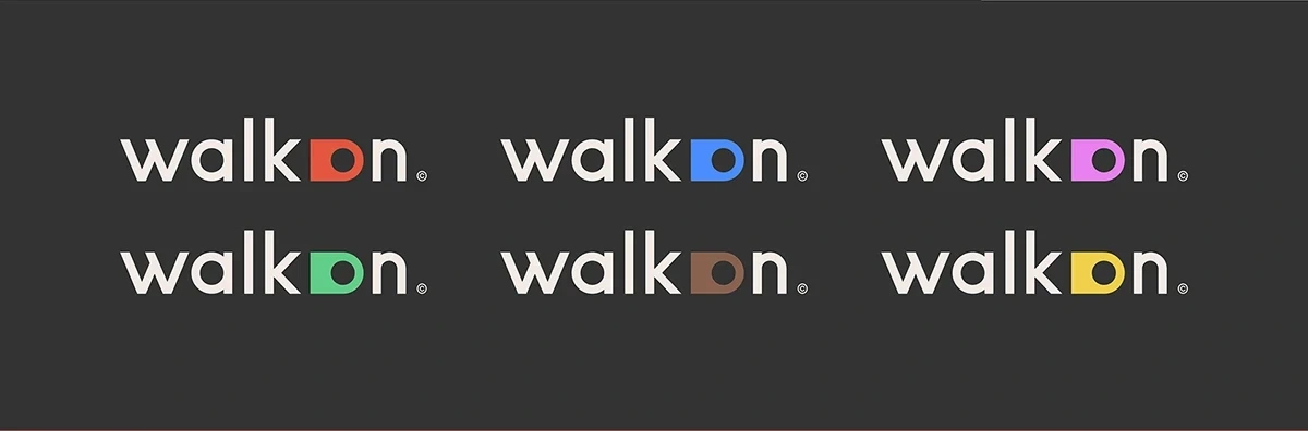
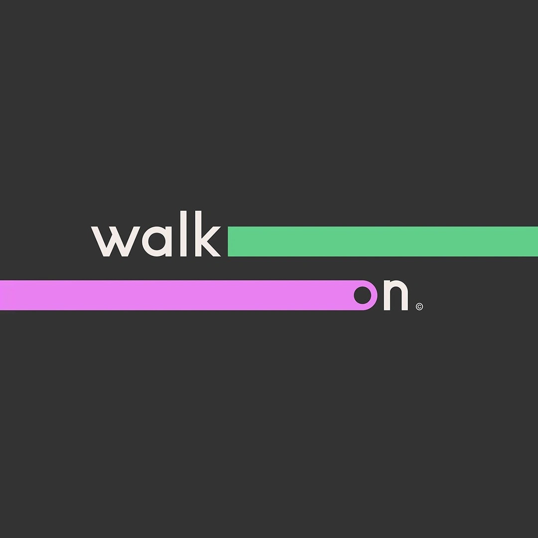
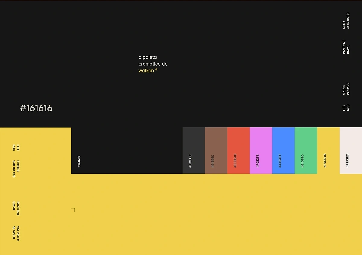
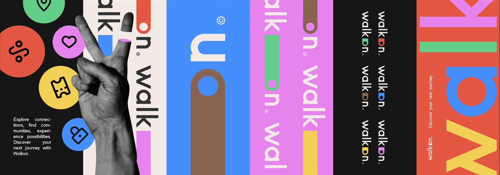
The identity was built around two ideas: movement and plurality. The typographic wordmark, condensed, bold, directional, was designed to tile, layer, and rotate across formats, creating a system that never sits still. Rather than a single brand colour, I developed a five-colour palette: cobalt blue, electric yellow, coral red, mint green, and hot pink. The decision was deliberate - a single-colour brand would have contradicted everything WalkOn stands for. Travel is plural; no two journeys are the same. The dark background anchors the palette, preventing visual chaos and giving the brand an unexpected premium quality despite, or because of, its loudness. The identity started with a simple point and a line: a journey. Everything built outward from there.
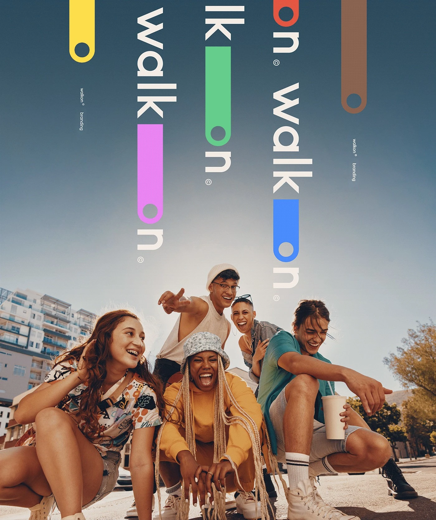
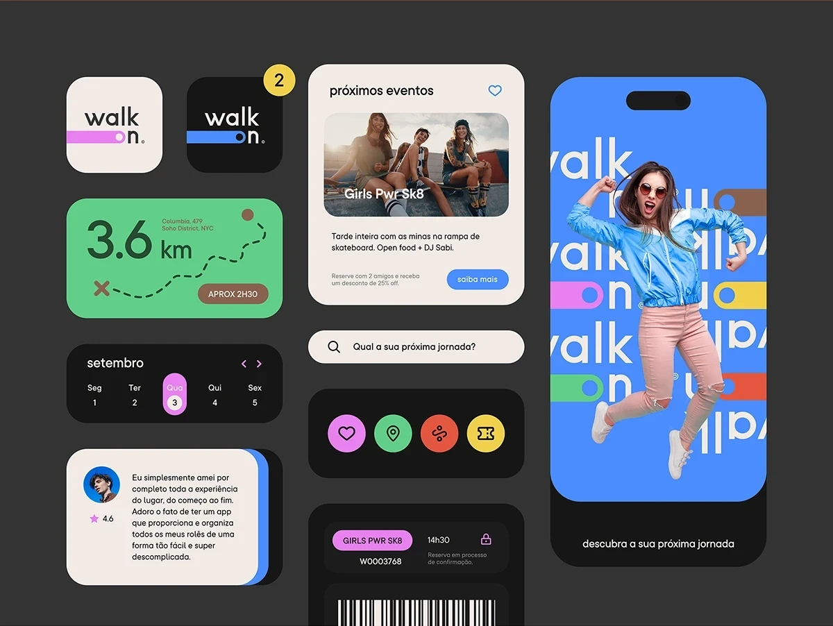
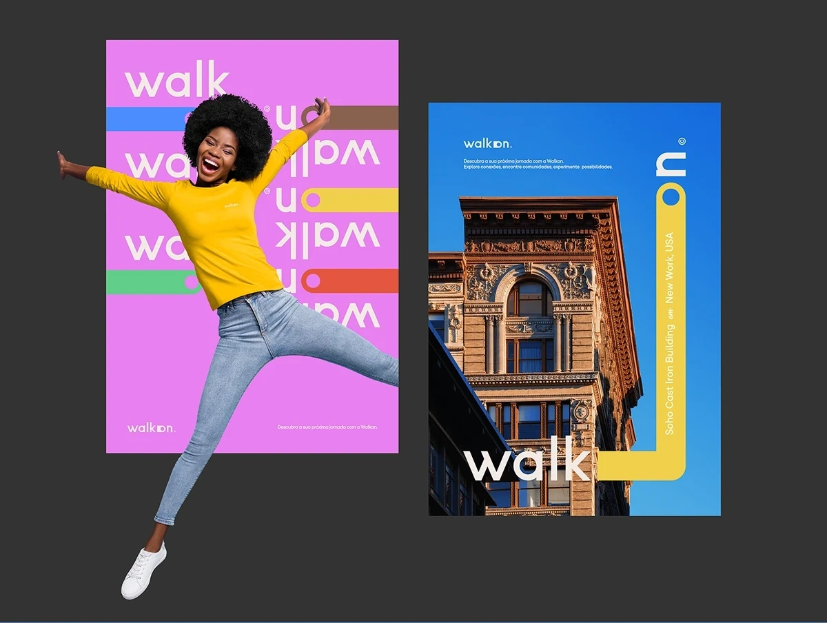
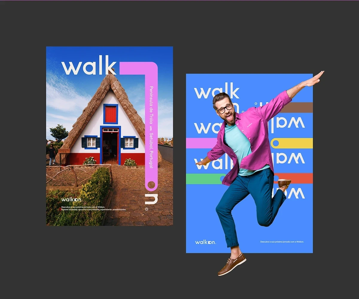
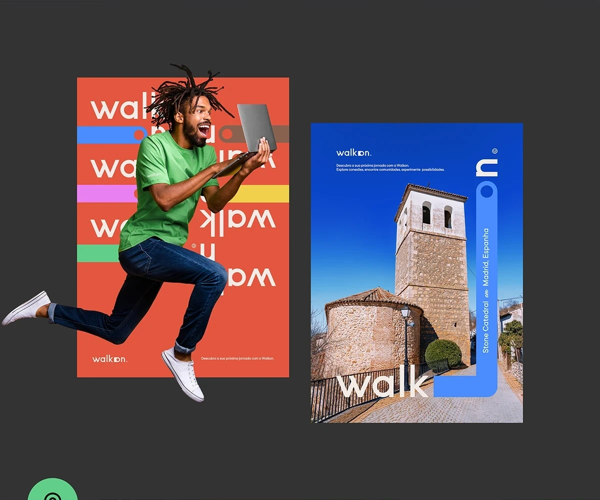
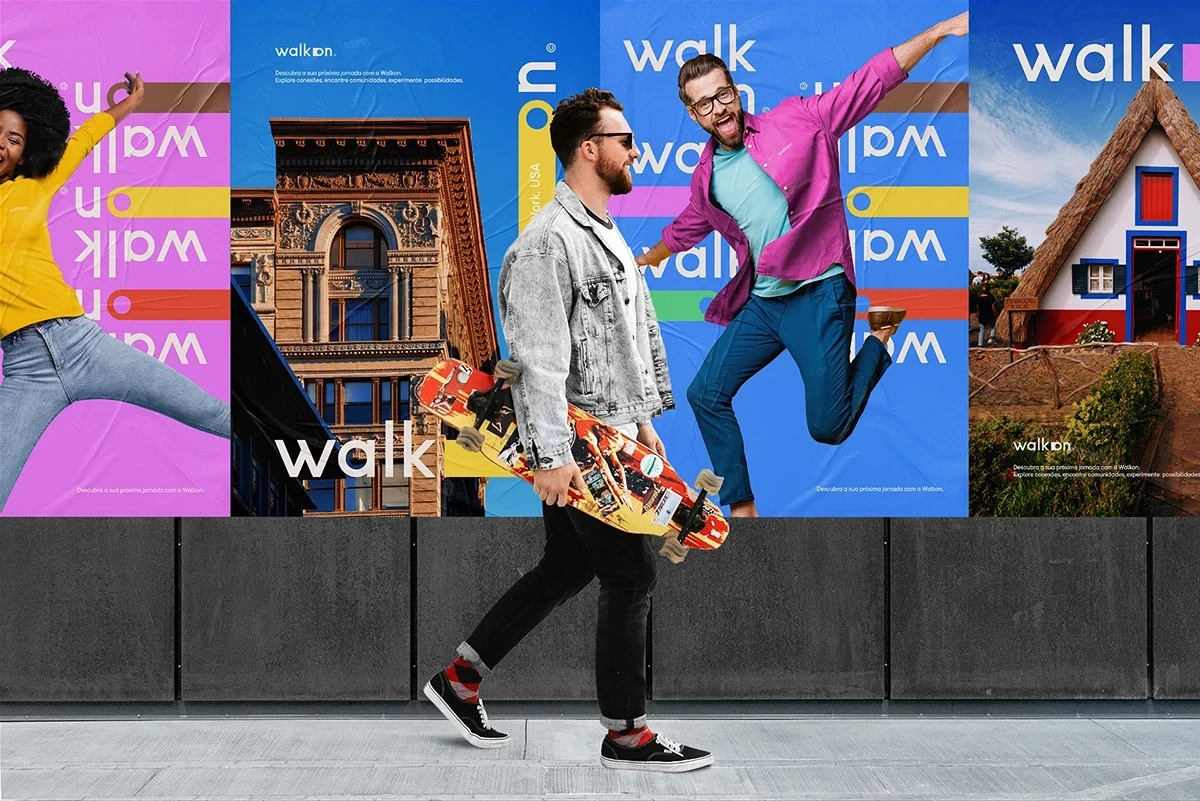
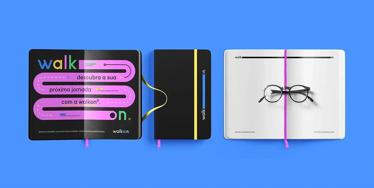
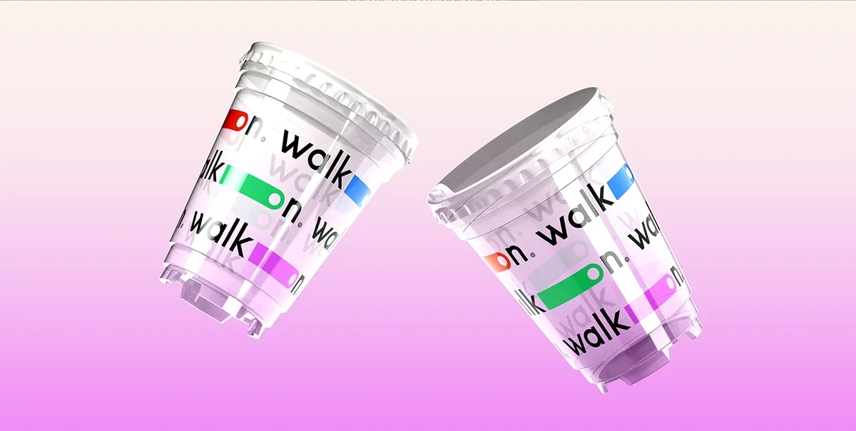
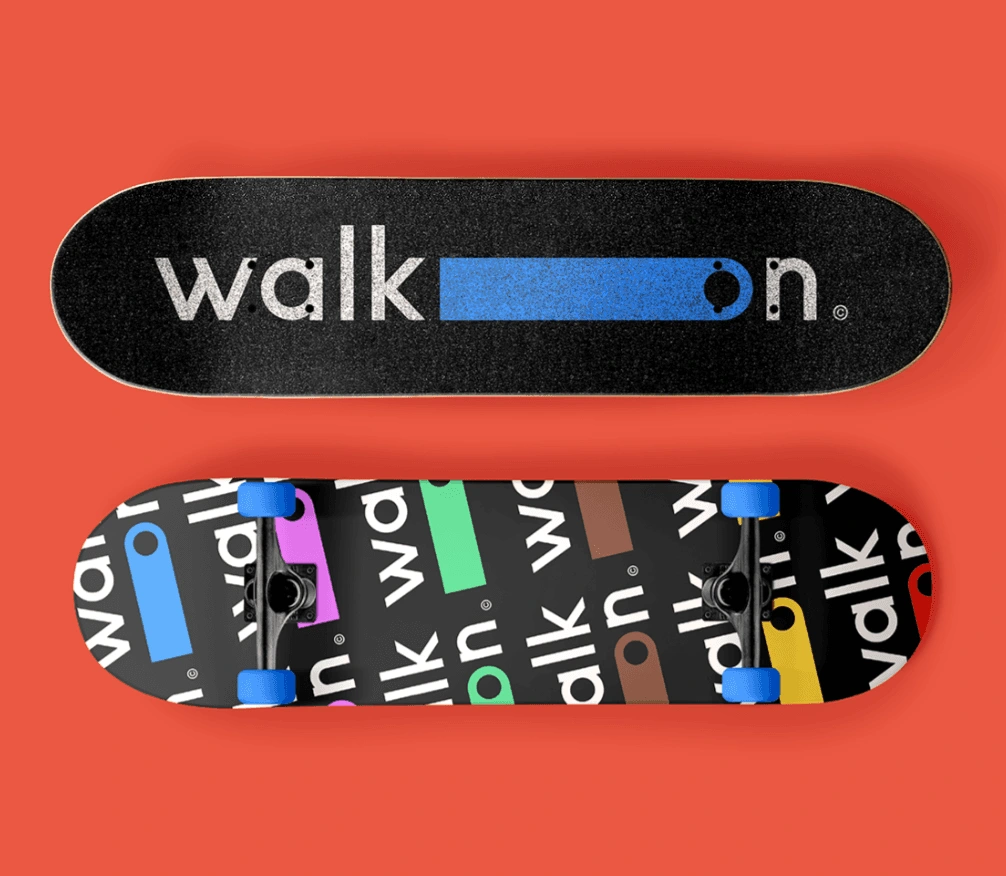
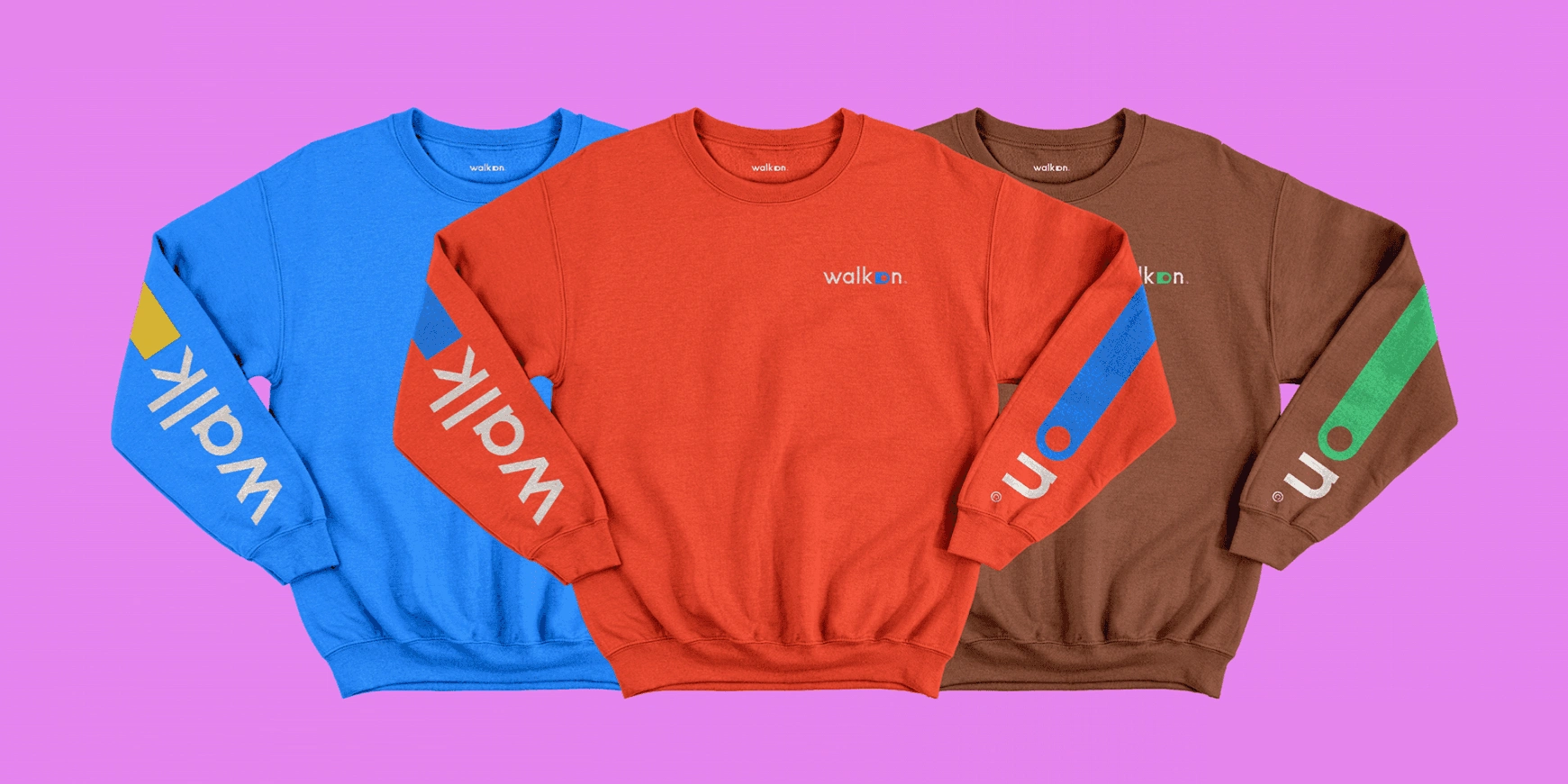
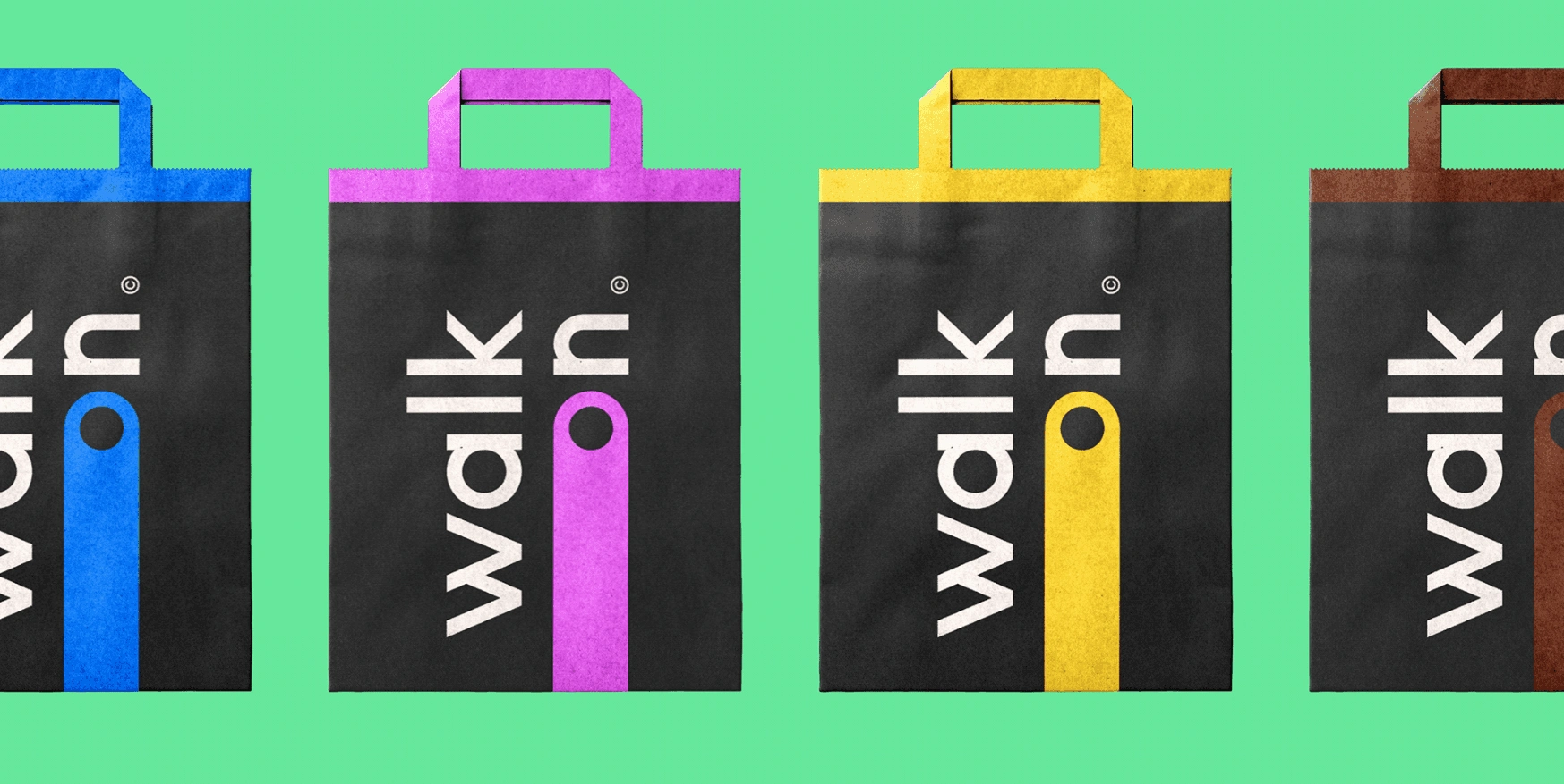
The complete brand system was delivered across digital and physical touchpoints - logo and wordmark suite, app UI mockups for home, messaging and map screens, a social media template system, poster designs, and a merchandise range including water bottles, tote bags, sweatshirts, and enamel pins. The identity gave WalkOn a market-ready visual presence capable of competing with established travel platforms from day one.
Like this project
Posted May 5, 2026
Created WalkOn's visual identity to emphasize human connection in travel.