White Sprut Shopify Store Redesign
Andrii Danilov
Project Overview
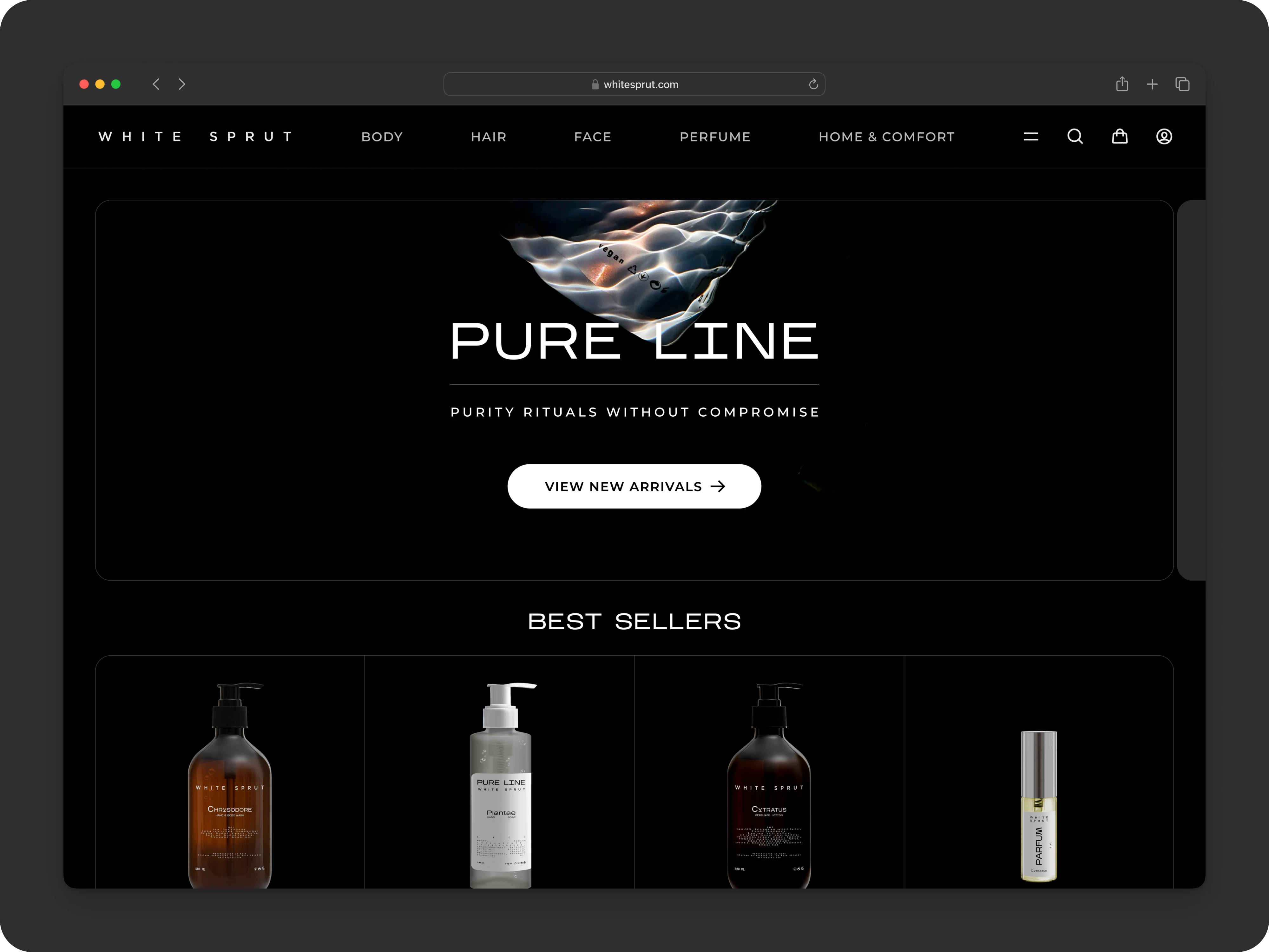
I teamed up with White Sprut — a Kyiv-based maker of premium organic skincare — to reimagine their Shopify presence and bring their “purity rituals” to life online. The goal was to craft a light, airy interface that feels as clean and balanced as their ingredient lists, while also offering an immersive dark-mode experience for evening browsing.
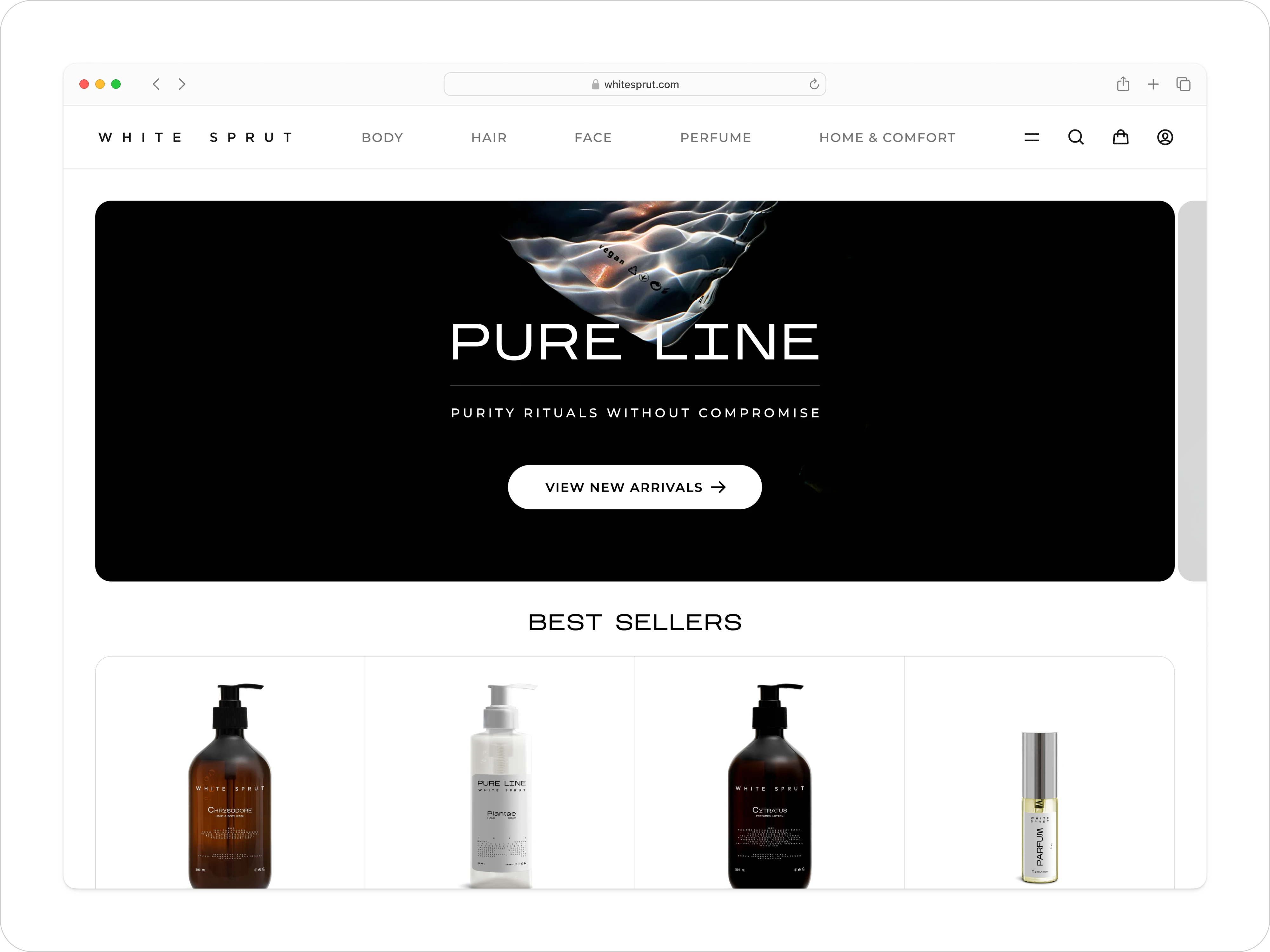
The Homepage & Grid
A minimalist full-bleed hero sets the tone: pure, high-contrast, and instantly on-brand. Below, a flexible grid of “Best Sellers” adapts seamlessly from desktop to mobile — no cramped cards, only generous white space and easy tap targets.
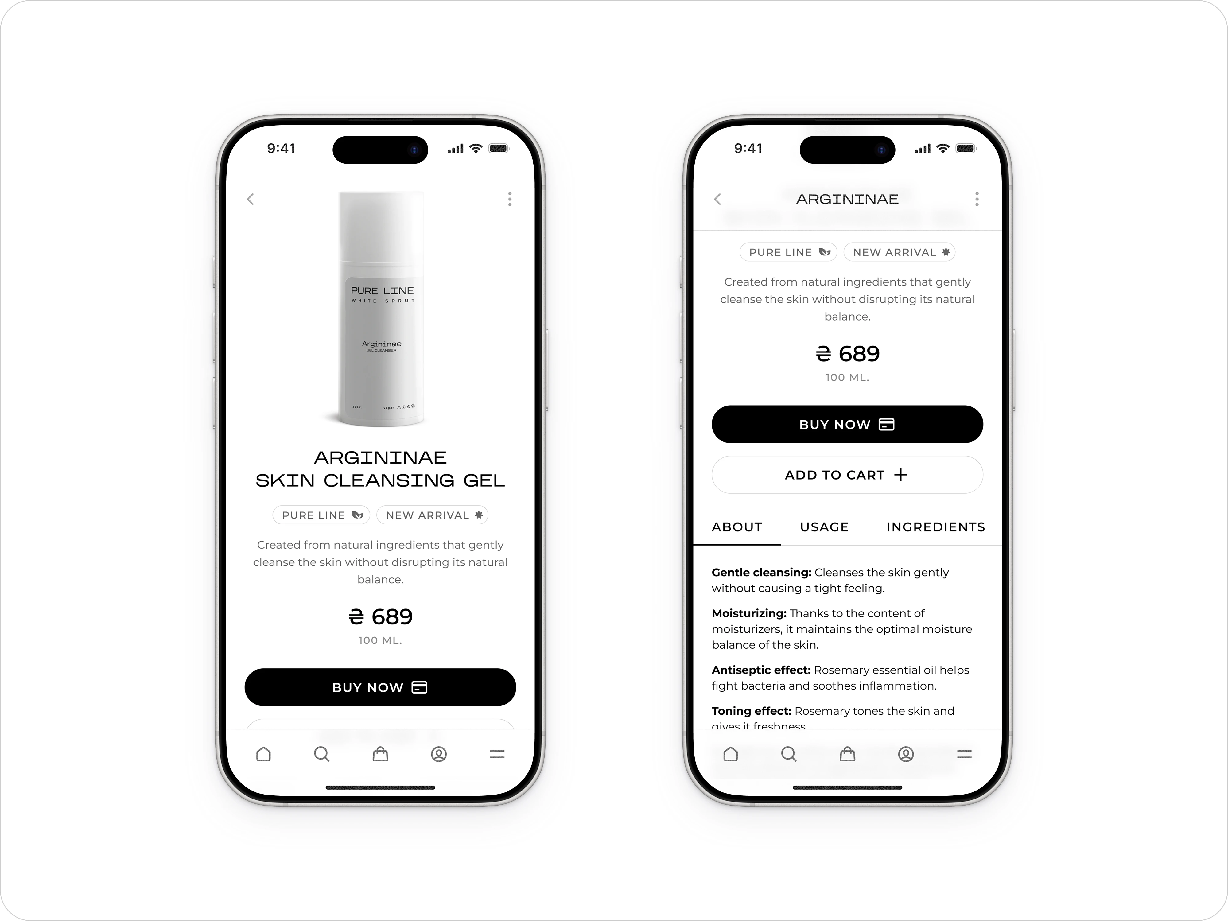
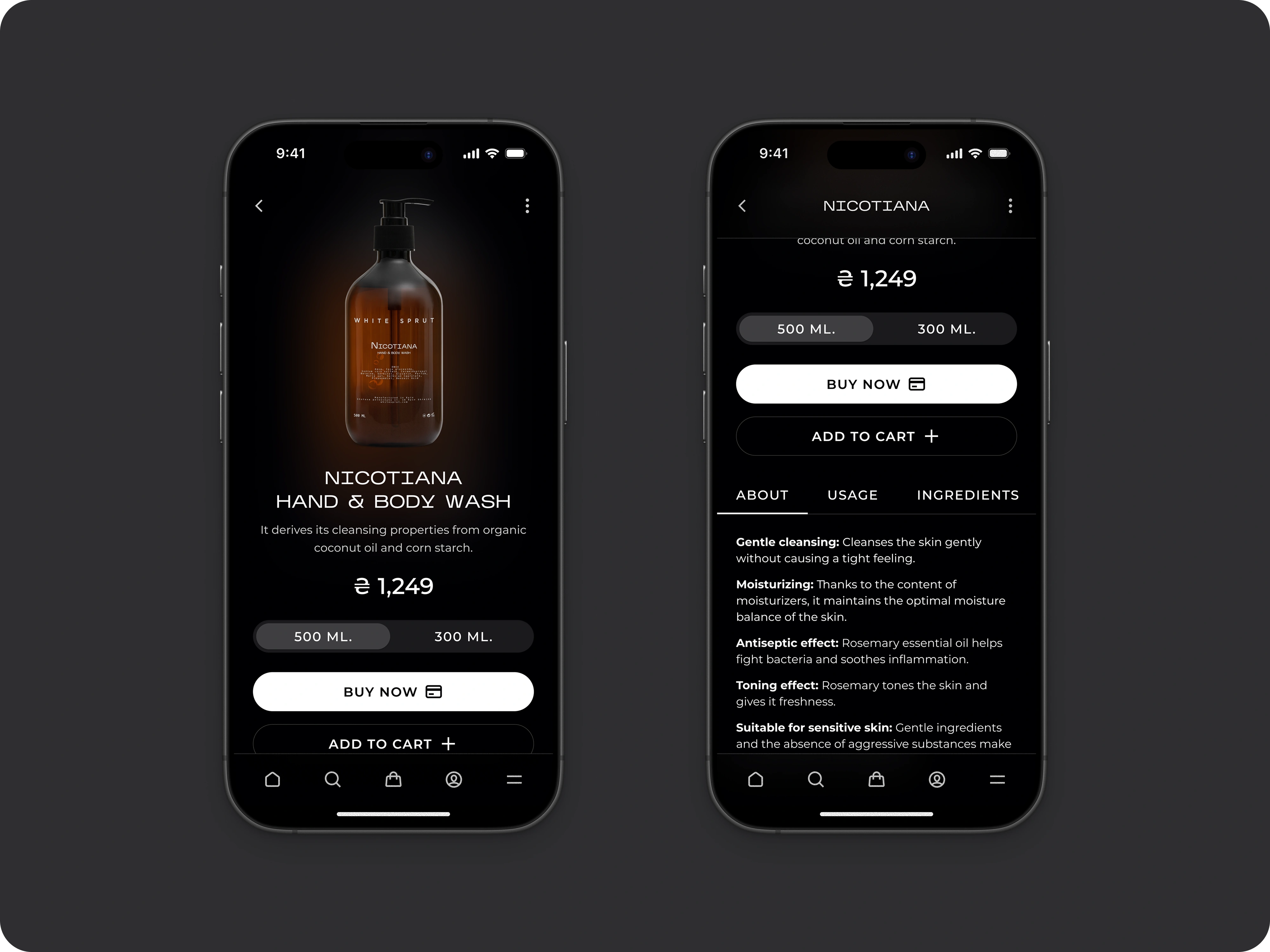
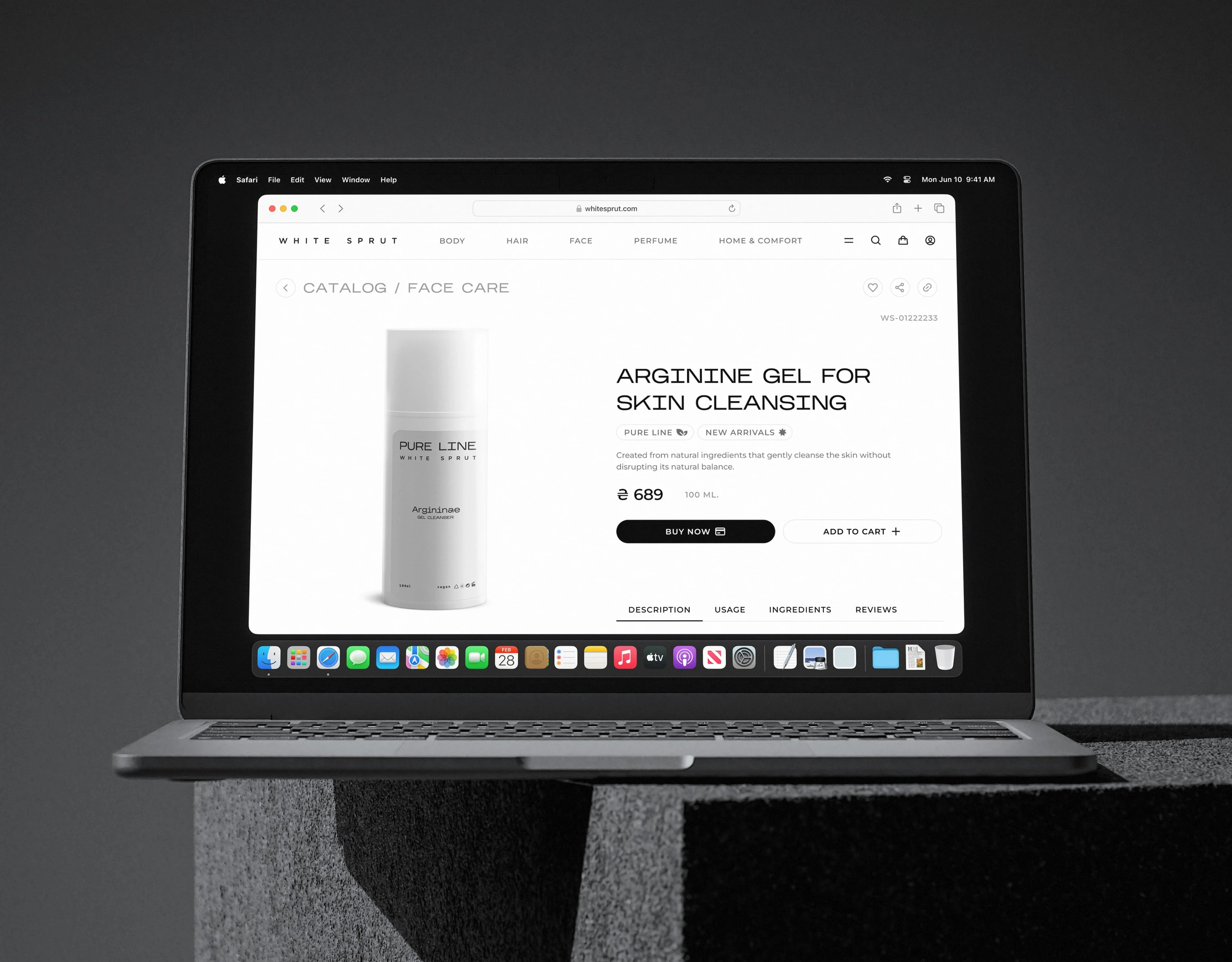
Product Card
Thumb-friendly actions ⋅ Tabbed details for quick skimming.
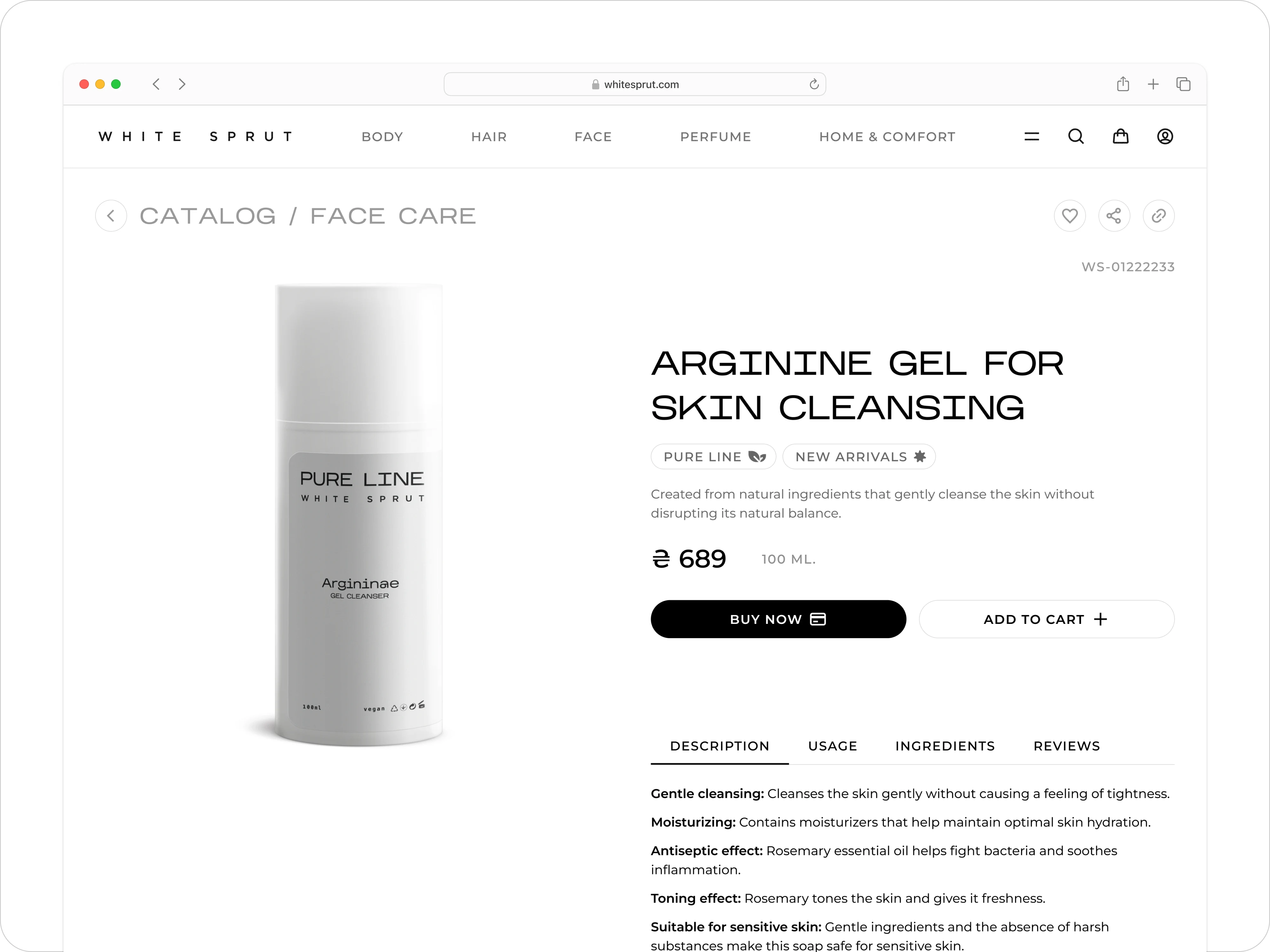
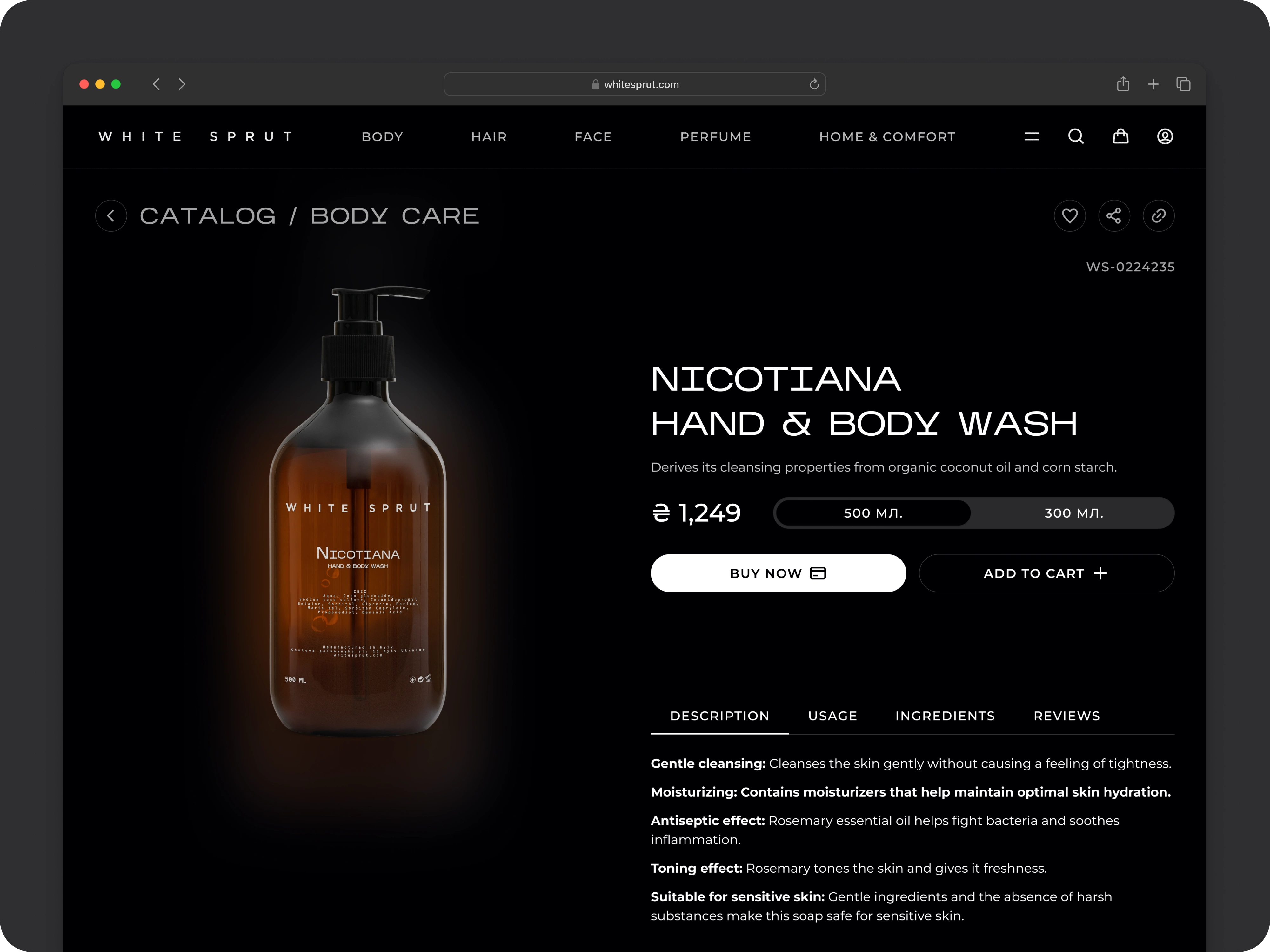
Whether in light or dark mode, each card floats on its canvas. Key info—image, name, price, size selector and buy/add buttons—stays pinned at thumb-height on mobile. Tabbed details (‘About’, ‘Usage’, ‘Ingredients’) transform scrolling into swift scanning.
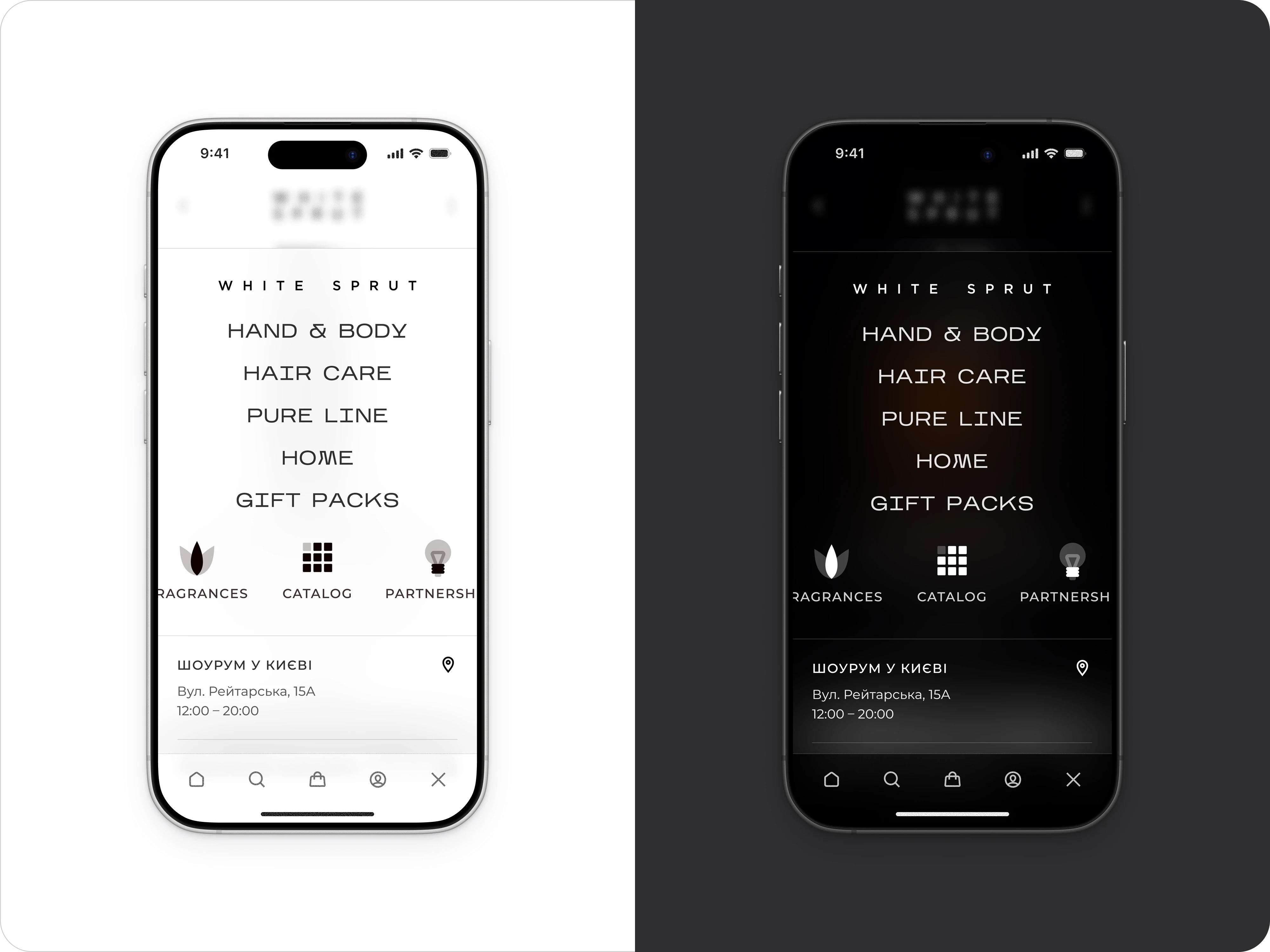
Global navigation
Persistent dark-mode switch ⋅ Icon + label tabs for instant access.
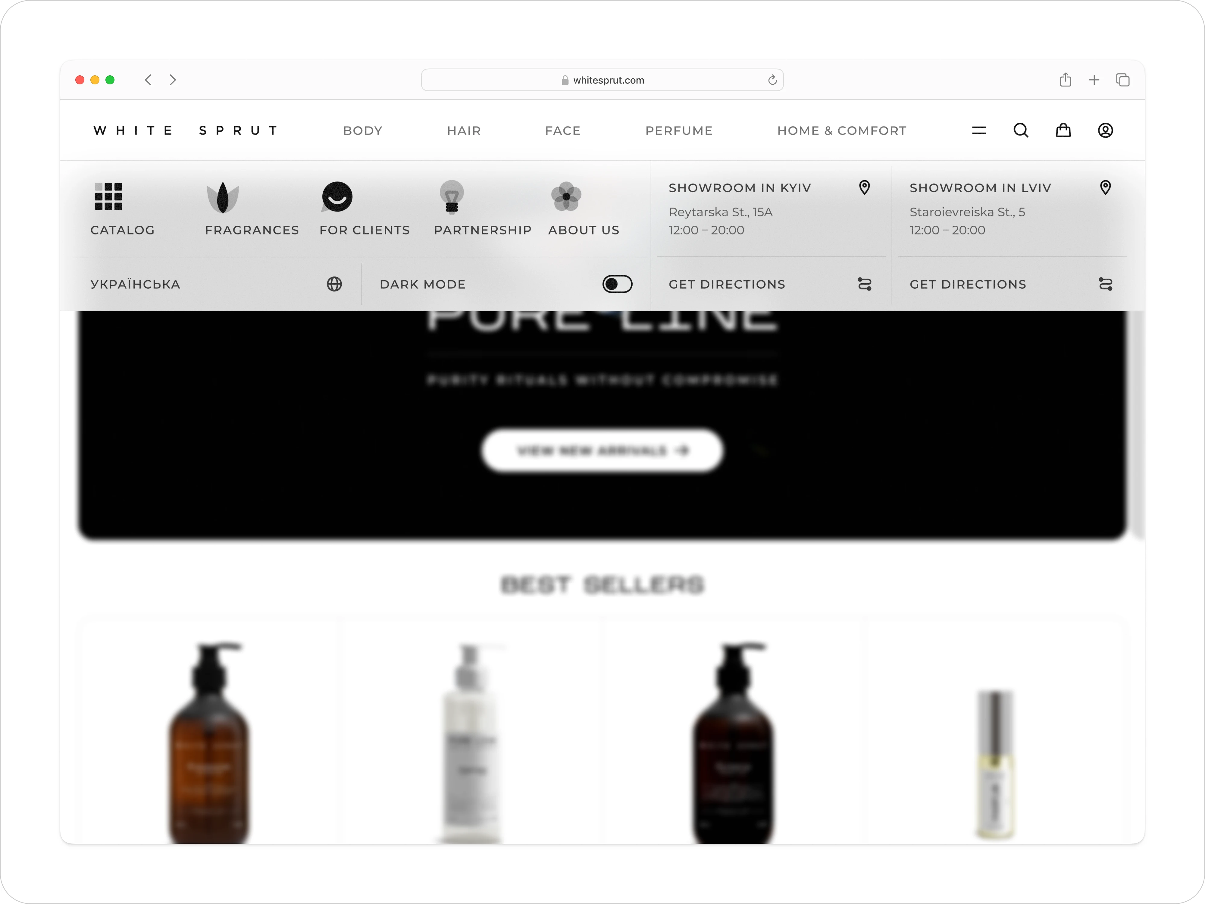
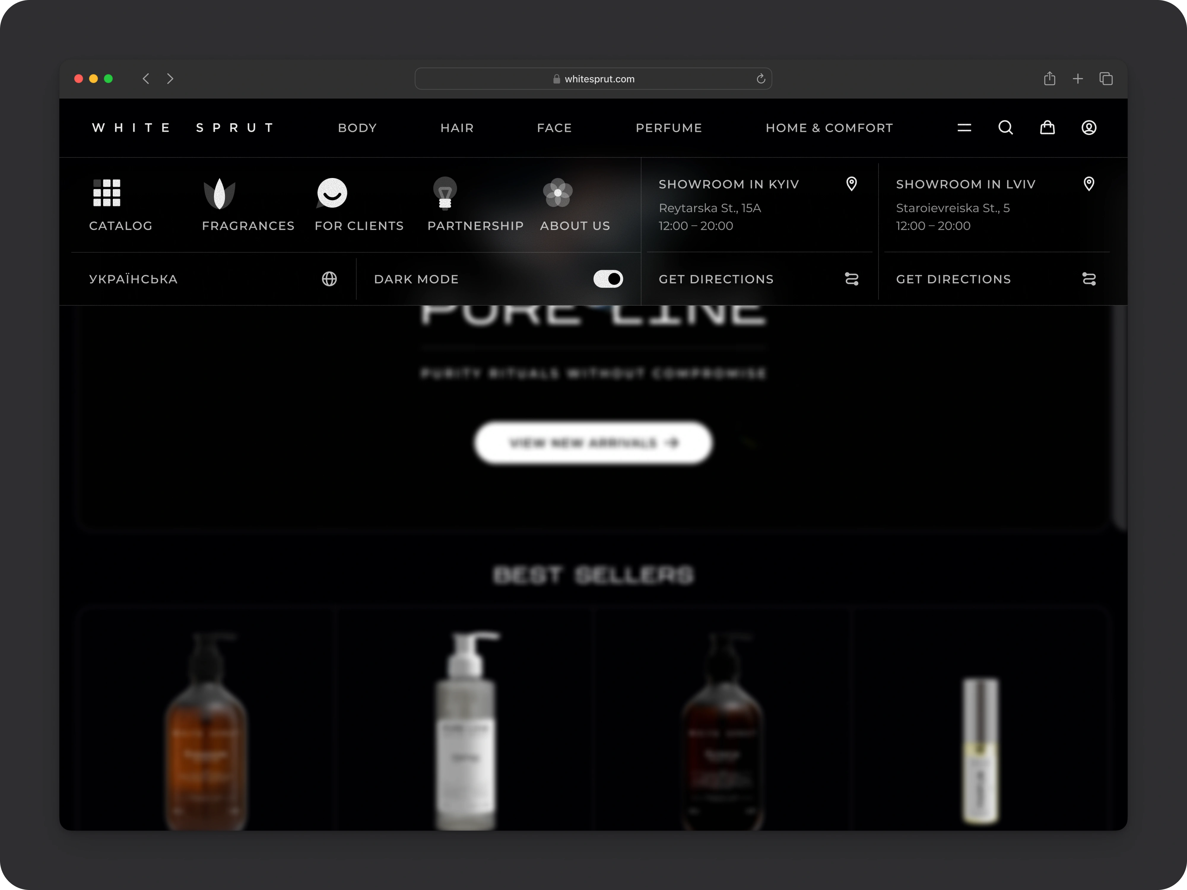
Top-bar categories (“Body”, “Hair”, “Face”, “Perfume”, “Home & Comfort”) live in a clean rail, with an always-visible dark-mode toggle tucked into the menu panel. On mobile, icon-driven tabs and a full-screen menu ensure exploration feels effortless — no more buried links.
Like this project
Posted Jul 21, 2025
Reimagined White Sprut's Shopify with clean, balanced design and dark-mode.
Likes
0
Views
13
Timeline
Mar 21, 2025 - Ongoing