Information Architecture
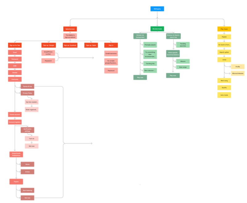
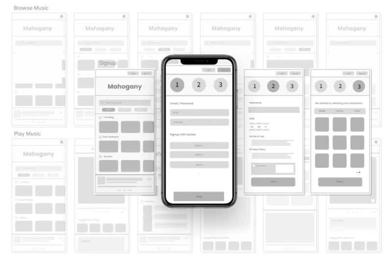
To create a solid foundation for the project, I developed an information architecture that outlined the structure and organization of Mahogany's music service. Its purpose is to create a well-structured framework that allows users to easily navigate, find, and understand the information presented. I included the sign-up flow, music search, and playing music.
Benchmarking
The case study began with extensive benchmarking. I analyzed existing music streaming platforms, such as Spotify and YouTube, to identify industry best practices, user expectations, and design trends. This research allowed me to understand the competitive landscape and gather inspiration.
User Flows
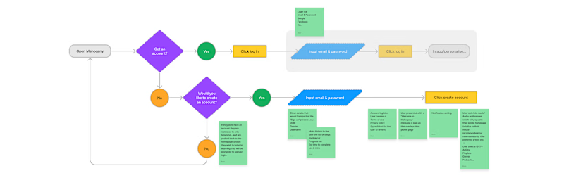
With a clear understanding of the information architecture, I proceeded to define user flows. I mapped out the step-by-step journeys users would take when performing key actions on the platform, such as signing up, searching for music, creating playlists, and playing songs. These user flows helped ensure a smooth and intuitive user experience.
Wireframing
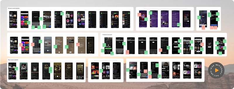
Before diving into detailed design, I created wireframes to visualize the layout and structure of the product. This low/mid-fidelity stage allowed me to focus on functionality and content placement without getting distracted by visual design elements. As we were working on signing up, searching and playing music, this is what I focussed on purely.
Color Palette
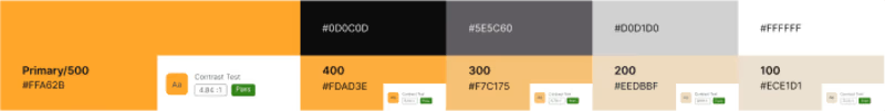
I carefully selected a color palette for Mahogany that reflected its musical identity. Warm, earthy tones combined with vibrant accent colors created a visually appealing and harmonious experience. The color scheme aimed to evoke emotions and enhance the user's connection to the music. I went for five primary colours and eight neutrals.
Typography and Grid
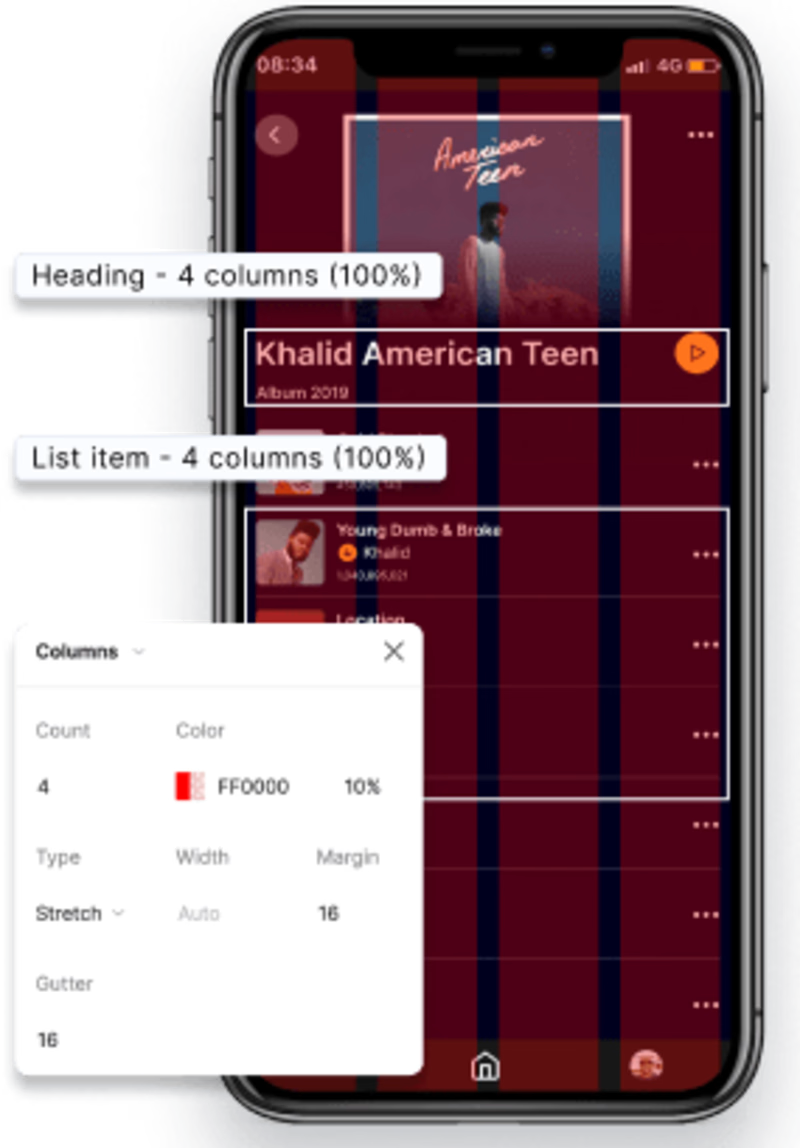
Typography was really important in assuring readabilty. I chose Inter as this is designed to be easy to read, especially when you mix them with capital letters, which is a great advantage for app screen. Users can quickly and easily understand the information. Body text was used in all of the components other than headings.
After deciding on the font I created two grids, both for desktop and mobile. This grid system ensured a seamless experience on various screen sizes and devices. Although I primarily focused on mobile, I also created some pages for desktop. In all instances, I ensured to adhere to the 4px rule.
Components
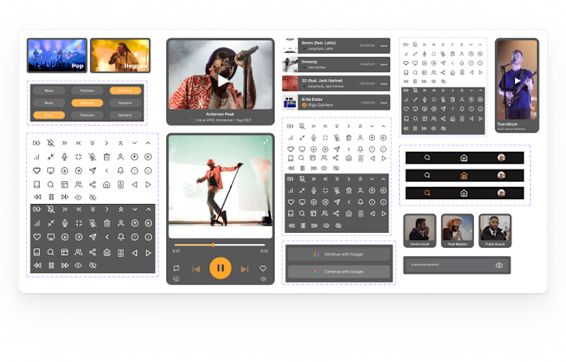
Below, you will find components such as icons, cards, buttons, and a navigation bar that I've created for this project. These components not only maintain design consistency but also saved me valuable time, enabling a more efficient workflow.
Final Designs
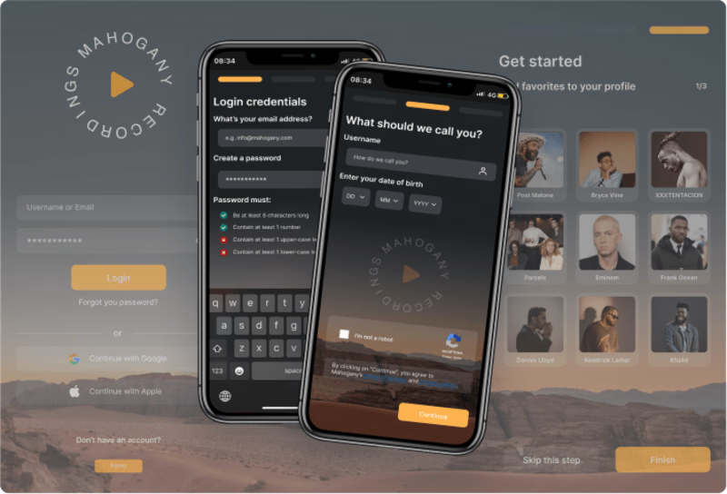
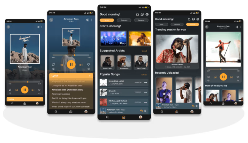
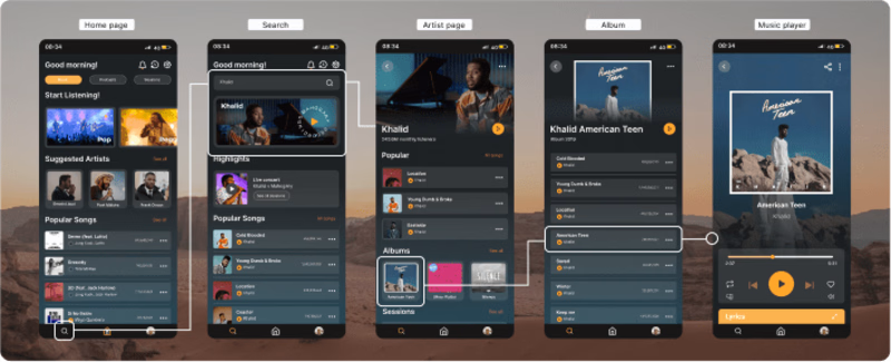
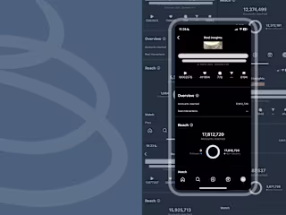
I designed a login flow, which not only authenticates users but also gathers essential user information and preferences. The experience of searching for music within the app was transformed, starting from the user's homepage and extending to artist profiles, allowing users to select albums and play individual songs effortlessly. The music player experience was enriched with the addition of sessions, incorporating video content. This helped differentiate the platform from competitors, ensuring a unique and engaging user experience.