Flair Brand Identity & Visual Campaign
Alfatiha Ahmed
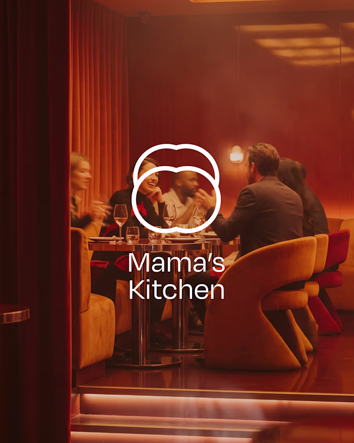
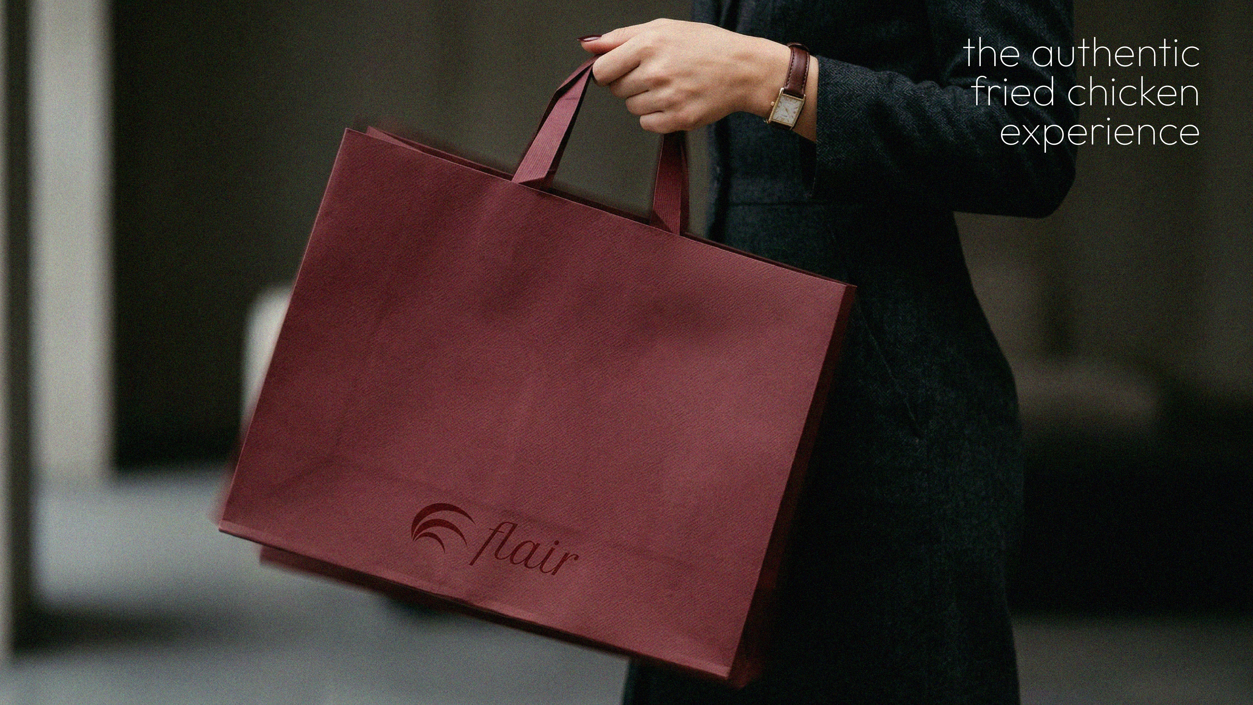
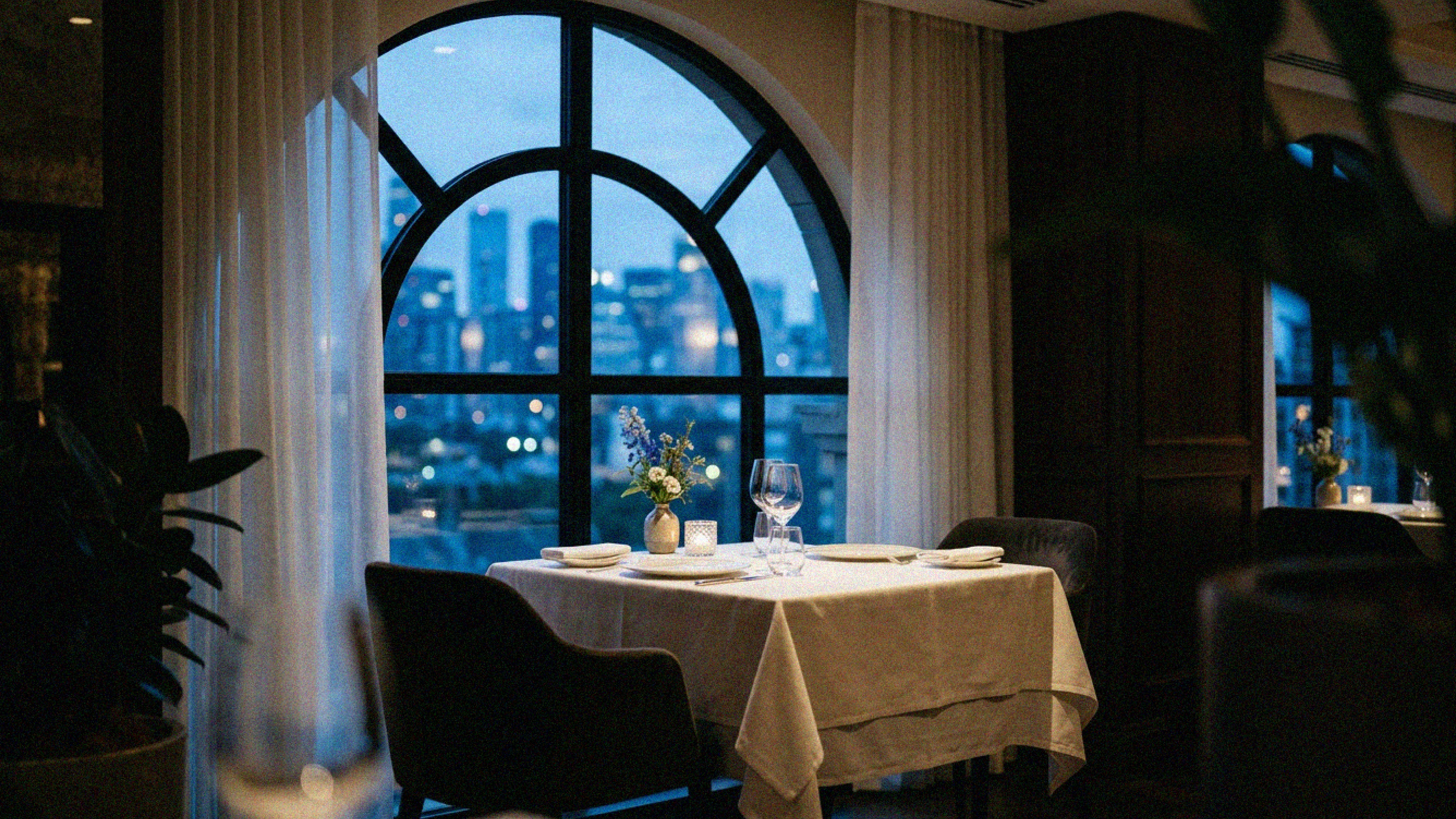
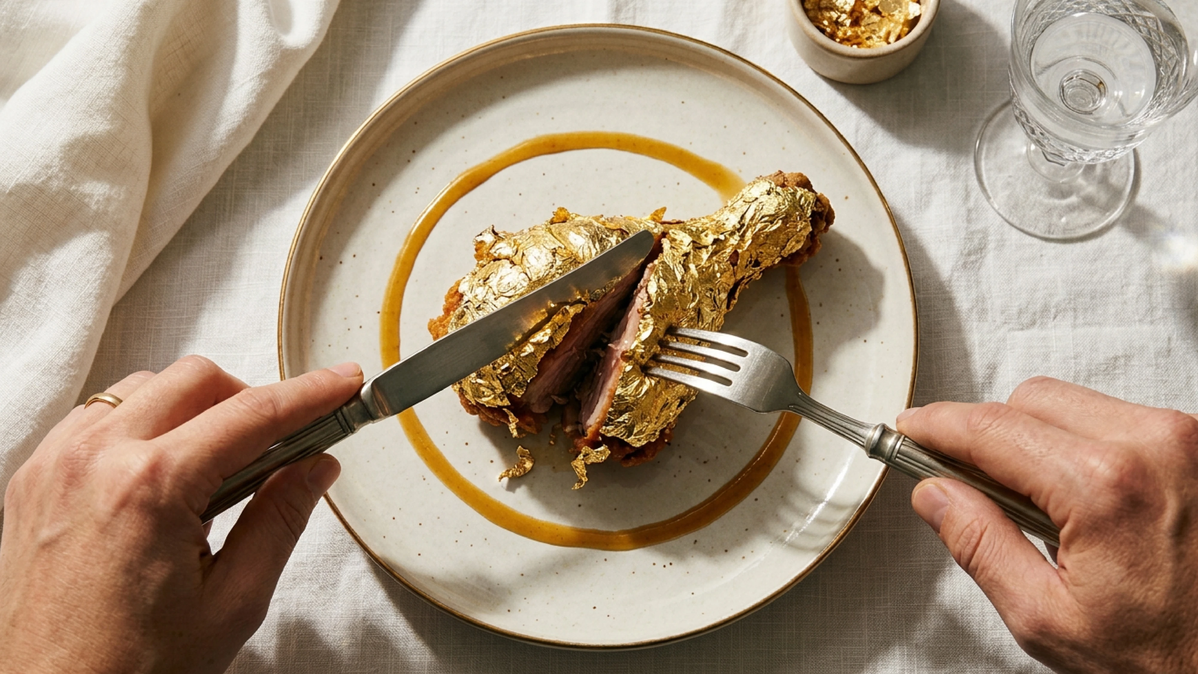
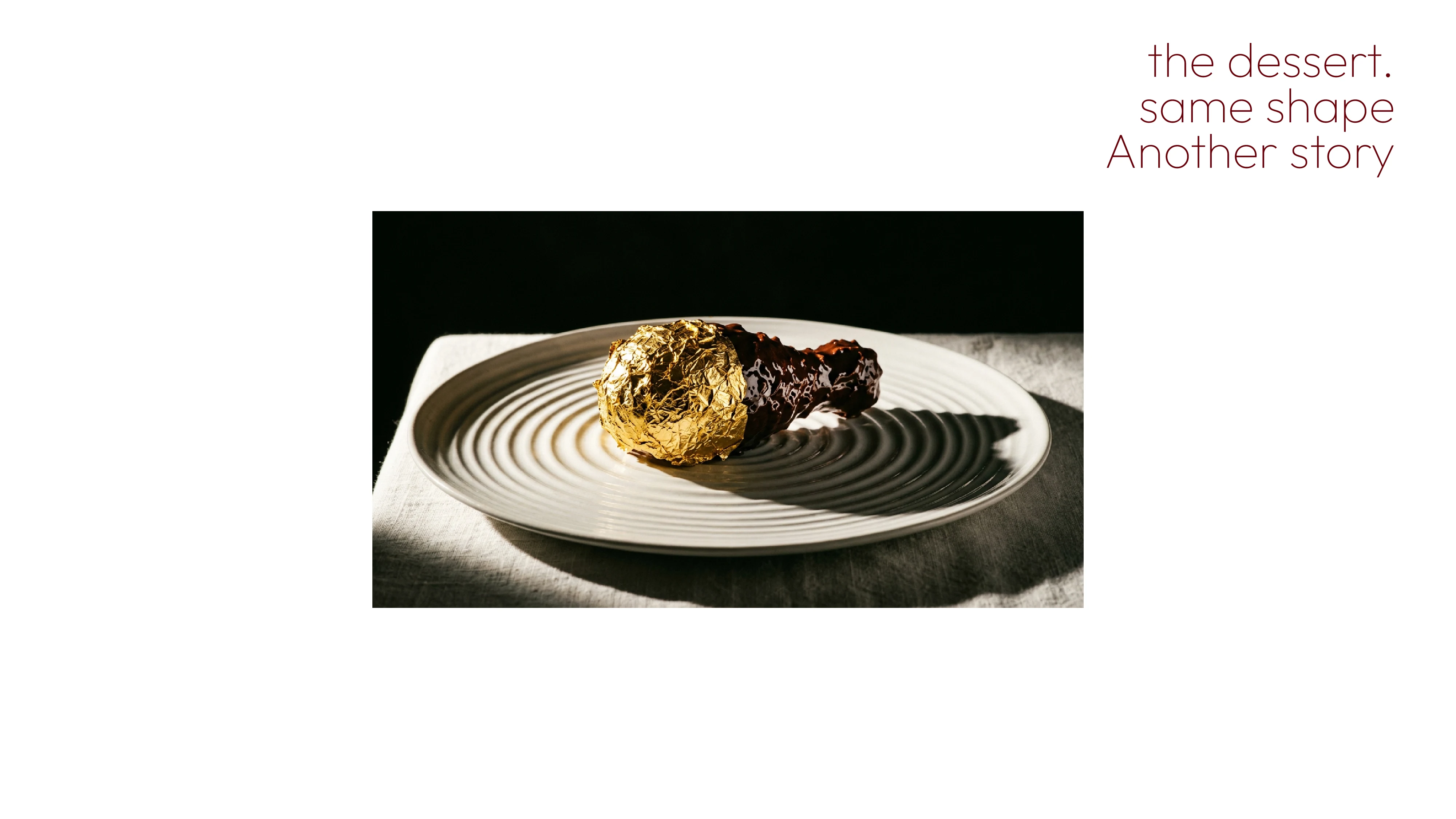
A luxury fried chicken fine dining concept an unexpected category that could easily feel gimmicky. The brand needed to make something familiar feel elevated, desirable, and completely worth the premium price without apologizing for what it is.
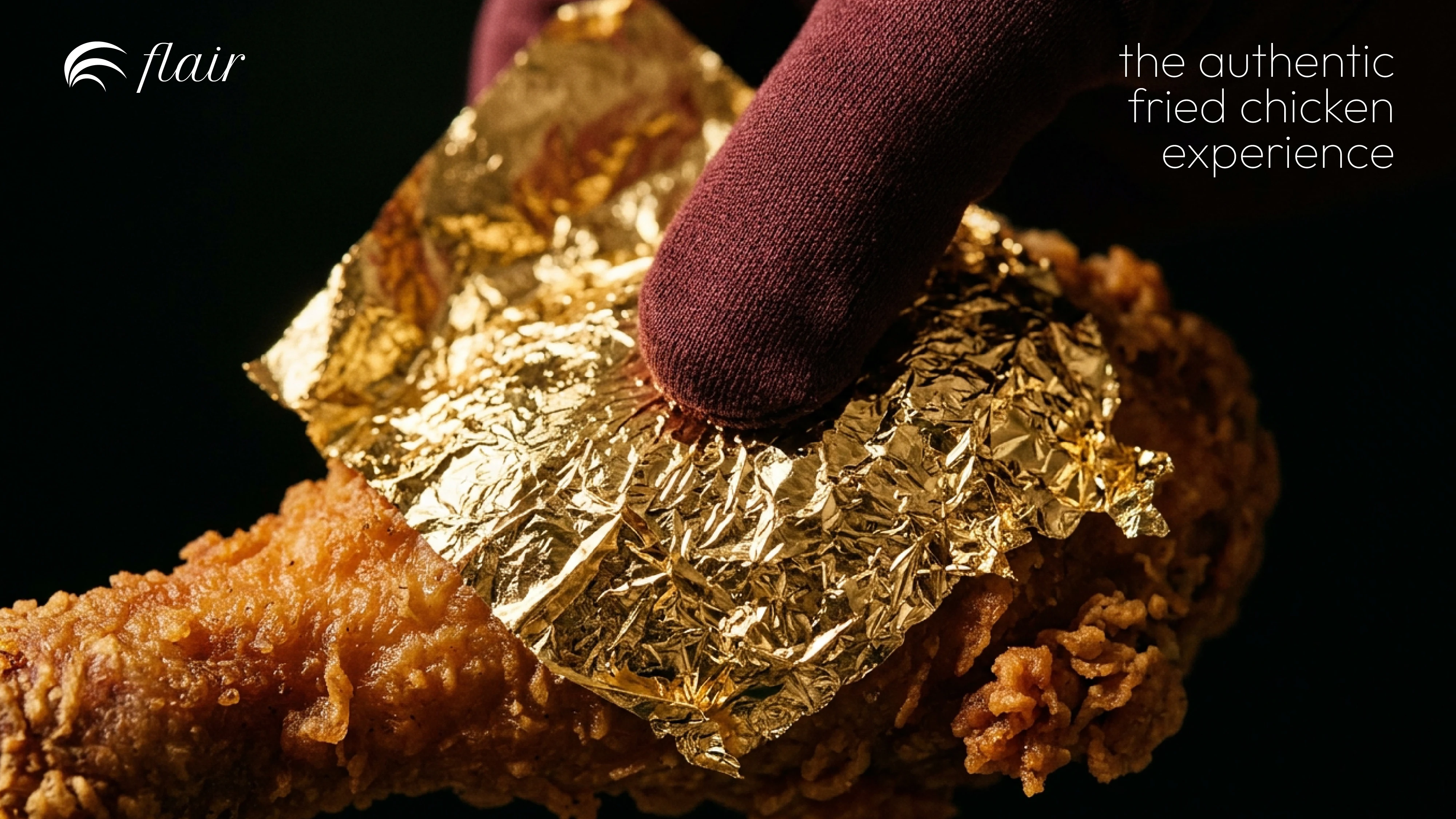
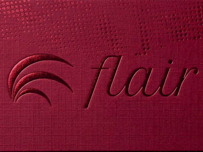
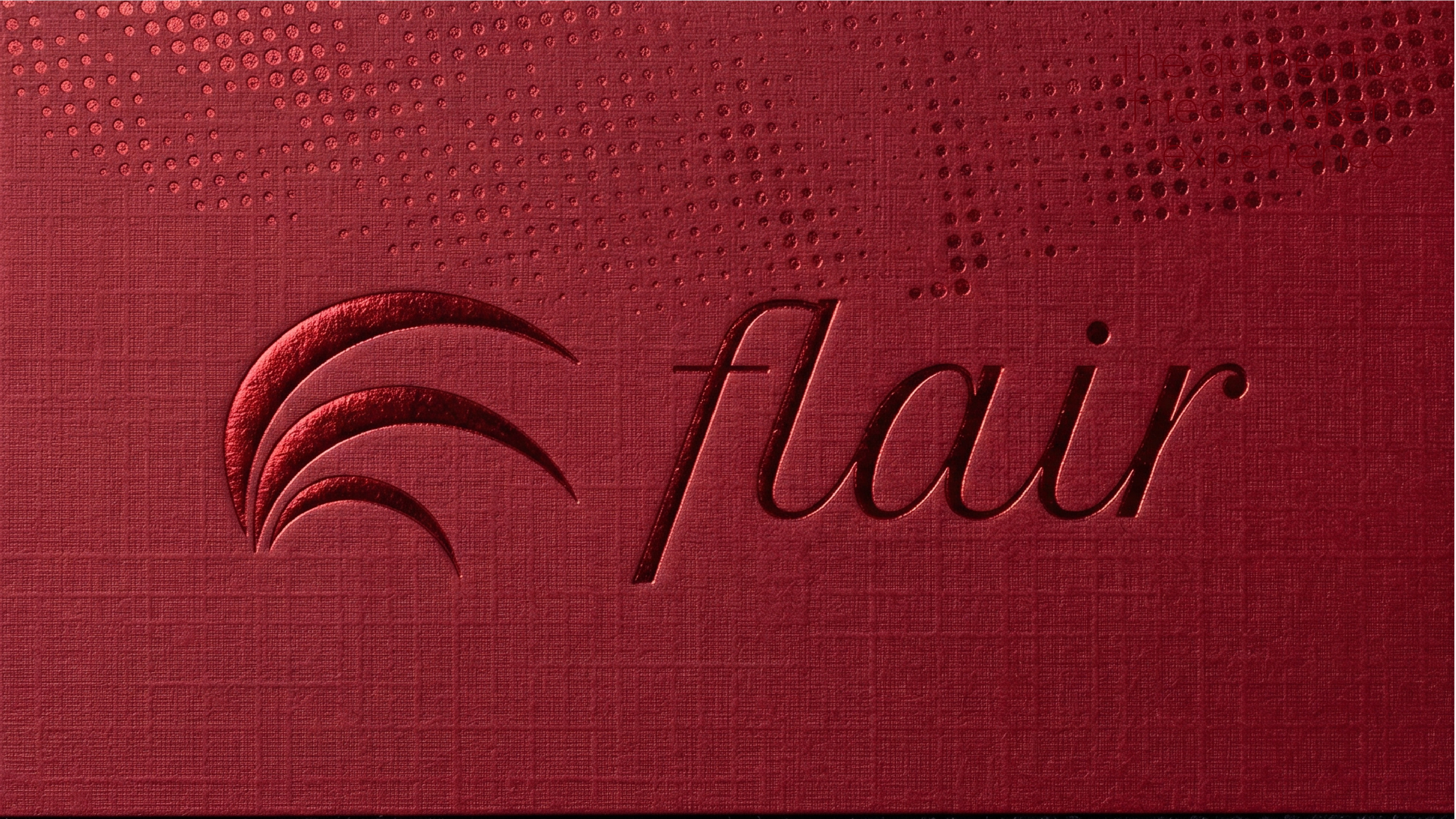
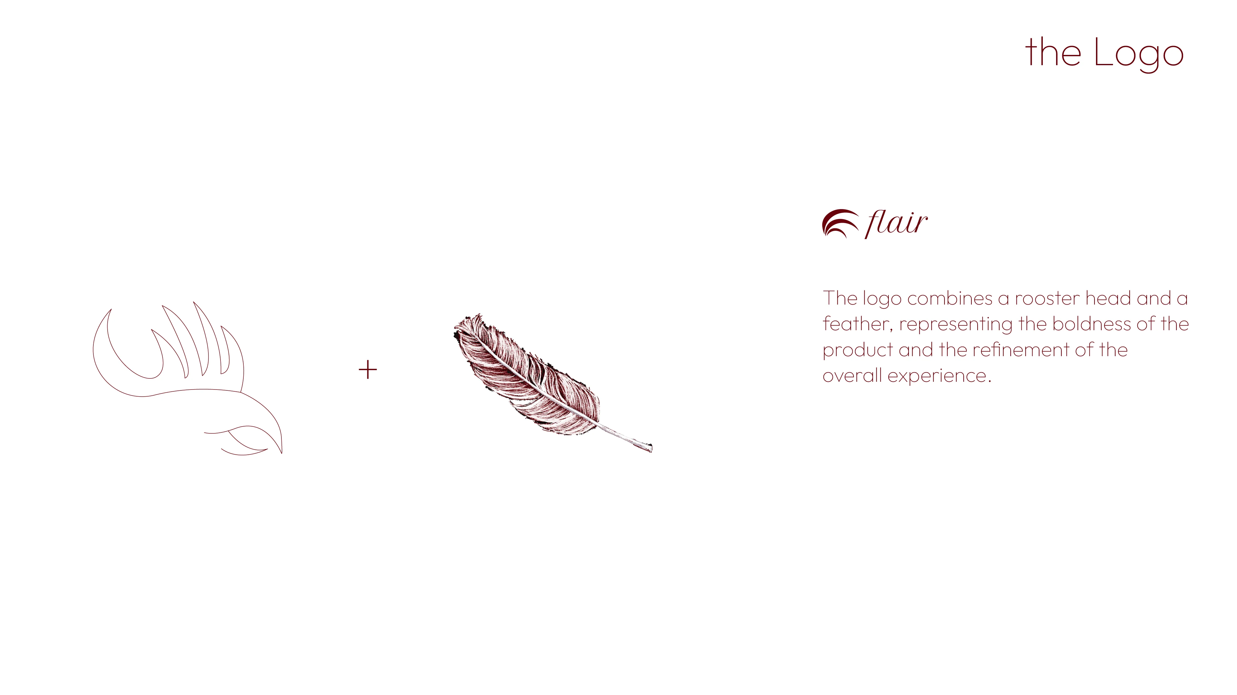
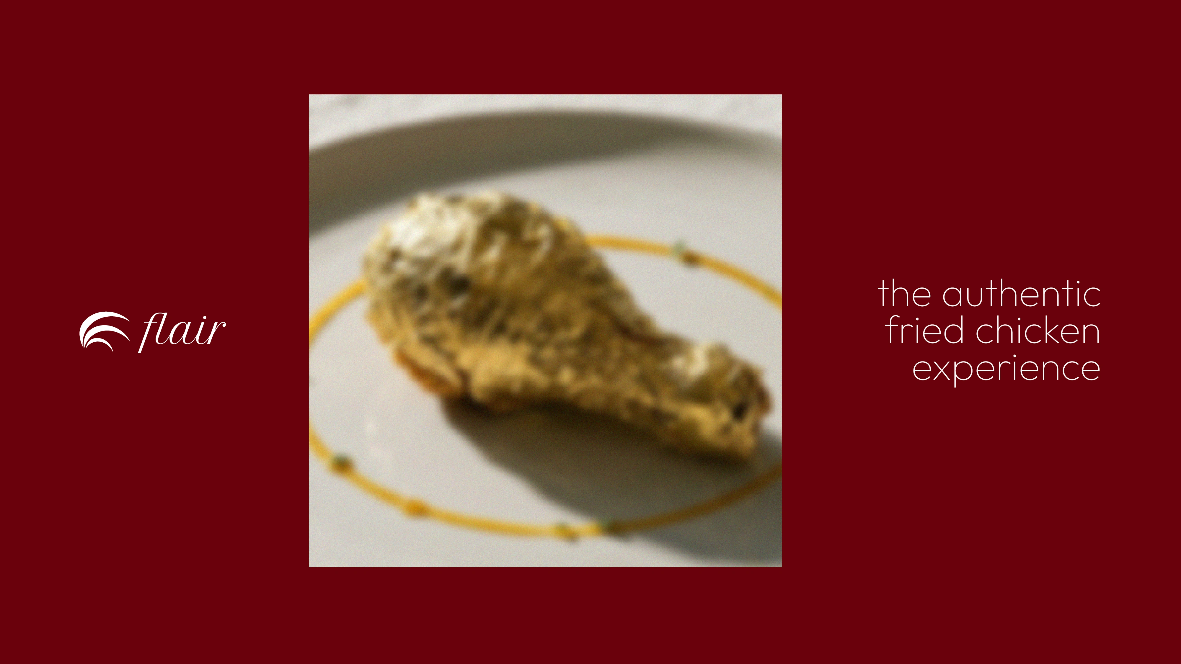
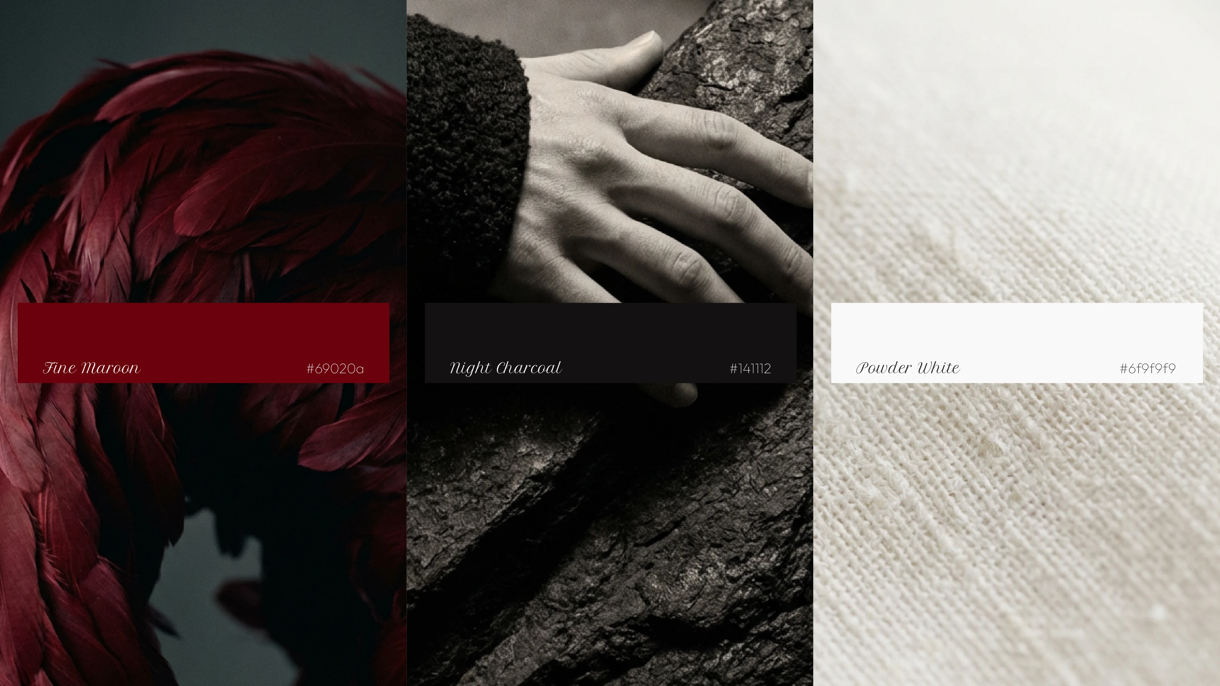
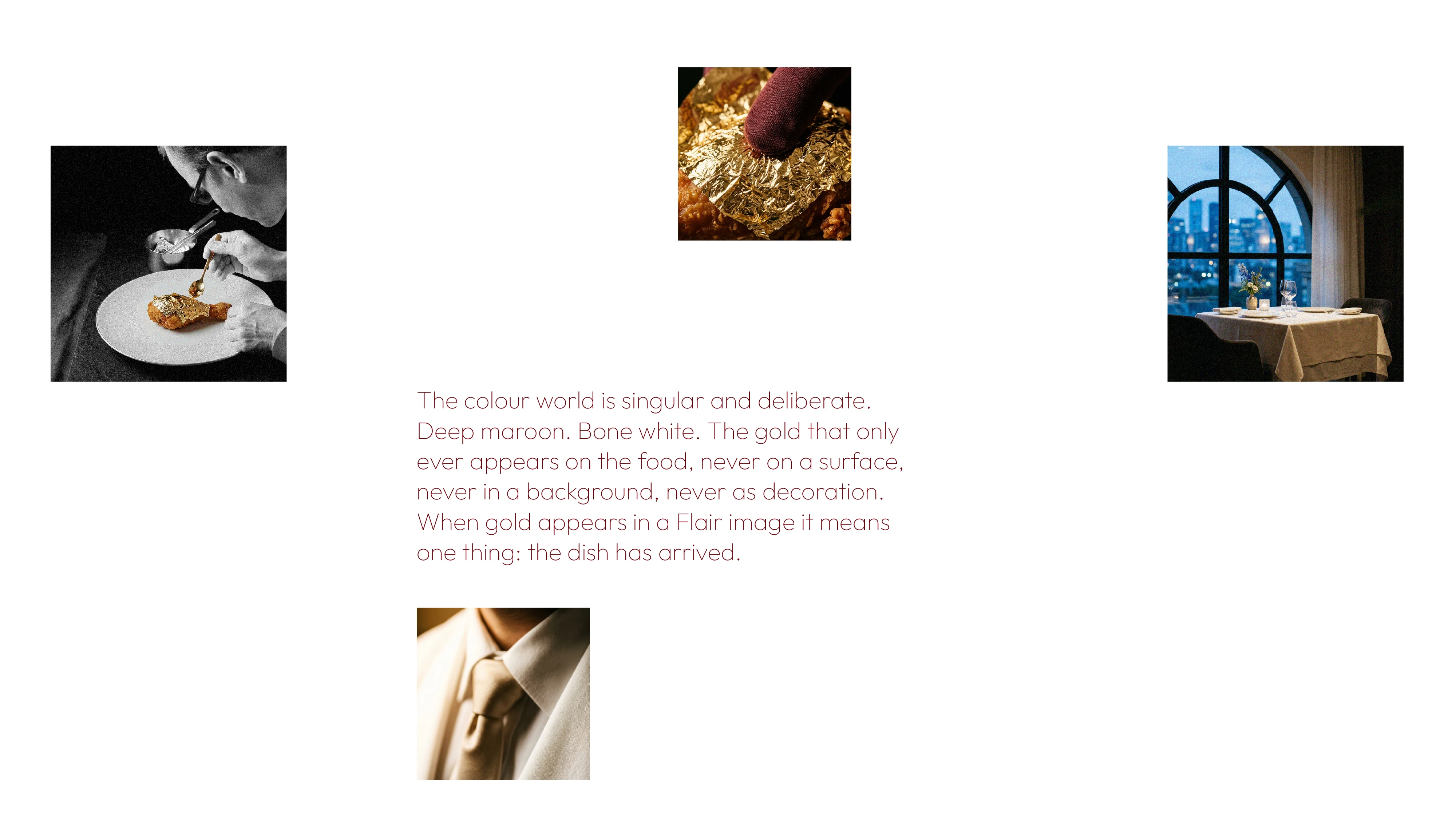
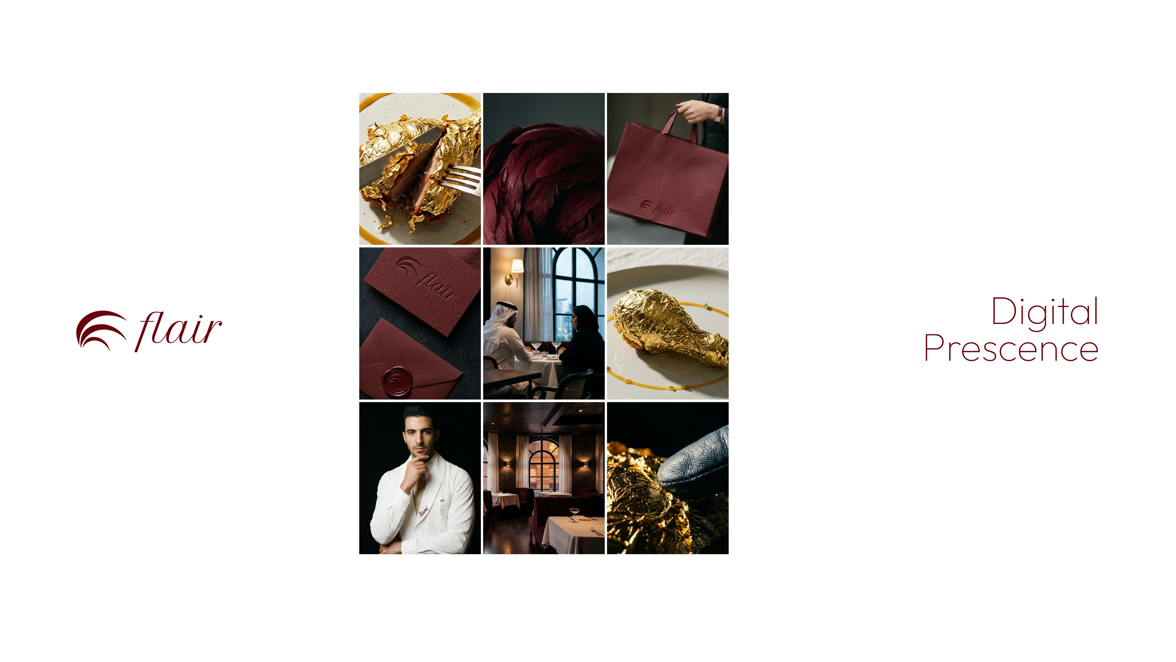
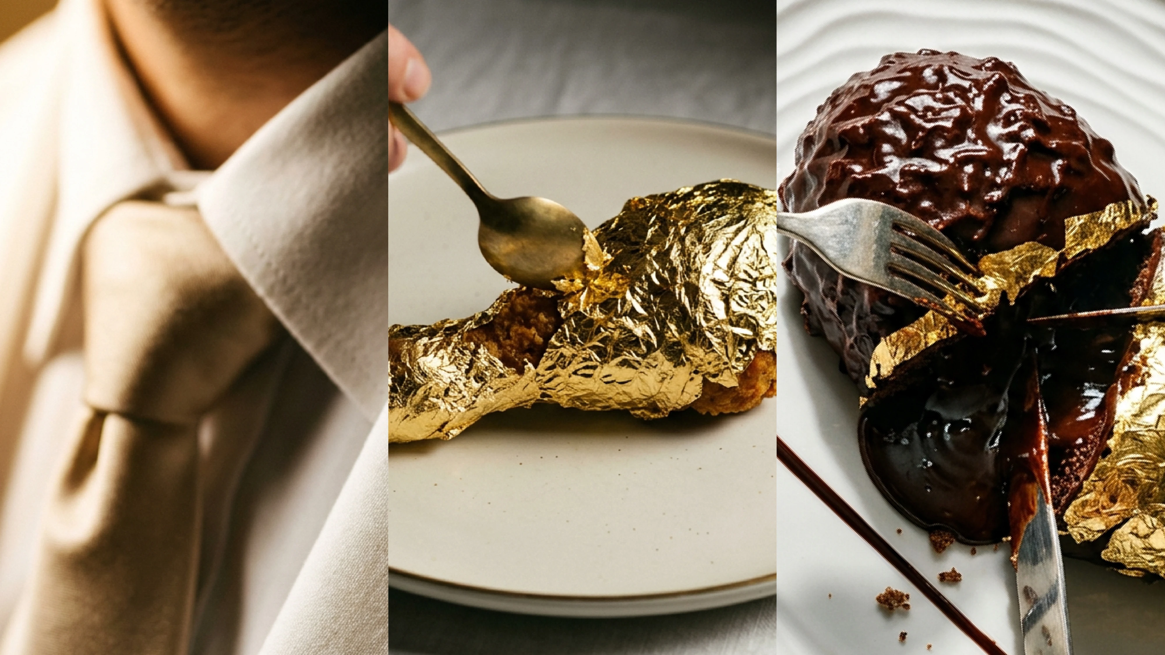
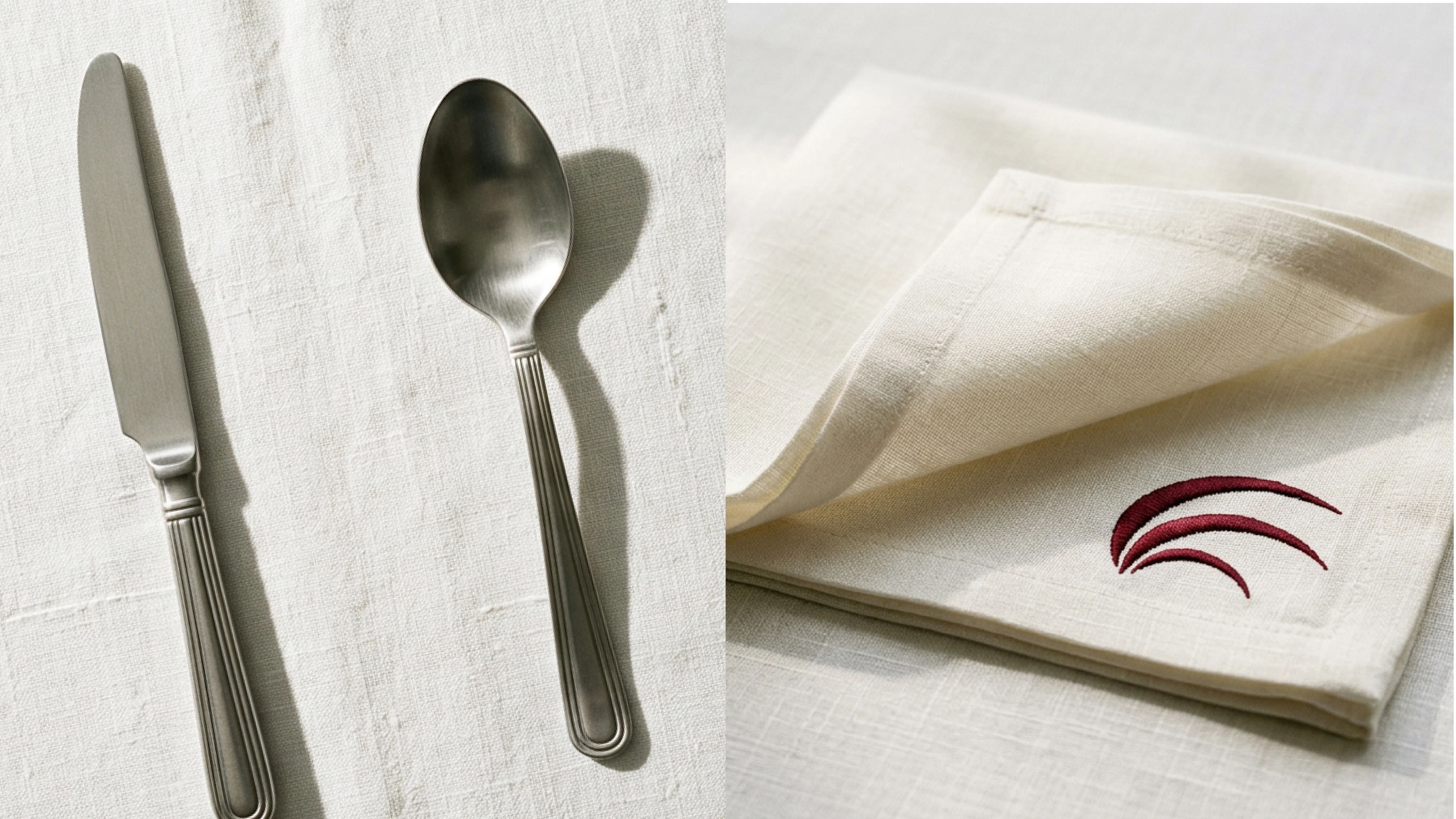
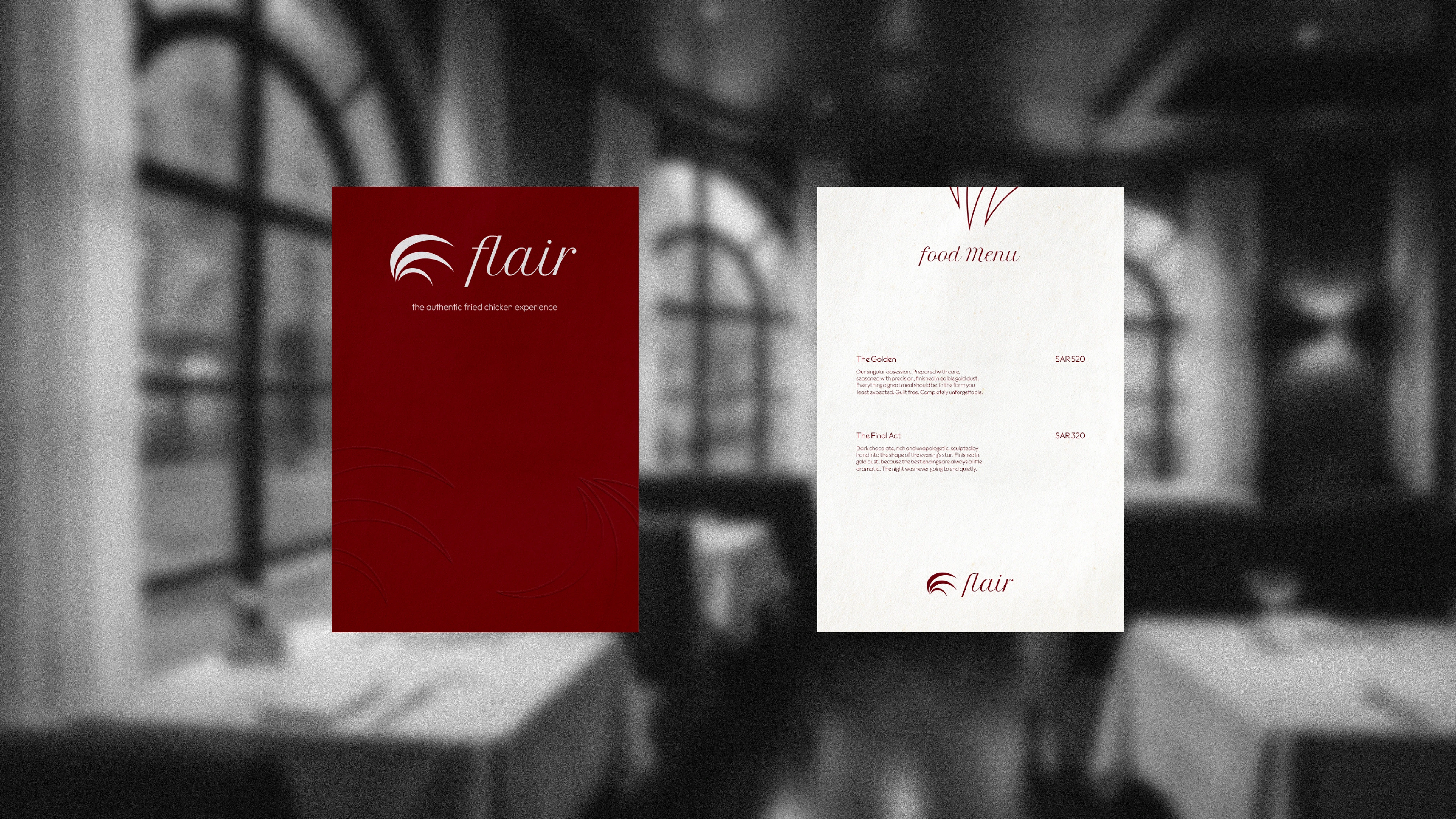
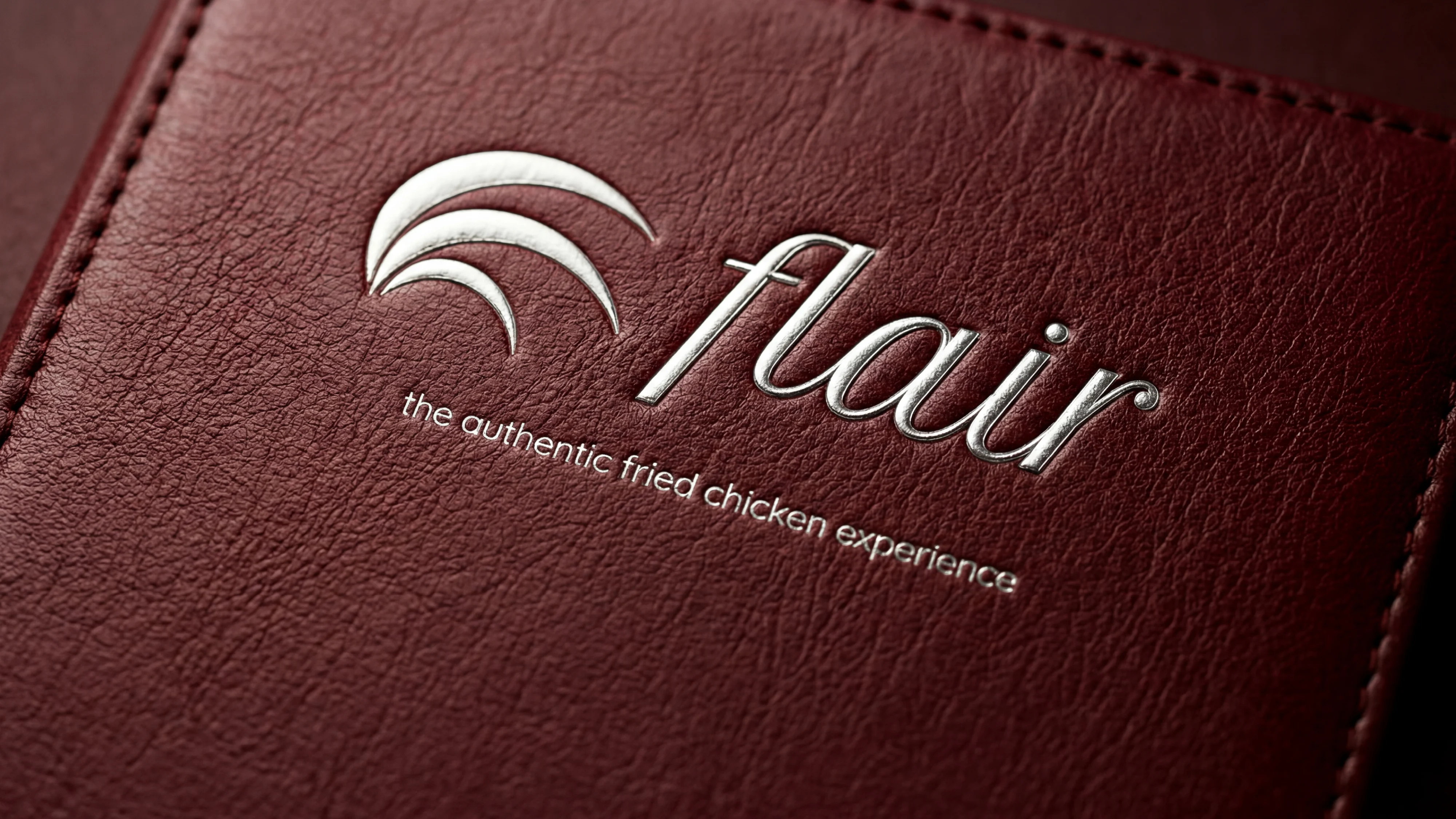
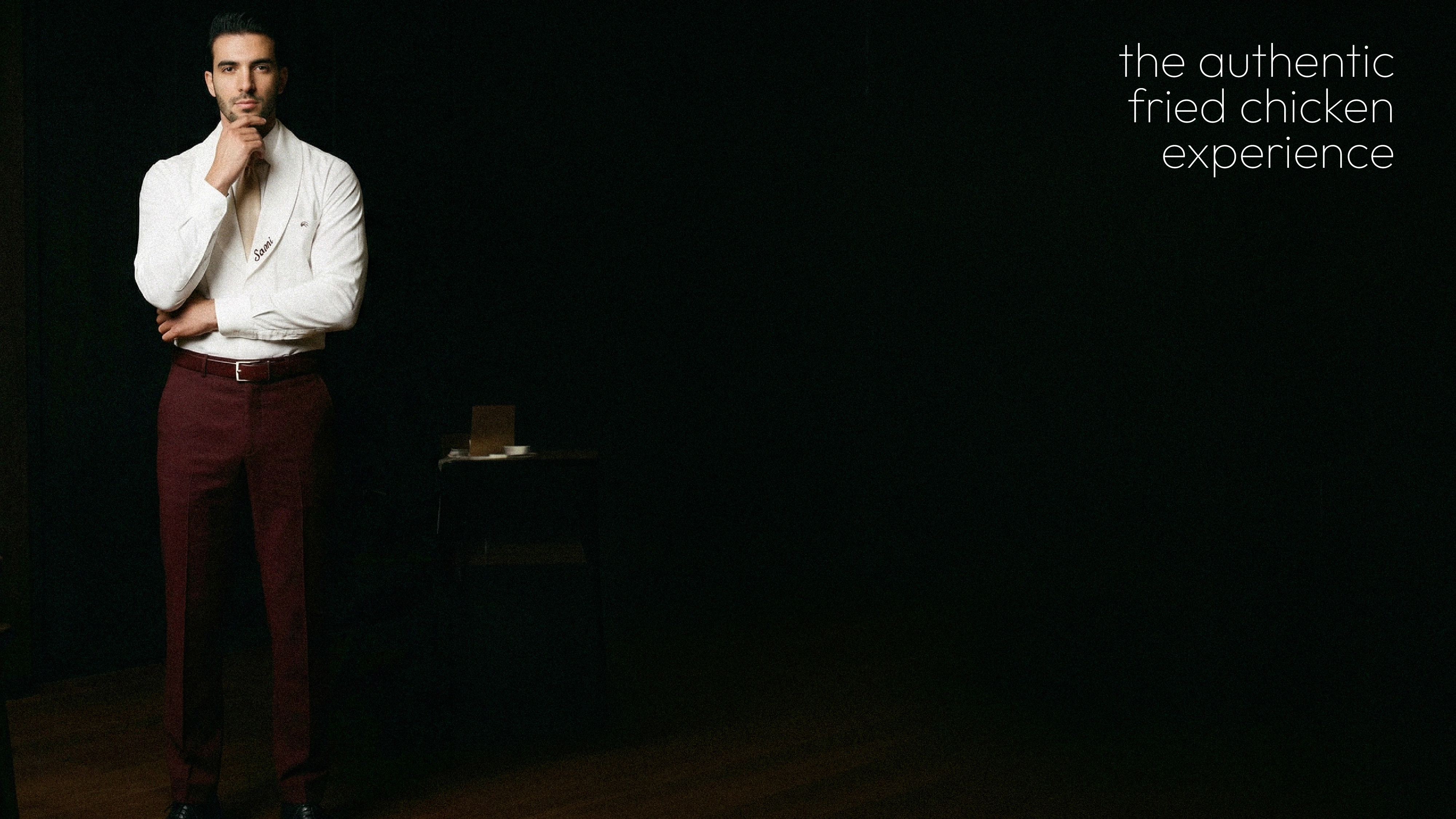
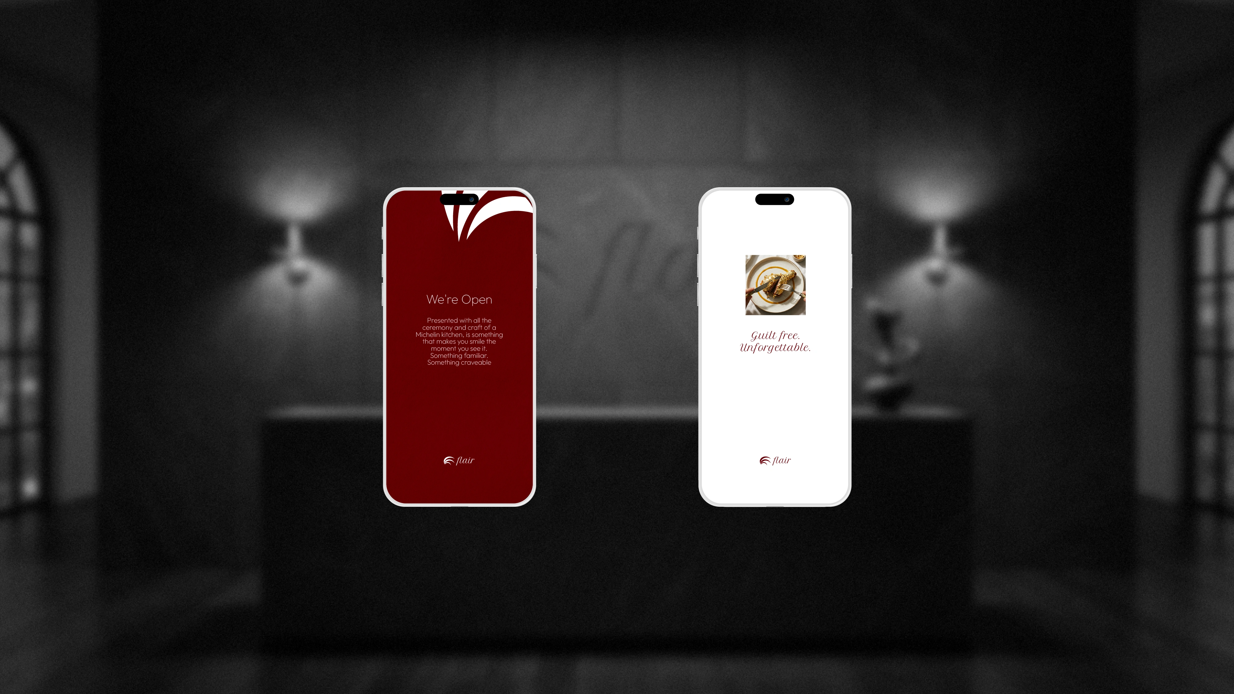
THE DIRECTION: A dual-read mark that holds a rooster and a feather in one form. Deep maroon, night charcoal, powder white. Language crafted to feel like an invitation to a very serious, very delicious evening. Every touchpoint menu, uniform, packaging built around the idea that gold dust belongs on fried chicken if the kitchen earns it.


Like this project
Posted Jun 3, 2026
Flair is a luxury fine dining experience restaurant built around a single dish. fried chicken, finished in edible gold.
Likes
1
Views
0