Measurementplan — SaaS Branding, Framer Design & Development
Efficient analytics visualization with minimalist design approach.
Live site: measurementplan.com

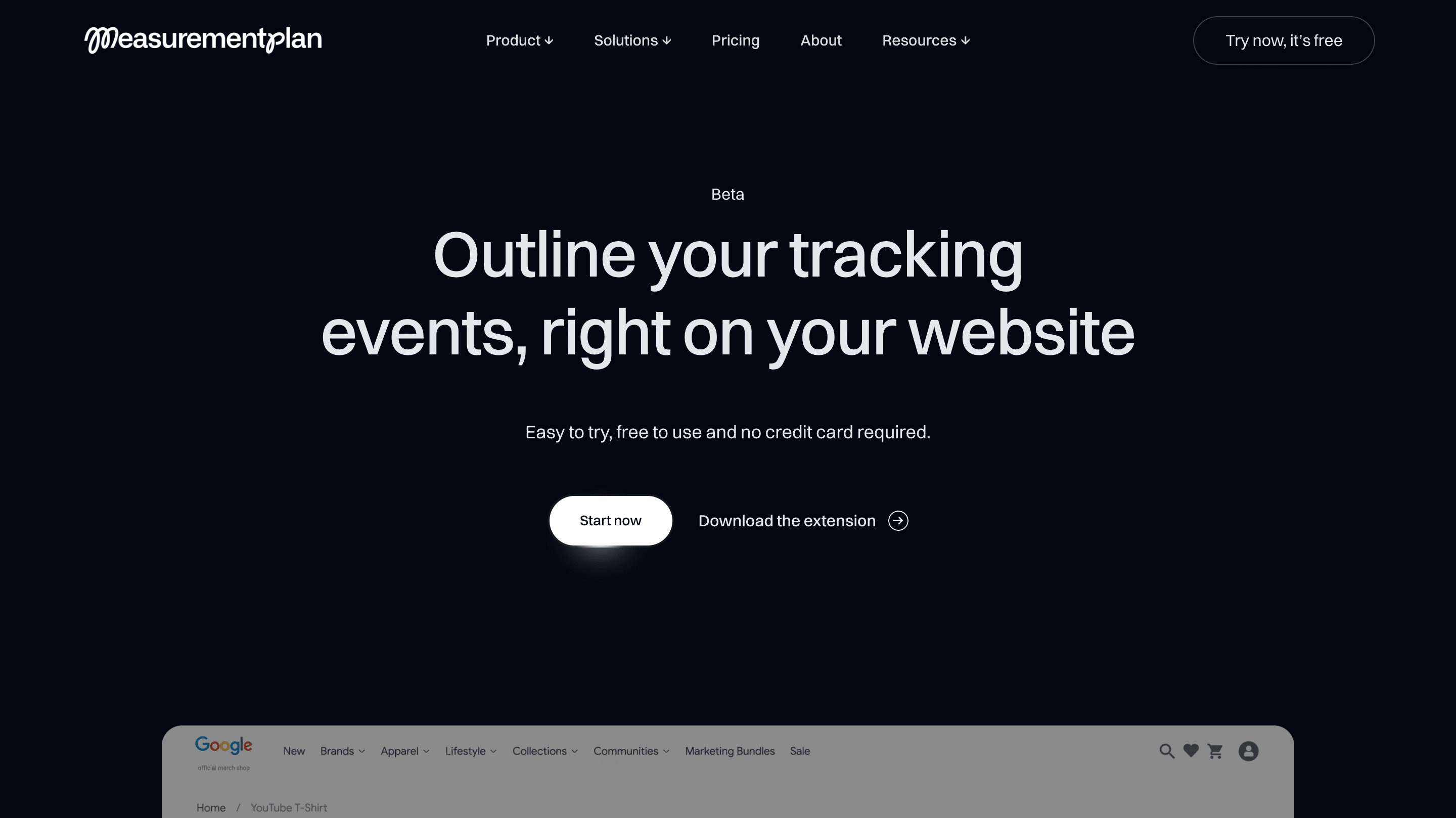
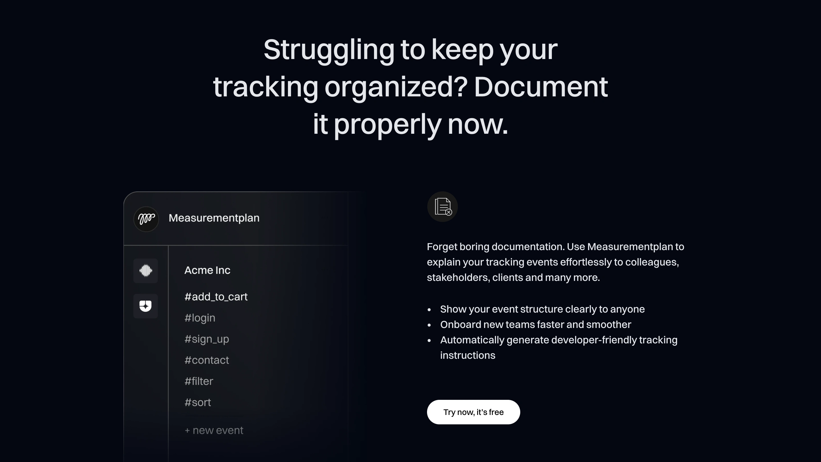
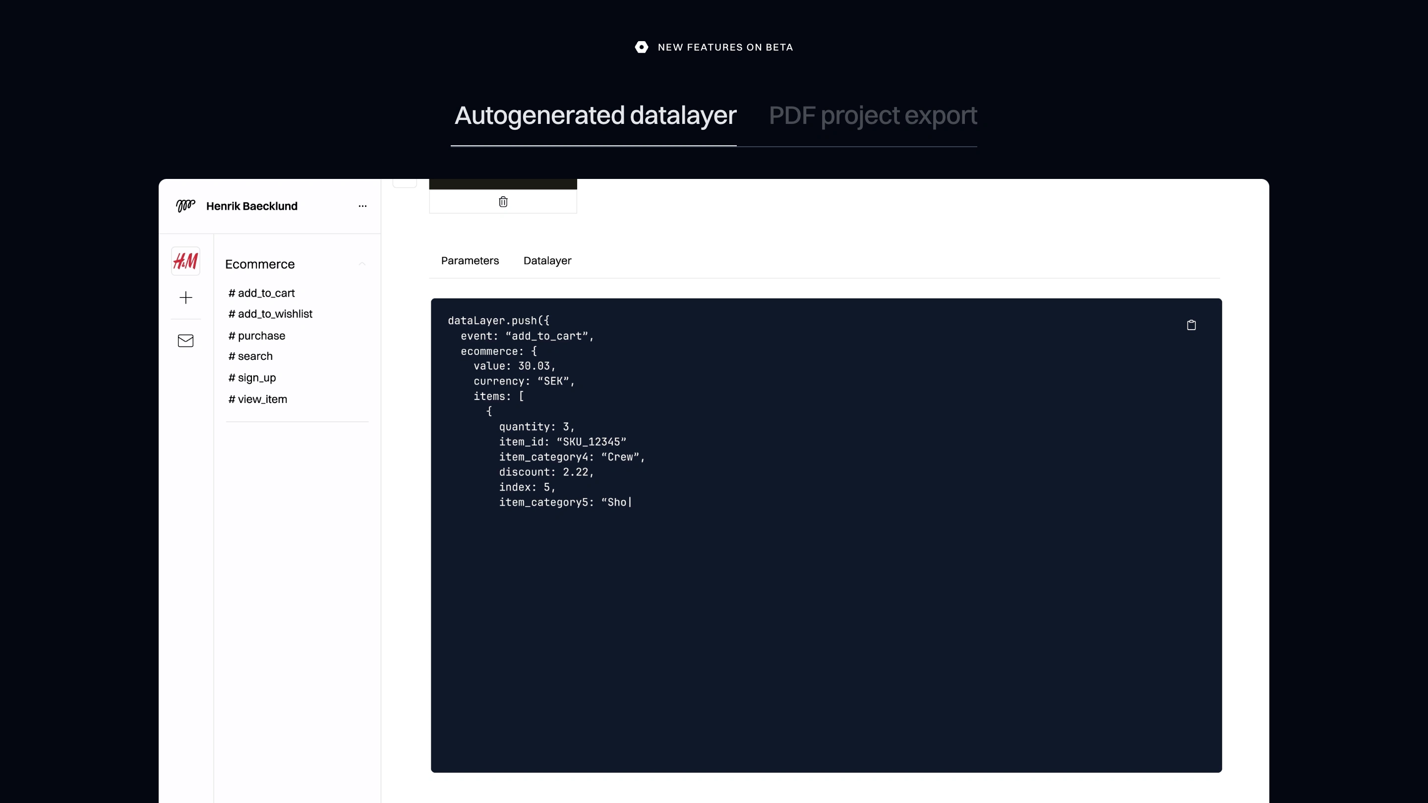
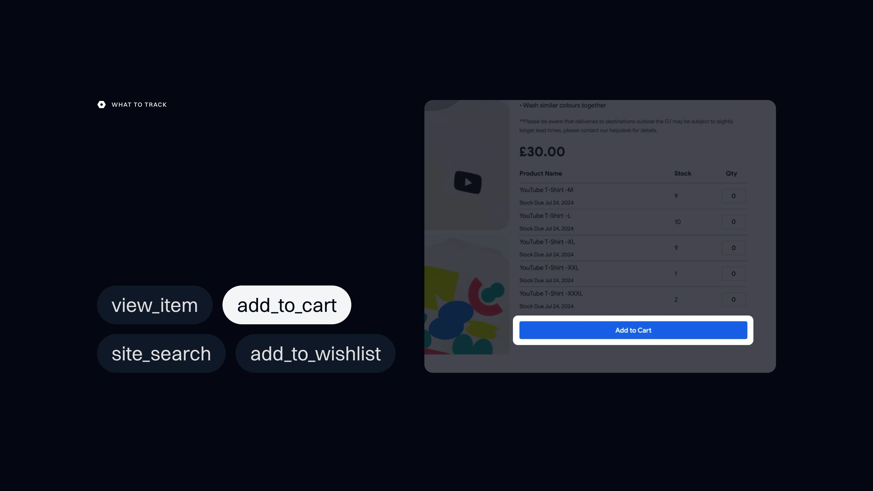
Measurementplan simplifies digital analytics with intuitive event visualization, enhancing team efficiency and promoting data-driven decision-making.
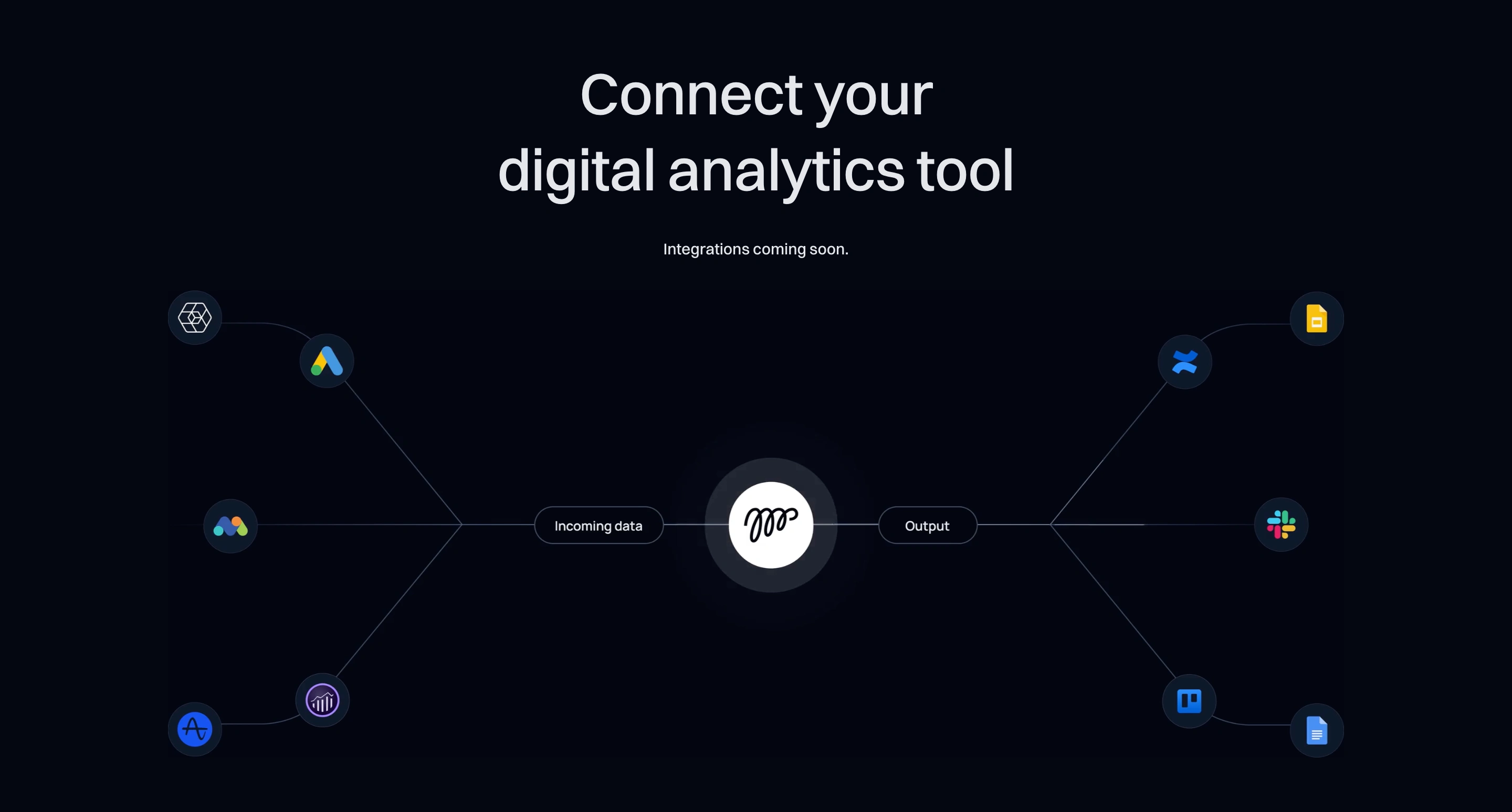
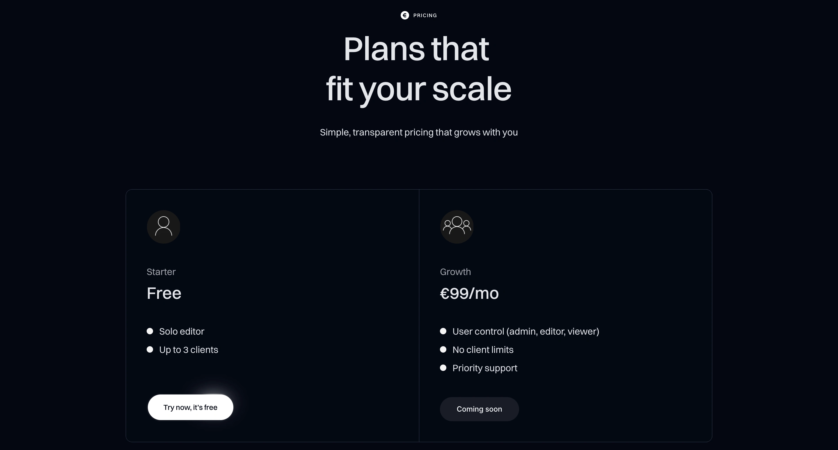
The founder approached to craft their branding and create a landing page in Framer to elevate their online presence. The goal was to establish a strong brand identity and attract users by effectively showcasing the tool's product, features, and benefits.
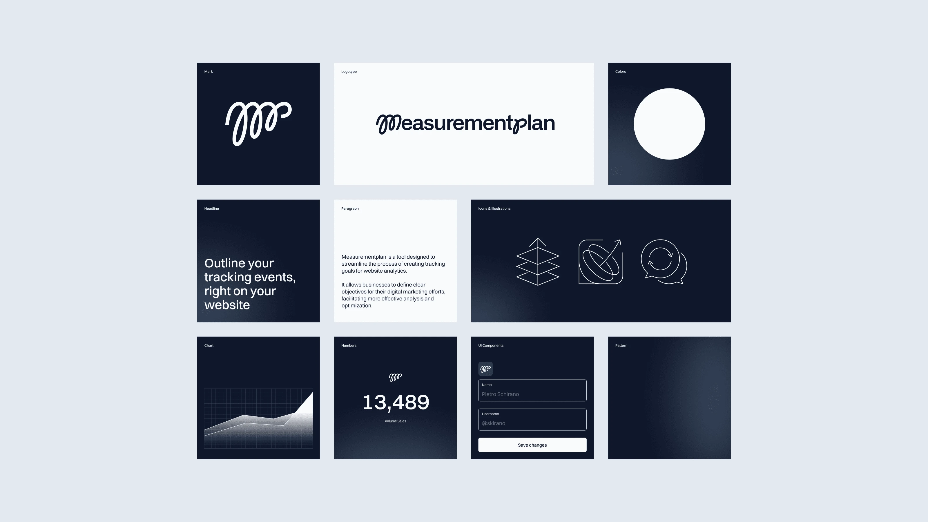
The logo design seamlessly incorporates the letters "M" and "P," forming a curved line that adds fluidity and harmony to the design. This evokes a feeling of relaxation and simplicity, reflecting the brand's commitment to providing a serene experience.
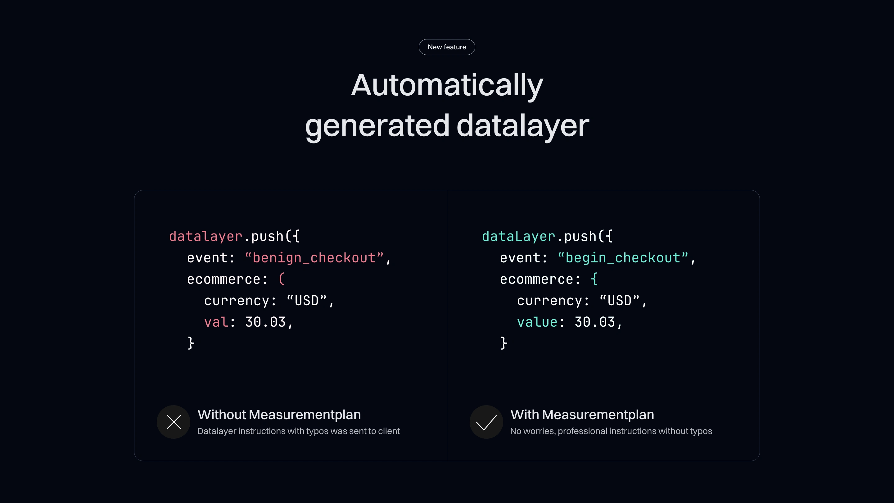
A timeless black and white color palette was chosen for its versatility, creating high-contrast visuals suitable for various designs. The typography conveys openness and airiness, enhancing readability across digital interfaces.
The typography alliance conveys openness and airiness, enhancing readability and ensuring a seamless user experience across various digital interfaces. Its versatility allows it to adapt effortlessly to different design contexts, maintaining consistency and coherence throughout the brand's visual language.
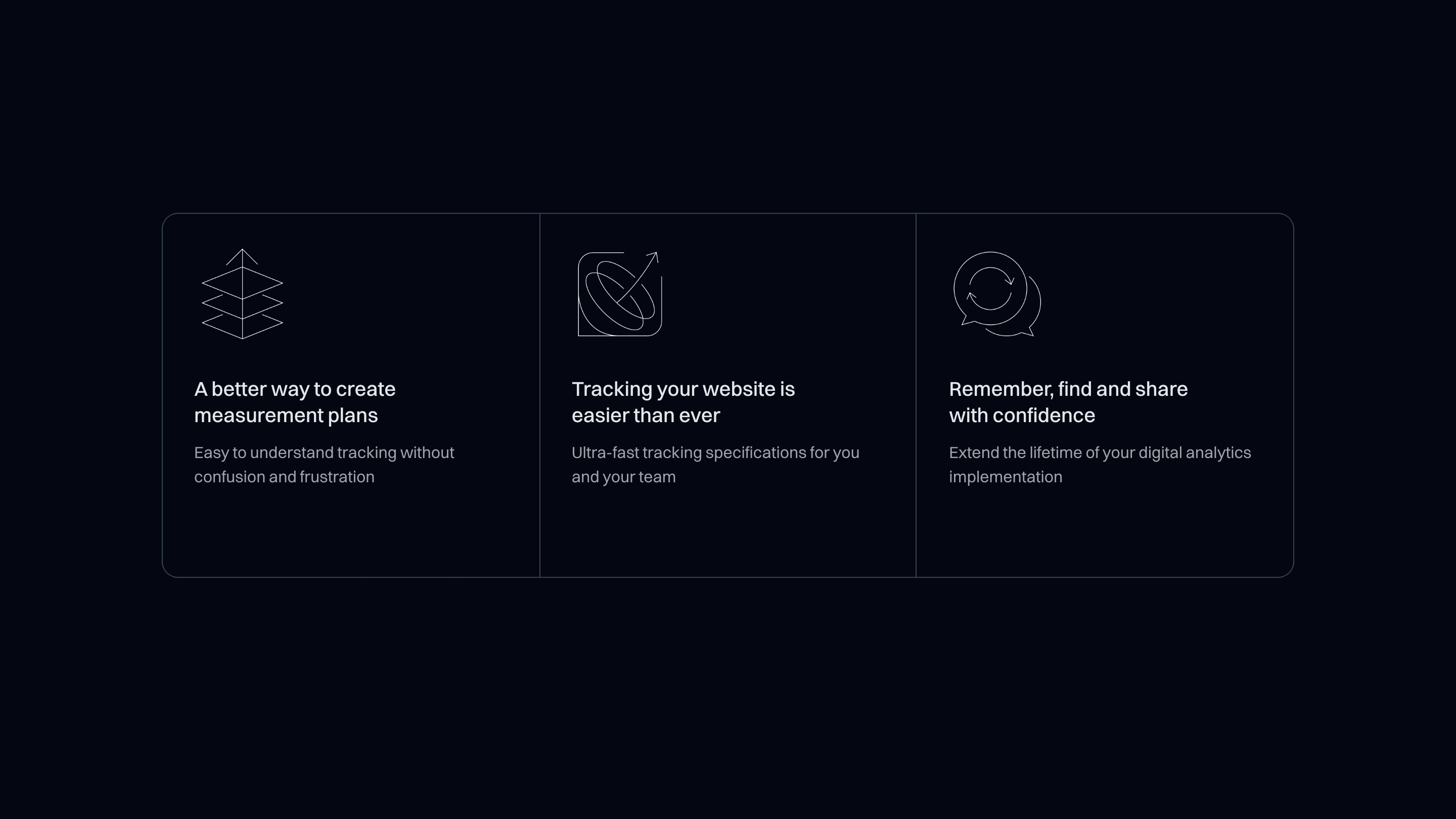
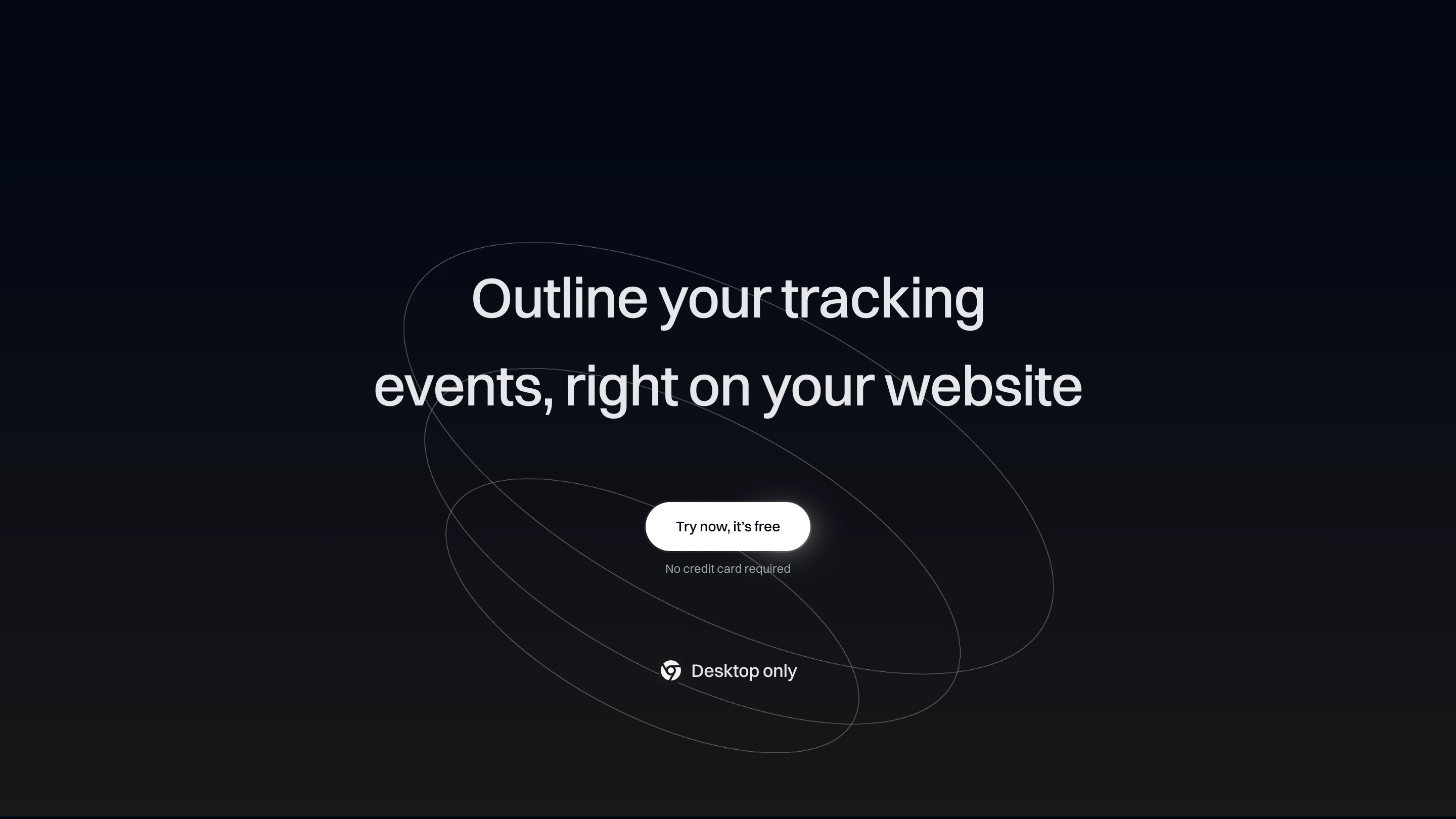
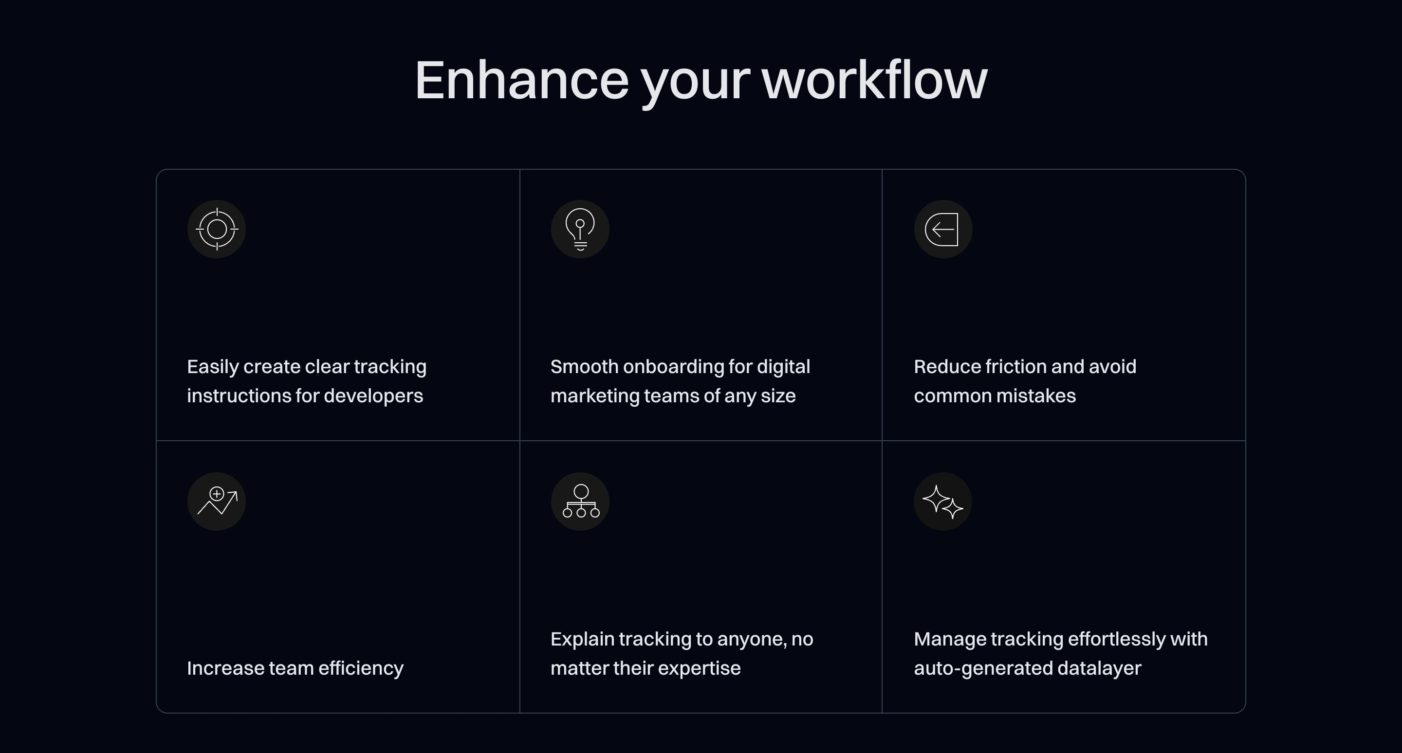
Subtle light gradients on dark backgrounds add depth and visual interest, guiding user attention and establishing hierarchy while maintaining a clean look. Icons provide symbolism and visual interest in simplistic shapes, used across marketing, environment, and product touchpoints.


Like this project
Posted May 7, 2024
Crafted a clean, data-driven interface for efficient analytics with a minimalist style. 🔗 measurementplan.com


