VoNo - App Redesign
PROJECT OVERVIEW:
VoNo is a memo app with 4 functionalities that allow users to easily save their ideas, or send them to their or others' emails with just one click. VoNo is most often used by busy people in the 20-45 age group, who like to keep their ideas organized and want to quickly take notes while performing other tasks. The core ‘memo’ functionalities include the following type of memos:
Voice-to-Text
Voice
Text
Photo
PROJECT OBJECTIVE:
Improve the UX/UI of the app by:
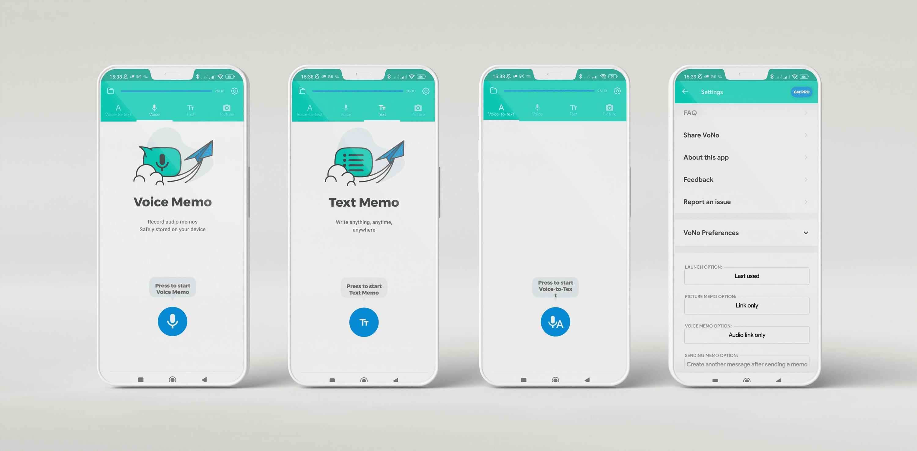
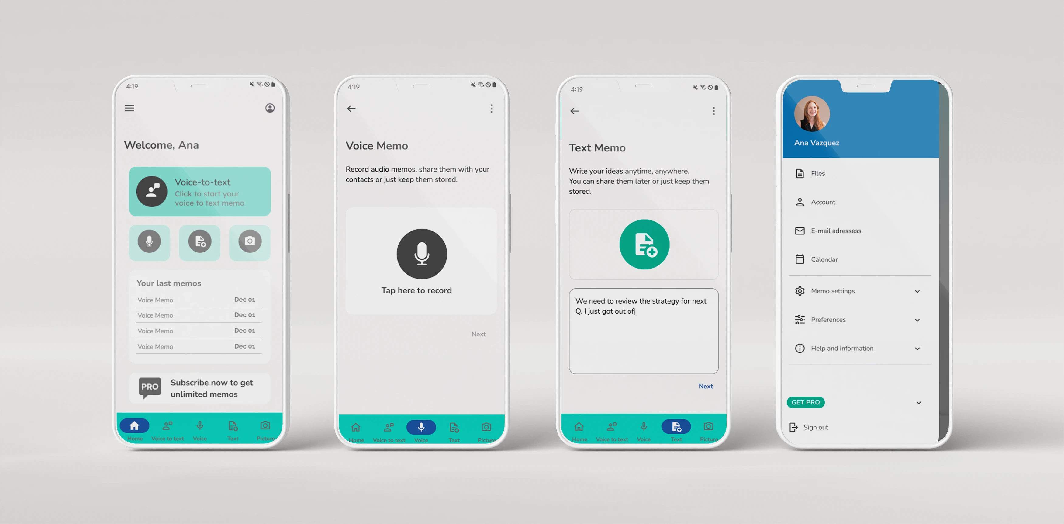
Completely change the visual style
Provide an updated version of the home screen
Present an improved memo sending flow
Before:
After:
THE PROCESS:
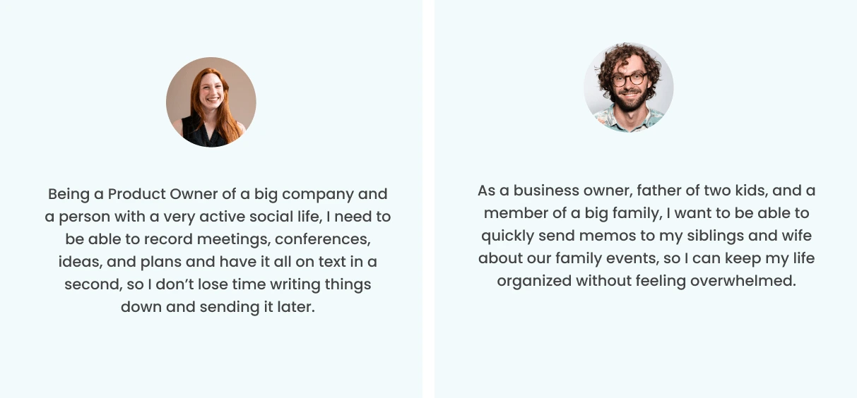
Defining the user stories:
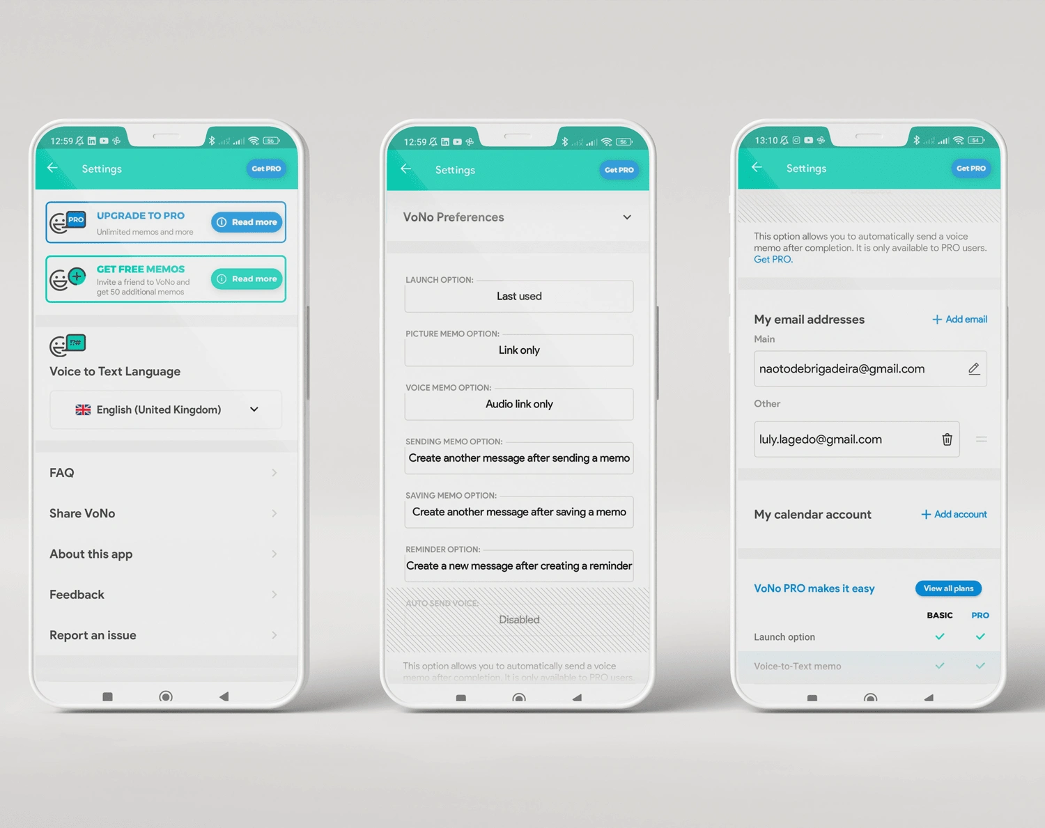
2. Rethinking the drawer menu:
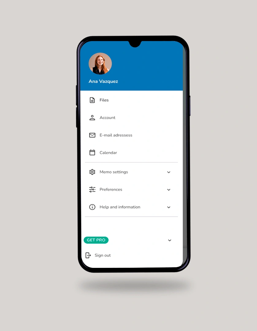
In its original version, the app has a settings icon that opens a big list of options, from settings to information about the PRO version of VoNo. I decided to turn this section into a drawer menu, reorganizing the information and grouping then under dropdown lists.
Improved version:
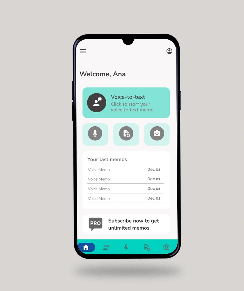
3. A new home screen:
The original version of the app doesn’t have a home screen that works as a starting point for the navigation. The app opens directly in one of the functionalities.
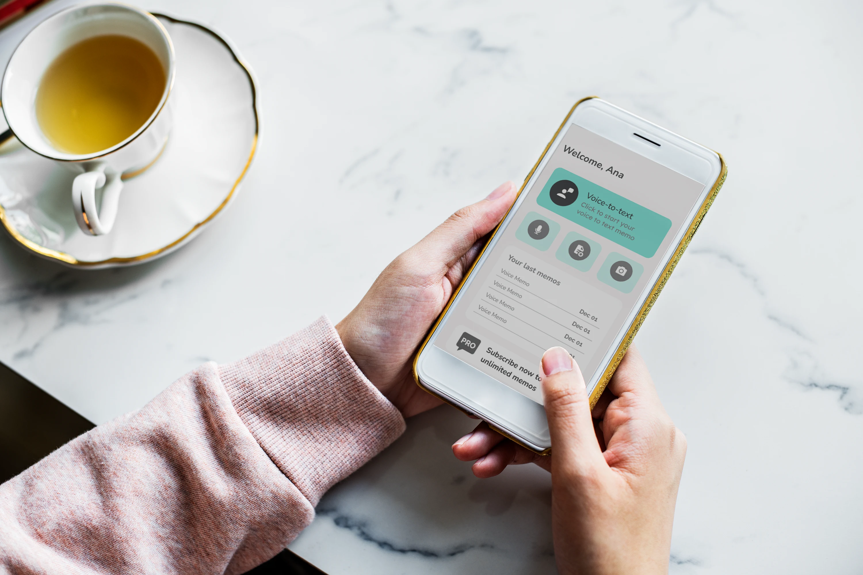
In this improved version, I created a new home screen that welcomes the user and let they choose how to start.
The Voice-to-text is highlighted as it’s the most used function
The user can access the last memos
There is a CTA inviting the user to subscribe to VoNo PRO
4. Improving the sending flow:
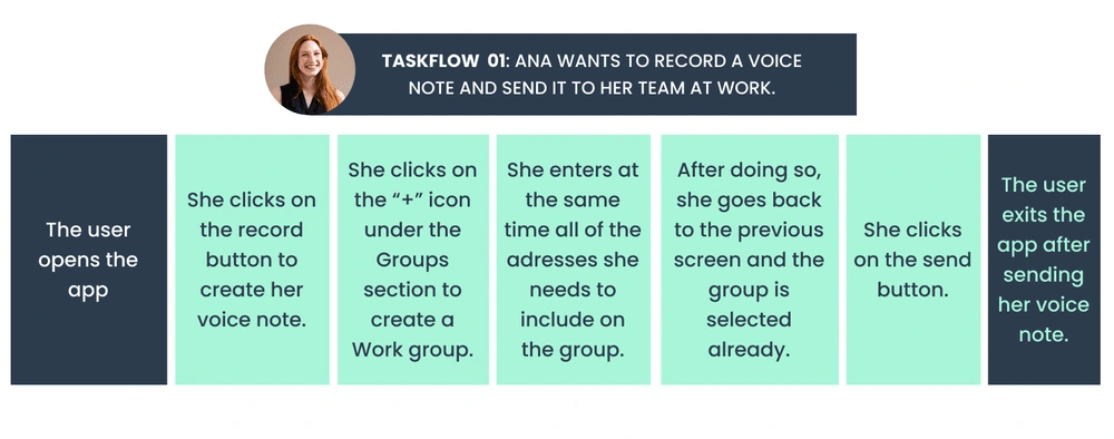
What has changed for Ana?
She can now choose when to start recording her voice noite
She is now able to create e-mail groups, that she can use later
She can add all the recipients and send the voice note to all of them at once, instead of sending it individually
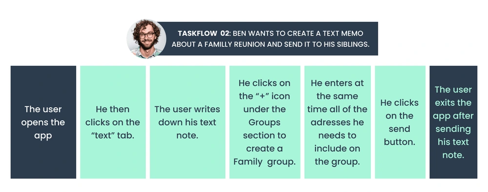
What has changed for Ben?
Ben opens the app and goes to the text memo section without being interrupted by the voice memo automatically recording.
He is now able to create e-mail groups, that he can use later
He can add all the recipients and send the voice note to all of them at once, instead of sending it individually
And this is how the new sending flow looks like:
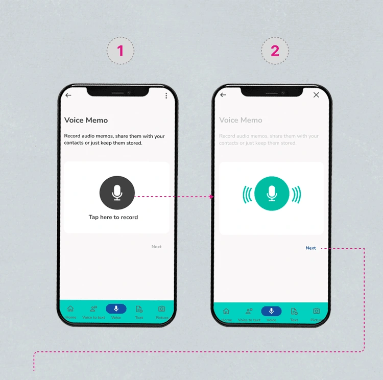
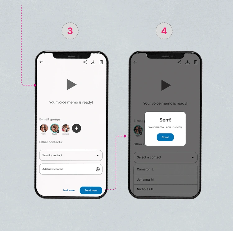
What has changed?
From the homepage or from the bottom nav bar, the user arrives at the functionality screen (1).
After tapping the icon on the screen, the user can start recording their voice memo.
The icon is now green (2) and indicates the recording is active as the sound elements are animated.
The user can pause the recording by tapping on the main green icon, and it resumes when tapping again.
After clicking on the NEXT button (2), the user arrives at the sending screen (3).
From this screen, the user can preview the voice memo, share, download, discard, or save it.
The user has the following options:
KEY TAKEAWAYS
💡 Design system
Defining a design system was key to establishing a consistent visual language across the app. It not only benefits the internal team by saving time and improving efficiency with the pre-established components, but the consistency leads to a more cohesive user experience, making it easier for users to understand and navigate the product.
💡 Understand the users to be relevant for them
Having a little bit of information on the target was important to having a reference on behavior, lifestyle, and more. The first version of my redesign was actually different and had more illustrations and a more ludic interface. After a first round of feedback, I adjusted it and came up with a more relevant version.
💡 Users need context
Although the app idea is simple and seems easy to understand, the user may not be aware of what they can do on each screen and how to make the best use of each functionality. Adding context on the screens was something I added later in my design process, and it was key to arriving in a better result.
💡 Interviews, usability tests: a next step
It would be important to have an interview session with real users to validate the information provided and to find out more about them to have new insights. Also, running usability tests with these users would definitely help in finding areas to improve with the next iterations.
Like this project
Posted Aug 16, 2023
UX/UI Design project to update the visual style and improve the users flows of this memo sending app.
Likes
0
Views
7

