
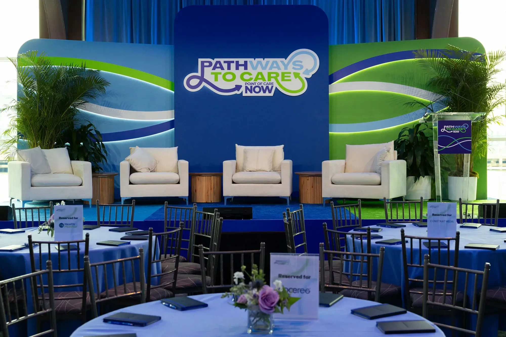
The Pathways to Care main stage
Brand / Identity / Event / Web
POC NOW Summit 2026
Pathways to Care: one looping line, carried from the stage to the badge, the passport and the website.
Client
POCMA (Point of Care Marketing Association)
Industry
Healthcare marketing association
Scope
Summit identity, event art direction, wayfinding, print, website and ads
01 The situation
A summit, not a meeting.
POCMA came to us through a word-of-mouth referral. POC NOW 2026 at Pier Sixty in New York was its flagship event: more than 400 attendees, 20 sponsors, one day and a tight deadline.
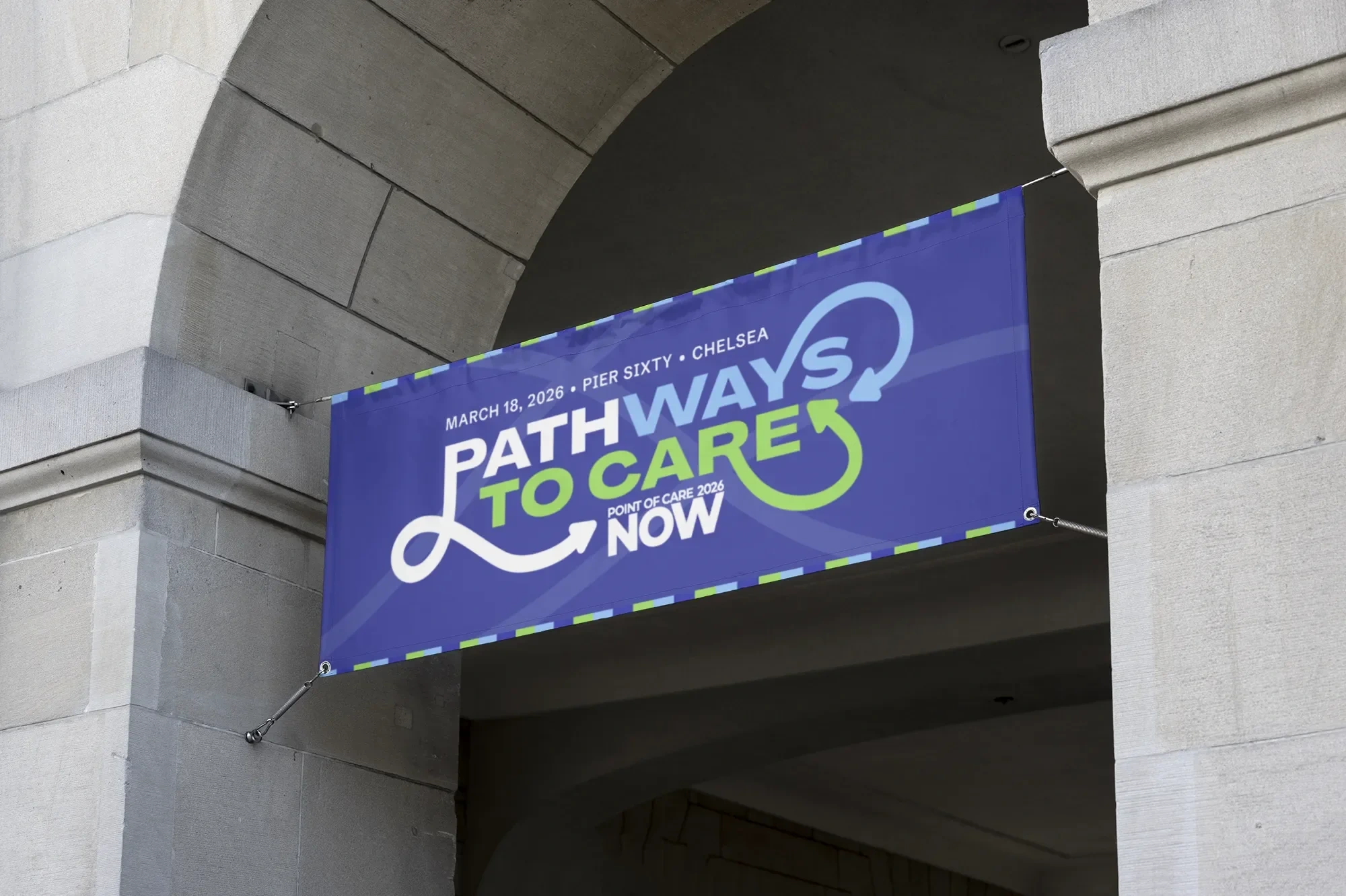
Street banner at Pier Sixty
02 The problem
Branded like a meeting.
For years, POC NOW ran under the association’s logo. It looked like a members’ meeting, not the industry summit POCMA wanted it to be.
For 2026 it needed a brand of its own, one that told pharma brand leaders this was the day to be in the room.
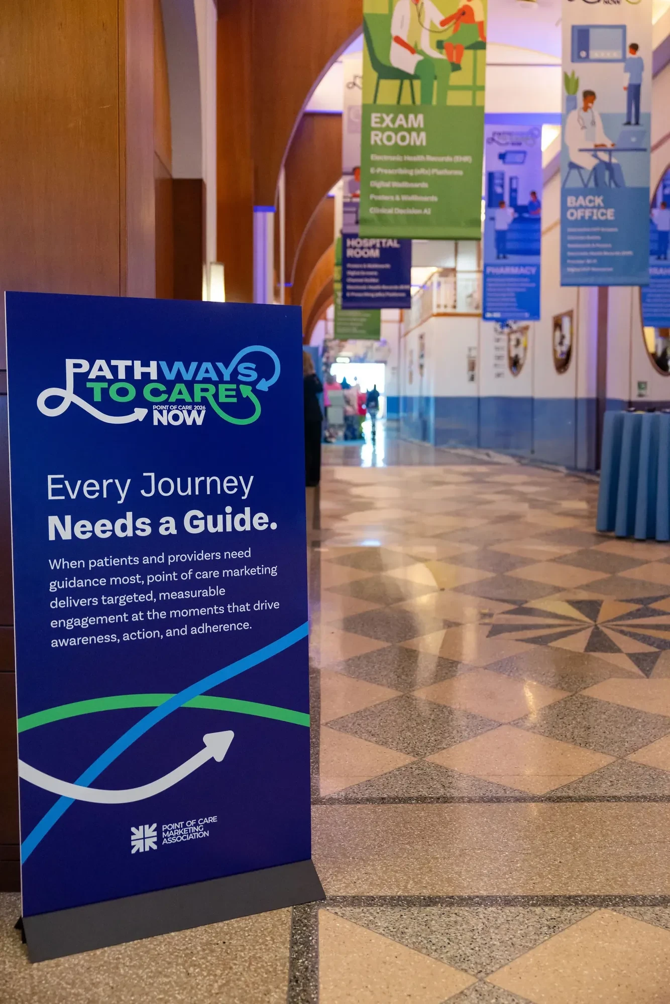
Every Journey Needs a Guide entrance sign
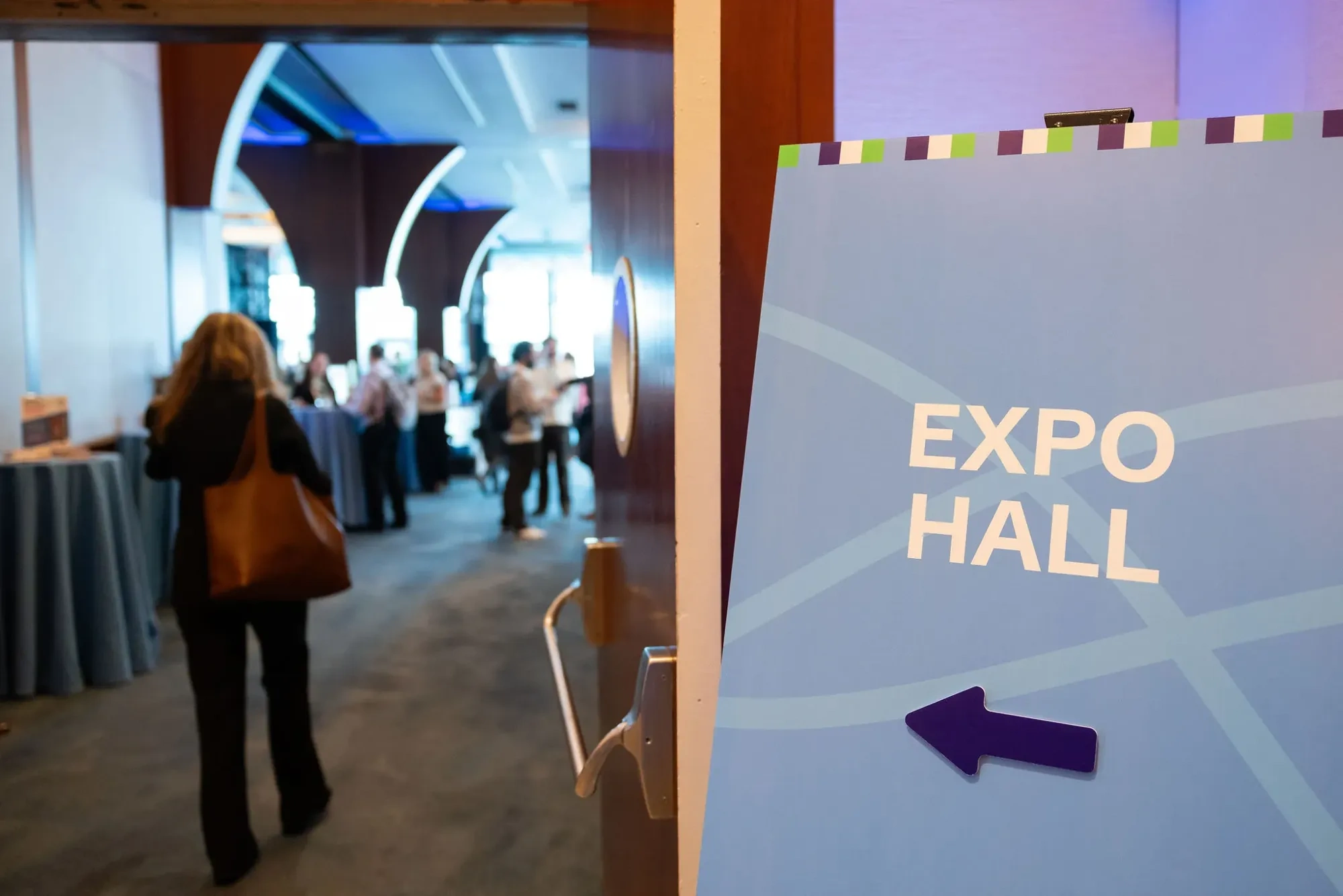
Expo Hall directional sign
03 The alignment
Follow the patient.
Working directly with POCMA leadership, we landed on one idea. Point-of-care marketing happens wherever patients meet care: the pharmacy, the exam room, the hospital room, the video visit.
A summit isn’t a meeting. It’s a route people follow.
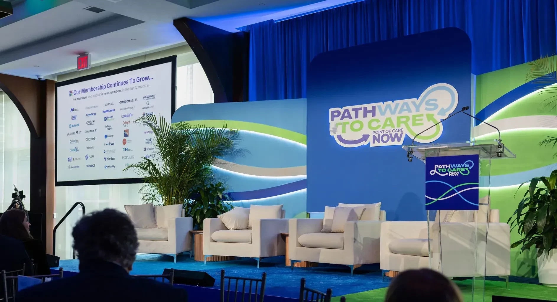
The main stage during a session
04 The system
One line, drawn between them.
I drew the path between those places as one looping line in purple, blue and green. It became the logo, then the whole identity, separate from POCMA’s own.
A line is easy to stretch: onto a badge, across a stage wall, through a room. A striped edge did the stitching, running across the sponsor wall, the signs and the agenda cards, with NOW printed down every lanyard.
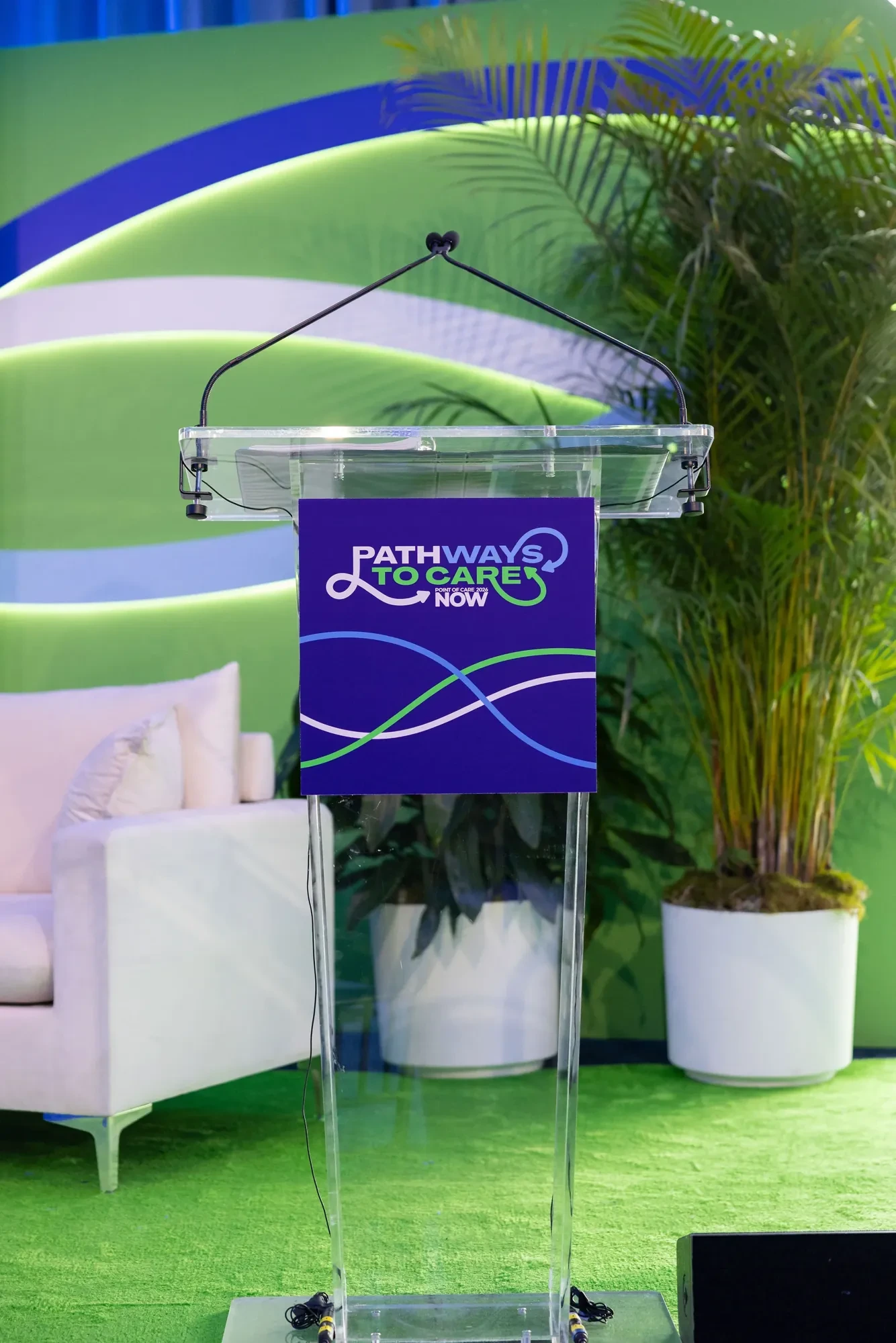
Podium sign
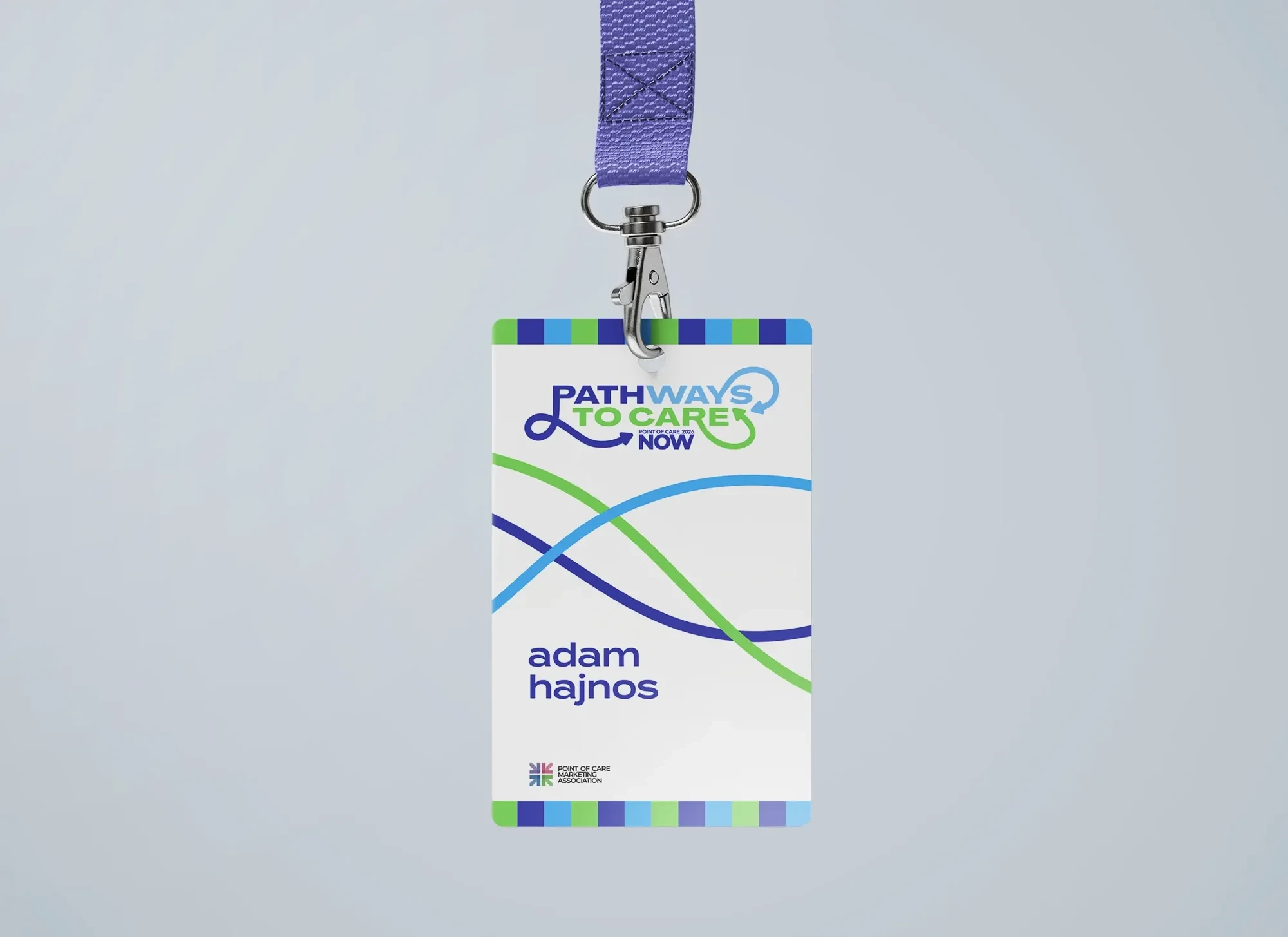
Attendee badge
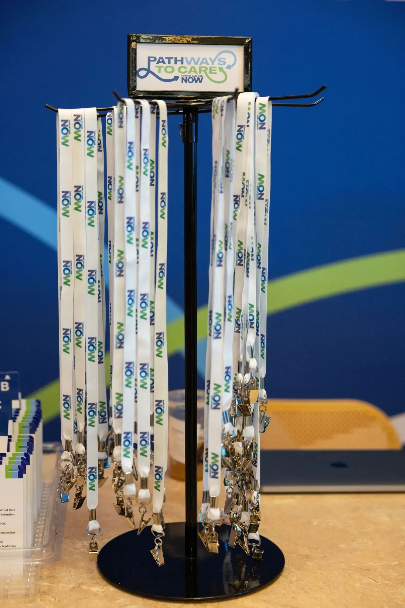
NOW lanyards
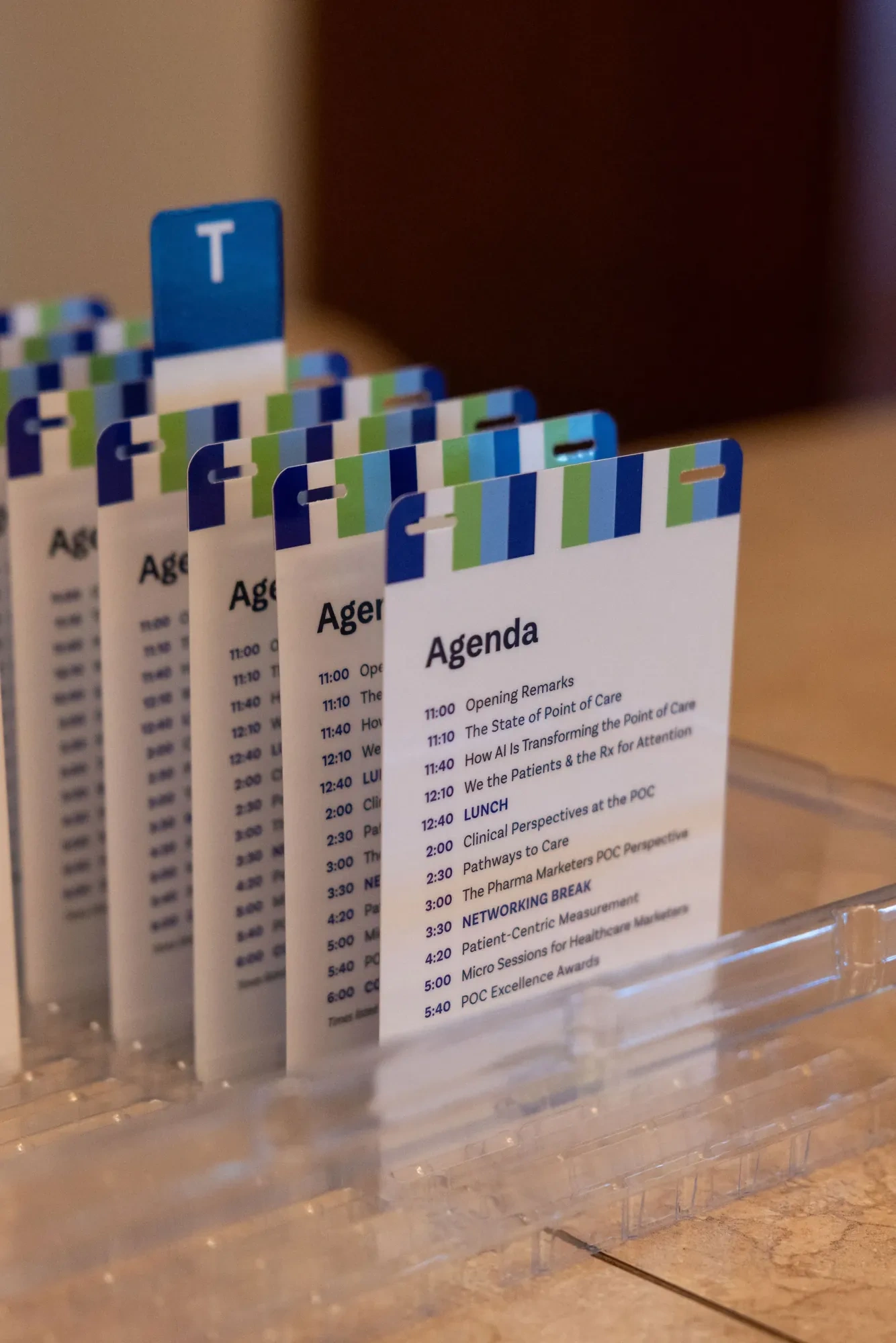
Agenda cards
05 The application
The pier became the map.
Hanging banners turned each point of care into a place, so walking the floor meant walking the patient’s route. The loop carried onto the 20′ × 10′ stage, the podium, the sponsor wall and every directional sign.
The printed program became a passport, with a stamp for every exhibitor. Collect half the stamps, enter the raffle, and be there for the drawing. Guests got a reason to visit every booth, and sponsors got a reason to start a conversation.
Before anyone arrived, the site and ads used the same loop, palette and type, with one clear path from the first ad to a finished registration.
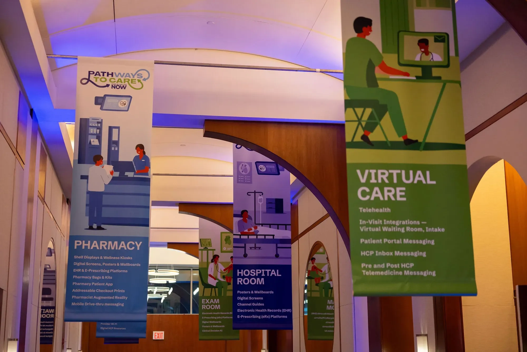
Points of care hanging banners
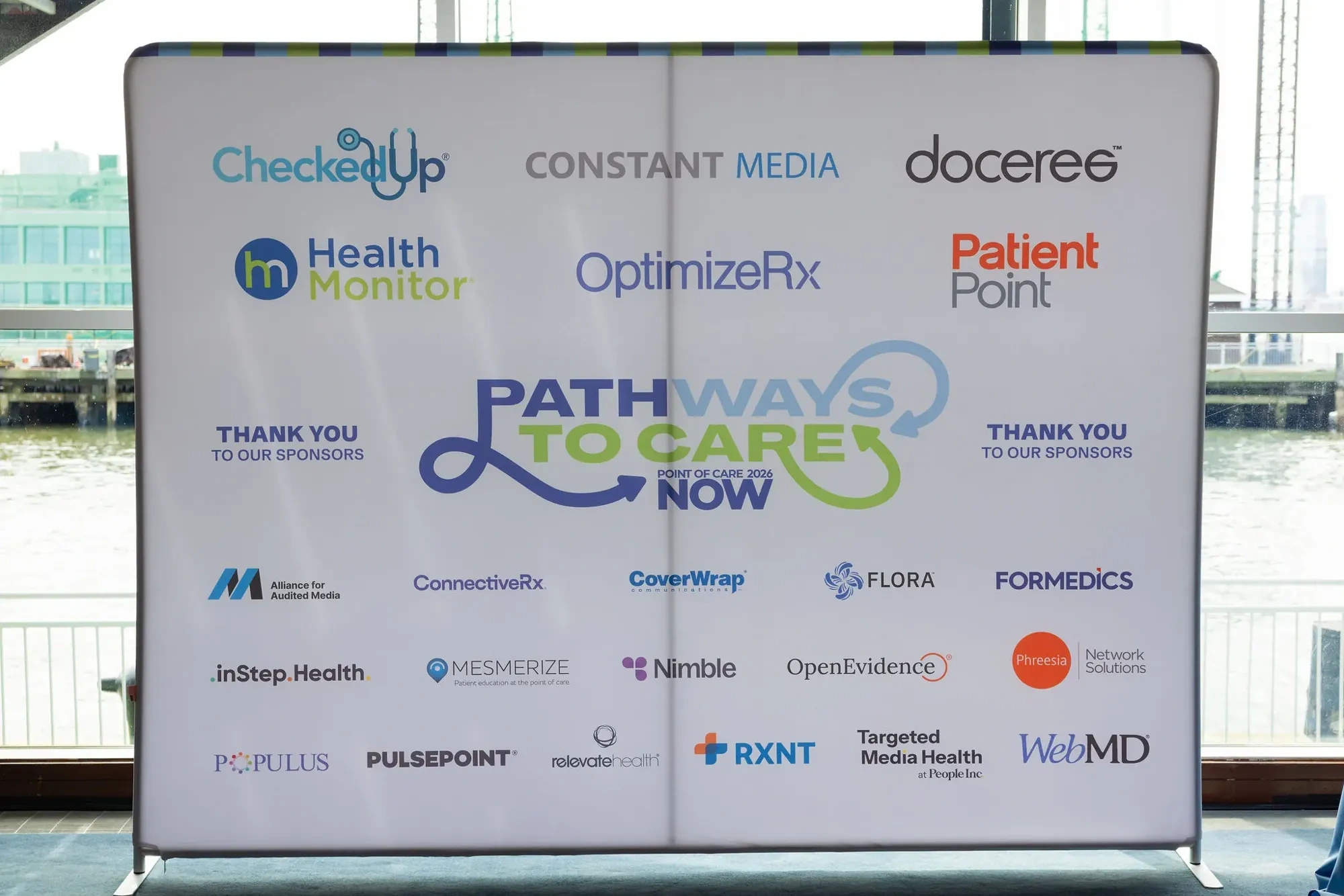
Sponsor wall
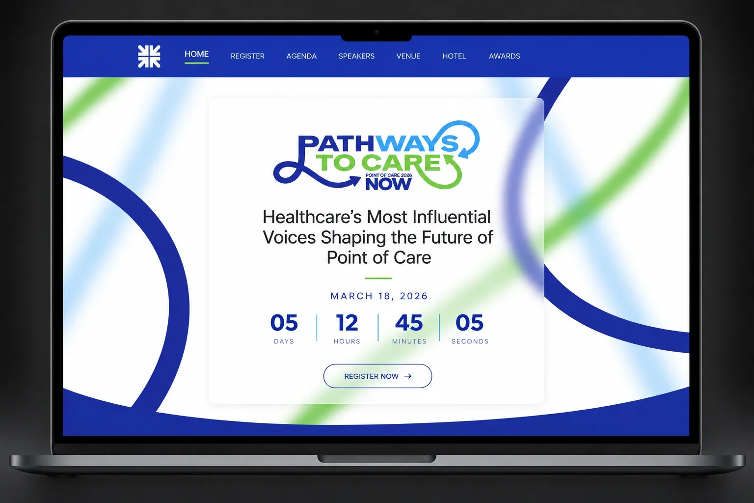
POC NOW website
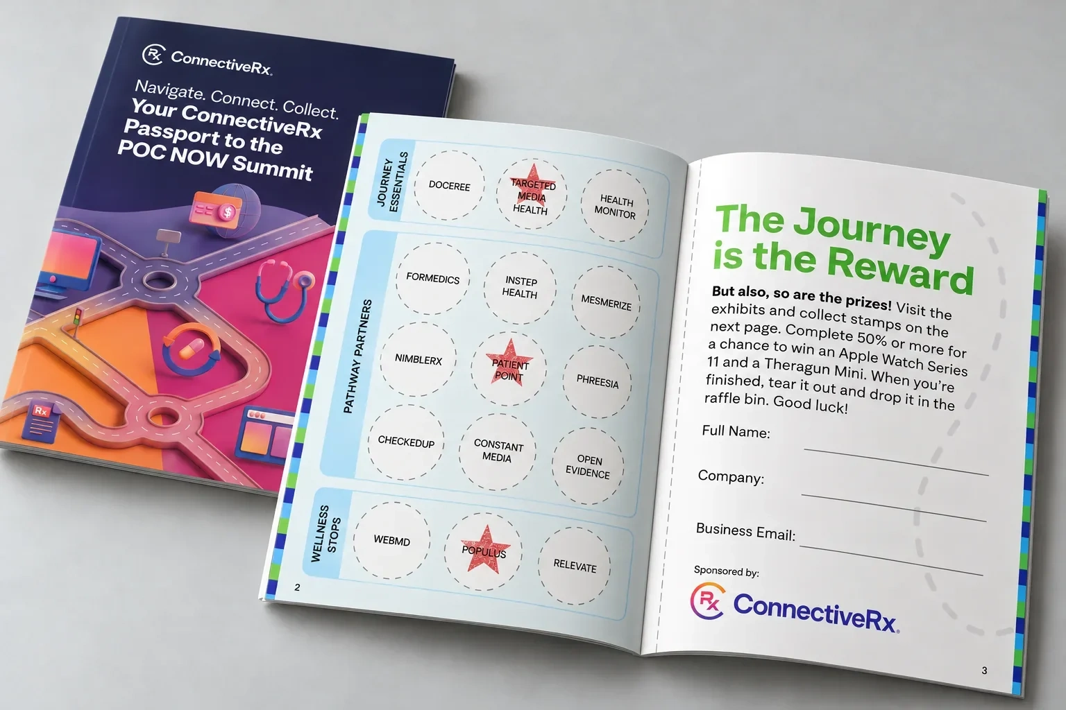
Passport booklet
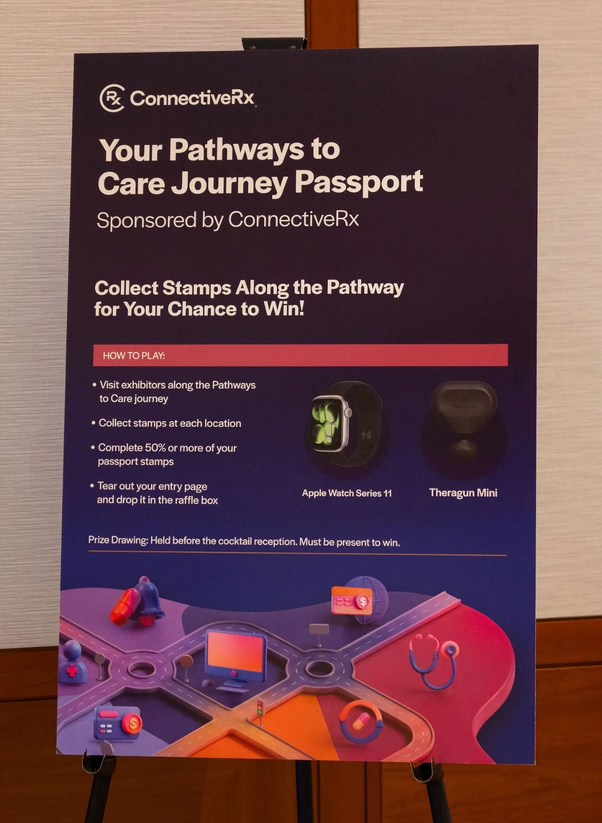
Raffle sign
06 The result
The loop never broke.
More than 400 attendees and 20 sponsors filled Pier Sixty, and every one of them moved through the same system: from the first ad to the stage, the badge around their neck and the passport in their bag.
“Every element felt cohesive and intentional. Seeing [the] work come together in real life was truly impressive.”
— Nicole Divinagracia, President, POCMA
0 likes · 0 views · Oct 29, 2026
Created summit identity with cohesive branding for POC NOW 2026, enhancing attendee and sponsor engagement.


