SBI Yono App Redesign UX/UI Case Study
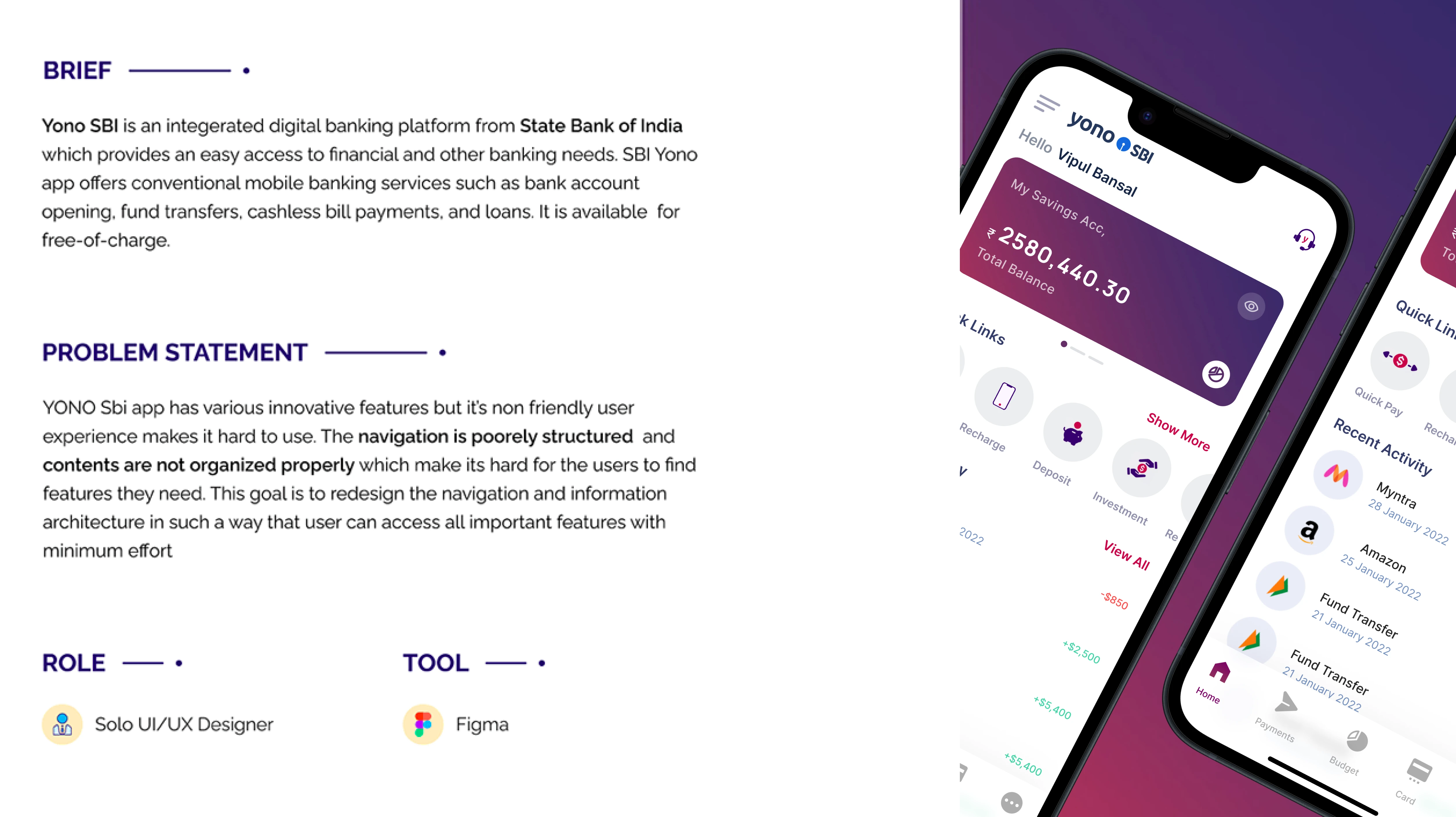
YONO SBI is a mobile app offered by the State Bank of India (SBI) that allows customers to manage their bank accounts and access various financial services.
Core Problem
Confusing user interface & experience

Research
In order to gain some perspective, I did secondary research and these are some insights:
Users find the app frustrating and confusing.
Non-tech-savvy people find it very difficult to use.
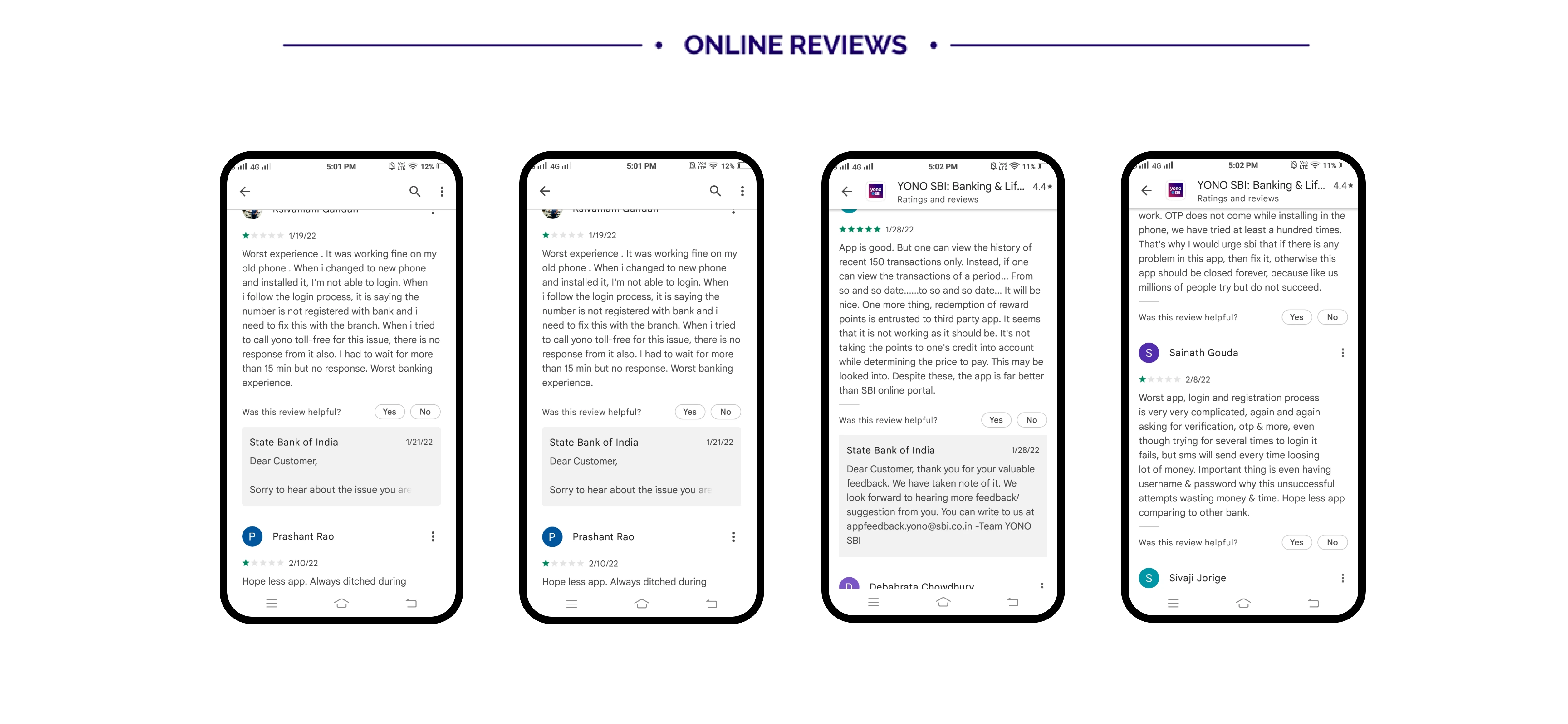
The problems faced by users were very common and many of them coincided with the problems faced by people who took the survey.
On analyzing the rating of other banking applications, it was clear that there is something wrong SBI is doing and there are things that other banks are doing correctly. I checked each app and took some inspiration from them.
Below is the comparison of ratings of YONO vs other apps in the same niche:
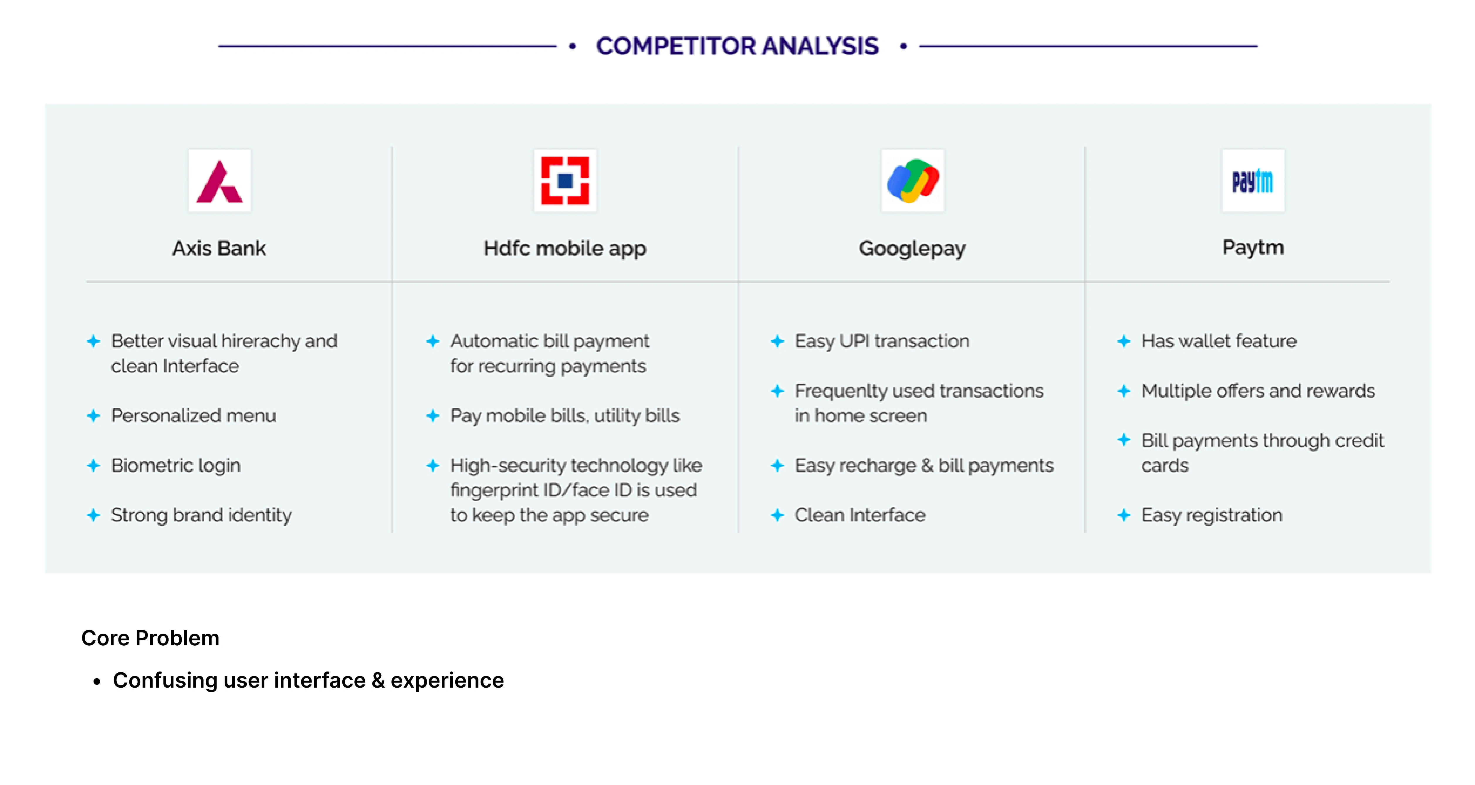
Competitor apps
Home page
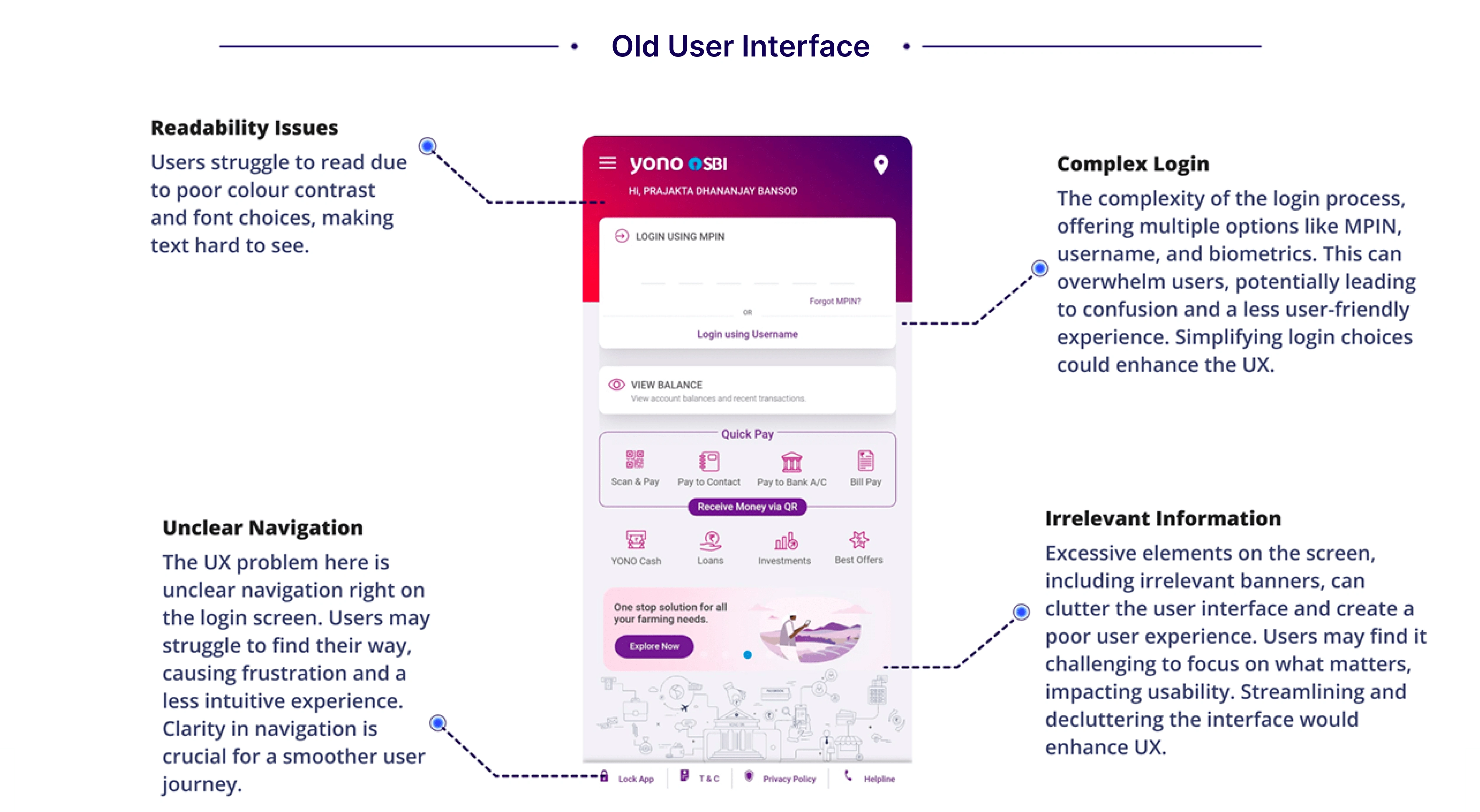
Problems
Everything is placed on the home screen with Poor Information Architecture and a lack of visual hierarchy.
Frequently used features like “payments” take 3–4 steps.
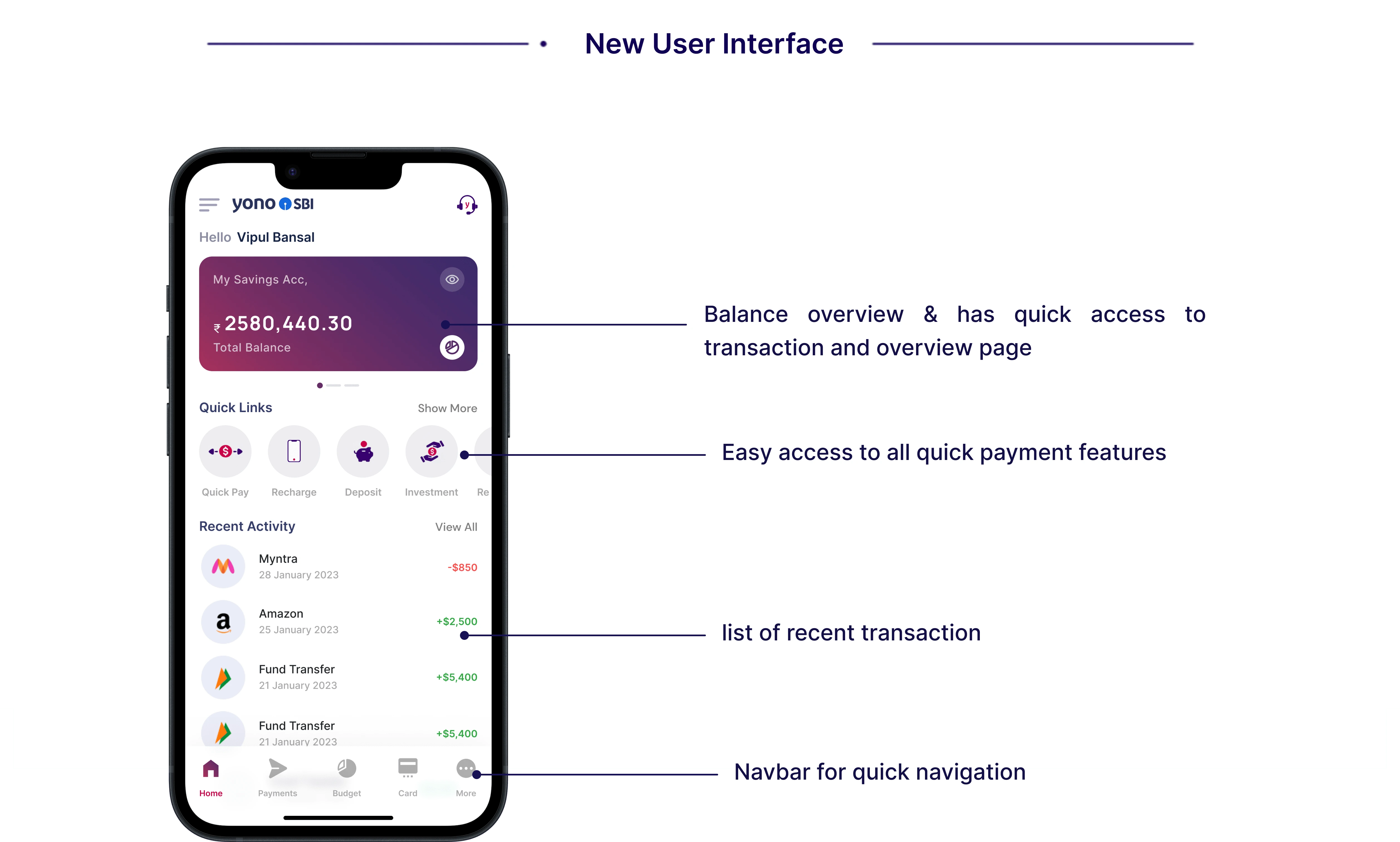
Solutions
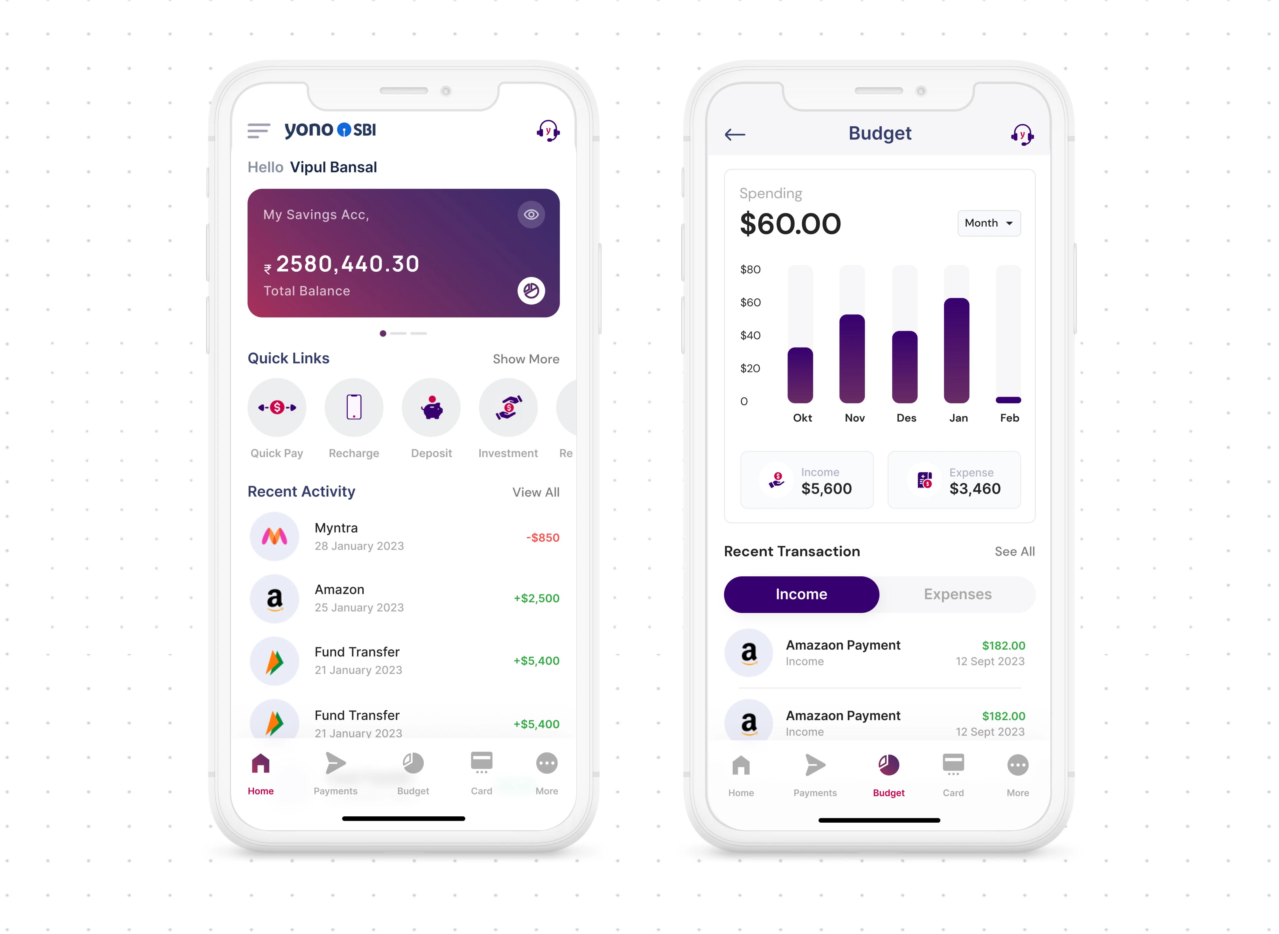
To fix the Information Architecture, I first listed all the features, then separated them with “frequently used” and “not frequently used but important”
Placed frequently used features in the home to reduce the steps.
My learnings
Each data point holds a different rank in the hierarchy and needs to be identified and conveyed accordingly.
I worked on a lot of iterations to arrive at the right solution. During this process, I realized that iteration is the key.
Thank you!
Like this project
Posted Feb 28, 2024
Redesign the existing YONO app with a better user experience. Eradicate common problems faced by users and make payments using YONO smoother.
Likes
0
Views
311


