Aeris Wine — Label System

Luciano Quintana


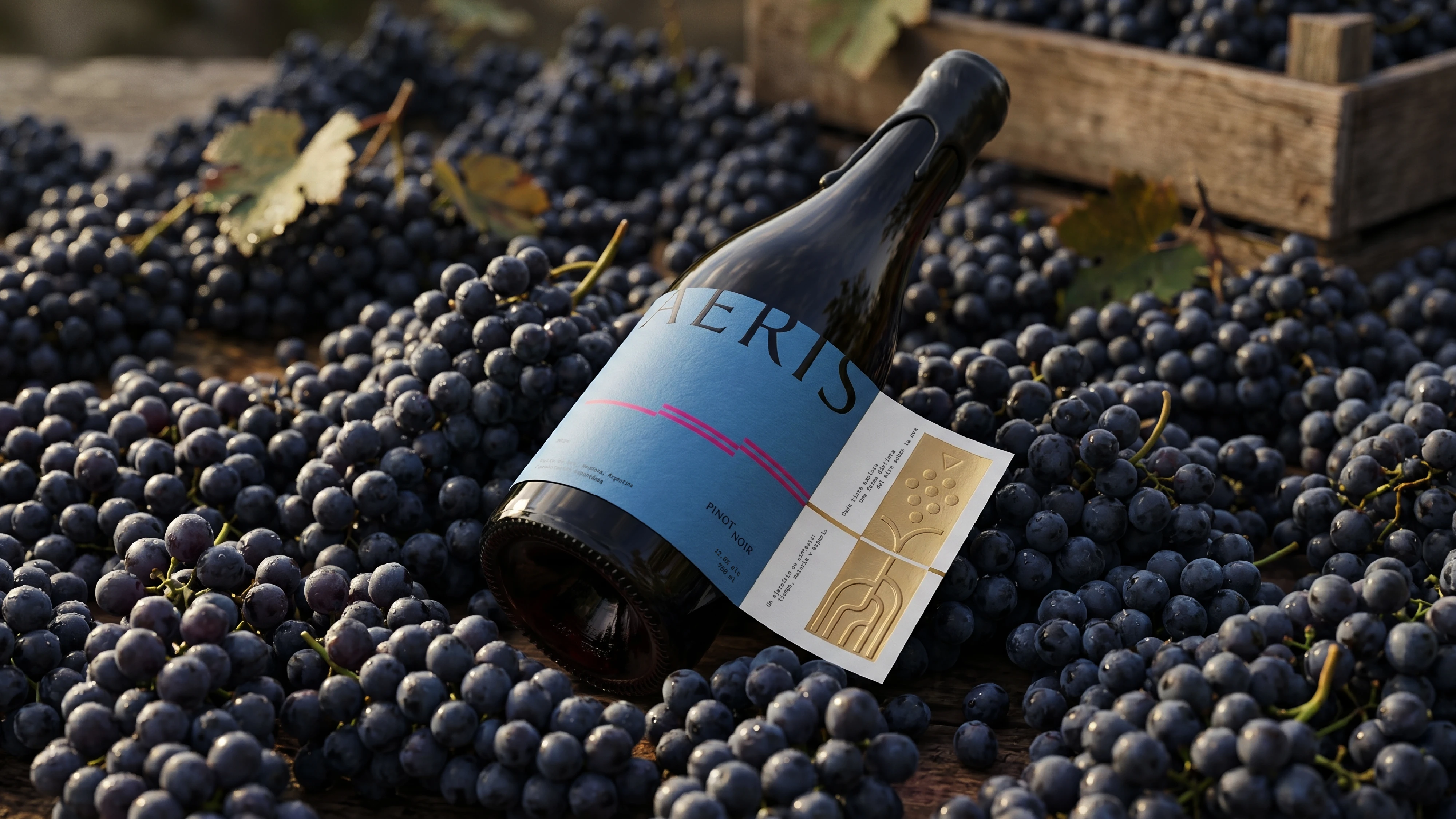
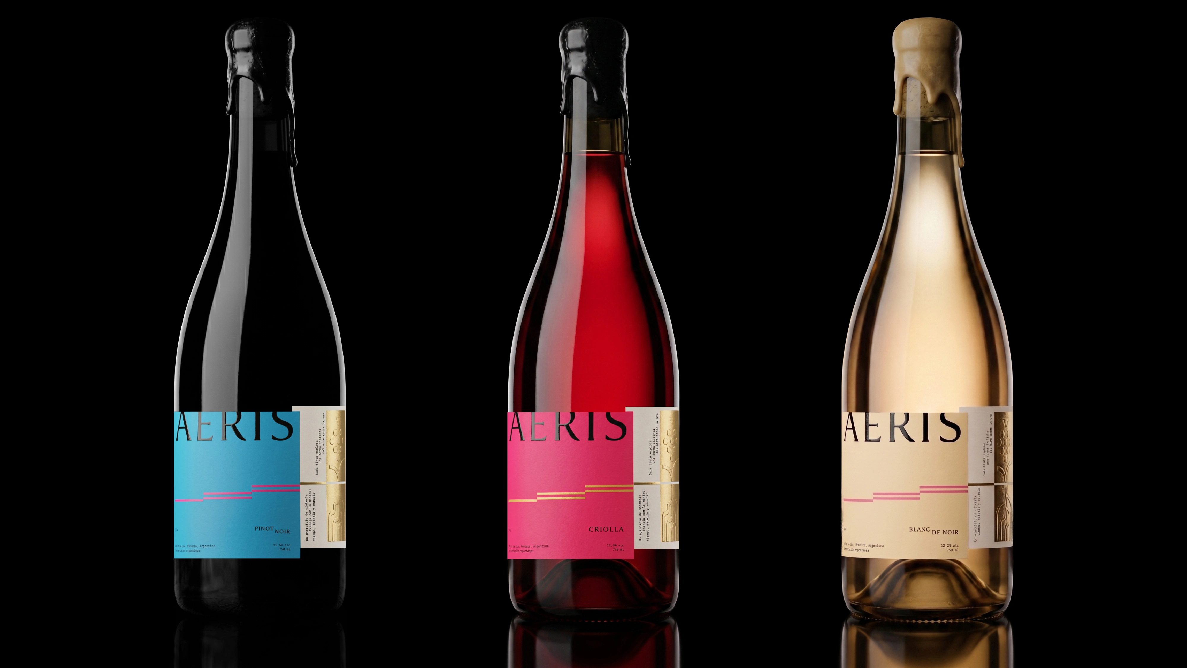
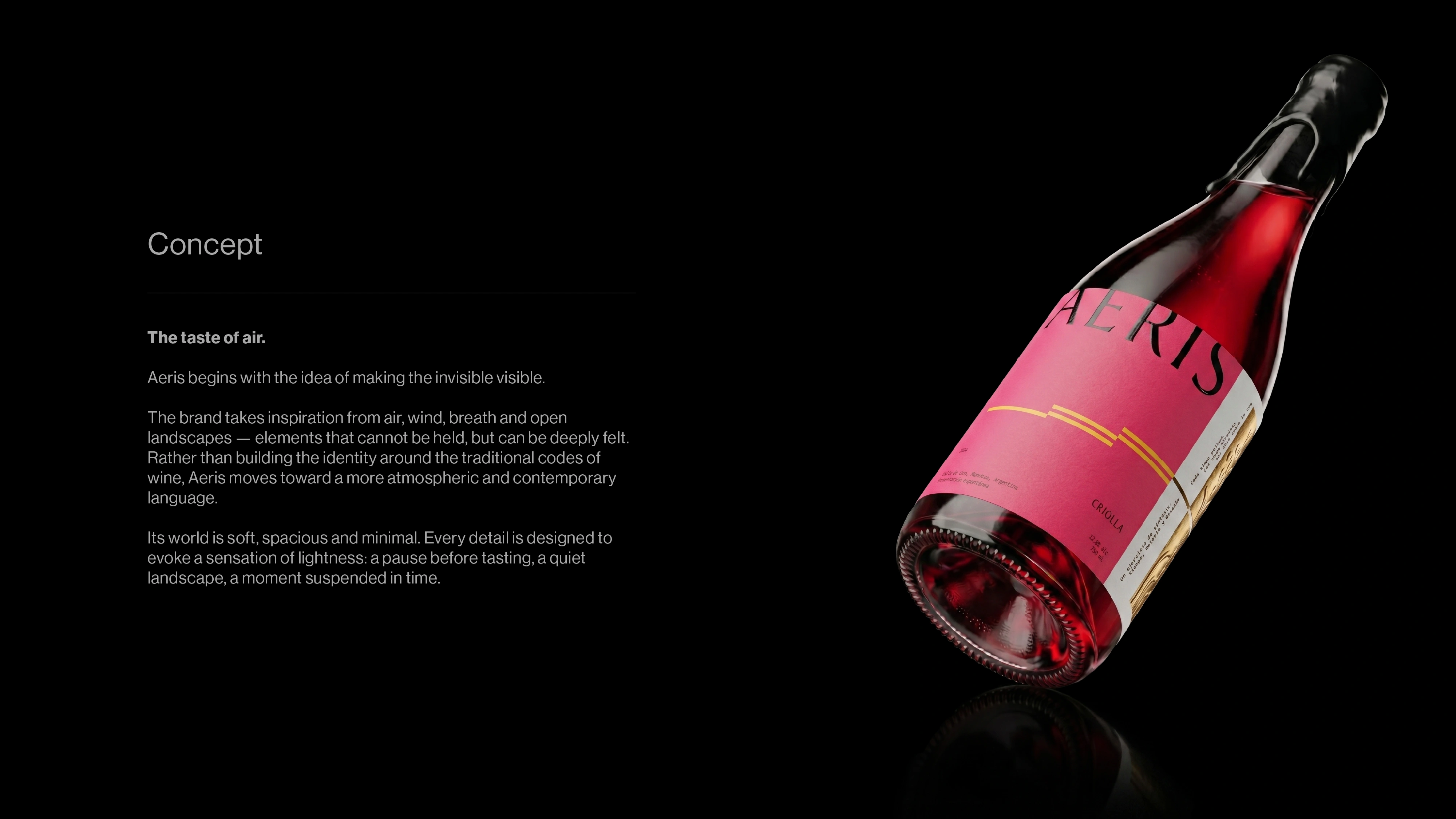
AERIS is a premium wine identity inspired by the quiet presence of air — invisible, essential and always in motion.
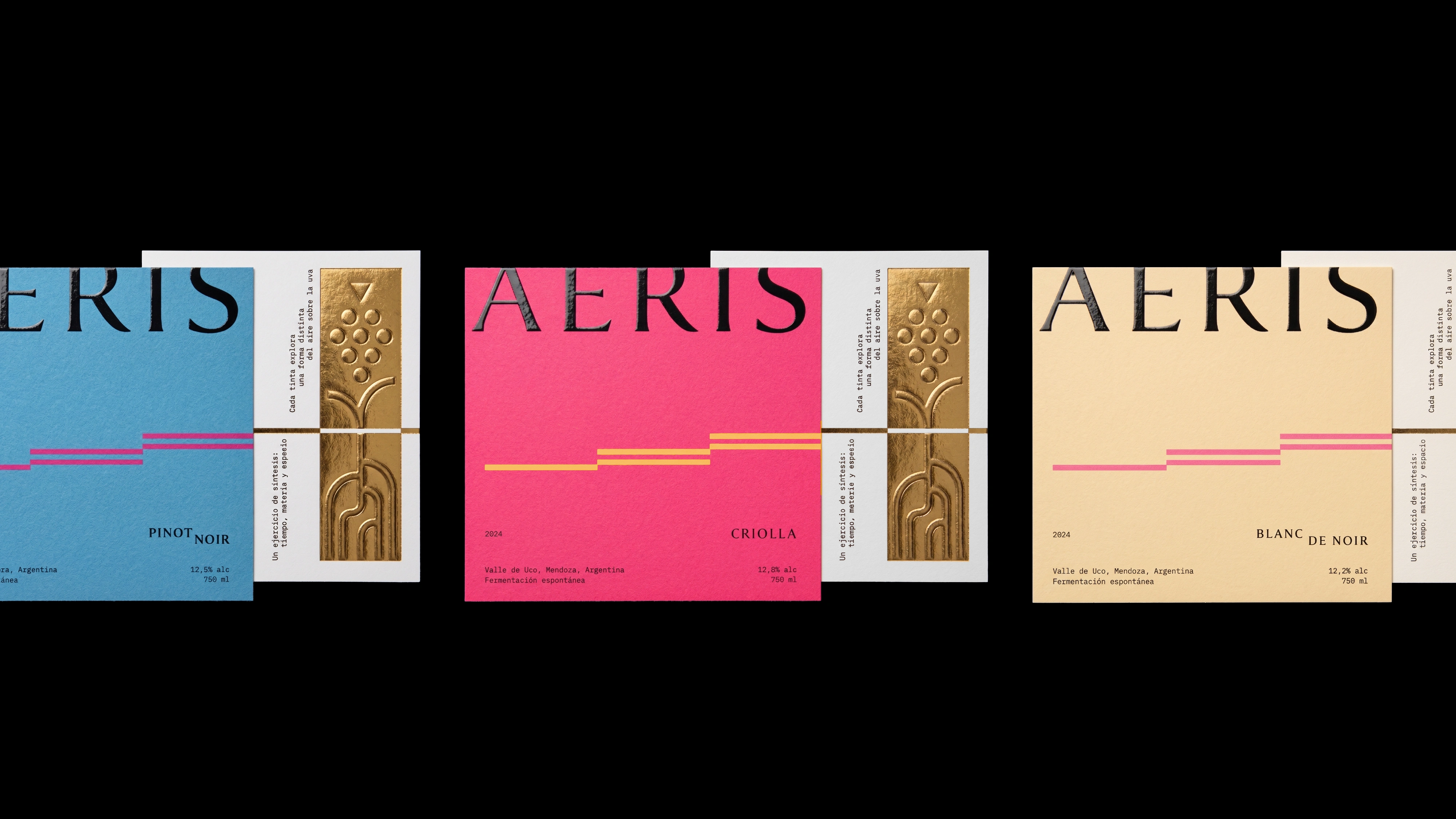
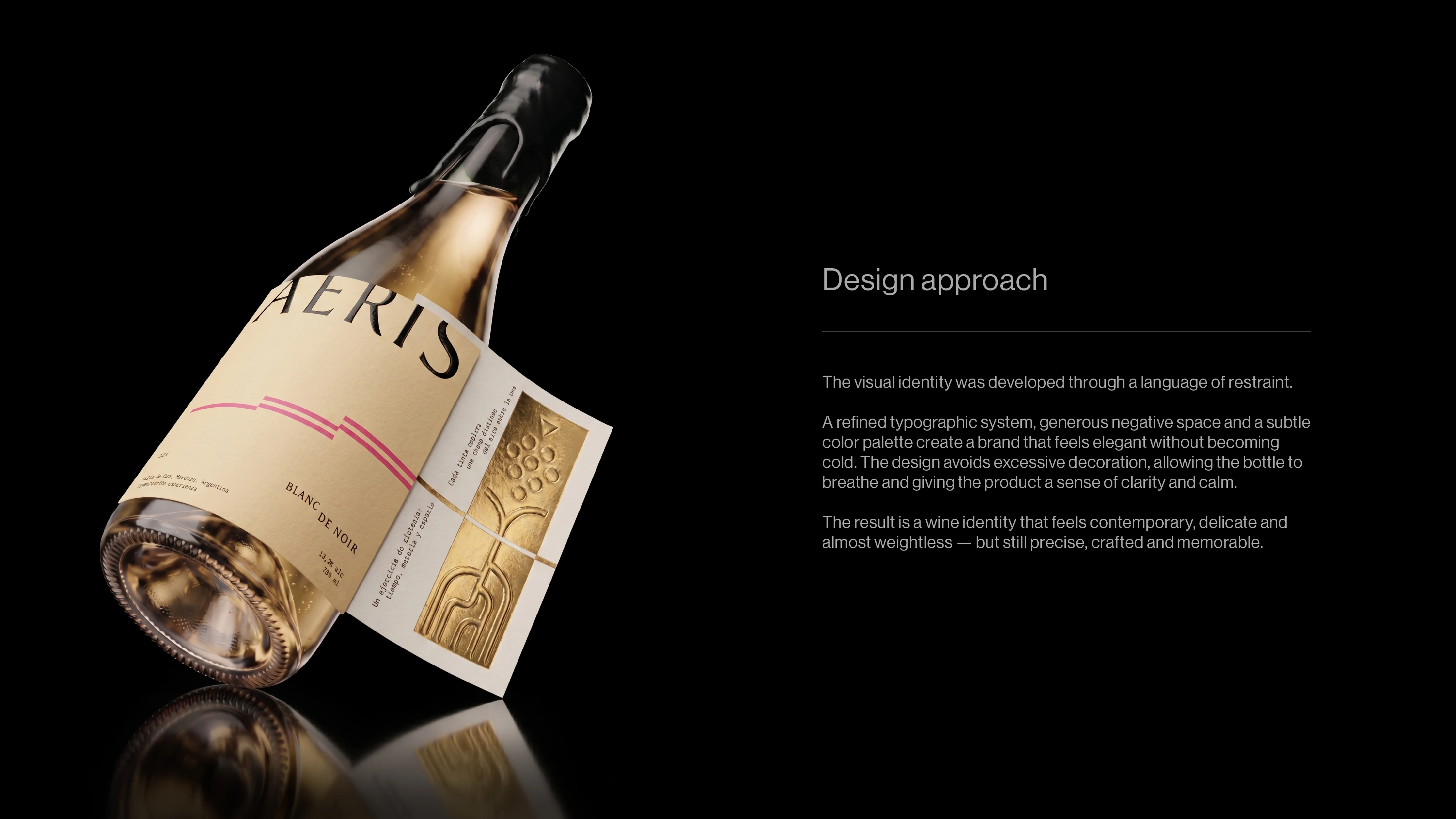
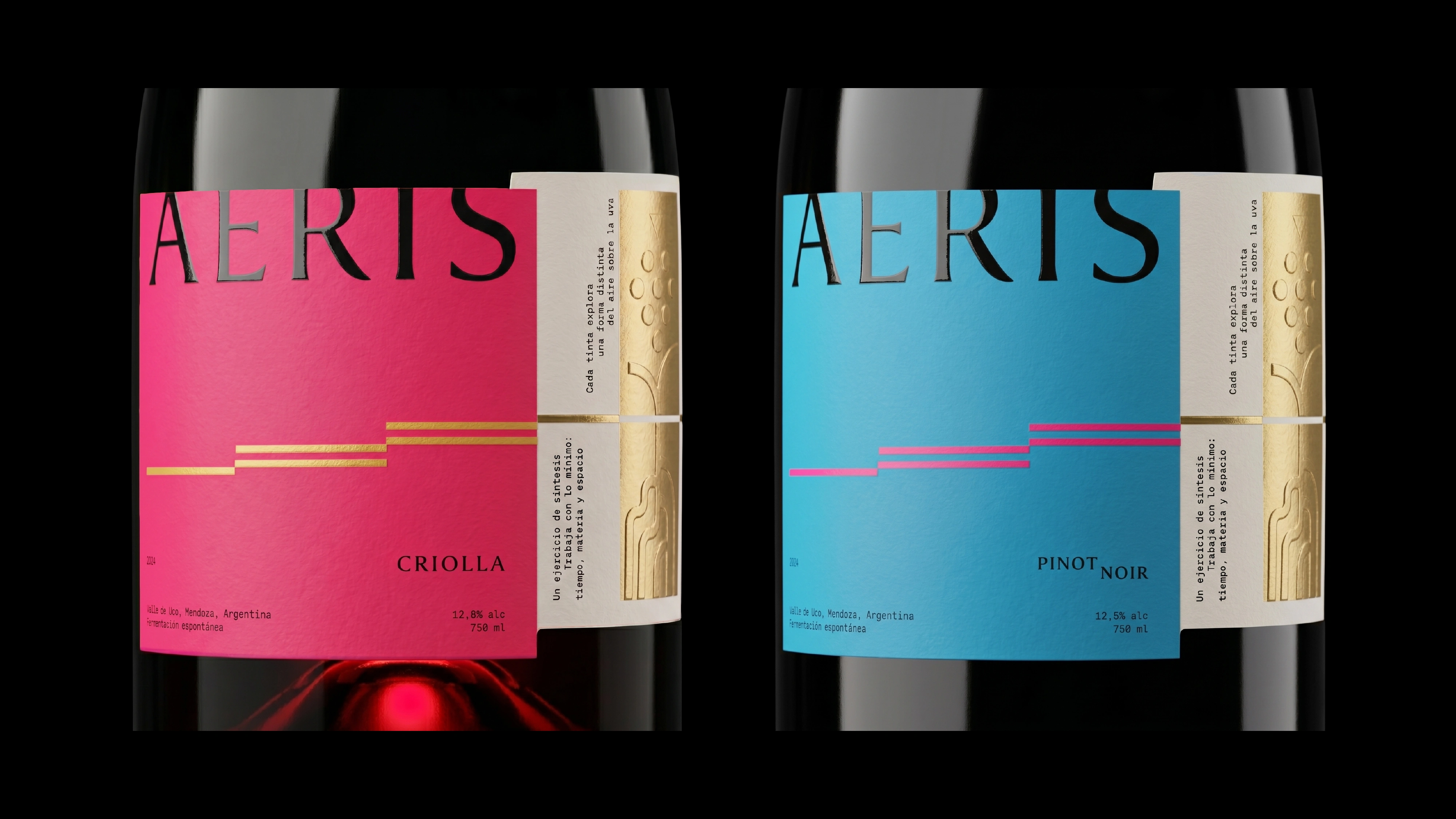
The packaging translates that idea into a restrained visual system built through light typography, generous space and contrasting material details. A bold front label is complemented by a sculptural gold element that reveals another layer of the identity as the bottle turns.
Designed as a family rather than a single label, AERIS explores how one visual language can shift across different wines while remaining unmistakably consistent.
Working on a wine or premium packaging project? Let’s create something distinctive together.
Like this project
Posted Aug 12, 2026
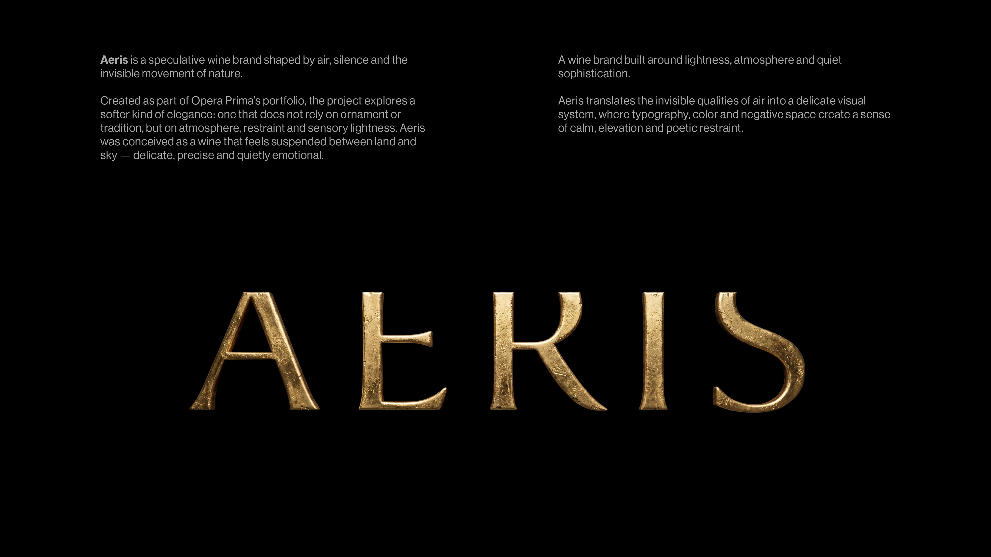
AERIS is a wine brand built around lightness, atmosphere and quiet sophistication.