Livsain Diagnostics™ - Identity Design
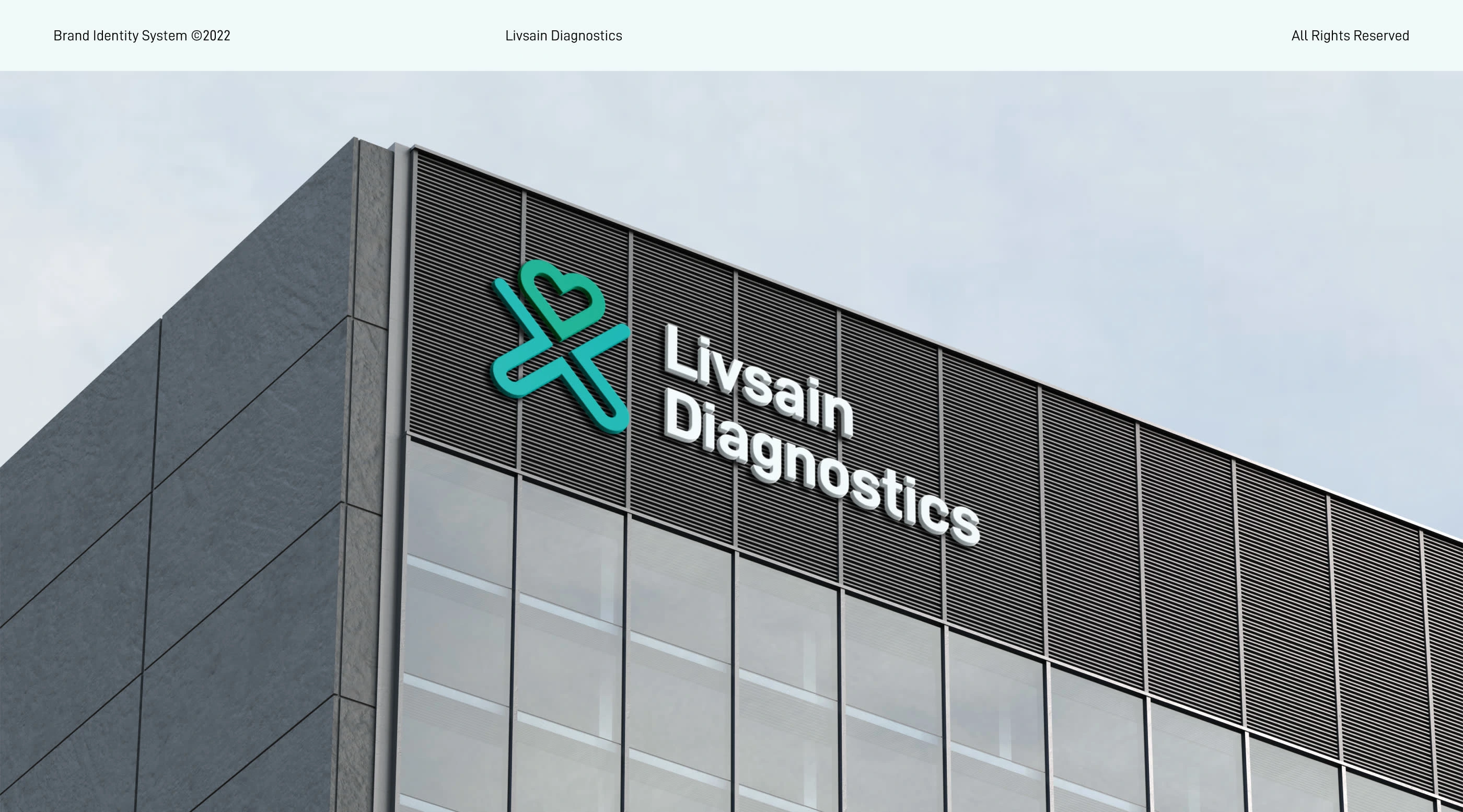
Where care comes first.
Since the first outbreak in December 2019, COVID-19 has destroyed millions of lives and occupations of the entire population. On the bright side, the global pandemic has made people more aware of the quality of their own lives. Oftentimes, people ignore regular medical tests, which serve as a preventative measure.
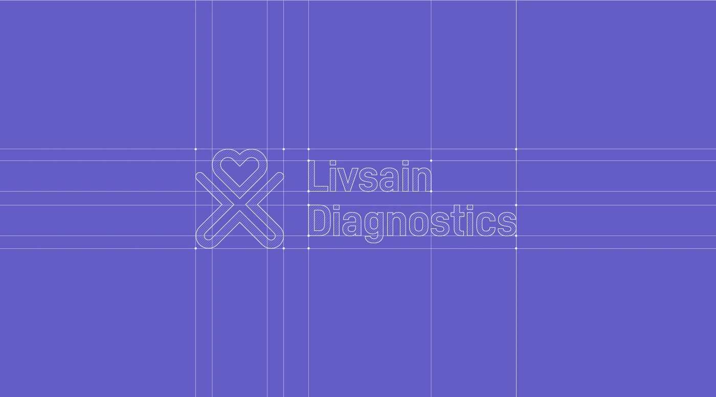
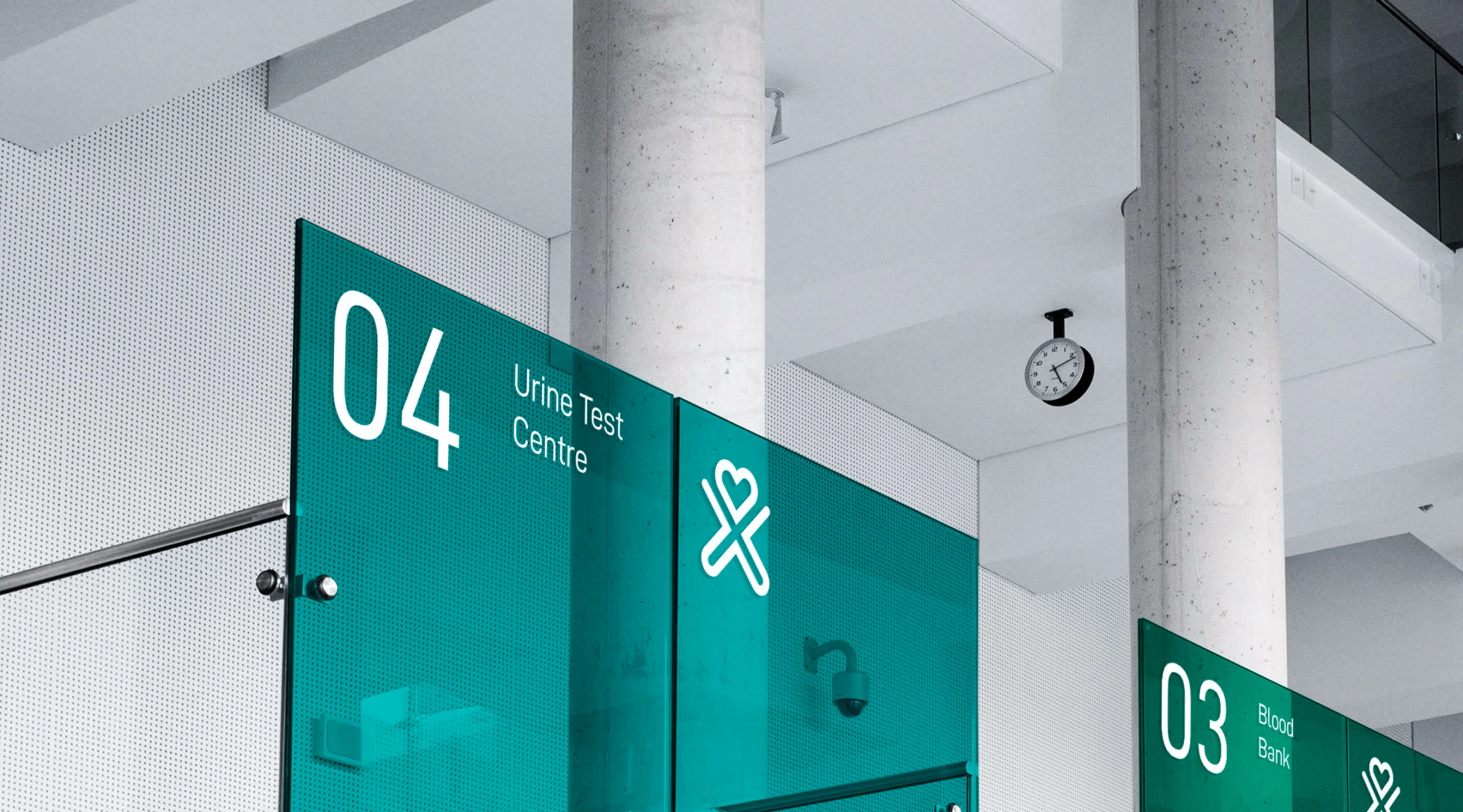
Those inspiration led to the birth of Livsain Diagnostics™ - a diagnostics center and pathology lab located in Ranchi, Jharkhand. They provide all kinds of urine, blood, stool, semen, tissue and sputum tests. Additionally, they offer COVID-19 and RT-PCR tests. Home delivery of the test results is one of their primary objectives. Using simple and recognizable shapes, we created an identity that is solid, has emotion, and is easily recognizable.
Project Scope: Brand Identity & Design System.
Project Duration: January 2022 – March 2022
Client: Vishal Singh
Brand Attributes
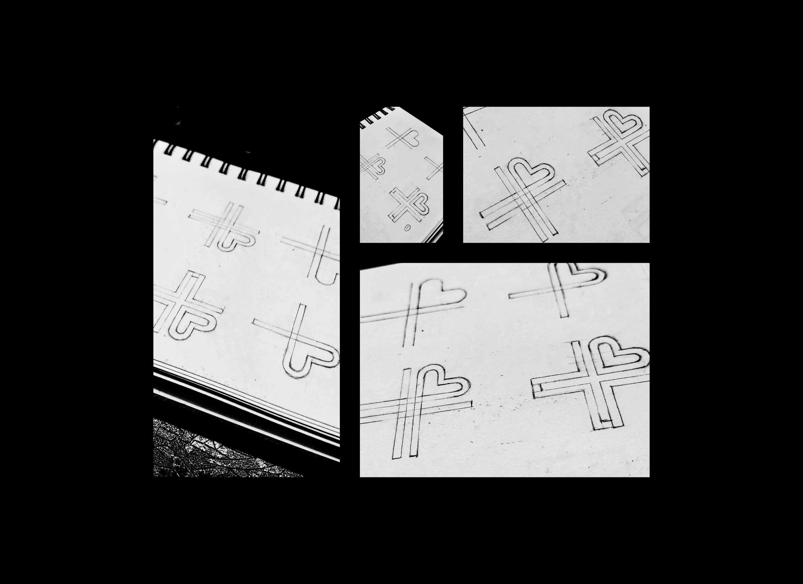
Livsain is an all-in-one diagnostics center that applies all the latest technologies to improve human wellbeing. Livsain's tests and solutions aim to secure precious lives with the slogan "Where Care Comes First". In Livsain, we strive to enrich the customer experience and help them "Feel More". Each of Livsain's tests is designed to deliver the attributes of Clean, Friendly, Character, Modern, and Efficient.
Logo Animation

Brand Pattern
Color Palette
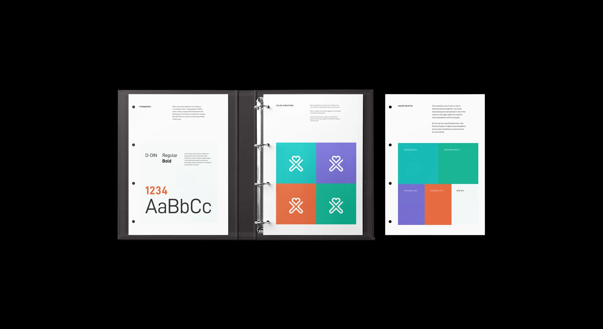
In addition to the soothing, clean, and peaceful shades of green, we added a bit of vibrant character to it. Raisin Black and the White Cream balances out the overall colors. Each color shows a different attribute of the brand. The Primary Colors consist of the Light Sea Green, and Jungle Green whereas the Secondary Colors are the Flame, and Slate Blue. Each color has it proper usage percentage.
Brand Colors
Typography
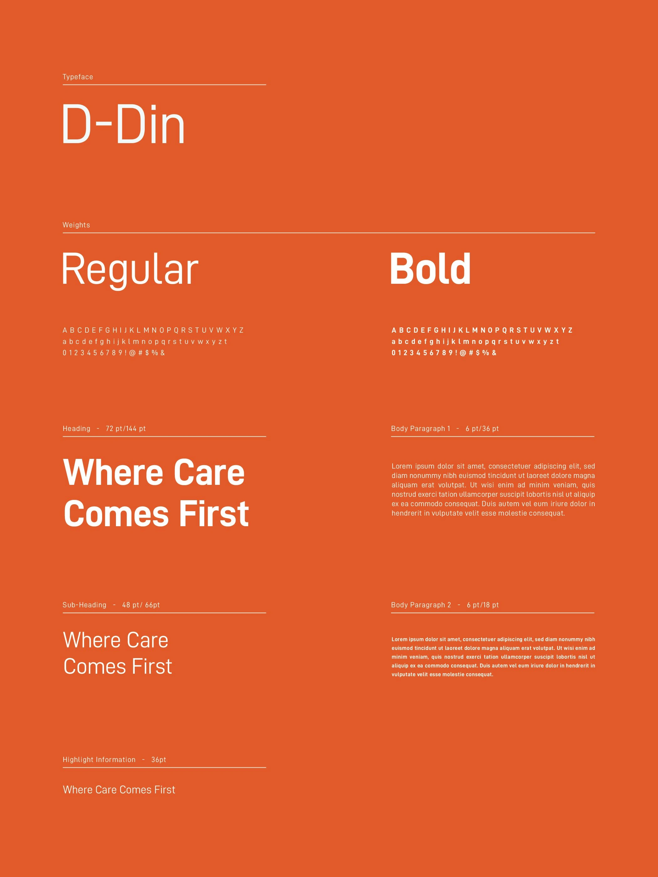
Typography is the art and technique of arranging type to make written language legible, readable and appealing when displayed. In Livsain Diagnostics, keeping the brand attributes intact we have chosen DIN, which is a handsome san serif typeface in the grotesque style. It was designed in 1995 by Albert-Jan Pool, based on DIN-Mittelschrift and DIN-Engschrift, as defined in the German standard DIN 1451.
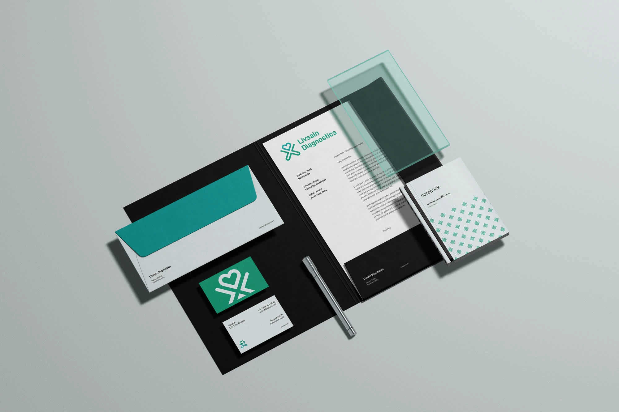
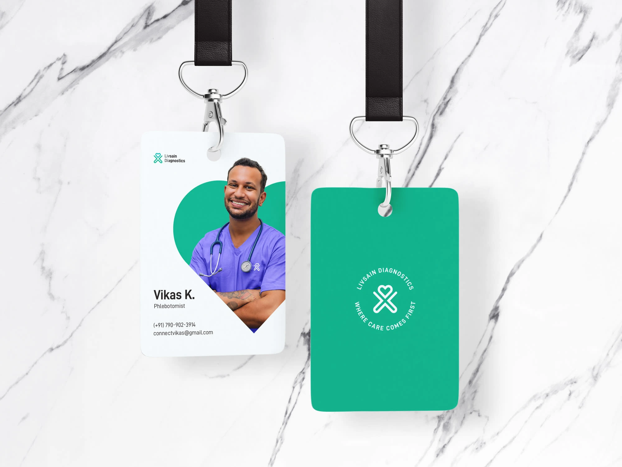
Stationary
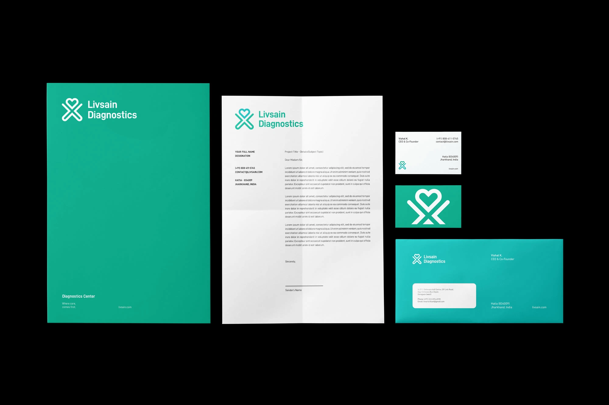
We optimize and integrate the concept of minimalism in the design of Livsain's Stationary. The logomark with the Logotype, which accounts a portion of the design, is easy to be recognized and display in a variety of sizes and angles as it can be used as a design element. We also make good use of negative space, typography, and colors to stimulate the brand attributes that the customers are looking for.
Online Interaction
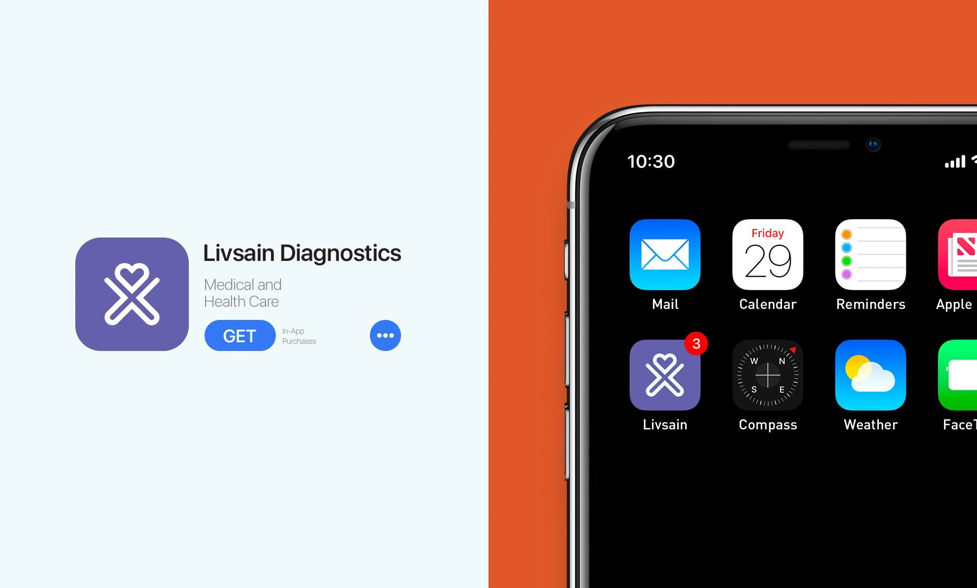
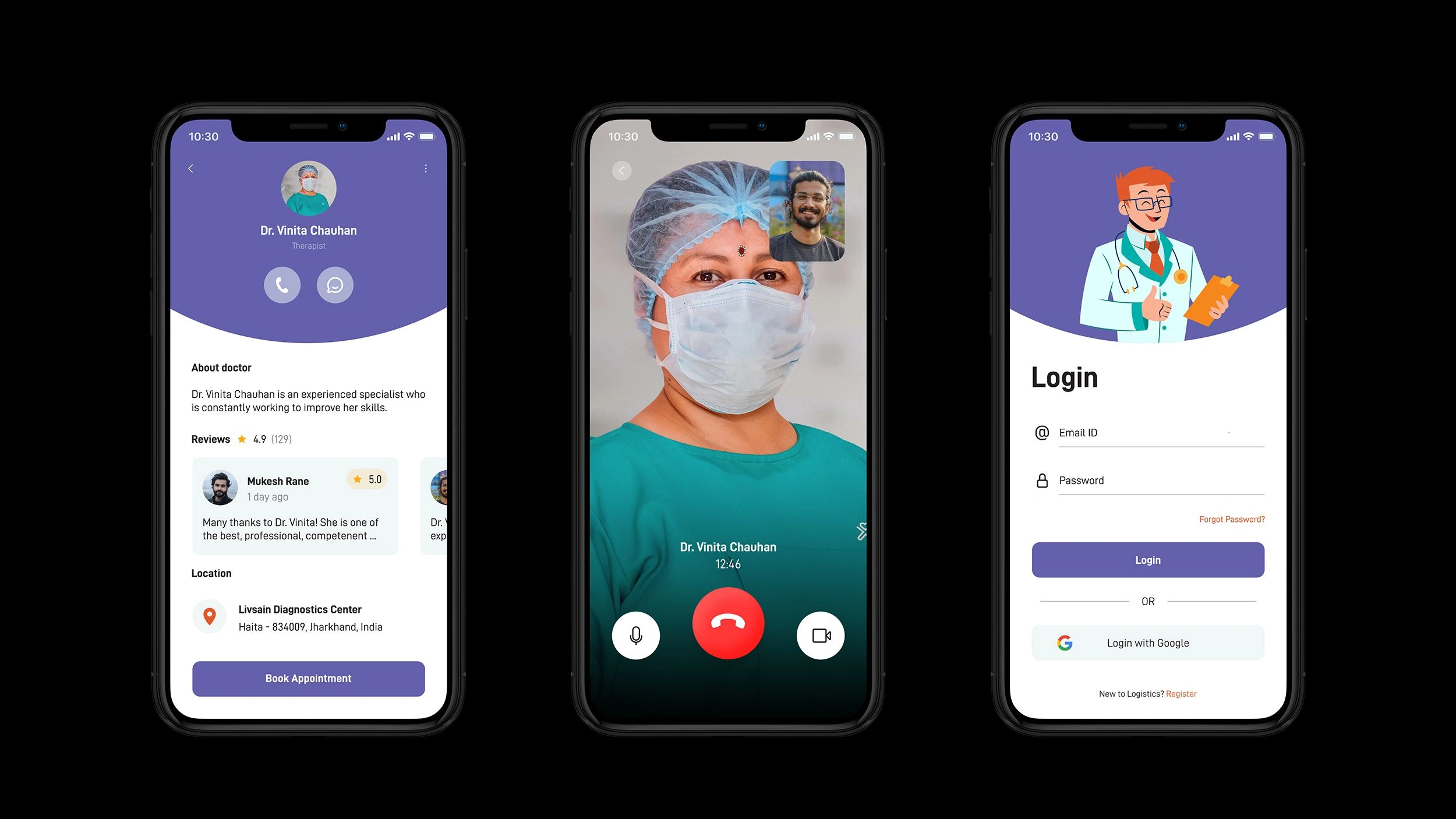
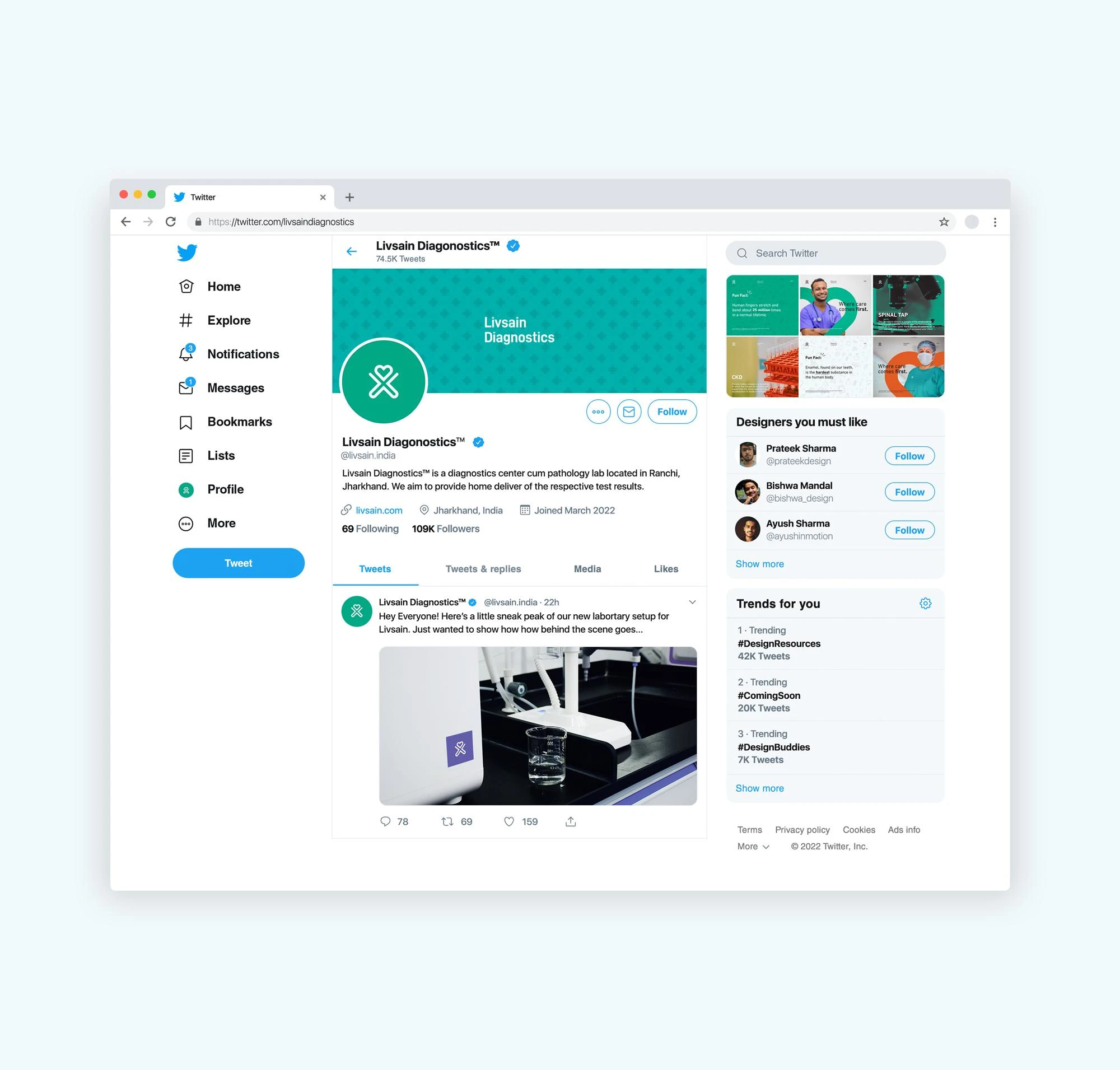
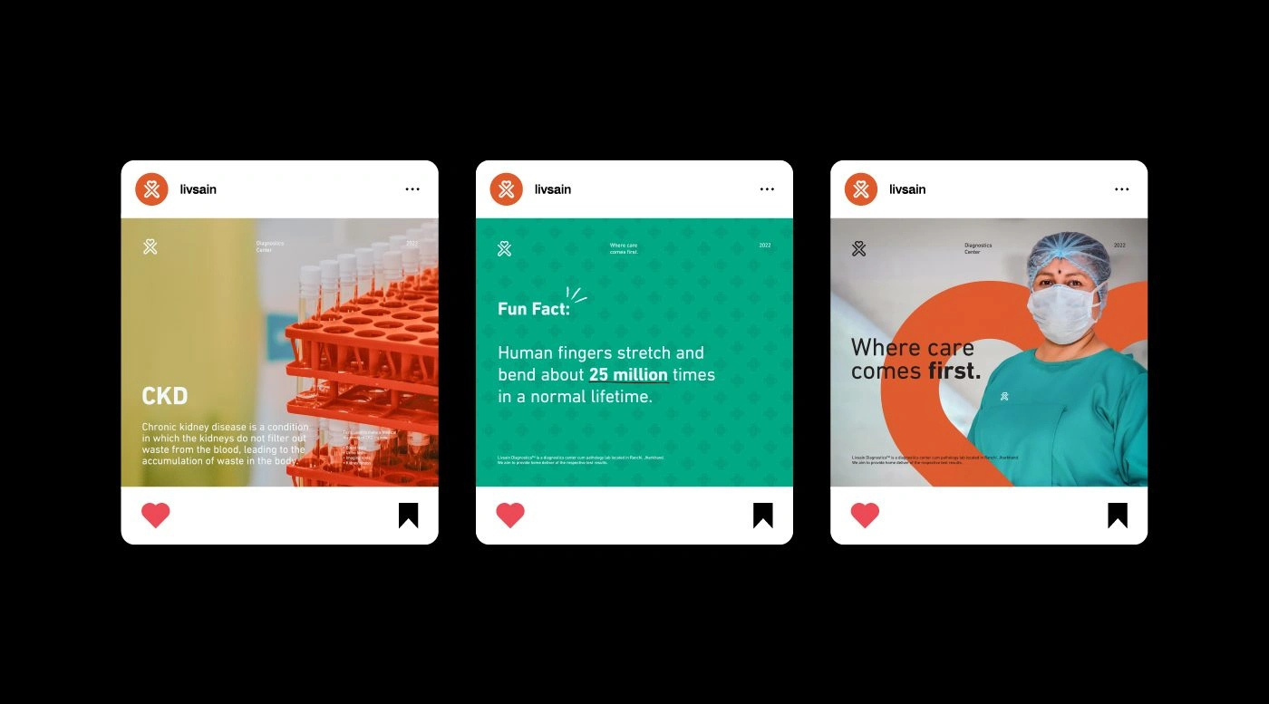
A consistent design applies across all of our website/app UI. Our focus is optimally on providing a user-friendly experience and easy to make changes we need.
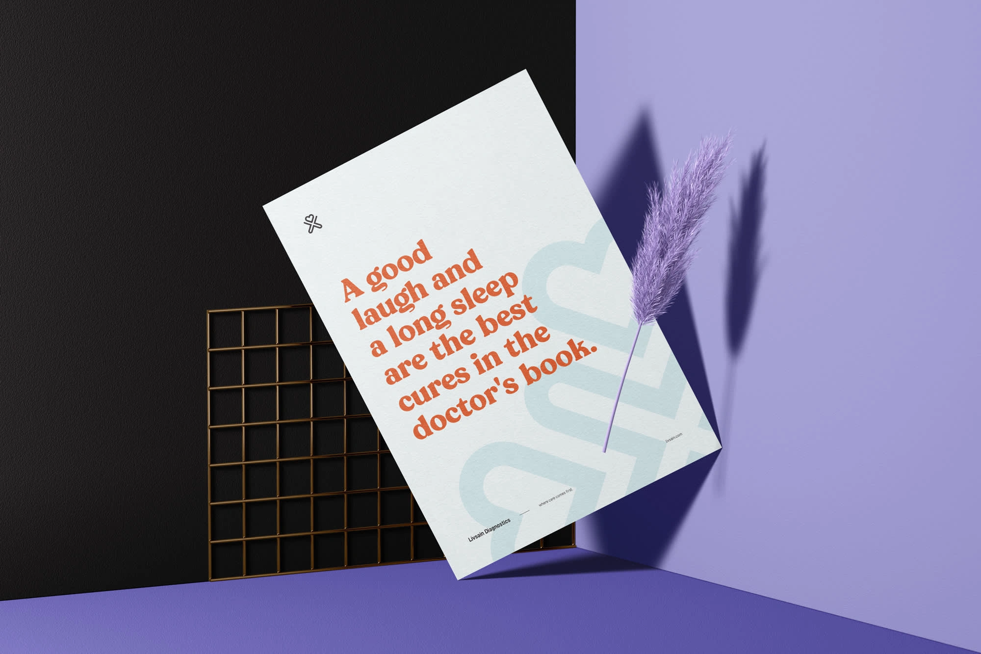
Posters & Billboards
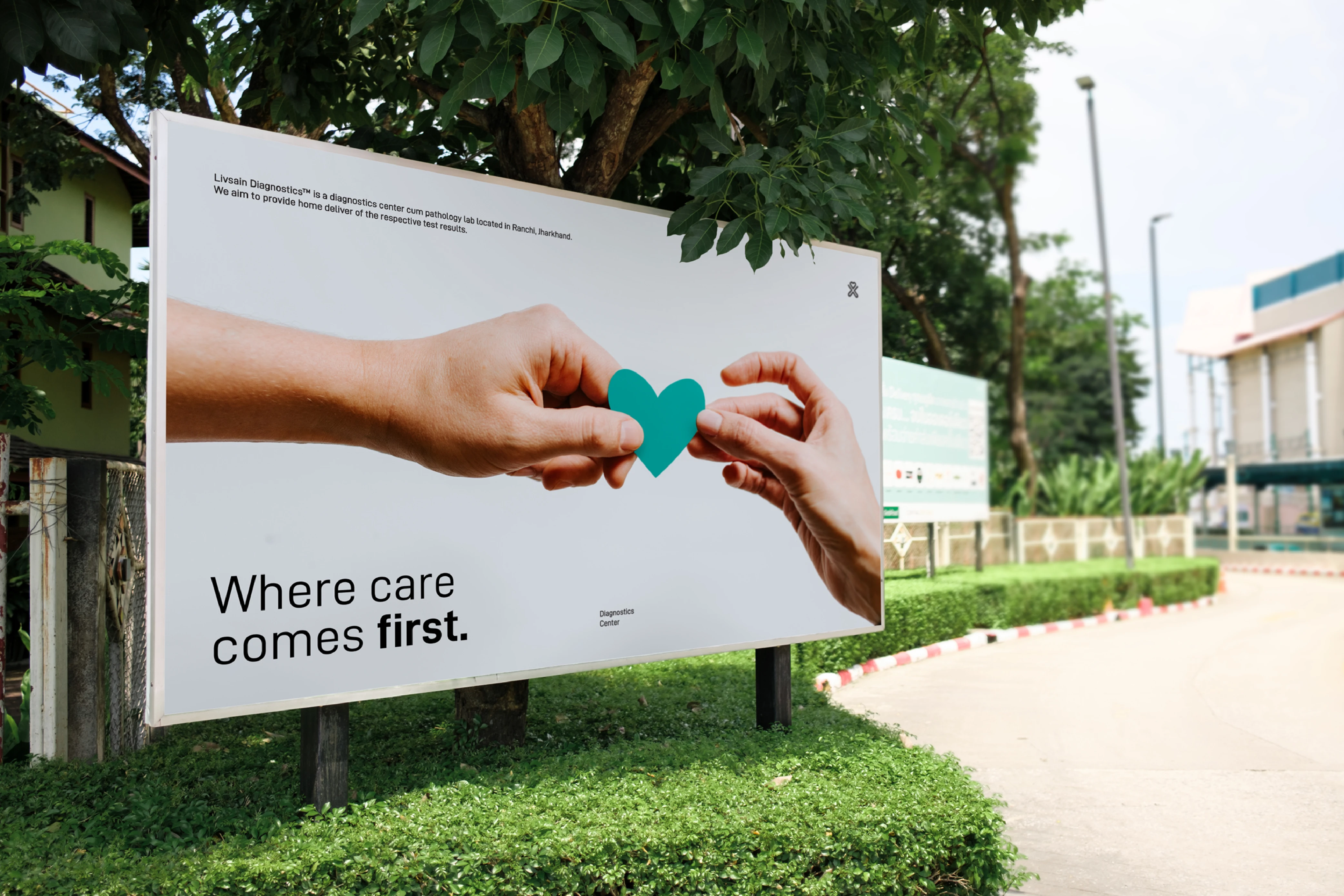
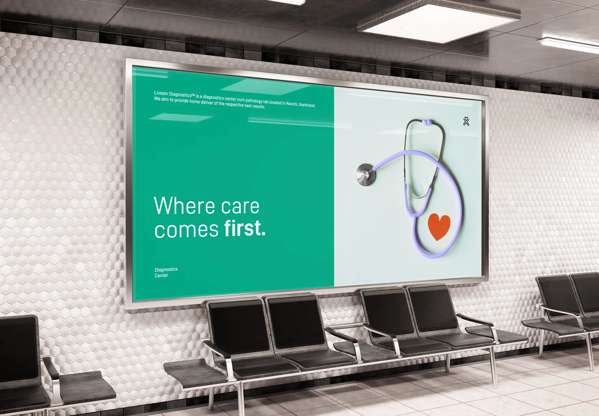
Inspiring from the concept, the posters and billboards gives attention to the key elements such as logo, slogan, product images, typography, and colors, making good use of negative space.
Like this project
Posted Aug 20, 2024
Livsain is an all-in-one diagnostics center that applies all the latest technologies to improve human wellbeing.

