
A thoughtful brand identity for Nami Matcha Bar, built around a calm, distinctive visual language and carried through its customer-facing applications. The project brings together brand strategy, visual identity, and a range of applications to create a cohesive expression of the matcha bar.
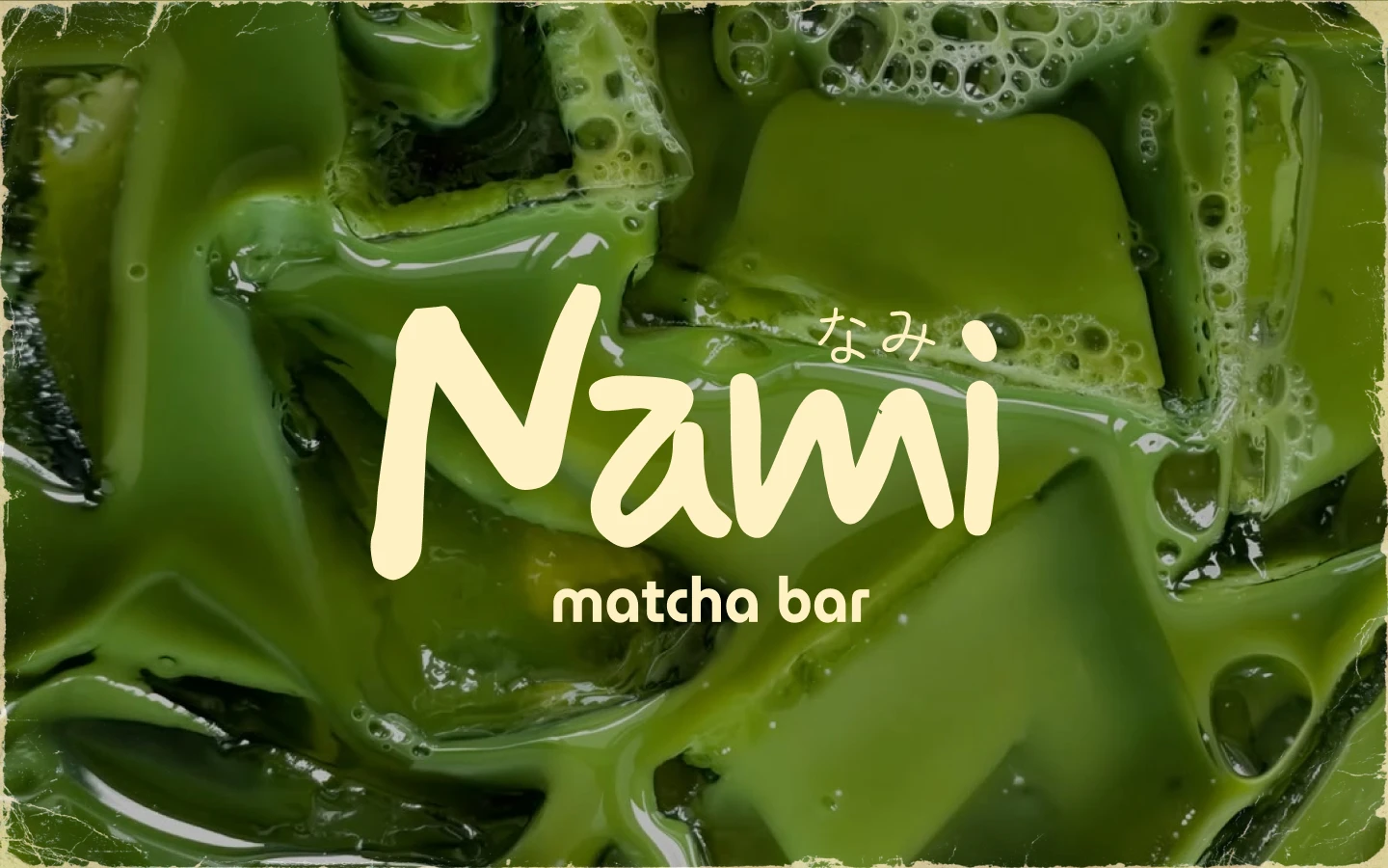
Nami Matcha Bar is shaped around a simple idea: a thoughtful cup, enjoyed at your own pace. The identity translates that feeling into a calm, distinctive visual language that feels considered and welcoming.
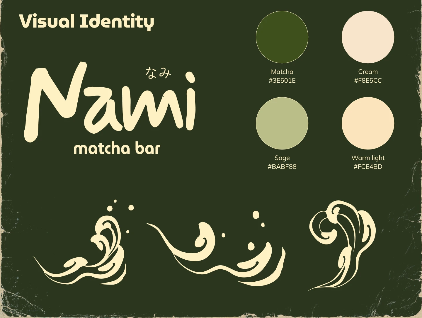
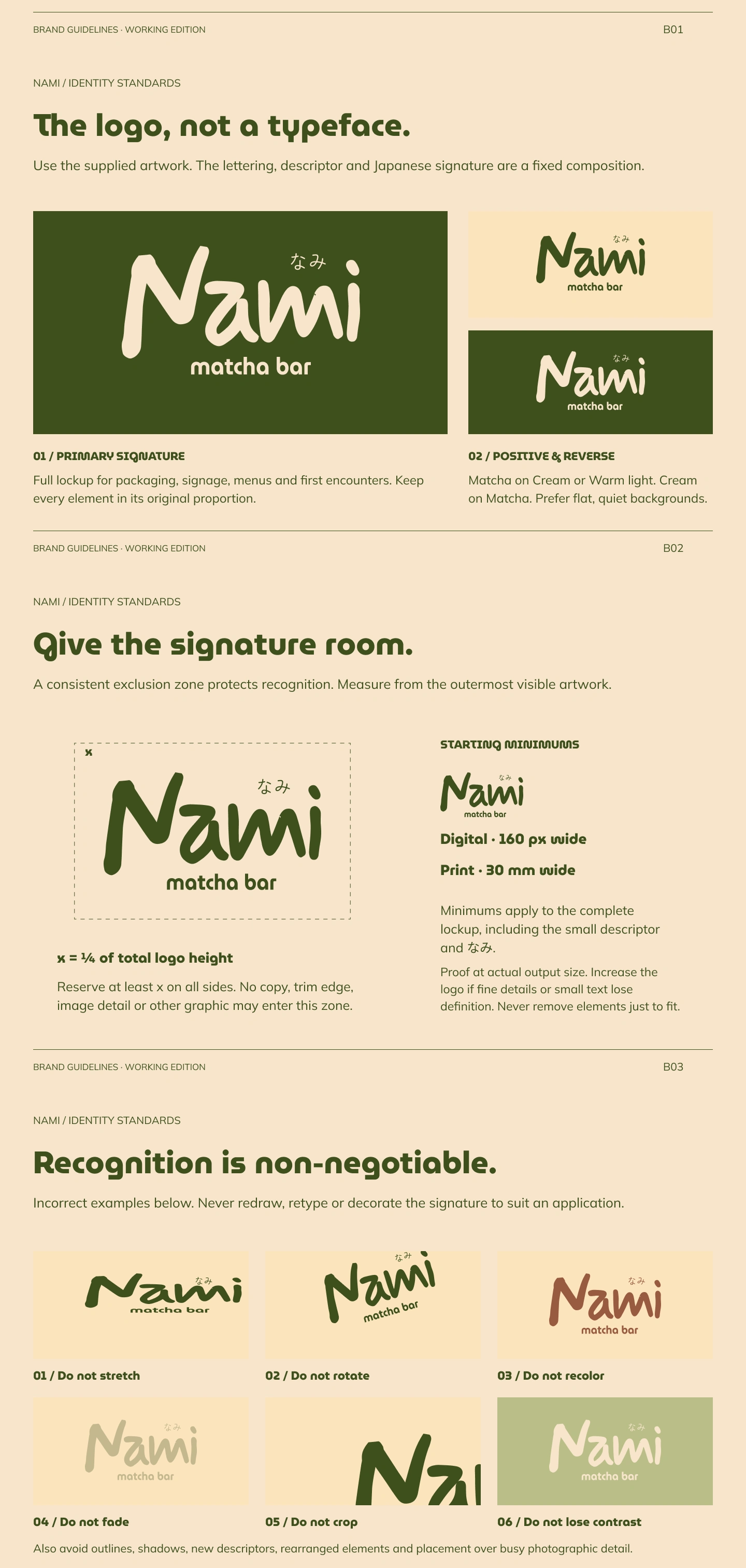
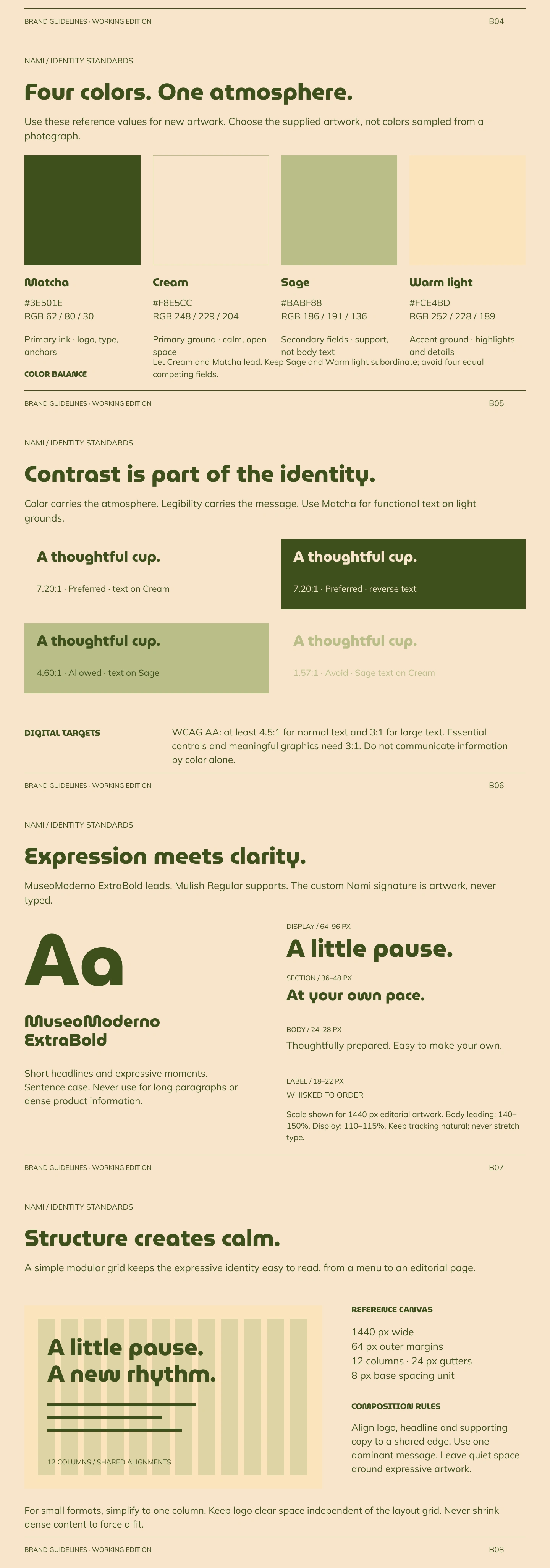
A deep forest-green and warm-ivory palette provides the foundation. The relaxed Nami wordmark gives the brand a personal character, while flowing wave details bring movement to the identity and connect its different elements. Together, these choices create a recognizable system that can move naturally across the brand’s touchpoints.
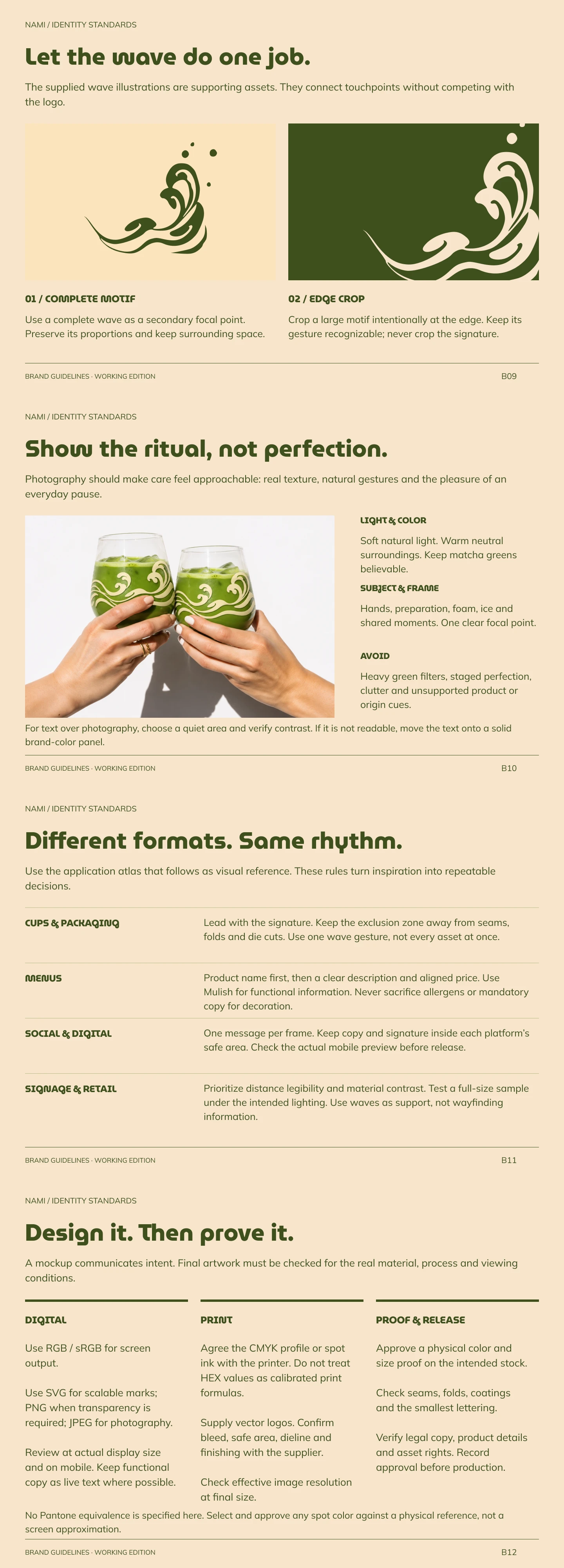
The visual identity is applied across takeaway cups and drinkware, packaging, menus, signage, printed collateral, and staff apparel. Each application carries the same colors, wordmark, and wave motif, helping the brand feel cohesive in different formats and settings—from a cup in hand to the menu and signage.
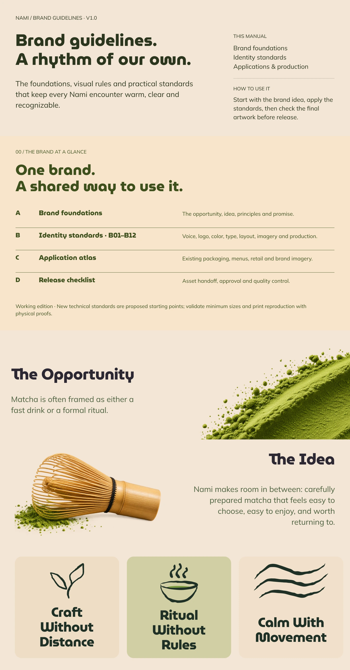
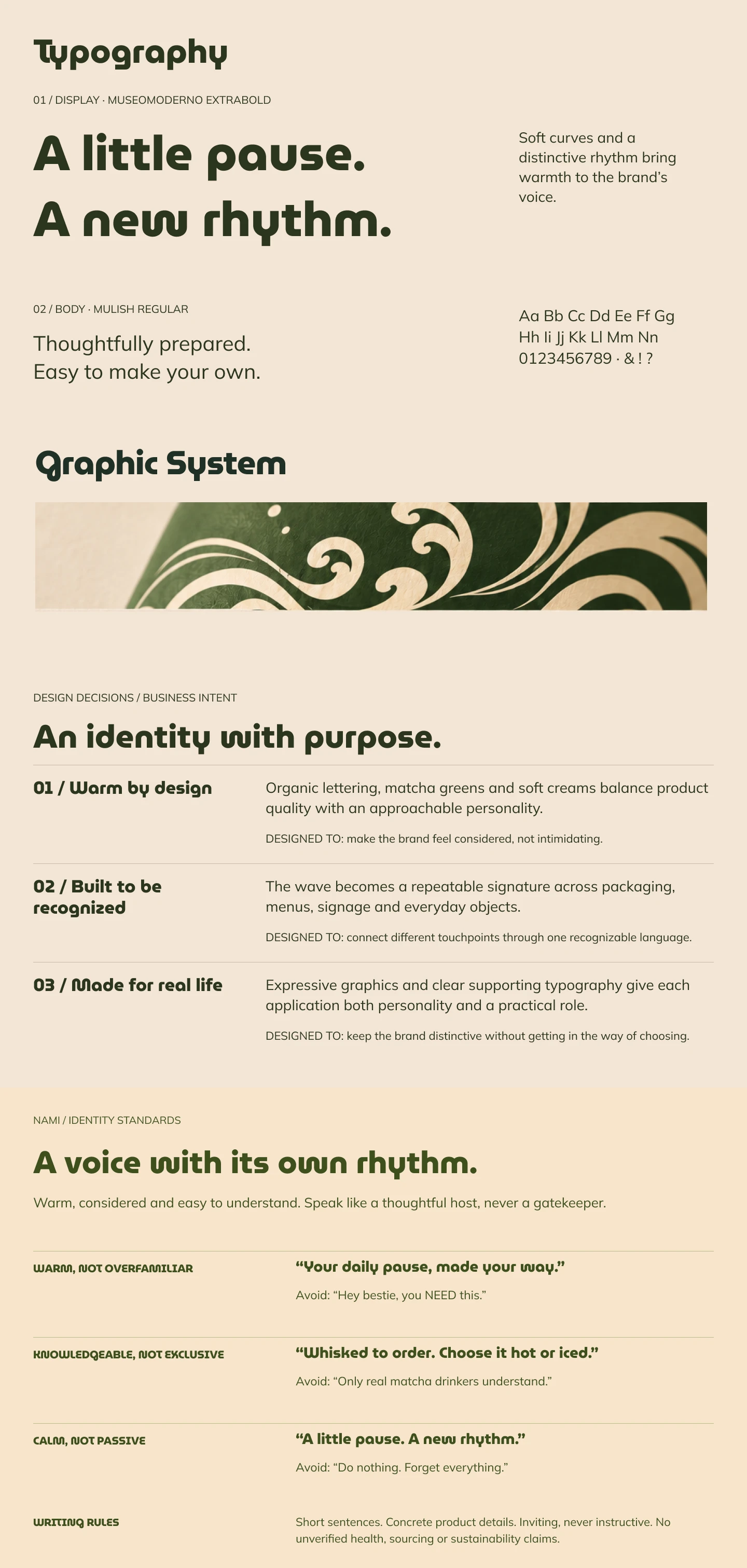
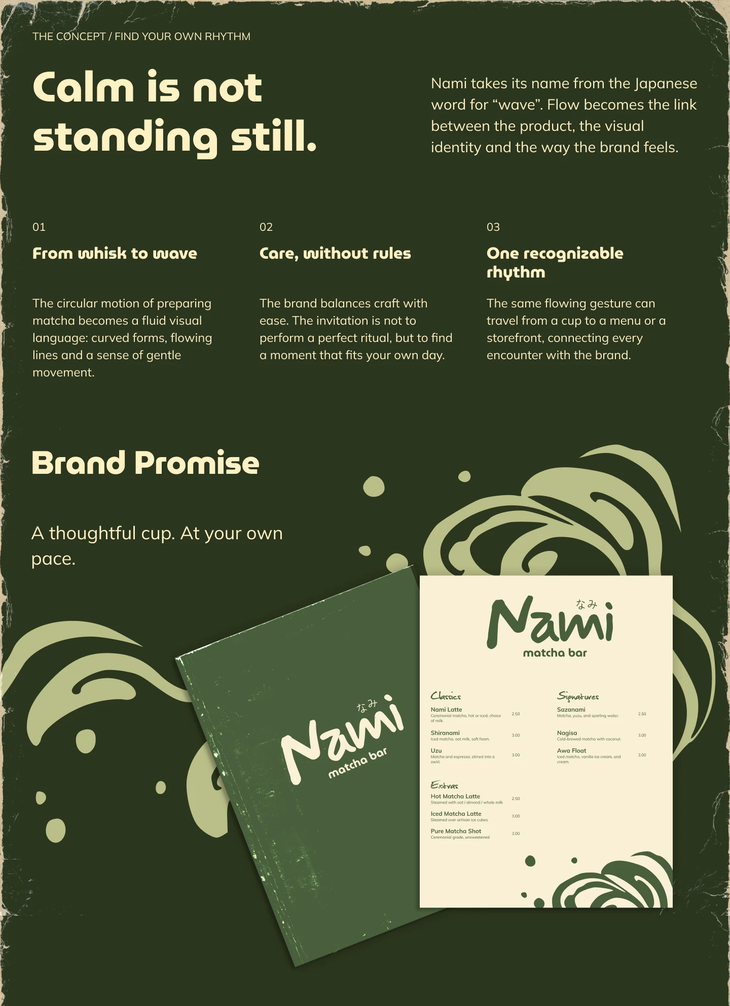
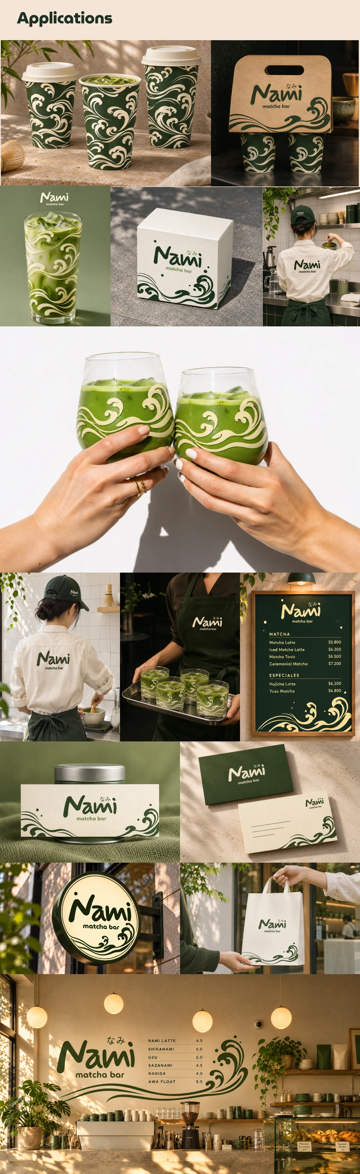
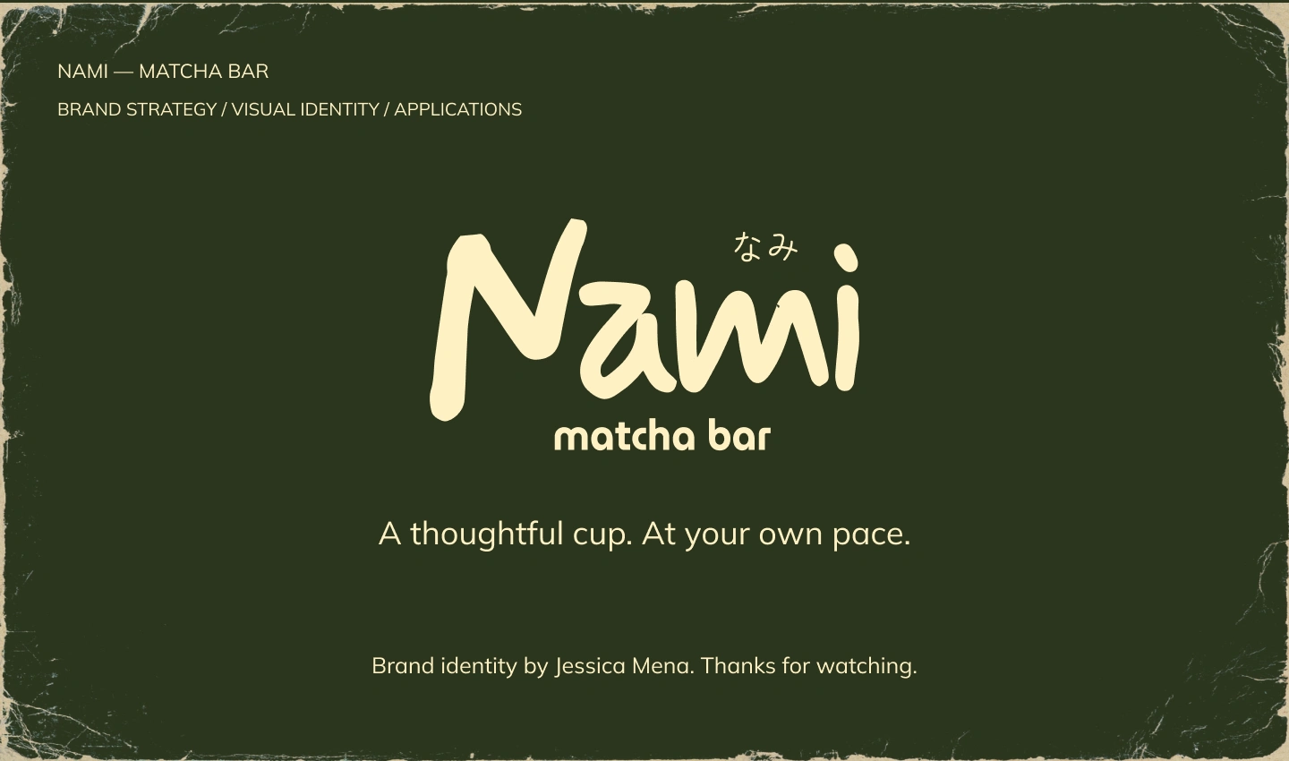
The result is a unified brand expression with a calm, thoughtful character, guided by the line “A thoughtful cup. At your own pace.”
0 likes · 6 views · Nov 17, 2026
A thoughtful brand identity for Nami Matcha Bar, built around a calm visual language of forest green, warm ivory, and flowing wave details. The project brings t

