Perpy – Modern Flow Brand Identity
Eashin Arafath
Overview
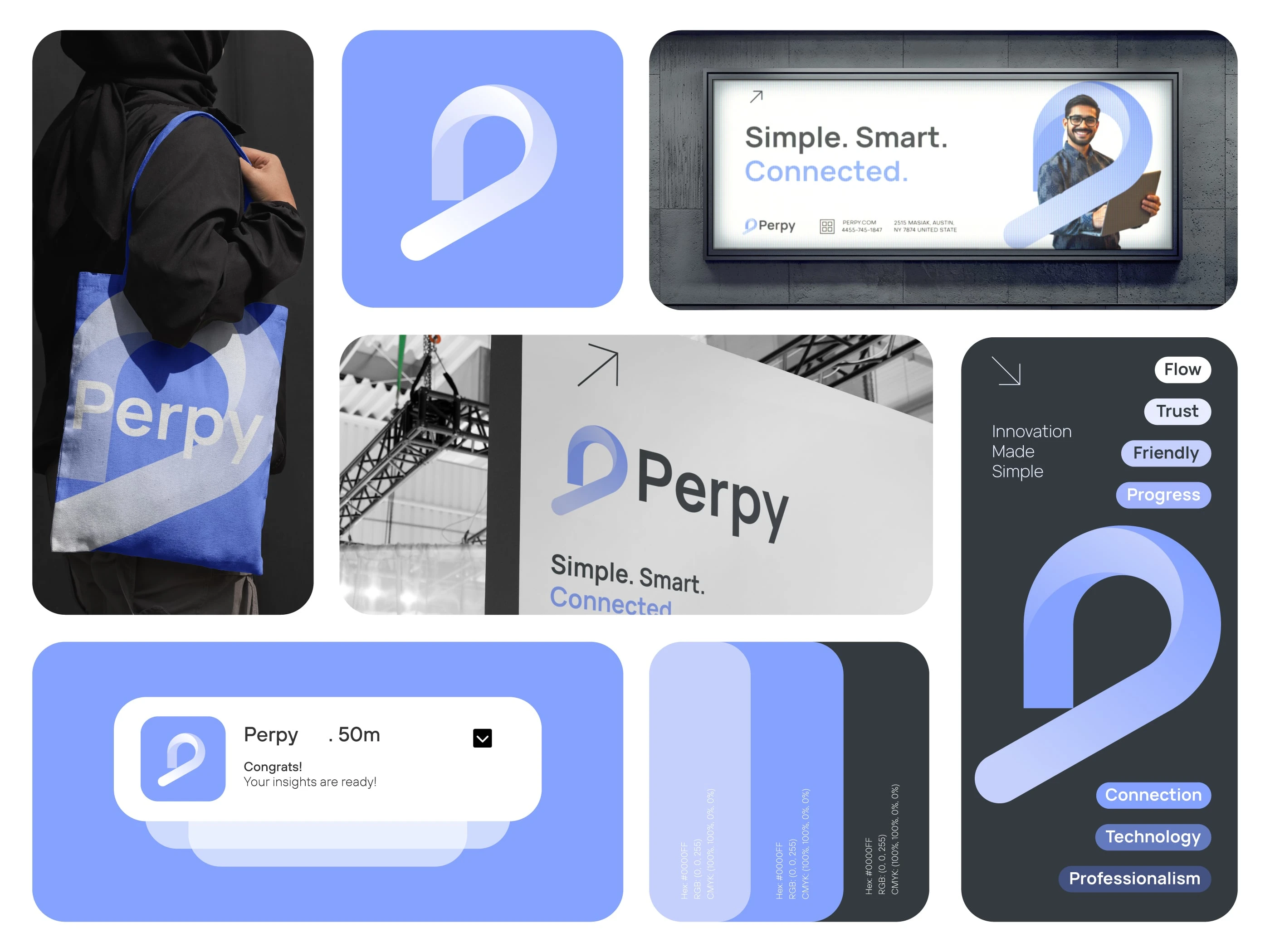
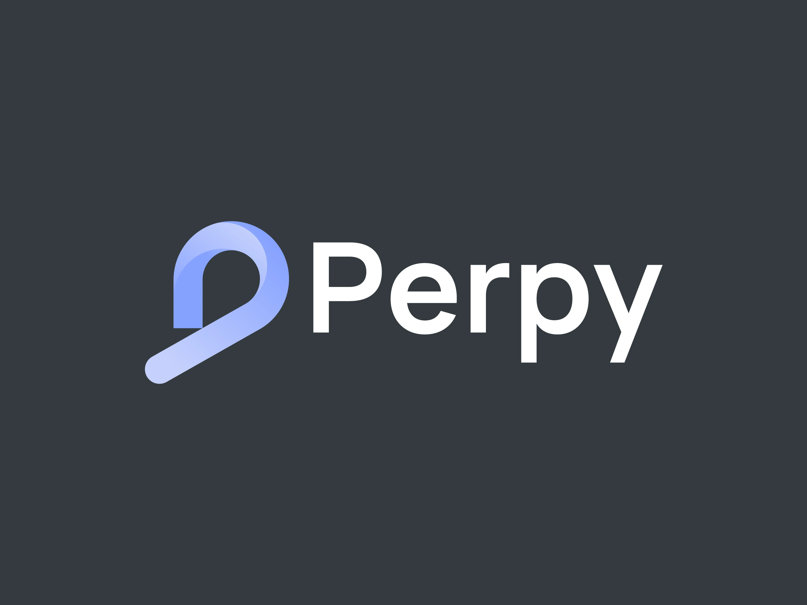
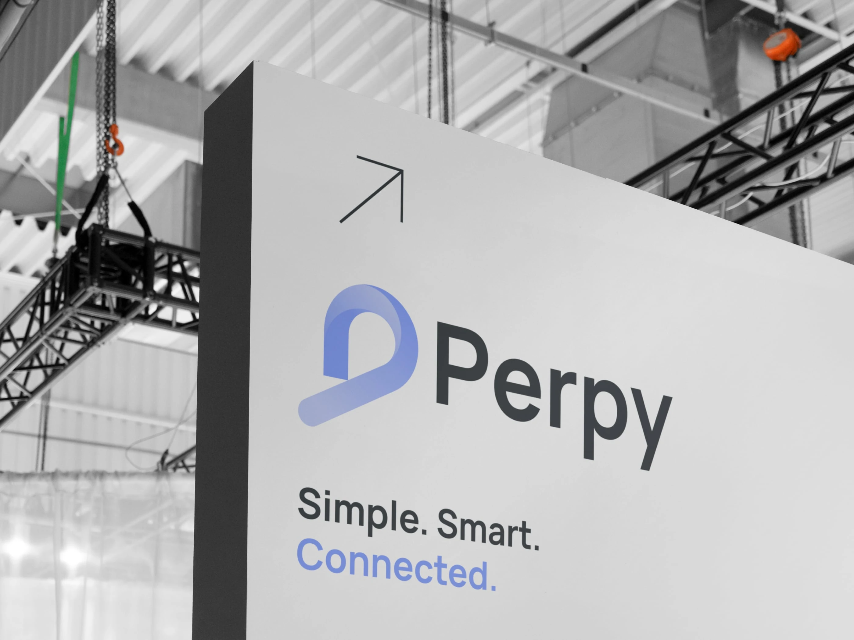
Perpy is a modern digital brand that focuses on simplicity, innovation, and seamless user experience. The goal of this project was to design a clean and memorable logo that visually communicates connection, progress, and modern technology.

The Concept
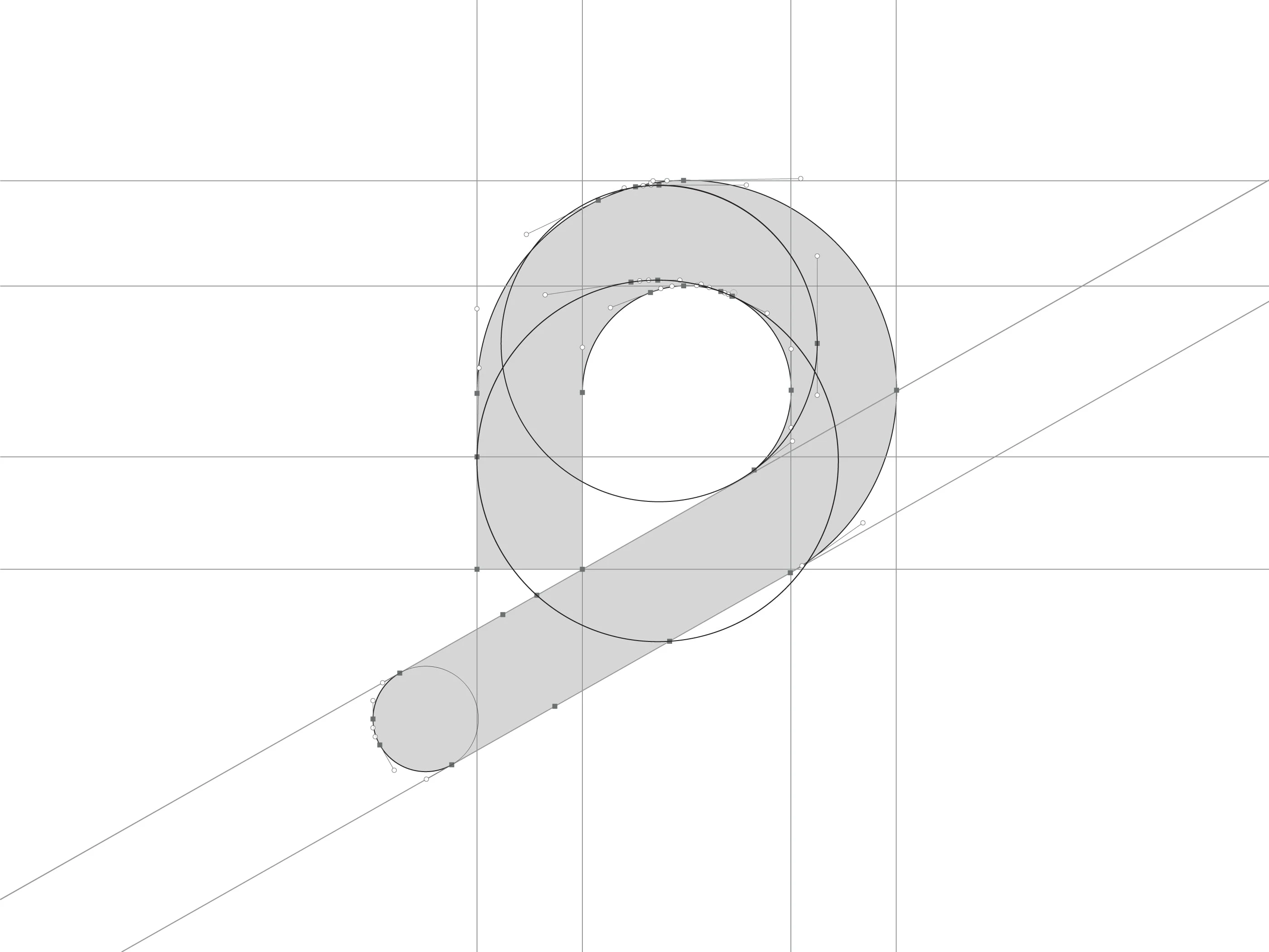
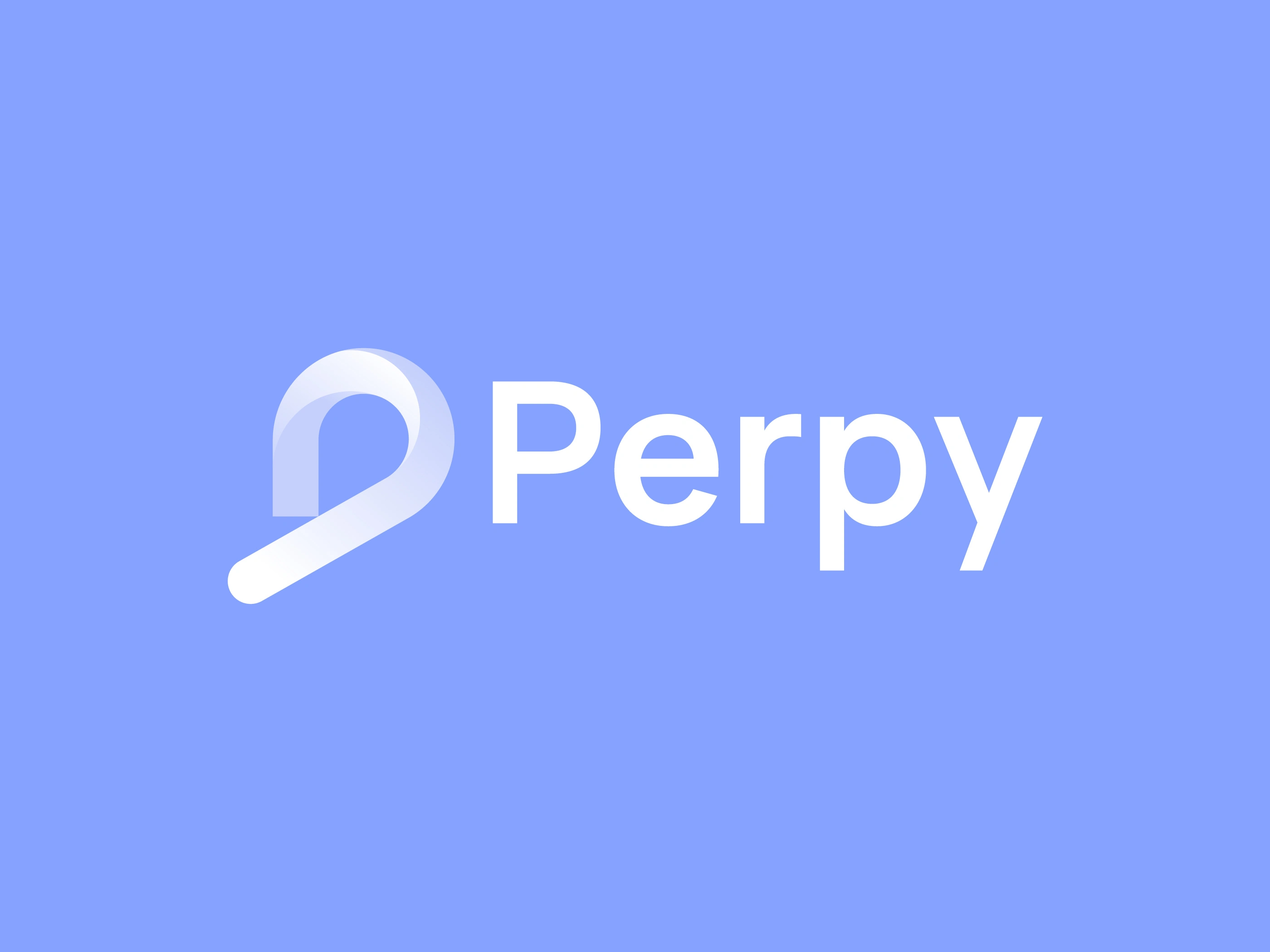
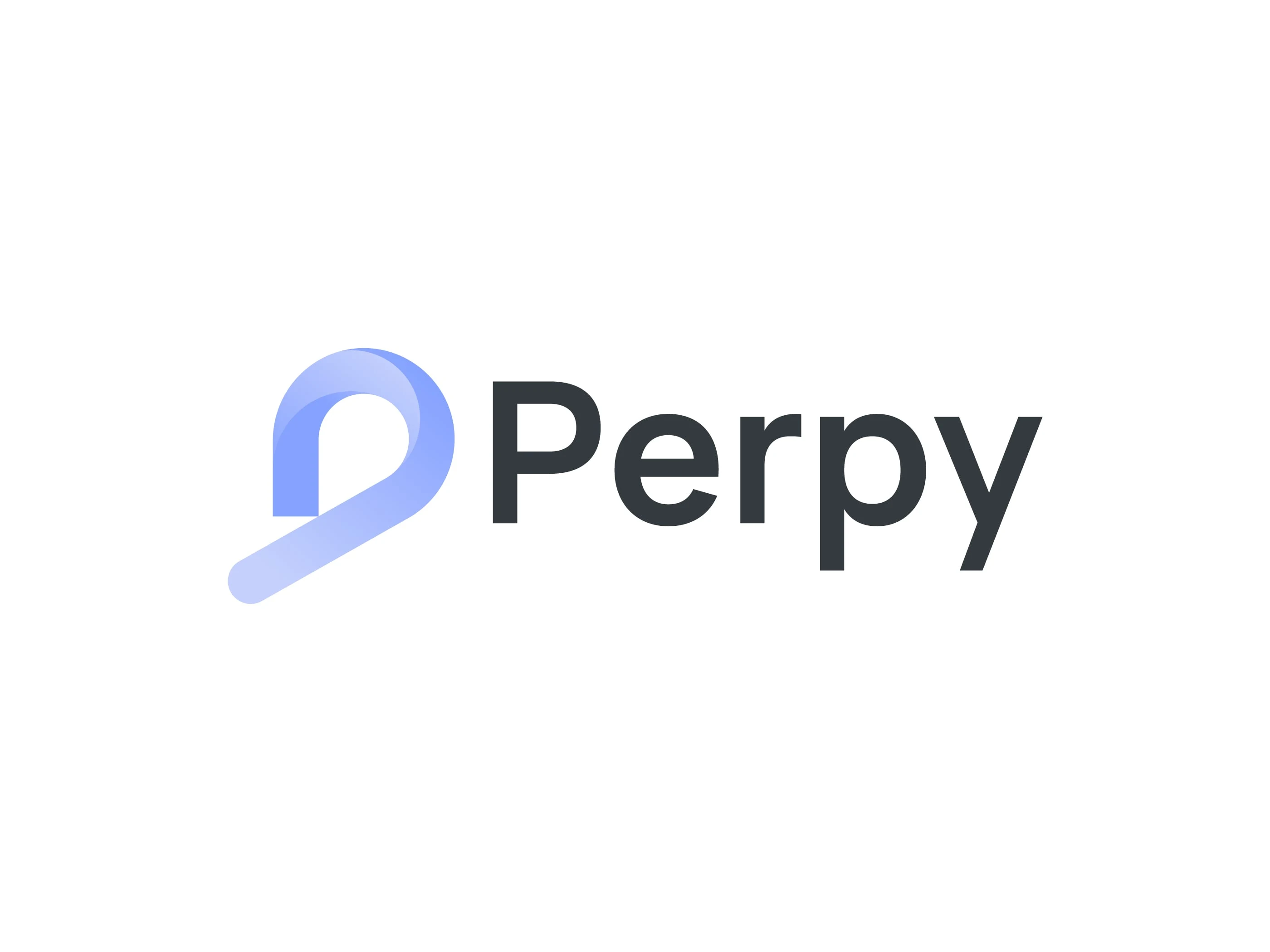
The Perpy logo is built around a minimal abstract “P” monogram. The flowing curved shape represents movement, progress, and continuous growth.
The smooth structure also symbolizes a seamless digital experience, making the brand feel approachable, modern, and forward-thinking.
Design Approach
The design process focused on three key elements:
Simplicity – A clean and minimal shape that is easy to recognize.
Flow – The curved structure creates a sense of motion and flexibility.
Memorability – The abstract “P” mark gives the brand a strong visual identity.
Symbol Meaning
Abstract P Symbol
Represents:
Progress
Innovation
Digital connection
Modern simplicity
The symbol forms a continuous flow which reflects smooth interaction and evolving technology.
Typography
A modern sans-serif typeface was chosen to complement the symbol. The clean and balanced letterforms help maintain a professional and contemporary brand appearance.
Color Concept
Blue Gradient
The blue tone communicates:
Trust
Technology
Reliability
Professionalism
It reinforces the brand’s digital and modern identity.
Brand Personality
Perpy represents a brand that is:
Modern
Friendly
Innovative
Minimal
Technology-focused
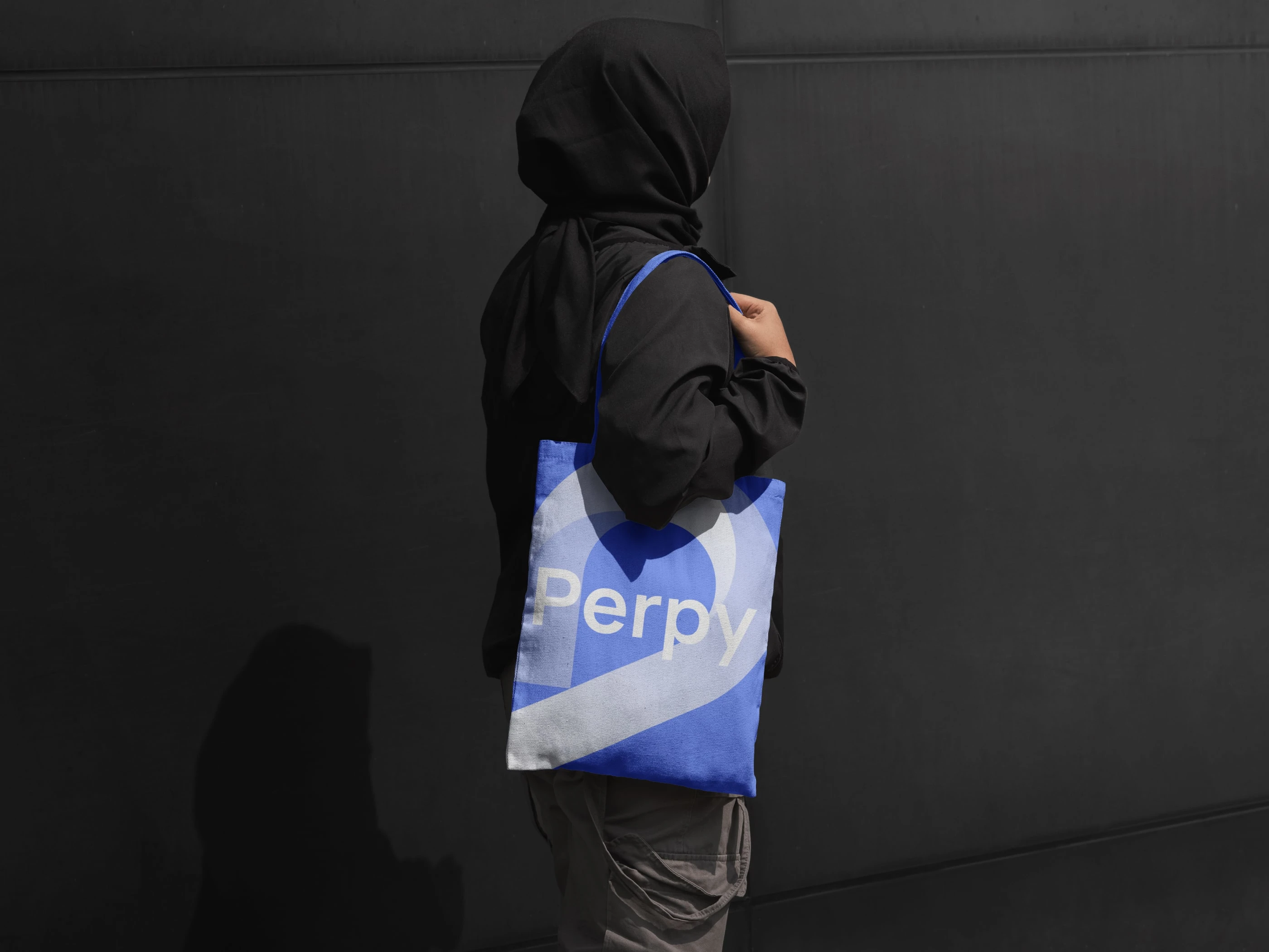
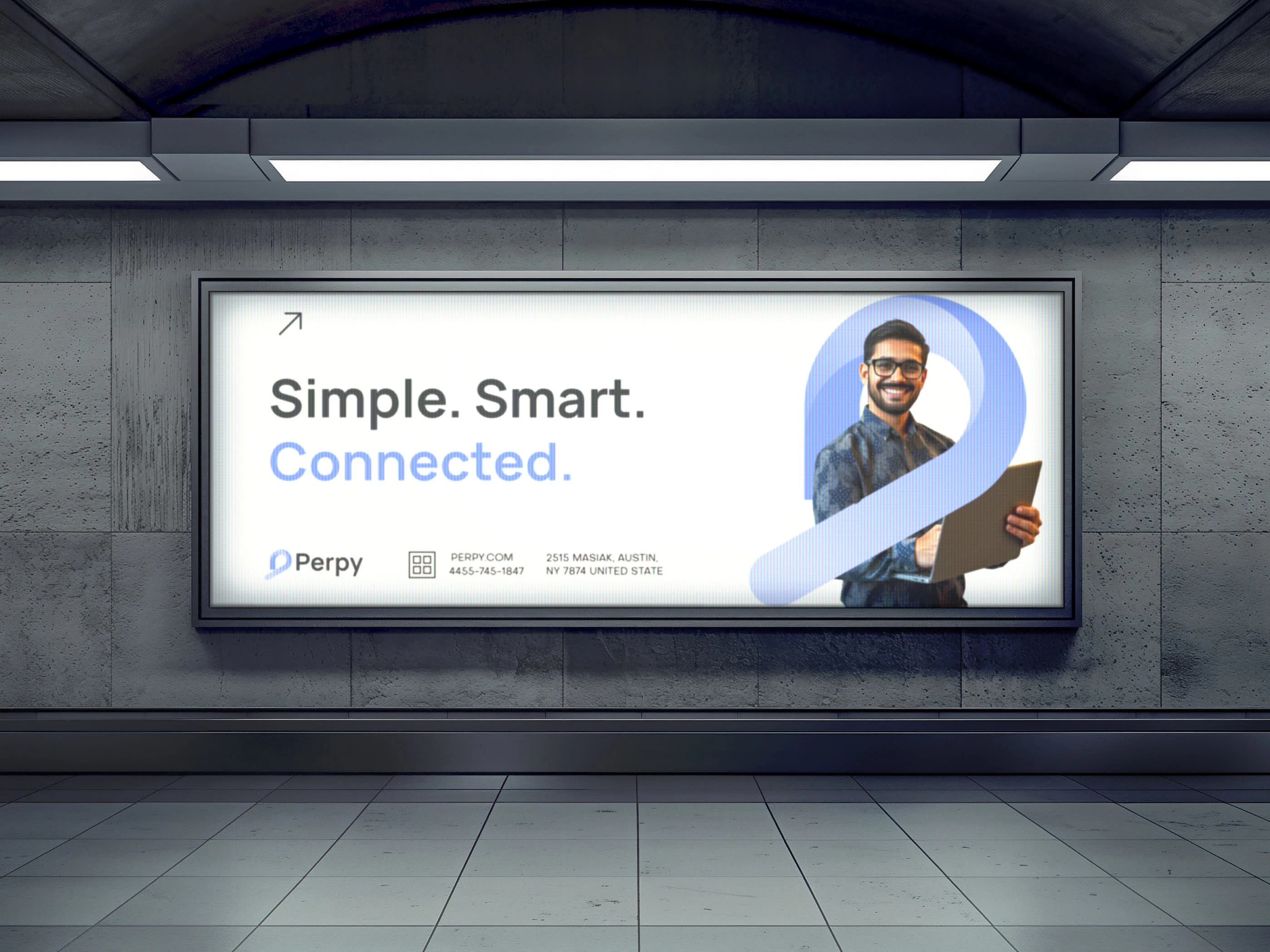
Result
The final logo creates a strong and flexible brand mark that works across digital platforms, branding materials, and product interfaces. The simple yet dynamic symbol ensures high recognition and scalability.
Like this project
Posted Mar 5, 2026
Designed a modern, memorable logo for Perpy focused on simplicity and innovation.