Galvix - US Sales Tax Compliance

Arjun Suresh

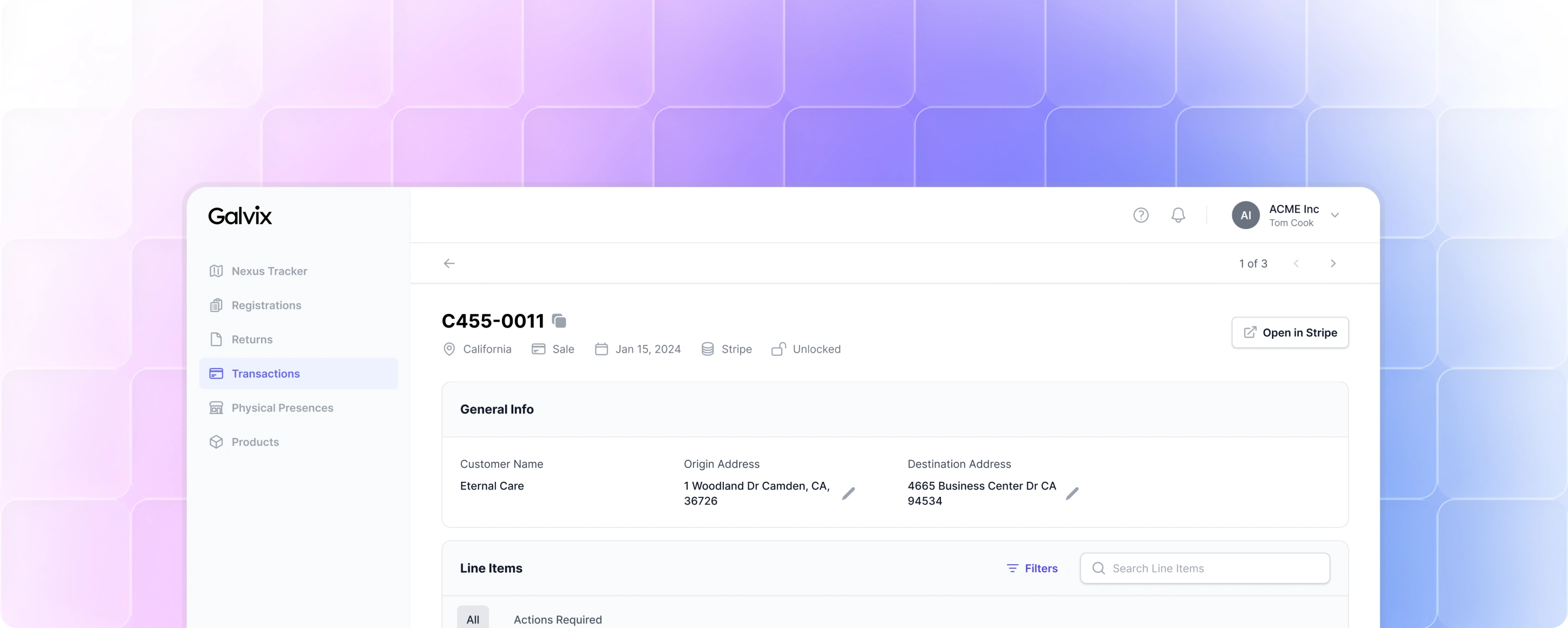
Galvix is a B2B SaaS platform that helps businesses manage sales tax compliance across the United States. It automates tax calculations, tracks nexus obligations, prepares returns, and guides users through the entire compliance lifecycle, from registration to filing.
At Galvix, my role went far beyond designing individual screens. As the founding product designer, I worked alongside the founder and engineering team to take the product from 0 → 1. I was responsible for shaping the product experience, creating the design system, defining interaction patterns, building the landing page, establishing the visual identity, and working closely with engineering to turn complex tax workflows into software that finance teams could confidently use.
Over the next two years, Galvix grew to over 50 paying customers, many of whom switched from established competitors despite Galvix doing little to no marketing.
My RoleThe ChallengeUnderstanding the Problem Before Designing the SolutionUnderstanding the Existing ProductsDesign Principles1. Structure Complexity, instead of hiding it.2. Explain the "why," not just the "what.”3. Prioritize confidence over speed.Building a Shared Foundation Before Building the ProductDesigning Around the Way People WorkPlatform FrameworkBuilding the ProductMaking Customer Onboarding EffortlessHelping Businesses Understand Where They Owe TaxBuilding Trust Through TransparencyMaking Returns Easier to ReviewThe Impact
My Role
I worked across nearly every part of the product. User Experience Design, User Interface Design, Design System, Product Architecture, Brand Identity, Landing Page, Admin Panel, Design & Functionality QA, Project Management, and Product Management.
The Challenge
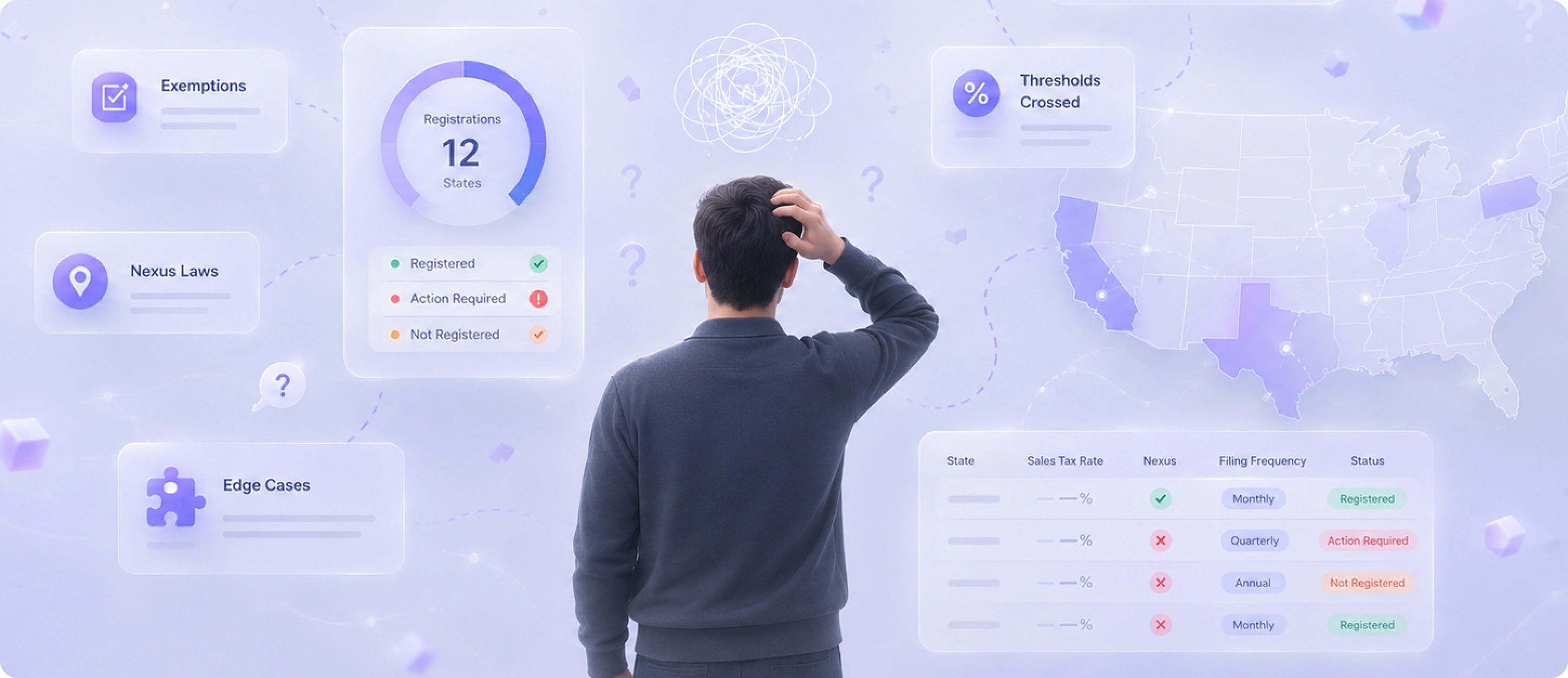
Sales tax compliance isn't difficult just because the rules are complex. It's difficult because businesses are expected to understand those rules without being tax experts.
As businesses expand into new states, sell through different channels, or introduce new product categories, their tax obligations become harder to track. Something as simple as hiring an employee in another state or crossing a revenue threshold can create new compliance requirements.
While existing software automates parts of this process, it still expects users to understand tax terminology, state regulations, filing frequencies, registrations, and countless edge cases before they can take action with confidence.
Understanding the Problem Before Designing the Solution
This wasn't a domain I was familiar with. Before opening Figma, I spent time understanding how sales tax compliance actually works and how businesses manage it today.
I worked closely with the founder, studied the complete compliance workflow, reviewed competitor products, and read through customer feedback of those products to understand where businesses struggled the most.
One thing became obvious very quickly. The hardest part wasn't filing tax returns. It was everything leading up to them.
Businesses first need to determine where they have nexus, understand registration requirements, register for sales tax, categorize products correctly, manage exemptions, reconcile transactions, prepare returns, and finally submit filings.
Every step depends on the previous one. A mistake made during onboarding can easily surface months later when returns are due.
Understanding the Existing Products
Instead of comparing feature lists, I focused on the actual jobs users were trying to accomplish. I mapped the entire compliance journey and compared how existing platforms supported each stage.
Competitors handled tax calculations reasonably well once everything had been configured correctly. But setup was another story.
Many workflows were still highly manual. Users often had to jump between government websites, interpret unfamiliar terminology, configure dozens of settings, and understand tax concepts before they could even begin using the product.
Reading through customer reviews reinforced the same pattern.
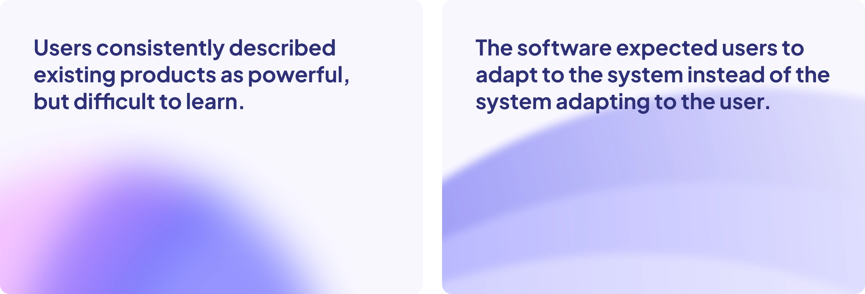
That insight shaped almost every design decision that followed.
Design Principles
The more we learned about how businesses actually deal with sales tax compliance, the more it became obvious that the real problem wasn’t about adding more features. It was about helping people navigate something that’s genuinely complex and often confusing.
That insight helped me define three core product principles. From then on, we used them as a kind of filter for every decision.

1. Structure Complexity, instead of hiding it.
Compliance will never be simple, and pretending otherwise only creates confusion when something unexpected happens. Instead of hiding complexity, I wanted to organize it into predictable workflows that clearly communicated where users were, what they needed to do next, and how different parts of the system connected.
2. Explain the "why," not just the "what.”
Whenever users encountered a status, warning, or calculation, the interface should answer the obvious follow-up question before they had to ask it. Helping users understand the reasoning behind the system was just as important as showing them the outcome.
3. Prioritize confidence over speed.
Sales tax isn't an area where users want to move fast. It's an area where they want to avoid mistakes. That meant adding context, review steps, and clear system feedback wherever it helped users feel more confident making high-impact decisions.
Building a Shared Foundation Before Building the Product
One of the first discussions we had as a team wasn't about features. It was about how we could build a product quickly without sacrificing consistency.
As an early-stage startup, speed mattered. We wanted to avoid designing and building common UI patterns from scratch, so the founder, engineering team, and I decided to use Tailwind CSS Plus as the foundation for the product. It gave engineering a mature set of production ready components and allowed us to focus our time on solving product problems instead of rebuilding standard UI.
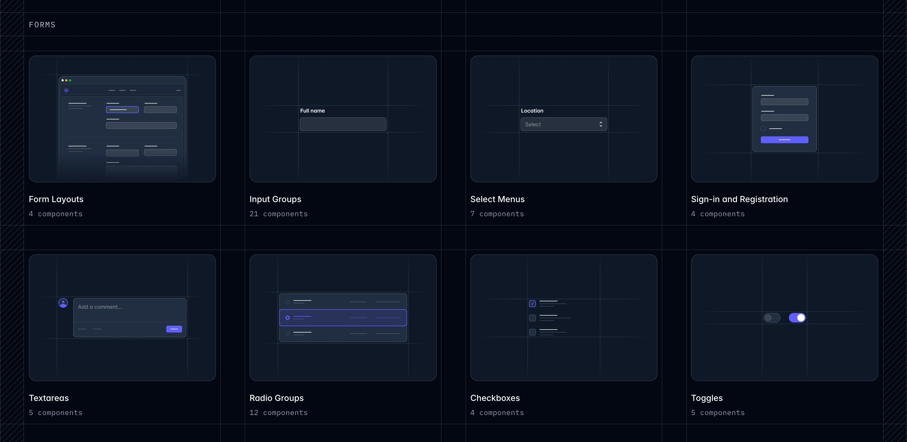
There was just one issue. While Tailwind CSS Plus provided everything engineering needed, there wasn't a Figma library that matched it. Without a shared design language, we knew we'd end up spending unnecessary time translating designs into engineering terms, recreating components, and clarifying implementation details.
I decided to bridge that gap by creating a Figma design system that mirrored Tailwind CSS Plus as closely as possible.
Rather than simply copying components, I recreated the underlying system by matching its naming conventions, spacing, typography, colors, interaction states, and component structure so that designers and engineers were effectively working from the same source of truth.
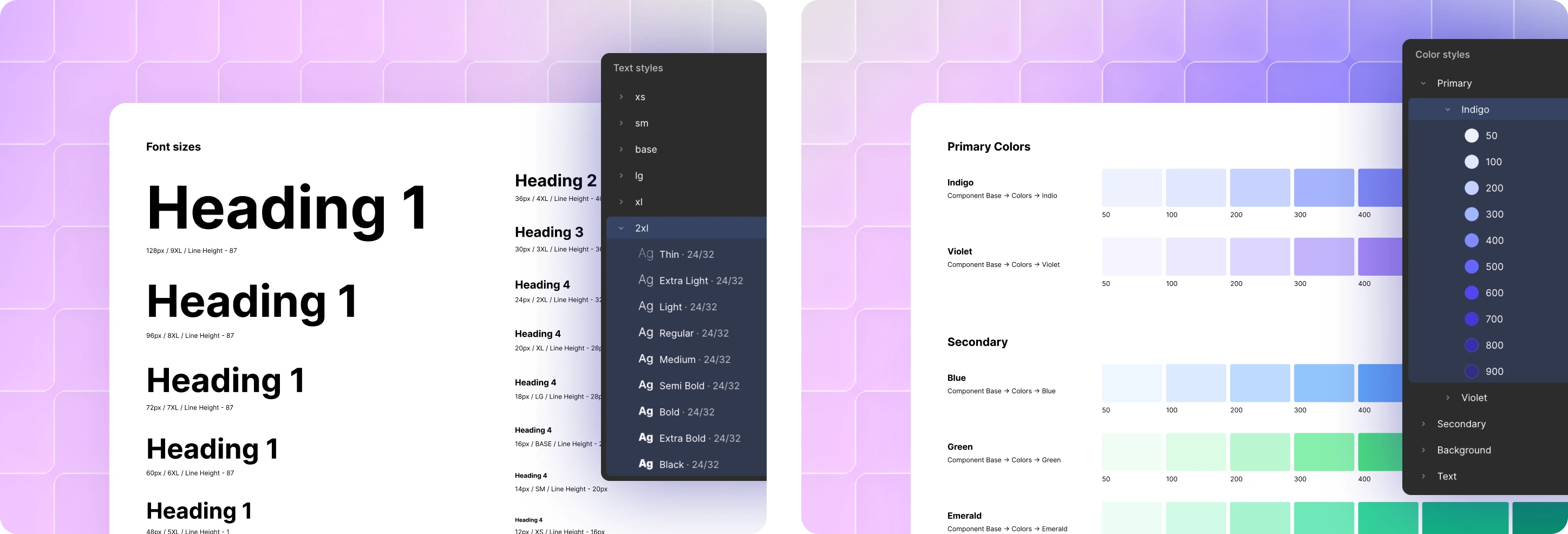
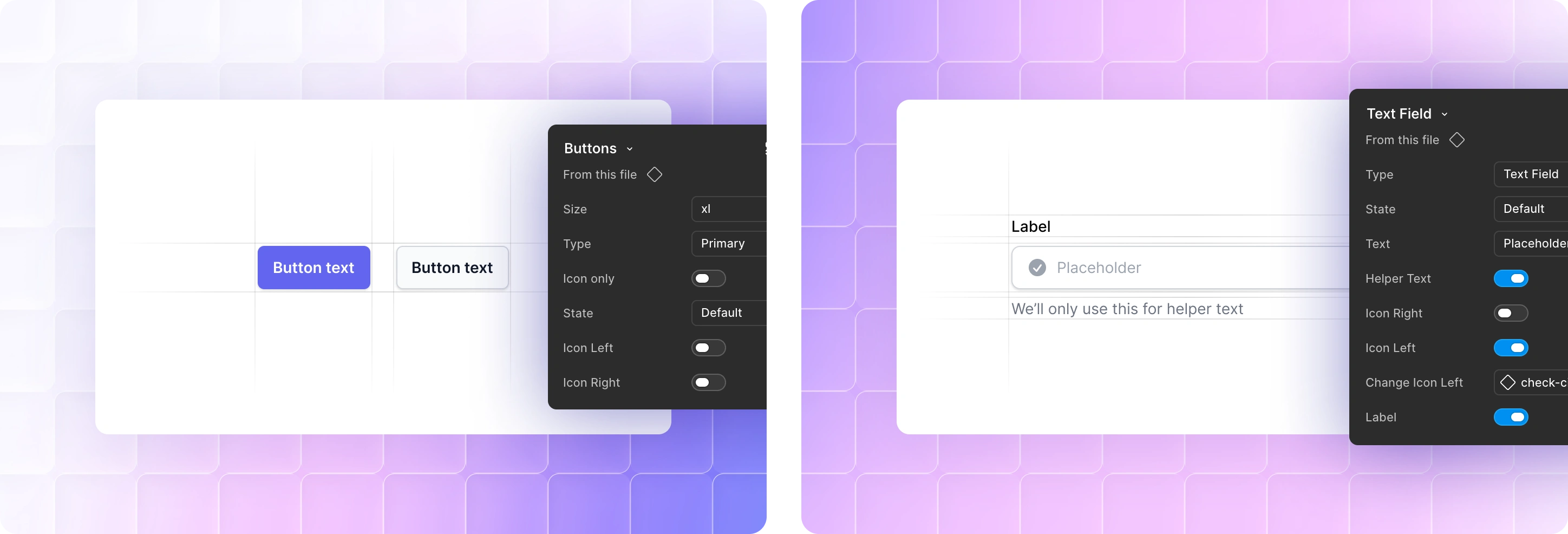
That investment paid off throughout the project. Design handoffs became far more predictable, engineering could build directly from familiar patterns, and new features could be designed and implemented much faster because we were speaking the same language from day one.
Designing Around the Way People Work
With the foundation in place, the next challenge was deciding how the product itself should be organized. Rather than structuring the application around features or technical capabilities, I wanted the navigation to reflect the way finance teams naturally think about their work.
People don't wake up thinking, "I need to use the Nexus module." They think, "I need to figure out where I owe tax."
The same applies to transactions, returns, registrations, and products. These aren't features, they're the building blocks of a finance team's day-to-day workflow.
That thinking shaped the product's information architecture from the very beginning.
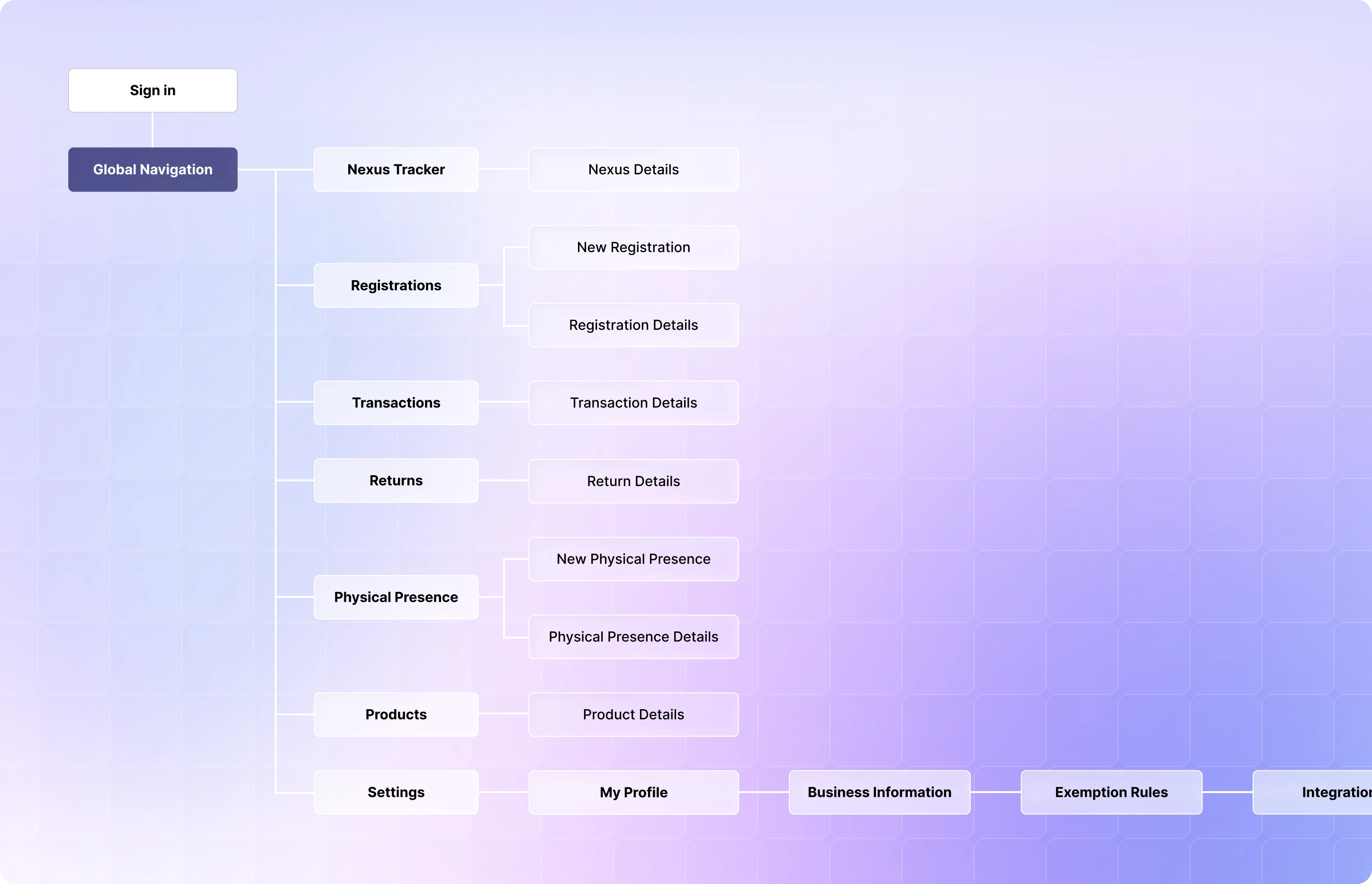

The primary navigation was organized around real-world entities like Nexus, Registrations, Transactions, Returns, Physical Presence, and Products, making the platform feel more intuitive even for users encountering sales tax compliance for the first time.
Platform Framework
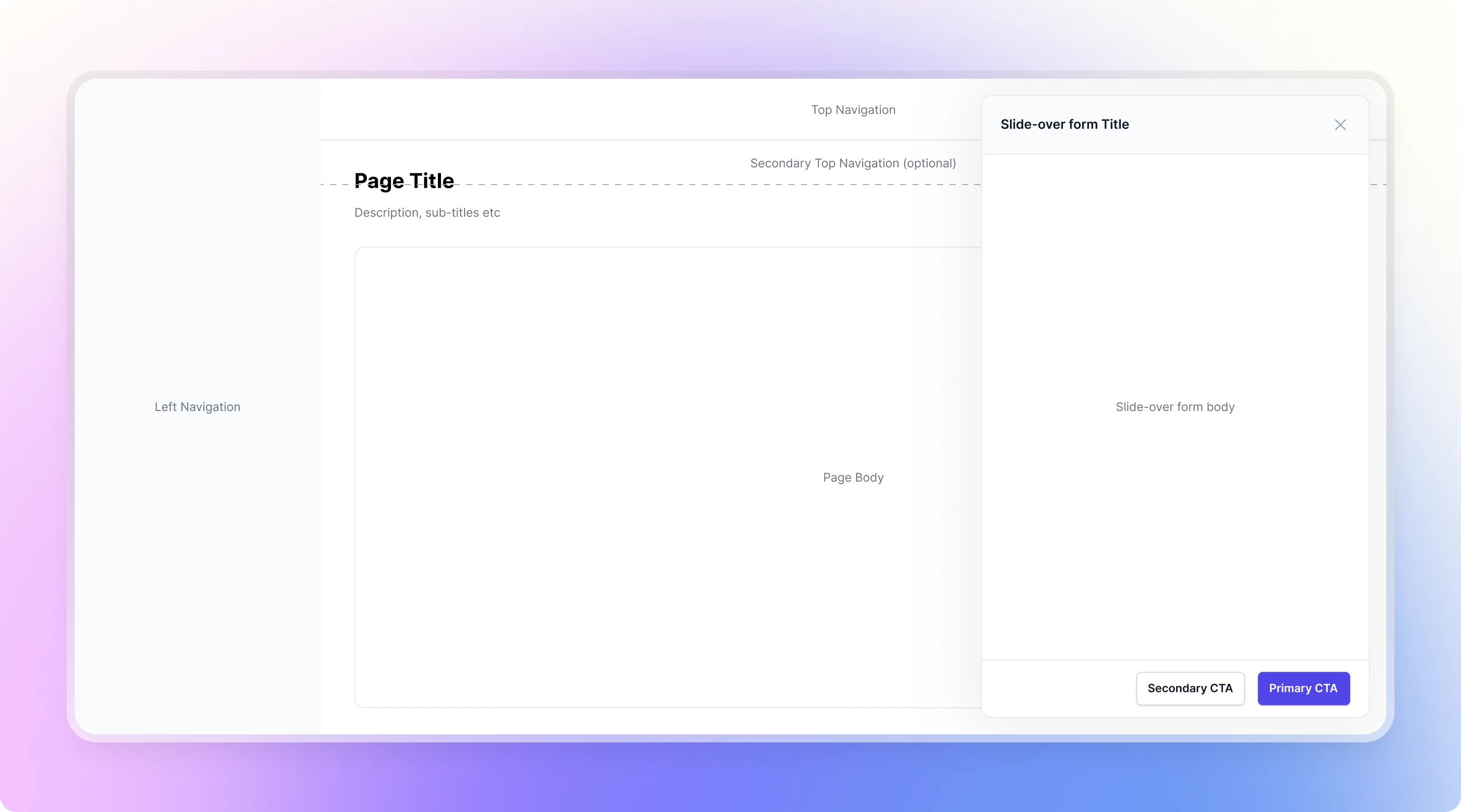
After the first few iterations, we stepped back and defined a platform framework that reflected how the product was evolving. Since Galvix handles sensitive financial and tax data, it was important for customers to feel oriented and confident as they moved through the platform.
Rather than designing each module independently, we established a consistent framework that could accommodate future features while maintaining familiar navigation and interaction patterns. This reduced surprises, shortened the learning curve, and gave both users and the team a shared structure to build upon.
Building the Product
With the foundation in place, we were finally ready to start building Galvix. But unlike many products, we weren't building against a long list of predefined requirements or validated user flows. Every new customer gave us a better understanding of how businesses approached sales tax compliance, what information they already had, and where they struggled the most. We went through countless iterations of each module, refining the product with every new insight and customer conversation, until we arrived at a solution that was intuitive, reliable, and genuinely addressed their needs.
That meant product development wasn't simply about shipping features. It was about gradually turning manual processes into scalable product experiences.
In the early days, customer onboarding was completely manual as well. Businesses came to us through founder-led conversations, where we'd understand their workflow, demonstrate the product, create their account internally, and help them get started.

Making Customer Onboarding Effortless
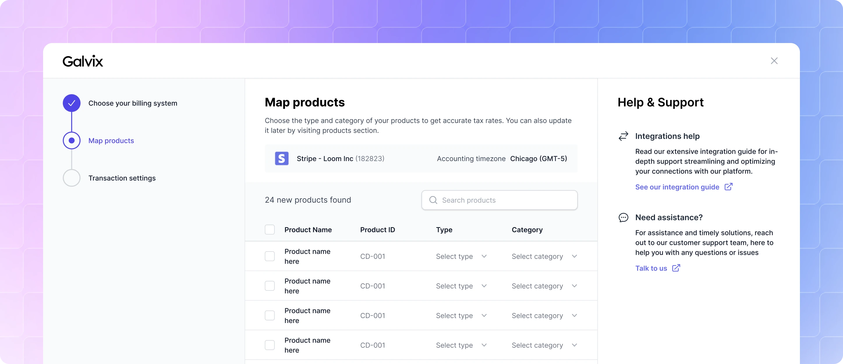
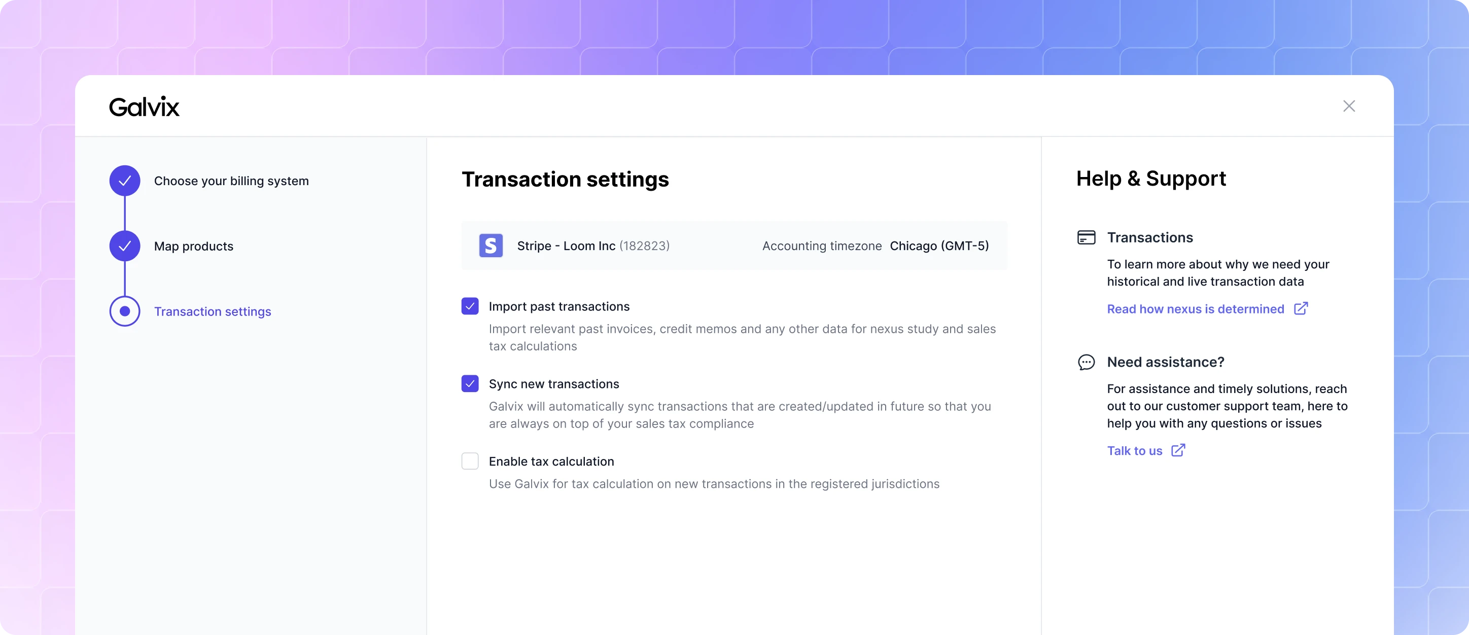
The first step for every new customer was importing data from their billing system. We designed a simple three-step flow where customers connected their billing platform, categorized their products, and configured how transactions should be imported.
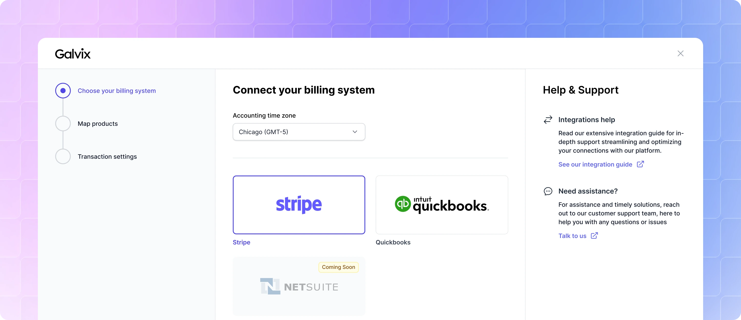
Choose Billing System
Map Products
Transaction Settings
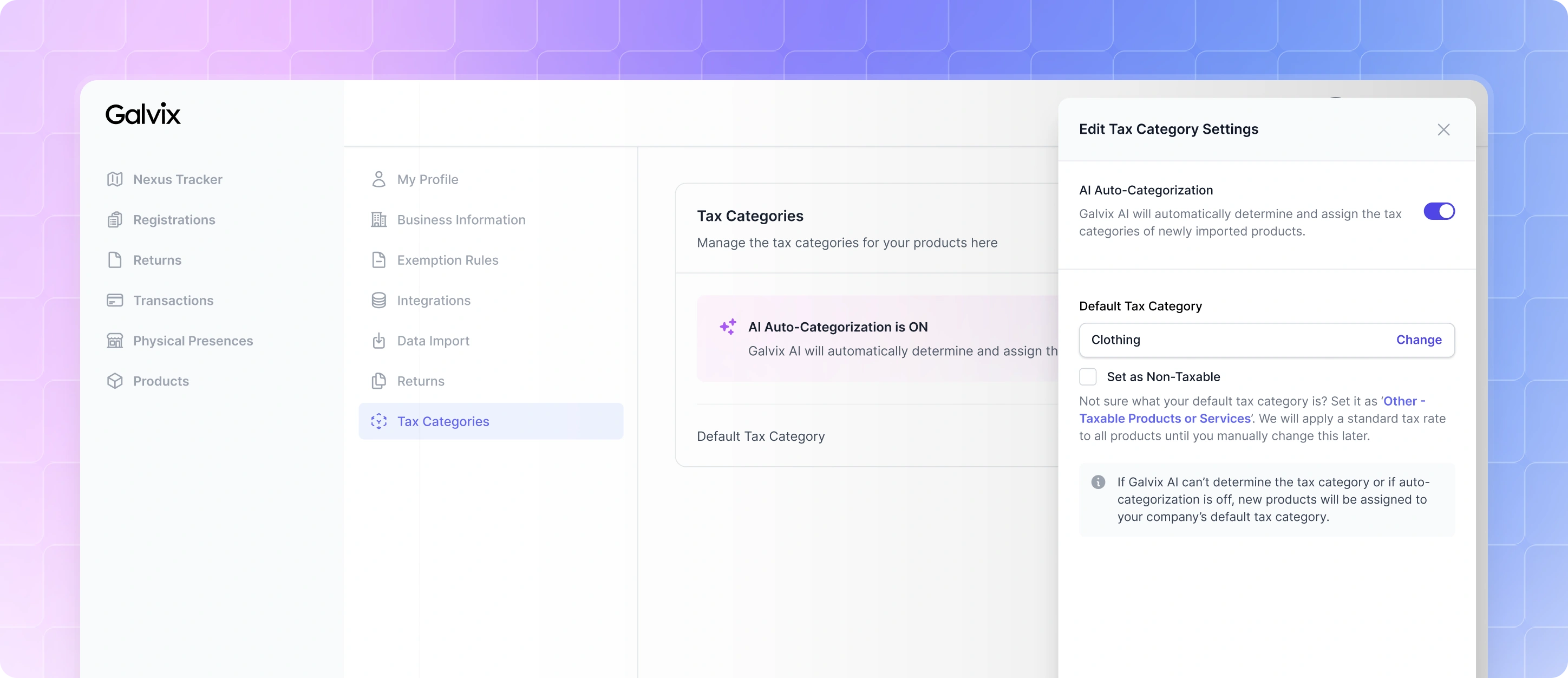
The biggest challenge quickly became product categorization. Every product needed a tax category before Galvix could calculate sales tax accurately, but manually categorizing hundreds of products created significant friction during onboarding. While customers could skip this step, doing so meant tax calculations wouldn't work. Our first improvement was introducing a default tax category. Any uncategorized product would automatically inherit this category, allowing customers to complete onboarding and start using the platform immediately. It wasn't perfect, it assumed most businesses sold similar types of products, but it significantly reduced the effort required to get started.
As the product matured, we introduced AI-assisted tax categorization. Using the product's name and description, Galvix automatically assigned it to the most appropriate tax category. If the confidence score was low, it fell back to the company's default category, while still allowing customers to review or disable AI entirely.
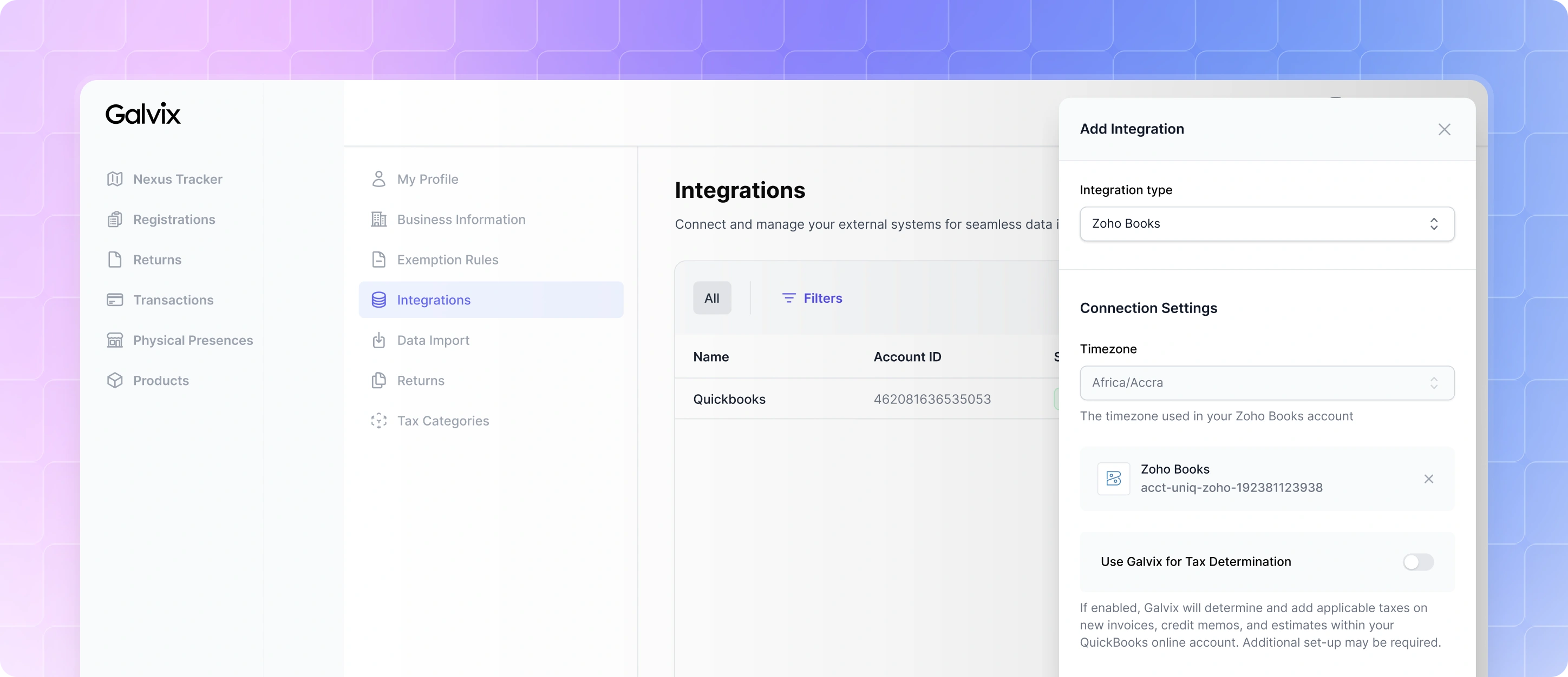
Alongside these improvements, we simplified the import experience itself. The original full-screen wizard was replaced with a lightweight slide-over, making it faster to connect a billing system, configure import settings, and start syncing data.
Helping Businesses Understand Where They Owe Tax
One of the biggest challenges businesses face is knowing where they're required to collect and remit sales tax.
In the US, each state has its own rules for establishing nexus. A business might become liable because of the amount of sales they've made in a state (economic nexus), because they have an employee or office there (physical nexus), or through several other criteria.
Before a business can register or file returns, they first need to understand where these obligations exist.
This became one of the first workflows we built. Our initial exploration presented every jurisdiction in a data table, along with metrics other metrics. While it provided the necessary information, it quickly became apparent that it wasn't the easiest way to understand something that was inherently geographic.
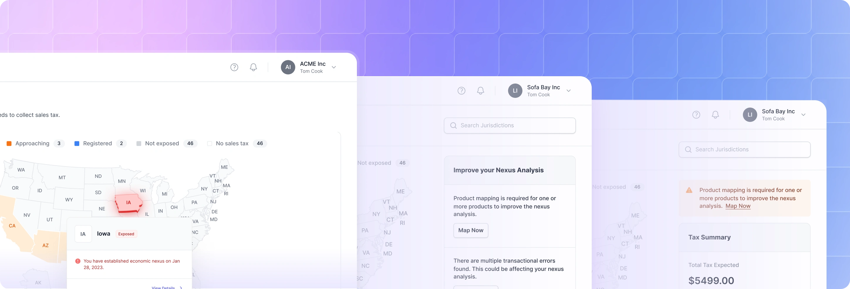
We experimented with a map of the United States early in the design process, and the difference was immediate. Instead of scanning rows in a table, customers could instantly see which states required their attention. We decided to make the map the primary experience in the very first version of the product.
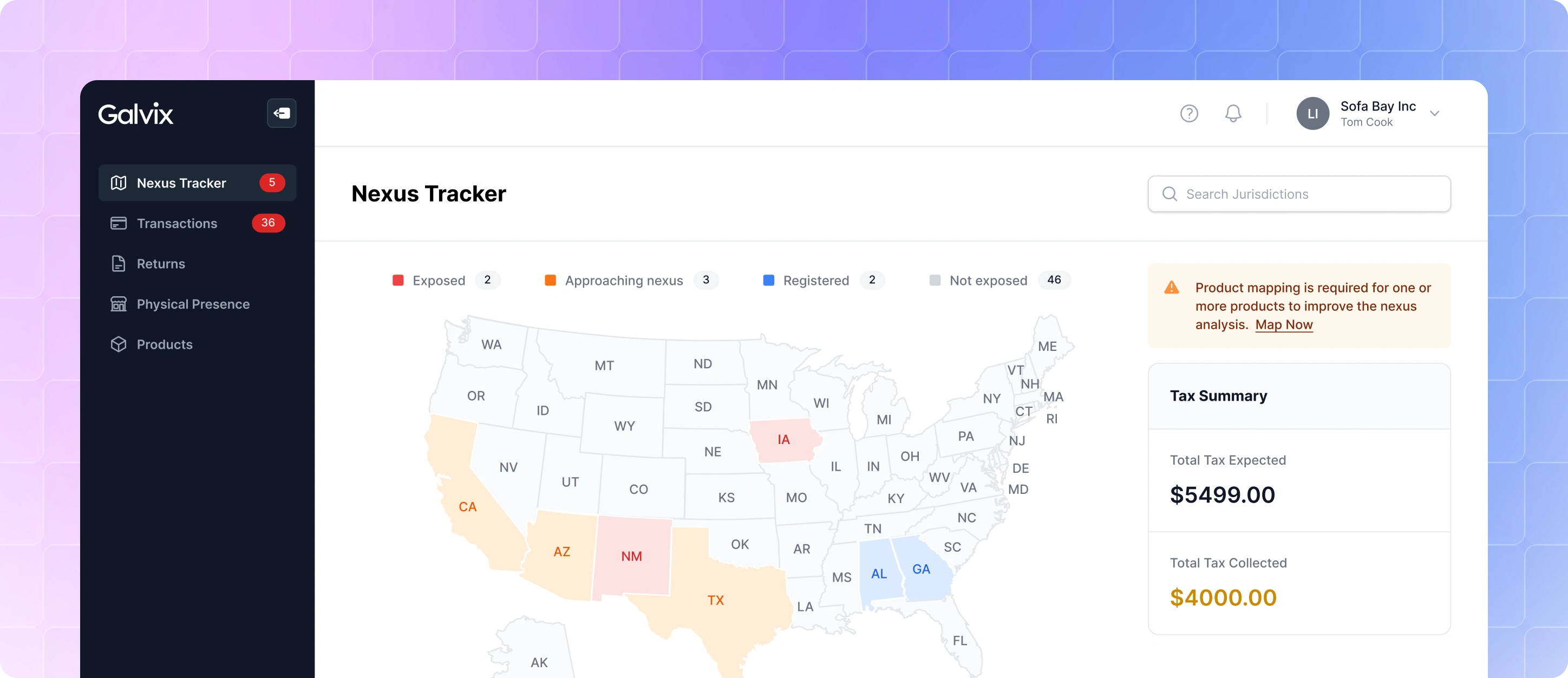
Selecting a state opened a detailed view where customers could understand exactly why nexus had been established. We compared each state's economic nexus thresholds against the customer's transaction data and evaluated physical nexus based on the locations they had added to their account.
Rather than simply telling users that they had nexus, we wanted to show the reasoning behind it so they could make informed decisions with confidence.
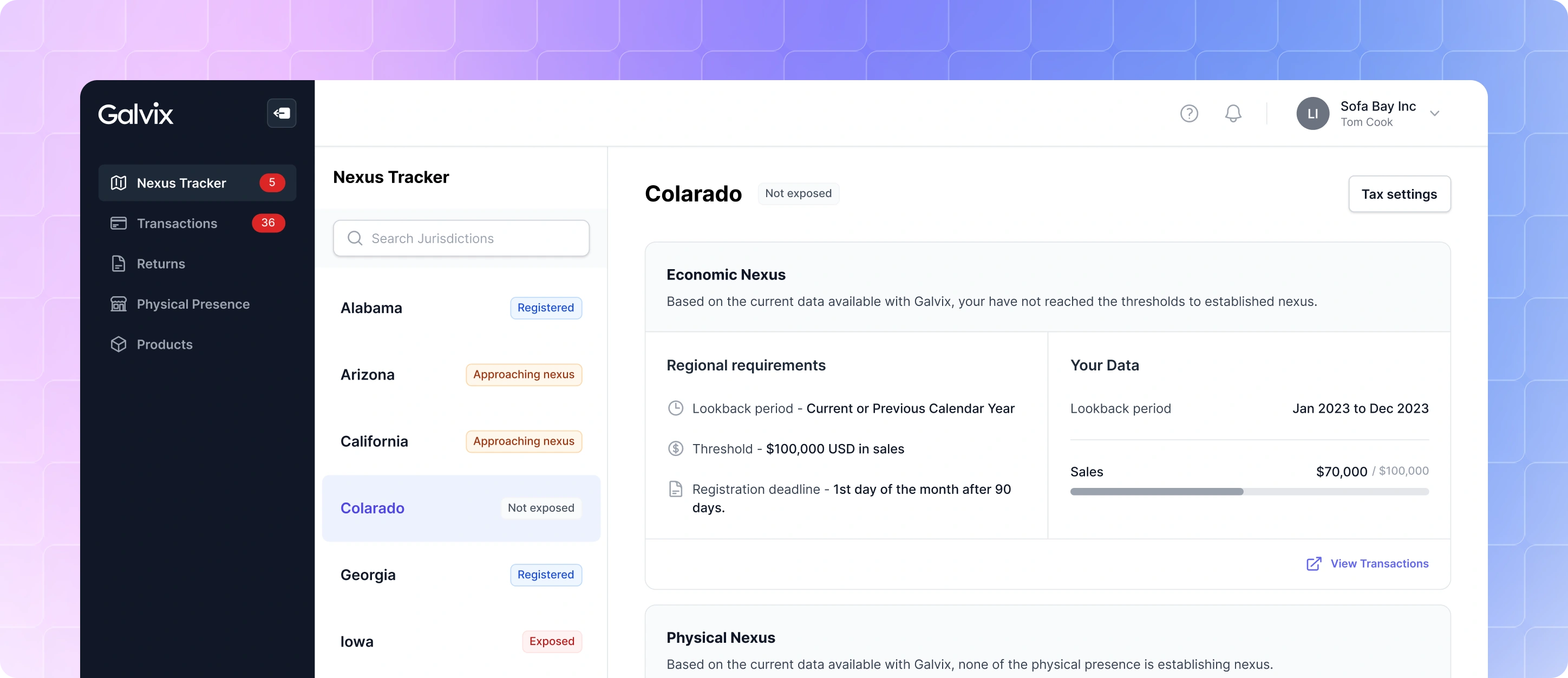
As customers started using the product, we discovered that not every piece of information we had included was actually helpful. For example, displaying Expected Tax and Tax Collected on the overview page created more questions than answers. Customers weren't always sure what those numbers represented, whether they reflected only registered states, states where nexus had been established, or another point in time. Since the metrics weren't helping users make better decisions, we removed them to reduce confusion.
As the product evolved, we revisited the application's visual hierarchy. The initial version used a dark sidebar to clearly separate navigation from the workspace, but we found that it competed for attention during data-heavy workflows. We switched to a lighter navigation to reduce its visual prominence, allowing the workspace to become the primary focus while easier-to-scan interface
We also noticed that moving between jurisdictions felt unnecessarily cumbersome. The original details page used the same collapsed list pattern found throughout the product, requiring users to repeatedly expand the list and switch between states.
To make comparisons faster, we replaced it with a dedicated navigation bar that allowed customers to move between jurisdictions without leaving the details page.
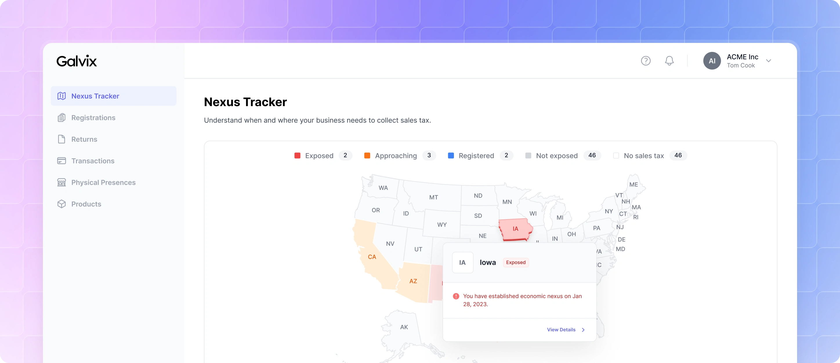
Updated Nexus Tracker
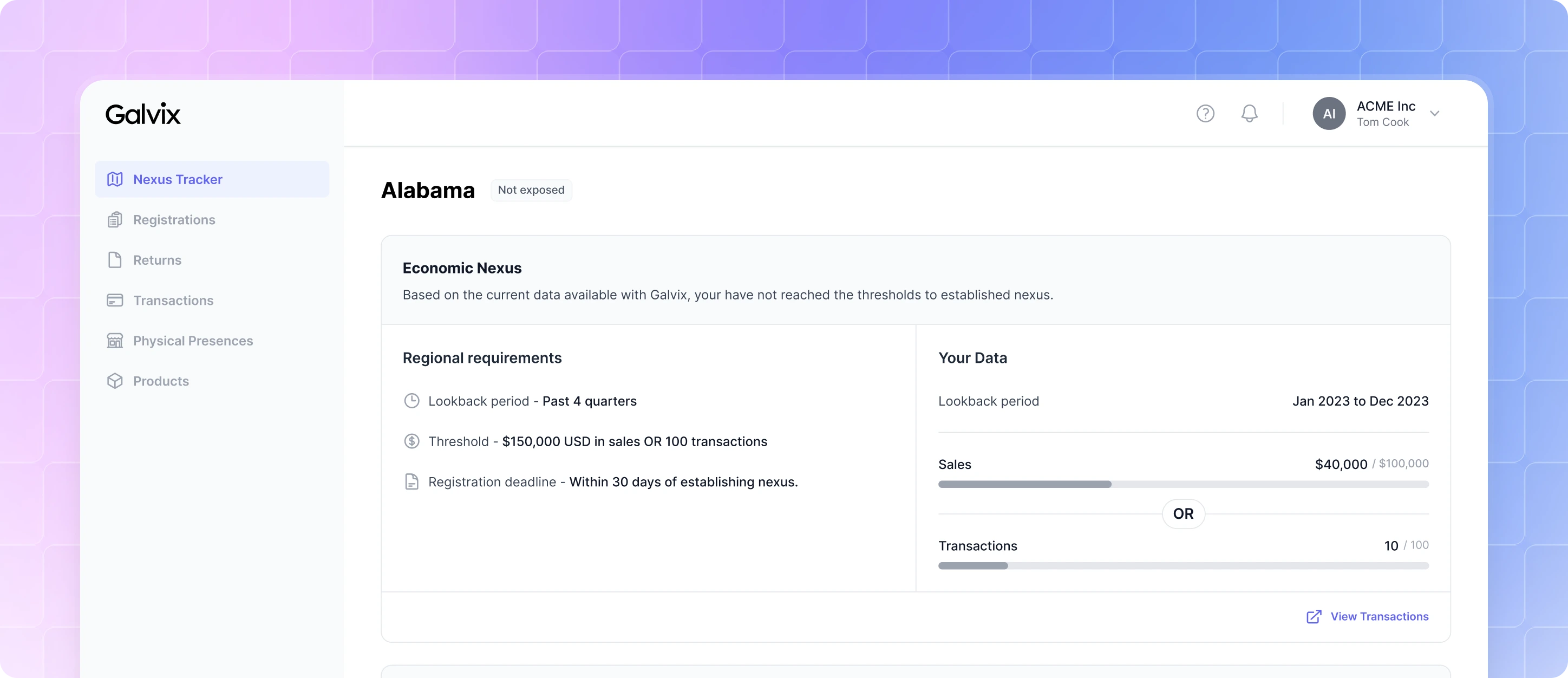
Updated Nexus Details
Building Trust Through Transparency
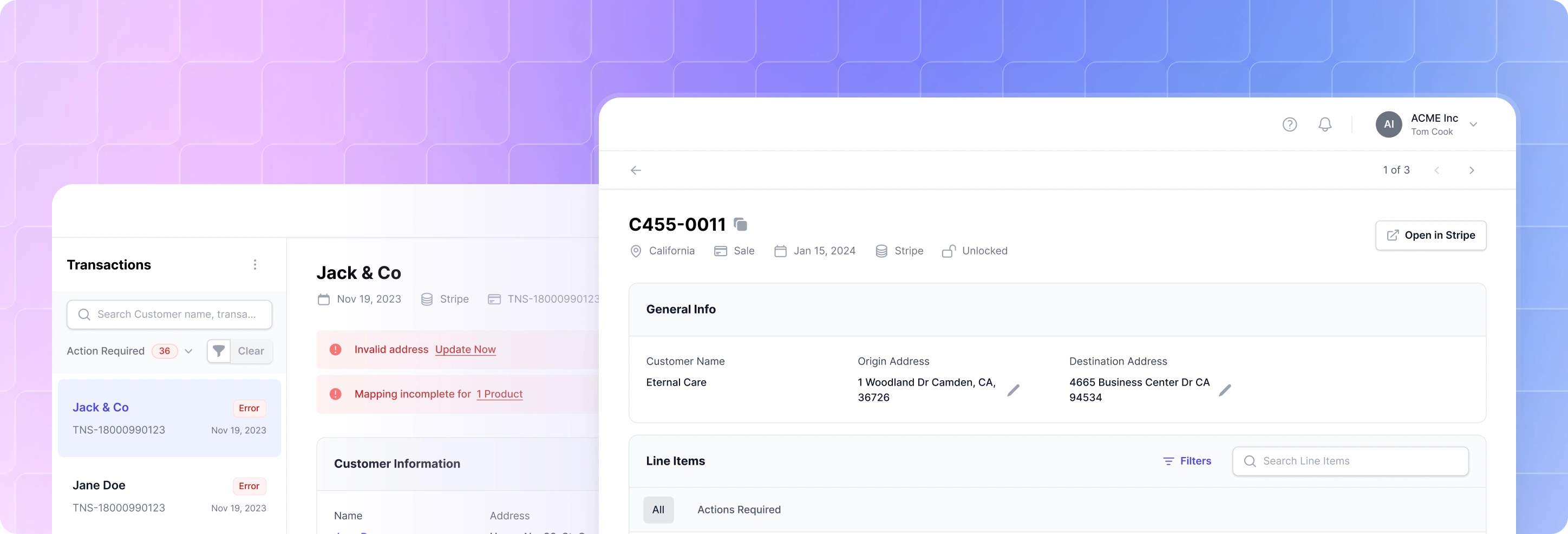
Once customer data was imported, the Transactions module became the primary place for reviewing tax calculations. The first version provided a straightforward overview of every transaction, showing the expected tax, tax collected, and a detailed breakdown of how each line item contributed to the total tax liability.
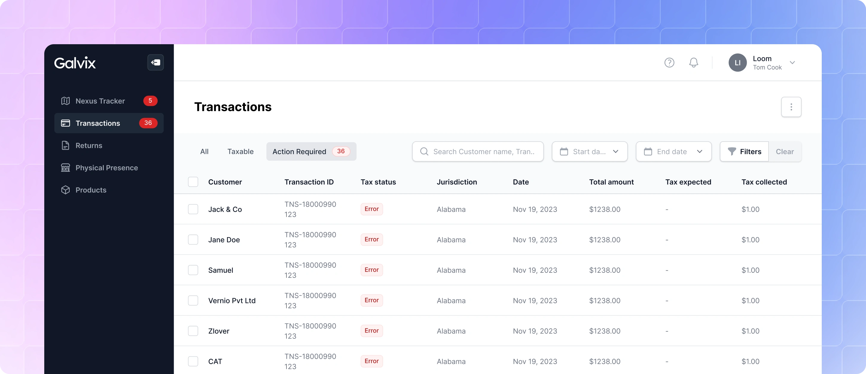
Listing Page
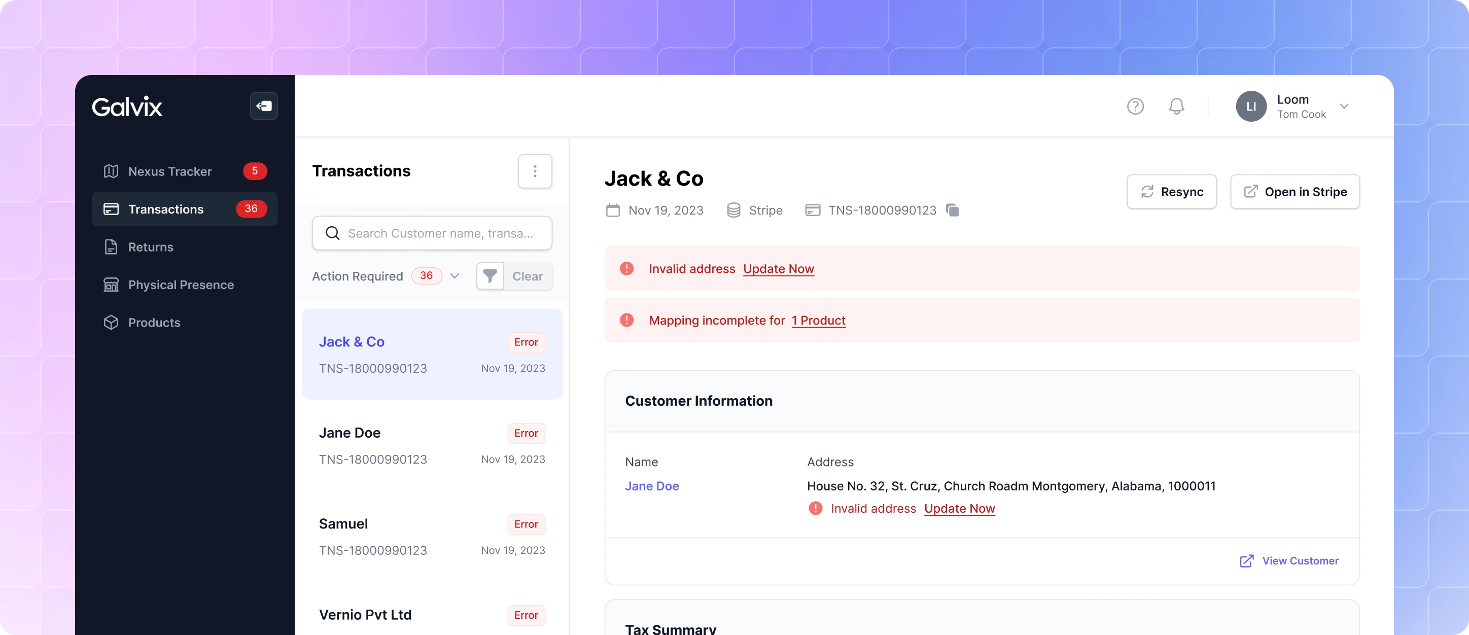
Details Page
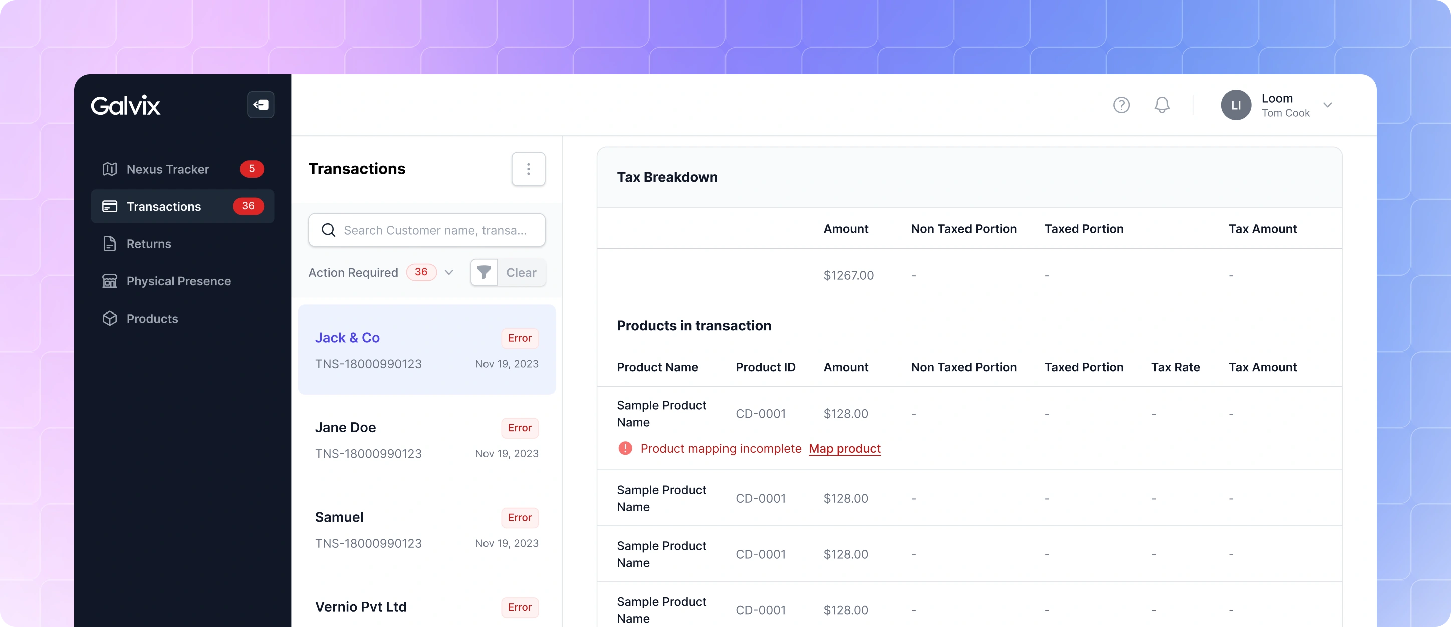
Tax Breakdown
While this gave customers visibility into the final calculations, we found that it didn't answer the question they cared about most: Why was this product taxed this way?
To make tax calculations easier to understand, we redesigned the transaction details experience to explain how the taxability of each line item was determined. Instead of only showing the result, we surfaced the factors behind it, whether the business was registered in that jurisdiction, whether the customer was tax exempt, whether the product itself was taxable, and how tax was applied across the different tax levels within that jurisdiction.
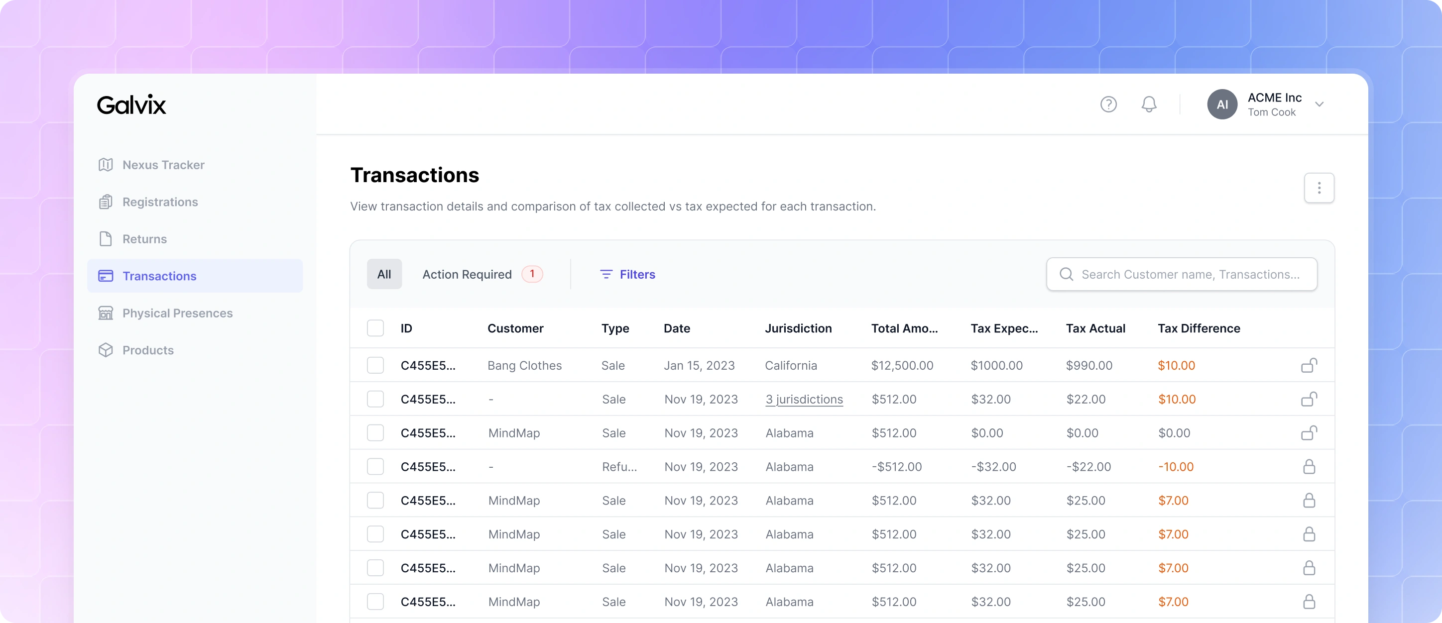
Updated Listing Page
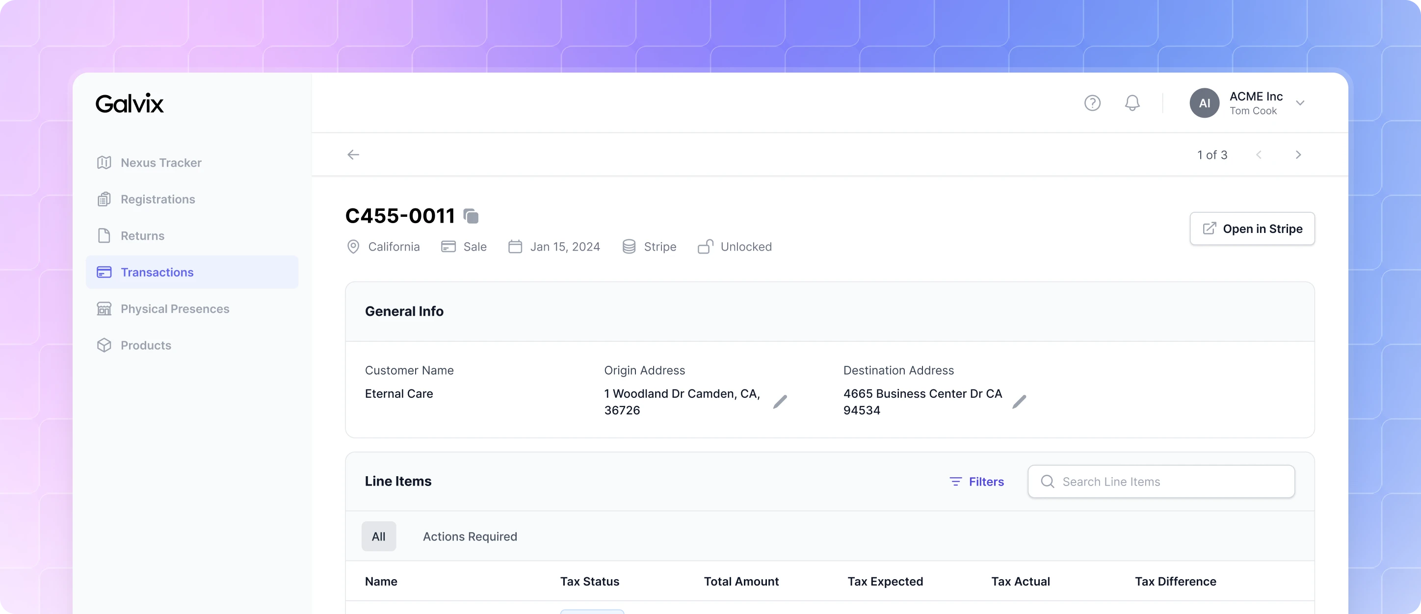
Updated Details Page
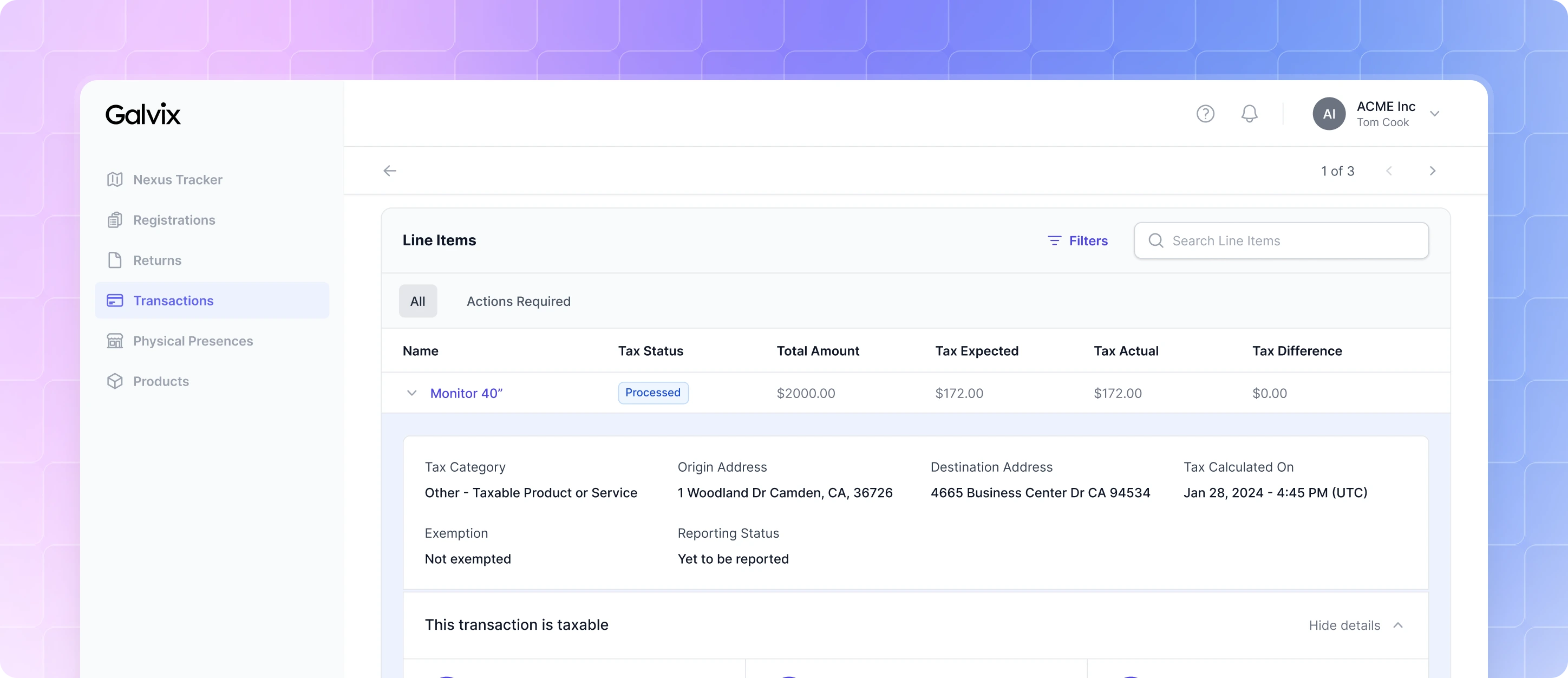
Tax Breakdown 1
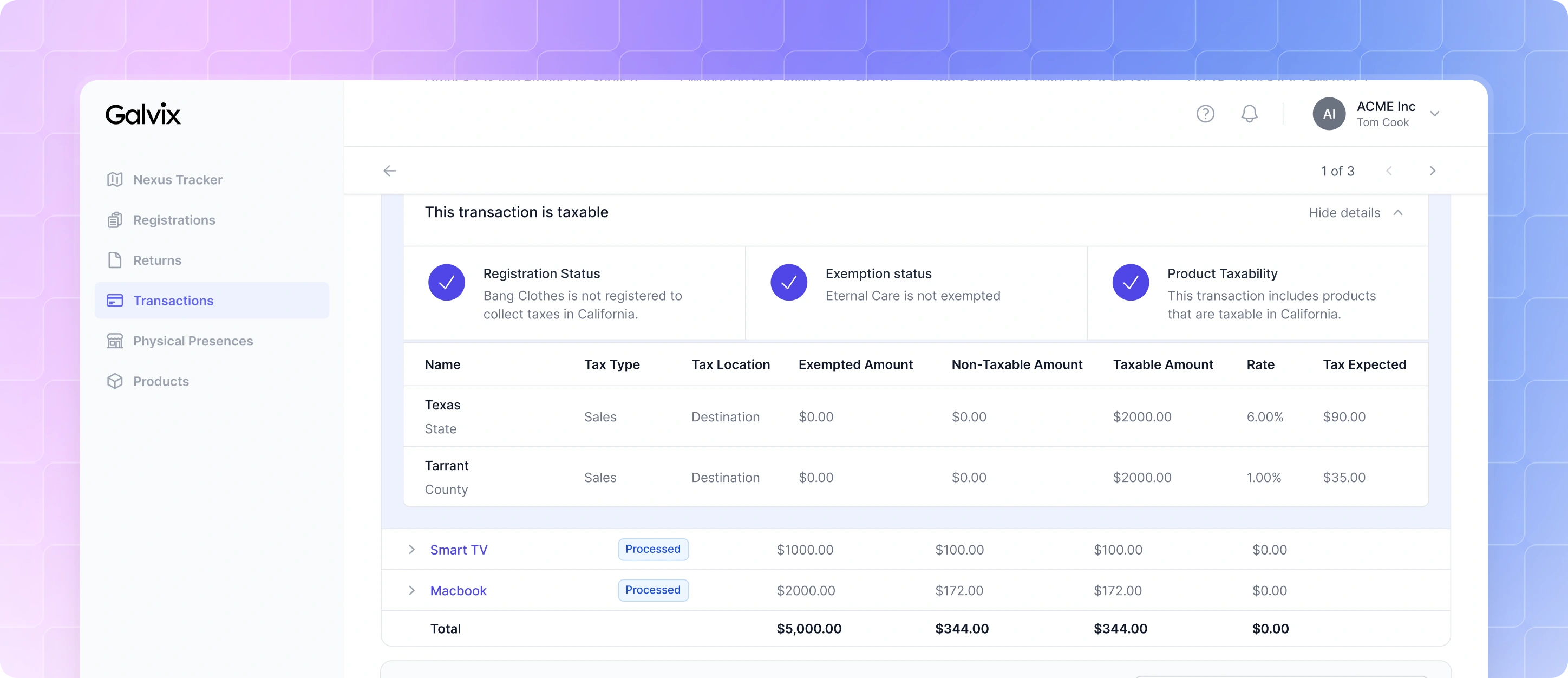
Tax Breakdown 2
Making Returns Easier to Review
Preparing tax returns is the final step in the compliance workflow, so it was important that customers could easily review the numbers before filing. The first version presented returns in a simple data table. Since many of the financial terms weren't immediately familiar, we introduced hover cards that broke down the values contributing to each figure, while the details page provided additional information about the return.
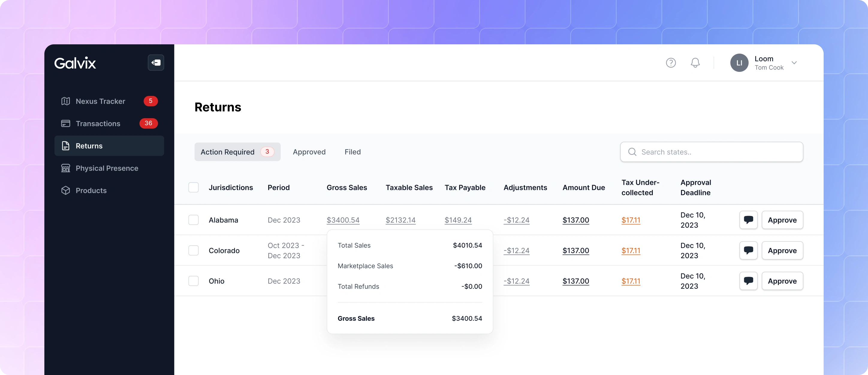
Listing Page
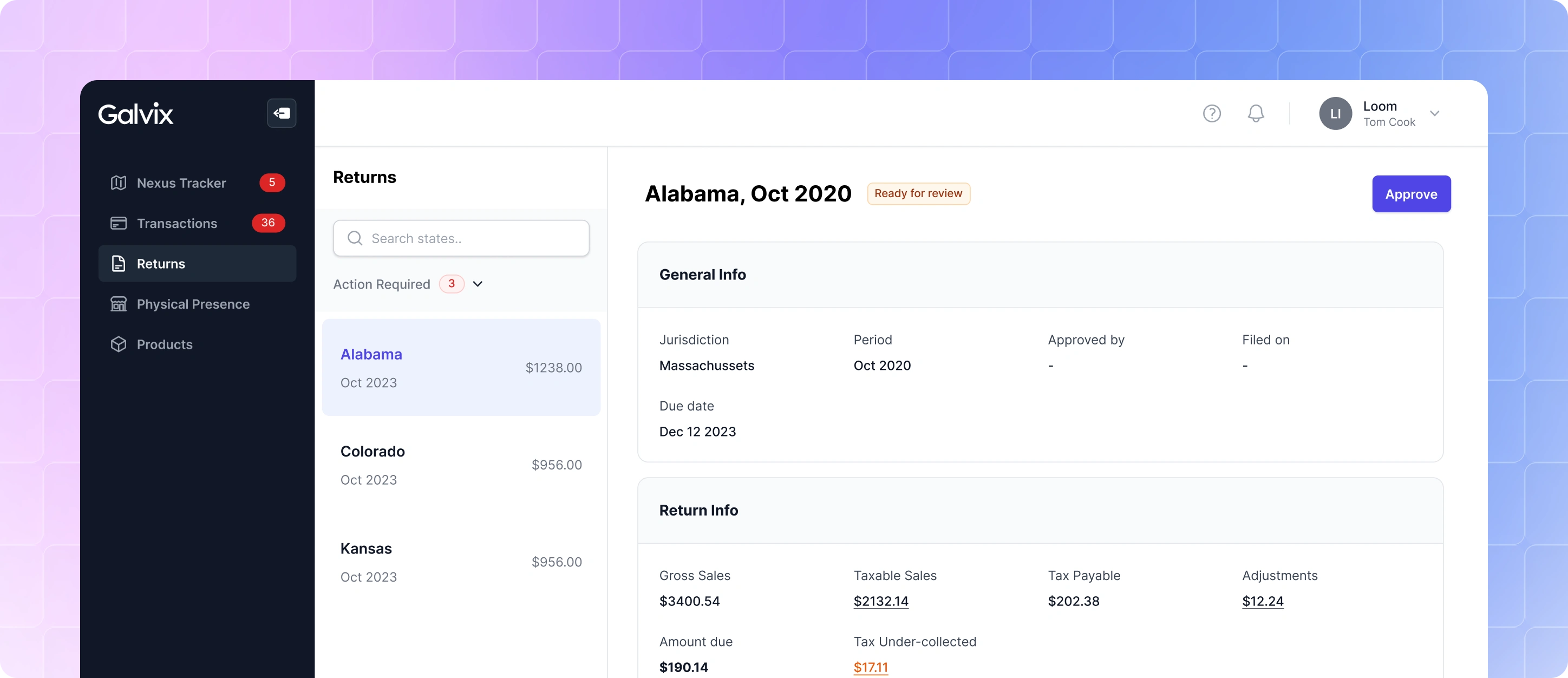
Details Page
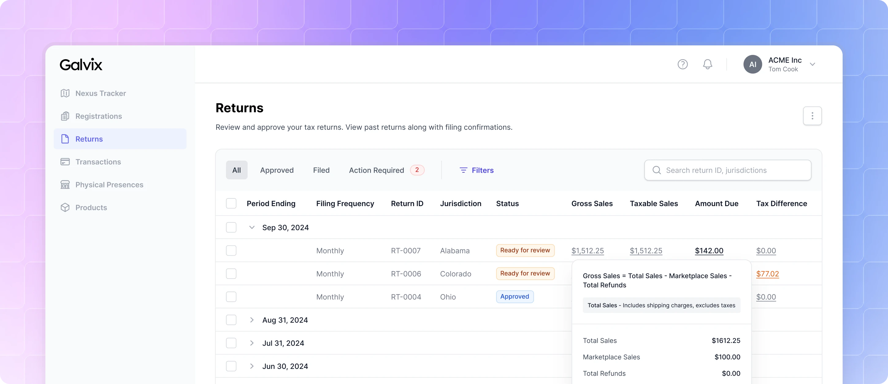
As customers started using the product, we noticed they cared most about the newly generated returns that required action, while older returns were referenced only occasionally.
To reflect this, we redesigned the listing page to group returns by the month they were generated. The latest returns were surfaced at the top, with previous months neatly collapsed but still easily accessible. We also improved the hover cards to show the actual calculations behind each value, making it easier for customers to understand how the final figures were derived.
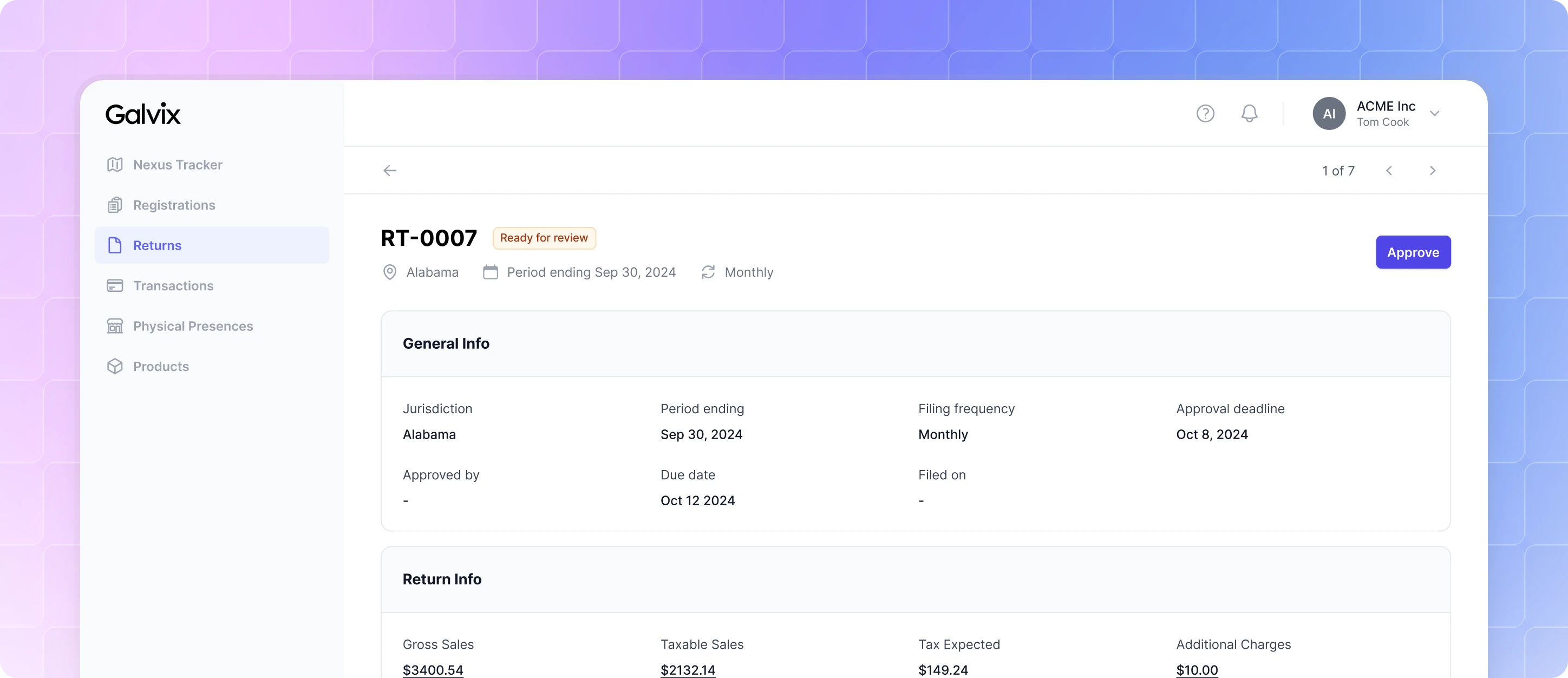
The details page also evolved to provide more context. We introduced a dedicated Transactions section that listed every transaction included in a return, allowing customers to trace the reported values back to the underlying data whenever they needed to investigate or verify a filing.
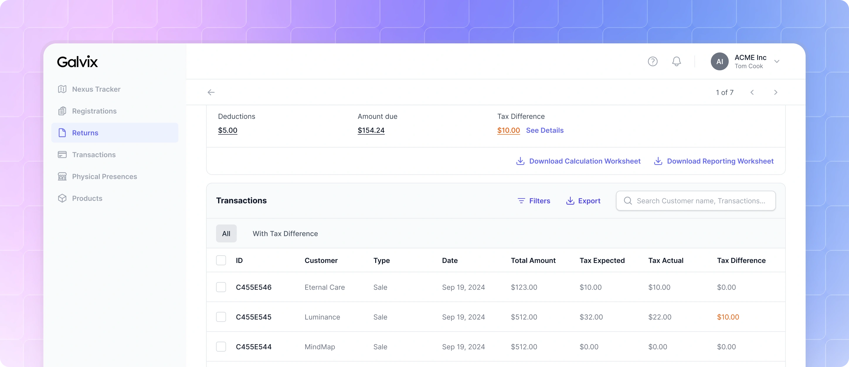
Details Page - Transactions Card
The Impact
Galvix reached 50+ paying customers within the first two years, with little to no marketing. A large number of these businesses switched from established competitors, which was a strong validation of the product and experience.

Galvix helped reduce the time users spend on sales tax workflows by ~99.31% a month, especially around preparing and reviewing returns across states. Here’s little excerpts from what one of our customers had to say after using Galvix:
Even just when I log in... the way things are presented... everything is like, all on the same page, stacked, and I don't have to open up a million tabs... It's just really well organised. It’s not over-built. I've never once had to go to like a help page and search to try to figure out how to do a thing, ever, because it's just obvious how to do it.
Meredith Harold Founder/CEO, The Informed SLP
If you want to read more detailed customer reviews, you can do so here: www.galvix.com/customers/
Check out Galvix’s G2 reviews here: www.g2.com/products/galvix/reviews
Like this project
Posted Aug 11, 2026
Taking a B2B SaaS product from 0 → 1 by designing a sales tax compliance platform that simplifies a complex operational workflow for growing businesses.
Likes
0
Views
10