"Ella's Bakery" @ntuart x @kontrapunktcom
Overview 🔎
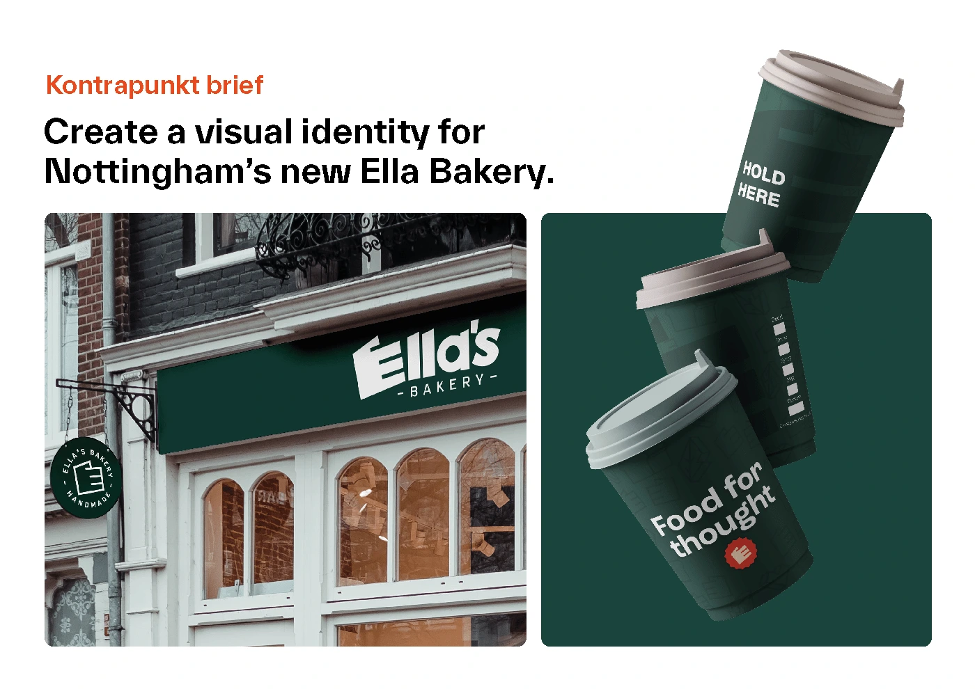
This project is part of my Graphic Design studies portfolio, the following briefing was given by the Kontrapunkt Studio from Copenhagen:
Ella left Copenhagen, where she had a successful bakery, to move to Nottingham where she now started thinking about building a family. Create a visual identity for Nottingham’s new Ella Bakery.
Problem & Solution 🤝
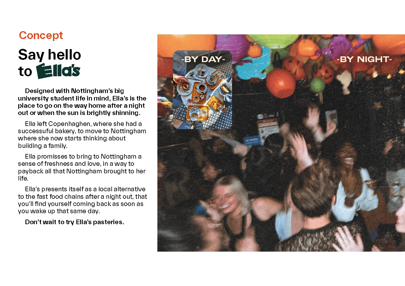
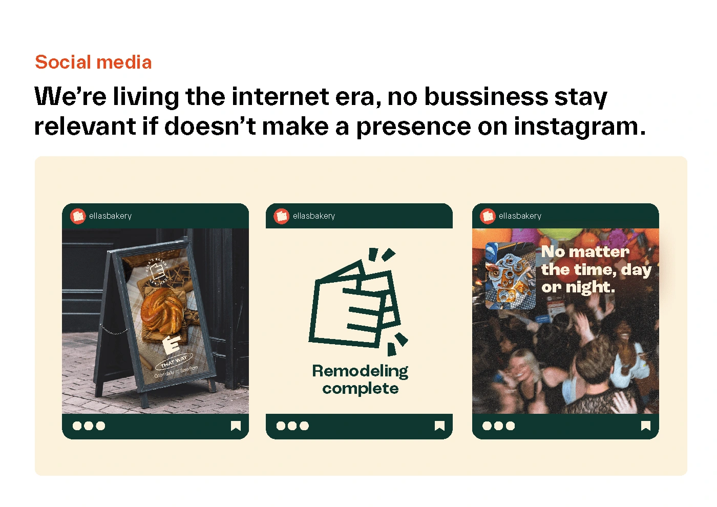
Designed with Nottingham’s big university student life in mind, Ella’s is the place to go on the way home after a night out or when the sun is brightly shining. Ella promises to bring to Nottingham a sense of freshness and love, in a way to pay back all that Nottingham brought to her life. Ella’s presents itself as a local alternative to the fast food chains after a night out, and you’ll find yourself coming back as soon as you wake up that same day.
Process 🛣
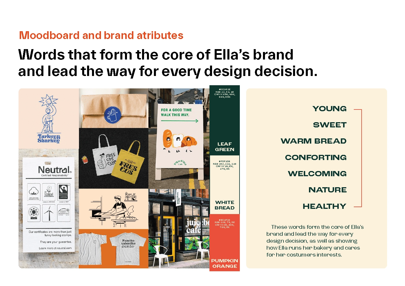
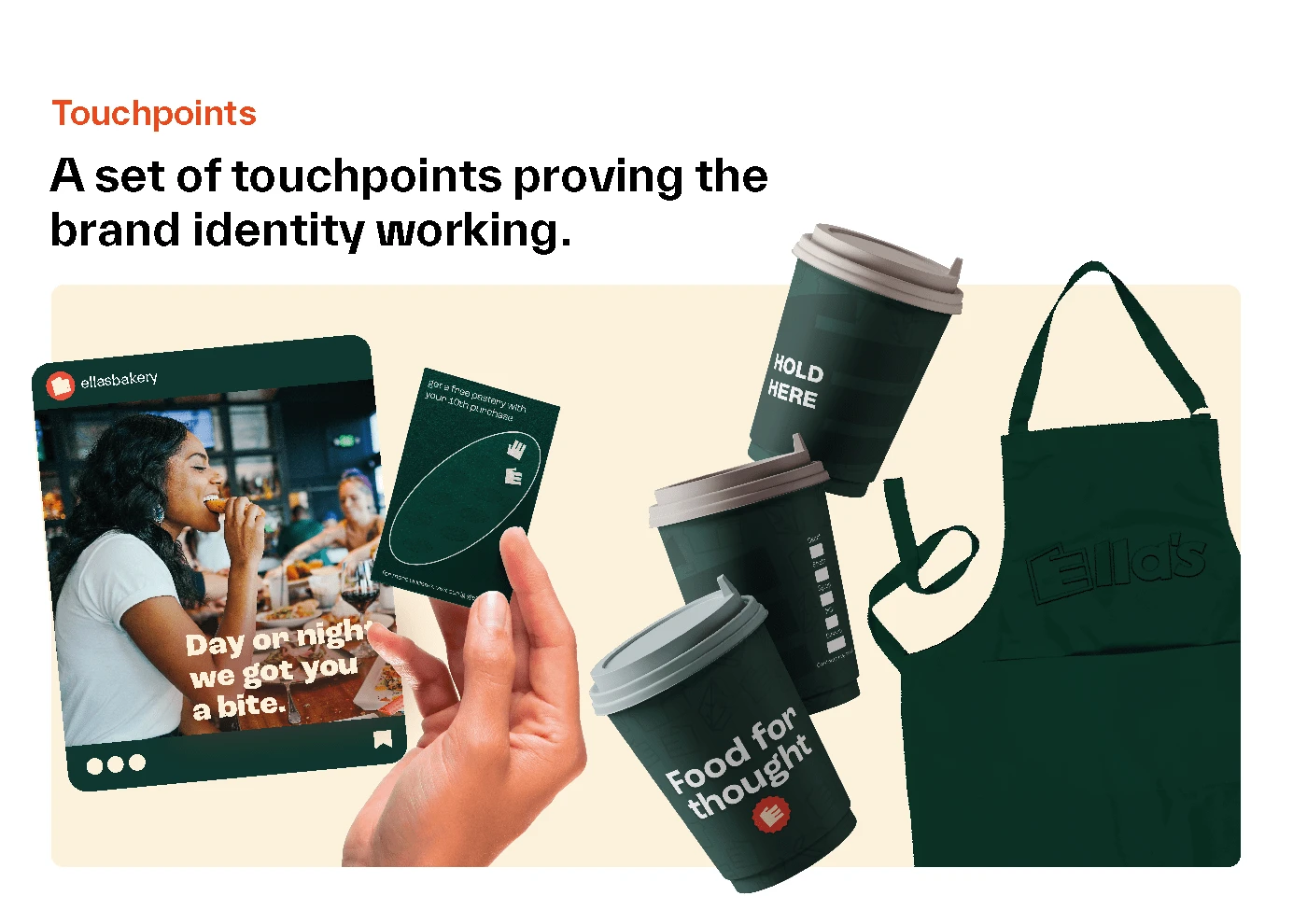
Young, sweet, warm bread, a comforting, healthy and welcoming feeling, full of nature and a feel of healthiness, are the words that form the core of Ella’s brand and lead the way for every design decision, as well as showing how Ella runs her bakery and cares for her costumers.
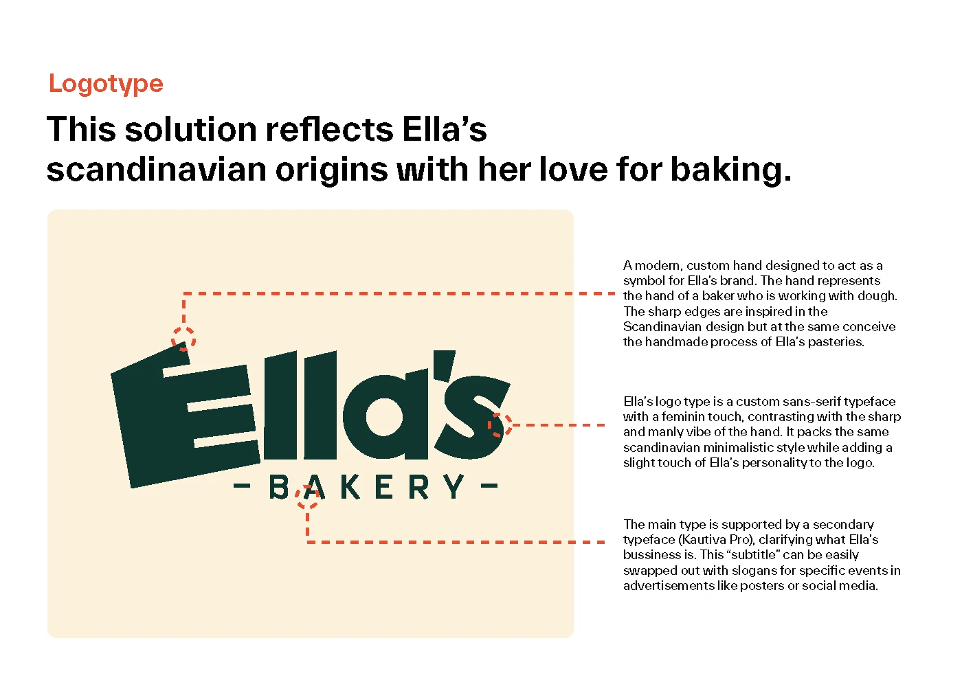
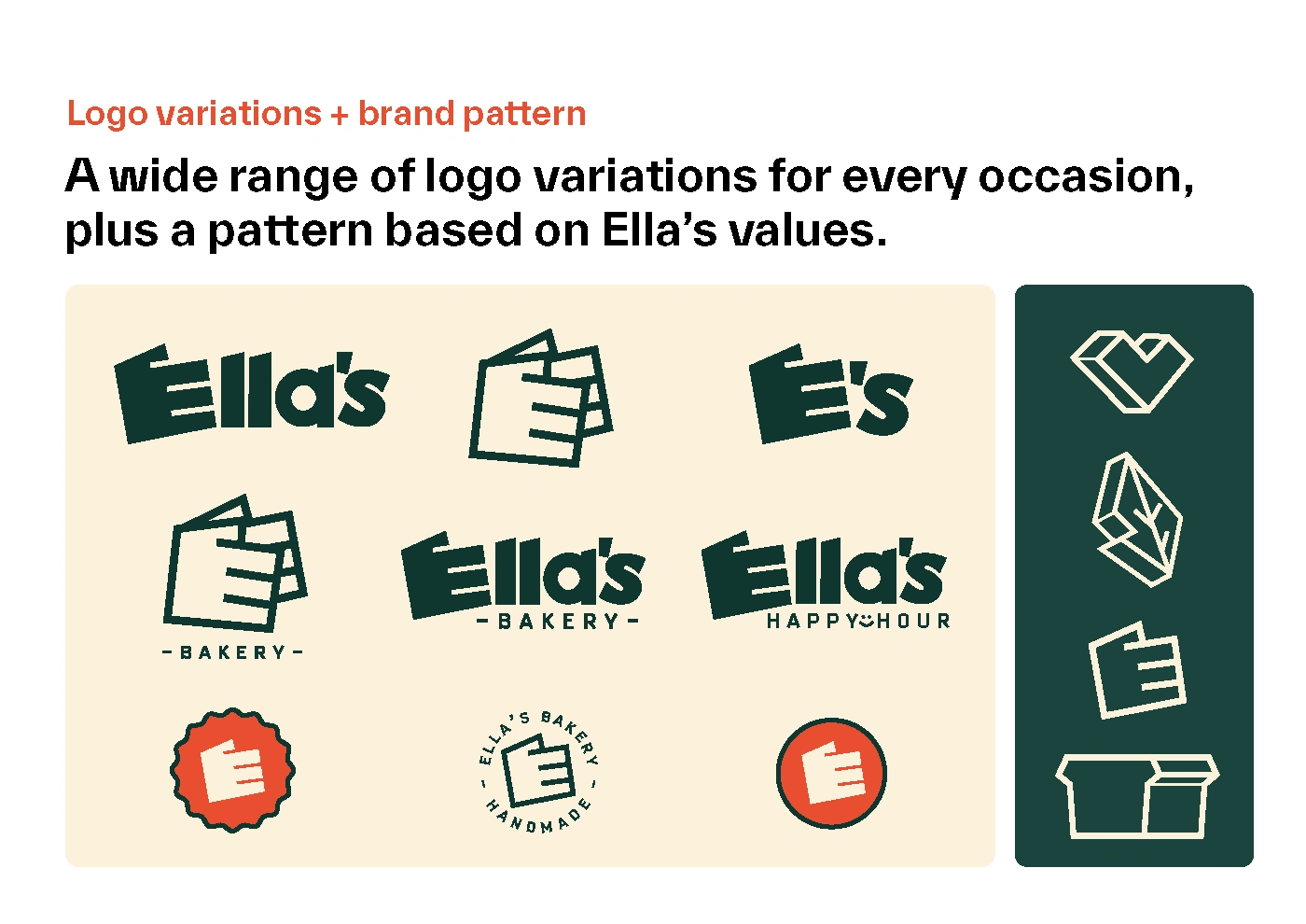
The design was inspired by the Scandinavian design style, the hand gives refers to a baker's hand and serves as an indicator that it is hand-made and not a machinery-based business. It’s also a versatile brand asset that on the shop front sign it’s used to indicate the direction of the shop from the sign.
Results 🎁
Like this project
Posted Sep 25, 2022
"Ella's Bakery" @ntuart x @kontrapunktcom Branding live-brief project pitched by @kontrapunktcom studio to the 2nd year student group. #branding #bakerydesign

