Park+ Onboarding Redesign to Increase VRN Submission

Sagar k


Context
Park+ is an all-in-one car app used for challans, FASTag , parking, car insurance, and more.
Team
1 Product Manager
Head of Growth
1 Designer (Me) ⭐️
4 Engineers
My Role
Qualitative research
Strategy,
Ideation
Conceptualisation,
UX flows
UI design
Interaction & motion design
Dev handoff
Background Insight
Users who add their Vehicle Registration Number (VRN) engage 2× more with Park+ services because they start receiving personalized updates like challan alerts, FASTag status, insurance reminders, etc.
VRN = Engagement = Revenue
Understanding Problem
Only 10% of users were adding their VRN during onboarding.
Why?
Because the older flow was:
Mobile Number → Home Screen → Bottom Sheet: “Enter Your VRN” → Ignored by 90%
📞We sat with the calling team and spoke to users who did not enter their VRN.
Their response was: "Most apps usually work with just my phone number. Why do you need my vehicle details?”
Translation: Users didn’t understand
Who Park+ is,
What the app does,
Why VRN is important,
and what they get in return.
The Goal
Primary Goal
Increase user engagement by increasing VRN submissions
Sub-goal
Make users understand Park+ as a super-app for your car and give them a reason to enter VRN.
Strategy
The original flow was optimised for speed, not understanding.
We shifted the onboarding to optimise for clarity-first, ensuring users knew what Park+ offered and why their VRN unlocked value.
This came with a small tradeoff — the new flow is slightly longer, but every step was designed to feel effortless, guided, and worth the user’s time.
New Flow (Redesigned)
1. Splash Screen
After exploring 4+ iterations, we finalised an animation that introduces Park+ as a complete car companion.
The splash shows a car and some service icons like challans, FASTag, parking, insurance etc.
Giving users an instant sense of what the app actually does.
This sets the narrative before onboarding even begins
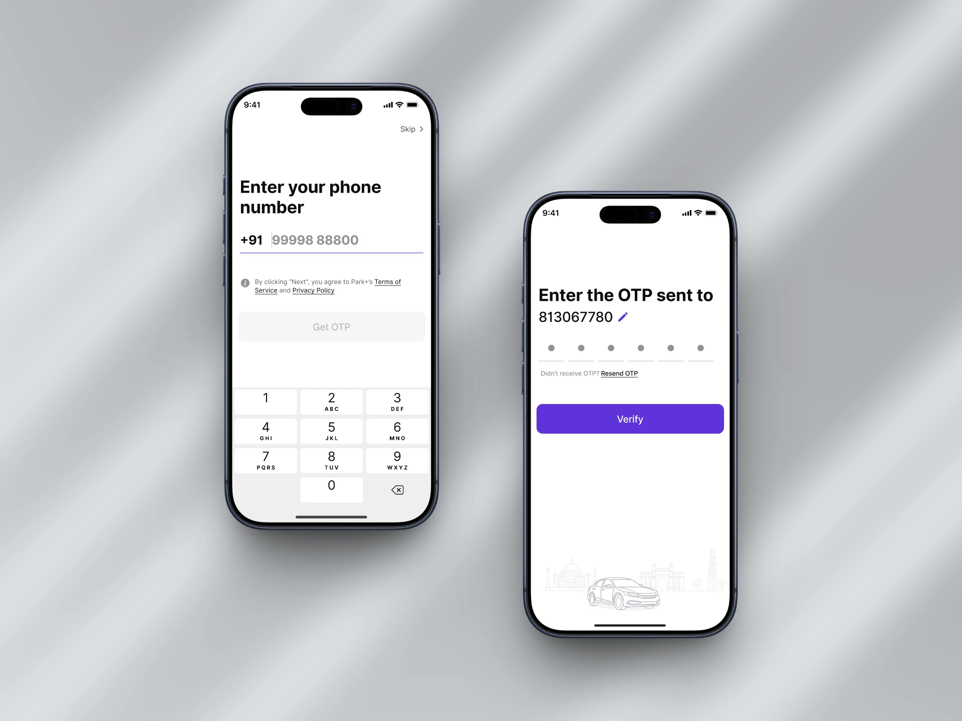
2. Mobile Number Verification
The mobile number screen remains intentionally simple.
Since users are already conditioned to verify with OTP, this step leverages familiar patterns to maintain flow.
3. Vehicle Number (VRN) Screen
The VRN step was redesigned to focus on user motivation.
Before asking for vehicle details, we highlight why VRN matters — access to challans, FASTag status, pollution checks and insurance alerts.
This transforms the VRN input from a “data request” into a gateway to relevant features.
Attention to detail
4. Vehicle Summary Screen
After the VRN step, we intentionally shift from input to value delivery.
The fetching animation communicates that Park+ is retrieving real data — challans, FASTag, PUC, insurance — in the background.
Once fetching is complete, users land on a personalized summary of their car.
Showing their car image adds familiarity and emotional comfort, while the consolidated data gives users instant value within seconds of entering the app.
6. Welcome Gift (Smart Motivation + Store Discovery)
To end onboarding on a high note, we introduced a “Welcome Gift” for users who complete the flow.
This does three things at once:
Communicates that Park+ has a full car accessories store
Most users had no idea we sold car-care products.
A free gift instantly introduces the store without needing extra explanation.
Lets us collect the user’s location naturally
When they claim the gift, they share their delivery location, which later helps us tailor services and offers.
Creates an immediate excitement spike
Ending onboarding with a reward makes the whole flow feel lighter, friendlier, and more satisfying.
Instead of “Thanks, you’re done,” users get: “Here’s something for you.”
How we handled the business side (without killing UX):
The product itself costs ₹20–25
We charge ₹80 as delivery
This keeps the operation break-even (no loss, no profit)
So the gift feels generous to the user, but still sustainable for us
Results
We rolled out the new onboarding to every 11th user first to measure real-world behaviour.
Drop rate? Literally 0%.
Thanks for the 👏👏👏
Now we scaled it to every new user and the impact was instant:
VRN completion jumped from 10% → 48%
A 4.8× increase in users giving us clean vehicle data.
Better data = better targeting
Now that more users share their VRN, our messages switch from vague promos to precise utility alerts:
Before: “Hey, you might have a challan. Check now.”
After: “Hey, you have a ₹1000 challan due. Here’s the link.”
Utility > promotional.
Relevance drives action.
Messaging cost dropped from 80p → 15p
That’s because utility messages cost 15p, while promotional ones cost 80p.
More VRNs = more utility messages = less money burned.
Total WhatsApp marketing spend dropped by ~34%
Not theoretical.
Not estimated.
Real numbers from live traffic.

The End
Users don’t resist giving information — they resist giving it without a reason.
Once we fixed the story, the numbers followed.
This project is a reminder that great onboarding isn’t fast…
it’s effortless.
Like this project
Posted Sep 20, 2026
Redesigned onboarding for Park+ to boost VRN completion and user engagement.