St. Mary's Hospital: An Appointment-First Landing Page

Anyadi Onyekachukwu


St. Mary's Hospital: An Appointment-First Landing Page
St. Mary's Hospital is a healthcare landing page concept built around booking. Most hospital websites bury appointments behind menus and department pages. This design puts scheduling in the hero, so a visitor can start booking the moment the page loads.
My Role
[Solo developer / UI and frontend build, pick what is true]
The Challenge
Patients visiting a hospital site are often stressed, short on time, or looking for urgent help. The page had to build trust quickly, make booking obvious, and keep emergency contact one click away without competing with the main booking action.
The Approach
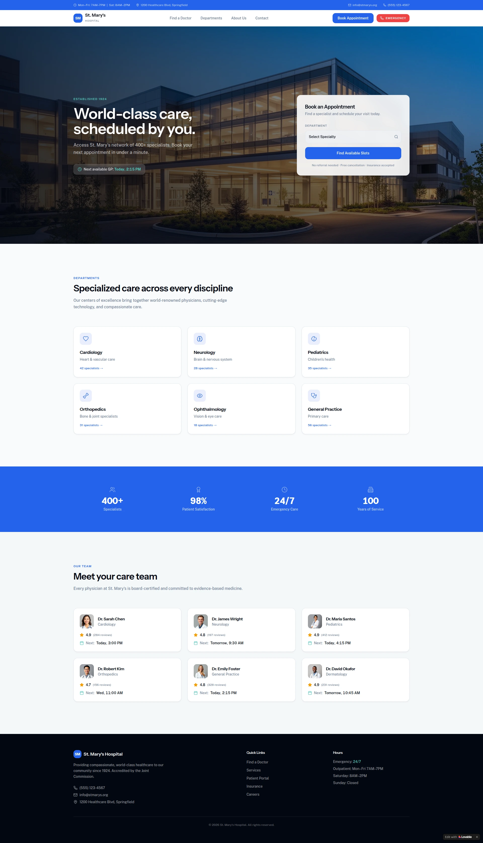
Booking in the hero: A "Book an Appointment" card sits beside the headline with a specialty selector and a "Find Available Slots" button. A short line beneath it addresses common worries: no referral needed, free cancellation, insurance accepted.
Live availability cue: A "Next available GP: Today, 2:15 PM" badge shows availability before the visitor does anything, which makes booking feel immediate.
Separate emergency action: A red Emergency button in the header sits next to the blue Book Appointment button, so the two intents are visually distinct and never confused.
Utility bar: Opening hours, address, email and phone are pinned at the very top so basic contact info needs no searching.
Department cards: Six specialties (Cardiology, Neurology, Pediatrics, Orthopedics, Ophthalmology, General Practice), each with an icon, a plain language description and a specialist count linking onward.
Trust stats band: 400+ specialists, 98% patient satisfaction, 24/7 emergency care and 100 years of service in a high contrast strip.
Care team cards: Each doctor card shows a photo, specialty, rating, review count and the next available appointment, so patients can choose a doctor and see when they could be seen in one glance.
Footer: Quick links, a patient portal entry, and full hours including emergency, outpatient, Saturday and Sunday.
Design Decisions
A blue and white palette that reads as clean, calm and clinical, with red reserved only for emergencies. The hero photo of the hospital building adds credibility, and the frosted booking card keeps the form readable over the image. Generous spacing and large headings keep the page easy to scan for anxious or older visitors.
Tech Stack
React, Next.js, TypeScript, Tailwind CSS, Lovable.dev
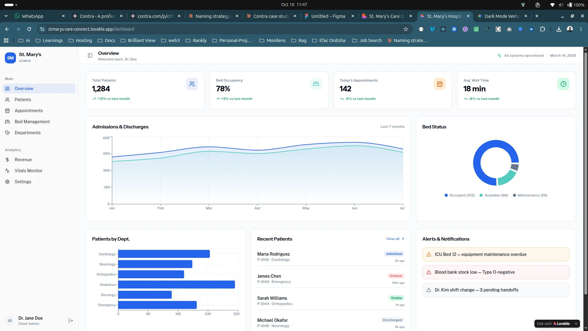
A sneak view of the dashboard
Like this project
Posted Oct 10, 2026
A hospital landing page designed around one goal: getting a patient from "I need a doctor" to a booked slot in under a minute.