Atexact: Lifestyle Editorial Website Design

Vineet Jaydeo

Atexact: Lifestyle Editorial Website Design
Project overview
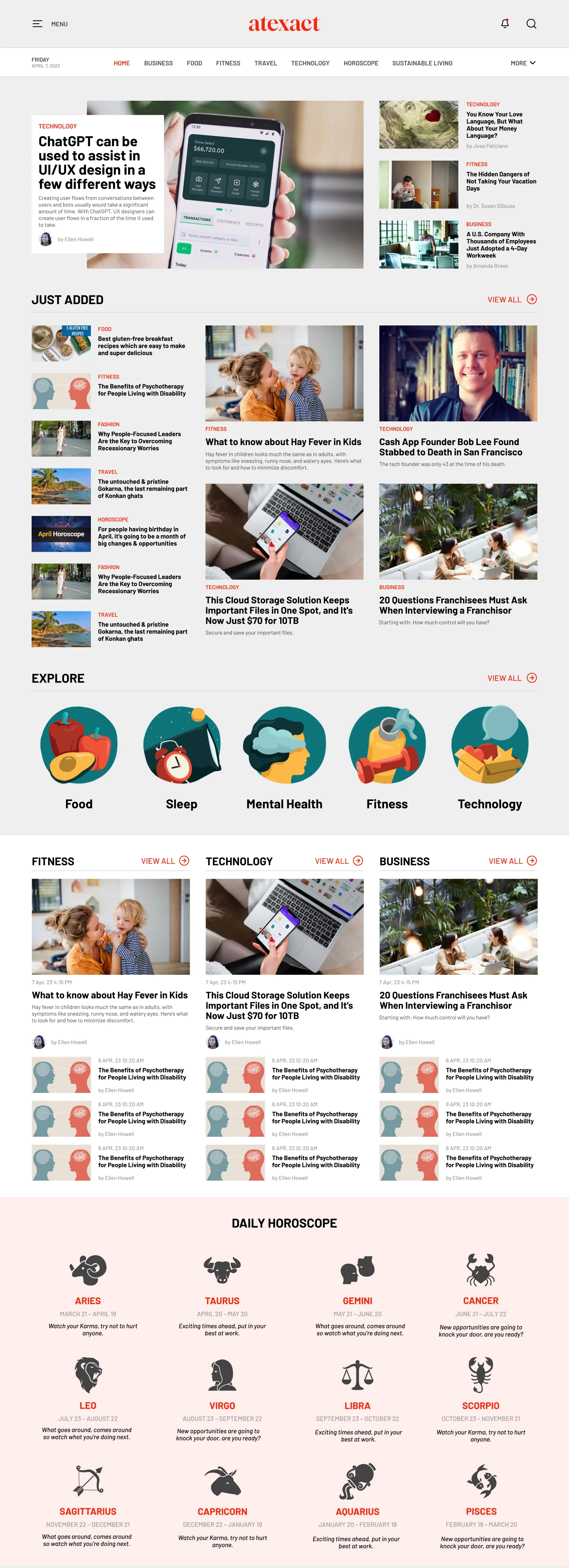
A Figma website design for Atexact, a lifestyle and editorial publication. The interface brings several content categories into a readable homepage, balancing one prominent feature story with smaller supporting articles.
My contribution
Website interface and visual design, covering the masthead, category navigation, featured-story composition and supporting article layout.
Design approach
The masthead gives the publication a distinct identity while utility controls are separated from the content navigation. Categories such as business, food, fitness, travel, technology and sustainable living provide recognizable paths into the publication.
The main feature combines a large image with an overlaid editorial card containing a category, headline, introduction and author information. A supporting column presents additional stories with thumbnails, headlines and bylines. This creates a clear difference between the lead story and the wider collection without treating every article as equally prominent.
The restrained background and warm accent color keep the focus on imagery and reading. The supplied layout also introduces a separate area for newly added content below the main feature.
Delivered work
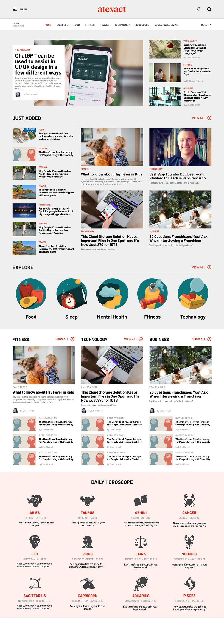
The editorial homepage design shown in the project image, created in Figma. It demonstrates content hierarchy, image-and-text composition and navigation for a multi-category publication.
Like this project
Posted Oct 12, 2026
Figma editorial website design with category navigation, a prominent featured story and supporting article cards for a lifestyle publication.
Likes
0
Views
9