CALEB Steakhouse + Bar - Brand Identity / Print / Advertising
Caleb Steakhouse + Bar is a high-end and modern Canadian restaurant located in Whistler Village. Caleb Steakhouse + Bar embodies a modern Canadian cuisine that is approachable and undeniably delicious. We offer the best in global cuisine using local, fresh ingredients served in a dim, contemporary setting. The overall feel of the menu and the brand is luxurious, premium, engaging, modern, simple, easy to read, welcoming and clean. The designs chosen were inspired by the mood board, creating a sleek, simple, rich colours and minimalist layout in the menu to convey our customer's experience that will keep our guests coming back again and again.
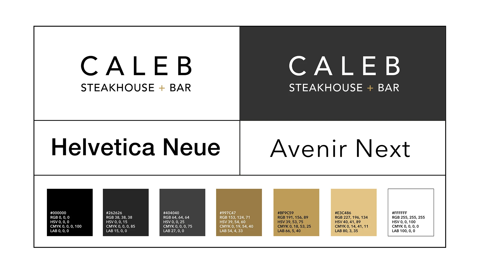
To create a simple and clean logo representing the brand that works with all types of media and prints. To ensure that the fonts and colours are appropriate and easy to read for the customer's view when reading the food items on the menu. To design the menu layout such that minimalism, luxury, boldness and modernity are showcased.
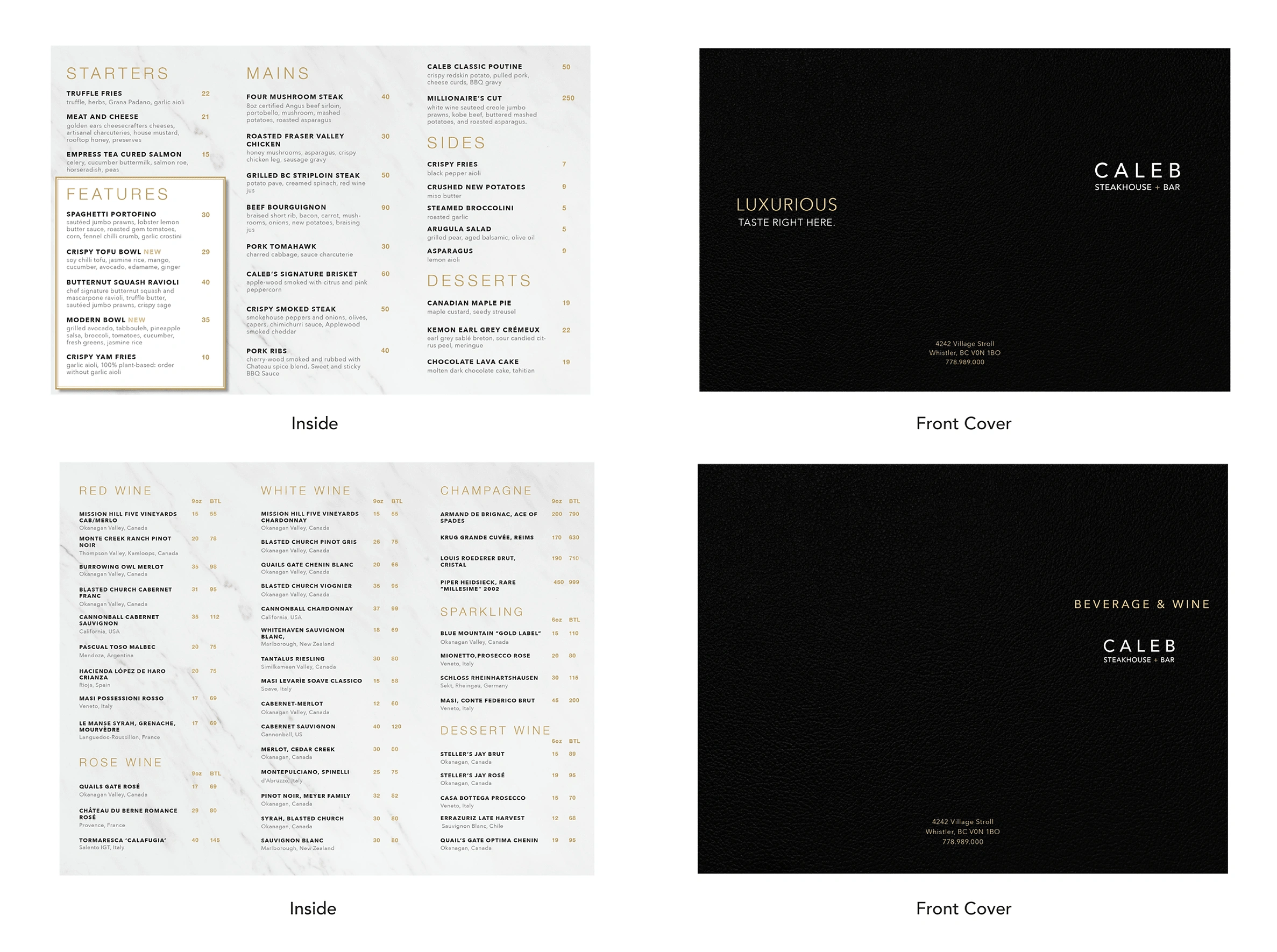
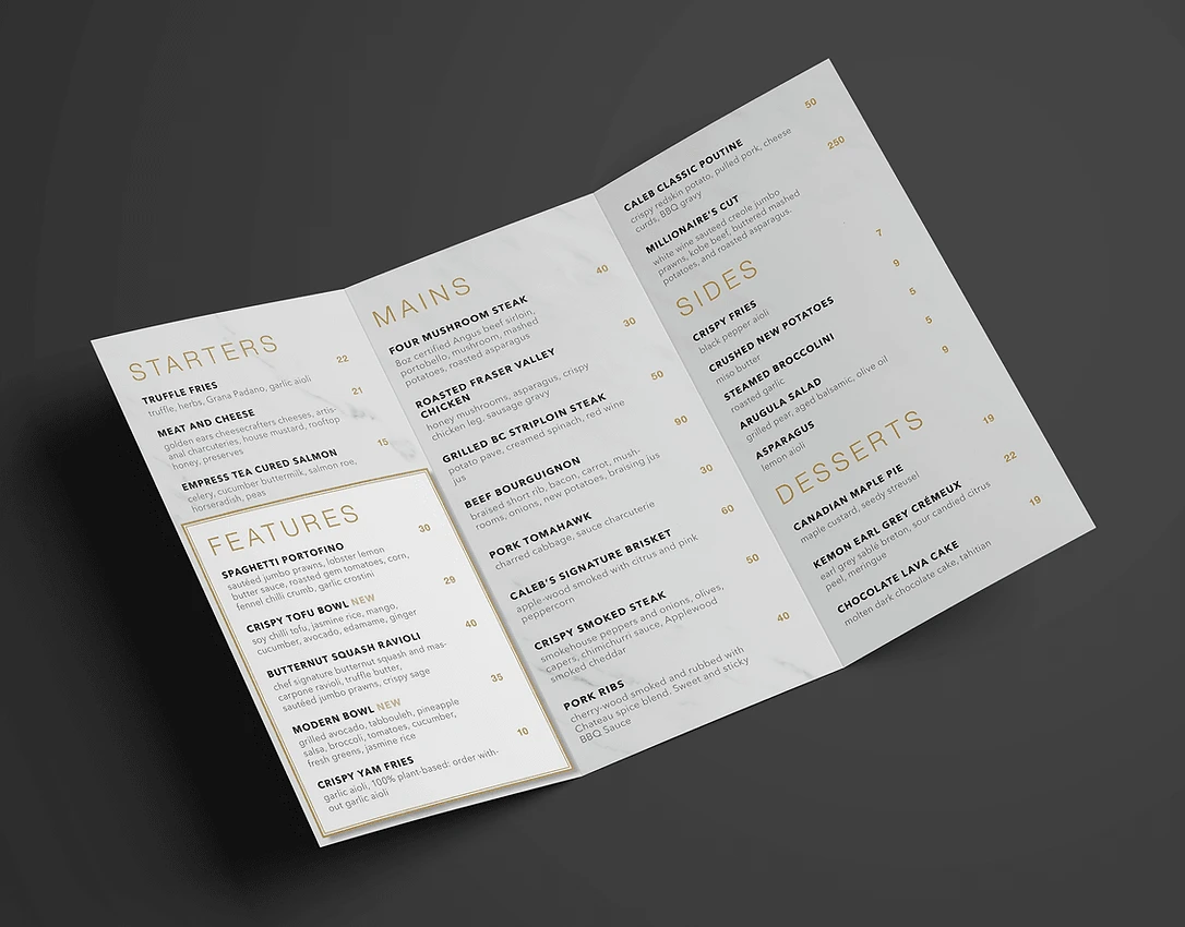
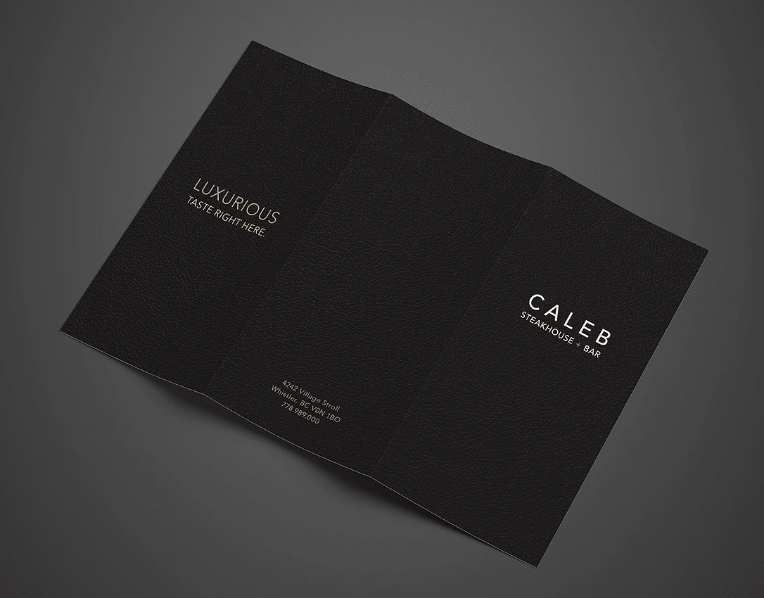
The luxury theme is carried throughout the menu. The cover features a simple and clean premium texture made in black leather to feel the menu. The marble-coloured paper is a thick, textured cardstock while the area with the graphics is a coated paper with a matte finish. The light paper provides easy visibility in a dark restaurant setting.
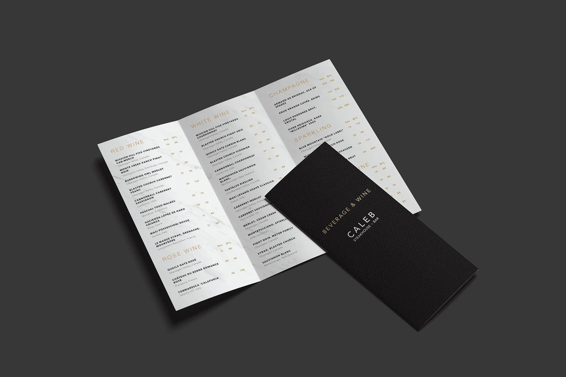

The luxury theme is carried throughout the menu. The cover features a simple and clean premium texture made in black leather to feel the menu. The marble-coloured paper is a thick, textured cardstock while the area with the graphics is a coated paper with a matte finish. The light paper provides easy visibility in a dark restaurant setting.
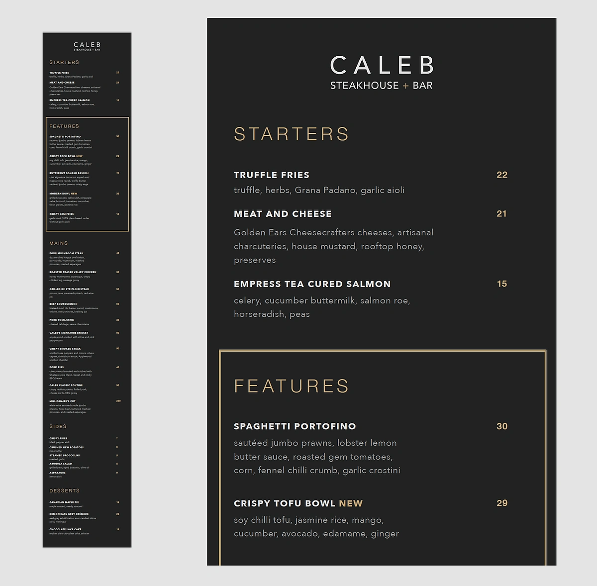
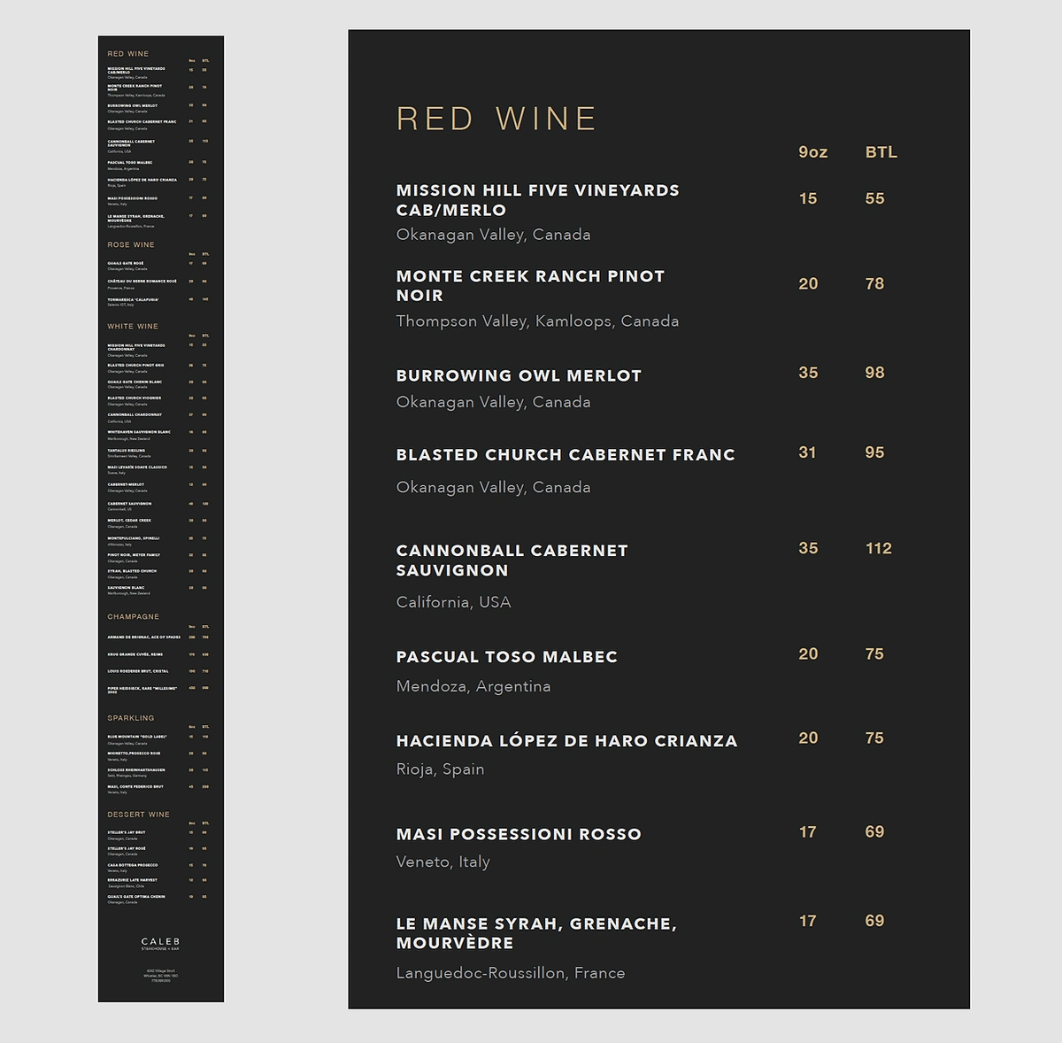
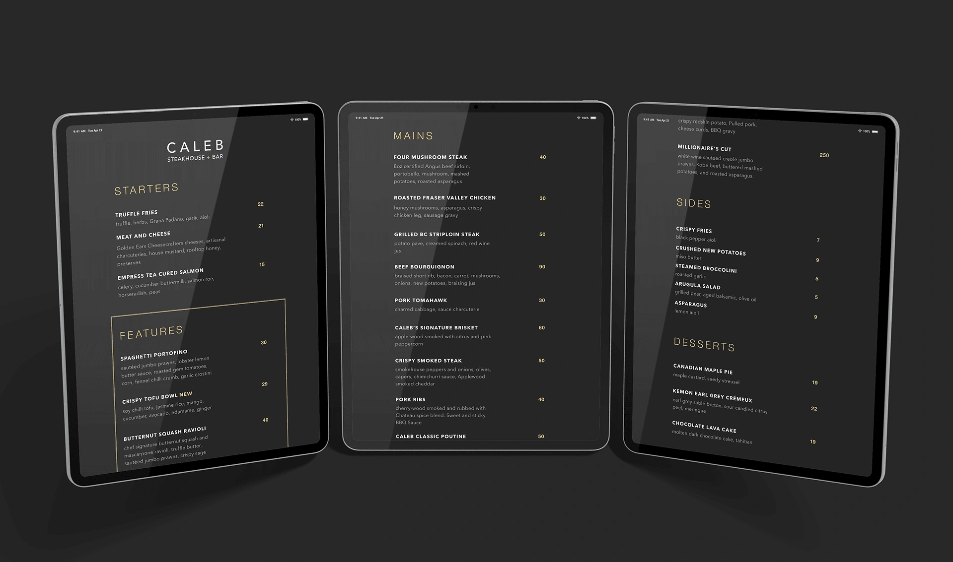
The iPad menu uses a dark background since this is better suited for a dimly lit environment and won't put a strain on the reader's eyes. The design elements are carried throughout the digital menu to create a cohesive look with the rest of the branding. The continuous scroll design incorporates plenty of white space so that the user is able to properly navigate through the tablet while reading the menu.
Like this project
Posted Dec 28, 2023
Indulge in luxury at Caleb Steakhouse + Bar in Whistler Village. Modern Canadian cuisine meets global flavors in a dim, contemporary ambiance.


