Corporate Wellness Page Redesign for YourDOST
Saurav Basu
Some projects stay with you, even when they don’t go as planned.
A while ago, YourDOST reached out to me for the role of Marketing & Communication Manager. As part of their assignment, I worked on a strategy to enhance their corporate wellness page. Unfortunately, the opportunity slipped away due to missed chances for a meaningful conversation. But the idea of redesigning this page stayed with me.
So, I took it upon myself to reimagine their corporate wellness landing page - one that not only looks good but also communicates impact effectively.
Addressing HR & CXO Pain Points
HR leaders and CXOs don’t have time for fluff. They need swift answers. This redesign speaks answers the following questions in their language:
Why should I care? - Clear data-backed problem statements.
What’s in it for my company? - ROI-focused wellness benefits.
Can I trust this? - Social proof, testimonials, and measurable impact.
How do I get started? - A simple, well-placed "Request a Callback" CTA.
By prioritizing clarity over complexity, the design ensures quicker decision-making and higher engagement.

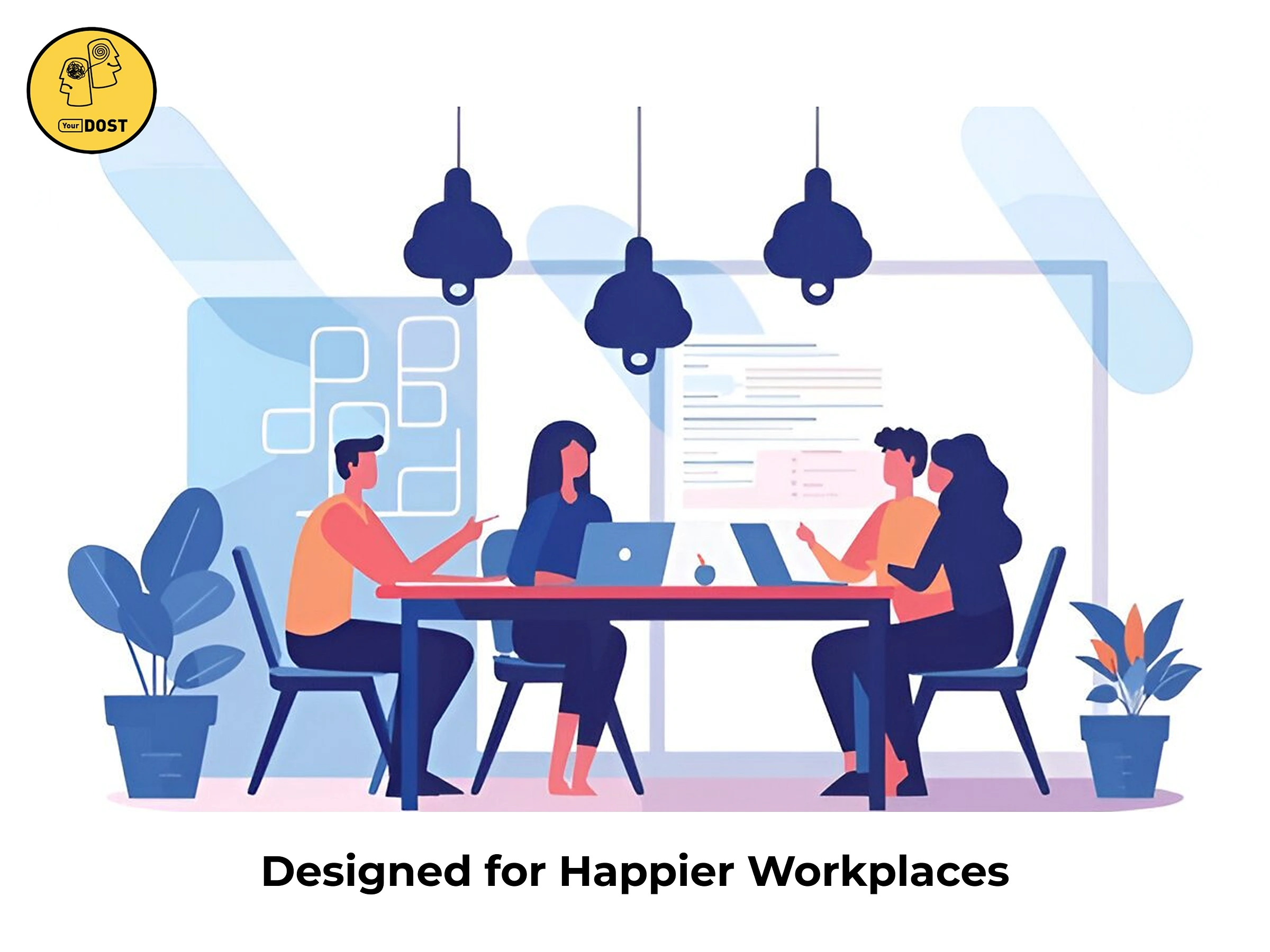
Hero Section
The headline instantly captures attention by highlighting the importance of emotional wellness in the workplace. A supporting subheading clearly defines the target audience—HR and CXOs—while reinforcing the benefits.
A powerful statistic (42.5% of employees suffer from stress) creates urgency, making the problem relatable. The CTA ("Start Your Free Demo Today") stands out with a bright yellow button, encouraging immediate action. The friendly illustration enhances engagement by reinforcing themes of collaboration and well-being.

Mental Health Impact Section
This section breaks down complex data into an easy-to-understand format. Three categories—At Risk, Suffering in Silence, No Symptoms but at Risk—address different concerns while providing insight into workplace mental health challenges.
Visual elements like circular graphs simplify data, making it digestible at a glance.
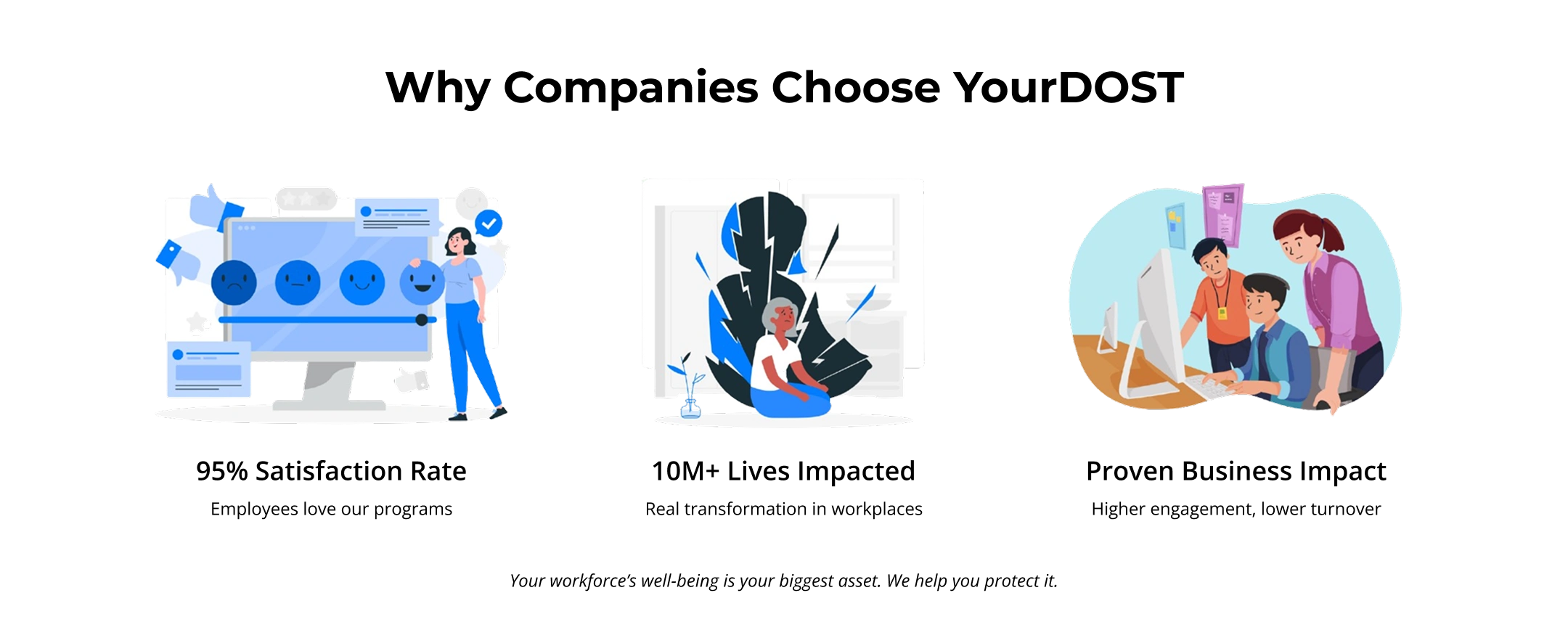
Why Companies Choose YourDOST
This section builds credibility through three key benefits: Satisfaction Rate, Lives Impacted, and Proven Business Impact. Simple icons and illustrations enhance readability, making it easy for decision-makers to grasp the value.
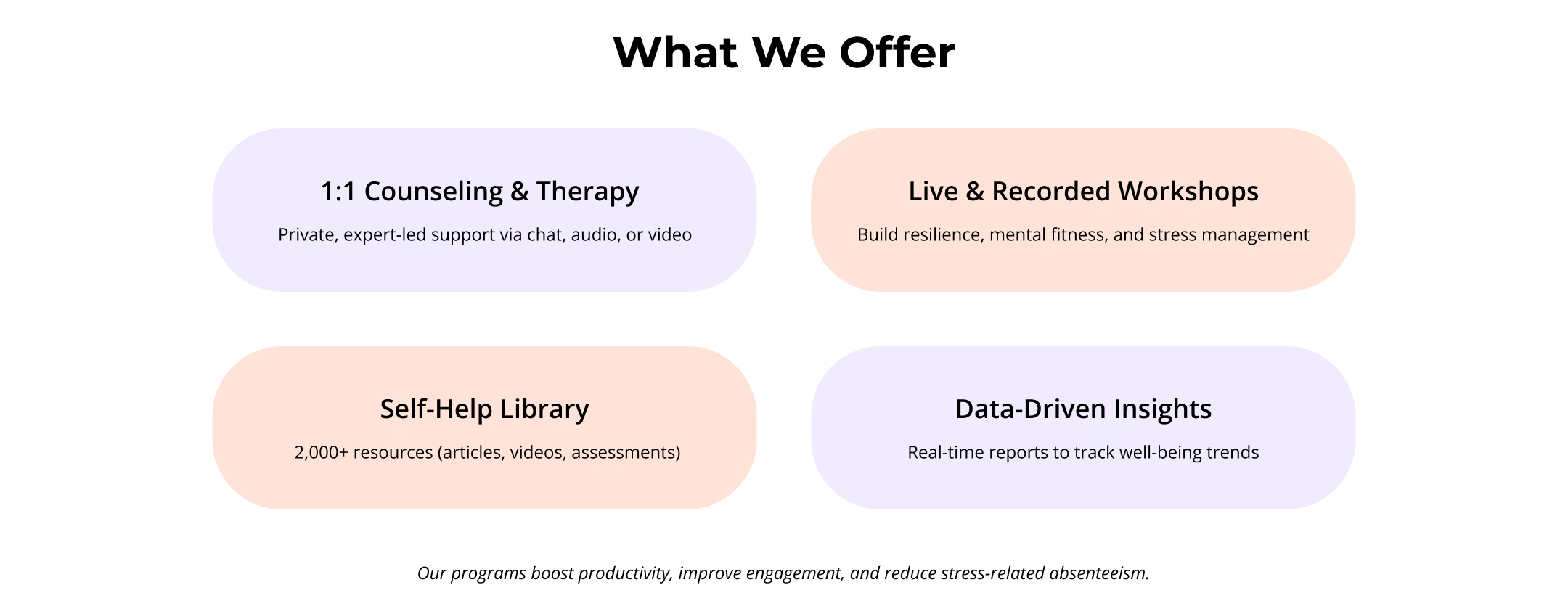
What We Offer
Four key services are presented in an organized, color-coded layout, making the information easy to scan. Each service description is short yet impactful, focusing on real benefits like resilience, stress management, and mental fitness.
A well-balanced mix of text and visuals ensures clarity without overwhelming users.

Real ROI of Emotional Wellness
This section highlights the measurable benefits of investing in emotional wellness, such as higher engagement, lower turnover, and stronger team loyalty. Icons and illustrations make it visually appealing, ensuring the key takeaways stand out.
Referencing a WHO study strengthens credibility.

Testimonials (What Our Clients Say)
Featuring real client logos and quotes, this section builds trust by showcasing the impact of YourDOST’s solutions. The short yet powerful testimonials provide social proof in a simple format.
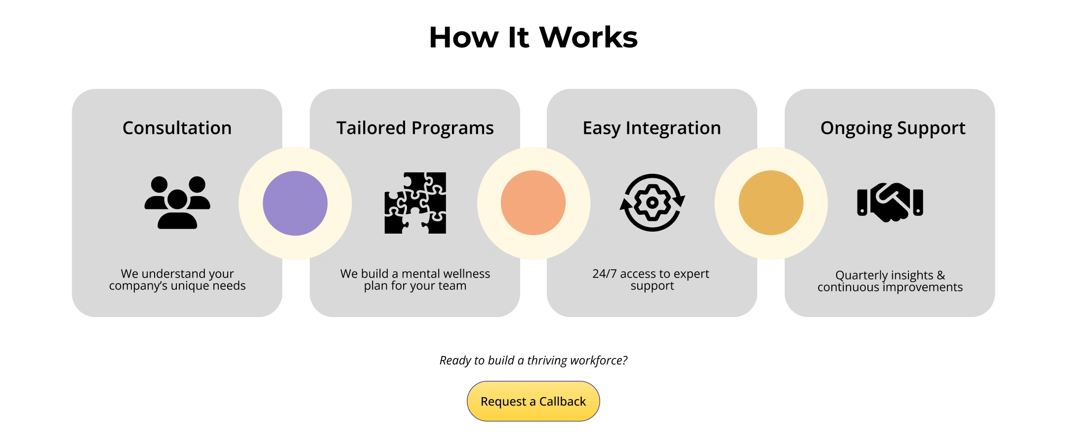
How It Works
The four-step process—Consultation → Tailored Programs → Easy Integration → Ongoing Support—is presented clearly with concise descriptions. Icons reinforce each step, making it easy to follow.

Crafting a Seamless Experience
Every section of this page follows a structured narrative, guiding HR and CXOs from problem awareness to solution adoption.
Hooking Attention: The hero section immediately sets the tone with a compelling headline and a direct CTA.
Establishing Need: Instead of generic claims, I used industry-backed data points to highlight employee wellness challenges.
Building Trust: A dedicated space for YourDOST’s impact metrics & testimonials assures decision-makers that they are in good hands.
Simplified Navigation: The layout is modular and scannable, ensuring a seamless reading experience.
The goal - Reduce cognitive load, improve engagement, and drive conversions.
This redesign is more than just aesthetics. It should enhance storytelling and reinforce brand identity.
Consistent color scheme to evoke trust and reliability.
Balanced whitespace for improved readability and focus.
Minimal yet expressive illustrations to add warmth and relatability.
Typography hierarchy ensuring key messages pop instantly.
The result - A highly functional, easy-to-digest landing page that speaks directly to HR professionals and CXOs.
I believe adding interactivity, such as an interactive ROI calculator, and short video walkthrough can make the UX more engaging and seamless. Features like animated transitions, hover effects, and real-time updates can enhance usability while keeping users actively engaged with the content.
Like this project
Posted Jul 14, 2025
Revamped wellness journey interface to re-engage users emotionally, improved navigation clarity, and delivered a cohesive brand experience.