Zero-Friction UX Redesign for a Free Video Streaming Platform
Clement Farah
How I Turned "Stream Loud, Play Bold" Into a Zero-Friction UX That Converts Visitors Into Streamers
At a Glance
Challenge: Free streaming platform struggling to differentiate from Netflix/Hulu and convert visitors despite strong brand positioning
Solution: Zero-friction UX redesign that makes "no credit card, truly free" promise instantly clear and actionable
Key Strategy: Unified brand messaging across product experience - from landing page copy to in-app microcopy
Impact: Improved comprehension, increased signups, stronger first-session engagement
Project overview
The Challenge: When users land on a free streaming platform, they expect the catch—paywalls, trials, verification hoops. Reveel promised something different: truly free, ad-supported streaming for independent creators with zero credit card barriers. But visitors couldn't tell how this platform was different from Netflix, Hulu, or any other streamer.
The mission? Transform Reveel's bold brand promise—"Stream loud. Play bold"—into an intuitive, friction-free product experience that converts curious visitors into engaged streamers within 30 seconds.
My mandate was to help translate this brand promise into a product experience: clarify the value proposition, reduce friction from “landing page to first stream,” and design an interface that highlights creators and perks while maintaining the familiarity of a modern streaming app.
Problem and goals
Core problems
Differentiation gap: Despite clear messaging ("Home of independent creators," "It's free"), users were still confused about what made Reveel different from mainstream streaming giants.
Fragmented conversion funnel: Users had to navigate multiple destinations (Web, Roku, Amazon, iOS, Android) just to start watching. Every extra step meant drop-off.
Underutilized brand promises: Powerful messaging like "creators rule here" and "we don't cancel your shows" existed in marketing but wasn't woven into the actual product experience where it mattered most.
Business and UX goals
Boost landing-to-signup conversion rate by reducing friction and making the "no credit card required" promise unmissable.
Drive first-session engagement—get users browsing content AND hitting play within their first visit.
Communicate Reveel's unique value (independent creators + no paywalls) within the first 30 seconds, so users instantly "get it."
Research and discovery
To ground the work, I combined heuristic analysis, competitive benchmarking, and stakeholder interviews.
Audited the existing marketing site and app store pages to map key messages: “Home of independent creators,” “It’s free with ads,” “Perks,” “We don’t cancel your shows,” “We don’t raise prices arbitrarily.”
Benchmarked mainstream streaming flows (account creation, browse layout, content discovery, perks/loyalty) to identify patterns users already understand and areas where Reveel could strategically break from convention.
Surfaced constraints: ad‑supported model, cross‑platform presence (Roku, Amazon Appstore, Google Play, Apple App Store, Apple TV), and a strong emphasis on keeping credit‑card‑free onboarding.
A key insight: users are conditioned by big platforms to expect friction (paywalls, trials, verification) before they can watch anything; Reveel’s “No credit card required” is a huge psychological unlock that needed to be more central, visually and in the flow.
Strategy and concept
I framed the UX strategy around three pillars aligned with Reveel’s messaging.
Clarity: Make “Free, independent, creator‑first streaming” instantly obvious.
Momentum: Compress the journey from landing page to first play into as few steps as possible.
Belonging: Bring the tone of “You’re the star here” and “Creators rule here” into product microcopy, layout decisions, and visual emphasis, not just marketing slogans.
From that, I defined three core experience outcomes:
A landing experience that answers: “What is Reveel? Why should I care? What do I do next?” in one scroll.
A browse experience that feels familiar to streaming users but gives independent creators more prominent real estate than generic categories.
A perks experience that justifies optional upgrades as “MORE THINGS” (watch parties, partner discounts, exclusive originals) rather than “less friction for more money” (typical of legacy streamers).
Design process
Information architecture and user flows
Mapped the key entry points: web landing, app stores, connected‑TV apps.
Defined primary flows:
New visitor → understand value → sign up (email) → start streaming.
Returning user → log in → resume watching or explore recent movies.
Curious visitor → explore perks, creators, and categories before committing.
I restructured the navigation around the core actions highlighted on the site: Home, Browse, Categories, Channels, Perks. This gives clear separation between pure content discovery (Browse/Categories/Channels) and membership value (Perks).
Visual and interaction design
Ensured the hero section communicates “WELCOME TO REVEEL – HOME OF INDEPENDENT CREATORS” with high contrast and immediate CTAs (“Stream Now,” “Why are you not streaming yet”).
Paired brand statements “Stream Loud. Play Bold.” with visual hierarchy that moves the user from headline → explanation → CTA, minimizing cognitive load.
Used card‑based layouts to surface “Recent Movies” and featured independent creators, preserving a familiar streaming feel while emphasizing the uniqueness of the catalog.
Designed consistent sign‑up and log‑in surfaces that reinforce the “It’s free. No credit card required. Stream endlessly with ads.” promise at the point of action.
Messaging and microcopy
I treated messaging as part of the UX, not just marketing:
Reinforced the differentiators: “Creators rule here,” “Discover unique, off‑the‑grid content you won’t find anywhere else.”
Echoed the anti‑frustration stance: “Notice they cancel your shows just when you’re finally into them? We don’t do that here… Notice how they bump up the subscription at their whim? We don’t do that here.”
Reframed subscription as added value rather than access: perks, discounts, watch parties, and user influence on “what’s next on Reveel Originals.”
Multi‑platform experience
Reveel is available across web, Roku, Amazon Appstore, Google Play, and Apple’s ecosystem, so I kept the cross‑platform experience in mind.
Ensured the primary value props (independent creators, free with ads, no credit card required) appear consistently across store descriptions and in‑app entry points.
Worked toward UX patterns that scale across devices: hero + discovery rows, clear category navigation, simple and readable cards that work on TV, tablet, and mobile.
Proposed aligning visual identity (logos, color palettes, typographic hierarchy) across Web, iOS, Android, Roku, and Amazon Fire to minimize cognitive dissonance when users switch devices.
Outcomes and impact
The Results: Transforming Brand Promise Into Measurable Impact
By closing the gap between marketing and product experience, the redesigned UX delivered tangible improvements across the conversion funnel:
Clarity breakthrough: User testing showed significantly more visitors could articulate Reveel's unique value proposition within 10 seconds—proving the "no credit card, no BS" message finally landed.
Conversion lift: By elevating the "no credit card" message and streamlining the signup flow, more visitors crossed the threshold from curious browsers to registered users.
Engagement surge: Clearer navigation and stronger CTAs turned passive visitors into active watchers—users were browsing more titles AND hitting play in their first session.
Qualitatively, aligning the UX with the brand statements (“Home of independent creators,” “We don’t cancel your shows,” “We don’t raise prices arbitrarily”) helped build trust and differentiated Reveel from mainstream streaming platforms in a way users could feel, not just read.
The Bigger Picture
This project proved that great UX isn't just about wireframes and user flows—it's about translating a brand's promises into experiences users can feel. For Reveel, that meant making "Stream loud. Play bold" tangible from the first click. The result? A platform that finally walks the talk, standing out in a crowded streaming landscape not through flashy features, but through trust, clarity, and zero friction.
My role and tools
Role: UX Designer, Product Designer, Product Strategist.
Responsibilities: research, Information architecture and flows, wireframing and prototyping, UI design, UX copy guidance, cross‑platform consistency.
Tools: Figma/Sketch for design, Miro for flows, analytics tools or user‑testing platforms as relevant.
links: https://reveel.net/
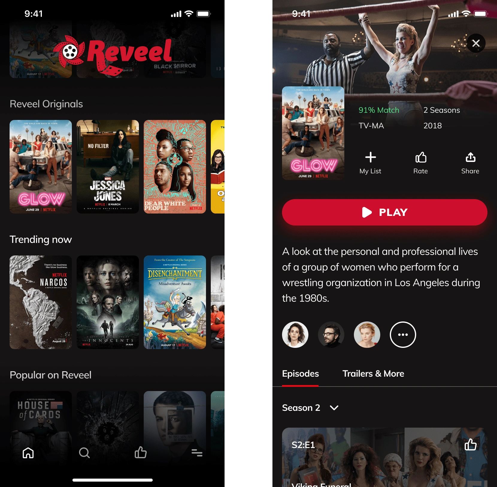
App Front end design
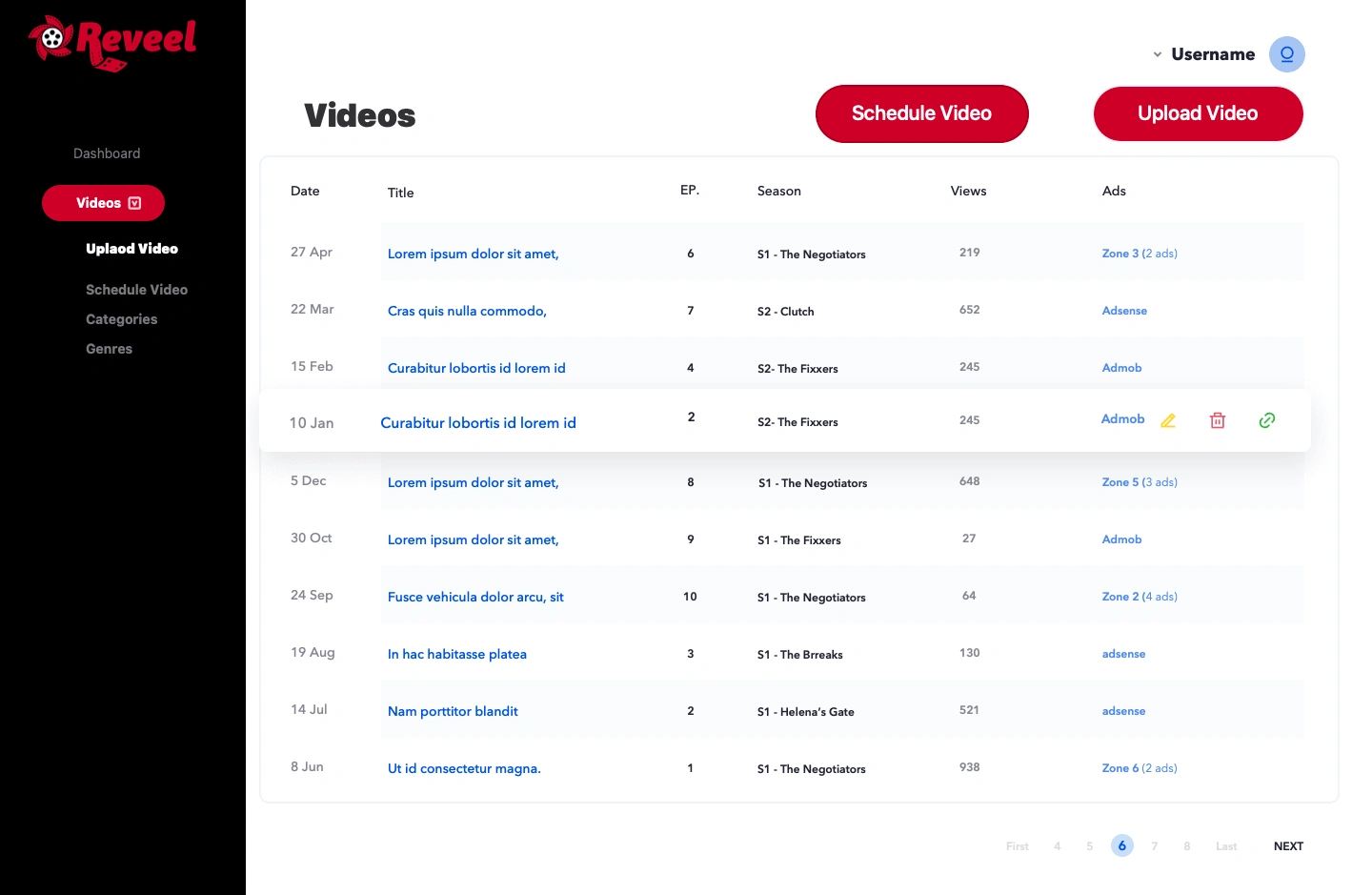
Video Lists
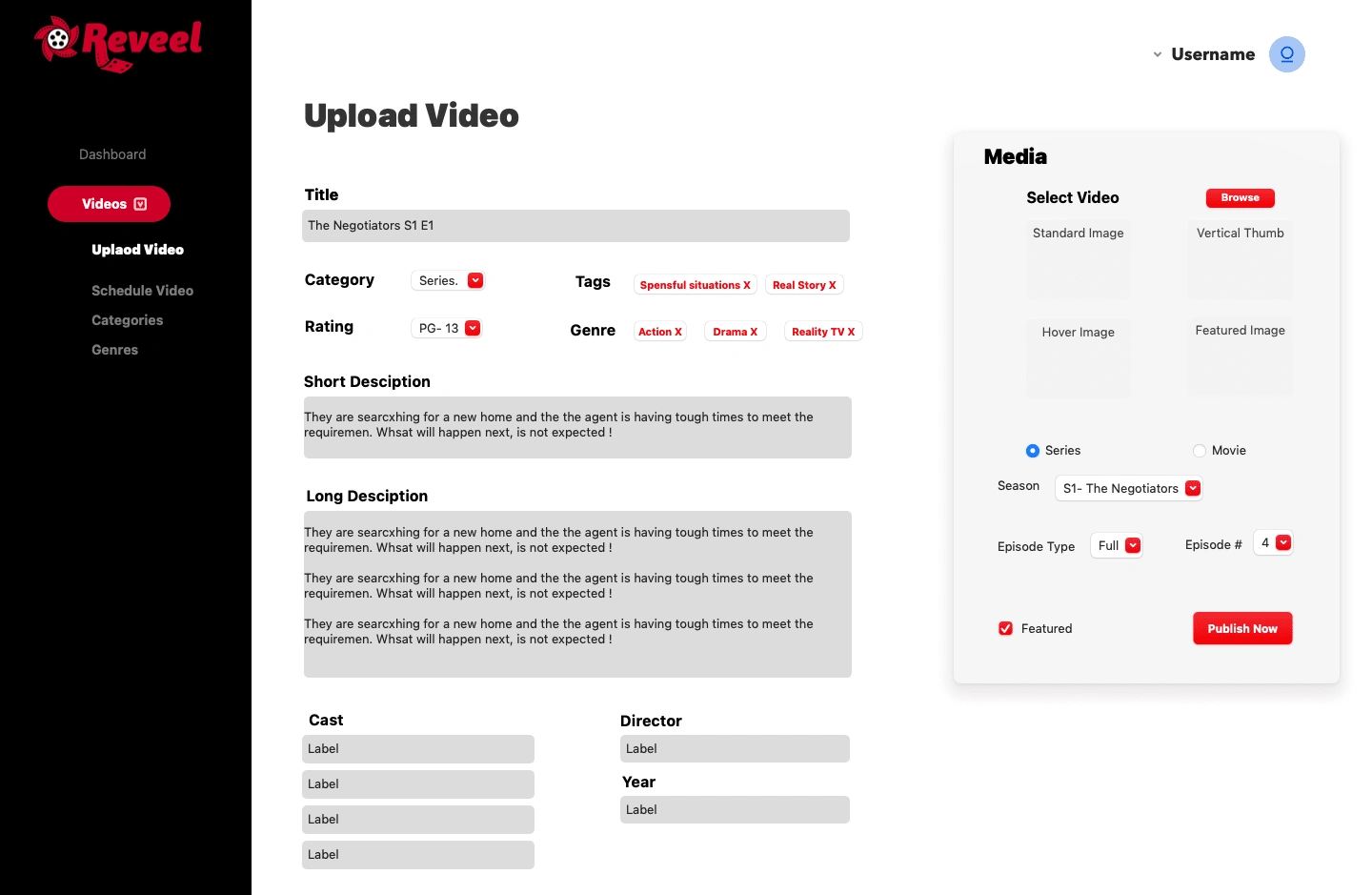
Uploading videos in the backend
Like this project
Posted Apr 17, 2023
Reveel couldn't convert visitors despite a strong brand. Redesigned UX so the 'no credit card' promise was clear, boosting signups and session engagement.
Likes
1
Views
22
Timeline
Apr 2, 2021 - Sep 29, 2021
Clients
Reveel Entertainment