Shopify Website Redesign for Hunker +27% total sales

Lucille Ruehland

Shopify Website Redesign: +41% Conversion for Hunker
Hunker makes poop stools from 100% post-consumer waste, designed to be left out in plain sight. The product was great. The website wasn't doing it justice.
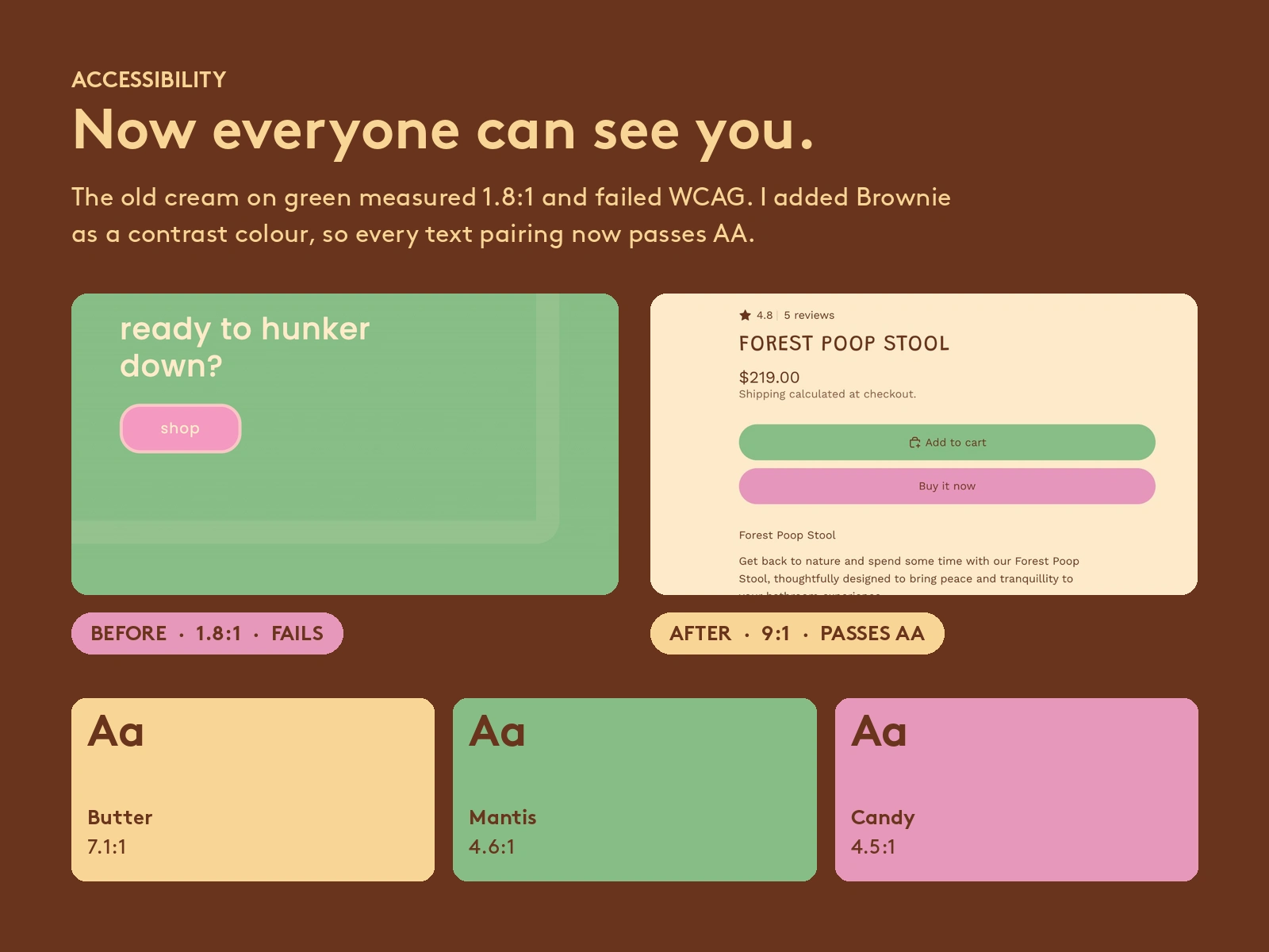
Cream text on green measured 1.8:1 contrast, well under the 4.5:1 accessibility minimum.
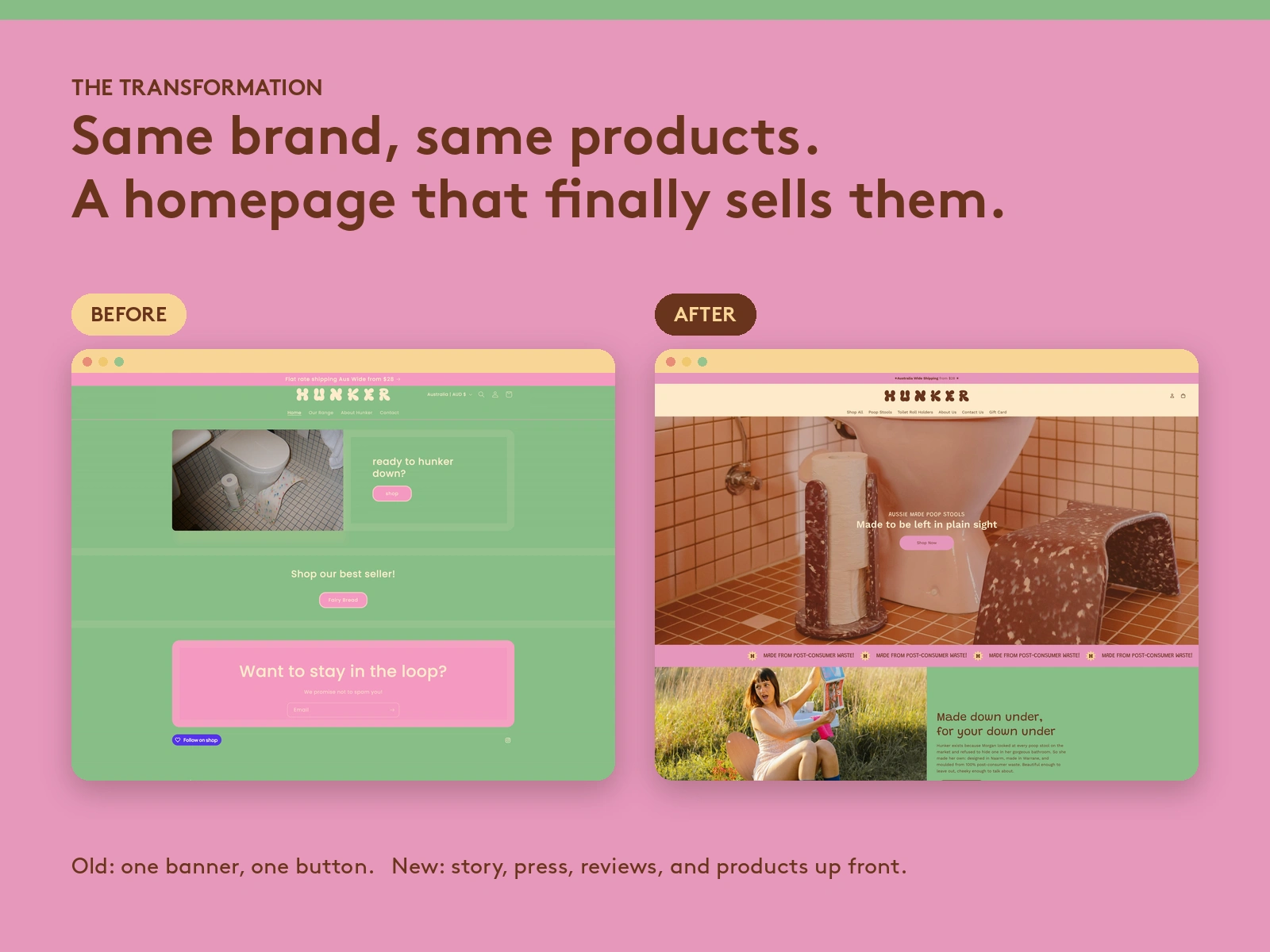
The homepage had one banner and one button, with no reviews, no press, and no founder story.
Product pages gave shoppers very little reason to buy.
Hunker Results
Accessibility
The job was to make the site accessible, lift conversions, and help more people find Hunker.
I added Brownie as a contrast colour. Black was off-brand, so I chose a colour that belongs in Hunker's world.
I retuned the palette so every text pairing passes WCAG AA. The main body text now sits at 9:1.
Homepage Redesign
I put social proof up front: press mentions from Broadsheet and Frankie magazine, real photos with faces, and customer reviews.
I added the founder story, so people know who's behind the brand.
A product carousel takes shoppers from the homepage straight into the range.
Search
New FAQs answer the questions people type into Google, like what a poop stool is and whether Hunker is Australian made.
Product copy is in Hunker's brand voice, and the brand language is consistent across the site.
Product pages
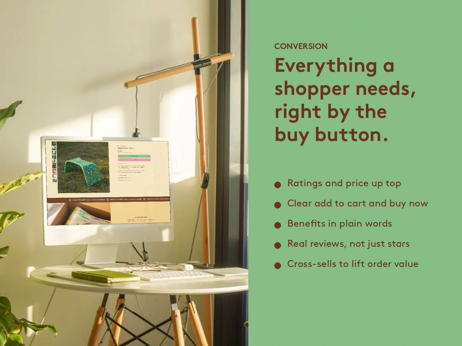
Ratings and price sit at the top, with clear add to cart and buy now buttons.
Benefits are in plain words: the go position, 100% post-consumer waste, and art, not equipment.
Reviews and cross-sells sit where shoppers make the decision.
The results
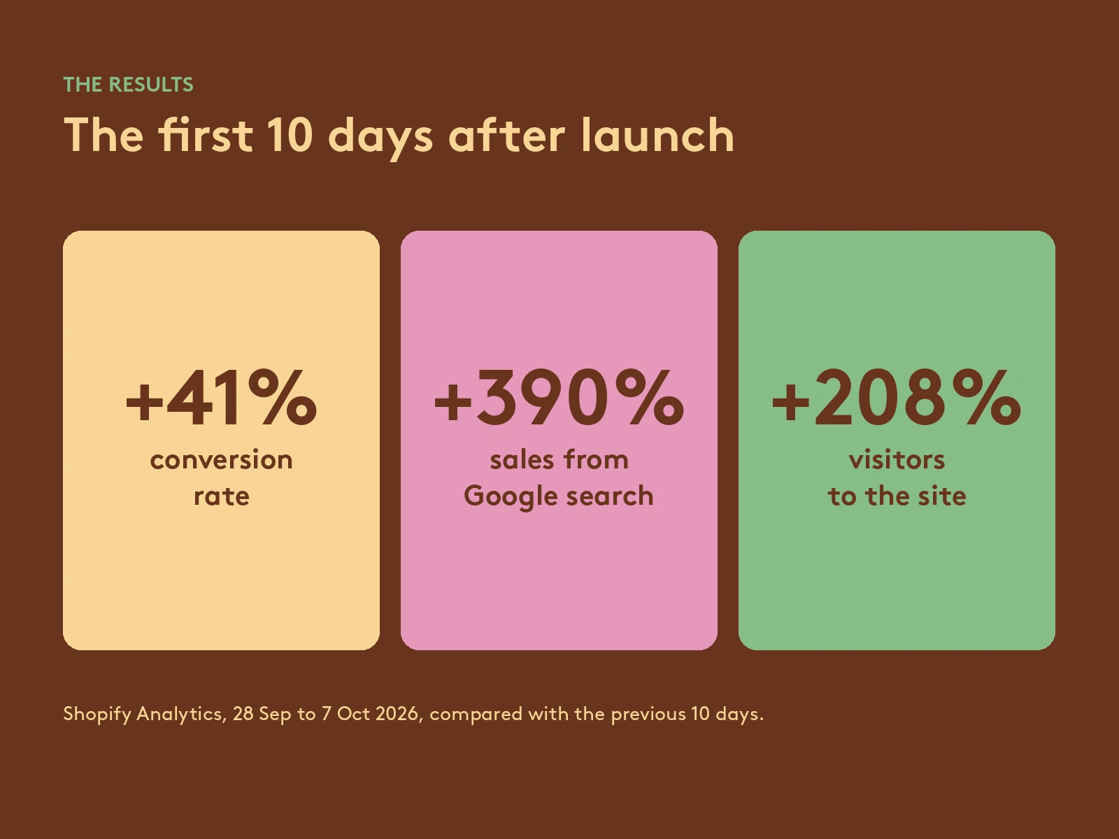
Shopify Analytics, first 10 days after launch (28 Sep to 7 Oct 2026) compared with the previous 10 days:
+41% conversion rate
+390% sales from Google search
+208% visitors (6,523 sessions)
+91% add to cart rate
+27% total sales
Like this project
Posted Oct 7, 2026
I redesigned Hunker's Shopify ecommerce site for WCAG AA accessibility, conversion, and SEO. In 10 days: +41% conversion, +390% Google sales, +208% visitors.
Likes
0
Views
3