Simplicity Sells Supplements

Mark Combs

Simplicity Sells Supplements
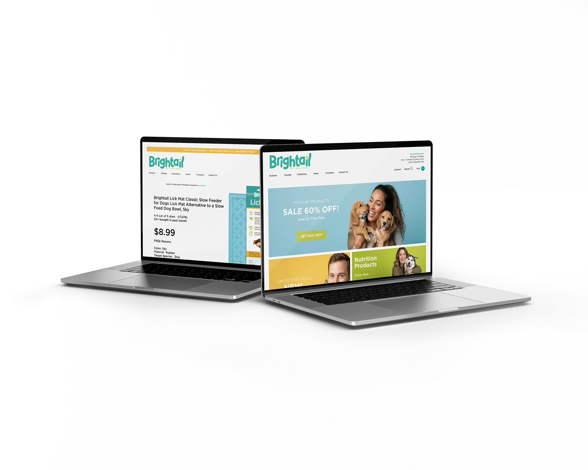
Building a brand from the ground up for Brightail Pet Wellness, a new Australian direct-to-consumer (DTC) company entering the pet supplement market. The scope included naming, brand identity, and packaging design.

Basic Ingredients
The Australian pet product market was already competitive. After a simple competitive analysis, we saw that the entire sector was relying on the same strategy: overly scientific, logic-based brands. None of them conveyed the emotional end result a pet owner truly wanted: simple clarity, trust, and a happy pet.
The owner had big plans and wanted a brand worthy of that vision, but this was a bootstrap project. The budget was small and fixed. The goal was to create a brand that could stand on its own in the crowded Pacific Rim DTC market while conveying clear, trustworthy information like honest ingredients, dosing schedules, and environmental-minded packaging.
Research and Naming
We used a brand foundations questionnaire to find the essence of the brand. The owner wanted to be known for Trust without guesswork and to position the brand as a Clear Compassionate Pet Wellness Guide.
The work culminated in the name Brightail.
The name had to be short, easy to say, and warm. “Bright” suggests clarity and vitality, while “Tail” is an instantly intuitive, universally recognized symbol of pet happiness. The combination avoids the clinical, science-heavy language of the competition and speaks directly to the emotional benefit.
The Solution: Packaging as a Guide
I wanted to translate the concepts of Trust and Clarity directly onto the packaging, which is the most critical touchpoint for a DTC brand. The design needed to be a clear compass for the overwhelmed customer.
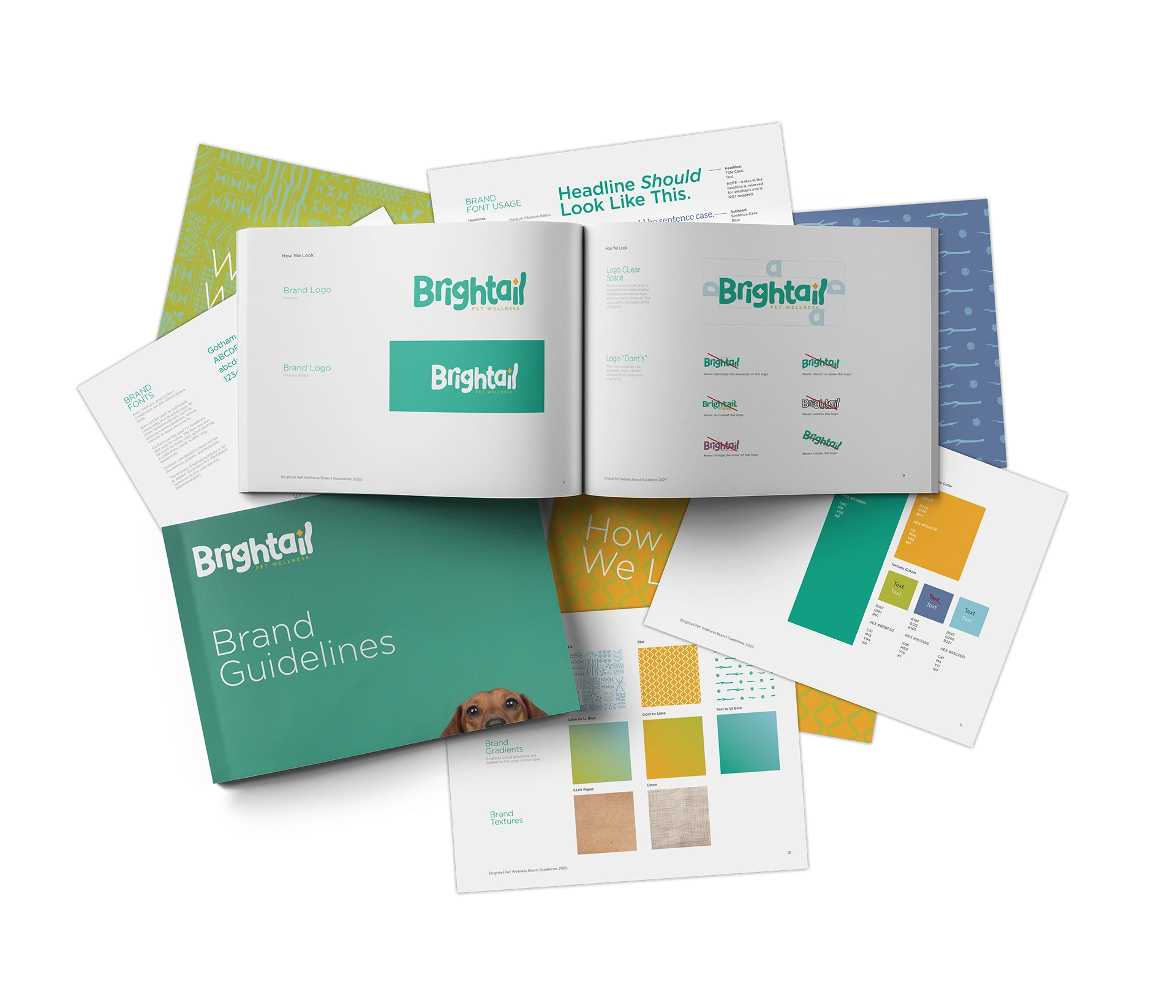
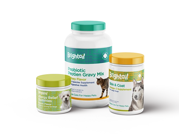
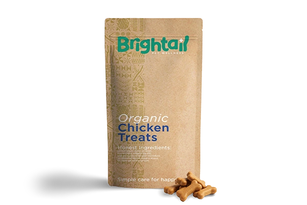
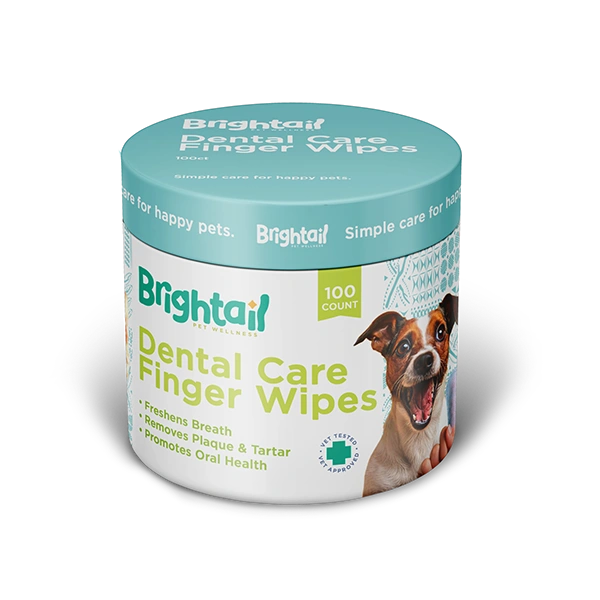
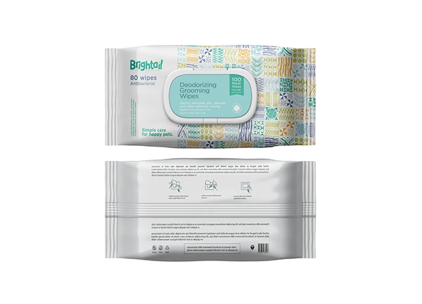
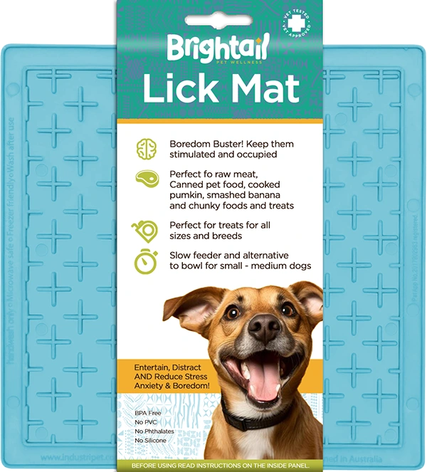
The design system uses ample white space and clean typography to ensure immediate legibility of critical information, directly countering the cluttered, text-heavy designs of competing brands. The color palette embraces bright colors along with clean white or craft paper textures, depending on the product, which aligns with the commitment to being environmental-minded and honest. To differentiate further, we developed a system of three unique patterns that include playful illustrations of ingredients, bones, sticks, and balls of yarn. This graphic approach adds warmth and personality without becoming cartoonish, perfectly balancing the brand’s professional credibility with its compassionate personality.

The Outcome: A Strong Foundation
At the time of publication, the products have not yet launched, the new brand identity and packaging system provide Brightail with a crucial advantage in the DTC marketplace. The design successfully rejects the industry’s clinical default and establishes a clear, trustworthy, and emotionally engaging position.
The disciplined and efficient use of the bootstrap budget resulted in a premium identity that is now poised to convert customers efficiently.
Like this project
Posted Sep 1, 2026
Named and built Brightail DTC pet-wellness brand: identity and packaging that prioritize clarity, trust, and emotional benefit for pet owners.
Likes
0
Views
0