The Sourcery.io Website Redesign
Luciano Dinapoli
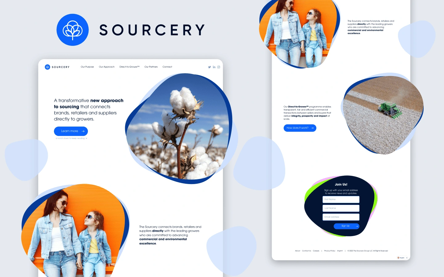
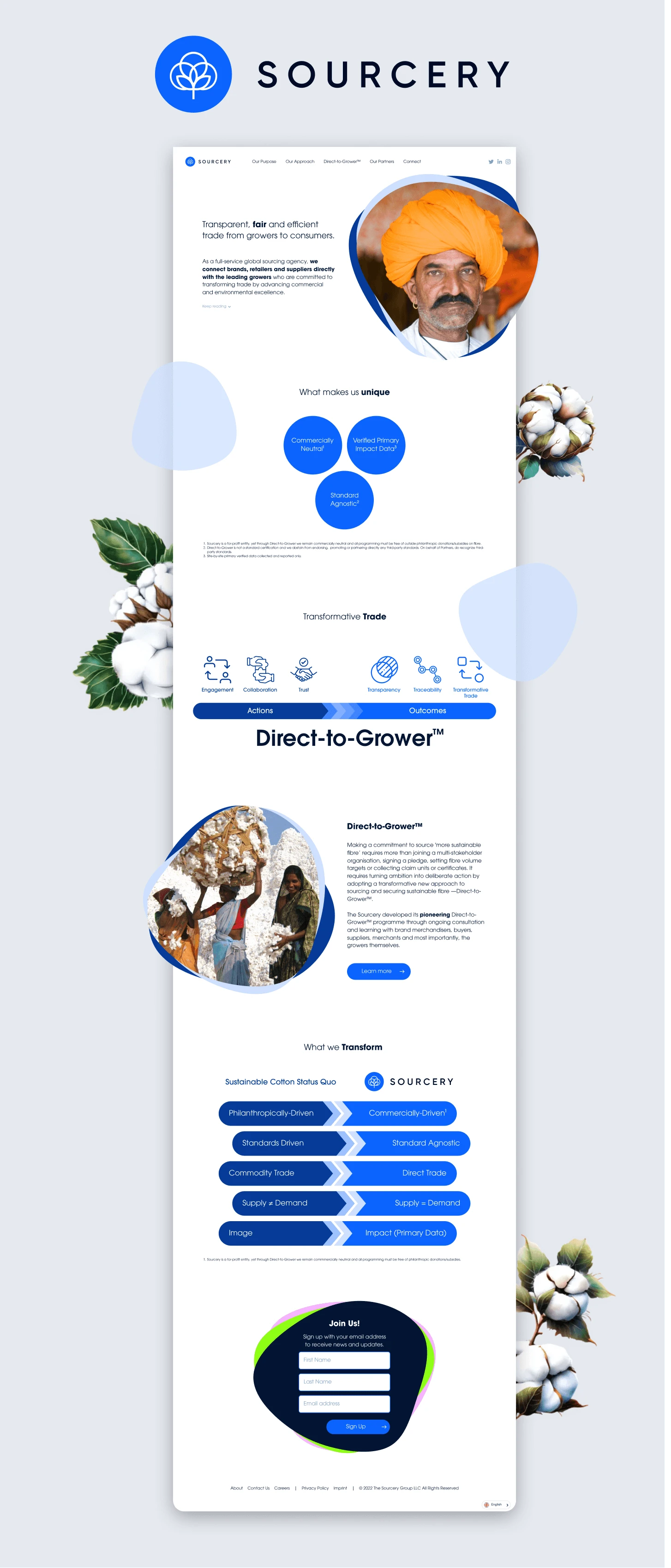
The Sourcery website
Transforming Trade for Good Through Purposeful Design
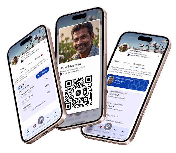
The Sourcery is a member-owned global sourcing platform connecting brands, manufacturers, and growers to transform trade for good. Their Direct-to-Grower™ Solution and Connect Platform blend human ingenuity and advanced digital intelligence to enable transparent, efficient, and trustworthy collaborations.
Website Redesign: Embracing an Organic and Authentic Brand Identity
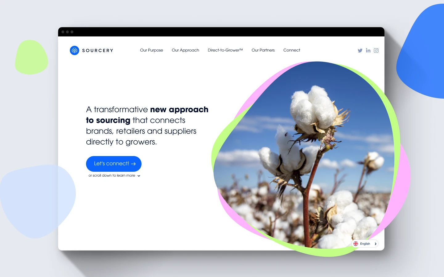
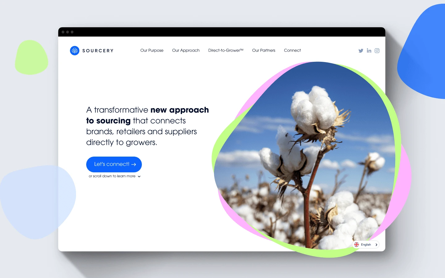
The Sourcery identified a need to move away from the rigid, dull appearance of their previous site. They envisioned a brand refresh that would visually align with their ethos: “Let’s Transform Trade for Good.” The design approach focused on creating an organic aesthetic, utilizing rounded, fluid shapes to bring softness and authenticity to the website’s look and feel. These shapes were used throughout the site to frame photos, adding a dynamic element to the layout and building a cohesive visual language that aligns with their mission.
Consistent Visual System Across Touchpoints
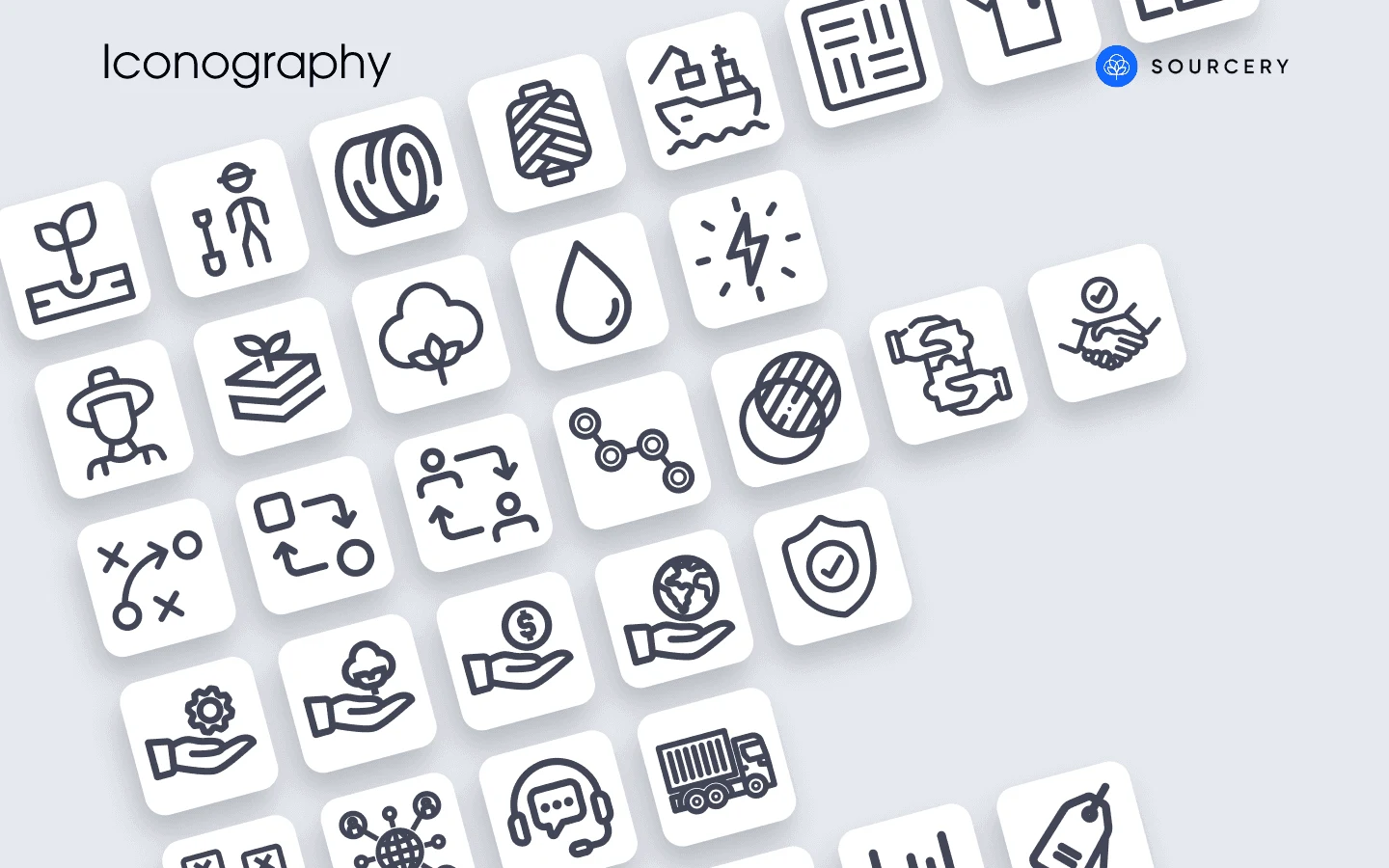
As part of the branding project, a set of icons was designed for use in graphs, infographics, and future presentation templates. Inspired by the geometric lines of The Sourcery’s logo, the icons feature thick, monochromatic outlines, maintaining a simplified and cohesive look. These elements were also included in the design system, ensuring versatility and consistency in future applications.
Harmonized Branding Guidelines
The updated branding guidelines expand The Sourcery’s color palette, integrating new hues that harmonize with the main brand color. This palette and the simplified iconography support a cohesive identity across digital and print materials, reinforcing the brand’s message of transparency and sustainability.
Below is a preview of a full-page layout that showcases the integration of organic shapes, logo-inspired icons, and the expanded color palette, creating a user experience that feels both inviting and aligned with The Sourcery’s core values.
Like this project
Posted Aug 6, 2025
Modernized the website for The Sourcery.io. Resulted in a 50% increase in website traffic and improved conversion rates.